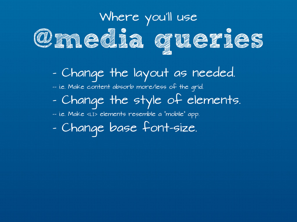
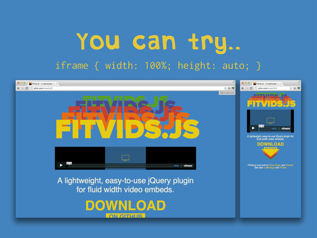
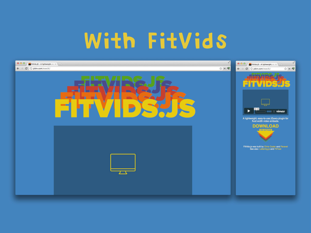
needed. -- i.e. Make content absorb more/less of the grid. - Change the style of elements. -- i.e. Make <LI> elements resemble a “mobile” app. - Change base font-size.
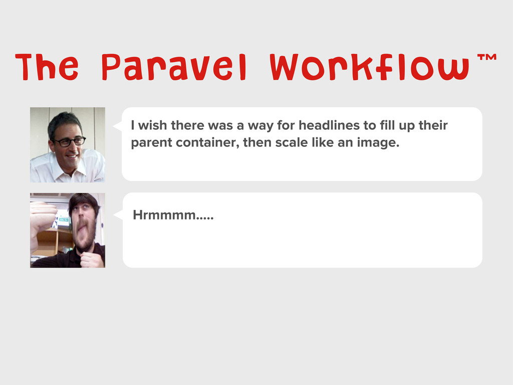
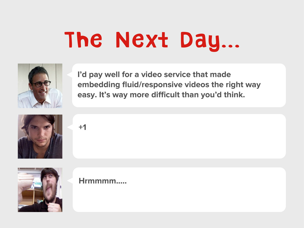
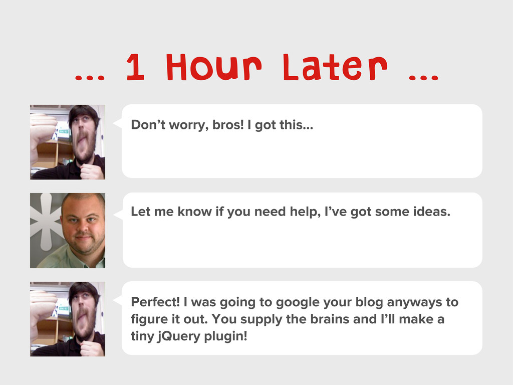
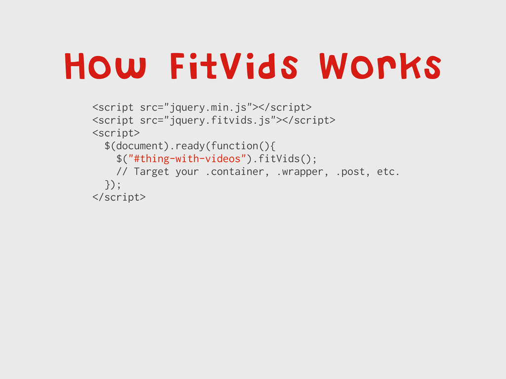
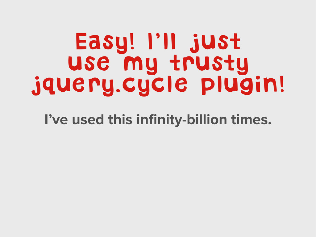
... Let me know if you need help, I’ve got some ideas. Perfect! I was going to google your blog anyways to figure it out. You supply the brains and I’ll make a tiny jQuery plugin!
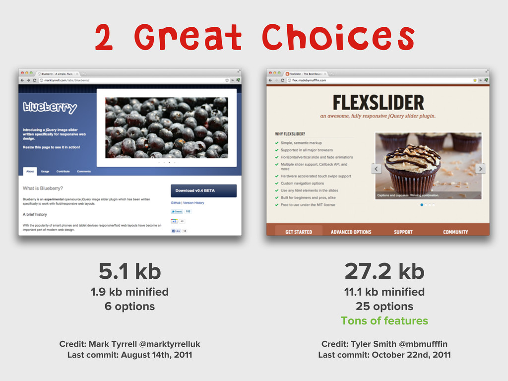
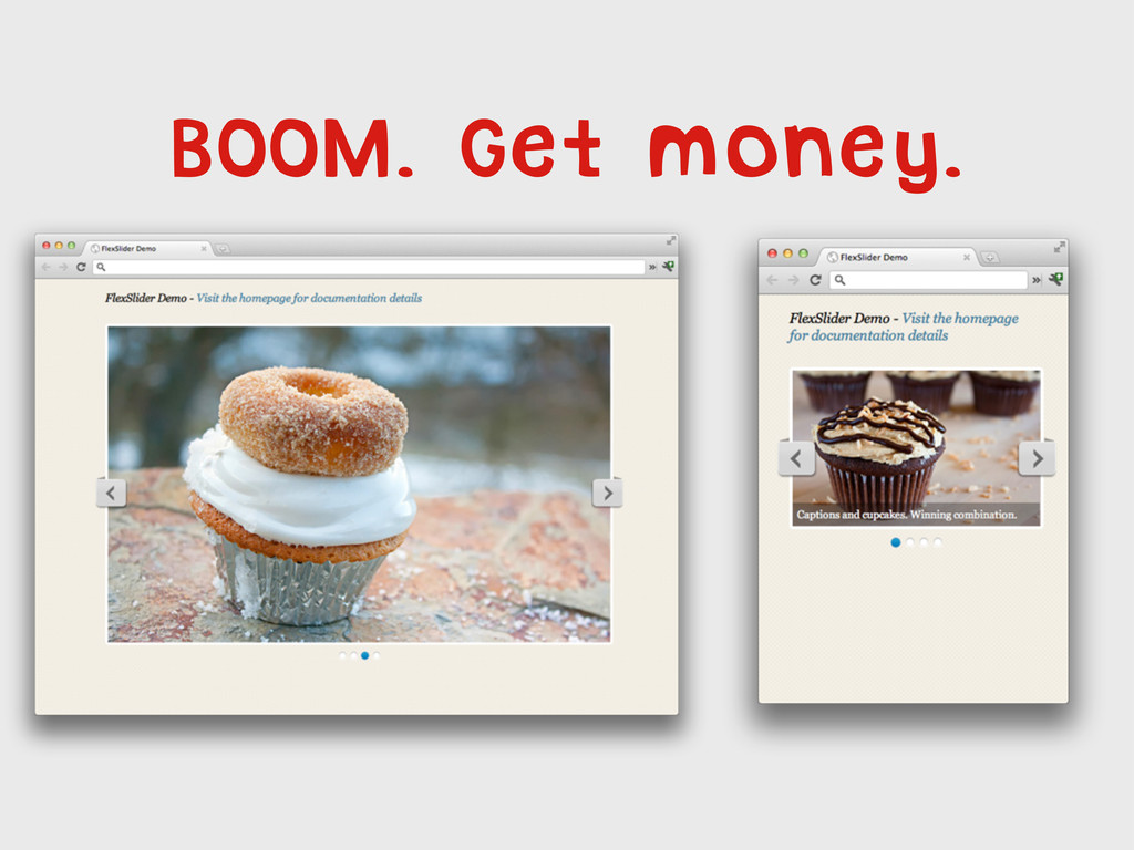
Credit: Mark Tyrrell @marktyrrelluk Last commit: August 14th, 2011 27.2 kb 11.1 kb minified 25 options Tons of features Credit: Tyler Smith @mbmufffin Last commit: October 22nd, 2011
 SiteGround - Reliable hosting with speed, security, and support you can count on.
 davatron5000
 guvalif
 mizchi
 yug1224
 kotetuco
 supurazako
 seike460
 konokenj
 kajitack
 panda728
 hayama17
 tonkotsuboy_com
 thasu0123
 csswizardry
 kneath
 eileencodes
 ivargrimstad
 chriscoyier
 chikuwait
 tammyeverts
 baasie
 soysaucechin
 lara
lara
 charlesmeaden