Upgrade to Pro
— share decks privately, control downloads, hide ads and more …
Speaker Deck
Features
Speaker Deck
PRO
Sign in
Sign up for free
Search
Search
Ross Hudgens — Data-Driven Content Marketing an...
Search
Sponsored
·
Ship Features Fearlessly
Turn features on and off without deploys. Used by thousands of Ruby developers.
→
Distilled
October 07, 2015
Technology
290
0
Share
Ross Hudgens — Data-Driven Content Marketing and Outreach
Distilled
October 07, 2015
More Decks by Distilled
See All by Distilled
Wil Reynolds — Paid Search Strategies SEOs will Love
distilled
0
170
Rand Fishkin — Search Ranking Factors in 2015 What Data, Opinions, and Testing Reveal
distilled
0
230
Larry Kim — The Top 10 Facebook & Twitter Advertising Hacks of All Time
distilled
0
190
Will Critchlow - Practical Tips for the Future of Search II
distilled
0
300
Tom Anthony - New Paradigms: Five Fundamental Changes in Search II
distilled
0
350
Aaron Friedman — ‘Google's Predictable Content Preference’
distilled
0
320
Aleyda Solis — ‘Unlocking Growth Opportunities with Search Analytics’
distilled
0
260
Anum Hussain — ‘Topics Over Keywords: An SEO-Driven Approach to Content Marketing’
distilled
0
310
Casie Gillette — ‘21 Must-Have PR Tools and Tactics’
distilled
0
210
Other Decks in Technology
See All in Technology
Strands Agents超入門
kintotechdev
1
160
Djangoユーザが知っ得なPostgreSQL機能 - 設計の選択肢を増やす / Djang-use-PostgreSQL
soudai
PRO
0
110
最低限これだけ押さえれ大丈夫_Claude Enterprise/Team企業展開ガバナンス入門
tkikuchi
1
720
Chart.js が簡単に使えるようになっていたので OGP 画像生成に使った話
kamekyame
0
140
脅威をエンジニアリングの糧にして:恐怖を乗り越えた先にあったもの / Turn threats into fuel for engineering: what lay beyond overcoming fear
nrslib
1
380
Databricks における 生成AIガバナンスの実践
taka_aki
1
280
AI活用を推進するために ファインディが下した、一つの小さな決断
starfish719
0
220
Javaコミュニティをもっと楽しむための9箇条
takasyou
0
1.2k
Javaで学ぶSOLID原則
negima
1
270
Agentic ERPをどう設計するか ー 受発注エージェントを動かす、現場の知見と設計思想ー
recerqainc
1
1.1k
AI Engineering Summit Tokyo 2026 AIの前に、やることがある 〜医療データ企業の4フェーズ〜
dtaniwaki
0
1.4k
生成 AI × MCP で切り拓く次世代 SRE!自律型運用への挑戦と開発者体験の進化
_awache
0
100
Featured
See All Featured
Speed Design
sergeychernyshev
33
1.8k
Leo the Paperboy
mayatellez
7
1.8k
Fight the Zombie Pattern Library - RWD Summit 2016
marcelosomers
234
17k
Large-scale JavaScript Application Architecture
addyosmani
515
110k
BBQ
matthewcrist
89
10k
The Curse of the Amulet
leimatthew05
1
13k
Noah Learner - AI + Me: how we built a GSC Bulk Export data pipeline
techseoconnect
PRO
0
190
Cheating the UX When There Is Nothing More to Optimize - PixelPioneers
stephaniewalter
287
14k
Color Theory Basics | Prateek | Gurzu
gurzu
0
320
What Being in a Rock Band Can Teach Us About Real World SEO
427marketing
0
240
The Invisible Side of Design
smashingmag
302
52k
Dealing with People You Can't Stand - Big Design 2015
cassininazir
367
27k
Transcript
Content Marketing Data That Moves the Needle Ross Hudgens, Founder,
Siege Media @RossHudgens http://siegemedia.com
Get the Deck: bit.ly/siege-sd
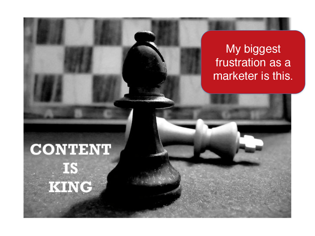
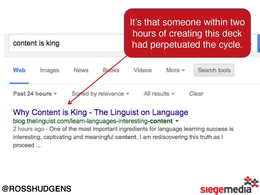
My biggest frustration as a marketer is this.
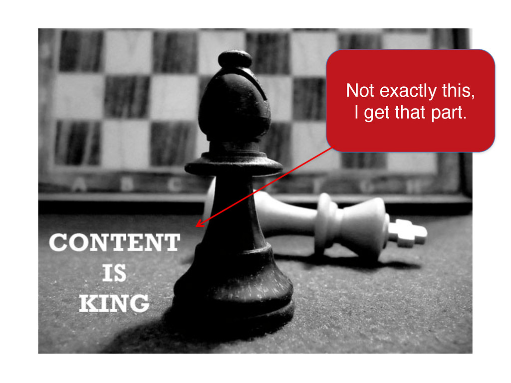
Not exactly this, I get that part.
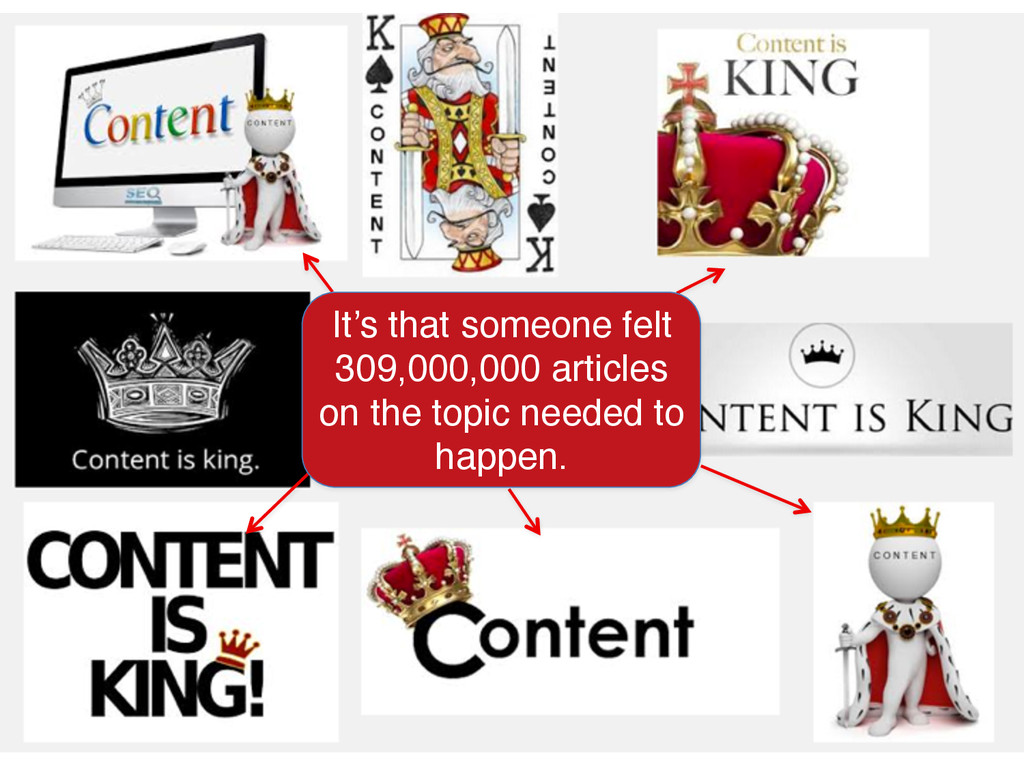
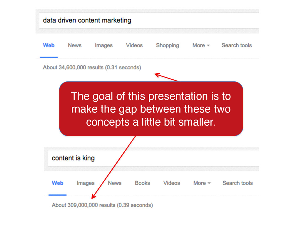
It’s that someone felt 309,000,000 articles on the topic needed
to happen.
@ROSSHUDGENS It’s that someone within two hours of creating this
deck had perpetuated the cycle.
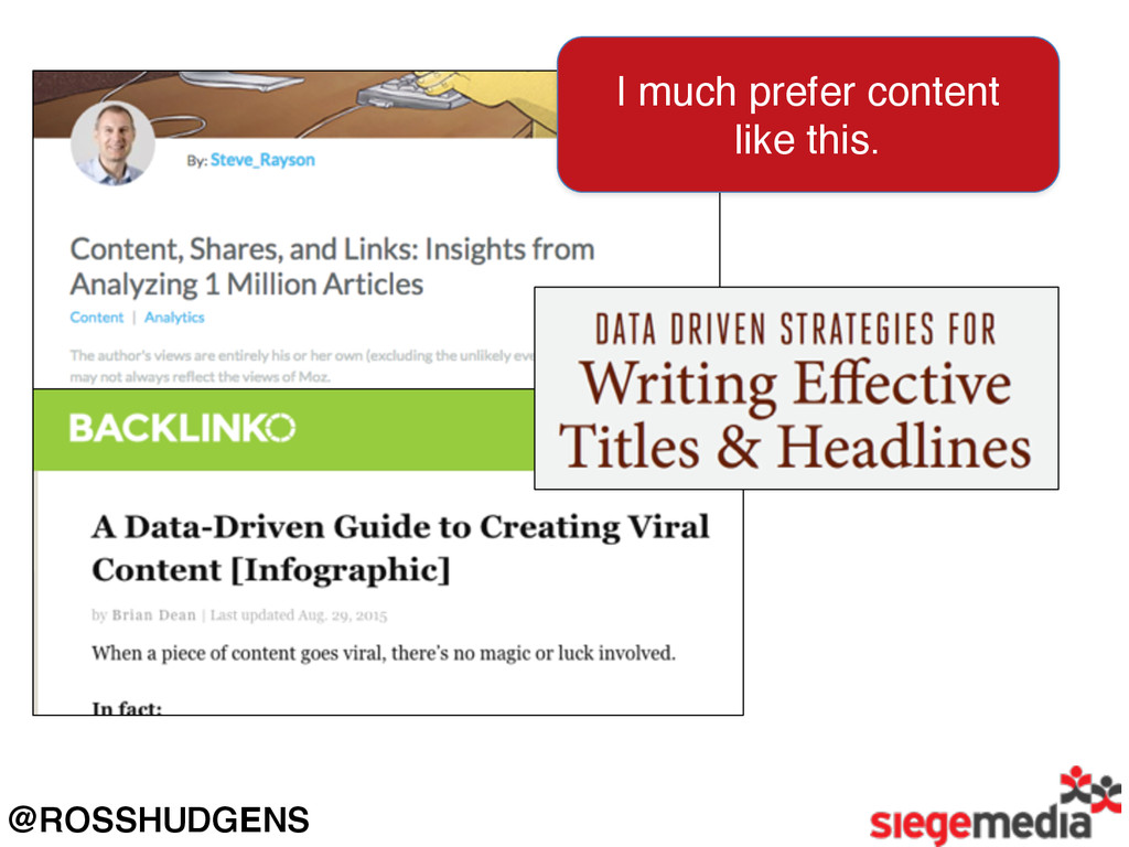
@ROSSHUDGENS I much prefer content like this.
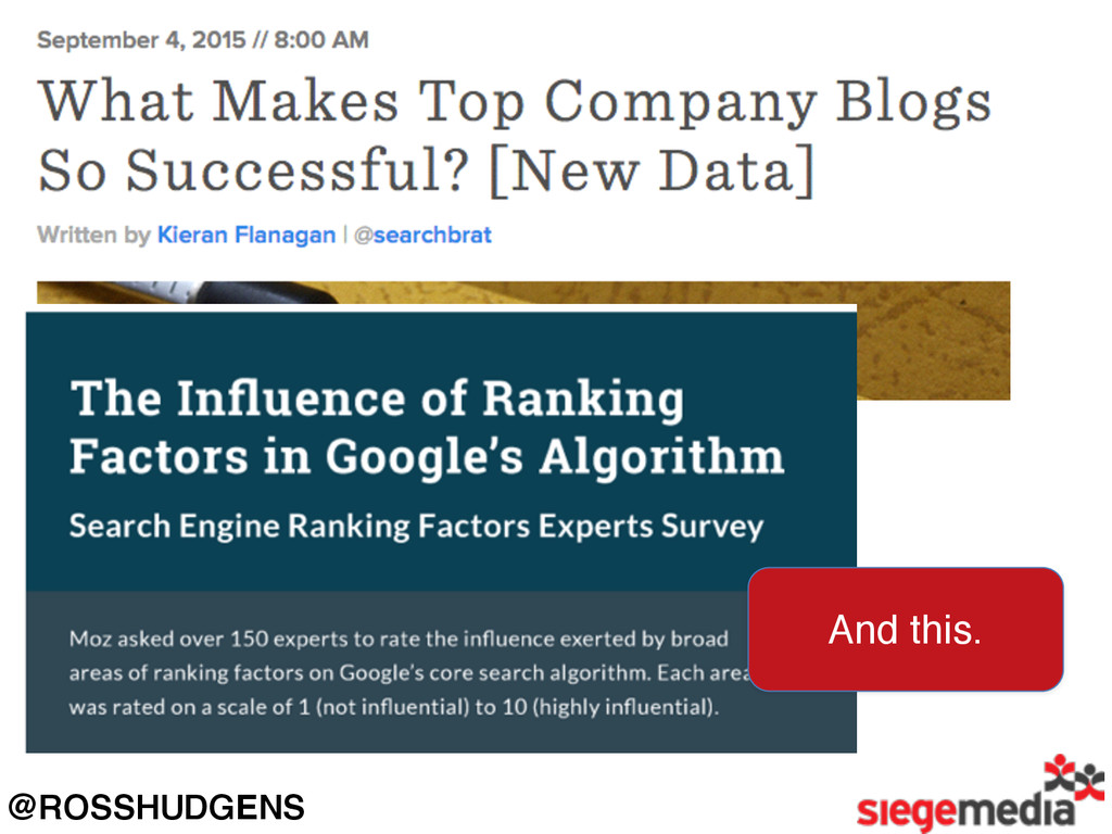
@ROSSHUDGENS And this.
The goal of this presentation is to make the gap
between these two concepts a little bit smaller.
PART 1: CONTENT STRUCTURE.
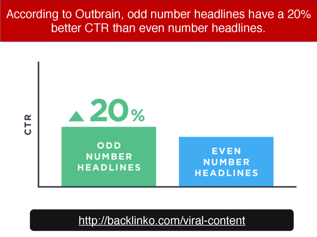
According to Outbrain, odd number headlines have a 20% better
CTR than even number headlines. http://backlinko.com/viral-content
HubSpot found that adding [brackets] in their titles bumped up
CTR by 38%. http://bit.ly/hubspot-title-research
Specifically, HubSpot found [templates] got the highest CTR average of
all bracketed terms. http://bit.ly/hubspot-title-research
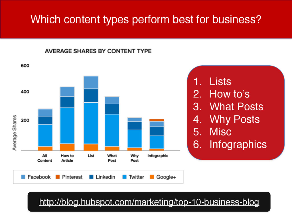
Which content types perform best for business? http://blog.hubspot.com/marketing/top-10-business-blog 1. Lists
2. How to’s 3. What Posts 4. Why Posts 5. Misc 6. Infographics
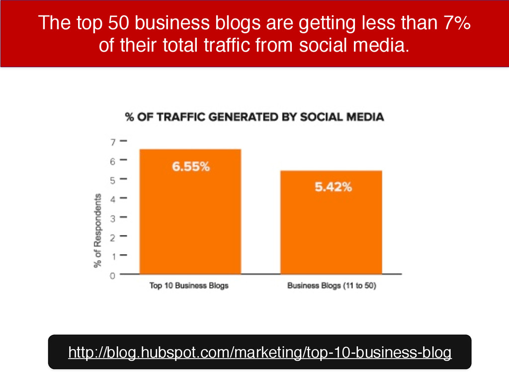
The top 50 business blogs are getting less than 7%
of their total traffic from social media. http://blog.hubspot.com/marketing/top-10-business-blog
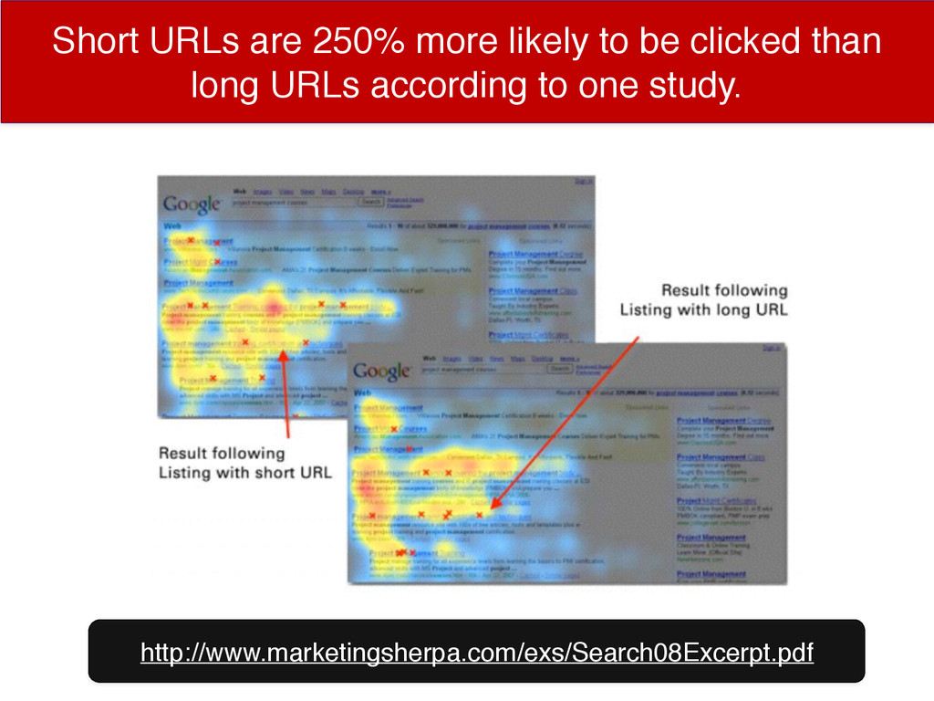
http://www.marketingsherpa.com/exs/Search08Excerpt.pdf Short URLs are 250% more likely to be clicked
than long URLs according to one study.
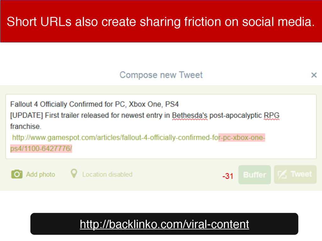
http://backlinko.com/viral-content Short URLs also create sharing friction on social media.
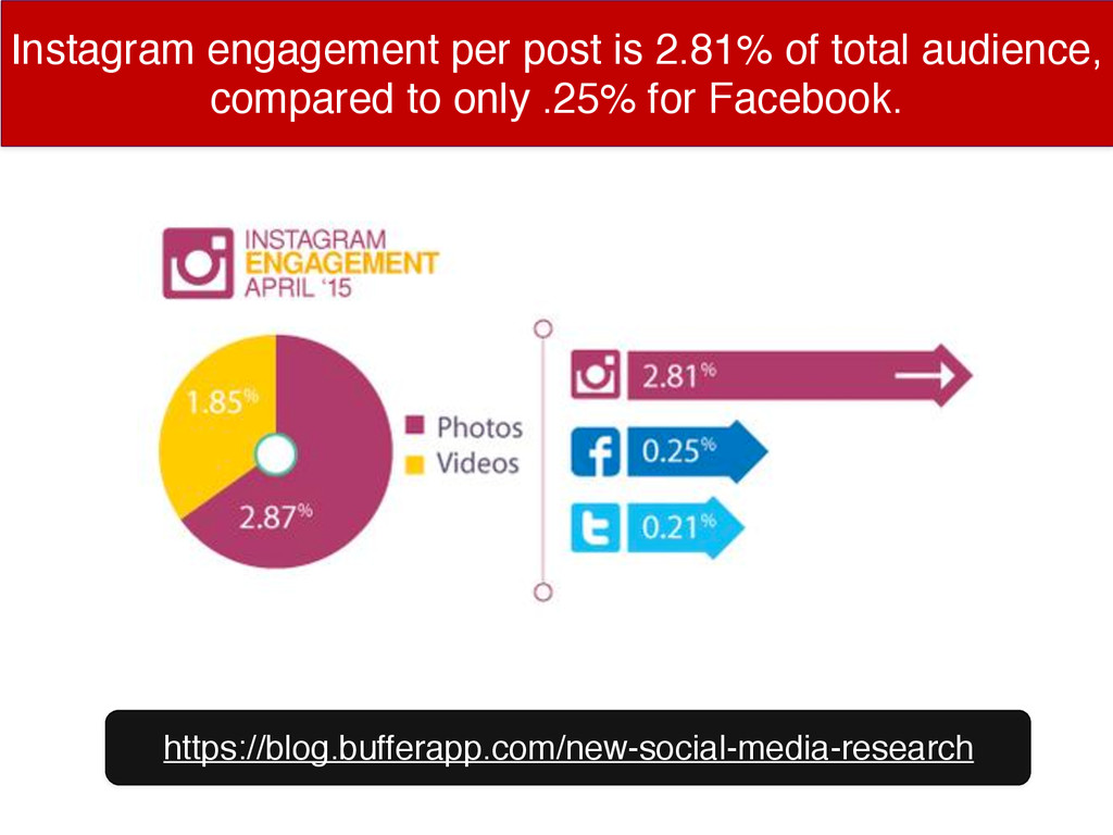
Instagram engagement per post is 2.81% of total audience, compared
to only .25% for Facebook. https://blog.bufferapp.com/new-social-media-research
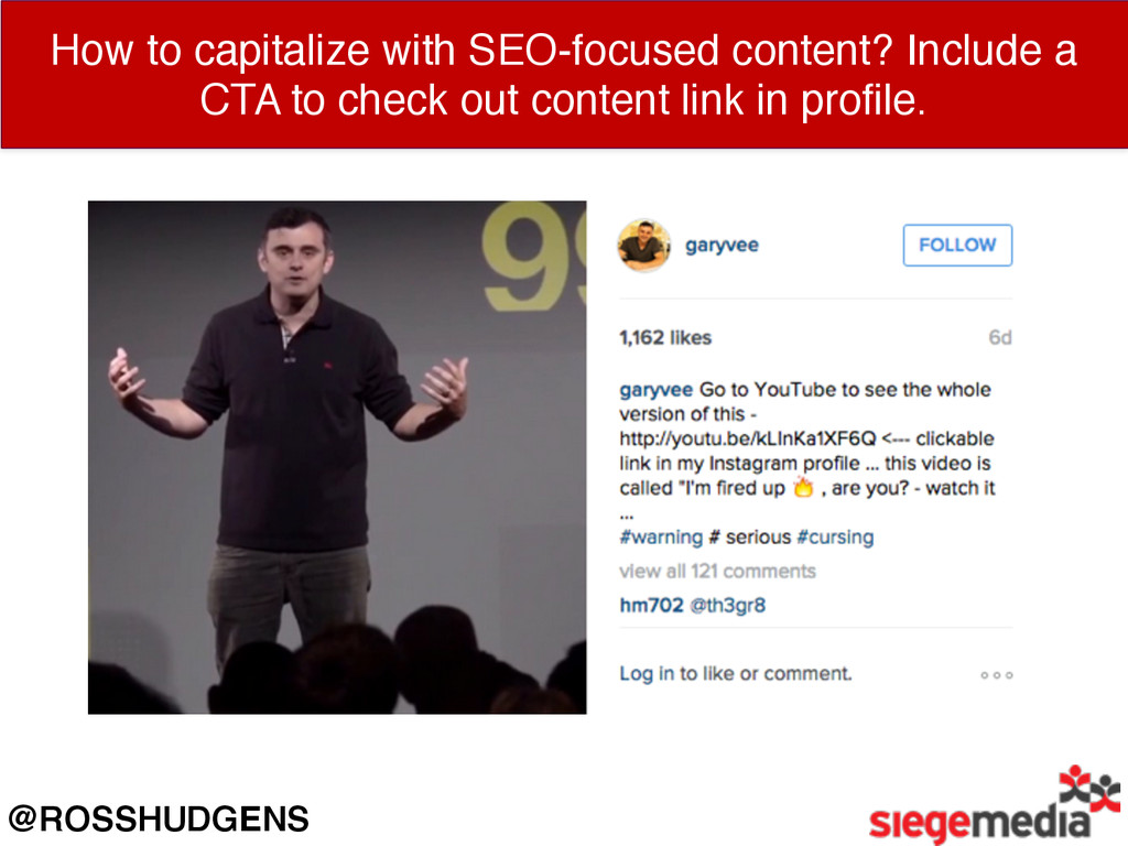
How to capitalize with SEO-focused content? Include a CTA to
check out content link in profile. @ROSSHUDGENS
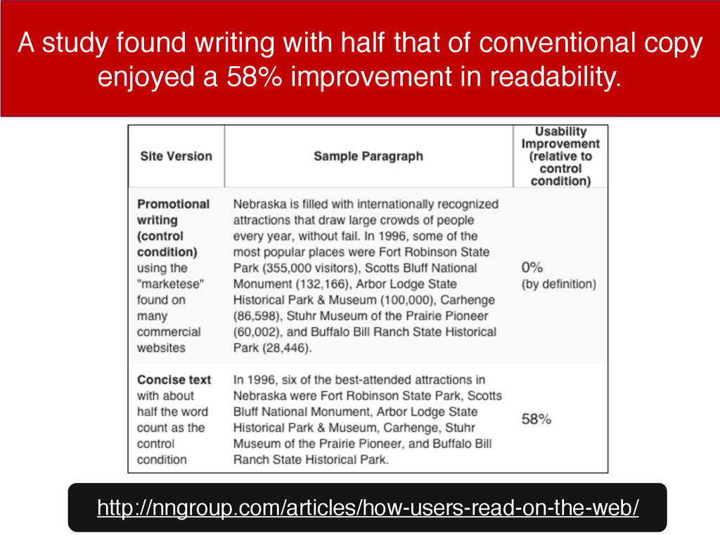
A study found writing with half that of conventional copy
enjoyed a 58% improvement in readability. http://nngroup.com/articles/how-users-read-on-the-web/
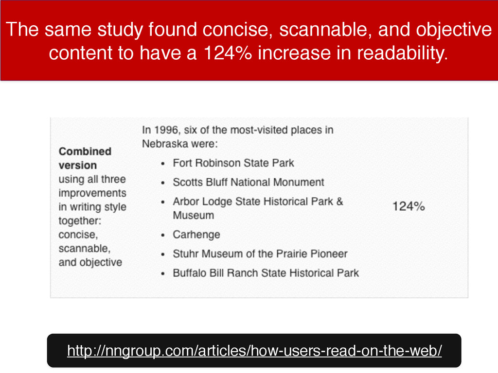
The same study found concise, scannable, and objective content to
have a 124% increase in readability. http://nngroup.com/articles/how-users-read-on-the-web/
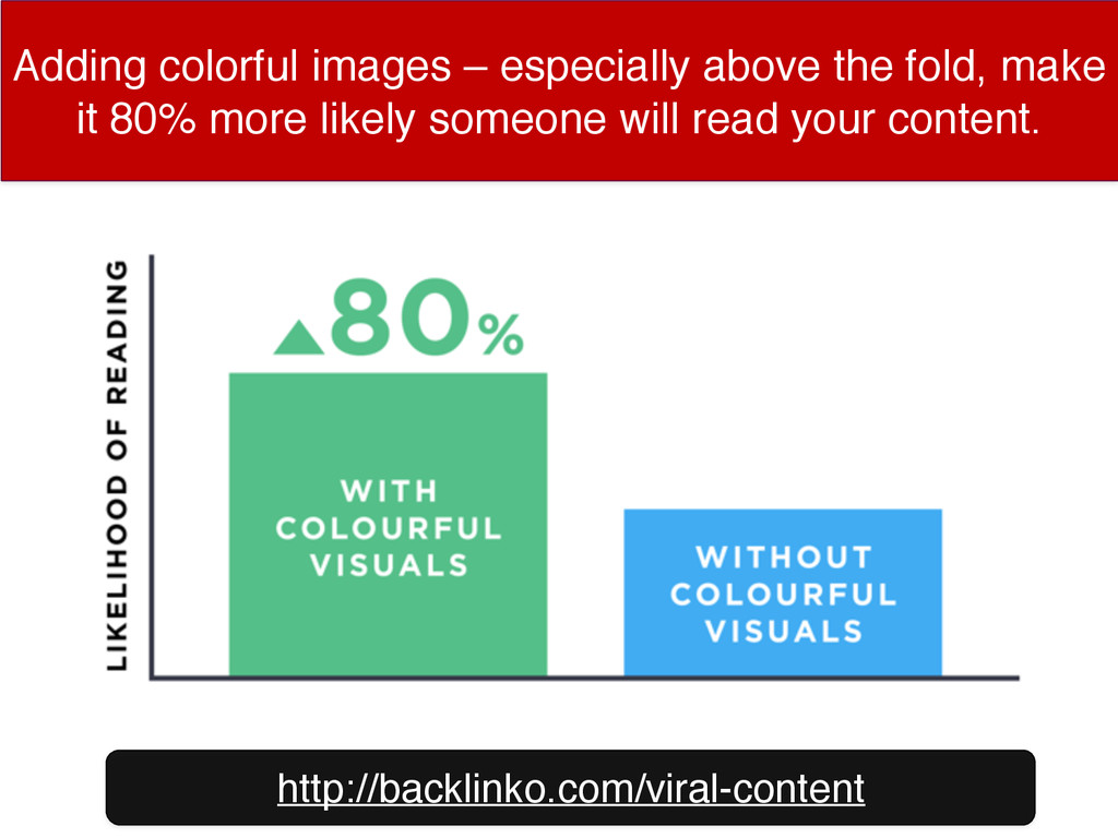
Adding colorful images – especially above the fold, make it
80% more likely someone will read your content. http://backlinko.com/viral-content
Welcome emails have 320% more revenue per email than other
promotional emails. http://blog.hubspot.com/marketing/optimize-welcome-emails
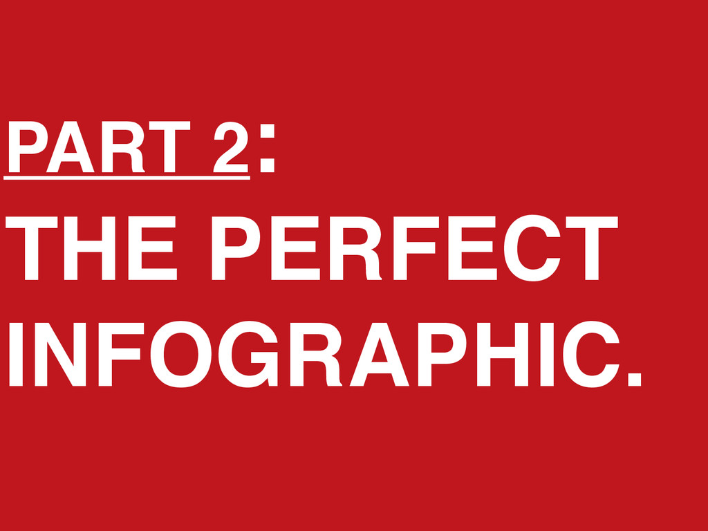
PART 2: THE PERFECT INFOGRAPHIC.
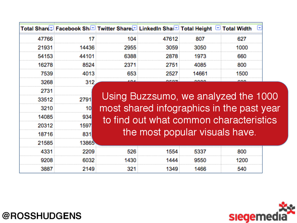
@ROSSHUDGENS Using Buzzsumo, we analyzed the 1000 most shared infographics
in the past year to find out what common characteristics the most popular visuals have.
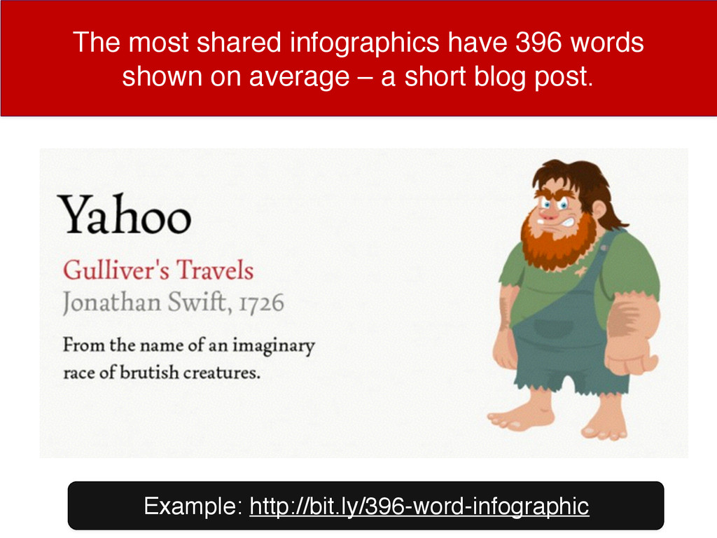
The most shared infographics have 396 words shown on average
– a short blog post. Example: http://bit.ly/396-word-infographic
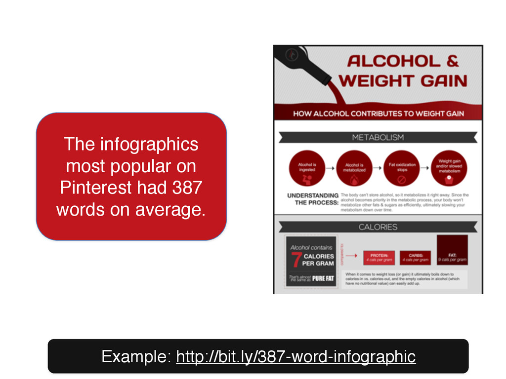
Example: http://bit.ly/387-word-infographic The infographics most popular on Pinterest had 387
words on average.
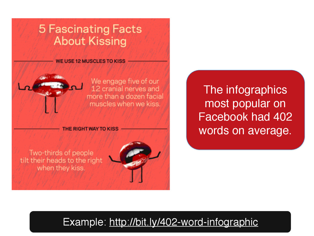
Example: http://bit.ly/402-word-infographic The infographics most popular on Facebook had 402
words on average.
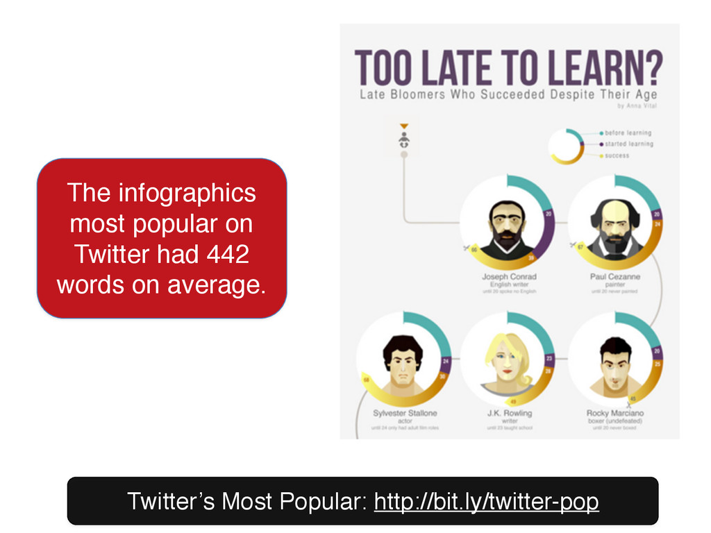
Twitter’s Most Popular: http://bit.ly/twitter-pop The infographics most popular on Twitter
had 442 words on average.
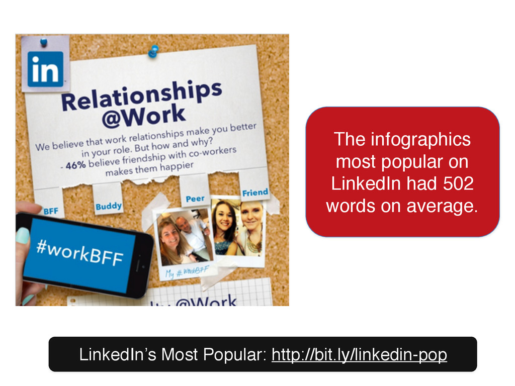
LinkedIn’s Most Popular: http://bit.ly/linkedin-pop The infographics most popular on LinkedIn
had 502 words on average.
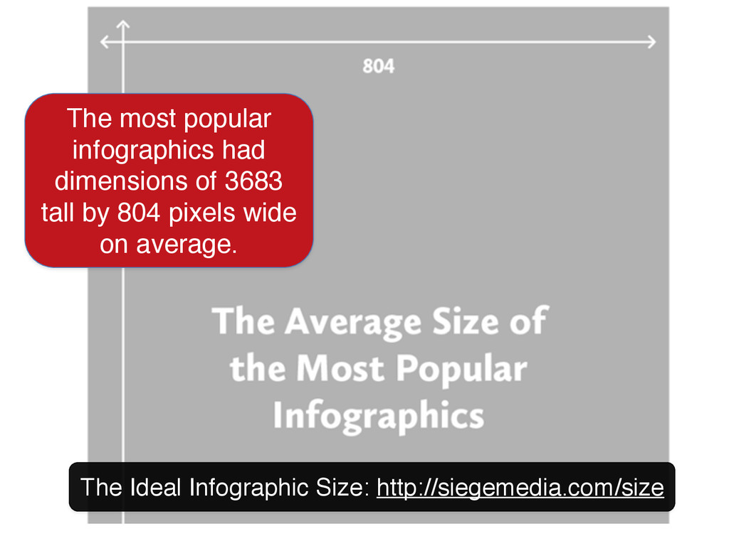
The Ideal Infographic Size: http://siegemedia.com/size The most popular infographics had
dimensions of 3683 tall by 804 pixels wide on average.
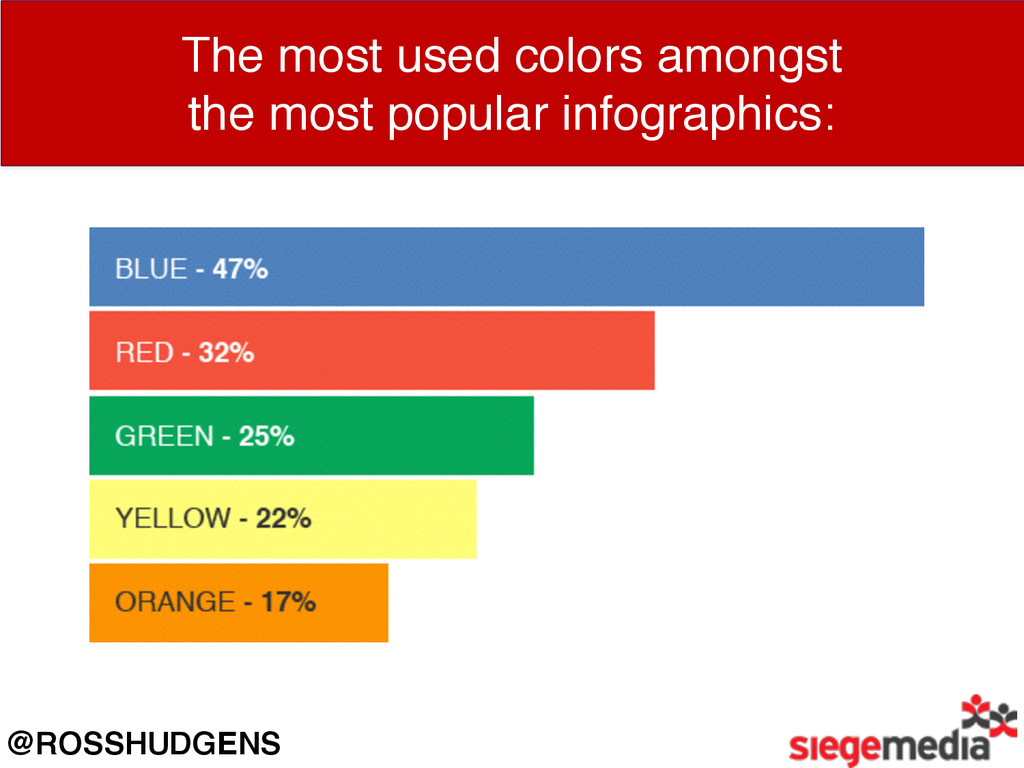
The most used colors amongst the most popular infographics: @ROSSHUDGENS
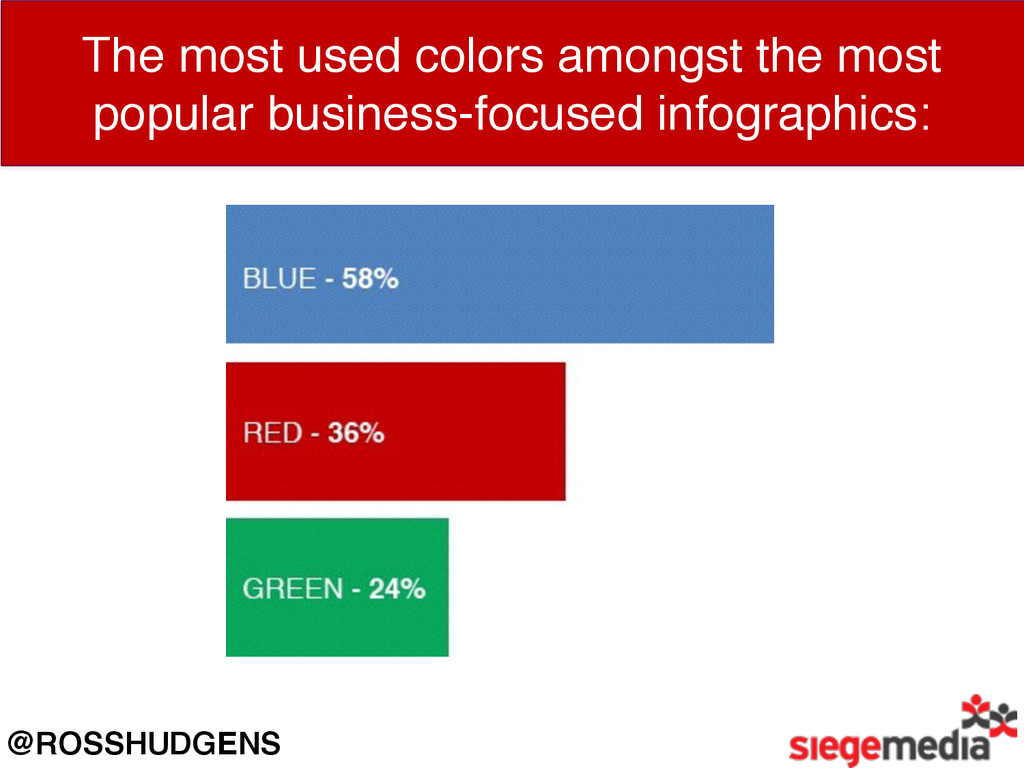
The most used colors amongst the most popular business-focused infographics:
@ROSSHUDGENS
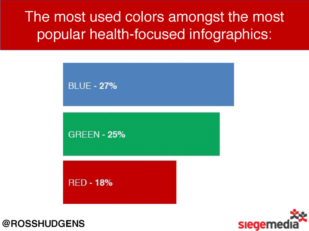
The most used colors amongst the most popular health-focused infographics:
@ROSSHUDGENS
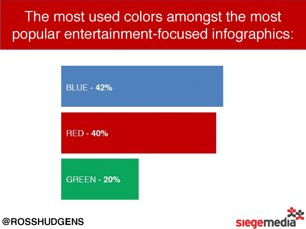
The most used colors amongst the most popular entertainment-focused infographics:
@ROSSHUDGENS
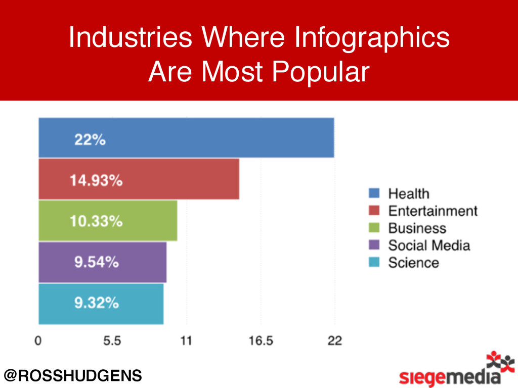
Industries Where Infographics Are Most Popular @ROSSHUDGENS
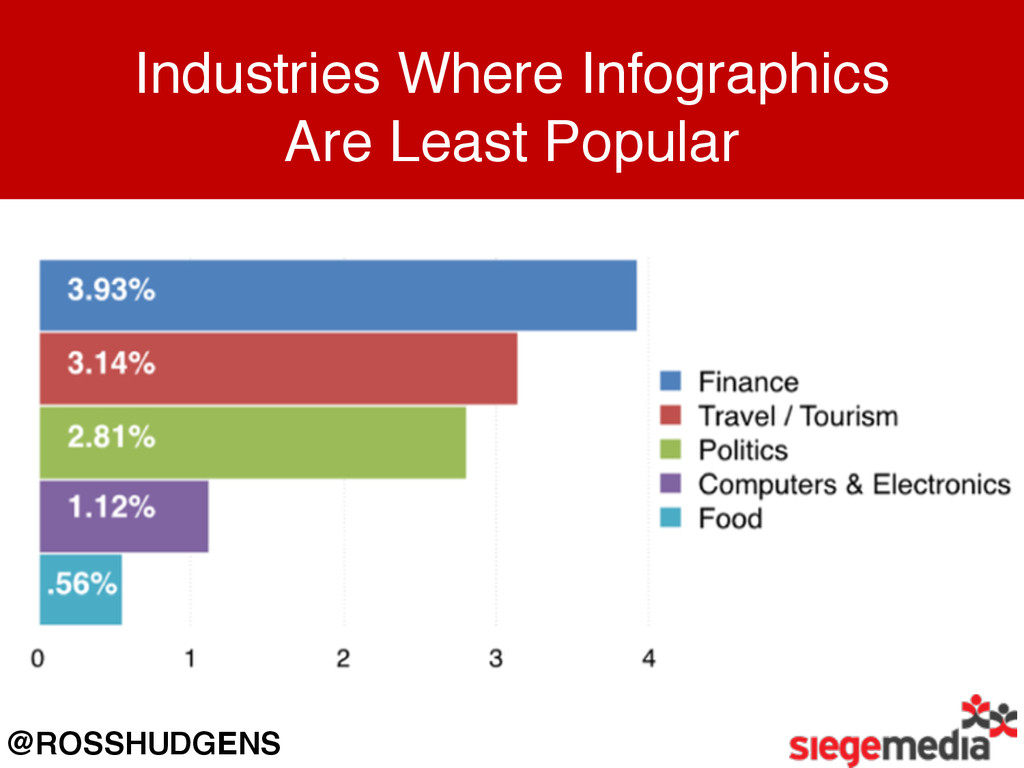
Industries Where Infographics Are Least Popular @ROSSHUDGENS
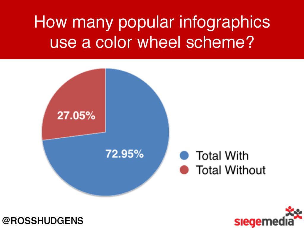
How many popular infographics use a color wheel scheme? @ROSSHUDGENS
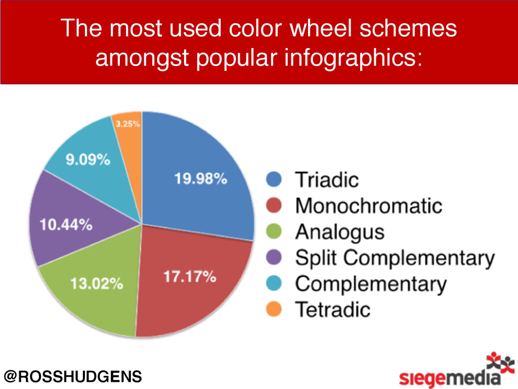
The most used color wheel schemes amongst popular infographics: @ROSSHUDGENS
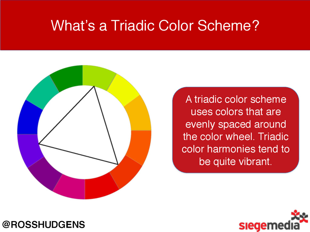
What’s a Triadic Color Scheme? A triadic color scheme uses
colors that are evenly spaced around the color wheel. Triadic color harmonies tend to be quite vibrant. @ROSSHUDGENS
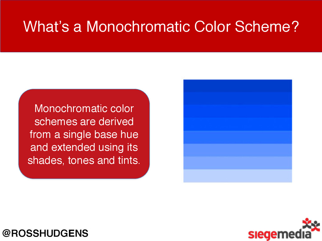
What’s a Monochromatic Color Scheme? Monochromatic color schemes are derived
from a single base hue and extended using its shades, tones and tints. @ROSSHUDGENS
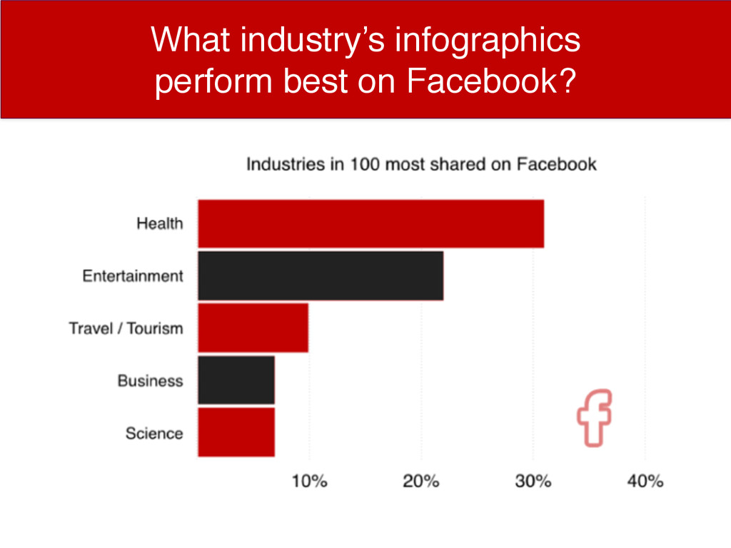
What Industries’ Infographics Do Best on Facebook? What industry’s infographics
perform best on Facebook?
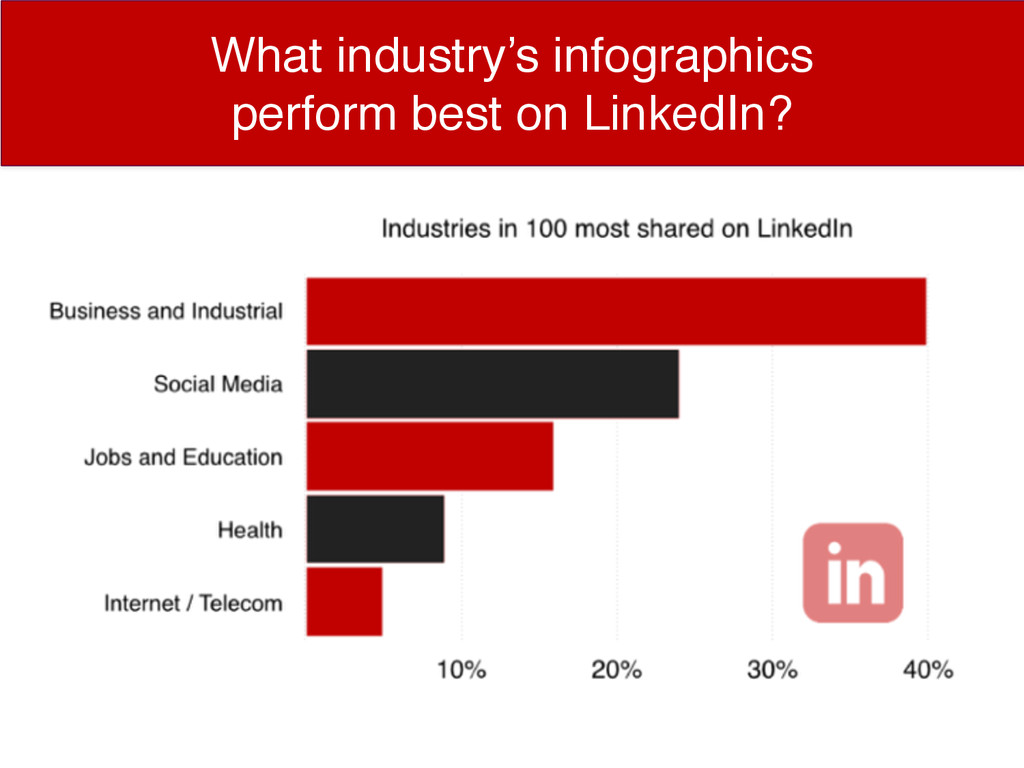
What Industries’ Infographics Do Best on LinkedIn? What industry’s infographics
perform best on LinkedIn?
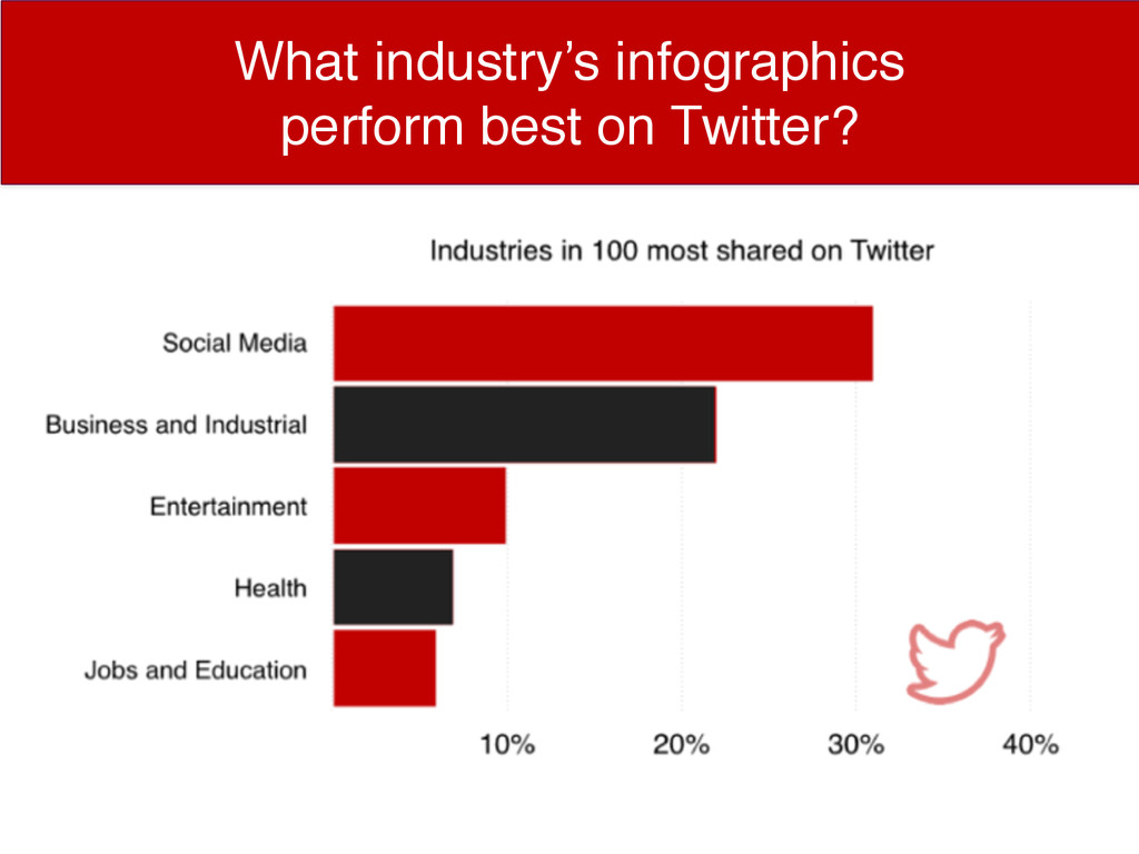
What Industries’ Infographics Do Best on Twitter? What industry’s infographics
perform best on Twitter?
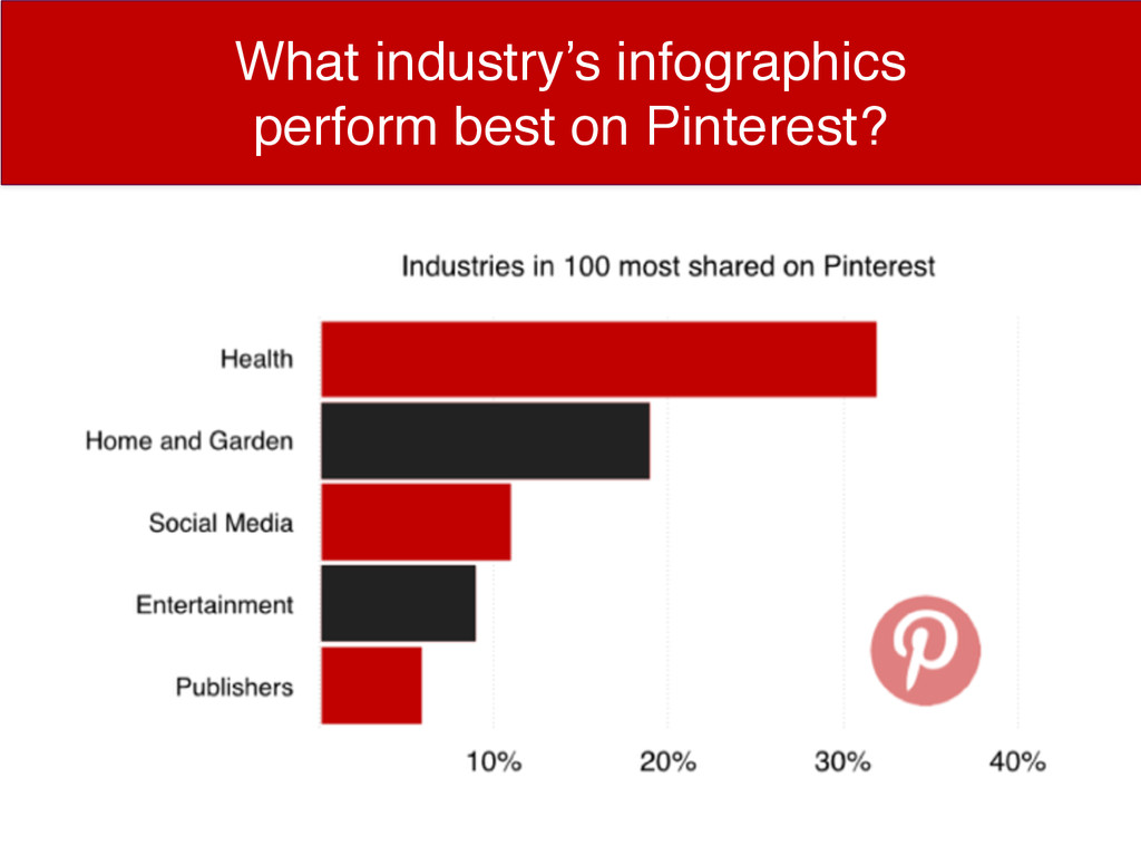
What Industries’ Infographics Do Best on Twitter? What industry’s infographics
perform best on Pinterest?
What Industries’ Infographics Do Best on Twitter? Anatomy of a
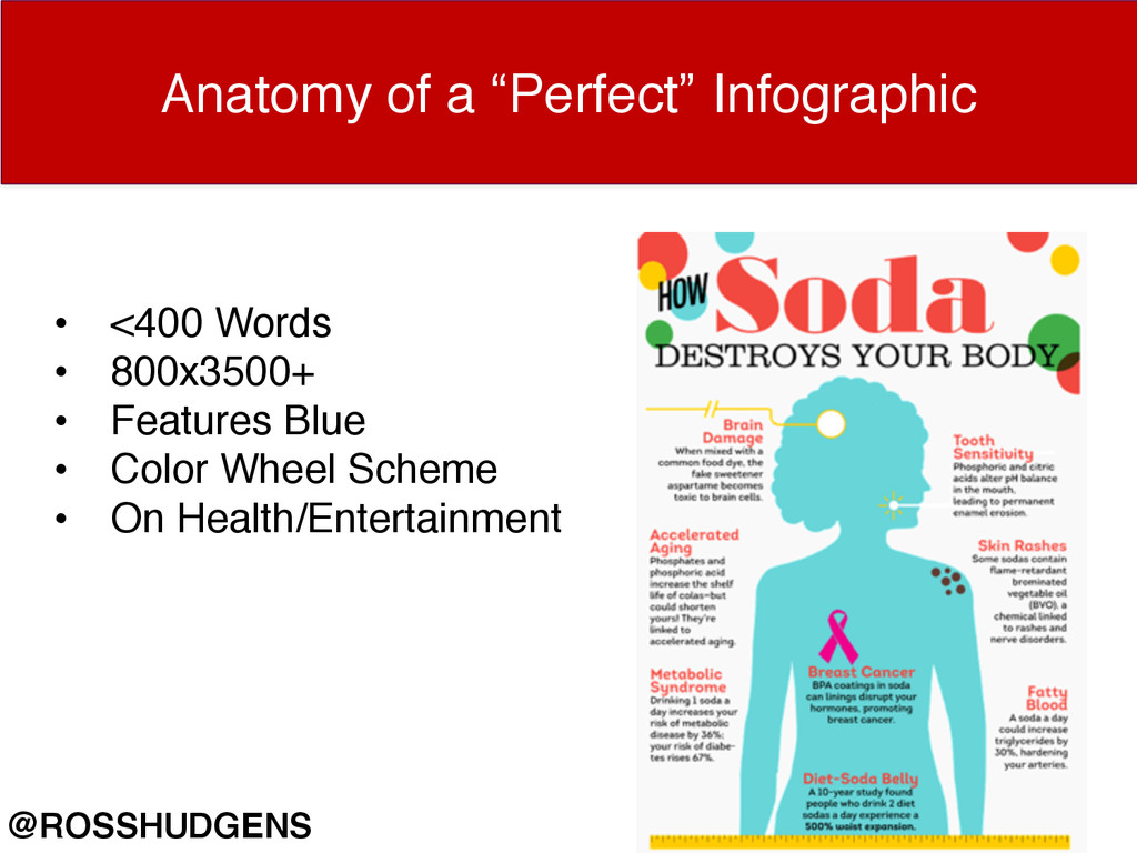
“Perfect” Infographic • <400 Words • 800x3500+ • Features Blue • Color Wheel Scheme • On Health/Entertainment @ROSSHUDGENS
Get the Data: siegemedia.com/searchlove
PART 3: CONTENT PROMOTION.
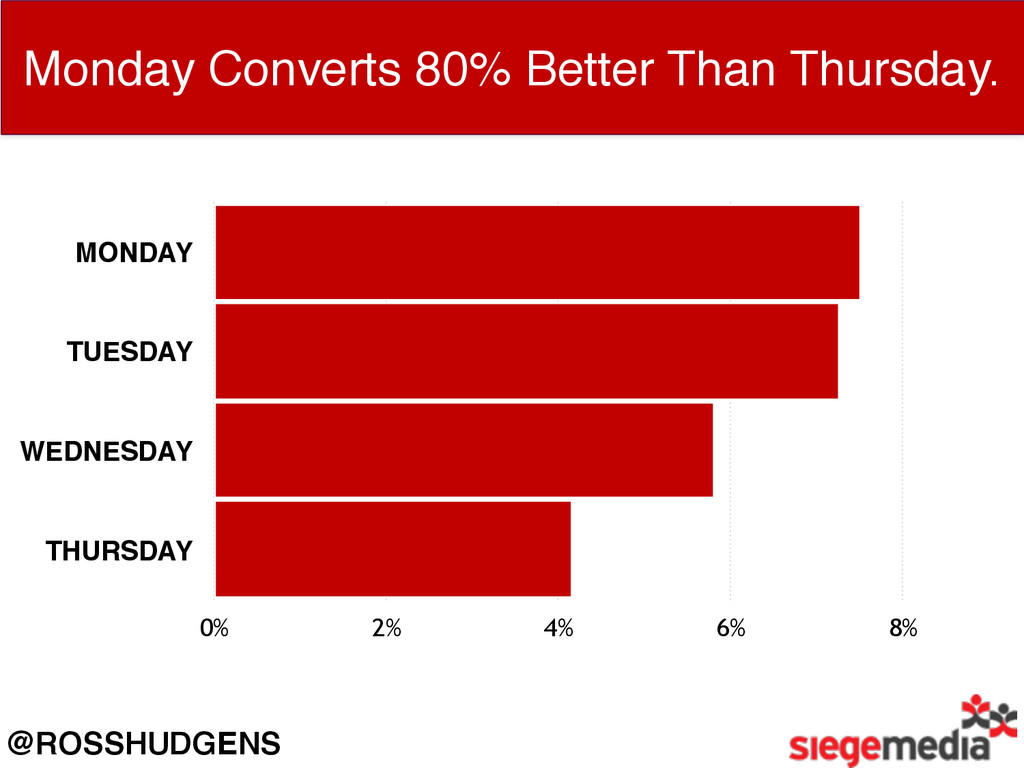
@ROSSHUDGENS What Days Covert Best for Outreach? Our Outreach Conversion
Rates by Day MONDAY TUESDAY WEDNESDAY THURSDAY 0% 2% 4% 6% 8%
@ROSSHUDGENS Monday Converts 80% Better Than Thursday. MONDAY TUESDAY WEDNESDAY
THURSDAY 0% 2% 4% 6% 8%
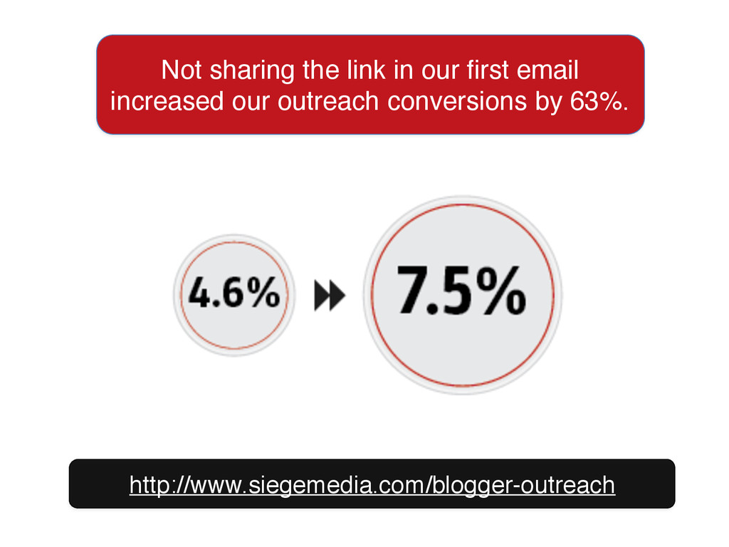
Not sharing the link in our first email increased our
outreach conversions by 63%. http://www.siegemedia.com/blogger-outreach
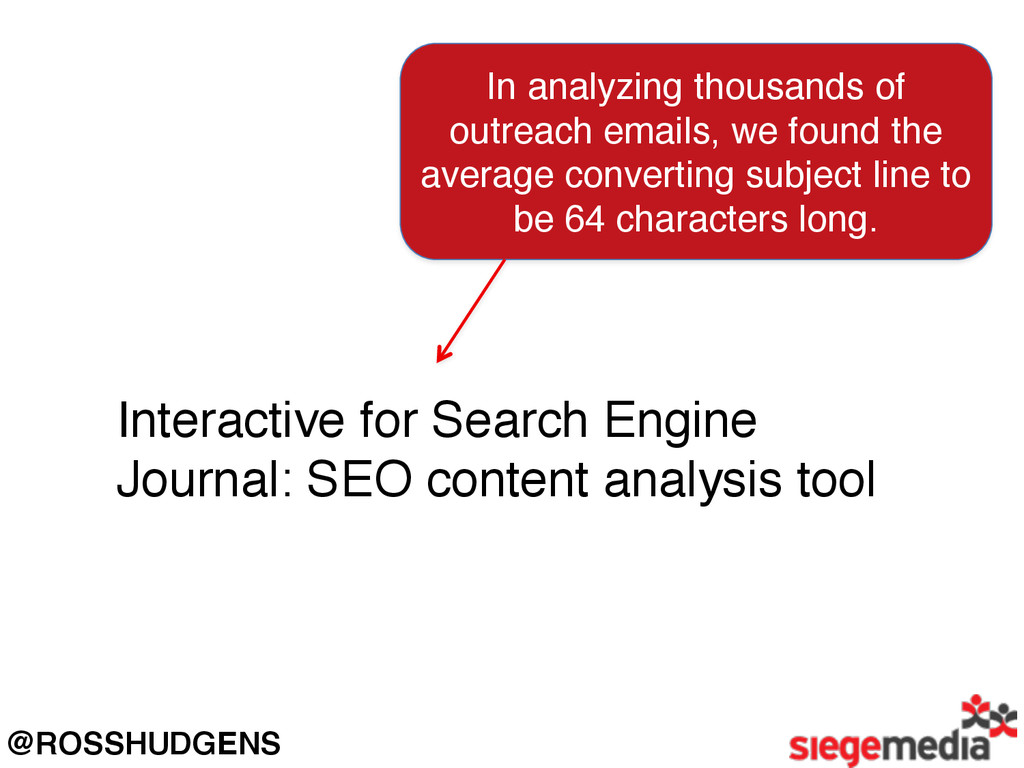
In analyzing thousands of outreach emails, we found the average
converting subject line to be 64 characters long. Interactive for Search Engine Journal: SEO content analysis tool @ROSSHUDGENS
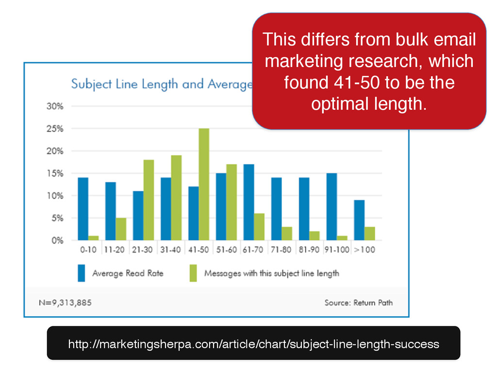
This differs from bulk email marketing research, which found 41-50
to be the optimal length. http://marketingsherpa.com/article/chart/subject-line-length-success
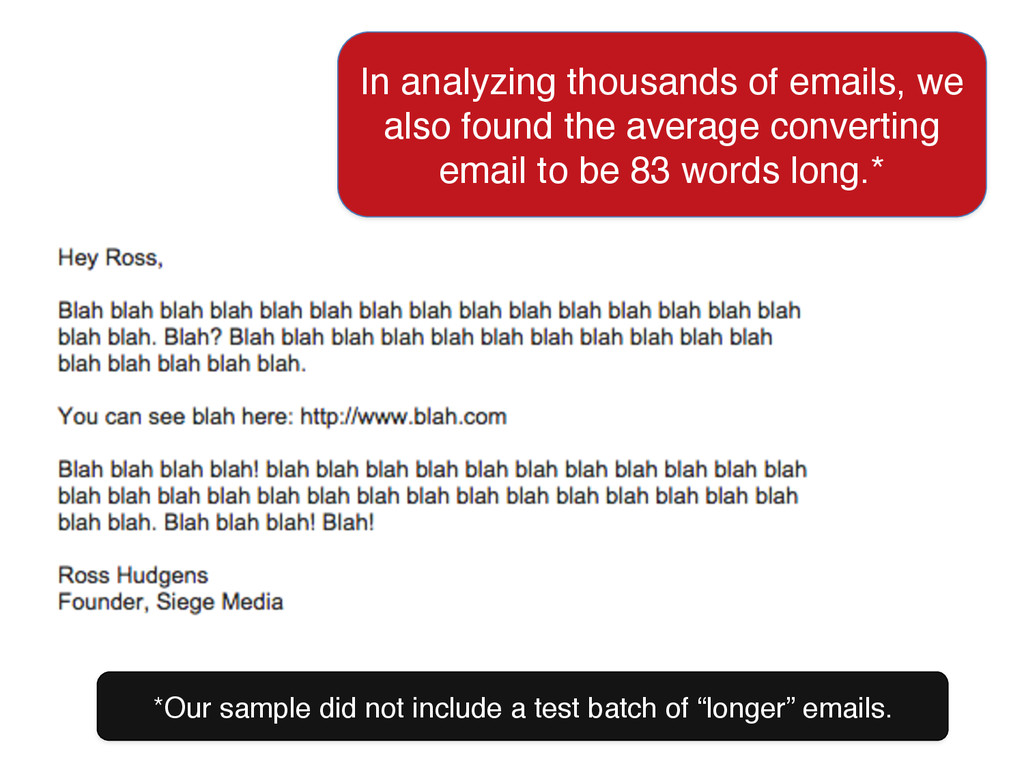
*Our sample did not include a test batch of “longer”
emails. In analyzing thousands of emails, we also found the average converting email to be 83 words long.*
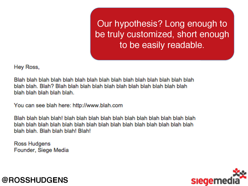
@ROSSHUDGENS Our hypothesis? Long enough to be truly customized, short
enough to be easily readable.
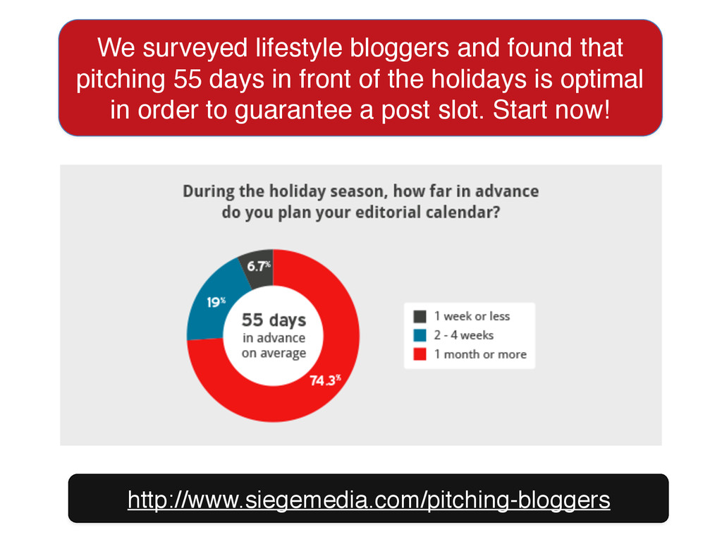
We surveyed lifestyle bloggers and found that pitching 55 days
in front of the holidays is optimal in order to guarantee a post slot. Start now! http://www.siegemedia.com/pitching-bloggers
None
None
http://bit.ly/siege-sd Ross Hudgens, Founder, Siege Media @RossHudgens http://siegemedia.com
![HubSpot found that adding [brackets] in their titles bumped up](https://files.speakerdeck.com/presentations/5f5485ec6c1248d398fc71f0d7386a71/slide_11.jpg)
![Specifically, HubSpot found [templates] got the highest CTR average of](https://files.speakerdeck.com/presentations/5f5485ec6c1248d398fc71f0d7386a71/slide_12.jpg)