Upgrade to Pro — share decks privately, control downloads, hide ads and more …

Design 101 for Developers: 5 ways to make your site less ugly

Design 101 for Developers: 5 ways to make your site less ugly

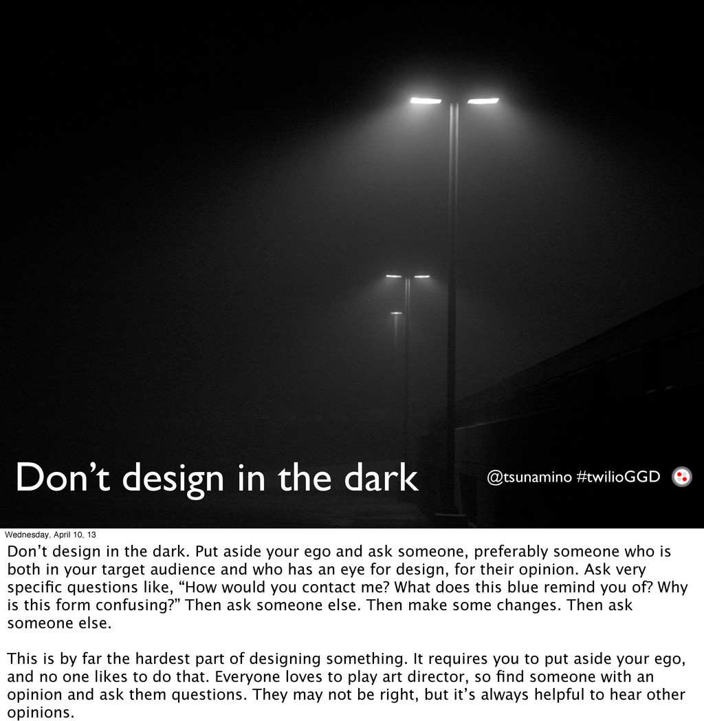
You are a brilliant engineer. You made an amazing product. You want people to see your amazing product and give you amazing amounts of money for it. But... your website is not so amazing. In this lightning talk, Danielle Leong, Front End Web Developer on Twilio's Design Team, will go over some basic design principles and guidelines to follow to make your site a little bit shinier.

Danielle Leong

April 11, 2013
Tweet

More Decks by Danielle Leong

Other Decks in Programming

Transcript

  1. Design 101 for Developers
    5 ways to make your site less ugly
    Wednesday, April 10, 13

    View Slide

  2. DANIELLE LEONG
    Front End Web Developer
    Twilio Design Team
    @tsunamino
    Wednesday, April 10, 13

    View Slide

  3. Why is design important? @tsunamino #twilioGGD
    Wednesday, April 10, 13
    Why design things? We’re engineers, we don’t need that fluffy stuff.

    View Slide

  4. Short attention spans @tsunamino #twilioGGD
    Wednesday, April 10, 13
    • Short attention span
    • You have __ seconds to capture someone’s attention before they move on and don’t give you
    money

    View Slide

  5. I shouldn’t have to think @tsunamino #twilioGGD
    Wednesday, April 10, 13
    • Consumers today are spoiled by good design. We want designers to do the thinking for us.
    Thinking is hard. UI and UX should be easy.

    View Slide

  6. Find your purpose
    Sketch it out
    Step back from the screen
    Cheat a little
    Don’t design in the dark
    @tsunamino #twilioGGD
    5 things to do
    Wednesday, April 10, 13
    We will only be focusing on desktop sites today, but some of these design principles apply to
    mobile and tablet design.

    View Slide

  7. Purpose @tsunamino #twilioGGD
    Wednesday, April 10, 13
    What is the purpose of your site? What is the point of your site? “Making something cool” isn’t good
    enough. Write a mission statement and stick to it. Constantly ask yourself if what you’re making aligns
    with your mission statement in a visual sense. Also remember to think about who your target
    audience is.

    View Slide

  8. Content
    Wednesday, April 10, 13
    Is the point of your site to be a blog and showcase thoughts and words?

    View Slide

  9. Business
    Wednesday, April 10, 13
    Is the point of your site to be a company website and convey what your company does?

    View Slide

  10. Products
    Wednesday, April 10, 13
    Are you trying to sell products?

    View Slide

  11. Photos
    Wednesday, April 10, 13
    Are you trying to showcase photos or illustrations? Each one of these requires a different
    design aesthetic, so keep that in mind when you’re looking at inspiration and designing your
    site.

    View Slide

  12. Sketch it out @tsunamino #twilioGGD
    Wednesday, April 10, 13
    • After you have your mission statement and have an idea of what your site’s purpose is, draw
    your ideas so that you have an idea of what you want. It makes it a lot easier to think out your
    user flow and will organize your thoughts. The first time I made a simple signup form, it was
    horrifying. Over several iterations of drawing text boxes and placing buttons in various places, I
    finally made something that made sense. Wireframe tools such as Balsamiq Mockups are
    fantastic for this. Good old fashioned paper and pen work well also.

    View Slide

  13. Step back from the screen @tsunamino #twilioGGD
    Wednesday, April 10, 13
    • After you’re done with some wireframes and make a first draft of your site, physically step back
    from the screen. What’s the first thing you see? Is that really what you want your target
    audience to see? In Western culture, we look top to bottom, left to right. Is the most important
    thing the first thing that you see? If not, go back and design it again. This site had a flashing
    banner ad in the upper right, which threw me off when I first went to the site. It was distracting
    and I couldn’t figure out what I was supposed to click.

    View Slide

  14. Cheat a little @tsunamino #twilioGGD
    Wednesday, April 10, 13
    • I’m a huge fan of cheating when you have the ability to do so. Bootstrap is awesome. It catches
    all of the little things that you may not have thought of, it’s got great documentation, and a lot of
    really smart supporters. Use wireframes where you can until you start to develop your skills.
    Modify what you don’t like.

    View Slide

  15. Golden ratio @tsunamino #twilioGGD
    1.618
    Wednesday, April 10, 13
    • The golden ratio is a ratio found commonly in nature that our eyes perceive as beautiful.

    View Slide

  16. Golden ratio @tsunamino #twilioGGD
    Wednesday, April 10, 13
    • This also applies to websites. As you can see here, with a 960px grid, you can see a commonly
    used ratio for content and navigation. It’s an easy way to make sure your site looks good.

    View Slide

  17. Golden ratio @tsunamino #twilioGGD
    Wednesday, April 10, 13
    • Here’s an example of the golden ratio in application.

    View Slide

  18. Wednesday, April 10, 13
    • Application of the Golden Ratio on the Facebook Home page

    View Slide

  19. Wednesday, April 10, 13
    • Application of the Golden Ratio on the Facebook Home page

    View Slide

  20. Rule of thirds @tsunamino #twilioGGD
    Wednesday, April 10, 13
    • Another great rule to follow when using grids is the rule of thirds. Divide your site into 9 parts.
    The four colored squares in the middle are where our eyes are drawn to the most. Typically, the
    upper left pink square is where you want your most important information, followed by the
    second pink square on the bottom. Math.

    View Slide

  21. Cheat some more @tsunamino #twilioGGD
    Wednesday, April 10, 13
    • If you’re ready to start experimenting with color, try some pre-made color pickers. There are a
    bunch out there that can help you pick from a photograph or a you can pick from suggestions
    built by a community of people who are good at this.

    View Slide

  22. Don’t design in the dark @tsunamino #twilioGGD
    Wednesday, April 10, 13
    Don’t design in the dark. Put aside your ego and ask someone, preferably someone who is
    both in your target audience and who has an eye for design, for their opinion. Ask very
    specific questions like, “How would you contact me? What does this blue remind you of? Why
    is this form confusing?” Then ask someone else. Then make some changes. Then ask
    someone else.
    This is by far the hardest part of designing something. It requires you to put aside your ego,
    and no one likes to do that. Everyone loves to play art director, so find someone with an
    opinion and ask them questions. They may not be right, but it’s always helpful to hear other
    opinions.

    View Slide

  23. Test time.
    @tsunamino #twilioGGD
    Wednesday, April 10, 13
    Let’s see if you can guess what the purpose of each of these sites are just by their design.

    View Slide

  24. Wednesday, April 10, 13

    View Slide

  25. Wednesday, April 10, 13

    View Slide

  26. Wednesday, April 10, 13

    View Slide

  27. Wednesday, April 10, 13

    View Slide

  28. Wednesday, April 10, 13

    View Slide

  29. Wednesday, April 10, 13

    View Slide

  30. Wednesday, April 10, 13

    View Slide

  31. Wednesday, April 10, 13

    View Slide

  32. @tsunamino #twilioGGD
    Find your purpose
    Sketch it out
    Step back from the screen
    Cheat a little
    Don’t design in the dark
    Wednesday, April 10, 13
    Concluding remarks

    View Slide

  33. Fin.
    @tsunamino #twilioGGD
    Wednesday, April 10, 13

    View Slide