Upgrade to Pro — share decks privately, control downloads, hide ads and more …

Postdesktop: a Look at Pervasive Computing in Education

Postdesktop: a Look at Pervasive Computing in Education

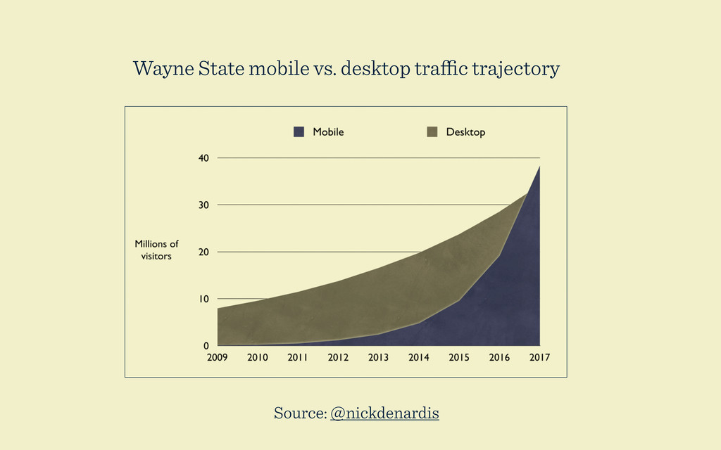
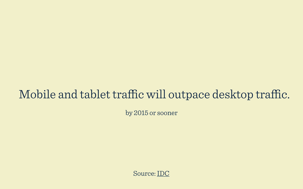
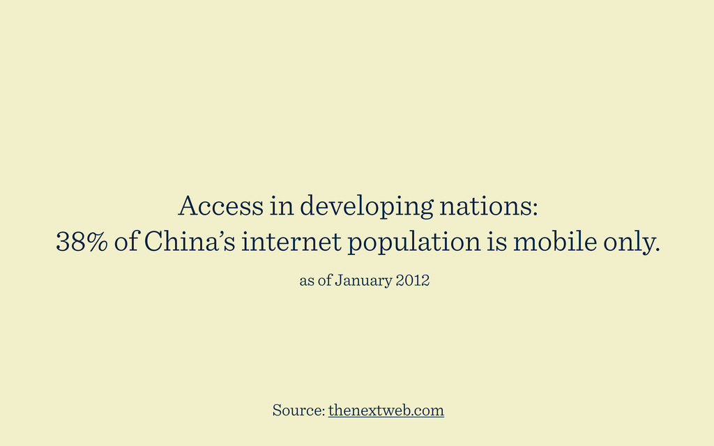
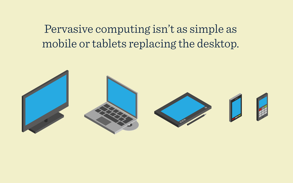
Responsive design, application development using APIs, and content strategy are hot topics in web development right now. These ideas belong to a bigger umbrella: ubiquitous computing and the role it plays in our lives. Traditional ideas of usability are undergoing dynamic changes as we move away from a desktop-first model of personal computing.

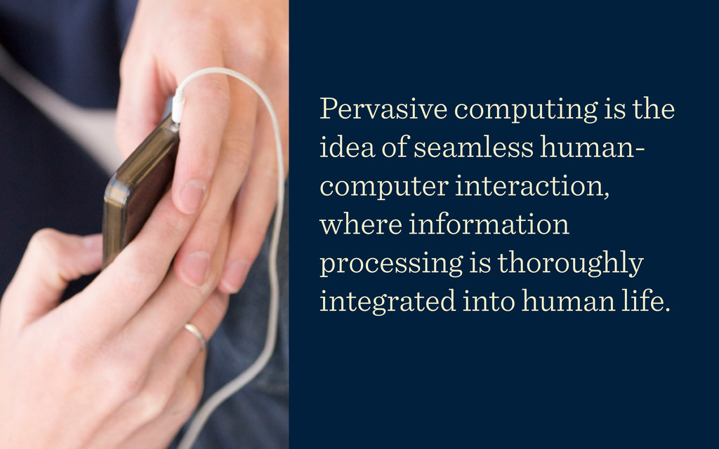
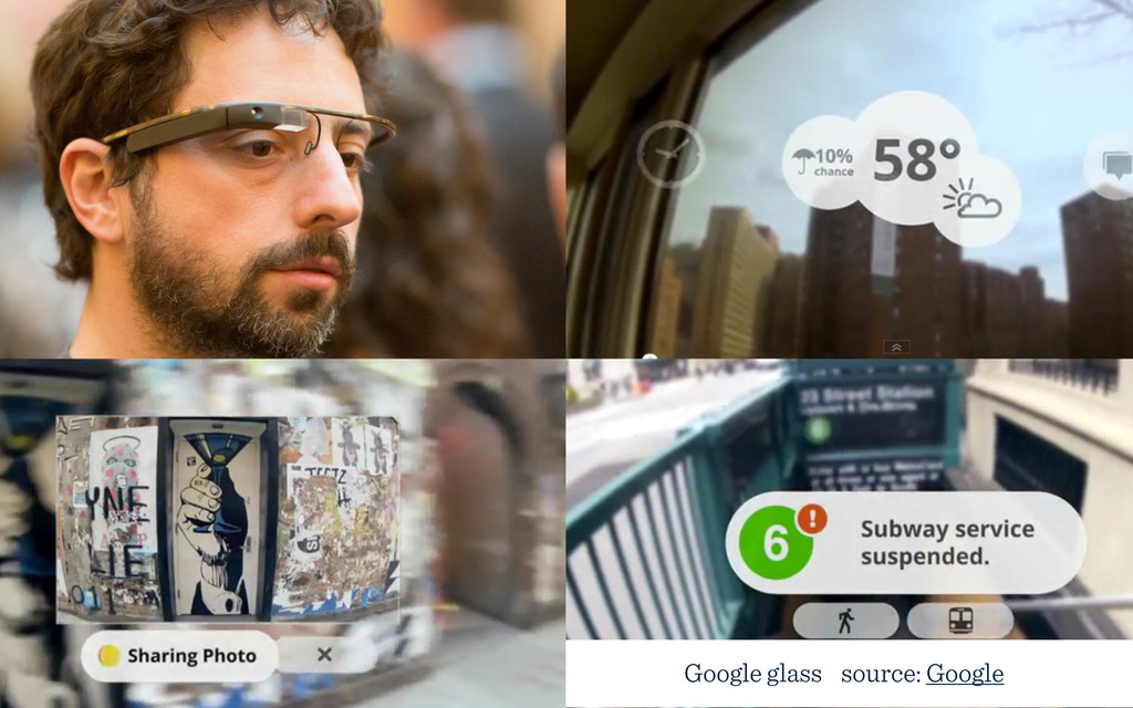
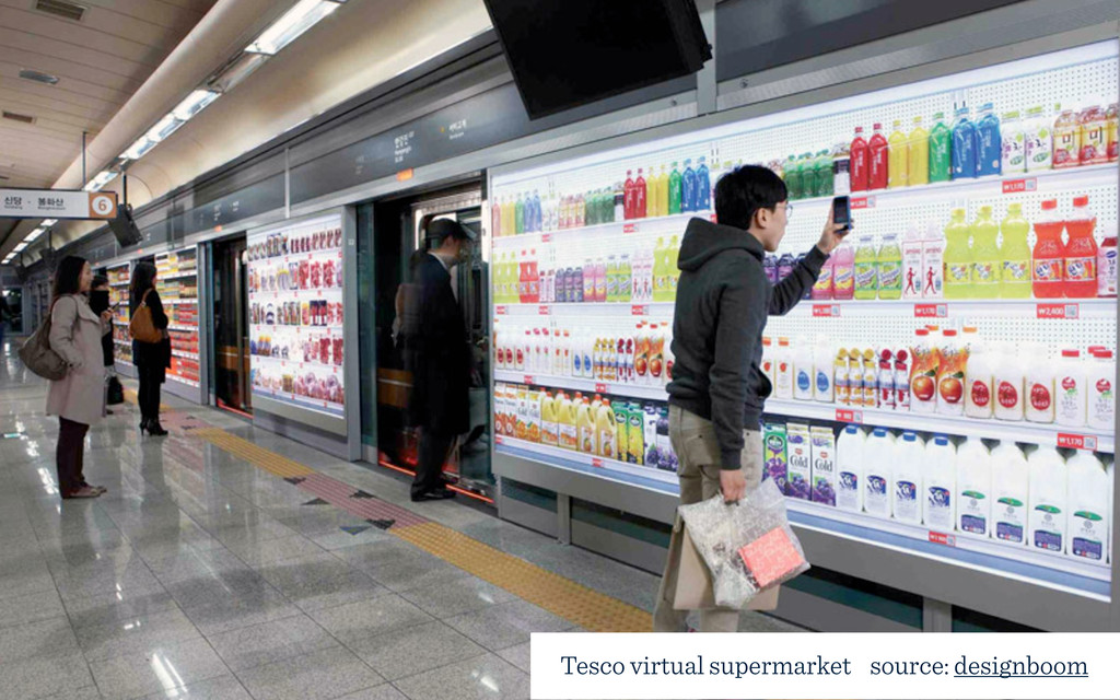
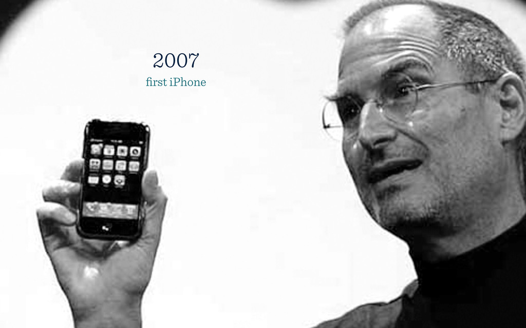
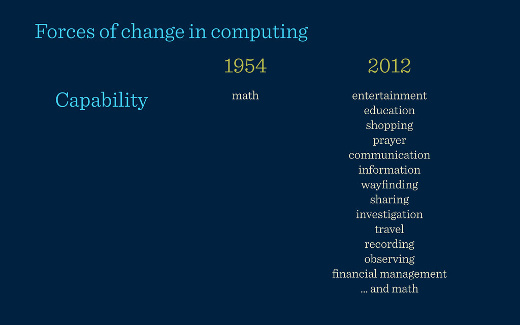
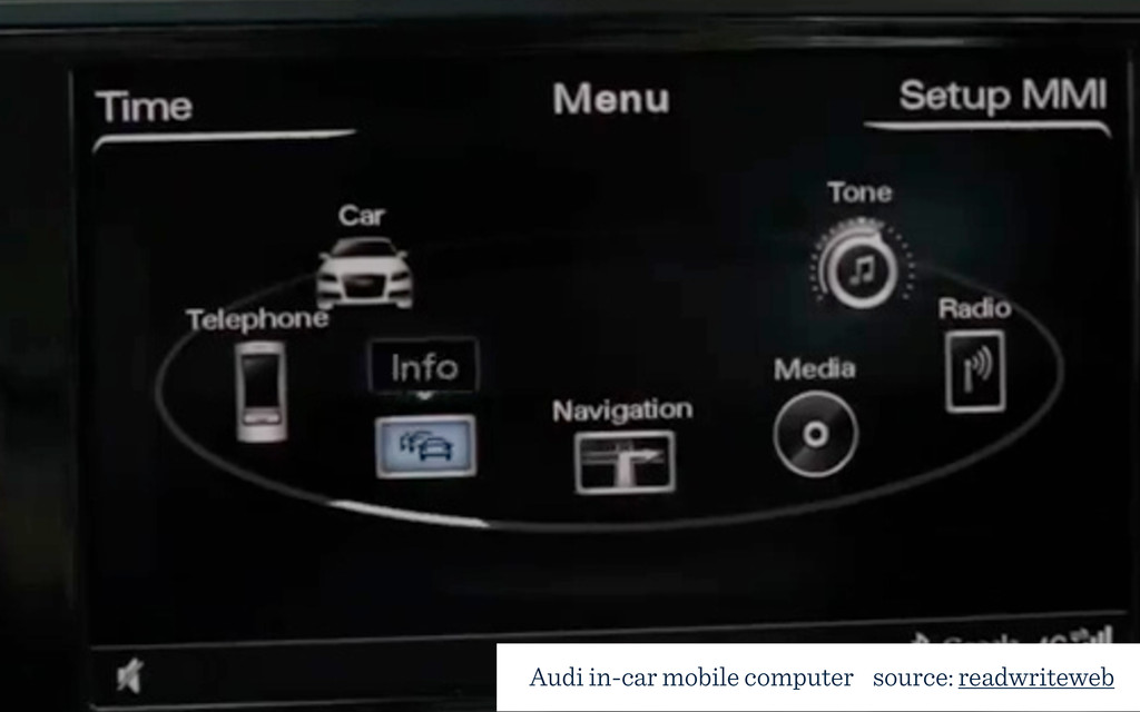
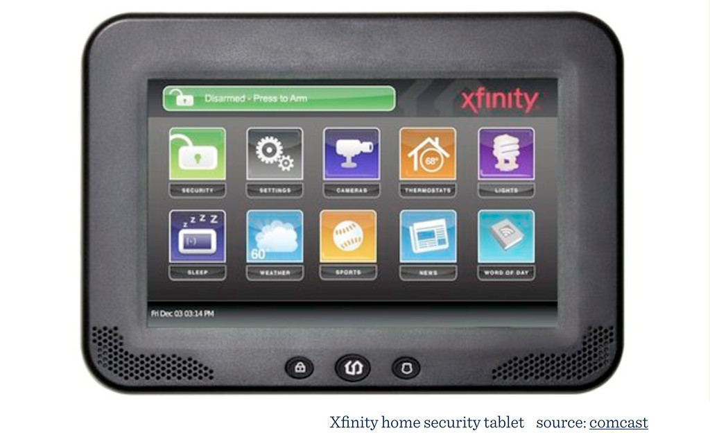
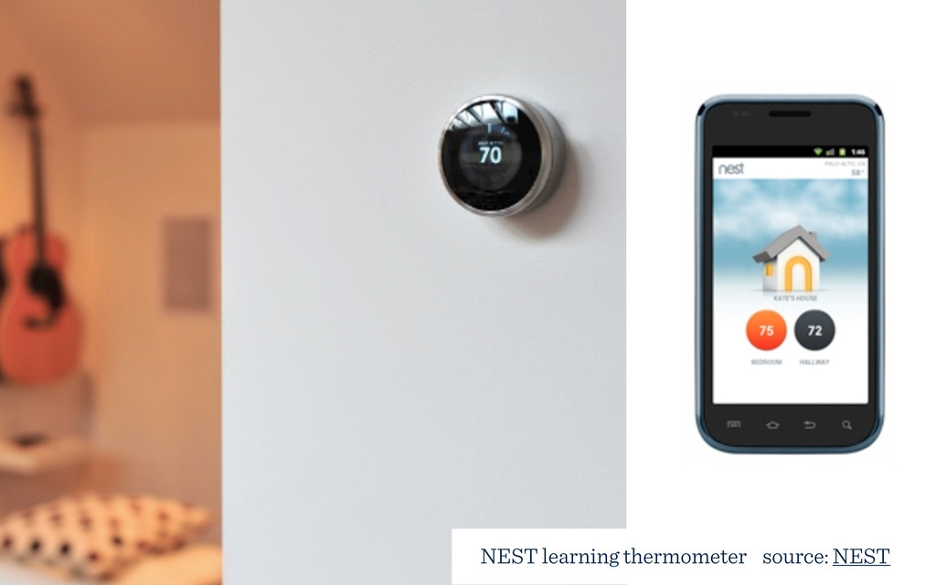
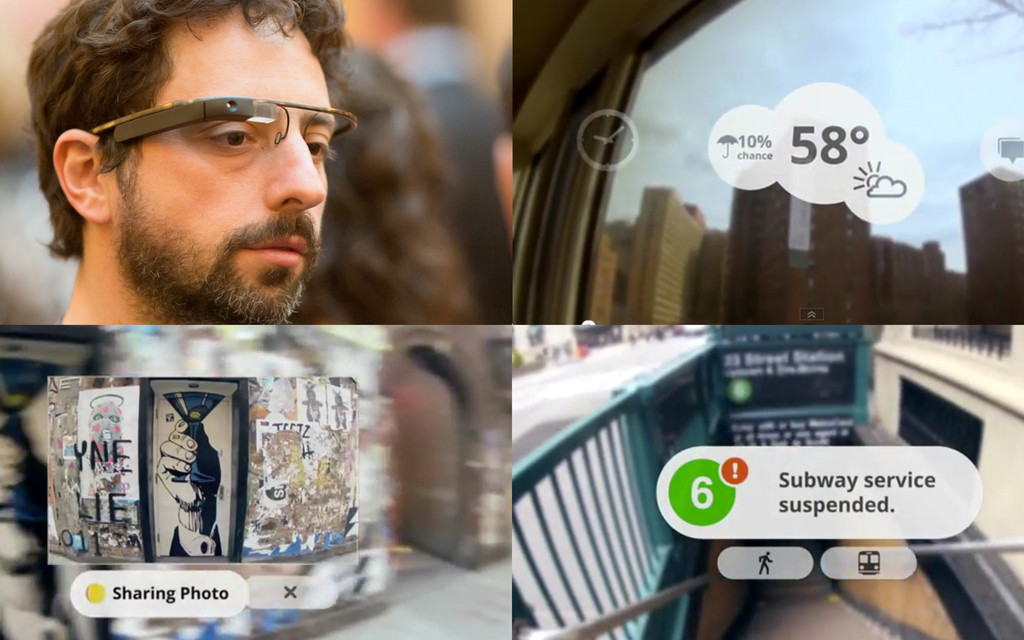
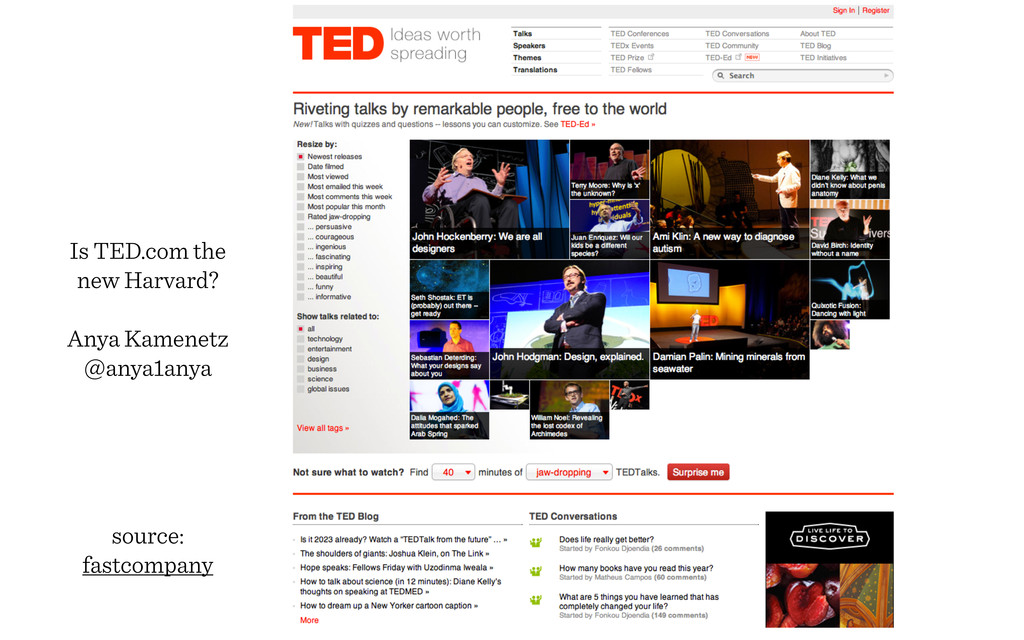
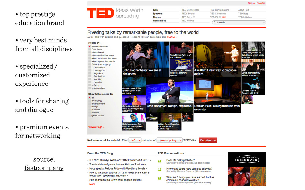
The internet refrigerator already exists and it's only the tip of the iceberg. In the near future, human-computer interactions will be thoroughly integrated into everyday objects and activities.

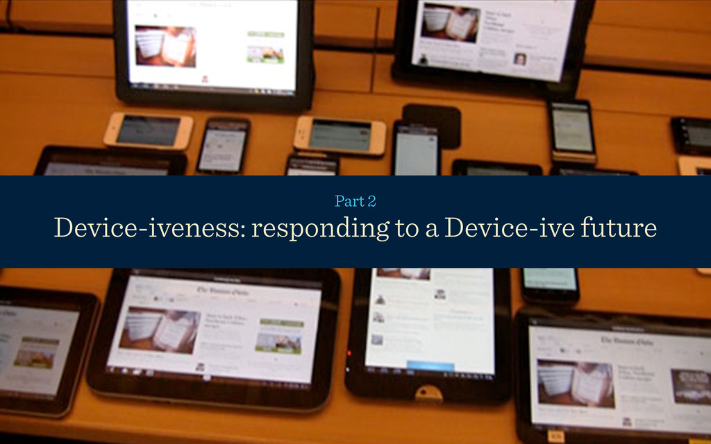
Postdesktop was a presentation to add clarity to responsive design as part of a larger context and to think about a shift that is changing the devices we use to access the web, the delivery method for education, the teaching and learning experience, and the whole of our lives.

Topics included a look at the role of pervasive computing:
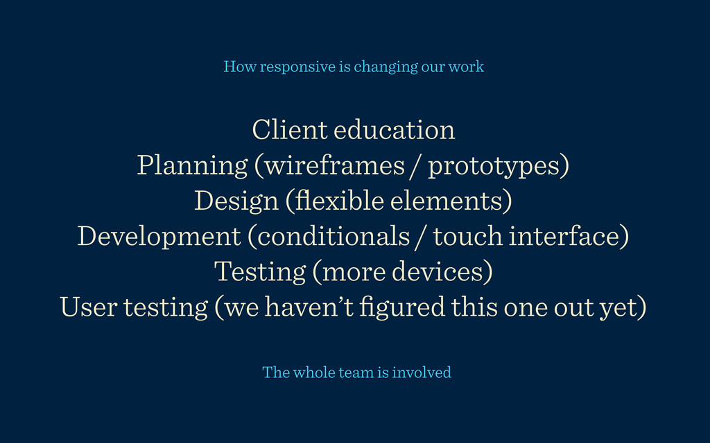
• as it relates to responsive design
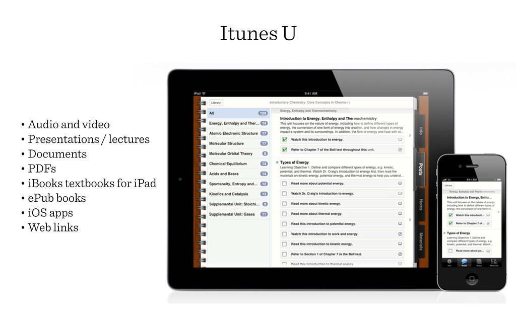
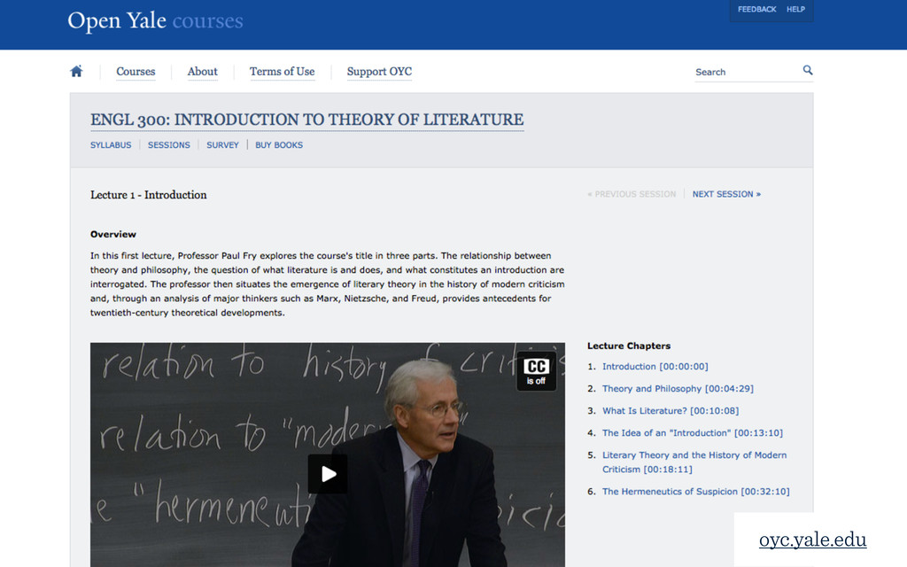
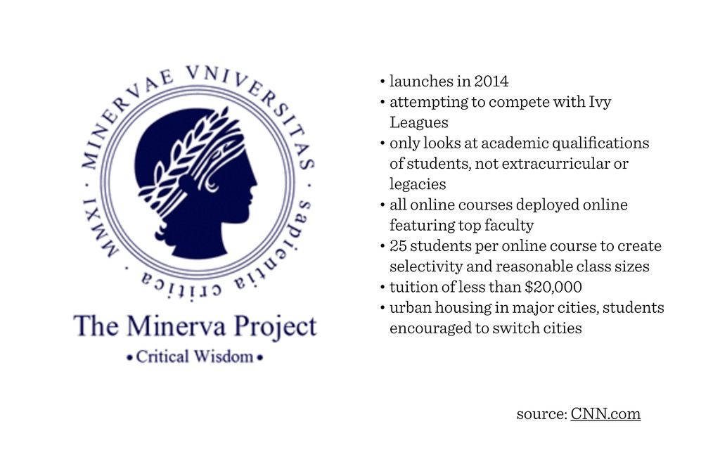
• in the classroom and textbooks
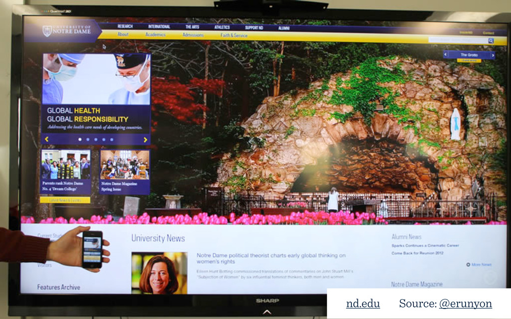
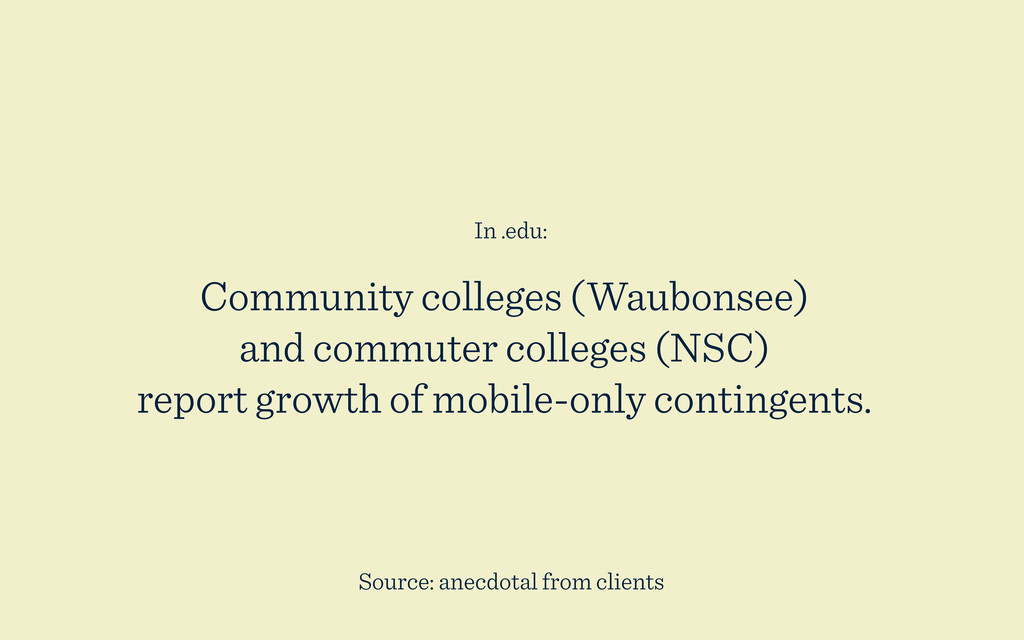
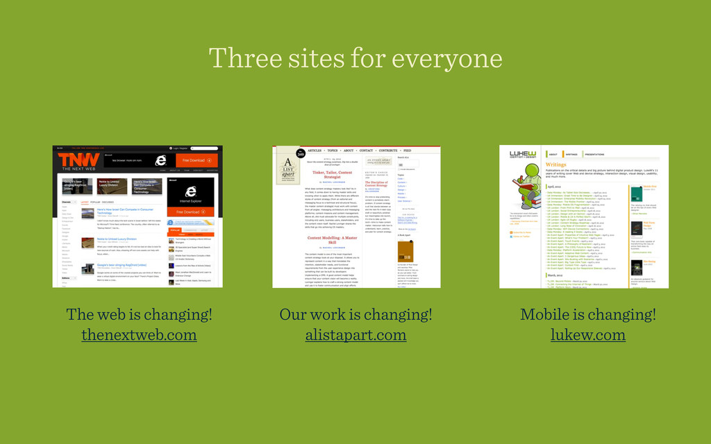
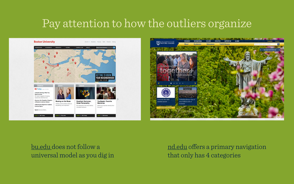
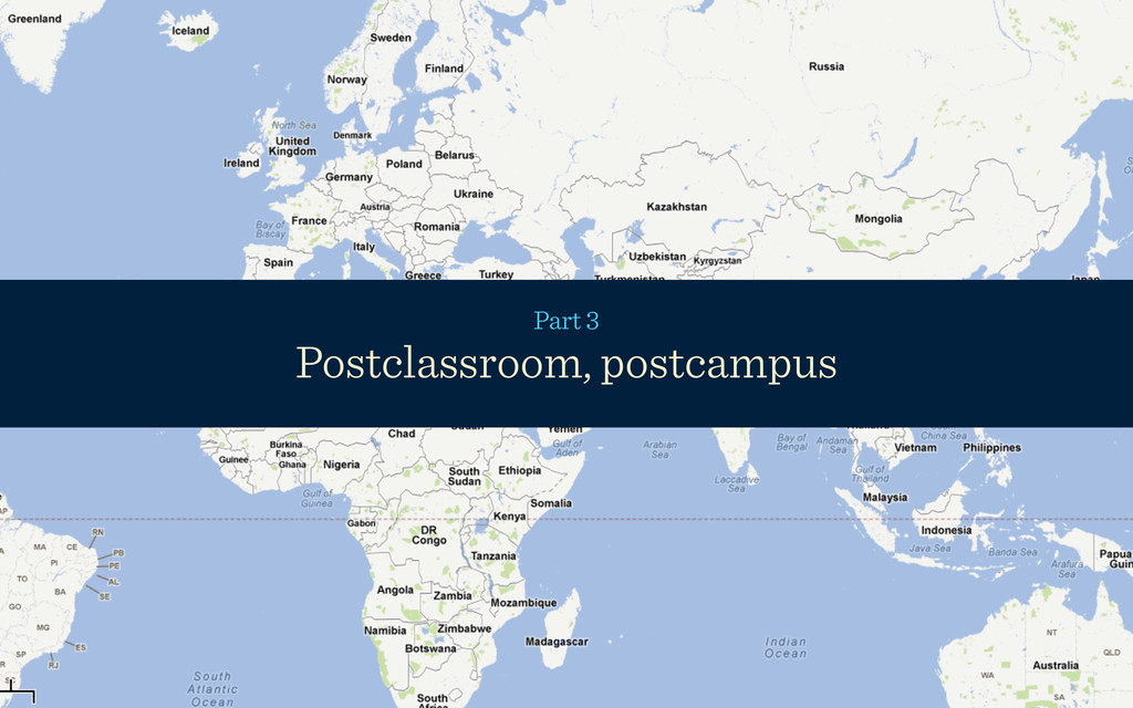
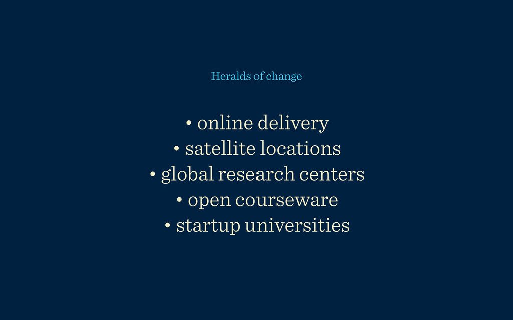
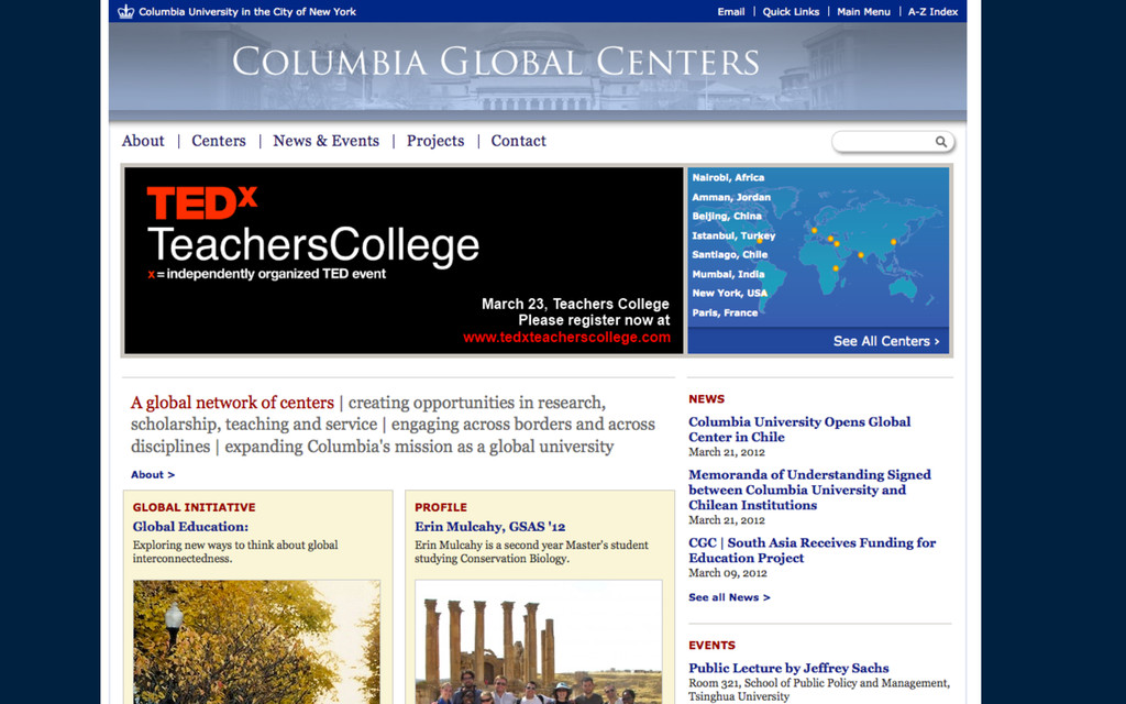
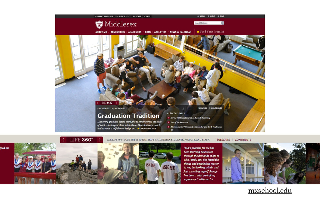
• in .edu marketing and utility on campuses

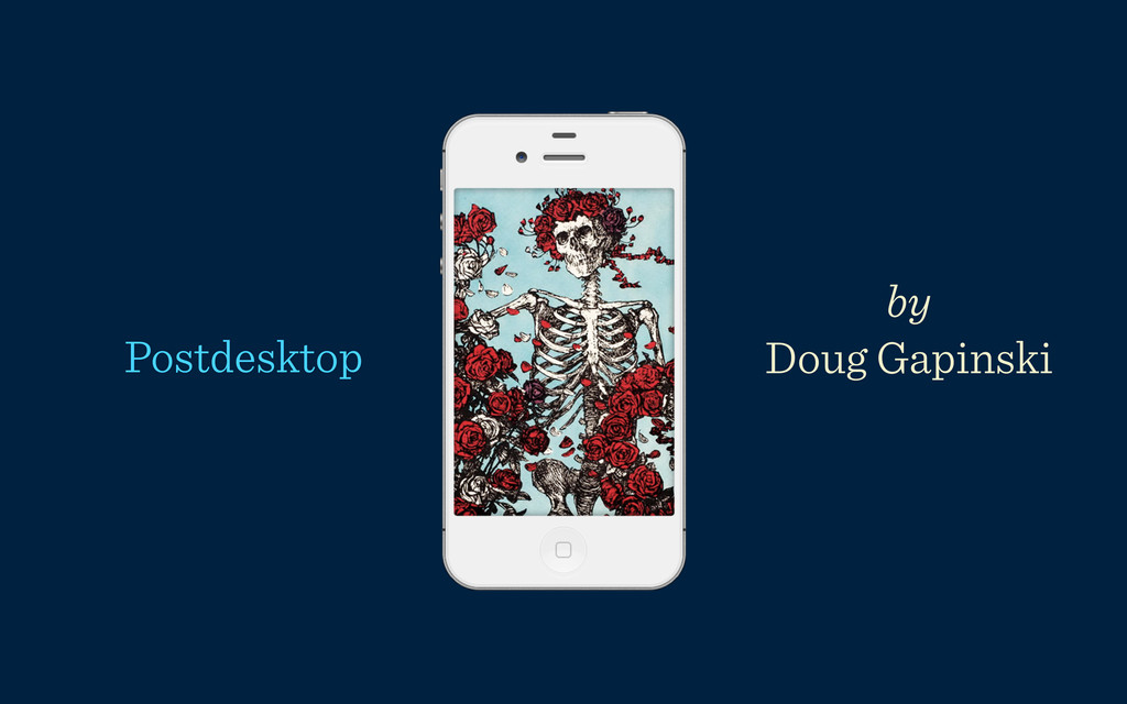
Written by Doug Gapinski and first delivered at PSU Web Conference 2012

Doug Gapinski

June 13, 2012
Tweet

More Decks by Doug Gapinski

Other Decks in Technology

Transcript

  1. Purpose: To view responsive design and mobile techology in a

    larger context of computing, the web, and the world.
  2. I. Three point four mainframes to every newborn II. Device-iveness

    III. Postclassroom, postcampus IV. Steal these ideas
  3. Everything in here should be shared. Part 1 3.4 mainframes

    to every newborn: an introduction to pervasive computing
  4. Pervasive computing is the idea of seamless human- computer interaction,

    where information processing is thoroughly integrated into human life.
  5. Properties • small, inexpensive, interconnected devices • interaction with computer

    is intuitive • computer provides human with enhanced capability Related topics • the Internet of Things • context-aware systems • augmented reality • mobile learning
  6. Touchscreens, mobile, GUI, wireless... in less than 60 years. These

    ideas are old. It just took a while to hit the mainstream. —and—
  7. Forces of change in computing 1954 2012 Portability mainframe; not

    portable smartphones and tablets Connectivity limited packet switching between two computers wireless access Interface punchcards touchscreen Cost $200,000 to $400,000 $200
  8. 1954 2012 Capability math entertainment education shopping prayer communication information

    wayfinding sharing investigation travel recording observing financial management ... and math Forces of change in computing
  9. Access in developing nations: half of India’s homes have cellphones

    but not toilets. as of March 14, 2012 Source: thehindu.com
  10. Access in developing nations: 38% of China’s internet population is

    mobile only. Source: thenextweb.com as of January 2012
  11. Community colleges (Waubonsee) and commuter colleges (NSC) report growth of

    mobile-only contingents. In .edu: Source: anecdotal from clients
  12. 29% of households in the U.S. own a tablet or

    e-reader. Source: MSNBC and Pew Internet 30 days before and after Christmas 2011
  13. +440% increase in traffic to Google ads from tablets. from

    November 2010 to December 2011 Source: Google mobile ads
  14. We’re headed toward a future where the web is connected

    seamlessly in affordable, ordinary devices.
  15. 562,000 iOs are sold every day, and 700,000 android devices.

    Source: @lukew and thenextweb.com as of January 2012
  16. Source: @lukew and thenextweb.com (562,000 iOs devices + 700,000 android

    devices) sold per day / 371,000 newborns born per day 3.4 mainframes to every newborn
  17. With this much change in less than 60 years, what

    does the future look like for us?
  18. Three sites for everyone The web is changing! thenextweb.com Mobile

    is changing! lukew.com Our work is changing! alistapart.com
  19. Responsive design is an approach to design and development that

    ensures a site displays optimally on a variety of devices, including mobile. A high-level definition UCSD.edu
  20. Client education Planning (wireframes / prototypes) Design (flexible elements) Development

    (conditionals / touch interface) Testing (more devices) User testing (we haven’t figured this one out yet) How responsive is changing our work The whole team is involved
  21. Hotgloo.com 1. Responsive prototyping for Miami University 2. Adding notes

    so that the wireframe is the beginning of functional specs 3. Our developers now edit the wireframes directly
  22. Hotgloo allows for annotations that can be the beginning of

    your functional specs document. i.e. how page elements will be set up in development
  23. +

  24. Pay attention to how the outliers organize Utility: custom mobile

    tools Investigative links point to responsive pages www.usc.edu/?view=m
  25. bu.edu does not follow a universal model as you dig

    in nd.edu offers a primary navigation that only has 4 categories Pay attention to how the outliers organize
  26. Responsive examples and design resources mediaqueri.es straightforward responsive gallery dribbble.com

    search responsive or mobile awwwards.com several different responsive resources
  27. • online delivery • satellite locations • global research centers

    • open courseware • startup universities Heralds of change
  28. • Audio and video • Presentations / lectures • Documents

    • PDFs • iBooks textbooks for iPad • ePub books • iOS apps • Web links Itunes U
  29. • launches in 2014 • attempting to compete with Ivy

    Leagues • only looks at academic qualifications of students, not extracurricular or legacies • all online courses deployed online featuring top faculty • 25 students per online course to create selectivity and reasonable class sizes • tuition of less than $20,000 • urban housing in major cities, students encouraged to switch cities source: CNN.com
  30. • top prestige education brand • very best minds from

    all disciplines • specialized / customized experience • tools for sharing and dialogue • premium events for networking source: fastcompany
  31. Every web trend that comes along is a chance to

    reinvent yourself as a professional. Remember
  32. The skull and roses image is a momento mori (symbol

    of our impermanence) from the Rubiyaat of Omar Khayyam. (1048–1131) translated by the poet Edward Fitzgerald and later appropriated by the Grateful Dead. Many Grateful Dead songs deal with topics of loss and hard luck, but the music is stylized to convey happiness and lightness of heart. The celebratory roses that frame the skeleton provide a counterweight to the reminder of death. In the face of radical change and difficulty, we can still feel good. Epilogue م"#$ %&' ت"#'")ر