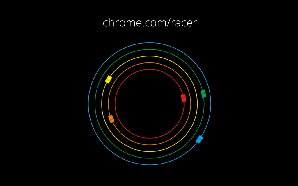
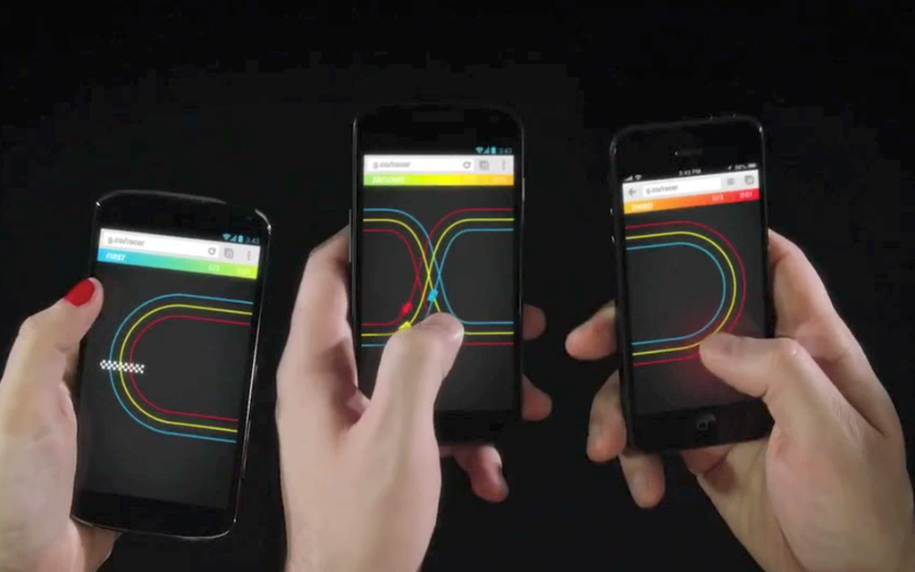
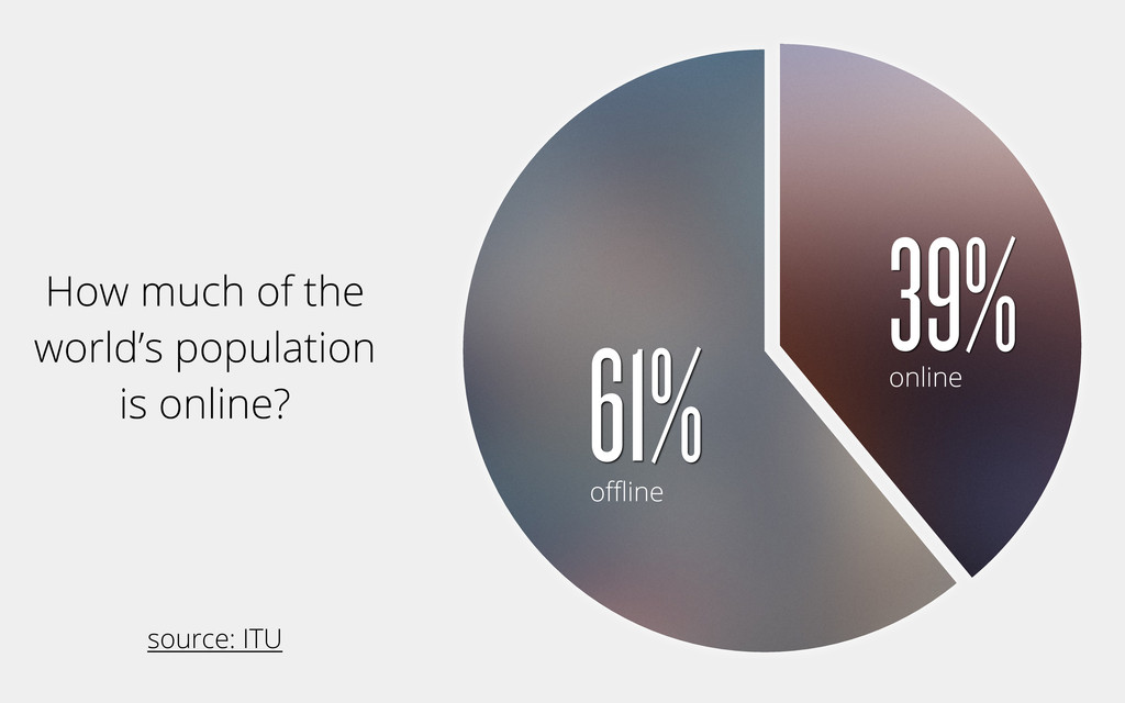
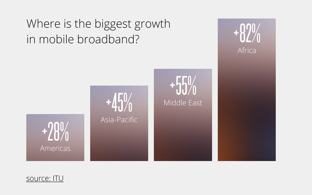
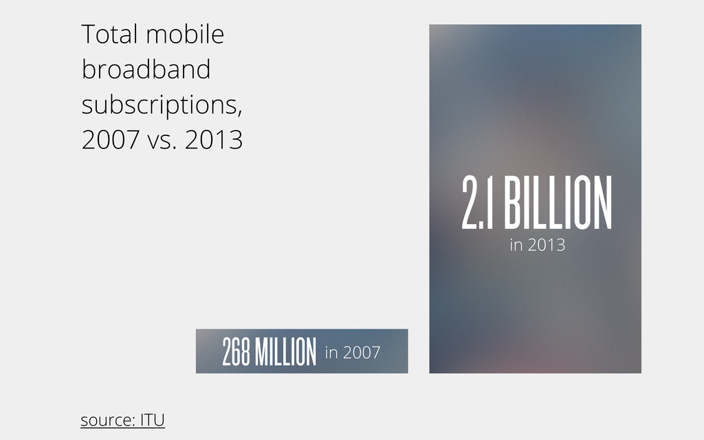
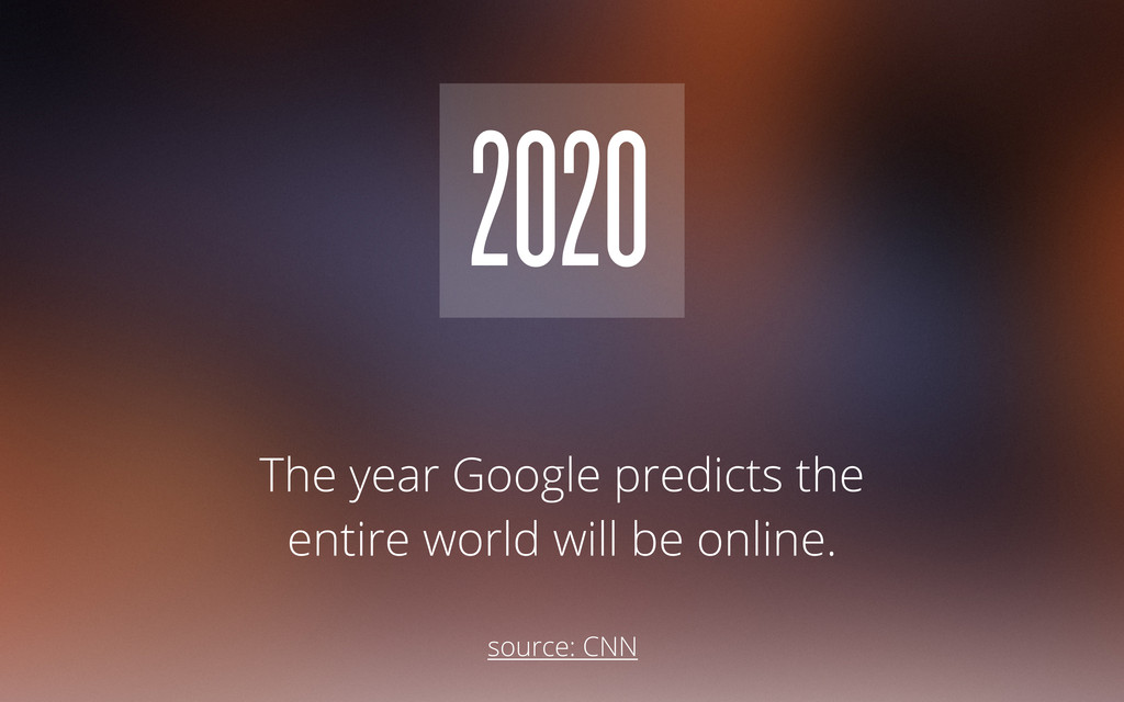
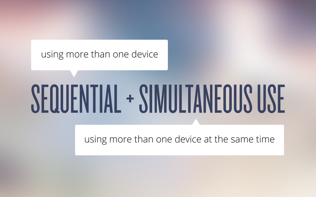
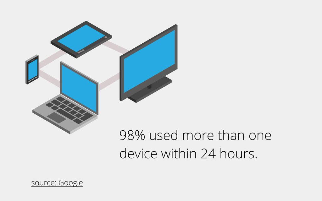
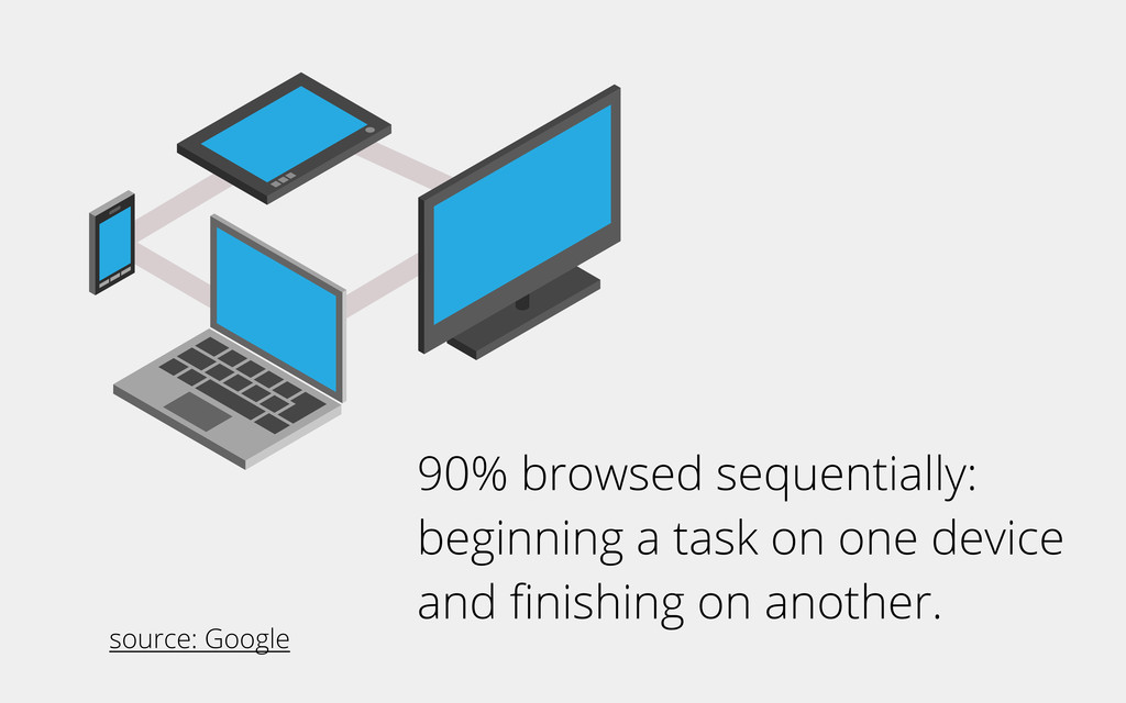
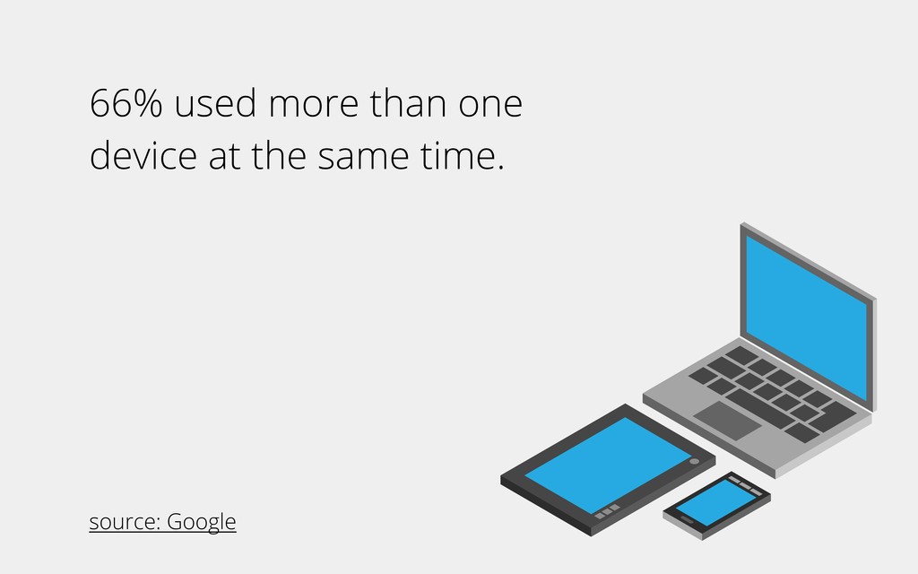
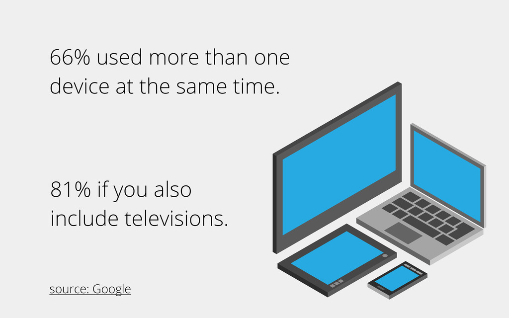
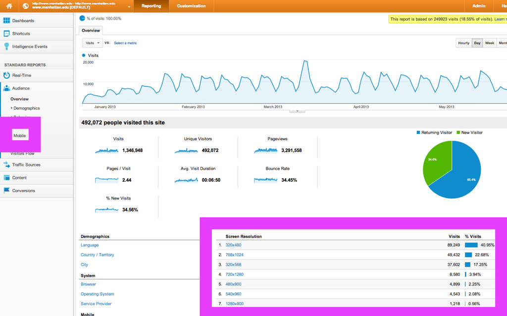
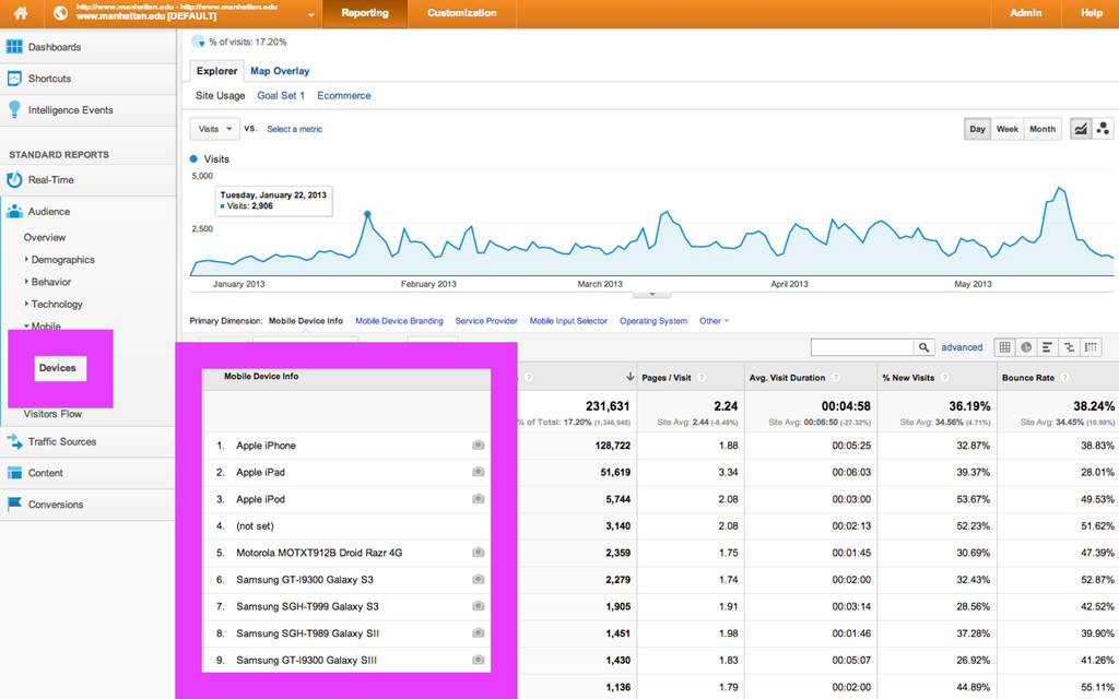
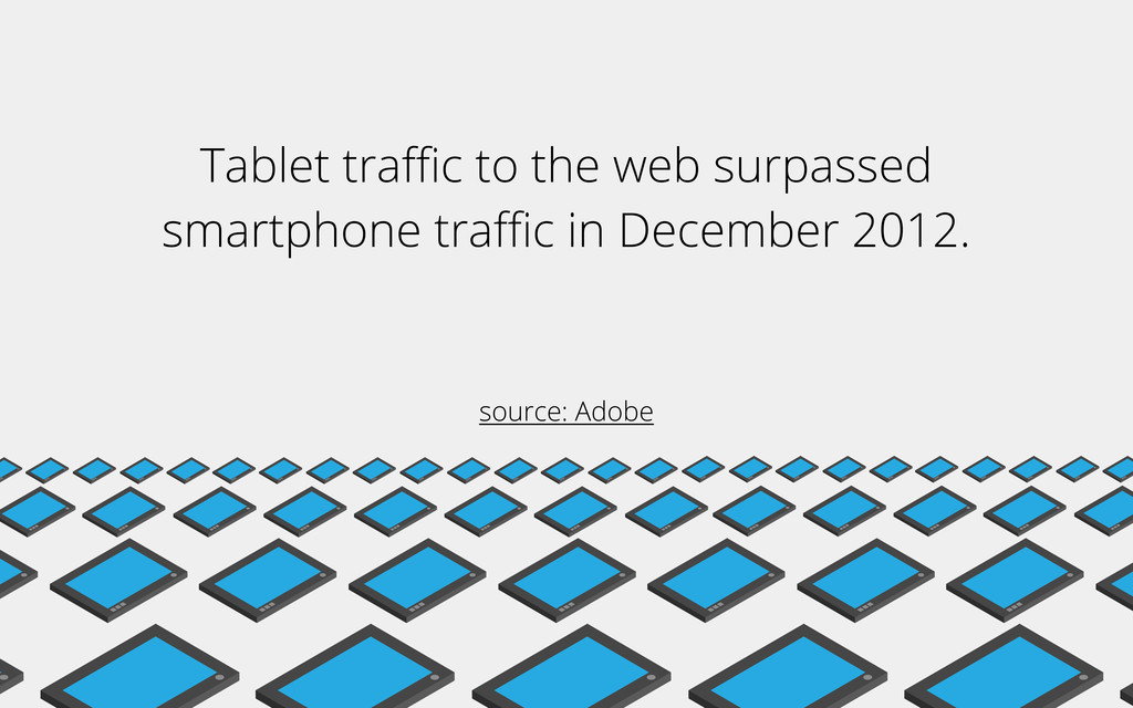
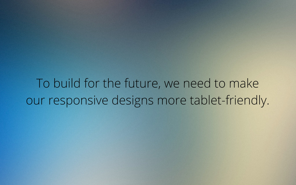
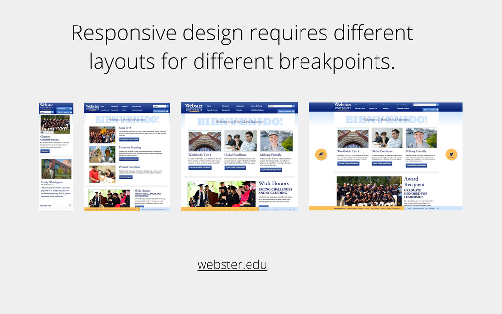
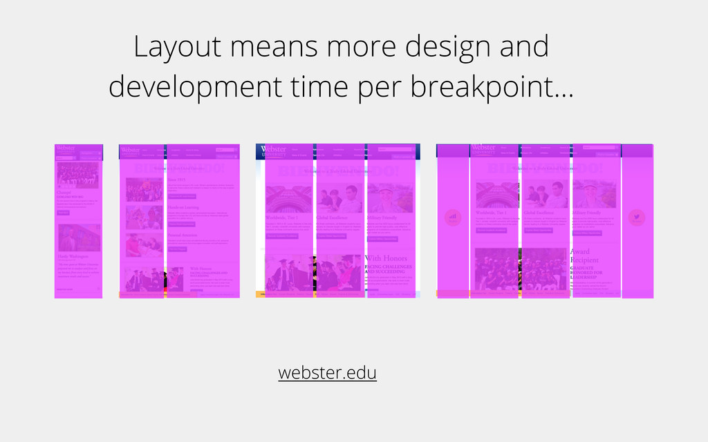
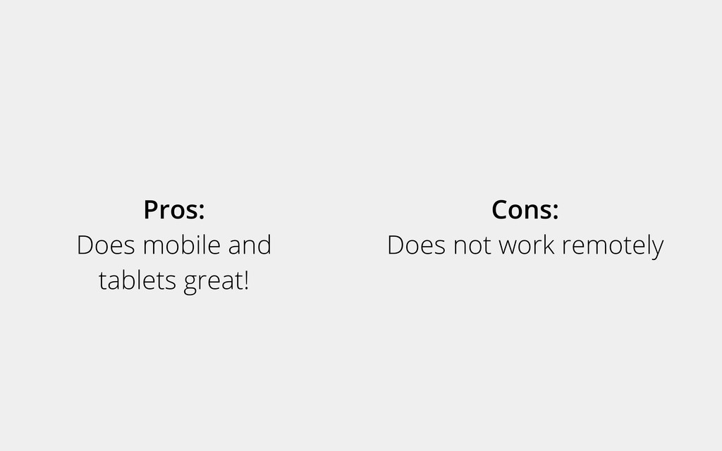
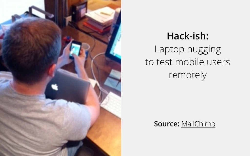
We’ve entered the age of sequential and simultaneous browsing. According to Google, 90% of consumers now use multiple screens to accomplish tasks on the web. Tablets and mobile remain hot topics for sales, use, and design. In an age where most users are accessing sites via multiple devices, top companies are focusing on fast and clean delivery of information.
This webinar focused on how new realities are changing web design, web design process, and usability standards.
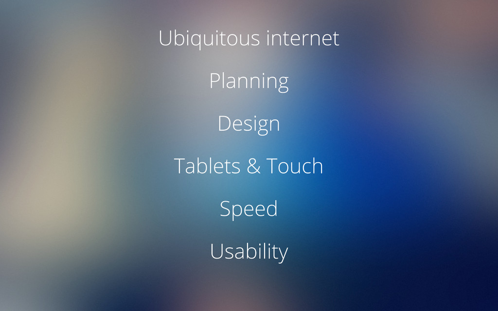
Session Outline
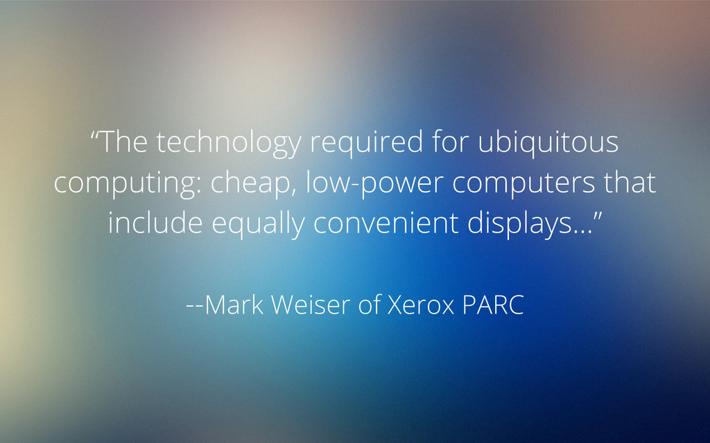
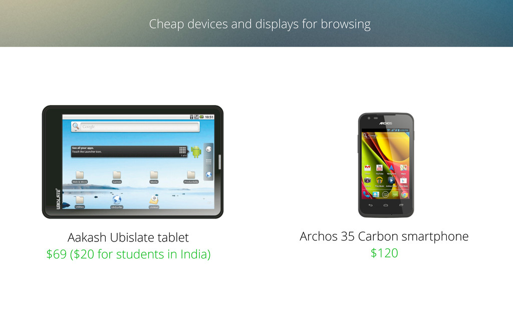
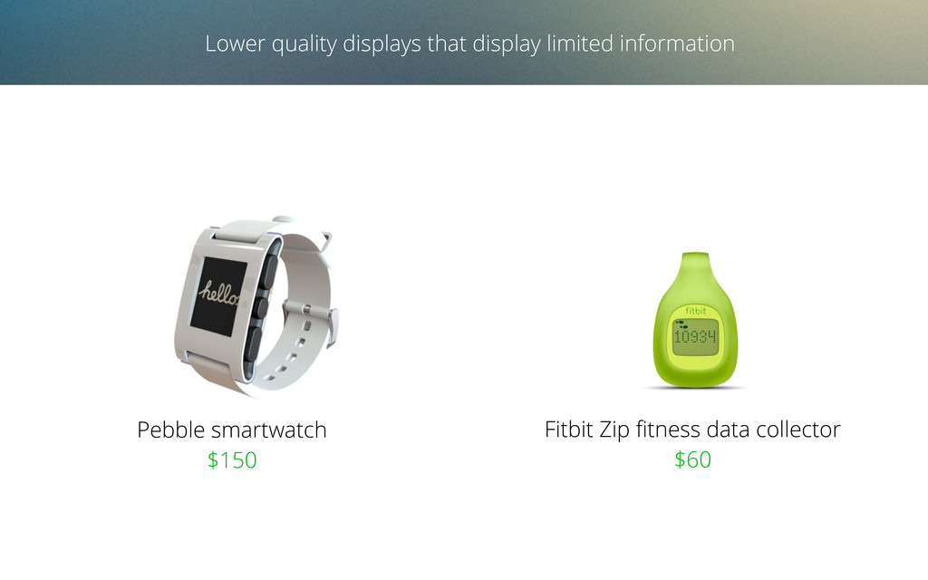
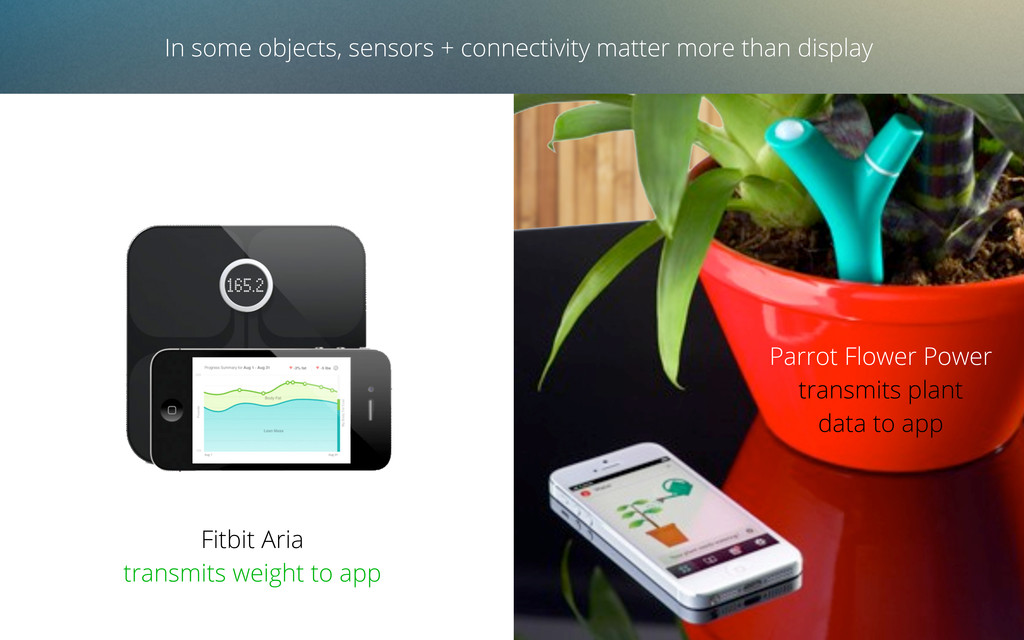
• Ubiquitous computing, ubiquitous internet
• Sequential and simultaneous browsing
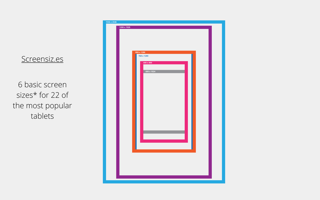
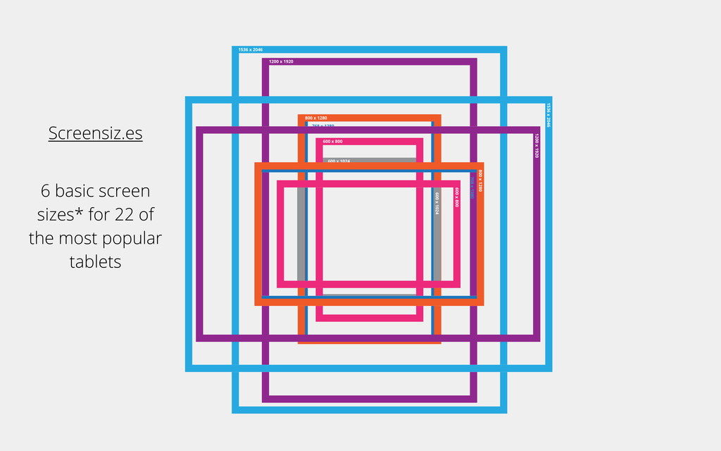
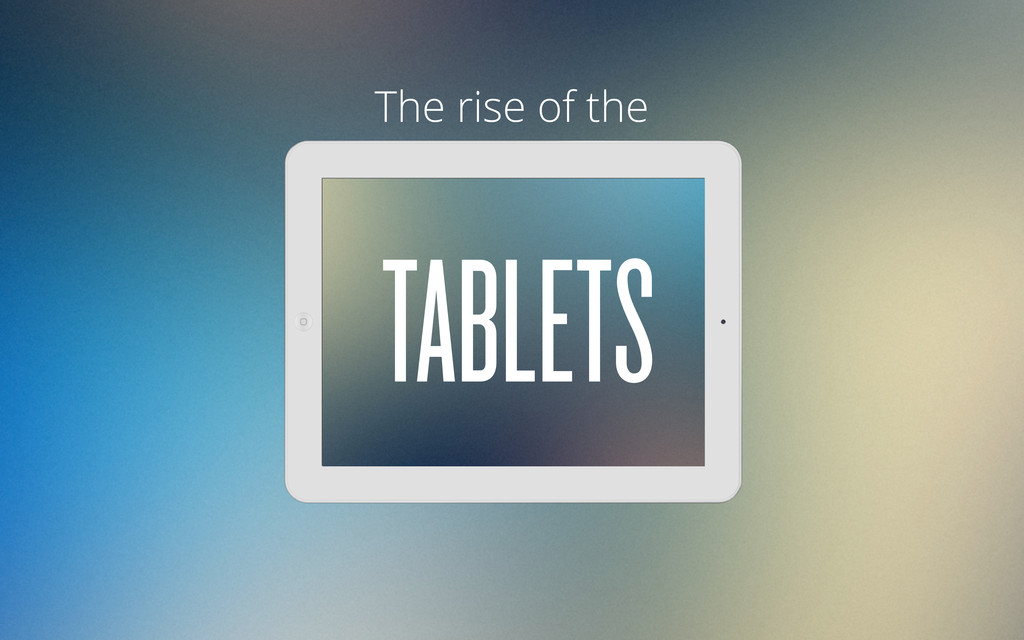
• The rise of the tablet
• Flat design for a lumpy web
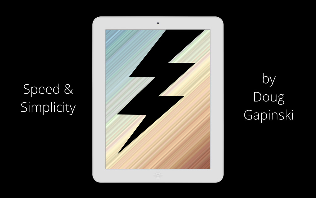
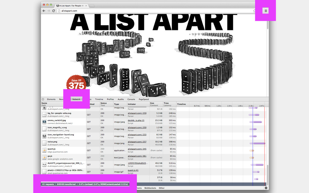
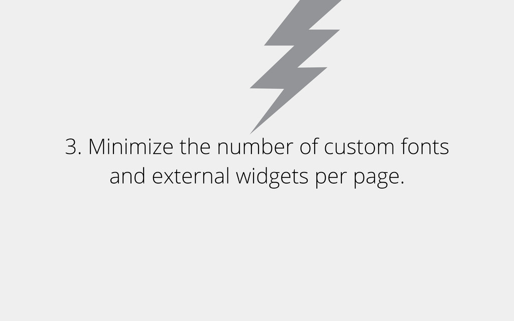
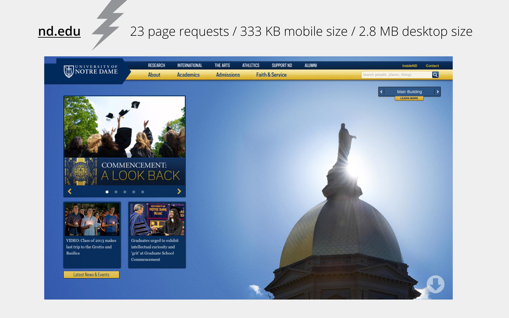
• Speed matters
• Usability strategies
 doug_gapinski
 nori_shinoda
 cheng_wei_chen
 findy_eventslides
 ymty
ymty
 you
you
 saorimurooka
 shihochan
 takasyou
 kozy4324
 74th
74th
 k_adachi_01
 shibuiwilliam
 jct
jct
 reverentgeek
 thekraken
 nonsquared
 stephaniewalter
 techseoconnect
 ammeep
 davidcarrasco
 3n
3n
 sarafernandez
 jcasabona
 tomoyanonymous