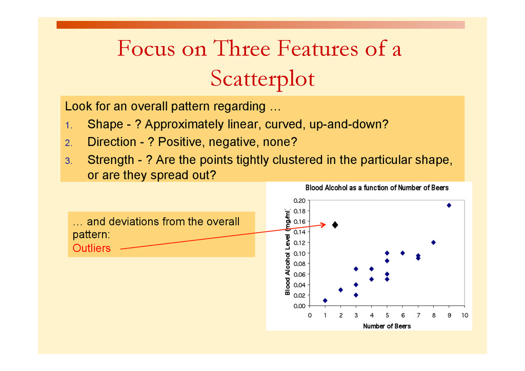
overall pattern regarding … 1. Shape - ? Approximately linear, curved, up-and-down? 2. Direction - ? Positive, negative, none? 3. Strength - ? Are the points tightly clustered in the particular shape, or are they spread out? Blood Alcohol as a function of Number of Beers 0.00 0.02 0.04 0.06 0.08 0.10 0.12 0.14 0.16 0.18 0.20 0 1 2 3 4 5 6 7 8 9 10 Number of Beers Blood Alcohol Level (mg/ ml) … and deviations from the overall pattern: Outliers ♦
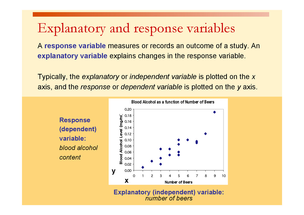
function of Number of Beers 0.00 0.02 0.04 0.06 0.08 0.10 0.12 0.14 0.16 0.18 0.20 0 1 2 3 4 5 6 7 8 9 10 Number of Beers Blood Alcohol Level (mg/ ml) Response (dependent) variable: blood alcohol content x y Explanatory and response variables A response variable measures or records an outcome of a study. An explanatory variable explains changes in the response variable. Typically, the explanatory or independent variable is plotted on the x axis, and the response or dependent variable is plotted on the y axis.
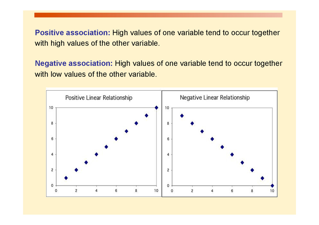
together with high values of the other variable. Negative association: High values of one variable tend to occur together with low values of the other variable.
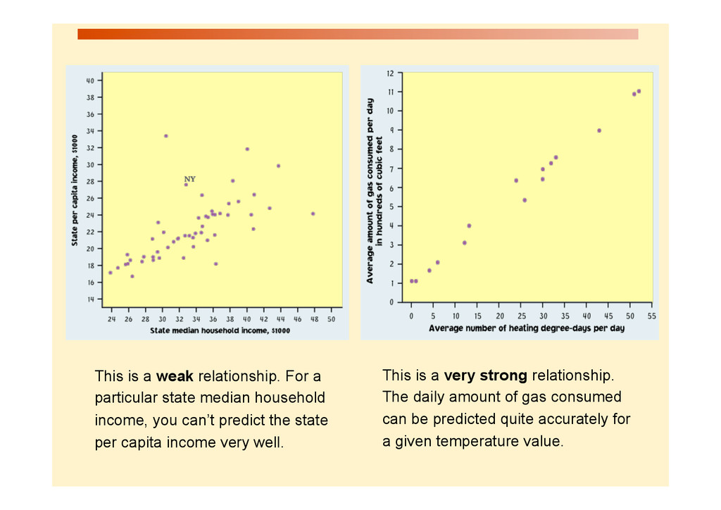
the two variables can be seen by how much variation, or scatter, there is around the main form. With a strong relationship, you can get a pretty good estimate of y if you know x. With a weak relationship, for any x you might get a wide range of y values.
gas consumed can be predicted quite accurately for a given temperature value. This is a weak relationship. For a particular state median household income, you can’t predict the state per capita income very well.
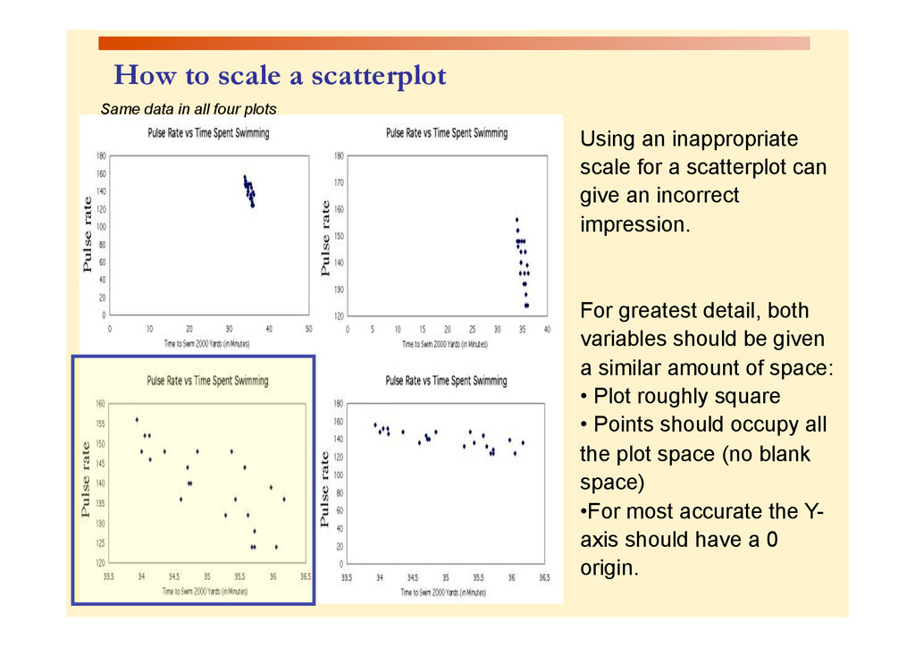
a scatterplot can give an incorrect impression. For greatest detail, both variables should be given a similar amount of space: • Plot roughly square • Points should occupy all the plot space (no blank space) • For most accurate the Y- axis should have a 0 origin. Same data in all four plots
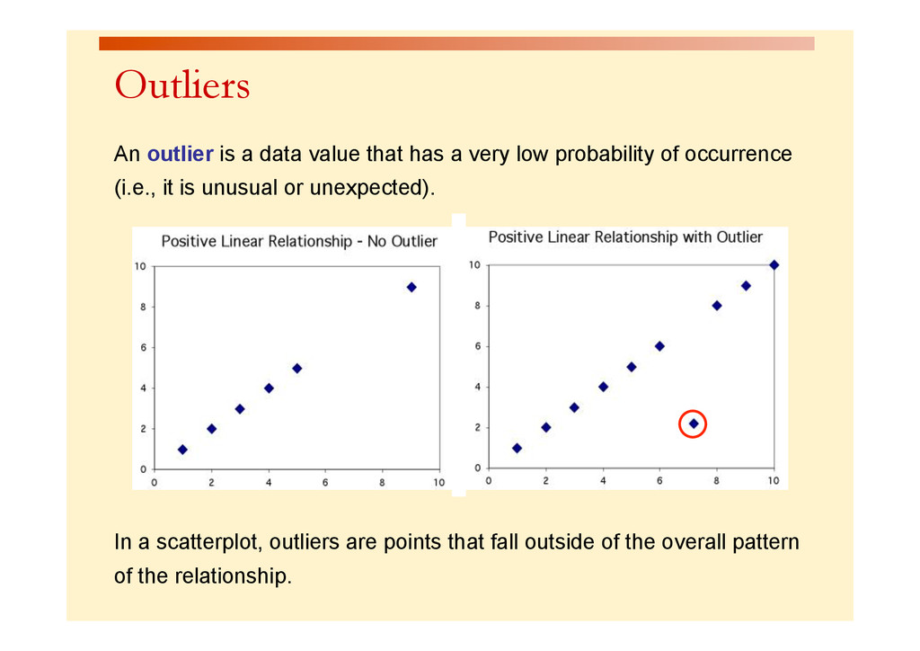
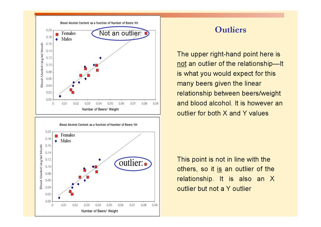
very low probability of occurrence (i.e., it is unusual or unexpected). In a scatterplot, outliers are points that fall outside of the overall pattern of the relationship.
an outlier of the relationship—It is what you would expect for this many beers given the linear relationship between beers/weight and blood alcohol. It is however an outlier for both X and Y values This point is not in line with the others, so it is an outlier of the relationship. It is also an X outlier but not a Y outlier Outliers
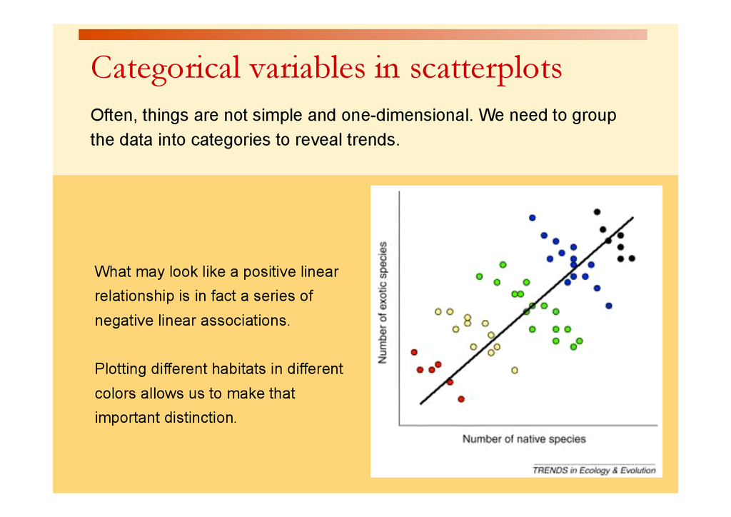
one-dimensional. We need to group the data into categories to reveal trends. What may look like a positive linear relationship is in fact a series of negative linear associations. Plotting different habitats in different colors allows us to make that important distinction.