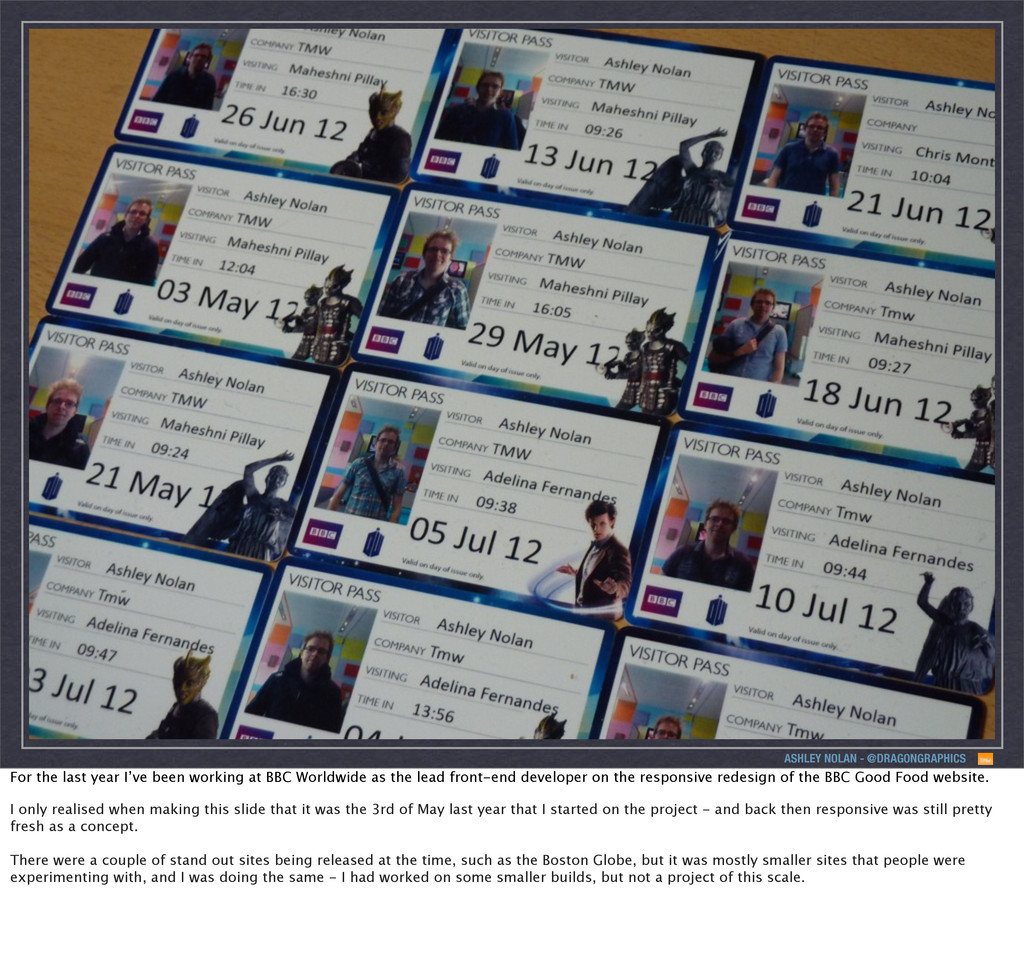
working at BBC Worldwide as the lead front-end developer on the responsive redesign of the BBC Good Food website. I only realised when making this slide that it was the 3rd of May last year that I started on the project - and back then responsive was still pretty fresh as a concept. There were a couple of stand out sites being released at the time, such as the Boston Globe, but it was mostly smaller sites that people were experimenting with, and I was doing the same - I had worked on some smaller builds, but not a project of this scale.
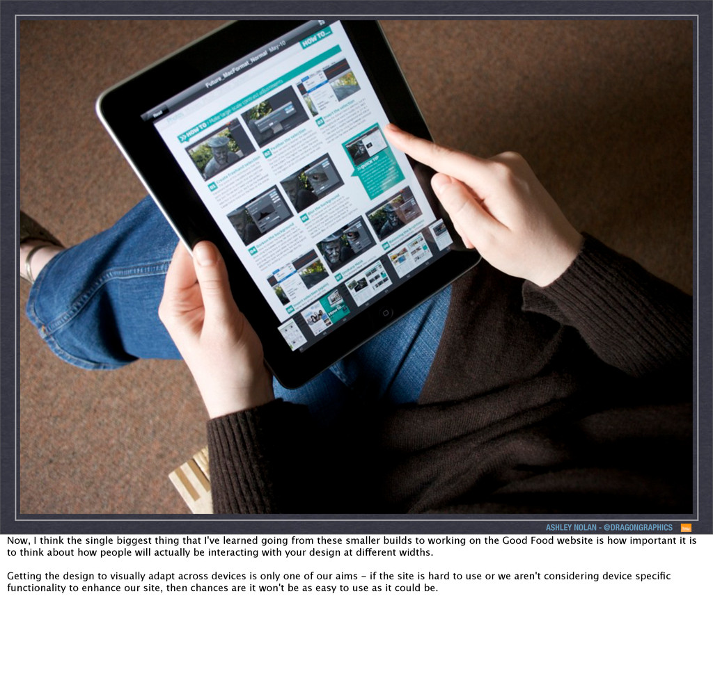
thing that I've learned going from these smaller builds to working on the Good Food website is how important it is to think about how people will actually be interacting with your design at different widths. Getting the design to visually adapt across devices is only one of our aims - if the site is hard to use or we aren't considering device specific functionality to enhance our site, then chances are it won't be as easy to use as it could be.
at this kind of slick interaction mainly because they don’t have to worry about different browsers in the way that site’s on the web have to. So, an app like TweetBot for example uses interactions such as swipe to enhance the app - it doesn’t overload the app with gestures, but the gestures it does use add to the user experience. It's a responsive sites goal to try and match this level of interaction - we are chasing this 'native' feel on whatever device the user is using at the time and more and more now there are examples of responsive sites launching that are doing a great job of achieving this.
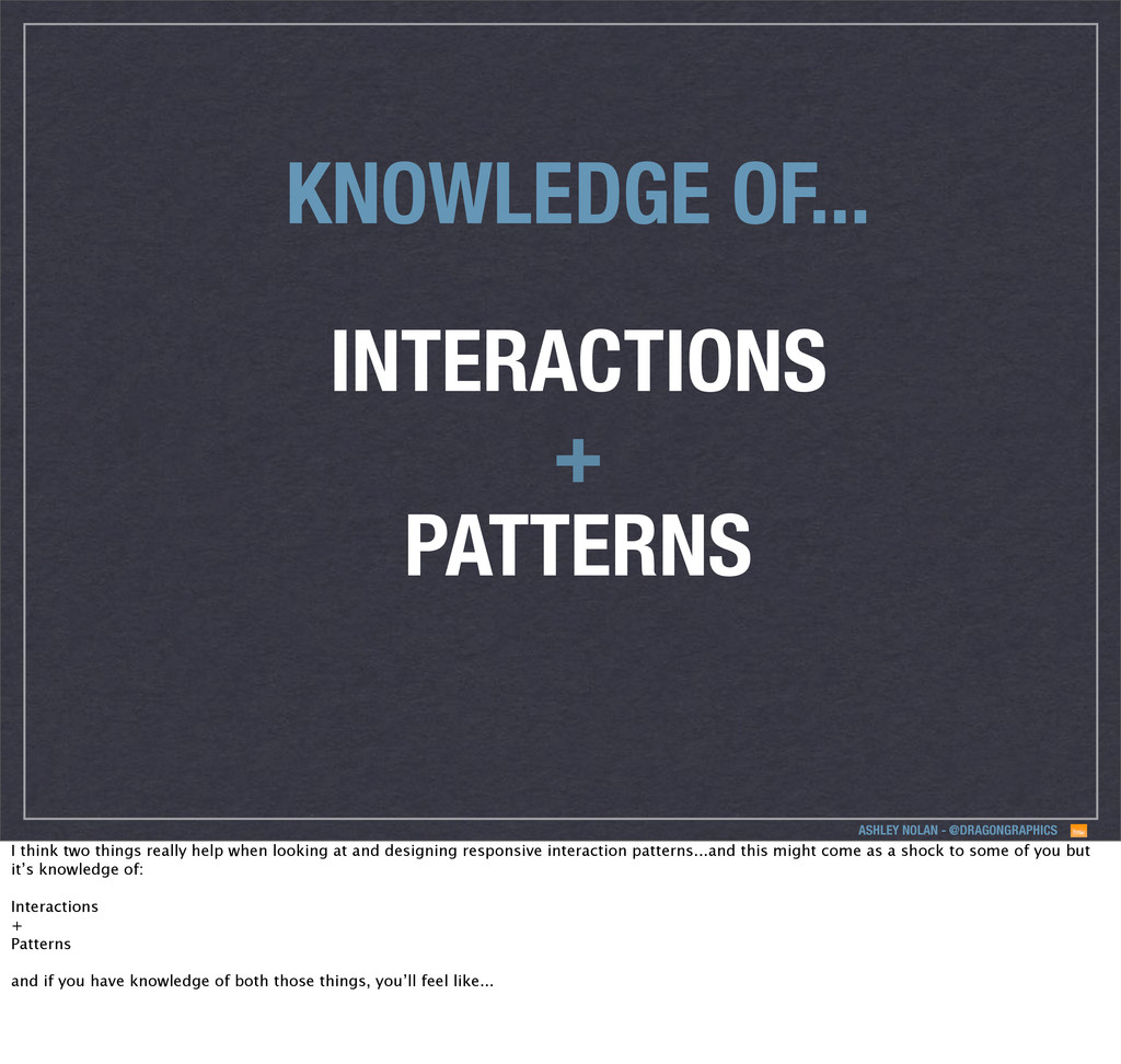
think two things really help when looking at and designing responsive interaction patterns...and this might come as a shock to some of you but it’s knowledge of: Interactions + Patterns and if you have knowledge of both those things, you’ll feel like...
think two things really help when looking at and designing responsive interaction patterns...and this might come as a shock to some of you but it’s knowledge of: Interactions + Patterns and if you have knowledge of both those things, you’ll feel like...
think two things really help when looking at and designing responsive interaction patterns...and this might come as a shock to some of you but it’s knowledge of: Interactions + Patterns and if you have knowledge of both those things, you’ll feel like...
So before you delve into actually designing patterns, you should know the strengths of the devices you are designing your patterns for and leverage them if possible. You should equally be aware of their weaknesses. So I’m going to quickly cover a few areas, which maybe you guys will know a bit about already, but I just wanted to make sure I went through them, as when I started out with responsive, they weren’t necessarily things I knew about.
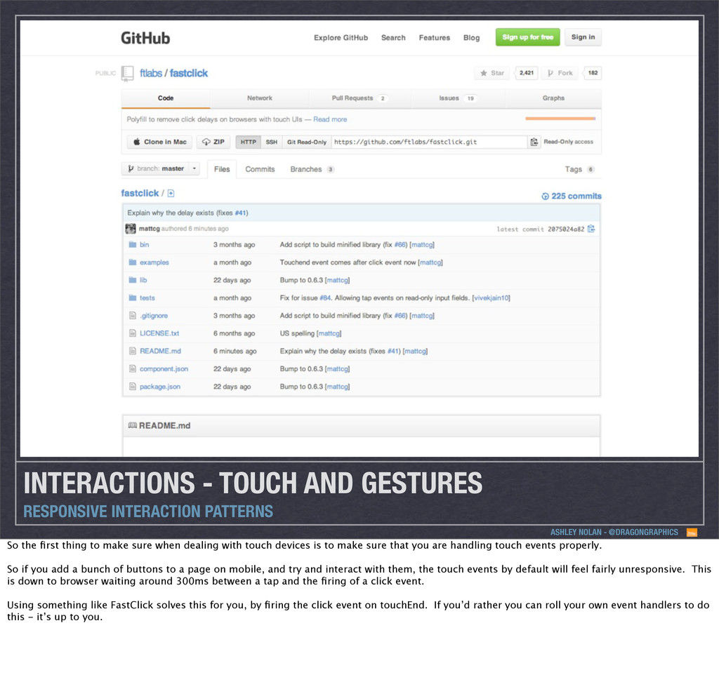
INTERACTION PATTERNS So the first thing to make sure when dealing with touch devices is to make sure that you are handling touch events properly. So if you add a bunch of buttons to a page on mobile, and try and interact with them, the touch events by default will feel fairly unresponsive. This is down to browser waiting around 300ms between a tap and the firing of a click event. Using something like FastClick solves this for you, by firing the click event on touchEnd. If you’d rather you can roll your own event handlers to do this - it’s up to you.
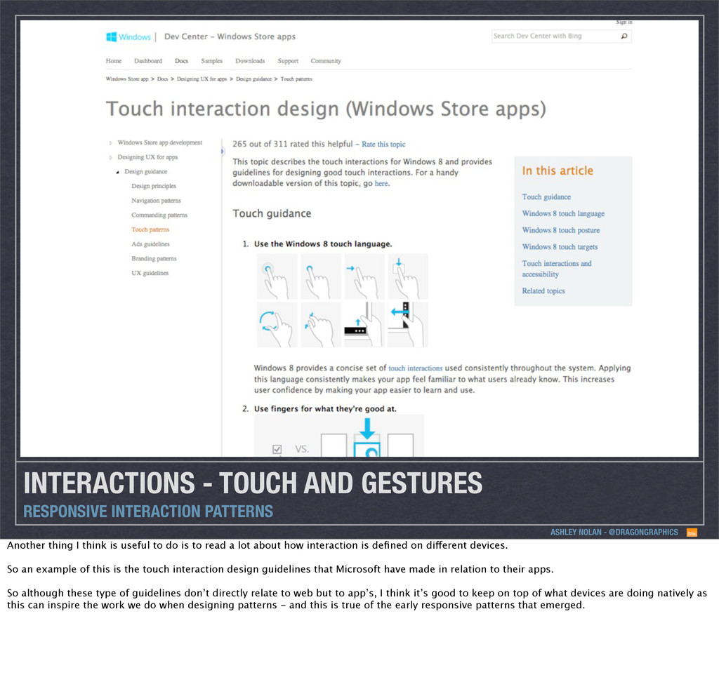
INTERACTION PATTERNS Another thing I think is useful to do is to read a lot about how interaction is defined on different devices. So an example of this is the touch interaction design guidelines that Microsoft have made in relation to their apps. So although these type of guidelines don’t directly relate to web but to app’s, I think it’s good to keep on top of what devices are doing natively as this can inspire the work we do when designing patterns - and this is true of the early responsive patterns that emerged.
Scrolling is a strange one, as it’s probably one of the interactions most taken for granted, as we’ve never really had to worry about it. In a weird kind of way though, gestures and scrolling are at odds with one another, which is why I think you don’t see more gesture based interactions on responsive builds. We found for example that carousels can get in the way of scrolling on devices, as you’re trying to scroll and you might trigger a gesture, and you do have to be careful how this is implemented.
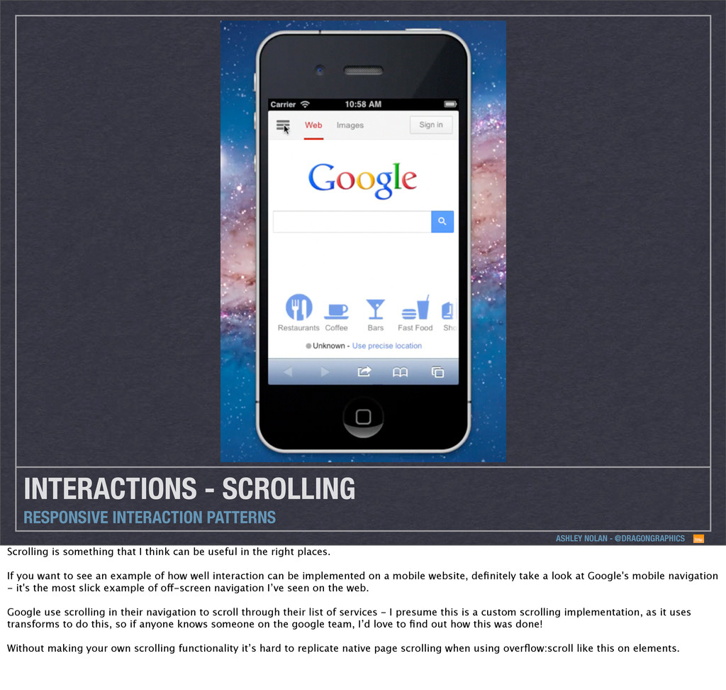
Scrolling is something that I think can be useful in the right places. If you want to see an example of how well interaction can be implemented on a mobile website, definitely take a look at Google's mobile navigation - it's the most slick example of off-screen navigation I’ve seen on the web. Google use scrolling in their navigation to scroll through their list of services - I presume this is a custom scrolling implementation, as it uses transforms to do this, so if anyone knows someone on the google team, I’d love to find out how this was done! Without making your own scrolling functionality it’s hard to replicate native page scrolling when using overflow:scroll like this on elements.
Scrolling is something that I think can be useful in the right places. If you want to see an example of how well interaction can be implemented on a mobile website, definitely take a look at Google's mobile navigation - it's the most slick example of off-screen navigation I’ve seen on the web. Google use scrolling in their navigation to scroll through their list of services - I presume this is a custom scrolling implementation, as it uses transforms to do this, so if anyone knows someone on the google team, I’d love to find out how this was done! Without making your own scrolling functionality it’s hard to replicate native page scrolling when using overflow:scroll like this on elements.
kind of fools gold Webkit tries to fix this with -webkit-overflow-scrolling: touch; which kind of gets your hopes up, but in fact this is a kind of fools gold as adding this property anywhere in your CSS, actually stops the default iOS behaviour of being able to touch the top of your screen to scroll back up to the top of the page, which isn’t ideal.
kind of fools gold Webkit tries to fix this with -webkit-overflow-scrolling: touch; which kind of gets your hopes up, but in fact this is a kind of fools gold as adding this property anywhere in your CSS, actually stops the default iOS behaviour of being able to touch the top of your screen to scroll back up to the top of the page, which isn’t ideal.
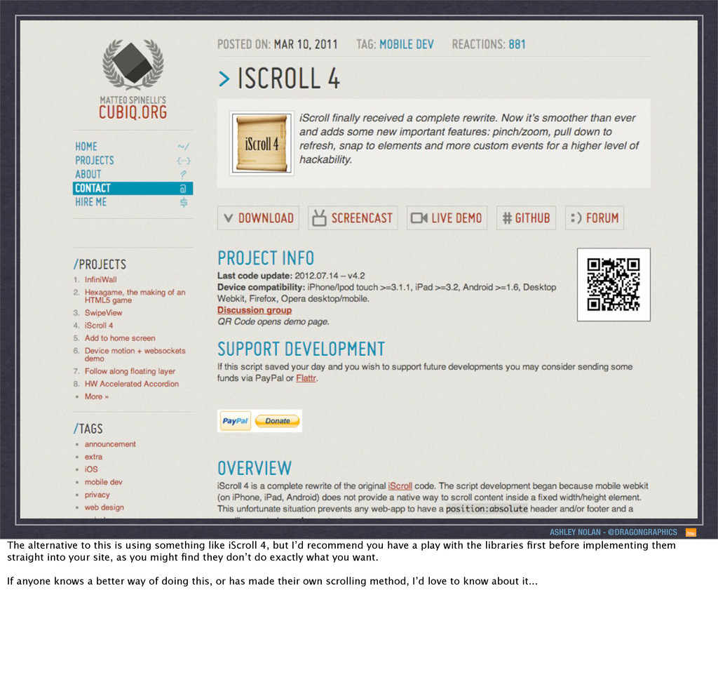
something like iScroll 4, but I’d recommend you have a play with the libraries first before implementing them straight into your site, as you might find they don’t do exactly what you want. If anyone knows a better way of doing this, or has made their own scrolling method, I’d love to know about it...
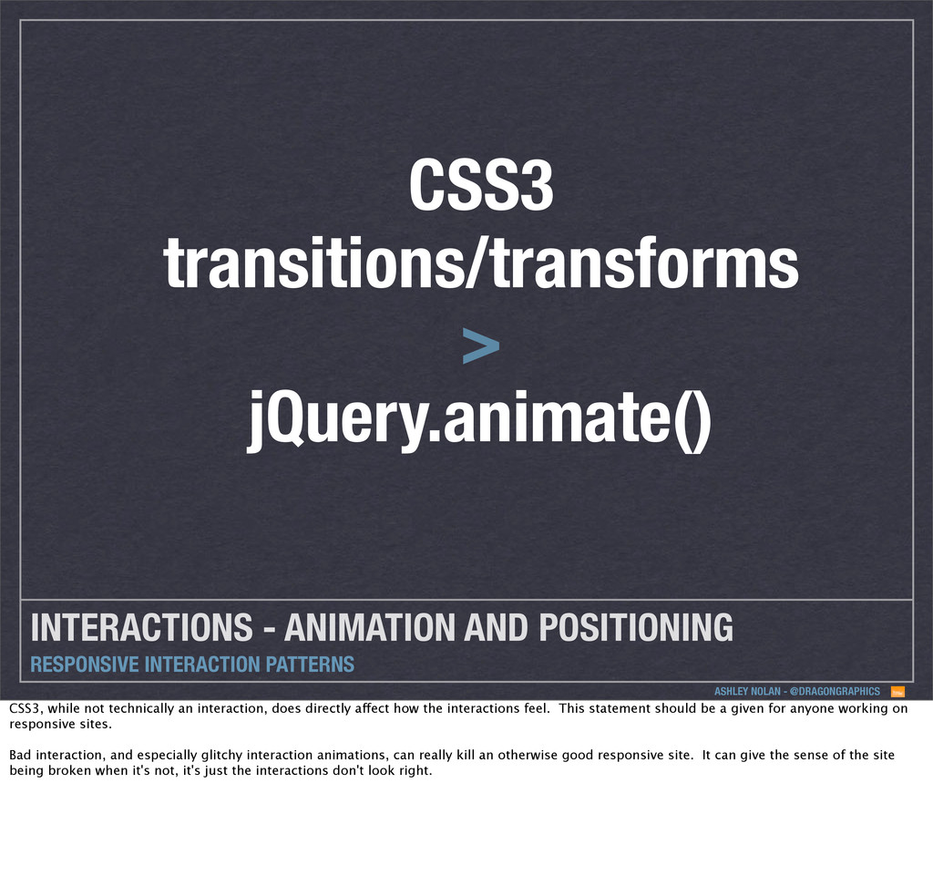
INTERACTION PATTERNS CSS3 transitions/transforms > jQuery.animate() CSS3, while not technically an interaction, does directly affect how the interactions feel. This statement should be a given for anyone working on responsive sites. Bad interaction, and especially glitchy interaction animations, can really kill an otherwise good responsive site. It can give the sense of the site being broken when it's not, it's just the interactions don't look right.
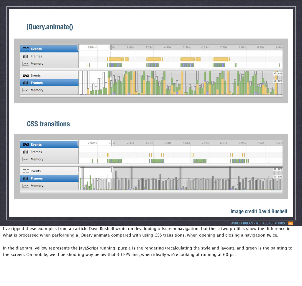
Bushell I’ve ripped these examples from an article Dave Bushell wrote on developing offscreen navigation, but these two profiles show the difference in what is processed when performing a jQuery animate compared with using CSS transitions, when opening and closing a navigation twice. In the diagram, yellow represents the JavaScript running, purple is the rendering (recalculating the style and layout), and green is the painting to the screen. On mobile, we’d be shooting way below that 30 FPS line, when ideally we’re looking at running at 60fps.
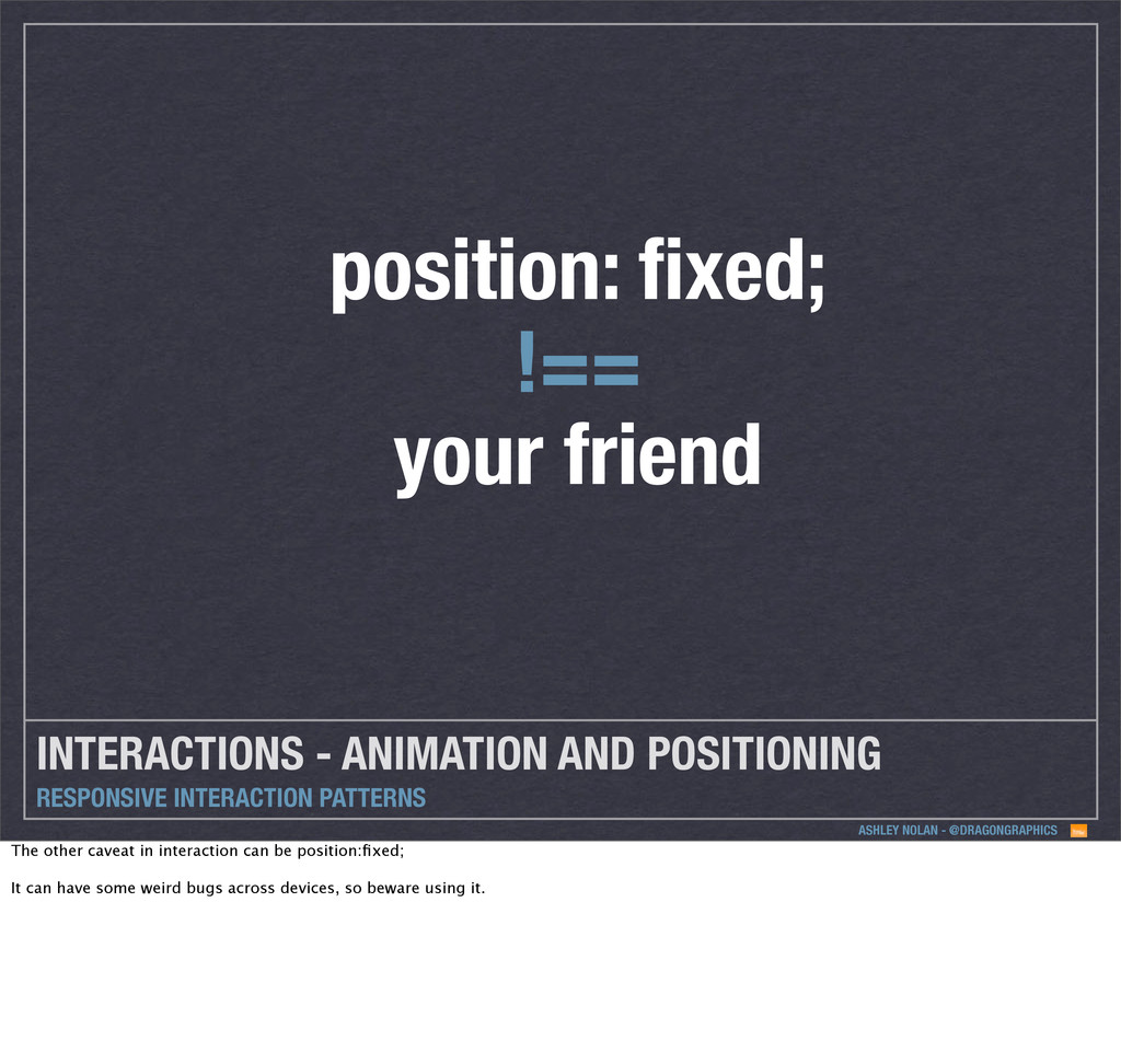
INTERACTION PATTERNS position: fixed; !== your friend The other caveat in interaction can be position:fixed; It can have some weird bugs across devices, so beware using it.
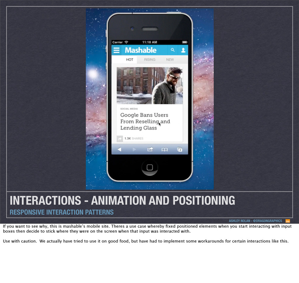
INTERACTION PATTERNS If you want to see why, this is mashable’s mobile site. Theres a use case whereby fixed positioned elements when you start interacting with input boxes then decide to stick where they were on the screen when that input was interacted with. Use with caution. We actually have tried to use it on good food, but have had to implement some workarounds for certain interactions like this.
INTERACTION PATTERNS If you want to see why, this is mashable’s mobile site. Theres a use case whereby fixed positioned elements when you start interacting with input boxes then decide to stick where they were on the screen when that input was interacted with. Use with caution. We actually have tried to use it on good food, but have had to implement some workarounds for certain interactions like this.
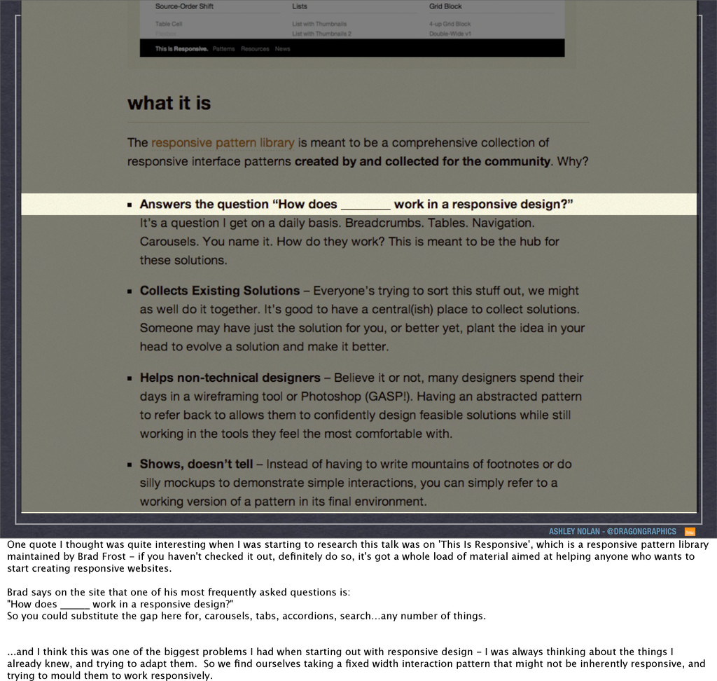
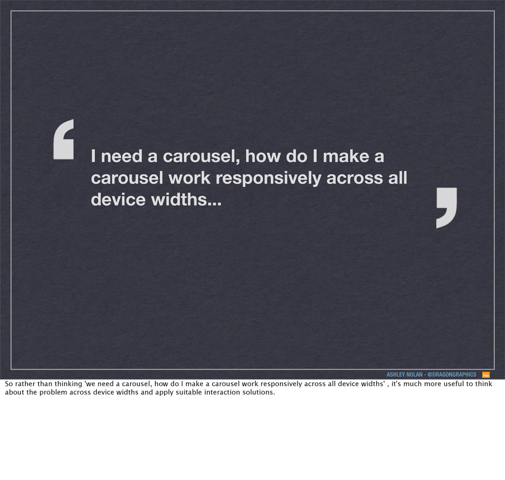
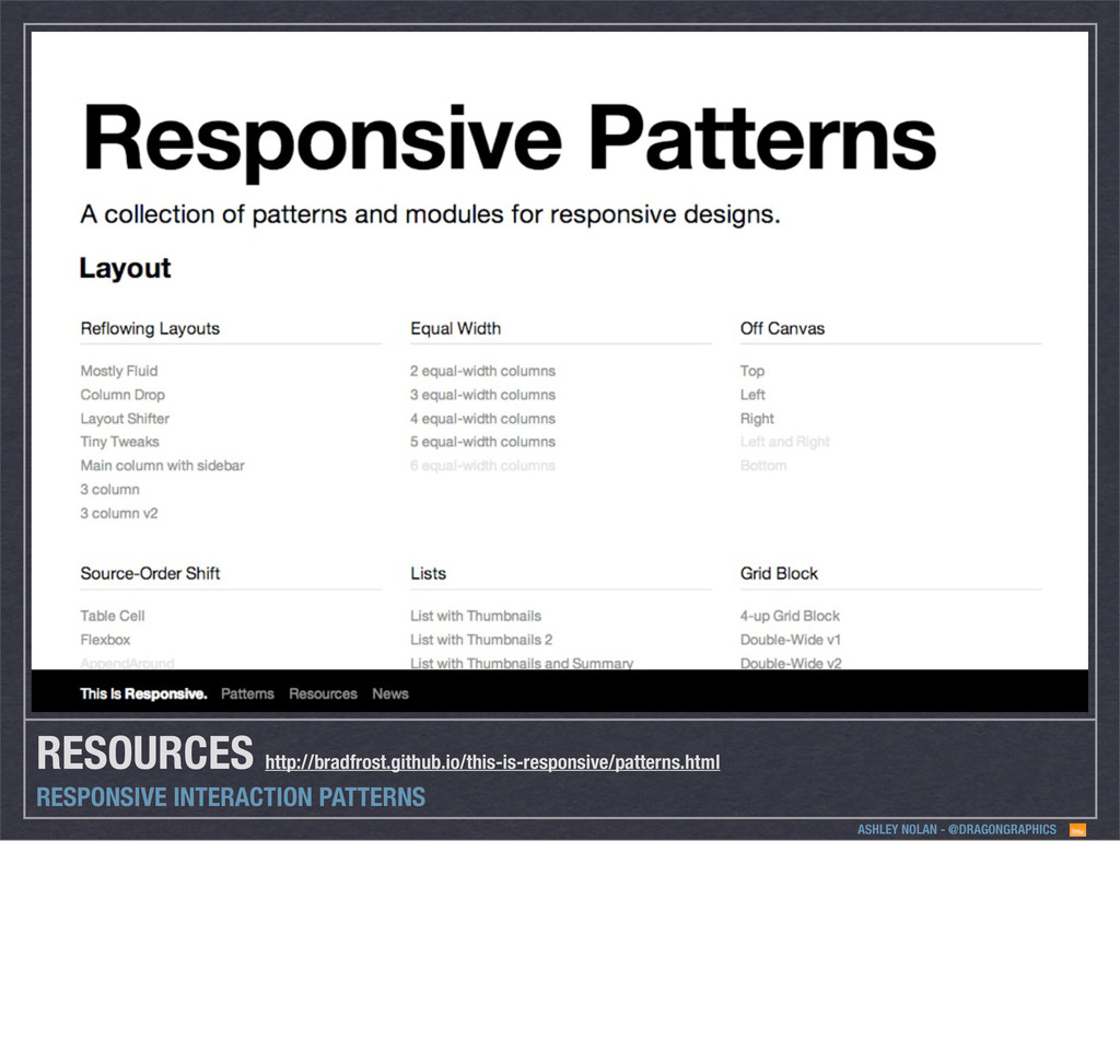
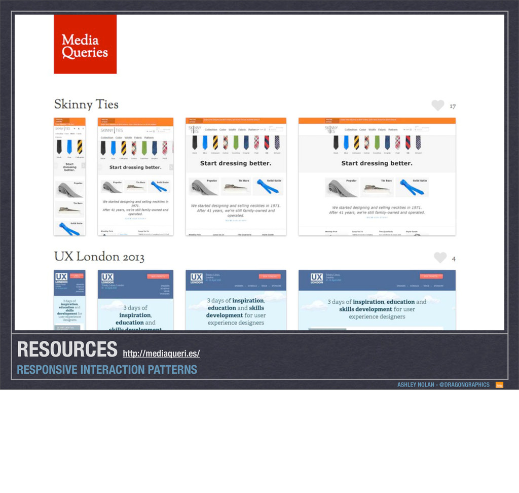
interesting when I was starting to research this talk was on 'This Is Responsive', which is a responsive pattern library maintained by Brad Frost - if you haven't checked it out, definitely do so, it's got a whole load of material aimed at helping anyone who wants to start creating responsive websites. Brad says on the site that one of his most frequently asked questions is: "How does ______ work in a responsive design?" So you could substitute the gap here for, carousels, tabs, accordions, search…any number of things. ...and I think this was one of the biggest problems I had when starting out with responsive design - I was always thinking about the things I already knew, and trying to adapt them. So we find ourselves taking a fixed width interaction pattern that might not be inherently responsive, and trying to mould them to work responsively.
interesting when I was starting to research this talk was on 'This Is Responsive', which is a responsive pattern library maintained by Brad Frost - if you haven't checked it out, definitely do so, it's got a whole load of material aimed at helping anyone who wants to start creating responsive websites. Brad says on the site that one of his most frequently asked questions is: "How does ______ work in a responsive design?" So you could substitute the gap here for, carousels, tabs, accordions, search…any number of things. ...and I think this was one of the biggest problems I had when starting out with responsive design - I was always thinking about the things I already knew, and trying to adapt them. So we find ourselves taking a fixed width interaction pattern that might not be inherently responsive, and trying to mould them to work responsively.
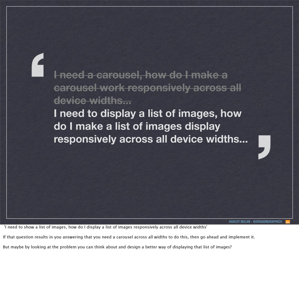
I make a carousel work responsively across all device widths... So rather than thinking 'we need a carousel, how do I make a carousel work responsively across all device widths' , it's much more useful to think about the problem across device widths and apply suitable interaction solutions.
I make a carousel work responsively across all device widths... I need to display a list of images, how do I make a list of images display responsively across all device widths... 'I need to show a list of images, how do I display a list of images responsively across all device widths' If that question results in you answering that you need a carousel across all widths to do this, then go ahead and implement it. But maybe by looking at the problem you can think about and design a better way of displaying that list of images?
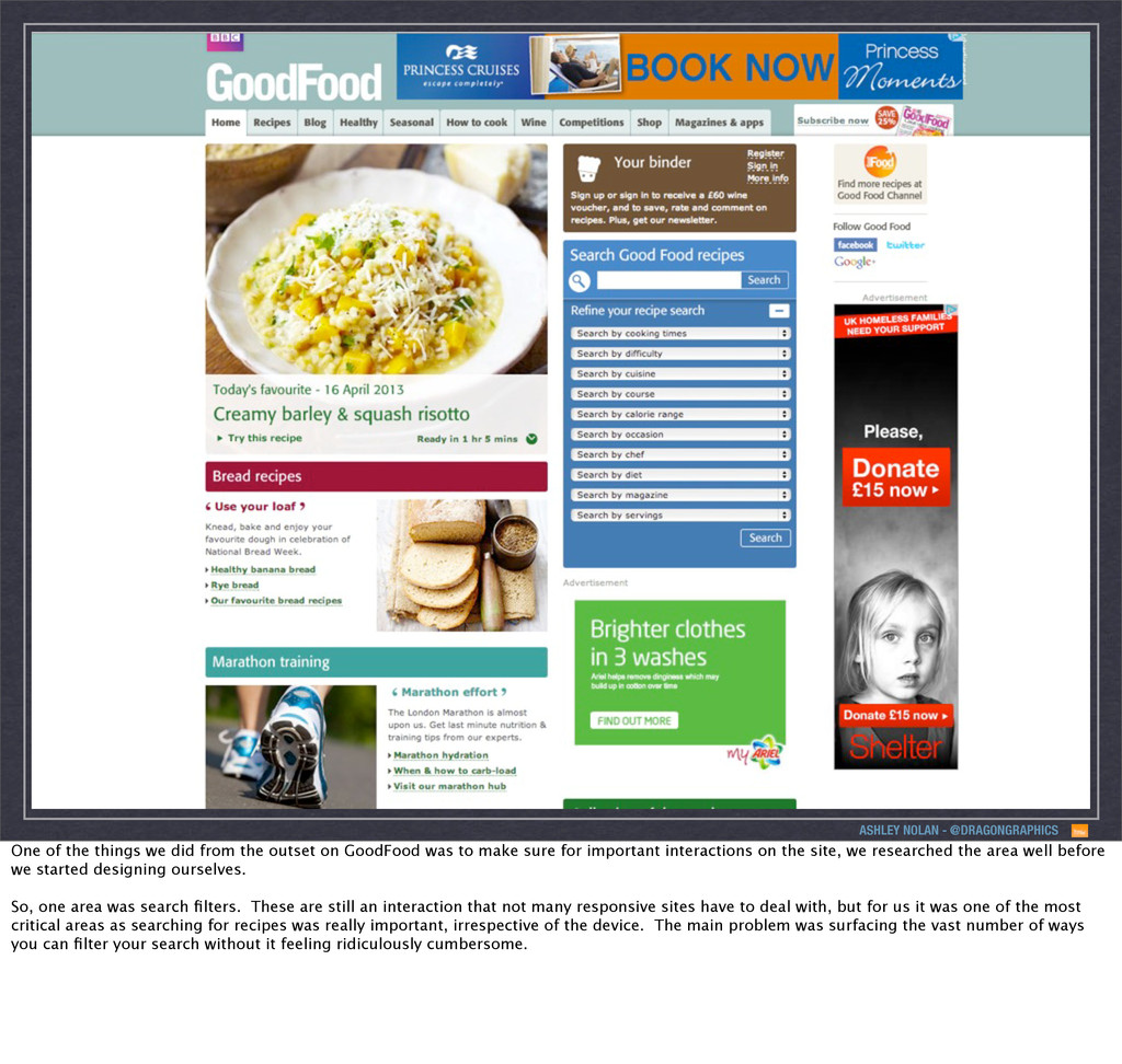
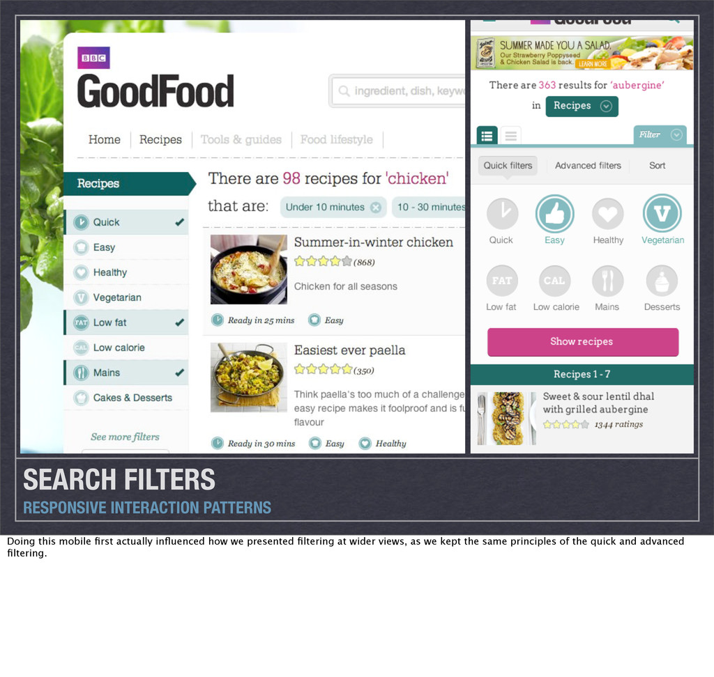
from the outset on GoodFood was to make sure for important interactions on the site, we researched the area well before we started designing ourselves. So, one area was search filters. These are still an interaction that not many responsive sites have to deal with, but for us it was one of the most critical areas as searching for recipes was really important, irrespective of the device. The main problem was surfacing the vast number of ways you can filter your search without it feeling ridiculously cumbersome.
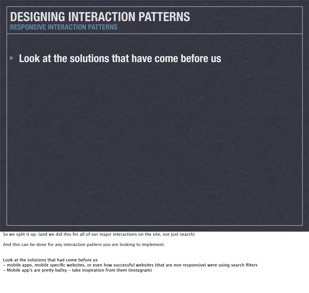
before us RESPONSIVE INTERACTION PATTERNS So we split it up: (and we did this for all of our major interactions on the site, not just search) And this can be done for any interaction pattern you are looking to implement. Look at the solutions that had come before us - mobile apps, mobile specific websites, or even how successful websites (that are non responsive) were using search filters - Mobile app's are pretty ballsy - take inspiration from them (instagram)
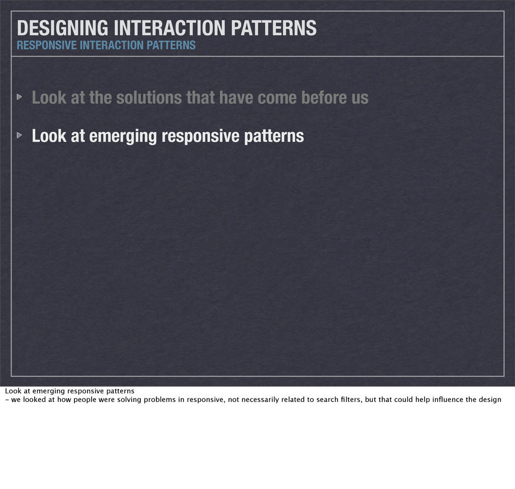
before us Look at emerging responsive patterns RESPONSIVE INTERACTION PATTERNS Look at emerging responsive patterns - we looked at how people were solving problems in responsive, not necessarily related to search filters, but that could help influence the design
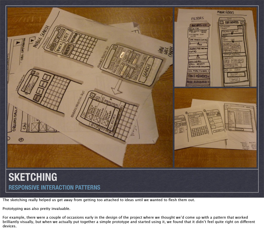
before us Look at emerging responsive patterns Sketch (and prototype too if you have the time) RESPONSIVE INTERACTION PATTERNS Sketch - We sketched out lots of possible ways to solve the problem
away from getting too attached to ideas until we wanted to flesh them out. Prototyping was also pretty invaluable. For example, there were a couple of occasions early in the design of the project where we thought we’d come up with a pattern that worked brilliantly visually, but when we actually put together a simple prototype and started using it, we found that it didn’t feel quite right on different devices.
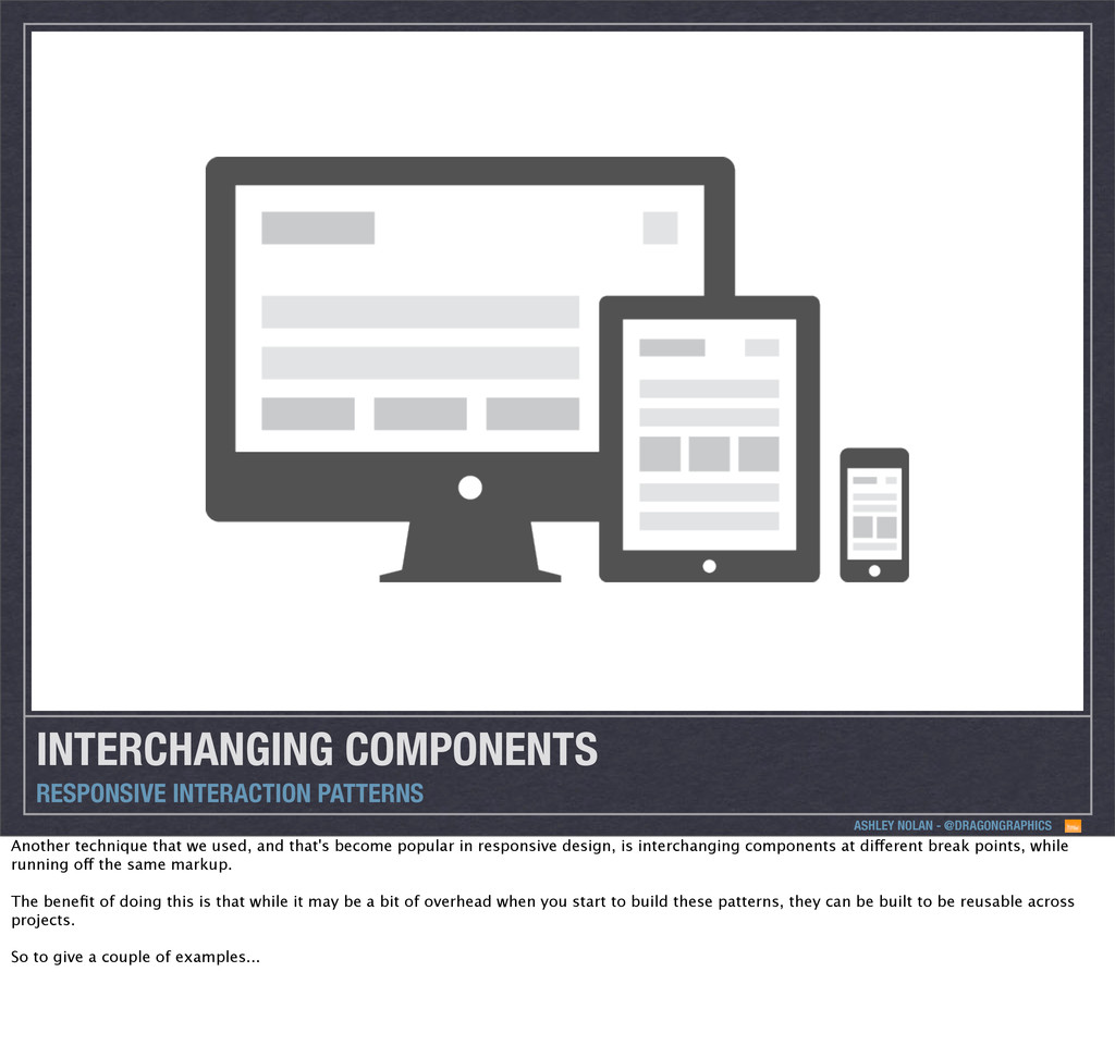
technique that we used, and that's become popular in responsive design, is interchanging components at different break points, while running off the same markup. The benefit of doing this is that while it may be a bit of overhead when you start to build these patterns, they can be built to be reusable across projects. So to give a couple of examples...
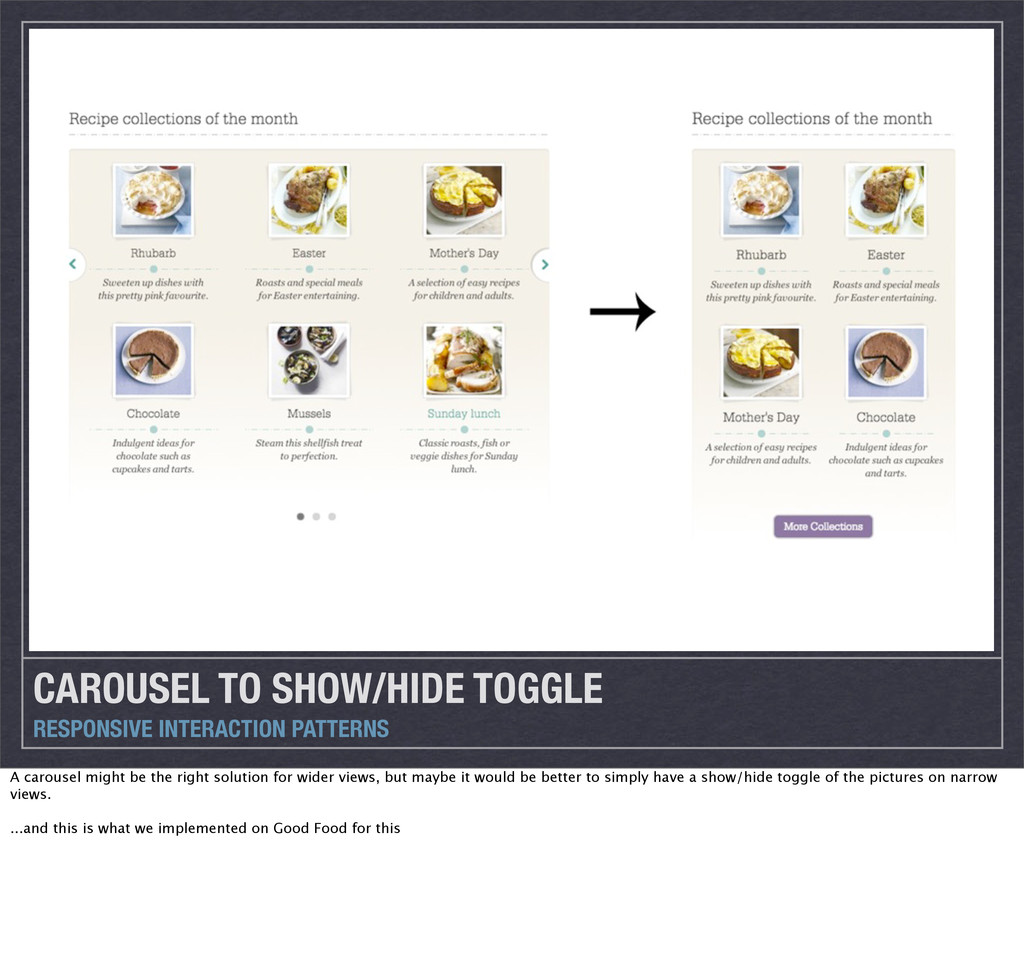
be the right solution for wider views, but maybe it would be better to simply have a show/hide toggle of the pictures on narrow views. ...and this is what we implemented on Good Food for this
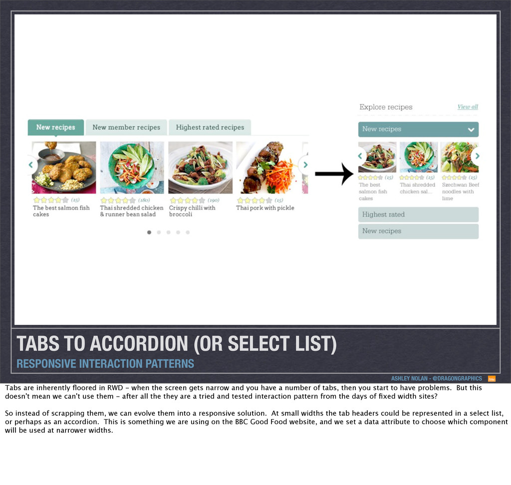
RESPONSIVE INTERACTION PATTERNS Tabs are inherently floored in RWD - when the screen gets narrow and you have a number of tabs, then you start to have problems. But this doesn't mean we can't use them - after all the they are a tried and tested interaction pattern from the days of fixed width sites? So instead of scrapping them, we can evolve them into a responsive solution. At small widths the tab headers could be represented in a select list, or perhaps as an accordion. This is something we are using on the BBC Good Food website, and we set a data attribute to choose which component will be used at narrower widths.
RESPONSIVE INTERACTION PATTERNS The final thing I want to mention is the importance of not just accepting what we have in terms of patterns. It doesn’t really matter if you feel like you don’t know what you’re doing sometimes or exactly how something might turn out, but chances are you’ll learn something from the process. There are a couple of prototypes we tried using on Good Food that didn’t make it into the current site, because we found they weren’t quite right, but I learned more about what might work in future from trying. Responsive is still very much in its infancy - patterns will emerge and evolve without a doubt over the next couple of years and great patterns are emerging all the time. Question existing patterns like carousels and ask yourself if there might be a better way of doing something. If you think there is, prototype it to show people on your project - it might just get implemented!
 dragongraphics
 you
you
 oracle4engineer
 tkyowa
 rakus_dev
 amanda_hinchman
 smt7174
 kimichan
 scrummasudar
 shift_evolve
 shinkufencer
 geekplus_tech
 schroneko
 keavy
keavy
 productmarketing
 morganepeng
 geoffreycrofte
 akademiya2063
 techseoconnect
 tamaranovitovic
 addyosmani
 tammyeverts
 irinanazarova
 jacobtomlinson