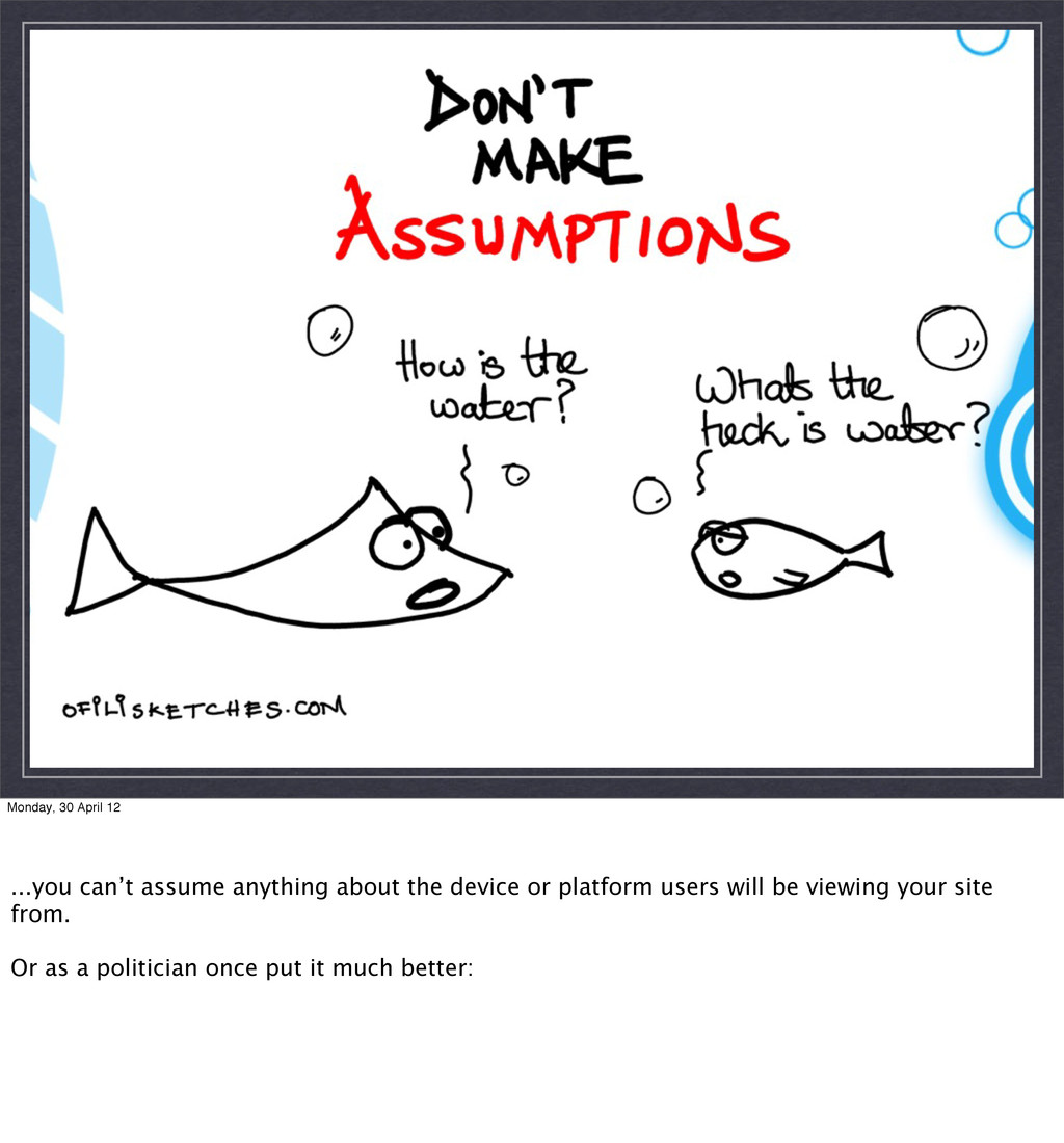
Introduce myself - Creative technologist - here to help bridge any gaps between design and development... - we keep on top of front end trends Introduce the talk - What is RWD - some examples - The challenges
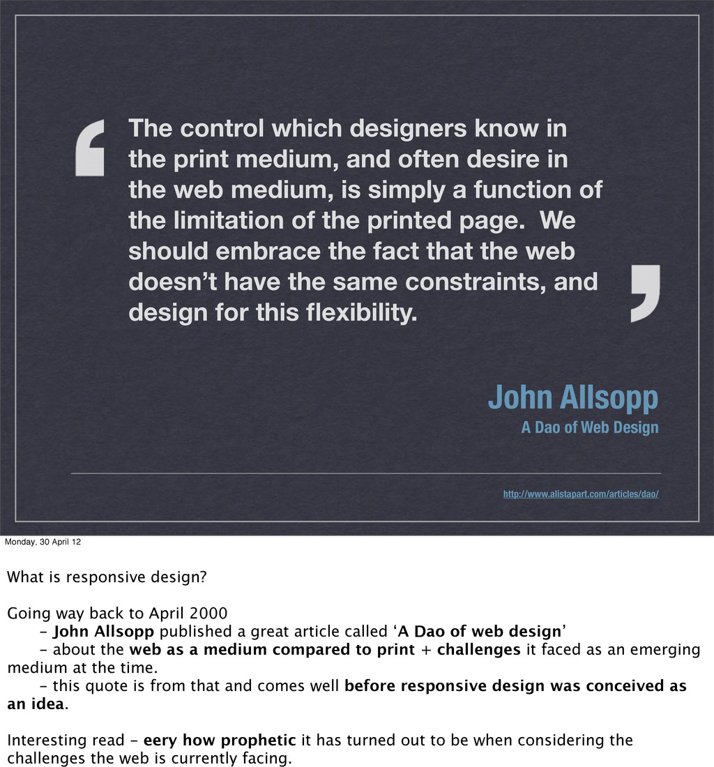
often desire in the web medium, is simply a function of the limitation of the printed page. We should embrace the fact that the web doesn’t have the same constraints, and design for this flexibility. John Allsopp A Dao of Web Design http://www.alistapart.com/articles/dao/ Monday, 30 April 12 What is responsive design? Going way back to April 2000 - John Allsopp published a great article called ‘A Dao of web design’ - about the web as a medium compared to print + challenges it faced as an emerging medium at the time. - this quote is from that and comes well before responsive design was conceived as an idea. Interesting read - eery how prophetic it has turned out to be when considering the challenges the web is currently facing.
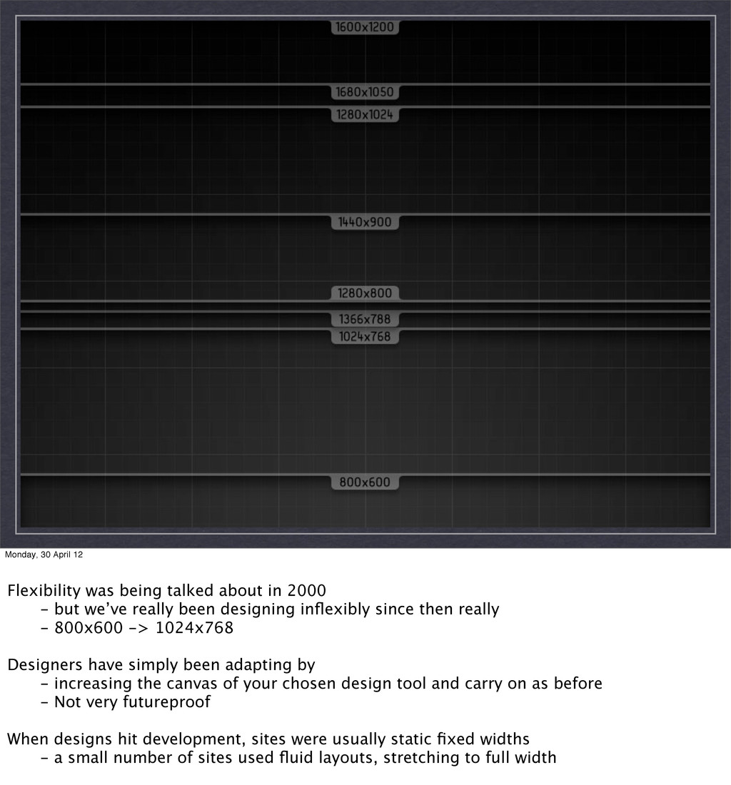
2000 - but we’ve really been designing inflexibly since then really - 800x600 -> 1024x768 Designers have simply been adapting by - increasing the canvas of your chosen design tool and carry on as before - Not very futureproof When designs hit development, sites were usually static fixed widths - a small number of sites used fluid layouts, stretching to full width
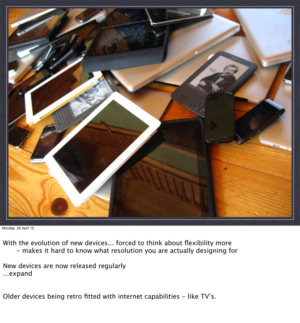
forced to think about flexibility more - makes it hard to know what resolution you are actually designing for New devices are now released regularly ...expand Older devices being retro fitted with internet capabilities - like TV’s.
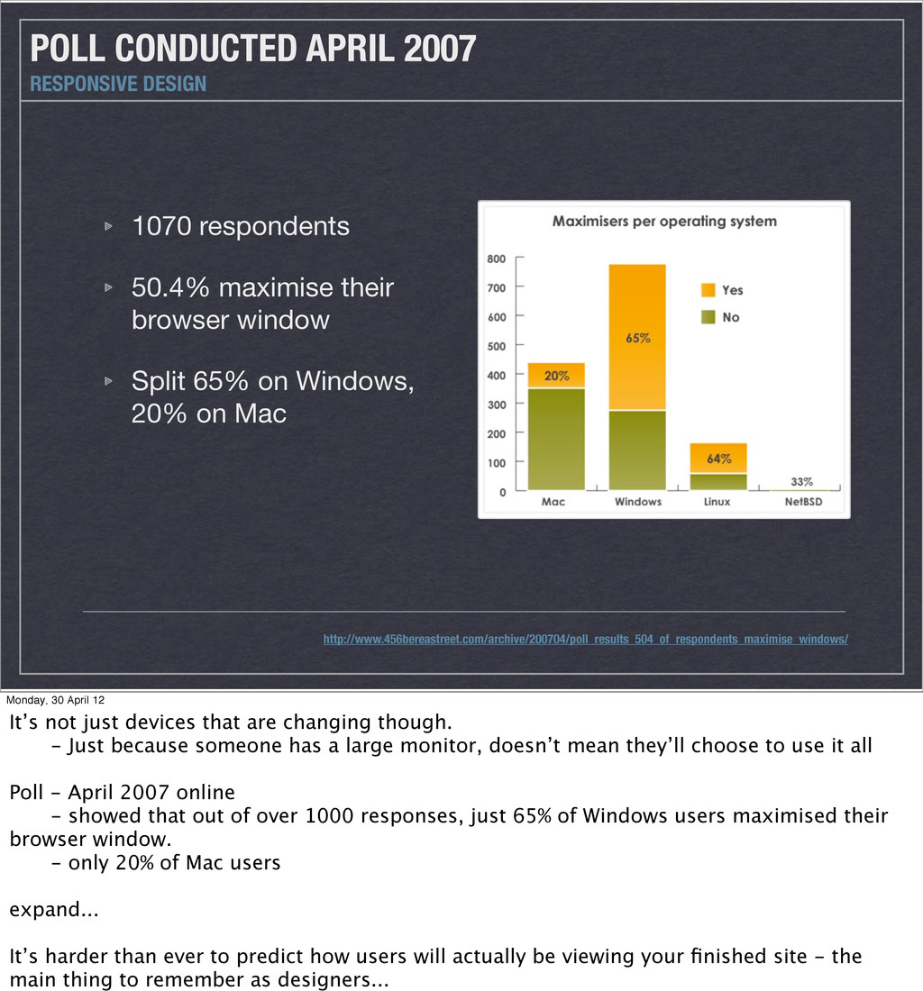
on Windows, 20% on Mac POLL CONDUCTED APRIL 2007 RESPONSIVE DESIGN Monday, 30 April 12 It’s not just devices that are changing though. - Just because someone has a large monitor, doesn’t mean they’ll choose to use it all Poll - April 2007 online - showed that out of over 1000 responses, just 65% of Windows users maximised their browser window. - only 20% of Mac users expand... It’s harder than ever to predict how users will actually be viewing your finished site - the main thing to remember as designers...
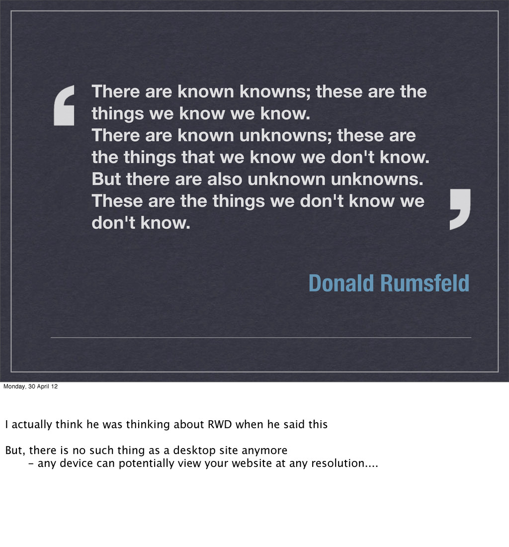
we know. There are known unknowns; these are the things that we know we don't know. But there are also unknown unknowns. These are the things we don't know we don't know. Donald Rumsfeld Monday, 30 April 12 I actually think he was thinking about RWD when he said this But, there is no such thing as a desktop site anymore - any device can potentially view your website at any resolution....
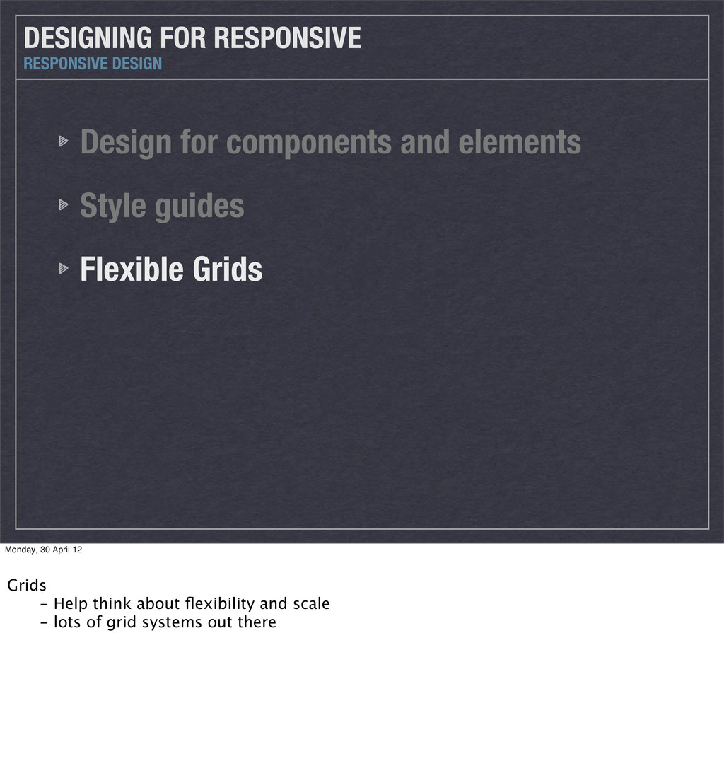
that caused people to start developing the idea of ‘responsive design’. As mentioned earlier, fluid grids had been used by some websites previously - but not particularly successfully, and fluid never become widely adapted Responsive is the evolution of fluid grids into something that’s much more flexible. != proportional sizing, more a new way of thinking about how you design...
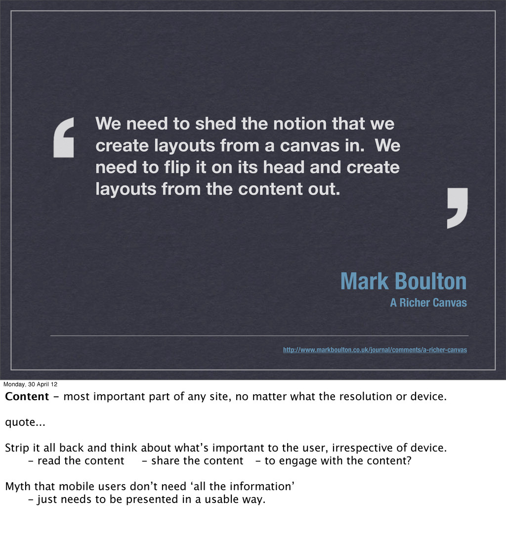
the notion that we create layouts from a canvas in. We need to flip it on its head and create layouts from the content out. Monday, 30 April 12 Content - most important part of any site, no matter what the resolution or device. quote... Strip it all back and think about what’s important to the user, irrespective of device. - read the content - share the content - to engage with the content? Myth that mobile users don’t need ‘all the information’ - just needs to be presented in a usable way.
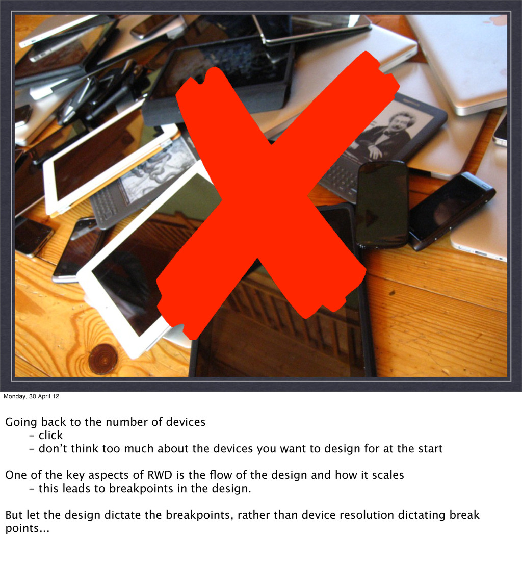
devices - click - don’t think too much about the devices you want to design for at the start One of the key aspects of RWD is the flow of the design and how it scales - this leads to breakpoints in the design. But let the design dictate the breakpoints, rather than device resolution dictating break points...
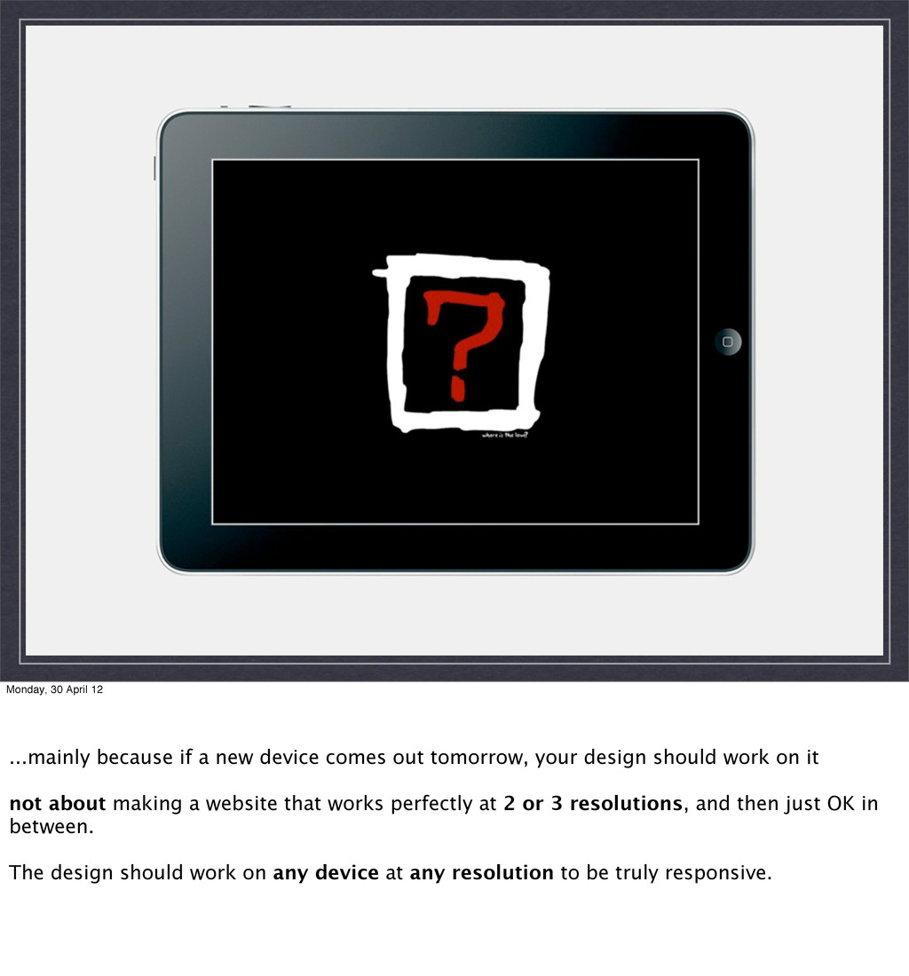
comes out tomorrow, your design should work on it not about making a website that works perfectly at 2 or 3 resolutions, and then just OK in between. The design should work on any device at any resolution to be truly responsive.
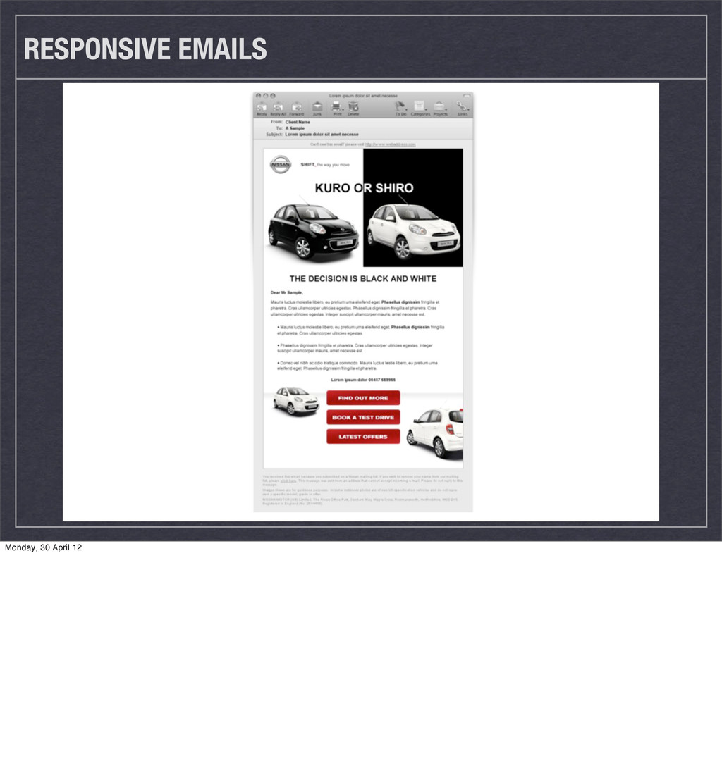
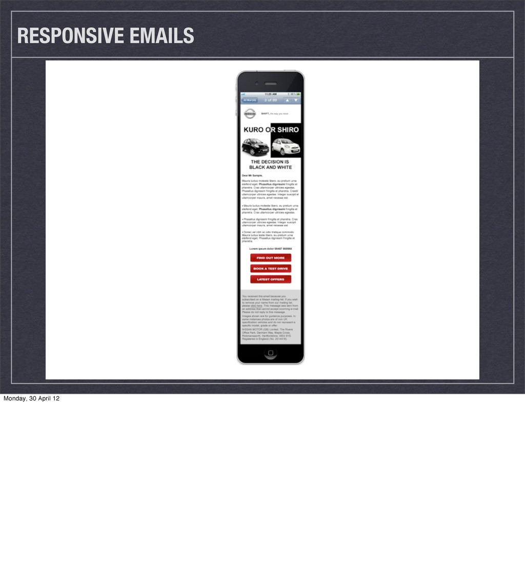
Images Not just how they scale - think about how they serve different purposes on smaller resolutions compared larger resolutions. (Youtube video to just a thumbnail)
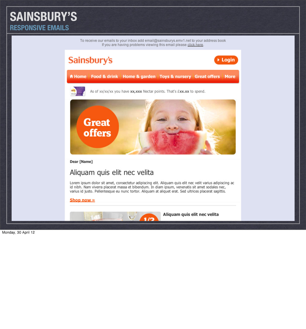
the other way around) Use 14pt as a minimum font size on mobile Keep CTAs big enough for a finger tap (44px of ‘space’) Think about how you can keep your logo / key imagery crisp (crops, clever slices etc) TIPS RESPONSIVE EMAILS Monday, 30 April 12 You can alter the font size from desktop to mobile (and colour etc)
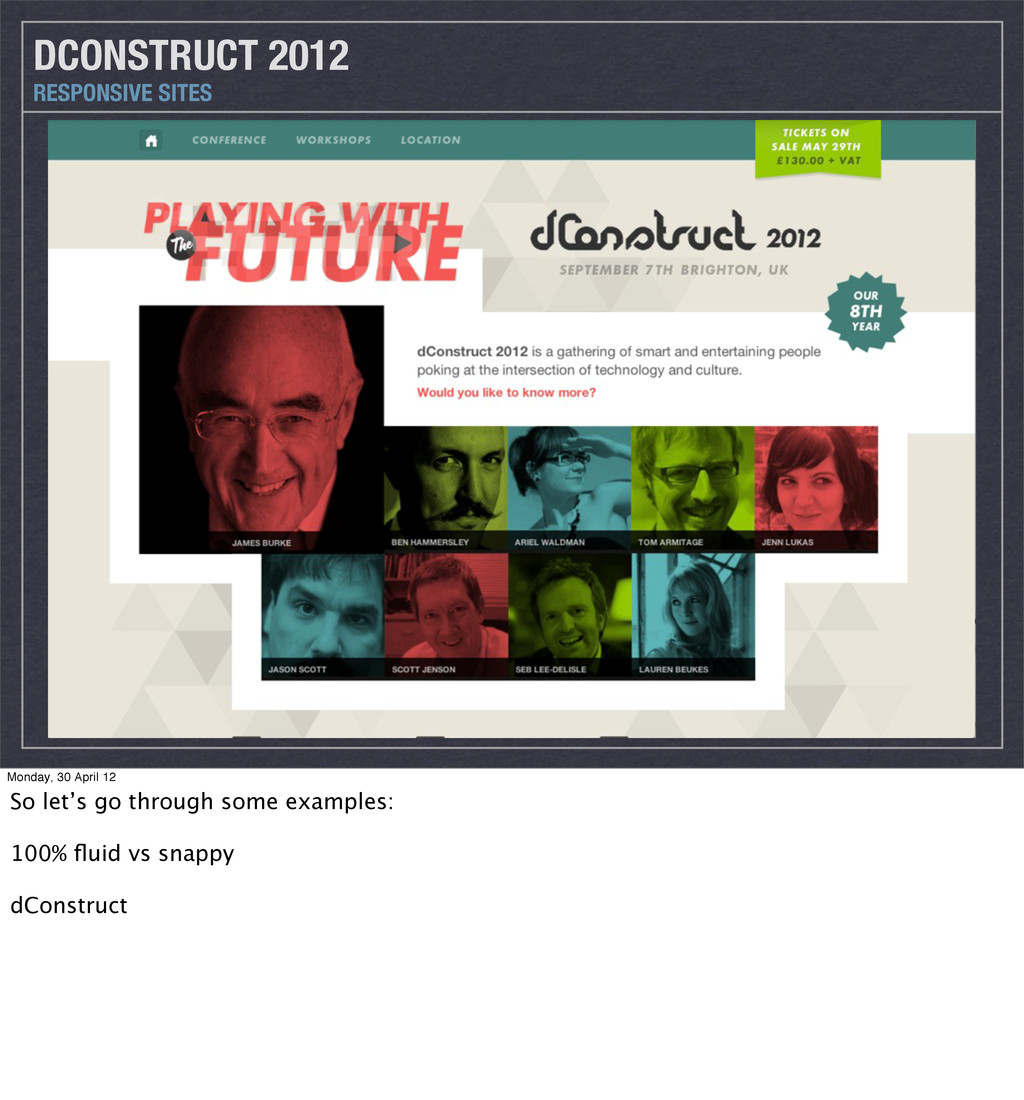
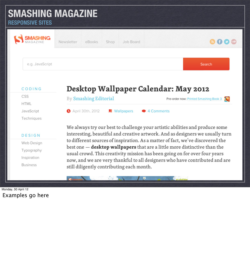
Monday, 30 April 12 BIGGEST CHALLENGE - finding the best way to design responsively How do you show how something scales in flat files? - not feasible for 5 designs
every designer, and how they prefer to work. Best RWD designs will come from those designers most willing to ‘let go’ of their designs - trust and collaborate the devs that are tasked with bringing them to life. - could learn some front end yourself (controversial) - know what’s possible Letting go is implicitly difficult - people (rightly) feel protective of their work
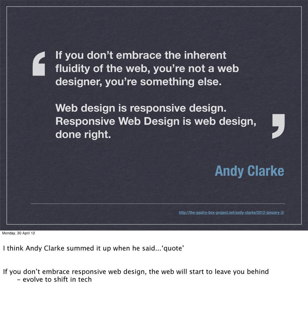
you’re not a web designer, you’re something else. Web design is responsive design. Responsive Web Design is web design, done right. Andy Clarke http://the-pastry-box-project.net/andy-clarke/2012-january-3/ Monday, 30 April 12 I think Andy Clarke summed it up when he said...‘quote’ If you don’t embrace responsive web design, the web will start to leave you behind - evolve to shift in tech
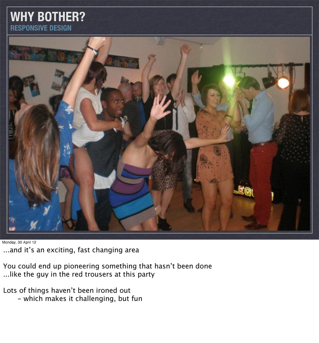
an exciting, fast changing area You could end up pioneering something that hasn’t been done ...like the guy in the red trousers at this party Lots of things haven’t been ironed out - which makes it challenging, but fun
 dragongraphics
 moco1013
 mhand01
 hiro93n
 terencebasart
 a2k
a2k
 abokadotyann
 hjmkth
 godlingkogami
 ranyfardiany
 ajstarks
 securecat
 caitiem20
 honzajavorek
 mza
mza
 uxyall
 michaelherold
 tapps
tapps
 nwiizo
.png) helenjbeal
helenjbeal
 deanohume
 marcelosomers
 tenderlove
 marketingsoph