Upgrade to Pro — share decks privately, control downloads, hide ads and more …

Non-traditional Layouts with CSS

Wendee
October 09, 2017

Non-traditional Layouts with CSS

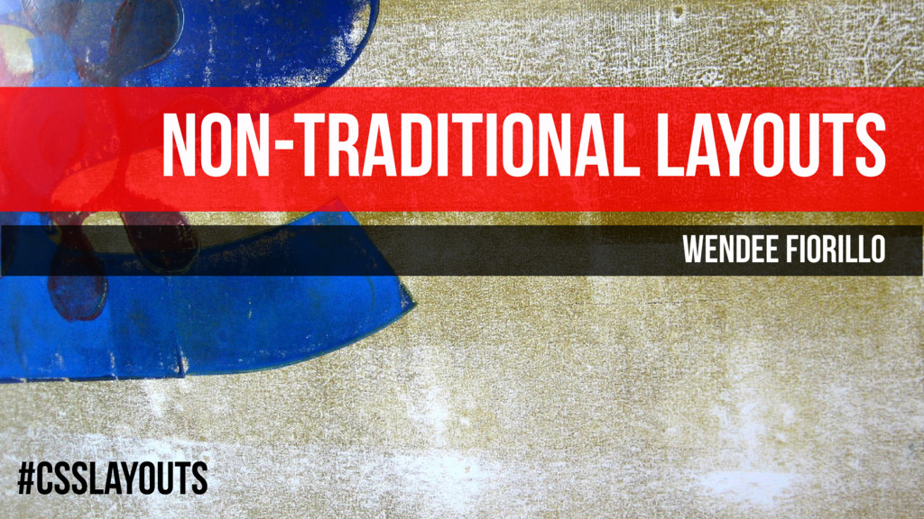
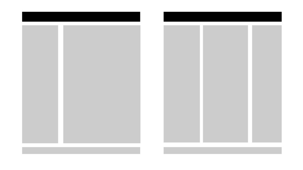
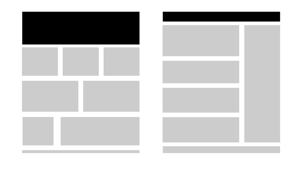
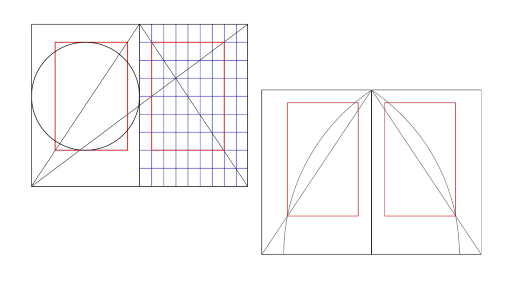
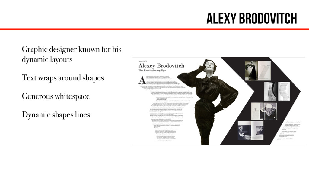
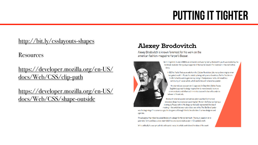
This session will share tips and techniques on how to bring the classic graphic design movements such as de Stijl, Bauhaus, Swiss International, and pop art to web design. We will break the traditional grid to create bold, dynamic layouts by drawing inspiration from great design icons such as Alexey Brodovitch, Herbert Bayer, Joseph Müller-Brockmann, Roy Lichtenstein and others.
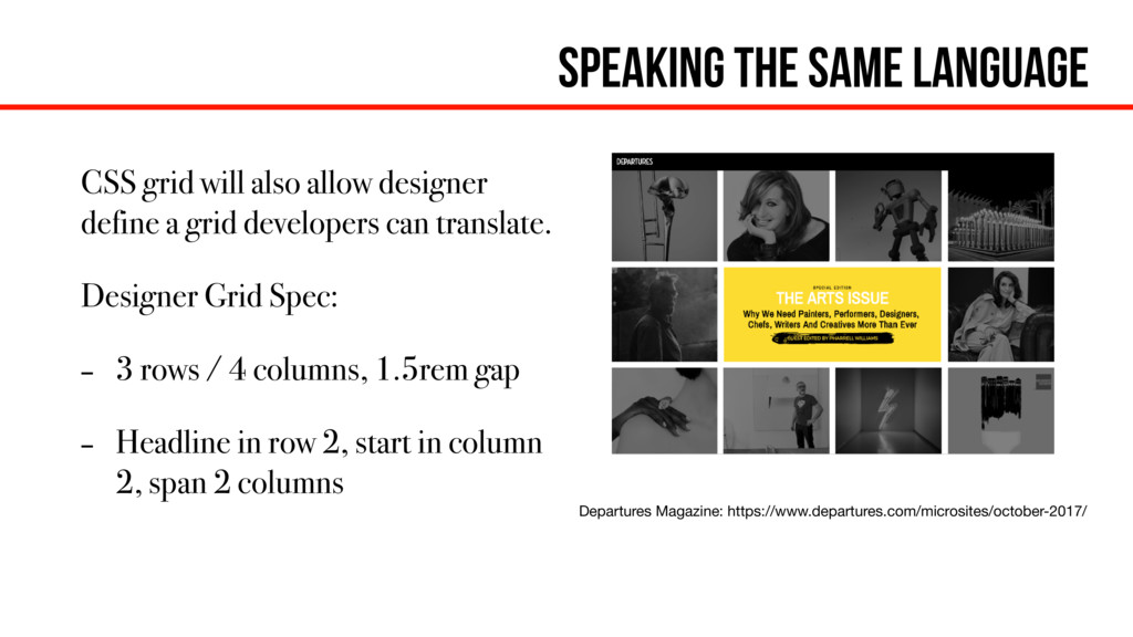
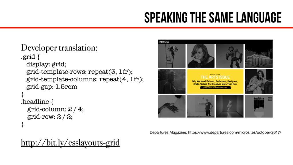
CodePen Collection:
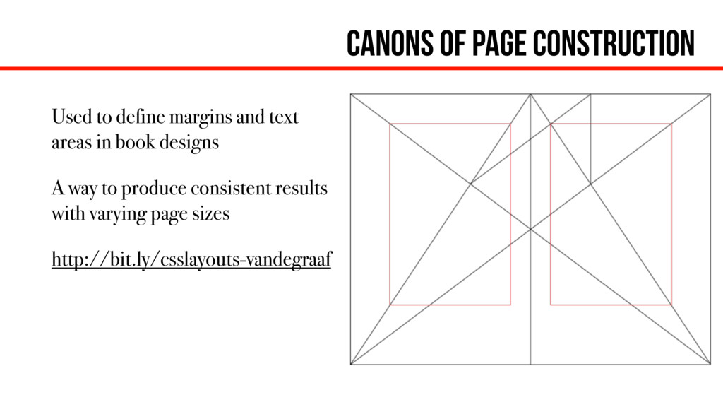
http://bit.ly/csslayouts-pens

Wendee

October 09, 2017
Tweet

Other Decks in Design

Transcript

  1. Key Takeaways Review of Design Elements and Composition Implementation Techniques

    The Approach and Workflow Process Provide Some Inspiration
  2. Different Drop cap Implementations Extra markup Pseudo class selector ::first-letter

    Pseudo class ::first-letter with initial-letter (Safari only) http://bit.ly/csslayouts-dropcap
  3. CSS ::first Letter w/ fallback @supports not (initial-letter: 6) {

    p::first-letter { display: block; float: left; margin: -.3em 0 -.2em 0; font-size: 8em; line-height: 1; } } @supports (-webkit-initial-letter: 6) { p::first-letter { -webkit-initial-letter: 6 5; initial-letter: 6 5; margin: 0; } }
  4. Canons of page construction Used to define margins and text

    areas in book designs A way to produce consistent results with varying page sizes http://bit.ly/csslayouts-vandegraaf
  5. Alexy Brodovitch Graphic designer known for his dynamic layouts Text

    wraps around shapes Generous whitespace Dynamic shapes lines
  6. Wrapping text Shape-outside: tells the text how to flow around

    a floated element. blockquote { Float: left; Border-radius: 50%; Shape-outside: circle(50%); } Note: Can also use images, gradients, and other values
  7. Creating shapes out of blocks Clip-path will let you crop

    an element to create a different shape. .crop-img { clip-path: polygon(75% 0%, 100% 50%, 75% 100%, 0% 100%, 25% 50%, 0% 0%); } Note: on an element w/ text, the text will get cropped off
  8. Grids for fun Two fun grid examples for implementation comparison

    http://bit.ly/csslayouts-flw http://labs.jensimmons.com/ 2017/01-011.html
  9. Css as art Recreation of Roy Lichtenstein’s Spray by Christina

    Gorton in CSS https://codepen.io/cgorton/ pen/jBZVWg
  10. Manipulating and mixing Blend-modes allow specify how an element blends

    with it’s parent element .text { Mix-blend-mode: multiply; } Filters allow you apply effects to element img { filter: sepia() }
  11. Bending Shadows Using text-shadow to create glowing text around a

    text knockout. http://bit.ly/csslayouts-shadows .knockout { background: url(image.png); -webkit-text-fill-color: transparent; -webkit-background-clip: text; }
  12. Bending Shadows Glowing and flickering neon text with a tex-shadow

    and animation http://bit.ly/csslayouts- shadows2
  13. Speaking the same language When designers and developers speak the

    same language, they can communicate effectively to reduce time, frustration, issues. It is helpful to write design specs based on the technology or medium used. Font shorthand is how a designer specified type to a typesetter. font: font-style font-variant font-weight font-size/line-height font-family; font: normal common-ligatures 300 1.2rem/1.3 serif;
  14. Speaking the same language CSS grid will also allow designer

    define a grid developers can translate. Designer Grid Spec: - 3 rows / 4 columns, 1.5rem gap - Headline in row 2, start in column 2, span 2 columns Departures Magazine: https://www.departures.com/microsites/october-2017/
  15. Speaking the same language Developer translation: .grid { display: grid;

    grid-template-rows: repeat(3, 1fr); grid-template-columns: repeat(4, 1fr); grid-gap: 1.5rem } .headline { grid-column: 2 / 4; grid-row: 2 / 2; } http://bit.ly/csslayouts-grid Departures Magazine: https://www.departures.com/microsites/october-2017/