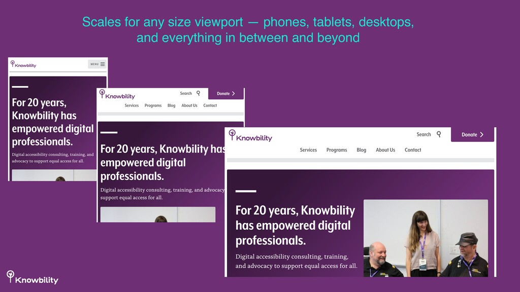
the same on a phone as they do on a tablet or desktop computer • Access to information and resources is as easy for phone users as it is for desktop users
(and hopefully look) great on devices that rely on mobile networks • Often includes design specific for the mobile experience • Should be a fast-loading site • Should also be secure https://developers.google.com/speed/pagespeed/insights/
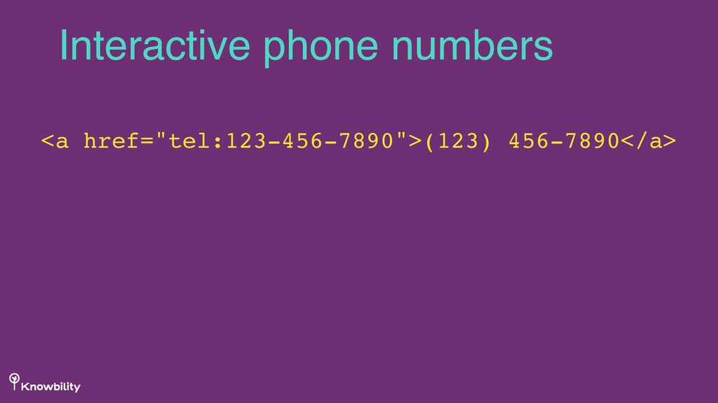
need to zoom* • Links are easy to select on touchscreens • Navigation is easy for visitors on phones, who may need to find information quickly • Information most important to mobile users is more prominent on tablets and phones • Phone numbers are linked to trigger call functionality • Notify users of download file sizes More than scaling, though
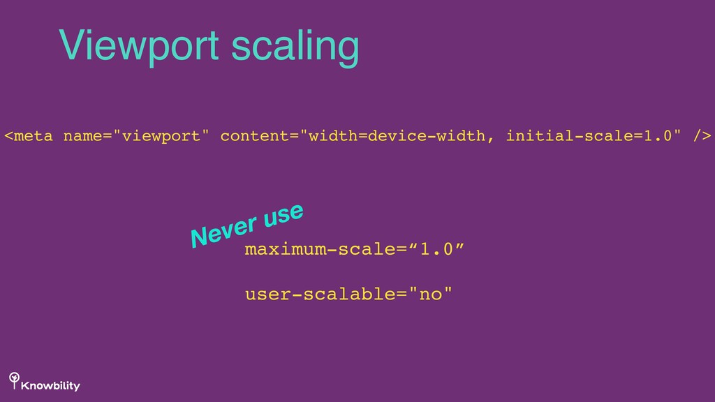
visitors the ability to zoom * On zooming When users resize text (zoom), many modern browsers trigger the RWD/mobile view for your site. So the choices you make for mobile users, can also impact visitors with low vision! Fun a11y fact!
— sometimes the views in-between, too • Considers what mobile users need and what should be prominent for mobile access? • Optimizes and compresses media for smallest file sizes and dimensions possible In an ideal world, mobile-first
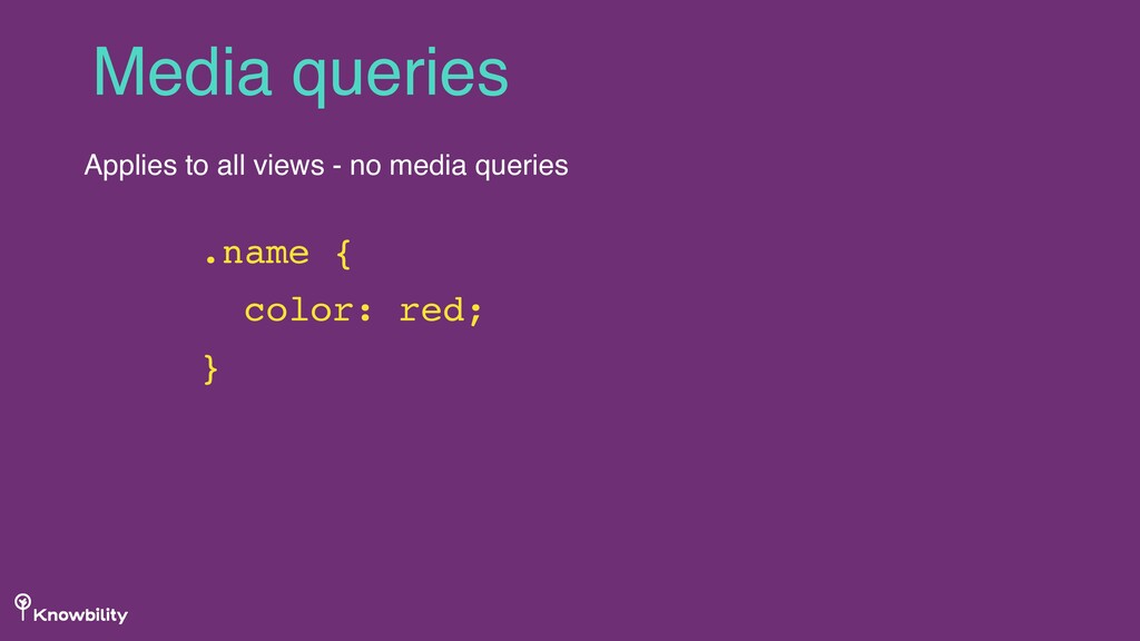
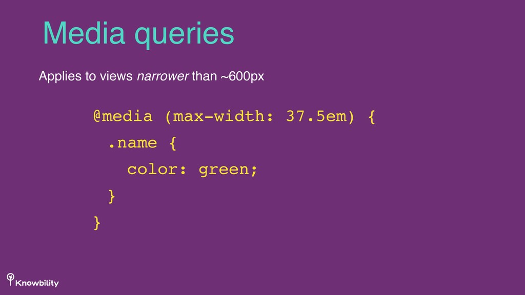
of reference, but allows for flexibility based on code and accessibility needs, as well as browser nuance • CSS starts with the mobile view and adds media queries to adjust as view gets wider: @media (max-width: 450px) • Lean, semantic HTML — only what you need • Client-side caching, compression and optimization In an ideal world, mobile-first
and avoids adding generated code from the back-end. • Optimizes all system queries for fast server responses • Adds caching to speed output • Builds systems to help content authors avoid uploading files that are too large In an ideal world, mobile-first
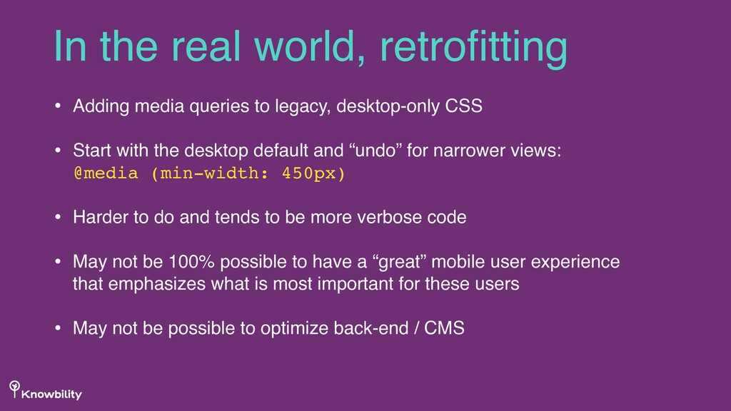
with the desktop default and “undo” for narrower views: @media (min-width: 450px) • Harder to do and tends to be more verbose code • May not be 100% possible to have a “great” mobile user experience that emphasizes what is most important for these users • May not be possible to optimize back-end / CMS In the real world, retrofitting
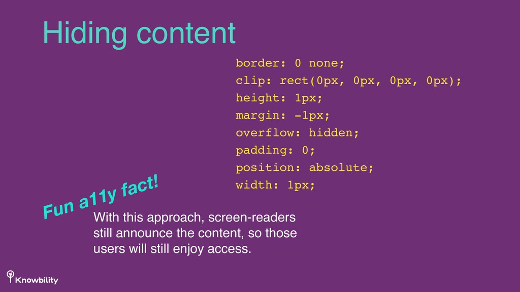
height: 1px; margin: -1px; overflow: hidden; padding: 0; position: absolute; width: 1px; With this approach, screen-readers still announce the content, so those users will still enjoy access. Fun a11y fact!
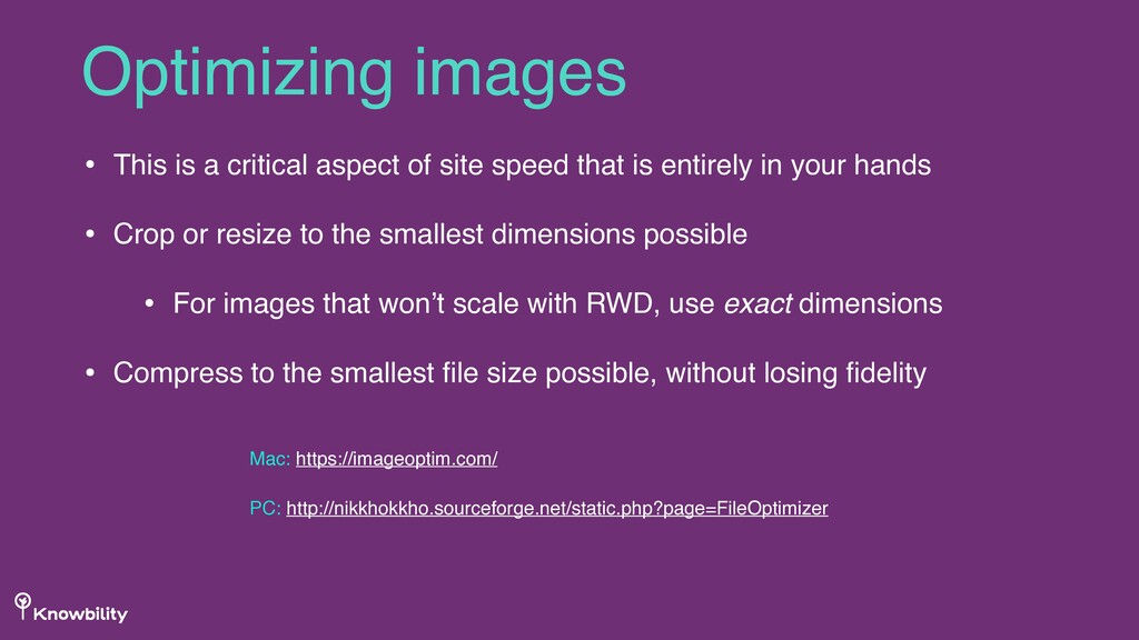
is entirely in your hands • Crop or resize to the smallest dimensions possible • For images that won’t scale with RWD, use exact dimensions • Compress to the smallest file size possible, without losing fidelity Optimizing images Mac: https://imageoptim.com/ PC: http://nikkhokkho.sourceforge.net/static.php?page=FileOptimizer
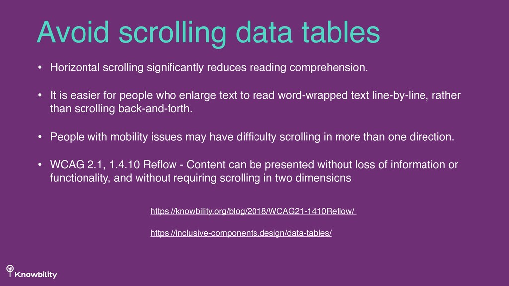
easier for people who enlarge text to read word-wrapped text line-by-line, rather than scrolling back-and-forth. • People with mobility issues may have difficulty scrolling in more than one direction. • WCAG 2.1, 1.4.10 Reflow - Content can be presented without loss of information or functionality, and without requiring scrolling in two dimensions Avoid scrolling data tables https://knowbility.org/blog/2018/WCAG21-1410Reflow/ https://inclusive-components.design/data-tables/
 emilylewis
 fossamagna
 kitano_yuichi
 sansantech
 yukiogawa
 yuksew
 lycorptech_jp
 rakus_dev
 kawauso
 kamoshika
 yama3133
 amanda_hinchman
 yoshimi0227
 keavy
keavy
 techseoconnect
 tammielis
 panda_program
 tammyeverts
 inesmontani
 honzajavorek
 chriscoyier
 tomoyanonymous
 davidcarrasco
 cassininazir
 sferik
![Questions? [email protected] @emilylewis](https://files.speakerdeck.com/presentations/bb2a82648da1496da676de1afdf80bd9/slide_35.jpg)