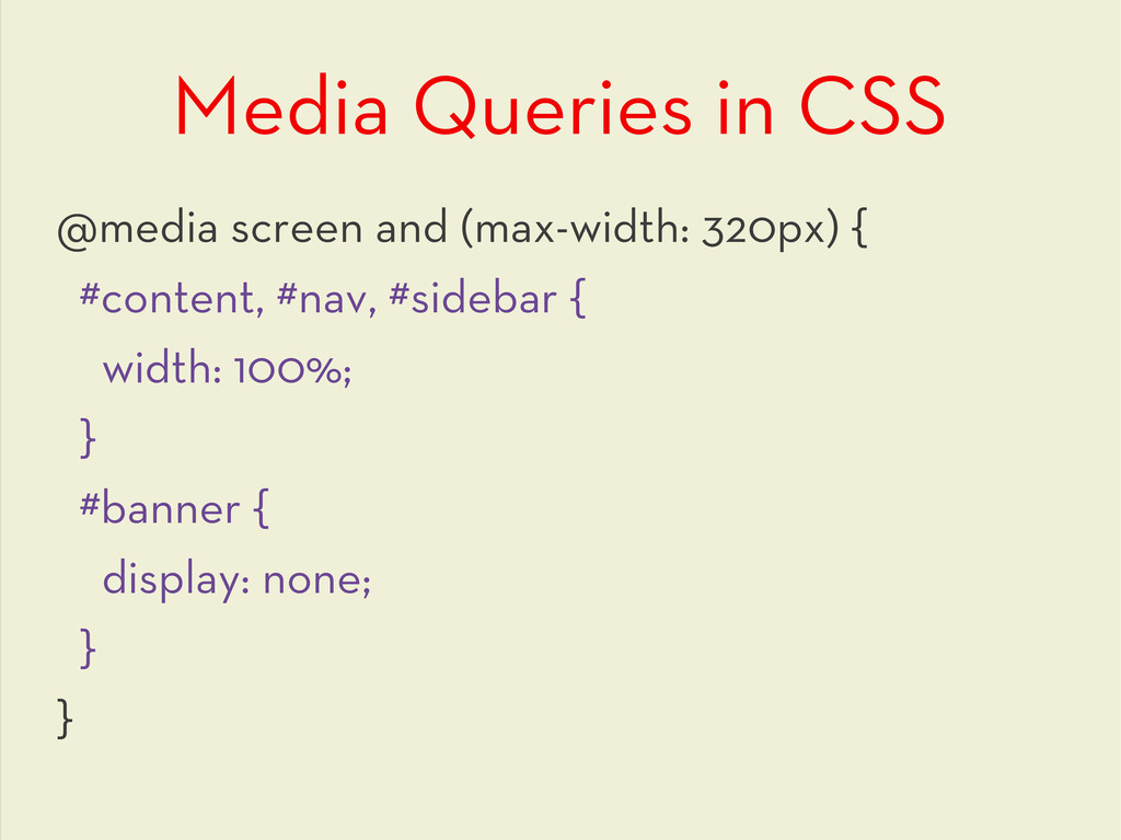
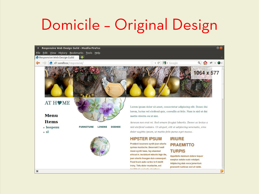
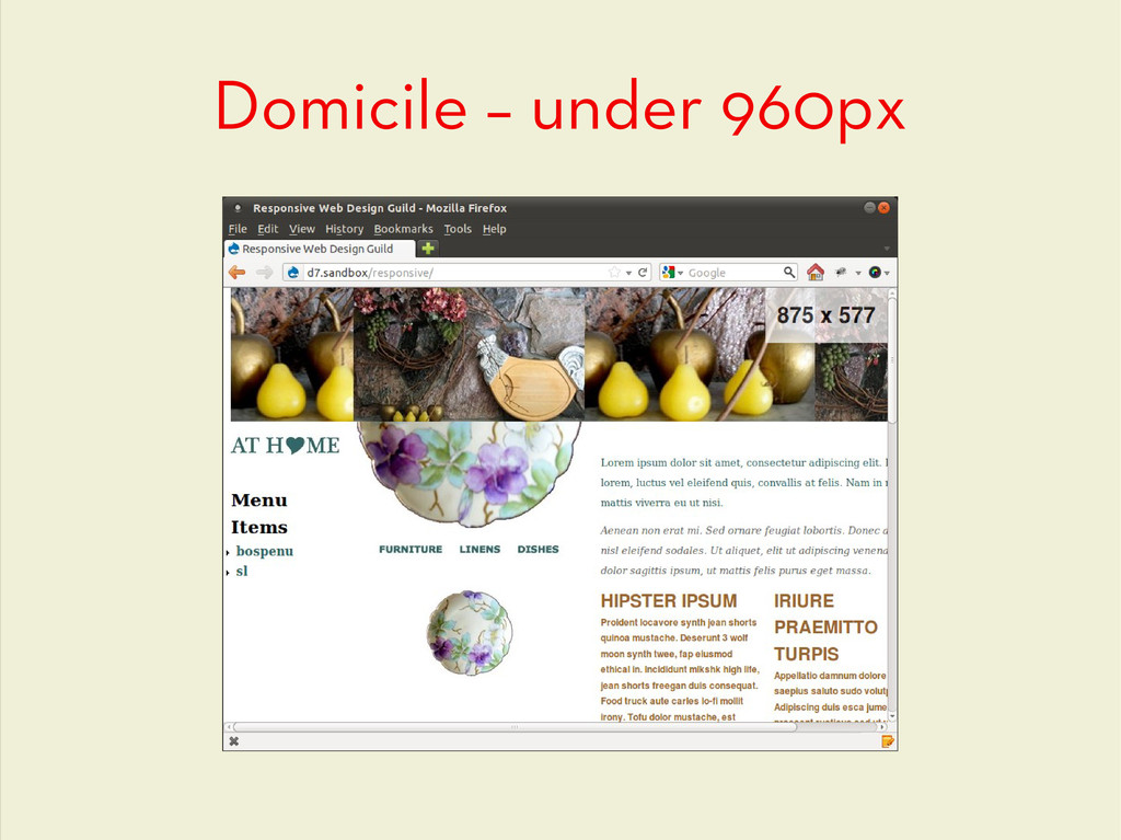
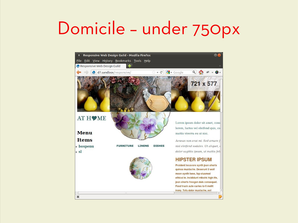
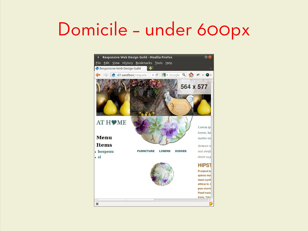
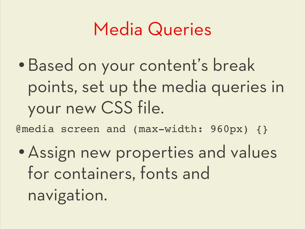
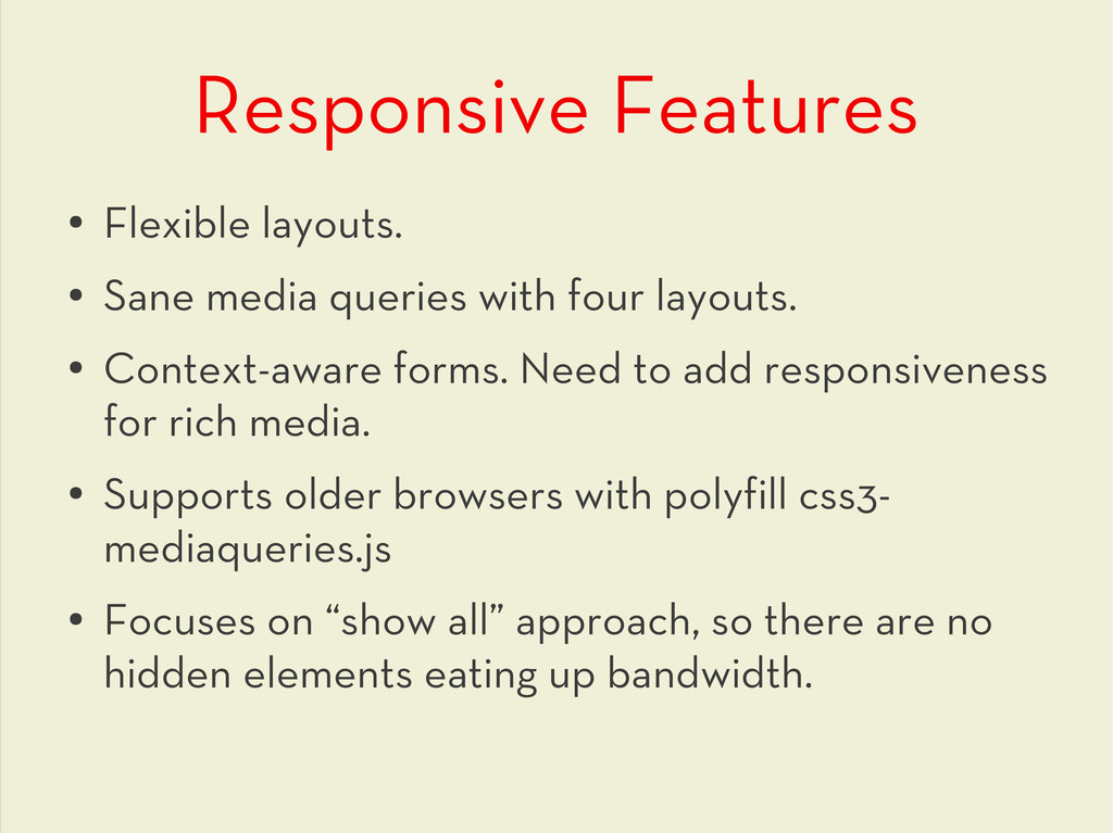
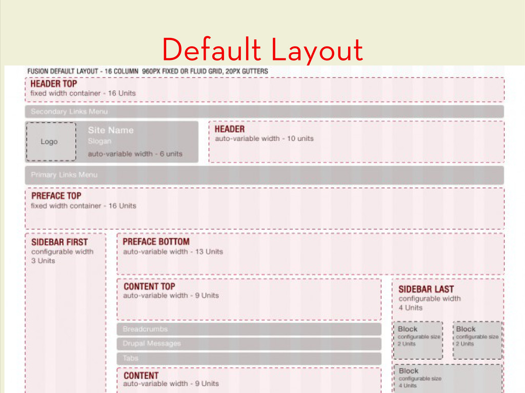
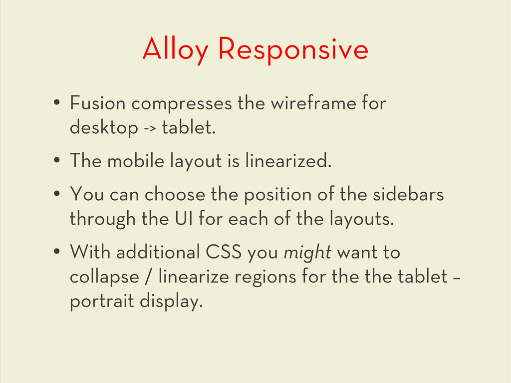
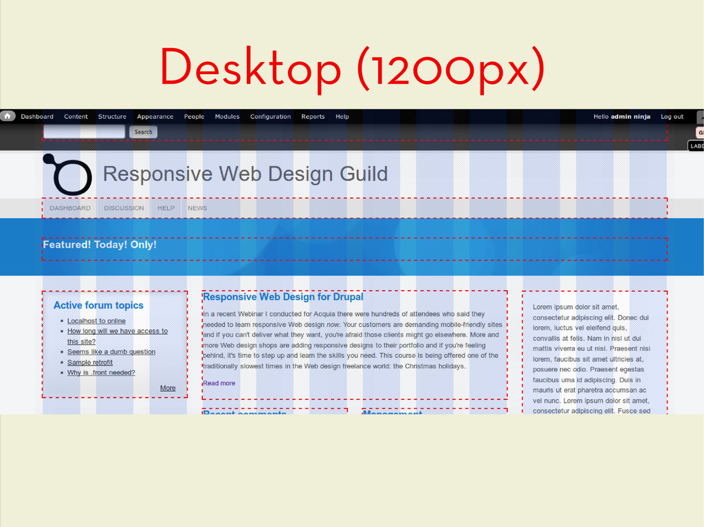
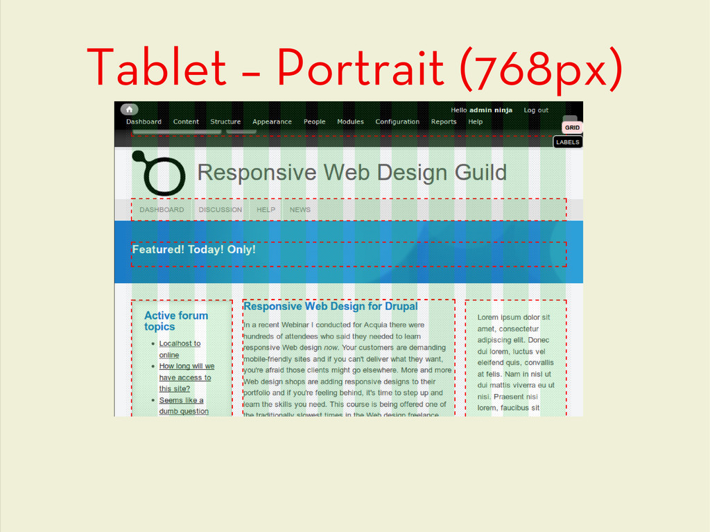
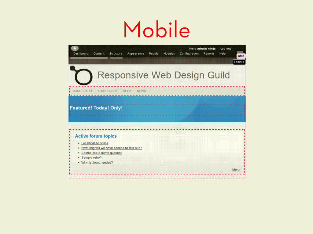
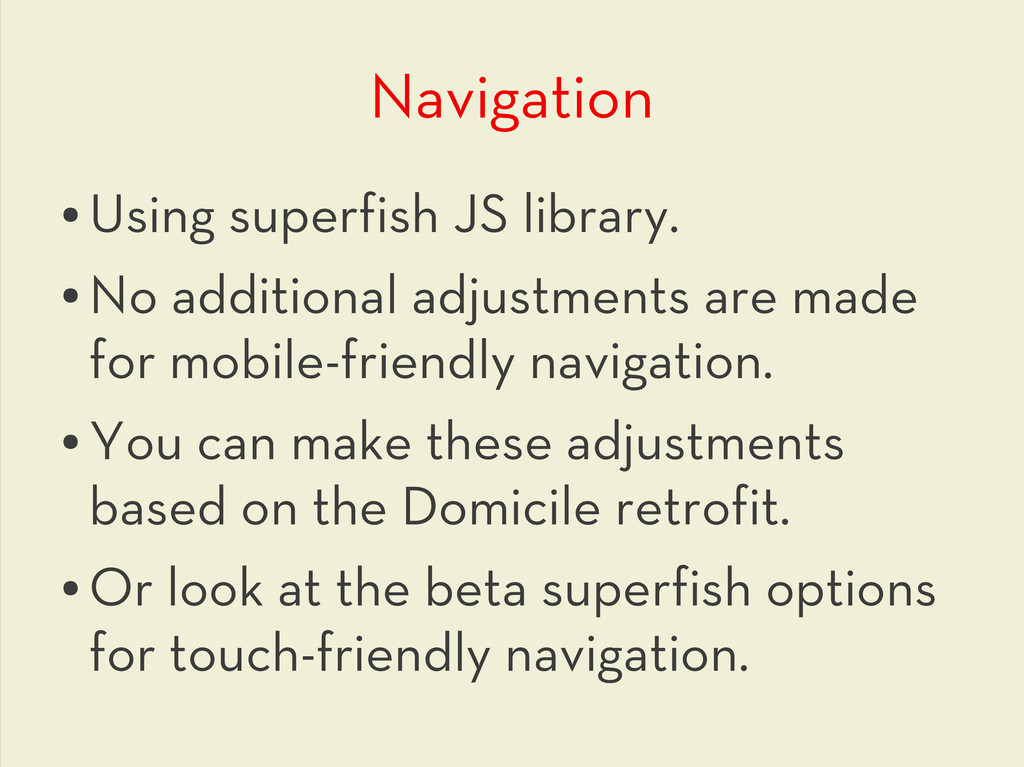
only screen and (max-device-width: 1024px) and (orientation:landscape), only screen and (min-width:960px) and (max- width:1199px) and (min-device-width: 1100px) • Tablet (portrait) only screen and (max-device-width: 1024px) and (orientation:portrait), only screen and (min-width:768px) and (max-width:959px) and (min-device-width: 1100px) • Mobile only screen and (max-width:759px) • These can all be easily adjusted in the UI.
 emmajane
 hirodragon112
 zzzzico
 mimifuwacc
 shift_evolve
 naitosatoshi
 oracle4engineer
 gappy50
 dmnlk
dmnlk
 ryoaccount
 yama3133
 katoaz
 aleyda
 michaelherold
 akashhashmi
 csswizardry
 rkendrick25
 ks91
ks91
 tammyeverts
 keavy
keavy
 sarafernandez
 wjessup
 takai
takai
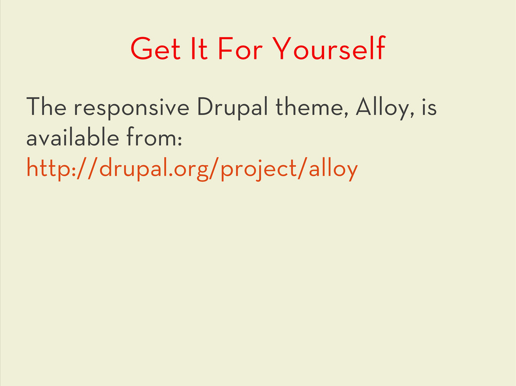
![Responsive Web Design for Drupal www.responsivewebdesignguild.com @emmajanedotnet [email protected]](https://files.speakerdeck.com/presentations/4fac095e6bbc6a002202998f/slide_0.jpg)
![Give Aways! www.responsivewebdesignguild.com @emmajanedotnet [email protected]](https://files.speakerdeck.com/presentations/4fac095e6bbc6a002202998f/slide_64.jpg)