Upgrade to Pro
— share decks privately, control downloads, hide ads and more …
Speaker Deck
Features
Speaker Deck
PRO
Sign in
Sign up for free
Search
Search
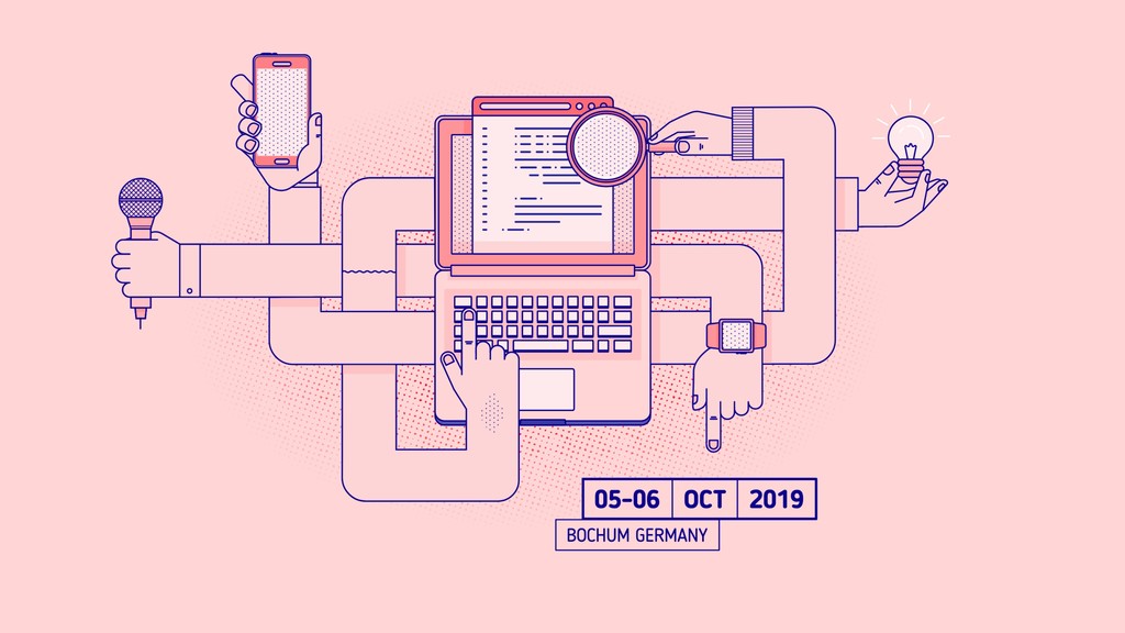
Size does matter - Responsive Design in 2019
Search
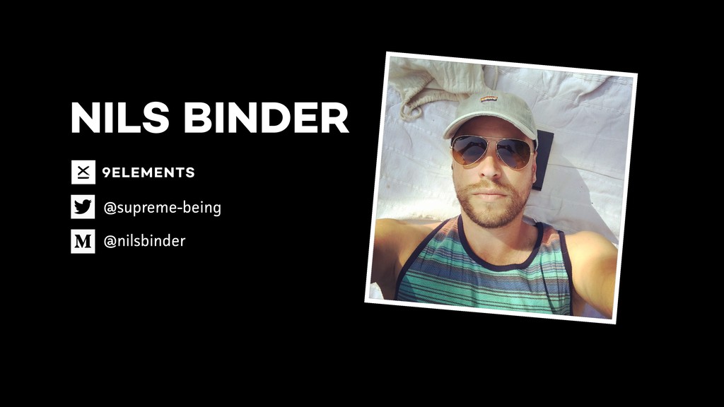
Nils
March 27, 2019
Technology
0
72
Size does matter - Responsive Design in 2019
Nils
March 27, 2019
Tweet
Share
More Decks by Nils
See All by Nils
Unwrapping Web Design | WW-Ruhr 2023
enbee81
0
110
History of Art vs. Web Design vs CSS Development
enbee81
1
120
How Studying History Of Arts Helped Me Become A Better Frontend Designer
enbee81
0
79
Variable Units
enbee81
0
73
History of Art and modern CSS
enbee81
0
270
Size does matter - Responsive Design in 2019 - V2
enbee81
0
180
Other Decks in Technology
See All in Technology
形式手法特論:SMT ソルバで解く認可ポリシの静的解析 #kernelvm / Kernel VM Study Tsukuba No3
ytaka23
1
790
Blue/Green Deployment を用いた PostgreSQL のメジャーバージョンアップ
kkato1
0
130
ThetaOS - A Mythical Machine comes Alive
aslander
0
170
イベントで大活躍する電子ペーパー名札を作る(その2) 〜 M5PaperとM5PaperS3 〜 / IoTLT @ JLCPCB オープンハードカンファレンス
you
PRO
0
200
AI時代のIssue駆動開発のススメ
moongift
PRO
0
230
Phase07_実務適用
overflowinc
0
1.8k
Agent Skill 是什麼?對軟體產業帶來的變化
appleboy
0
230
Phase01_AI座学_基礎
overflowinc
0
3.9k
データマネジメント戦略Night - 4社のリアルを語る会
ktatsuya
1
230
DMBOKを使ってレバレジーズのデータマネジメントを評価した
leveragestech
0
260
Why we keep our community?
kawaguti
PRO
0
220
Phase08_クイックウィン実装
overflowinc
0
1.7k
Featured
See All Featured
BBQ
matthewcrist
89
10k
Making Projects Easy
brettharned
120
6.6k
How Software Deployment tools have changed in the past 20 years
geshan
0
33k
Noah Learner - AI + Me: how we built a GSC Bulk Export data pipeline
techseoconnect
PRO
0
150
AI in Enterprises - Java and Open Source to the Rescue
ivargrimstad
0
1.2k
Abbi's Birthday
coloredviolet
2
5.6k
Exploring the relationship between traditional SERPs and Gen AI search
raygrieselhuber
PRO
2
3.7k
svc-hook: hooking system calls on ARM64 by binary rewriting
retrage
2
180
What the history of the web can teach us about the future of AI
inesmontani
PRO
1
490
<Decoding/> the Language of Devs - We Love SEO 2024
nikkihalliwell
1
160
Building a Scalable Design System with Sketch
lauravandoore
463
34k
How to Talk to Developers About Accessibility
jct
2
160
Transcript
SIZE DOES MATTER… …Responsive Design in 2019
NILS BINDER @supreme-being @nilsbinder
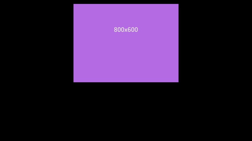
800x600
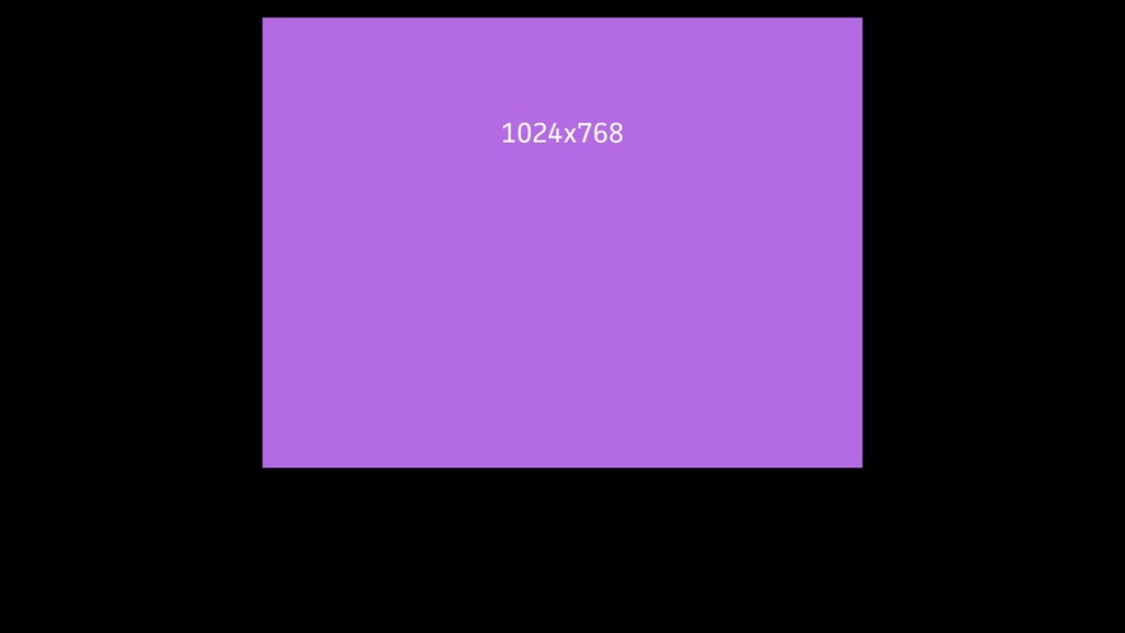
1024x768
1280x1024 1024
1280x1024 1200
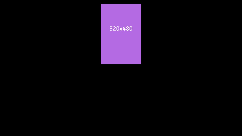
320x480
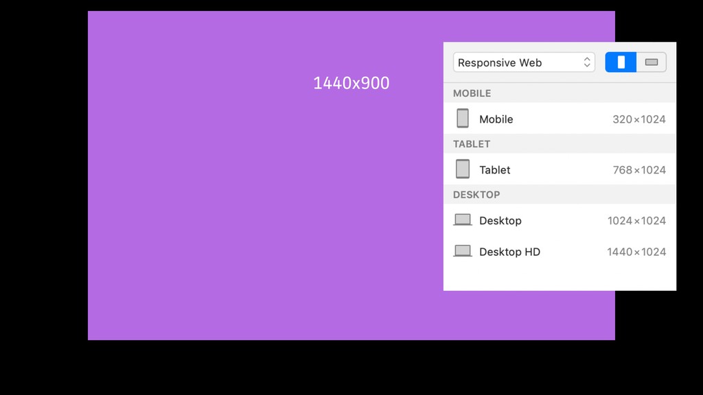
1440x900
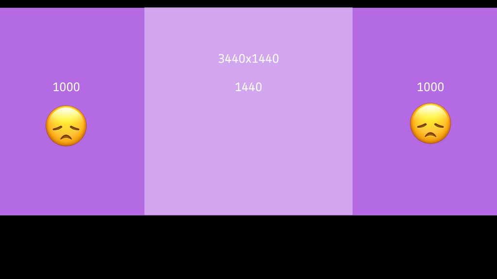
3440x1440 1000 1000 1440
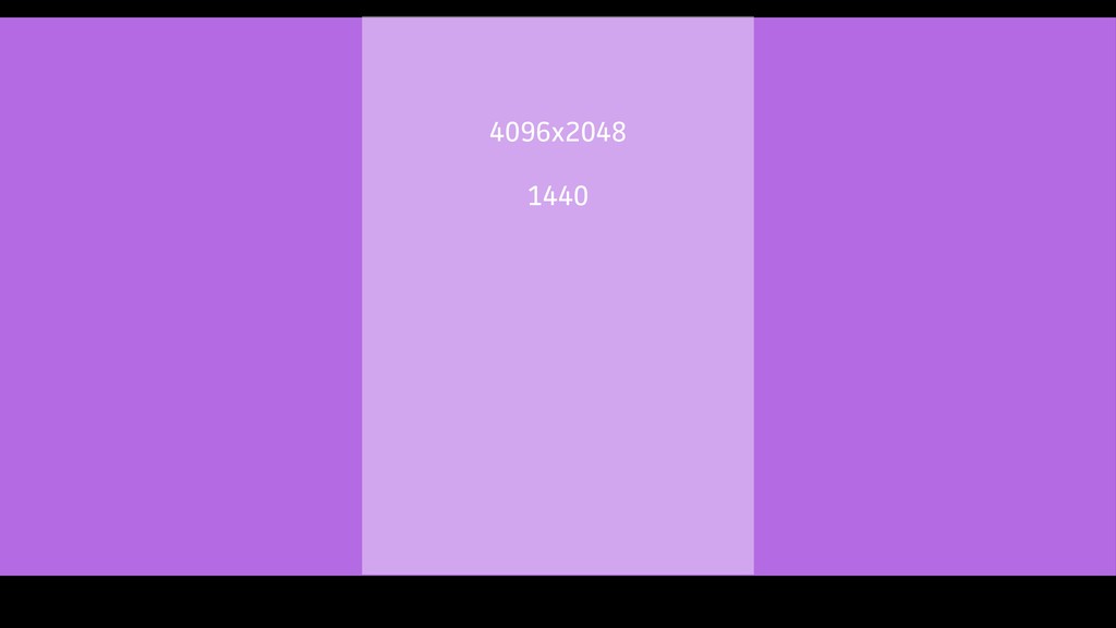
4096x2048 1440
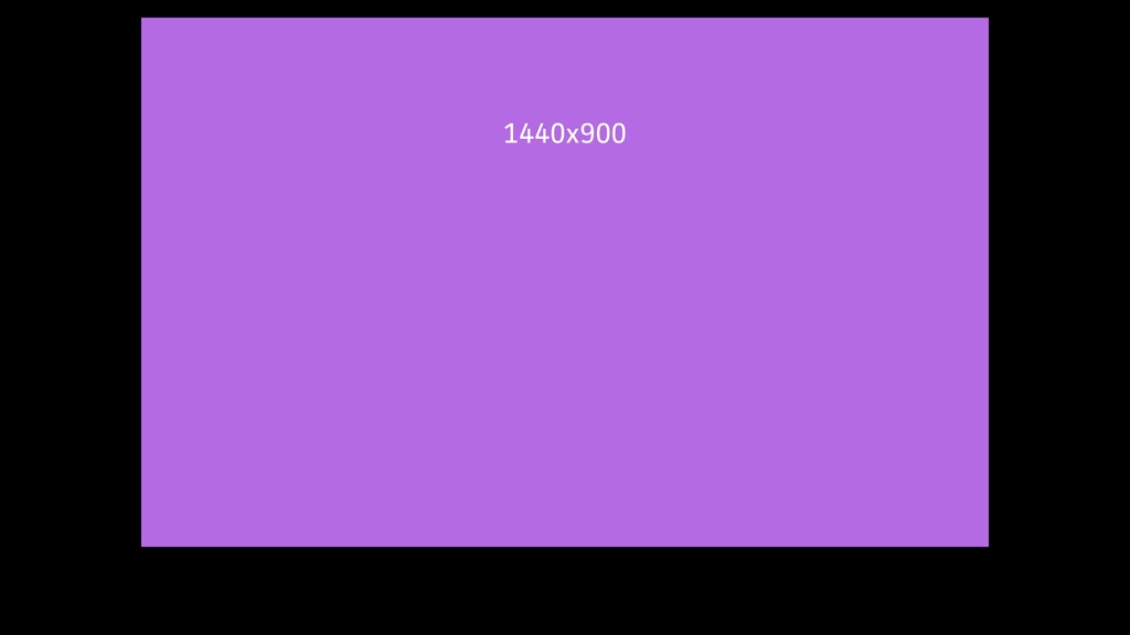
1440x900
None
None
None
None
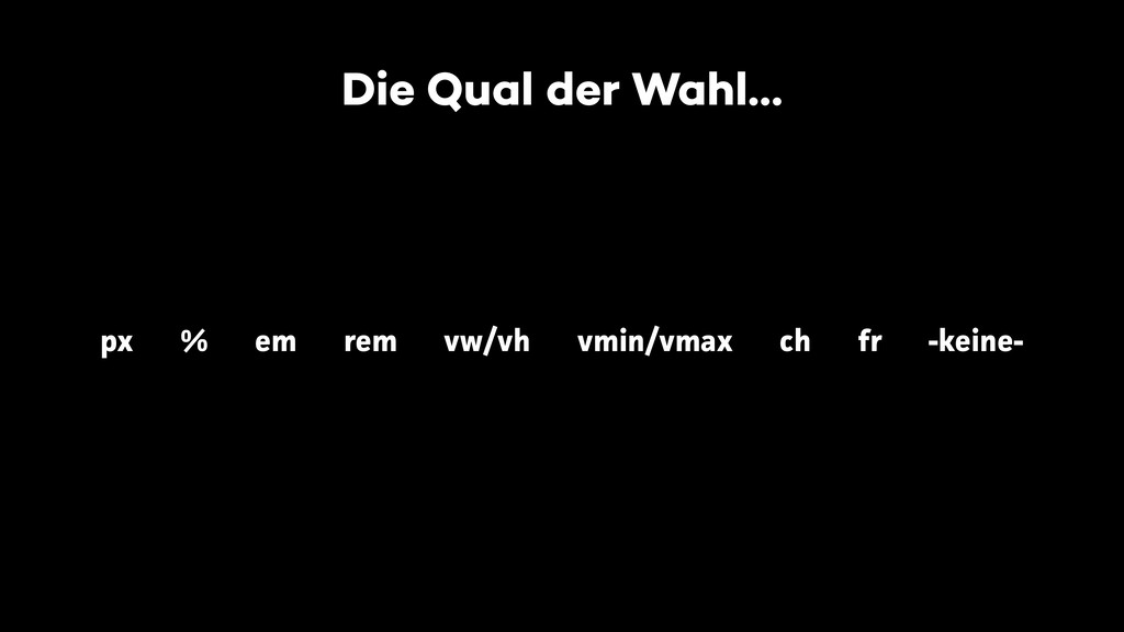
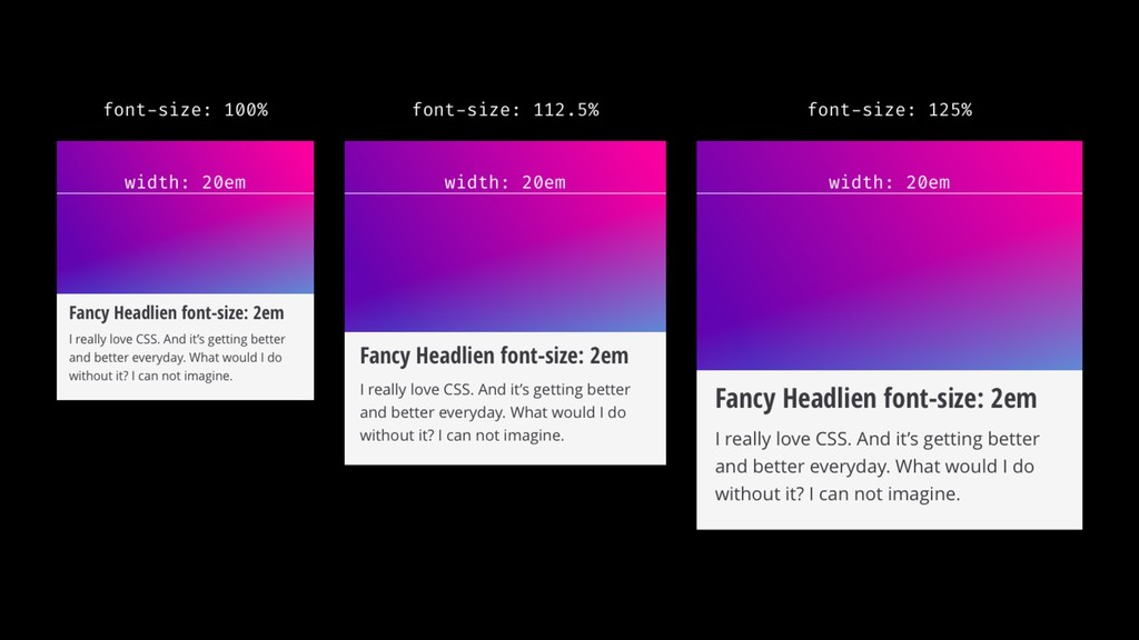
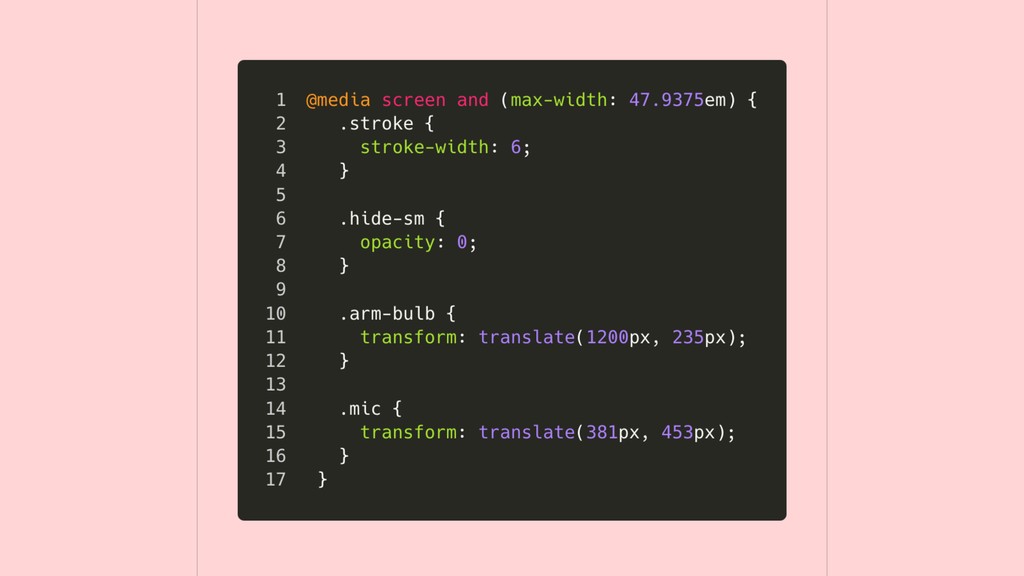
Die Qual der Wahl… px % em rem vw/vh vmin/vmax
ch fr -keine-
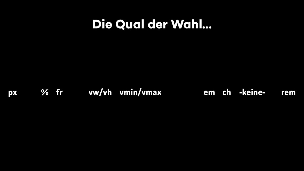
Die Qual der Wahl… px rem vw/vh vmin/vmax % fr
em ch -keine-
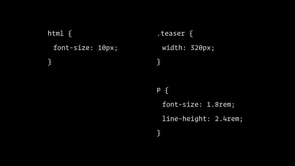
html { font-size: 10px; } .teaser { width: 320px; }
P { font-size: 1.8rem; line-height: 2.4rem; }
None
html { font-size: 10px; } .teaser { width: 320px; }
P { font-size: 1.8rem; line-height: 2.4rem; }
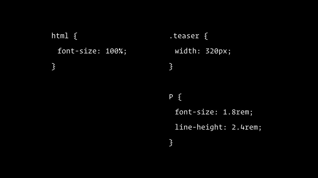
html { font-size: 100%; } .teaser { width: 320px; }
P { font-size: 1.8rem; line-height: 2.4rem; }
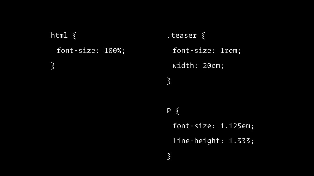
html { font-size: 100%; } .teaser { font-size: 1rem; width:
20em; } P { font-size: 1.8rem; line-height: 2.4rem; }
html { font-size: 100%; } .teaser { font-size: 1rem; width:
20em; } P { font-size: 1.125em; line-height: 1.333; }
None
None
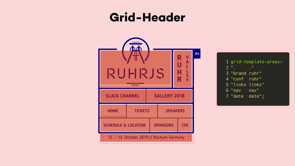
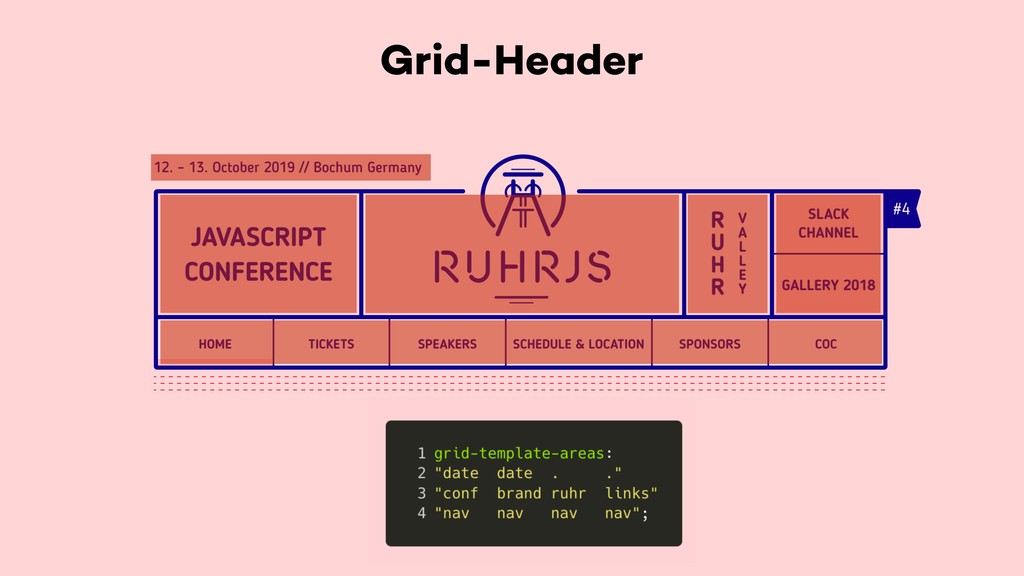
Grid-Header
Grid-Header
Grid-Header
None
None
None
None
None
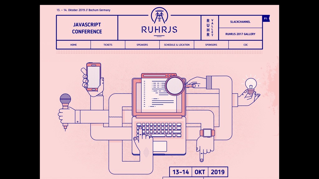
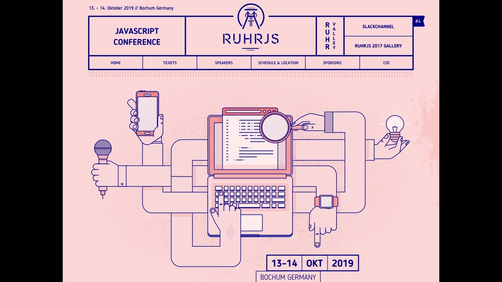
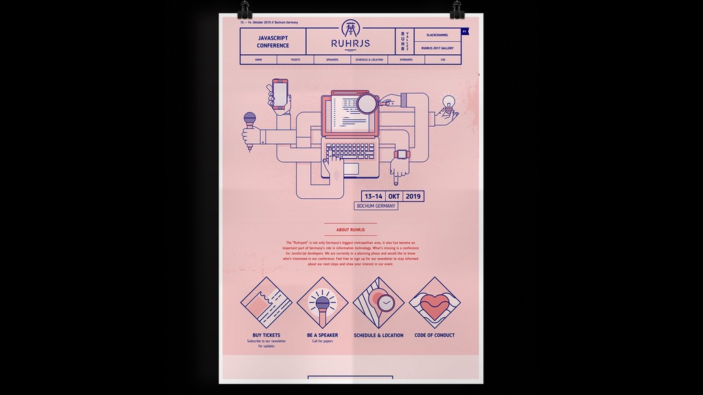
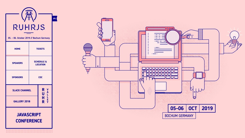
Visit https://ruhrjs.de
None
 enbee81
 ytaka23
 kkato1
 aslander
 you
you
 moongift
 overflowinc
 appleboy
.jpg) ktatsuya
ktatsuya
 leveragestech
 kawaguti
 matthewcrist
 brettharned
 geshan
 techseoconnect
 ivargrimstad
 coloredviolet
 raygrieselhuber
 retrage
 inesmontani
 nikkihalliwell
 lauravandoore
 jct
jct