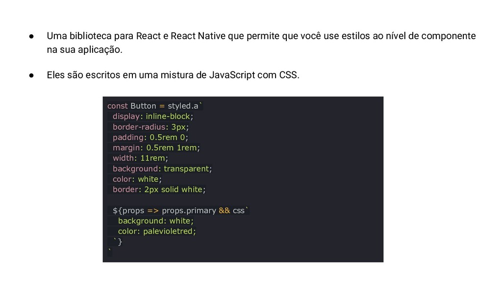
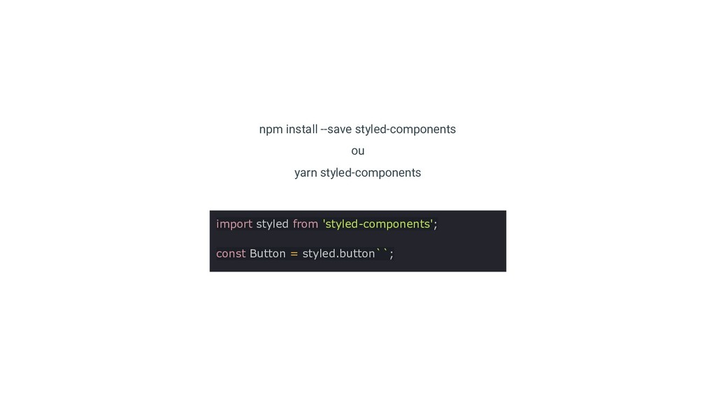
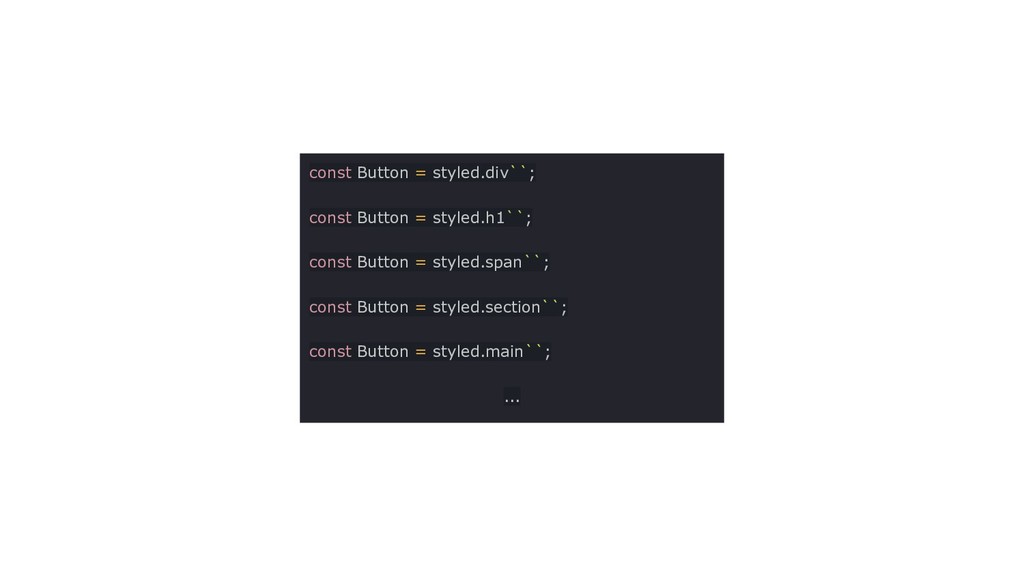
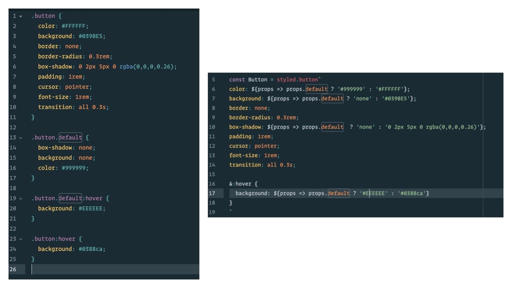
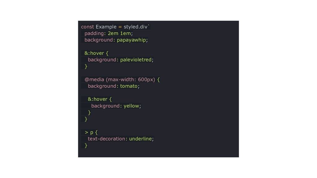
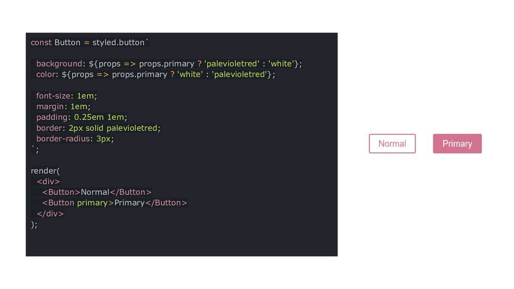
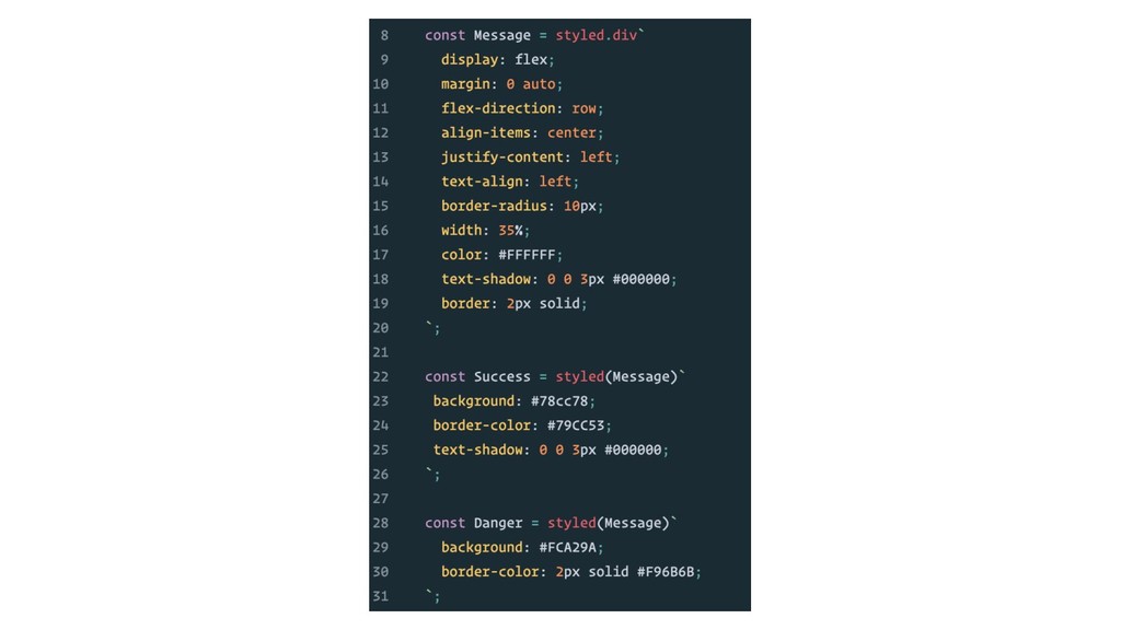
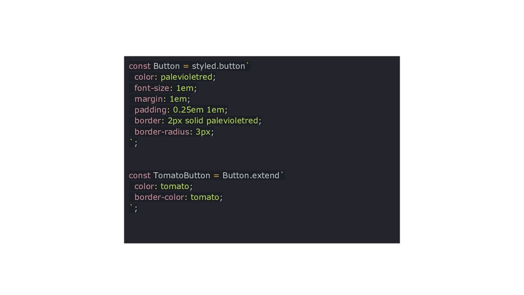
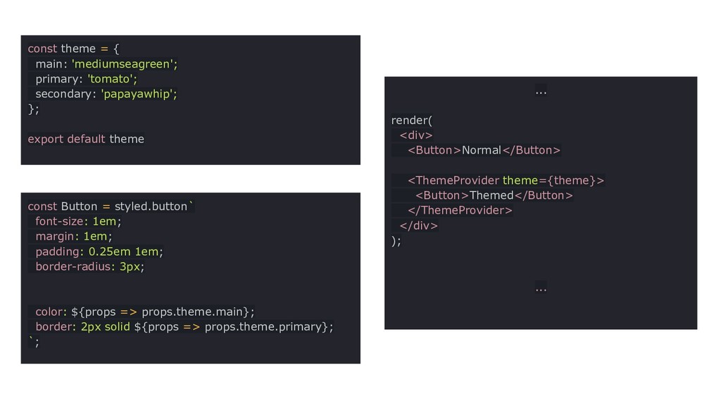
que você use estilos ao nível de componente na sua aplicação. • Eles são escritos em uma mistura de JavaScript com CSS. const Button = styled.a` display: inline-block; border-radius: 3px; padding: 0.5rem 0; margin: 0.5rem 1rem; width: 11rem; background: transparent; color: white; border: 2px solid white; ${props => props.primary && css` background: white; color: palevioletred; `} `
 evertondenis
 nwiizo
 nagisa53
 overflowinc
 aws_shota
 aslander
 g0xu
g0xu
 qa
qa
 sgash708
 asumikam
 blue_goheimochi
 ks91
ks91
 inesmontani
 portentint
 eileencodes
 aleyda
 scottboms
 brettharned
 techseoconnect
 katiecoart
 danielanewman