Upgrade to Pro — share decks privately, control downloads, hide ads and more …

Cleaner, scalable views with object oriented components

Cleaner, scalable views with object oriented components

Keep your Ruby on Rails views under control when growing your platform. Here is what we learned after four years of using the action_widget gem.

Christian Bäuerlein

January 24, 2017
Tweet

More Decks by Christian Bäuerlein

Other Decks in Technology

Transcript

  1. When using markup, the representation is the implementation. When is

    it "just markup", when does it become "code duplication"?
  2. Yes, it's just HTML and CSS, but: Components are often

    very complicated to configure. How many possible variants does a button in your UI have?
  3. OUR SOLUTION: ACTION WIDGET! ActionWidget provides a lightweight and consistent

    way to define interface components for Ruby on Rails applications. https://github.com/t6d/action_widget
  4. A SIMPLE EXAMPLE We want to create the following link

    button: <a class="btn btn-small" href="/login">Login</a>
  5. class ButtonWidget < ActionWidget::Base property :caption, converts: :to_s, required: true

    property :target, converts: :to_s, accepts: lambda { |uri| URI.parse(uri) rescue false }, required: true property :size, converts: :to_sym, accepts: [:small, :medium, :large], default: :medium def render content_tag(:a, caption, href: target, class: css_classes) end protected def css_classes css_classes = ['btn'] css_classes << "btn-#{size}" unless size == :medium css_classes end end
  6. # calling the class directly (self is an instance of

    ActionView) <%= ButtonWidget.new(self, caption: 'Login', size: :small, target: '/login').render %> # using the convenience helper <%= button_widget caption: 'Login', size: :small, target: '/login' %> # output <a class="btn btn-small" href="/login">Login</a>
  7. Passing blocks class PanelWidget < ActionWidget::Base property :title, required: true,

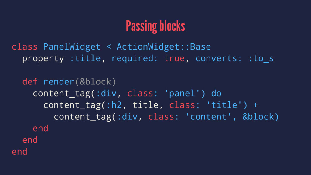
    converts: :to_s def render(&block) content_tag(:div, class: 'panel') do content_tag(:h2, title, class: 'title') + content_tag(:div, class: 'content', &block) end end end
  8. <%= panel_widget title: "Important Notice" do %> The system will

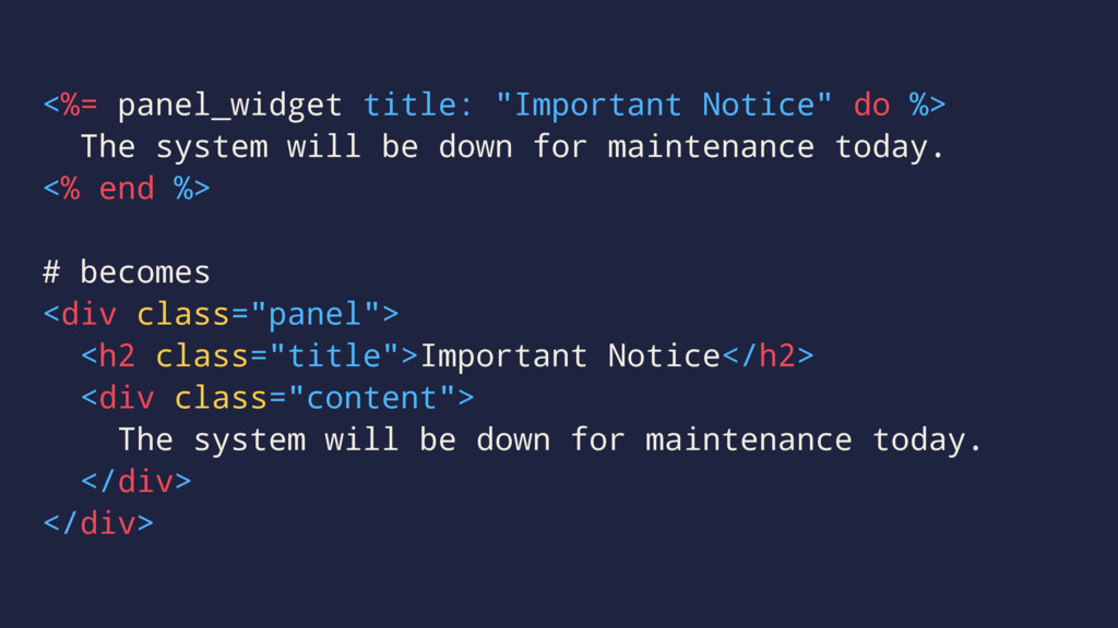
    be down for maintenance today. <% end %> # becomes <div class="panel"> <h2 class="title">Important Notice</h2> <div class="content"> The system will be down for maintenance today. </div> </div>
  9. Nested Widgets <%= menu_widget do |m| %> <%= m.item "Dashboard",

    "/" %> <%= m.submenu "Admin" do |m| %> <%= m.item "Manage Users", "/admin/users" %> <%= m.item "Manage Groups", "/admin/groups" %> <% end %> <% end %>
  10. Input validation class ButtonWidget < ActionWidget::Base property :caption, converts: :to_s,

    required: true property :target, converts: :to_s, accepts: lambda { |uri| URI.parse(uri) rescue false }, required: true property :size, converts: :to_sym, accepts: [:small, :medium, :large], default: :medium def render content_tag(:a, caption, href: target, class: css_classes) end protected def css_classes css_classes = ['btn'] css_classes << "btn-#{size}" unless size == :medium css_classes end end
  11. Unit Testing describe 'WidgetHelper#button_widget', type: :helper do subject do helper.button_widget(target:

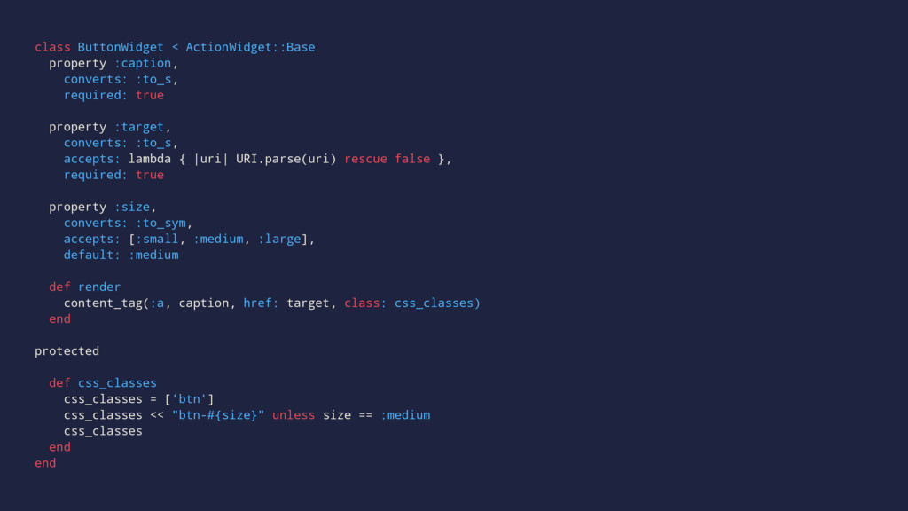
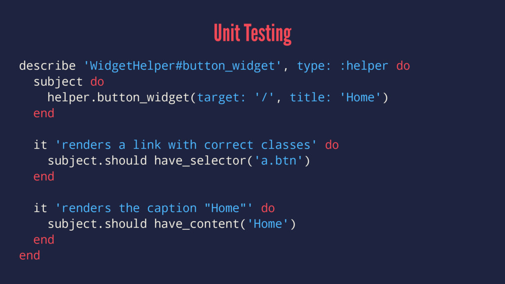
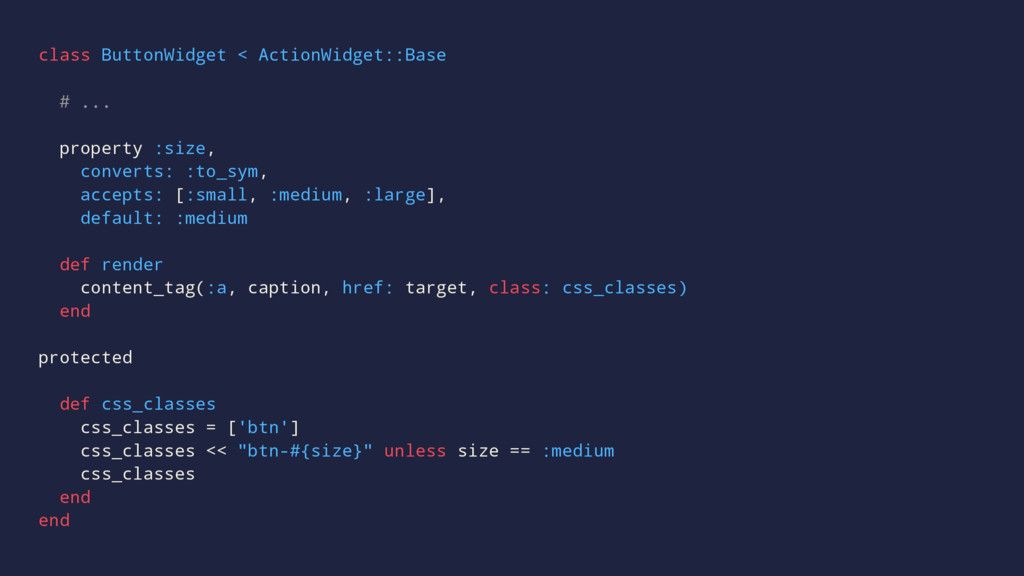
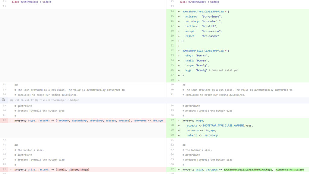
    '/', title: 'Home') end it 'renders a link with correct classes' do subject.should have_selector('a.btn') end it 'renders the caption "Home"' do subject.should have_content('Home') end end
  12. # BUT: we did not have buttons as markup <a

    class="btn btn-default primary large" href="/login">Login</a> # all our buttons were already button widgets <%= button_widget title: 'Example', type: :primary, size: :large %>
  13. class ButtonWidget < ActionWidget::Base # ... property :size, converts: :to_sym,

    accepts: [:small, :medium, :large], default: :medium def render content_tag(:a, caption, href: target, class: css_classes) end protected def css_classes css_classes = ['btn'] css_classes << "btn-#{size}" unless size == :medium css_classes end end
  14. Rendering the avatar image of a user avatar_widget size: :medium,

    image: user.avatar, title: user.screen_name, target: user_path(user)
  15. But, this is more than an <img/> tag. Logic needed,

    for e.g. size specific stylings, the default avatar or a loading indicator (if the avatar is being processed)
  16. Logic is wrapped in AvatarWidget class, instead of shattered across

    views and helpers. avatar_widget size: :medium, image: user.avatar, title: user.screen_name, target: user_path(user)
  17. We prerender clientside Handlebars.js templates in HAML, also using ActionWidgets,

    before we precompile it to JavaScript functions via Node. This is fine.
  18. = form_widget prefix: 'user' do |f| = f.email_field placeholder: 'Email',

    field: 'email', required: true, size: :large = f.password_field placeholder: 'Password', field: 'password', required: true, size: :large = f.submit_button on_click: 'signIn(model)', label: "Submit" = f.base_errors
  19. In "browser world", a button might look like this: <a

    class="btn btn-primary btn-lg" href="/login">Login</a>
  20. But in "HTML email world", everything is at least two

    nested tables. <table class="button"> <tr> <td> <table> <tr> <td><a href="#">Button</a></td> </tr> </table> </td> </tr> </table>
  21. This widget provides an interface for the important details, hides

    the markup complexity from the user. = email_button_widget href: '#' do Click here!
  22. = email_row_widget do = email_col_widget width: 12, last: true do

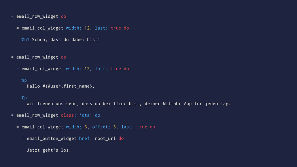
    %h1 Schön, dass du dabei bist! = email_row_widget do = email_col_widget width: 12, last: true do %p Hallo #{@user.first_name}, %p wir freuen uns sehr, dass du bei flinc bist, deiner Mitfahr-App für jeden Tag. = email_row_widget class: 'cta' do = email_col_widget width: 6, offset: 3, last: true do = email_button_widget href: root_url do Jetzt geht's los!
  23. TL;DR Object oriented widgets solve real problems! Good in addition

    to views, partials and helpers. Do not try to replace all your markup with widgets!
  24. Use widgets for the parts that ▸ are reused tens

    or hundreds of times ▸ are highly configurable ▸ need complex view specific logic ▸ have overly verbose markup for little presentation