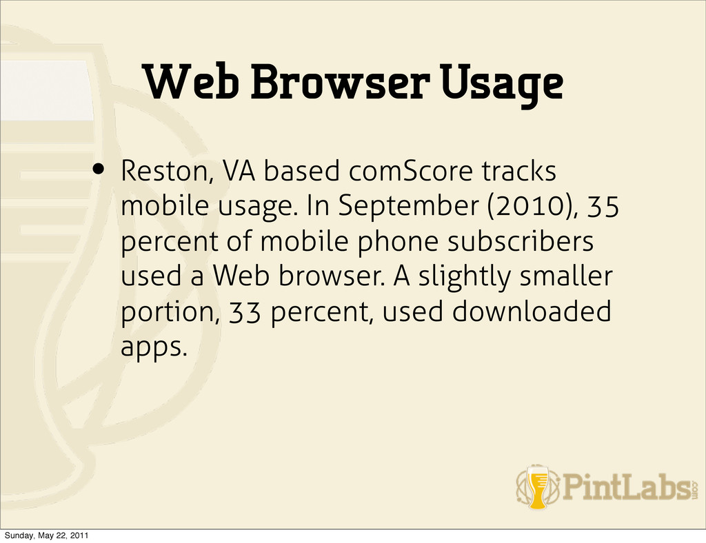
usage. In September (2010), 35 percent of mobile phone subscribers used a Web browser. A slightly smaller portion, 33 percent, used downloaded apps. Sunday, May 22, 2011
across limited bandwidth, and wireless data connection called WAP • WAP 1.0 - released in1997 • WAP 2.0 - released in 2002 • WAP 2.0 - Striped version of XHTML (XHTML-MP) • HTML5 Sunday, May 22, 2011
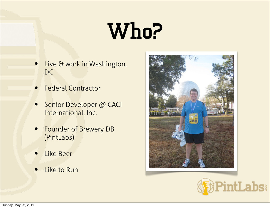
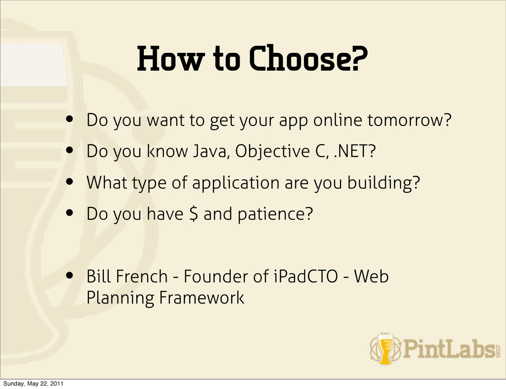
app online tomorrow? • Do you know Java, Objective C, .NET? • What type of application are you building? • Do you have $ and patience? • Bill French - Founder of iPadCTO - Web Planning Framework Sunday, May 22, 2011
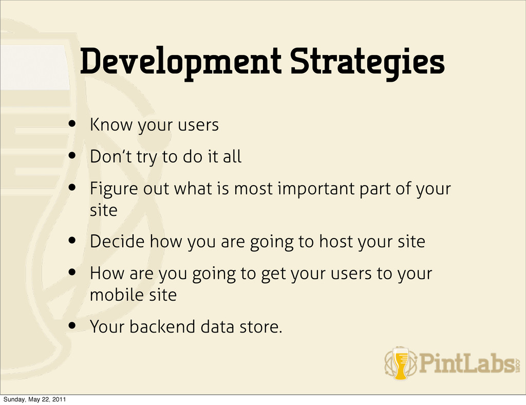
do it all • Figure out what is most important part of your site • Decide how you are going to host your site • How are you going to get your users to your mobile site • Your backend data store. Sunday, May 22, 2011
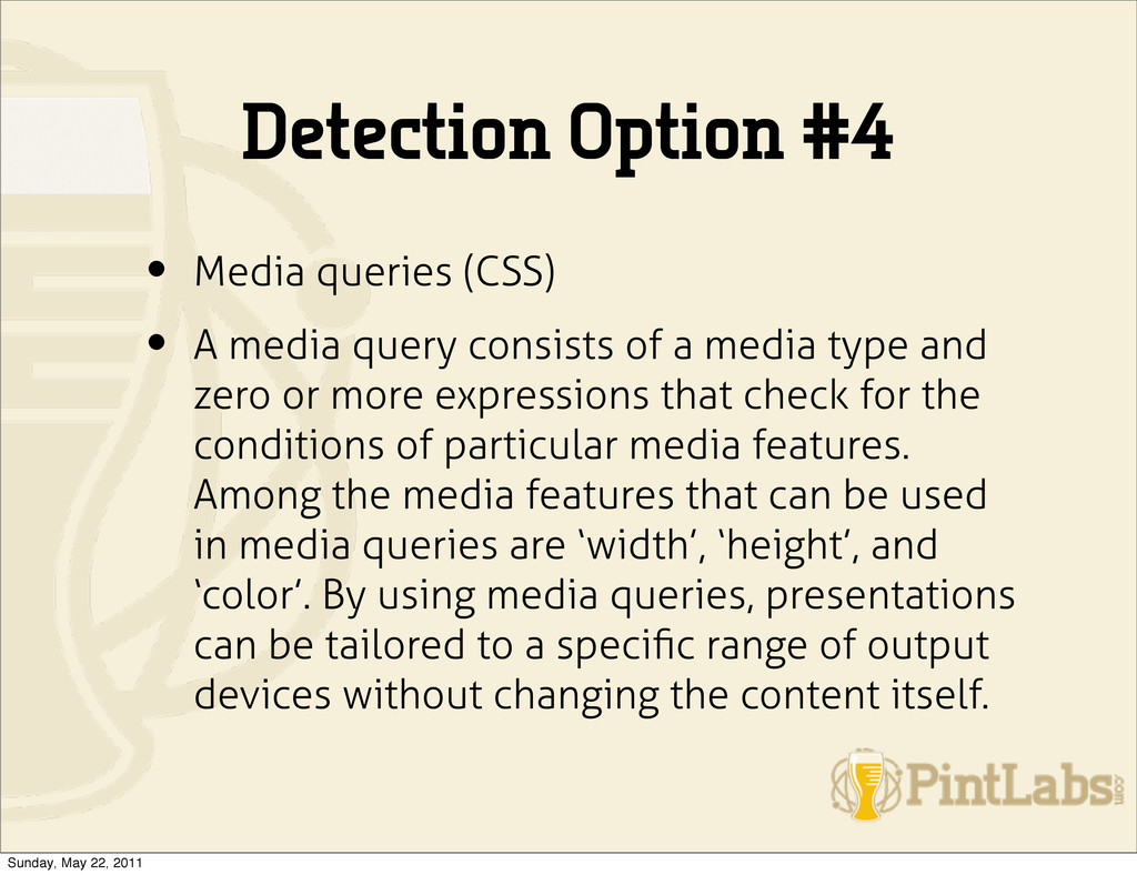
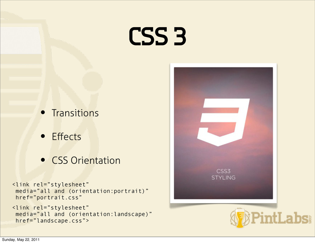
query consists of a media type and zero or more expressions that check for the conditions of particular media features. Among the media features that can be used in media queries are ‘width’, ‘height’, and ‘color’. By using media queries, presentations can be tailored to a specific range of output devices without changing the content itself. Sunday, May 22, 2011
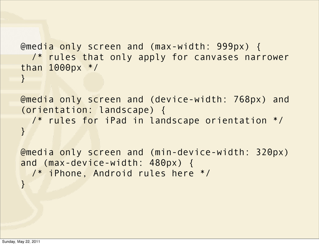
only apply for canvases narrower than 1000px */ } @media only screen and (device-width: 768px) and (orientation: landscape) { /* rules for iPad in landscape orientation */ } @media only screen and (min-device-width: 320px) and (max-device-width: 480px) { /* iPhone, Android rules here */ } Sunday, May 22, 2011
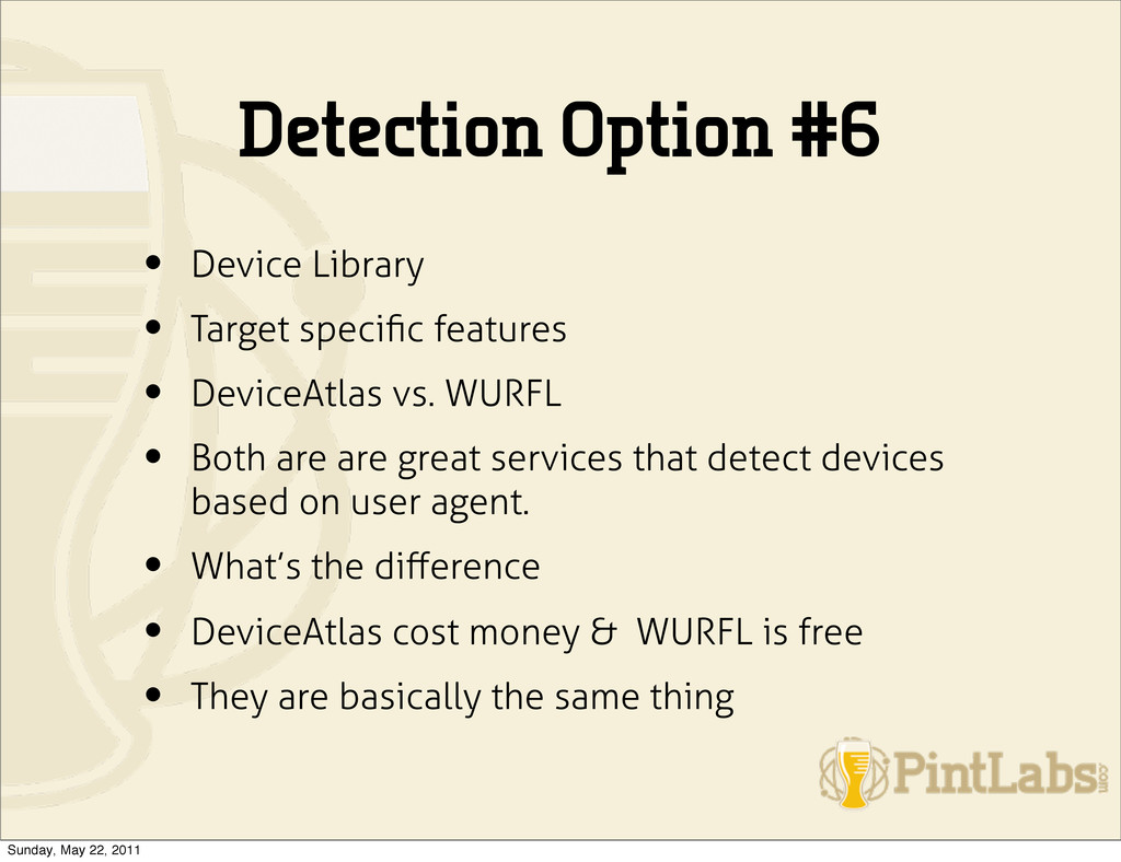
• DeviceAtlas vs. WURFL • Both are are great services that detect devices based on user agent. • What’s the difference • DeviceAtlas cost money & WURFL is free • They are basically the same thing Sunday, May 22, 2011
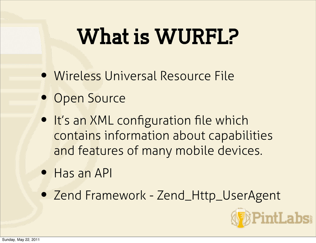
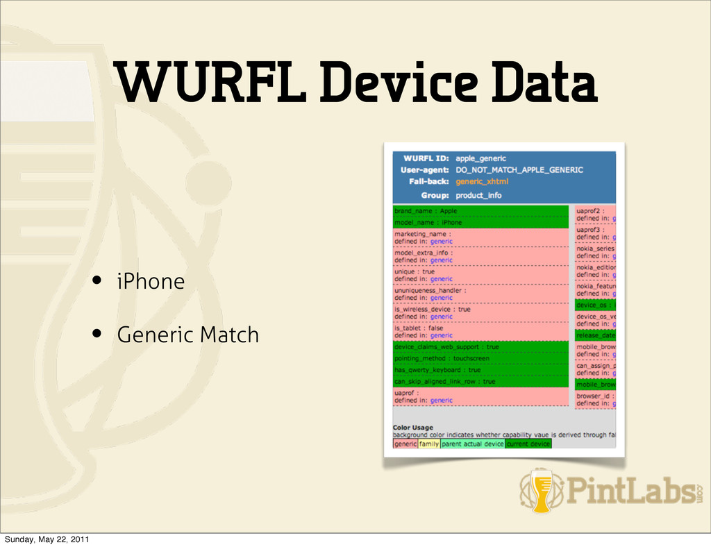
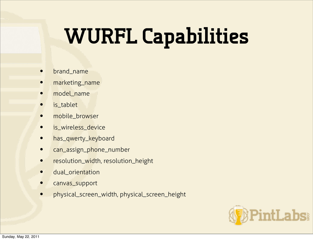
Source • It’s an XML configuration file which contains information about capabilities and features of many mobile devices. • Has an API • Zend Framework - Zend_Http_UserAgent Sunday, May 22, 2011
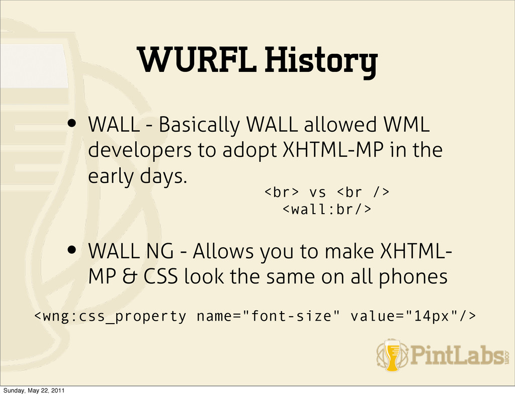
to adopt XHTML-MP in the early days. • WALL NG - Allows you to make XHTML- MP & CSS look the same on all phones <br> vs <br /> <wall:br/> <wng:css_property name="font-size" value="14px"/> Sunday, May 22, 2011
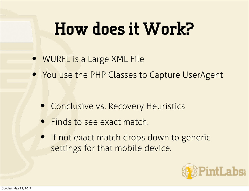
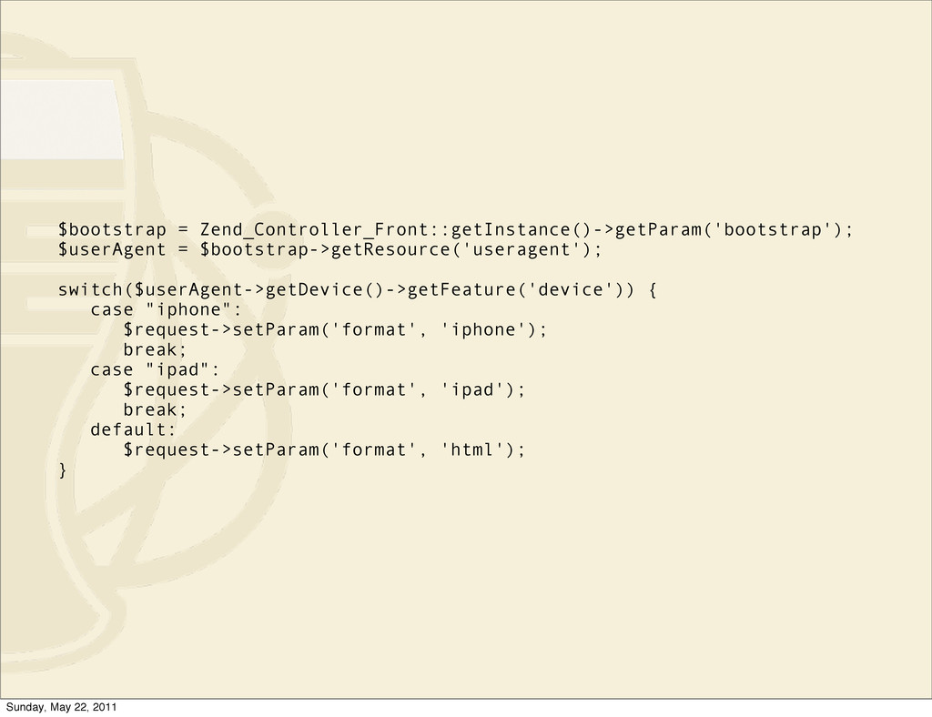
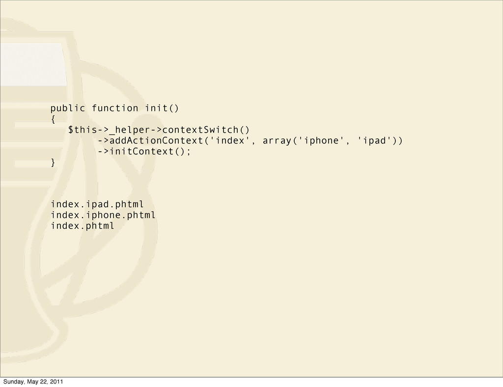
File • You use the PHP Classes to Capture UserAgent • Conclusive vs. Recovery Heuristics • Finds to see exact match. • If not exact match drops down to generic settings for that mobile device. Sunday, May 22, 2011
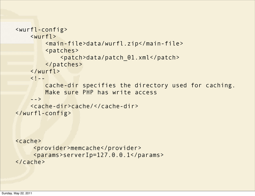
handle ZIP archives • You need the PEAR Logging libraries • You need WURFL API package • Extract the WURFL package edit the wurfl-config.xml • Initialize the WURFL manager. Sunday, May 22, 2011
the directory used for caching. Make sure PHP has write access --> <cache-dir>cache/</cache-dir> </wurfl-config> <cache> <provider>memcache</provider> <params>serverIp=127.0.0.1</params> </cache> Sunday, May 22, 2011
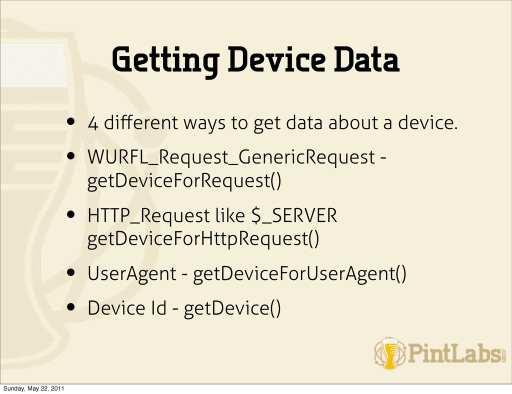
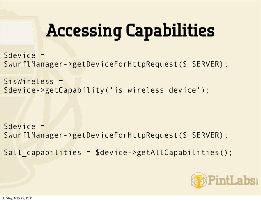
about a device. • WURFL_Request_GenericRequest - getDeviceForRequest() • HTTP_Request like $_SERVER getDeviceForHttpRequest() • UserAgent - getDeviceForUserAgent() • Device Id - getDevice() Sunday, May 22, 2011
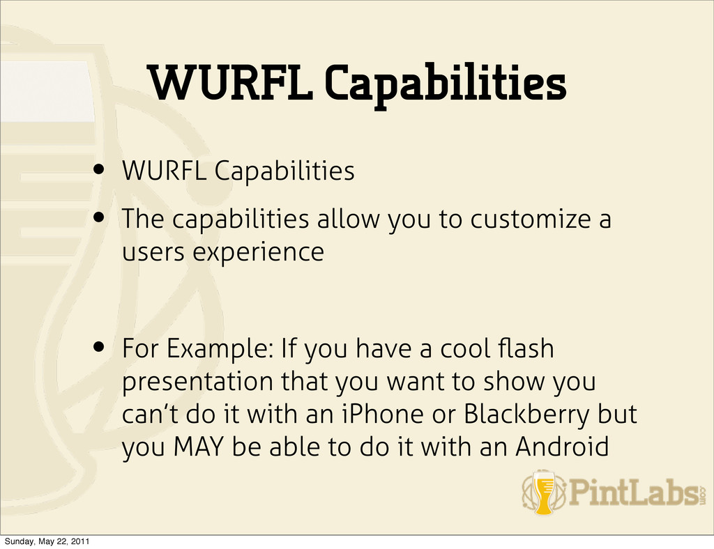
to customize a users experience • For Example: If you have a cool flash presentation that you want to show you can’t do it with an iPhone or Blackberry but you MAY be able to do it with an Android Sunday, May 22, 2011
rel=”stylesheet” media=”all and (orientation:portrait)” href=”portrait.css” <link rel=”stylesheet” media=”all and (orientation:landscape)” href=”landscape.css”> Sunday, May 22, 2011
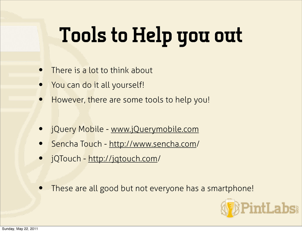
to think about • You can do it all yourself! • However, there are some tools to help you! • jQuery Mobile - www.jQuerymobile.com • Sencha Touch - http://www.sencha.com/ • jQTouch - http://jqtouch.com/ • These are all good but not everyone has a smartphone! Sunday, May 22, 2011
lots of phones • Go to the AT&T, Verizon, T-Mobile Stores • Simulators • Switch browser’s user agents • jQuery Mobile site talks about how they do testing. Worth a look! Sunday, May 22, 2011
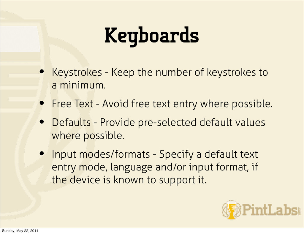
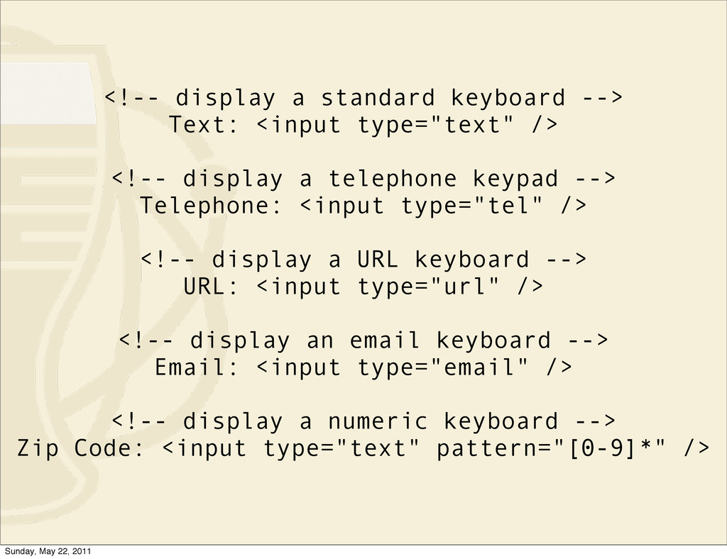
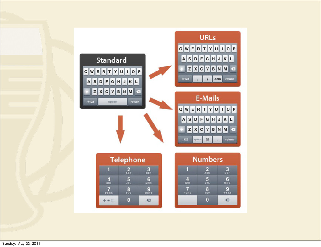
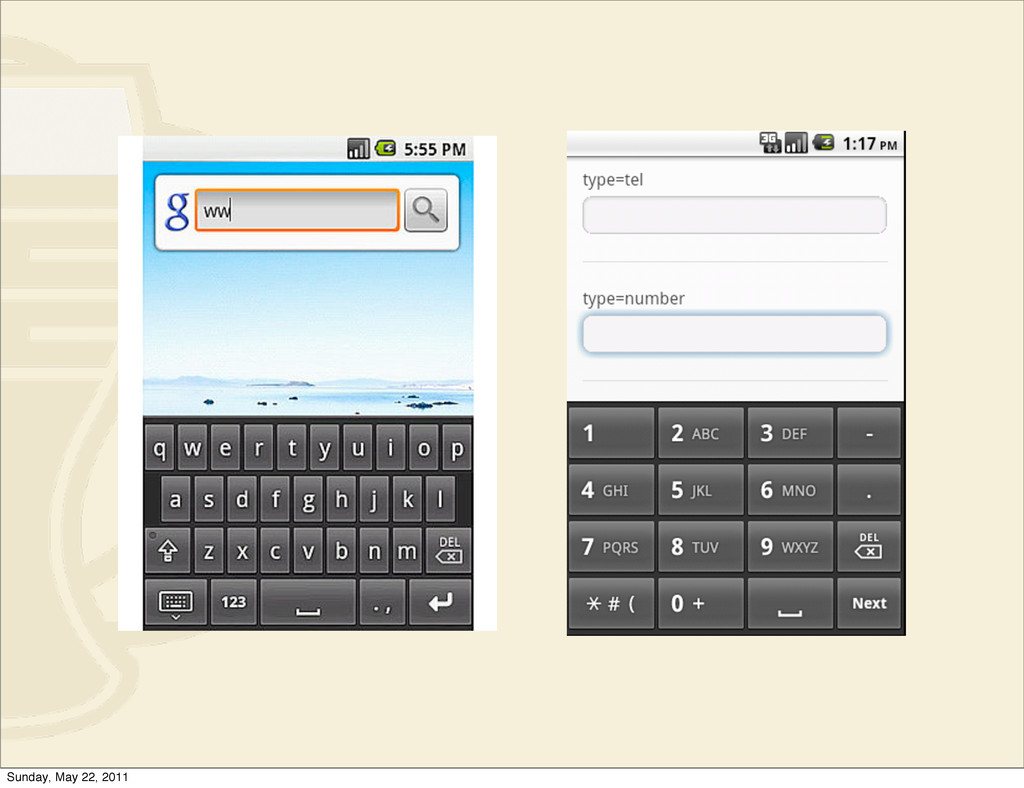
a minimum. • Free Text - Avoid free text entry where possible. • Defaults - Provide pre-selected default values where possible. • Input modes/formats - Specify a default text entry mode, language and/or input format, if the device is known to support it. Sunday, May 22, 2011
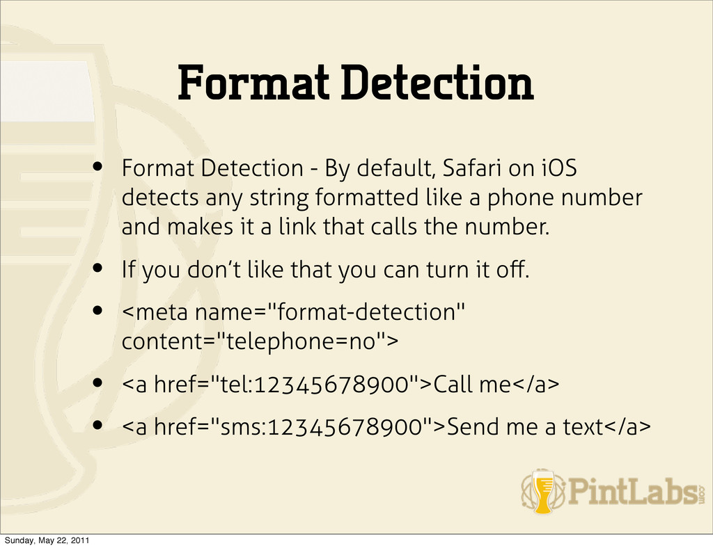
iOS detects any string formatted like a phone number and makes it a link that calls the number. • If you don’t like that you can turn it off. • <meta name="format-detection" content="telephone=no"> • <a href="tel:12345678900">Call me</a> • <a href="sms:12345678900">Send me a text</a> Sunday, May 22, 2011
to use CSS3 and HTML5 features while maintaining a fine level of control over browsers that don't. (http://www.modernizr.com/) • FormFactor helps you customize your web app for different form factors, e.g. when you make "the mobile version", "the TV version", etc. (https://github.com/PaulKinlan/formfactor) • Mustache Logic-less templates. (http://mustache.github.com/) • Lawnchair Sorta like a couch except smaller and outside, also, a client side JSON document store (http://westcoastlogic.com/lawnchair/) • JQuery Touch - http://plugins.jquery.com/files/jquery.touch.js.txt • TouchScroll - http://uxebu.com/blog/2010/04/27/touchscroll-a- scrolling-layer-for-webkit-mobile/ Sunday, May 22, 2011
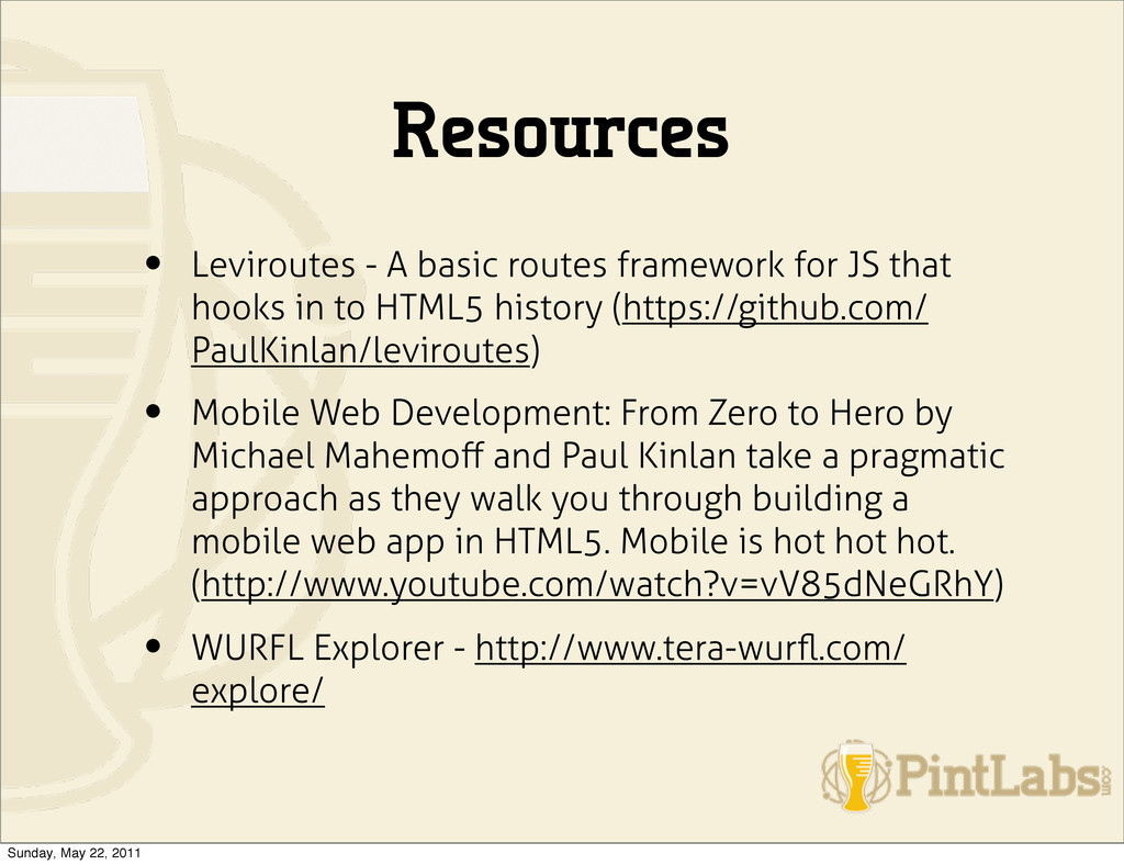
that hooks in to HTML5 history (https://github.com/ PaulKinlan/leviroutes) • Mobile Web Development: From Zero to Hero by Michael Mahemoff and Paul Kinlan take a pragmatic approach as they walk you through building a mobile web app in HTML5. Mobile is hot hot hot. (http://www.youtube.com/watch?v=vV85dNeGRhY) • WURFL Explorer - http://www.tera-wurfl.com/ explore/ Sunday, May 22, 2011
 farrelley
 glaforge
 shibuiwilliam
 shift_evolve
 kenta_hi
 kawaguti
 cscengineer
 flatt_security
 torumakabe
 joooee0000
 ks91
ks91
 oracle4engineer
 thekraken
 aleyda
 paigeccino
 maltzj
 axbom
axbom
.png) helenjbeal
helenjbeal
 sachag
 bcantrill
 gurzu
gurzu
 gr2m
gr2m
 honnibal
 danielanewman
![preg_match('/(up.browser|up.link|mmp|symbian|smartphone| midp|wap|phone|android)/i', str tolower($_SERVER ['HTTP_USER_AGENT']))) strpos(strtolower($_SERVER['HTTP_ACCEPT']),'application/ vnd.wap.xhtml+xml') > 0 isset($_SERVER['HTTP_X_WAP_PROFILE'])](https://files.speakerdeck.com/presentations/80e75cd04eaa0130960622000a1f866f/slide_34.jpg)
![$mobile_ua = strtolower(substr($_SERVER ['HTTP_USER_AGENT'], 0, 4)); $mobile_agents = array('w3c', 'acs-',](https://files.speakerdeck.com/presentations/80e75cd04eaa0130960622000a1f866f/slide_35.jpg)
![Questions? • @farrelley • [email protected] • http://joind.in/talk/view/3411 Sunday, May 22,](https://files.speakerdeck.com/presentations/80e75cd04eaa0130960622000a1f866f/slide_80.jpg)