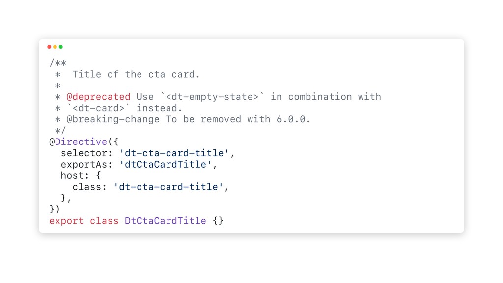
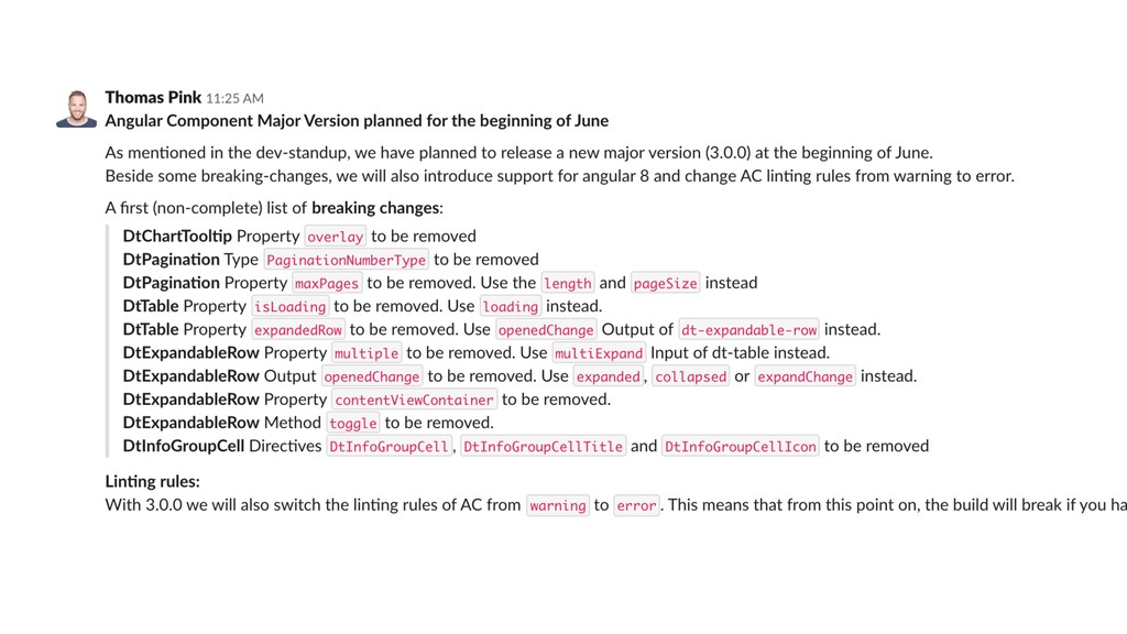
Use `<dt-empty-state>` in combination with * `<dt-card>` instead. * @breaking-change To be removed with 6.0.0. */ @Directive({ selector: 'dt-cta-card-title', exportAs: 'dtCtaCardTitle', host: { class: 'dt-cta-card-title', }, }) export class DtCtaCardTitle {}
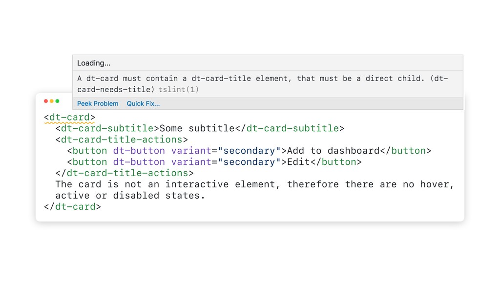
dt-button variant="secondary">Edit</button> </dt-card-title-actions> The card is not an interactive element, therefore there are no hover, active or disabled states. </dt-card>
 SiteGround - Reliable hosting with speed, security, and support you can count on.
 panda728
 niftycorp
 ivargrimstad
 andpad
 petamoriken
 htkym
htkym
 shibuchaaaan
 mshibuya
 jsoizo
 hanhan1978
 ganchiku
 pkshadeck
 akademiya2063
 madoxten
 aleyda
 katiecoart
 cassininazir
 destraynor
 speakerdeck
 jdejongh
 sergeychernyshev
 palkan
 addyosmani
 axbom
axbom
![<dt-select [(value)]="selectedValue"> <dt-option value="">--Please choose an option--</dt-option> <dt-option value="Americano">Americano</dt-option> <dt-option](https://files.speakerdeck.com/presentations/e9c59bbc0beb4174bdbd4178024e0595/slide_26.jpg)
![<dt-select [(value)]="selectedValue"> <dt-option value="">--Please choose an option--</dt-option> <dt-option value="Americano">Americano</dt-option> <dt-option](https://files.speakerdeck.com/presentations/e9c59bbc0beb4174bdbd4178024e0595/slide_27.jpg)