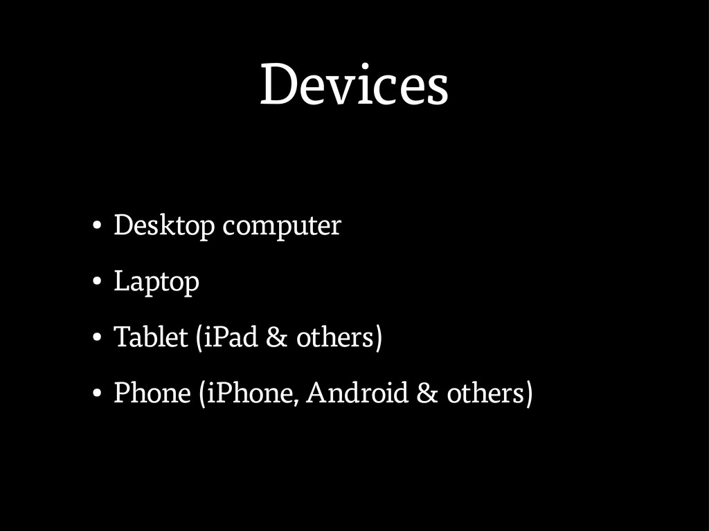
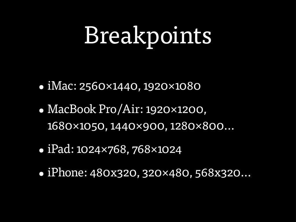
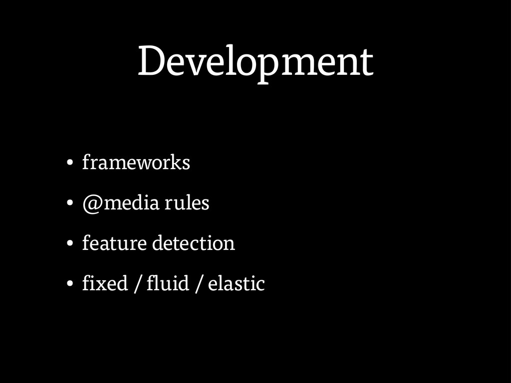
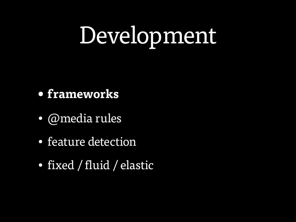
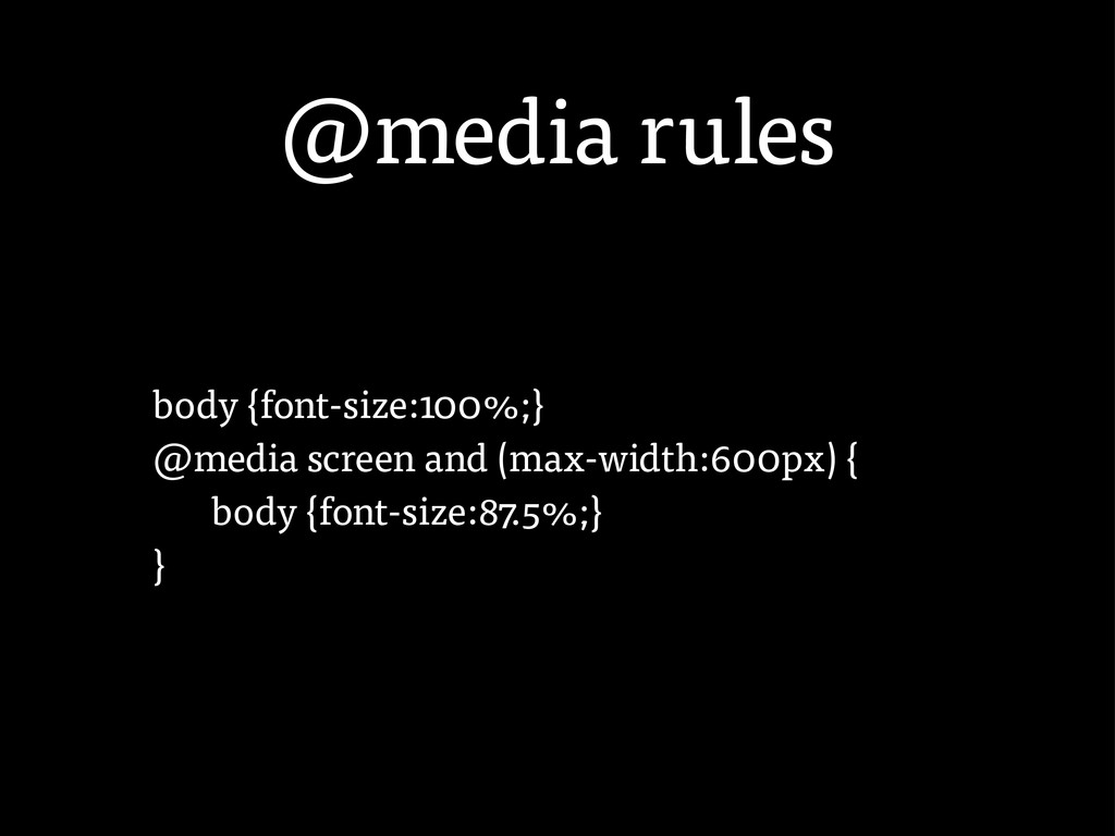
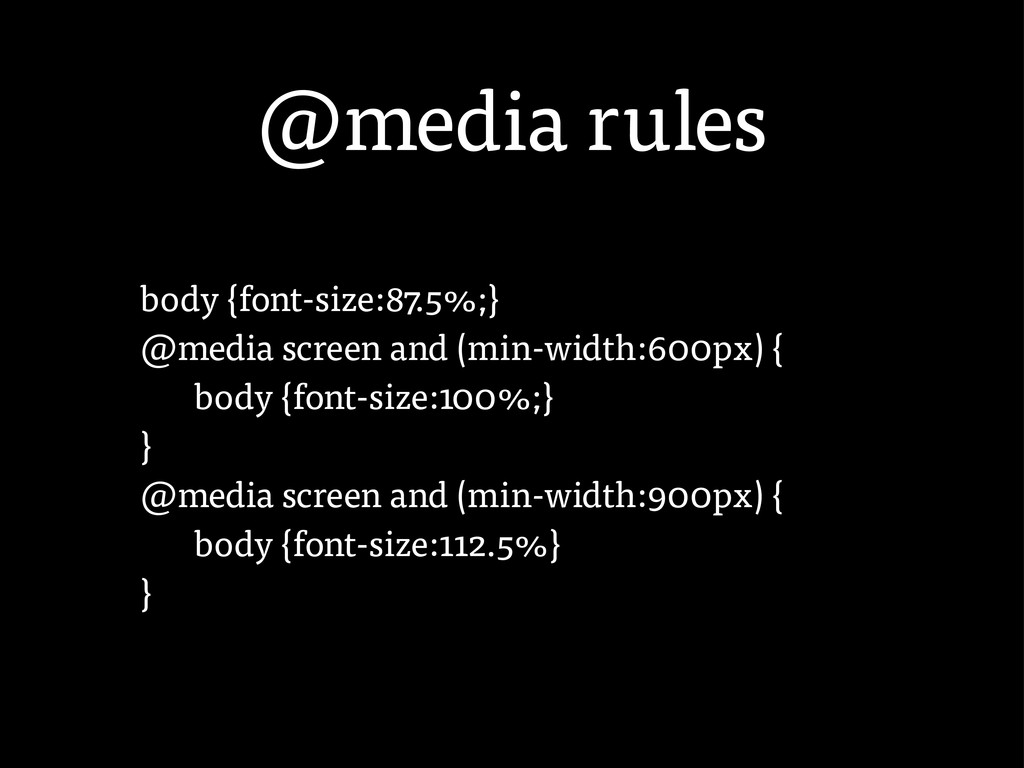
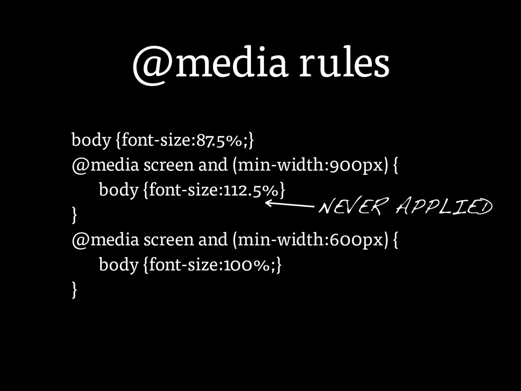
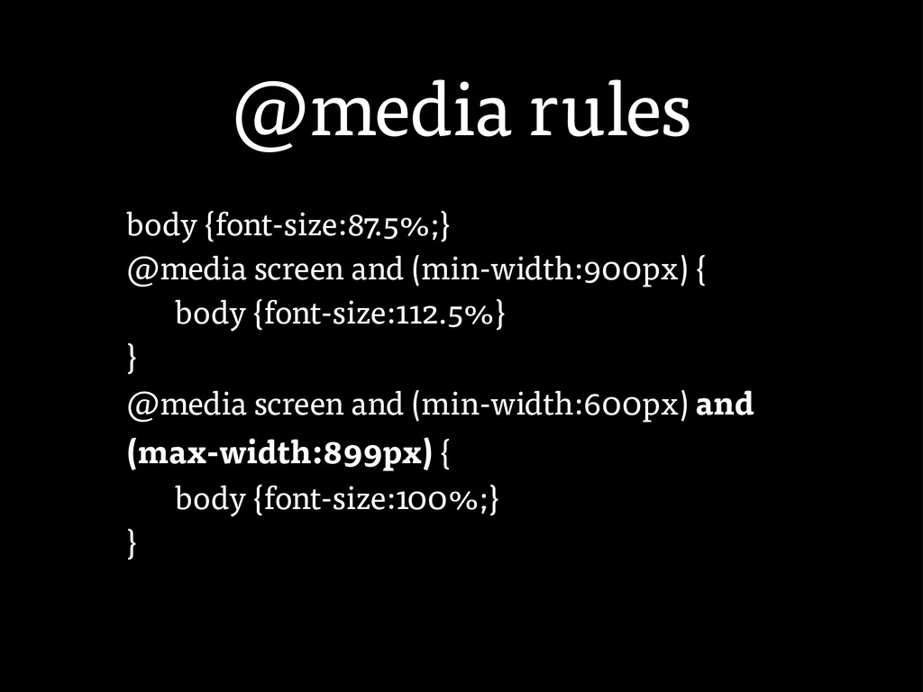
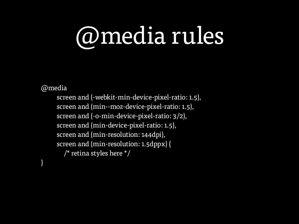
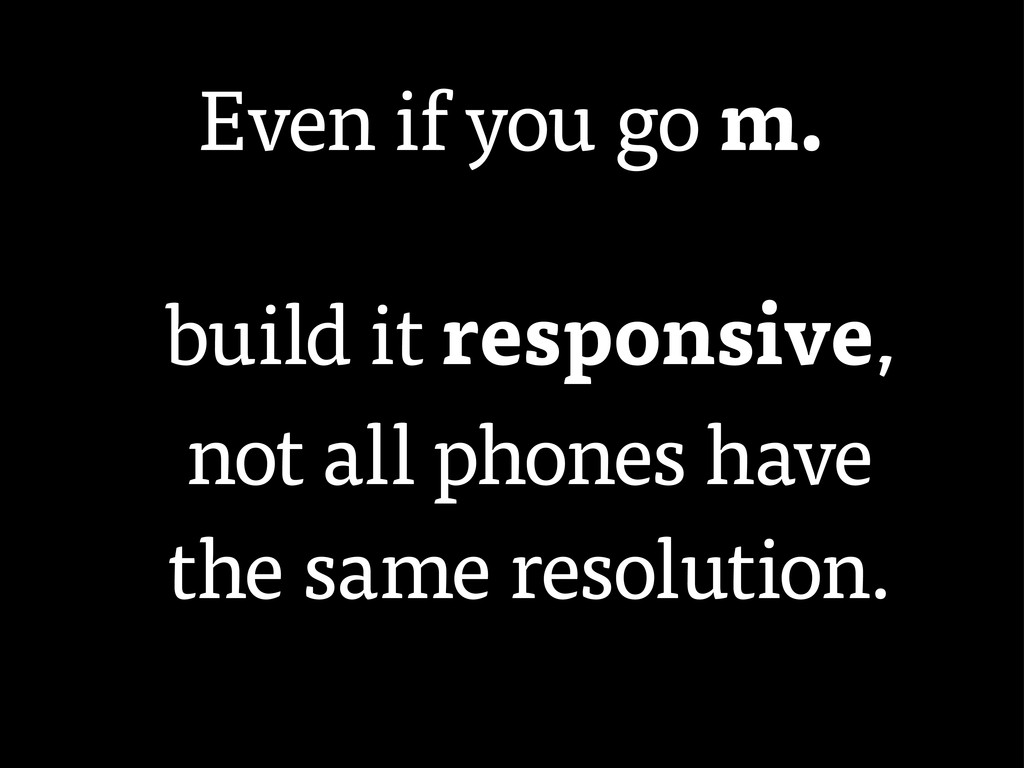
1.5), screen and (-o-min-device-pixel-ratio: 3/2), screen and (min-device-pixel-ratio: 1.5), screen and (min-resolution: 144dpi), screen and (min-resolution: 1.5dppx) { /* retina styles here */ }
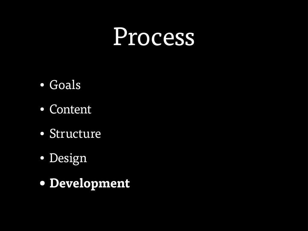
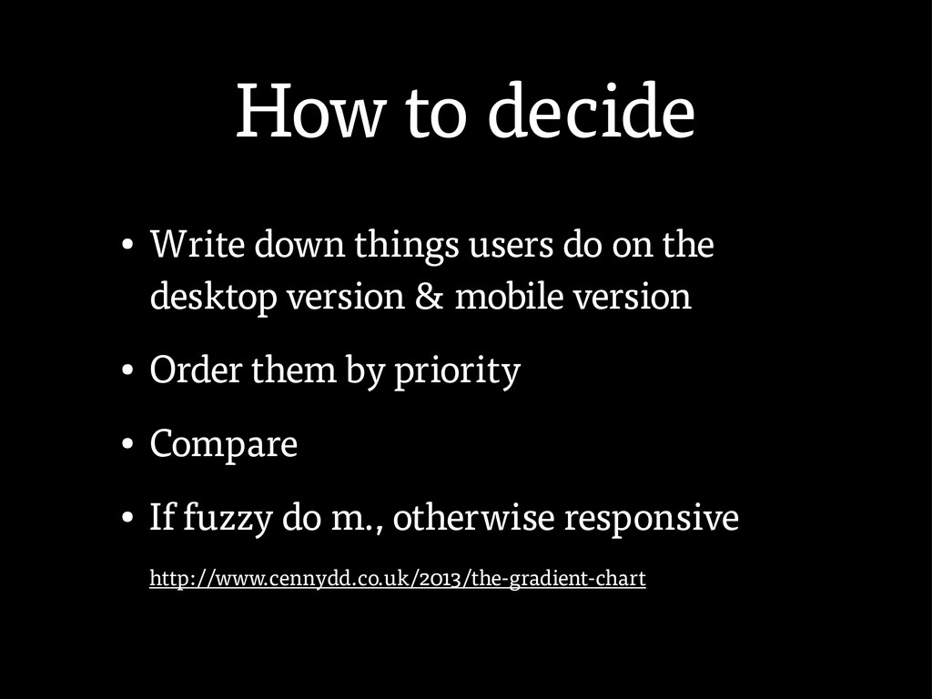
the desktop version & mobile version • Order them by priority • Compare • If fuzzy do m., otherwise responsive http://www.cennydd.co.uk/2013/the-gradient-chart
 friedcell
 miyamu
 coco_se
 torumakabe
 flatt_security
 kzykmyzw
 lycorptech_jp
 ynisqa1988
 tonkotsuboy_com
 nek0128
 ry0_ka
 hr01
hr01
 smt7174
 denniskardys
 3n
3n
 uxyall
 palkan
 reverentgeek
 holman
 codingconduct
 sugarenia
 tmiket
 marketingsoph
 kneath
 chriscoyier
![Use tricks <img src=”[img]” class=”respond” /> <style> .respond { width:100%;](https://files.speakerdeck.com/presentations/c3c1184087320130666012313926dcee/slide_48.jpg)
![Use tricks <img src=”[img]” class=”respond” /> <style> .respond { width:100%;](https://files.speakerdeck.com/presentations/c3c1184087320130666012313926dcee/slide_49.jpg)