Upgrade to Pro — share decks privately, control downloads, hide ads and more …

CSS from the future

CSS from the future

Slides for the presentation about CSS Variables at the FEVR Meetup on January, 26th 2017

Sorry for the broken emoji...

Avatar for Giacomo "Giko" Zinetti

Giacomo "Giko" Zinetti

January 26, 2017
Tweet

More Decks by Giacomo "Giko" Zinetti

Other Decks in Programming

Transcript

  1. How to define a property :root { --button-color: blue; --align:

    left; } header { --header-height: 300px; }
  2. <body> <a>Link 1</a> <footer> <a>Link 2</a> </footer> </body> Inheritance :root

    { --link: red } footer { --link: blue } a { color: var(--link) } <body> <a>Link 1</a> <footer> <a>Link 2</a> </footer> </body> $link: red footer { $link: blue } a { color: $link }
  3. <body> <a>Link 1</a> <footer> <a>Link 2</a> </footer> </body> Inheritance compiled

    :root { --link: red } footer { --link: blue } a { color: var(--link) } <body> <a>Link 1</a> <footer> <a>Link 2</a> </footer> </body> $link: red footer { $link: blue } a { color: $link red }
  4. <body> <a>Link 1</a> <footer> <a>Link 2</a> </footer> </body> Inheritance :root

    { --link: red } footer { --link: blue } a { color: var(--link) } <body> <a>Link 1</a> <footer> <a>Link 2</a> </footer> </body> $link: red footer { $link: blue } a { color: $link } Preprocessors: Nope
  5. :root { --gutter: 10px; } @media (min-width: 768px) { :root

    { --gutter: 15px; } } article { padding: var(--gutter); } Media queries $gutter: 10px; @media (min-width: 768px) { $gutter: 15px; } article { padding: $gutter; }
  6. :root { --gutter: 10px; } @media (min-width: 768px) { :root

    { --gutter: 15px; } } article { padding: var(--gutter); } Media queries compiled $gutter: 10px; @media (min-width: 768px) { $gutter: 15px; } article { padding: $gutter 10px; }
  7. :root { --gutter: 10px; } @media (min-width: 768px) { :root

    { --gutter: 15px; } } article { padding: var(--gutter); } Media queries $gutter: 10px; @media (min-width: 768px) { $gutter: 15px; } article { padding: $gutter; } Preprocessors: Nope
  8. :root { --gutter: 10px; } @media (min-width: 768px) { :root

    { --gutter: 15px; } } article { padding: var(--gutter); } Preprocessors solution $gutter: 10px; $gutter-large: 15px; @media (min-width: 768px) { article { padding: $gutter-large; } } article { padding: $gutter; }
  9. But… :root { --gutter: 10px; } @media (min-width: 768px) {

    :root { --gutter: 15px; } } article.class { padding: var(--gutter); } $gutter: 10px; $gutter-large: 15px; @media (min-width: 768px) { article { padding: $gutter-large; } } article.class { padding: $gutter; }
  10. <body> <a>Link 1</a> <footer> <a>Link 2</a> <section> <a>Link 3</a> </section>

    </footer> </body> Base rule a { background: var(--link, red) }
  11. <body> <a>Link 1</a> <footer> <a>Link 2</a> <section> <a>Link 3</a> </section>

    </footer> </body> Override variables, not properties section { --link: green } a { background: var(--link, red) }
  12. <body> <a>Link 1</a> <footer> <a>Link 2</a> <section> <a>Link 3</a> </section>

    </footer> </body> Make Cascade Love, not Specificity War section { --link: green } footer { --link: blue } a { background: var(--link, red) }
  13. Old school... section { --link: green } footer { --link:

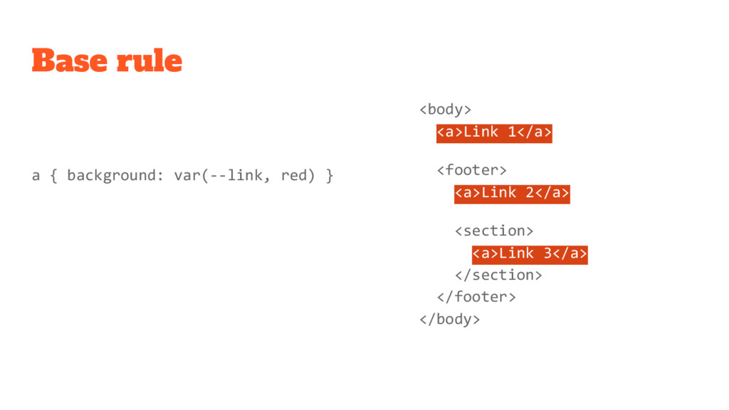
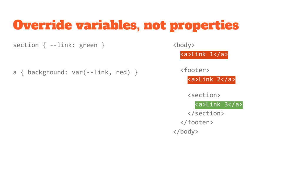
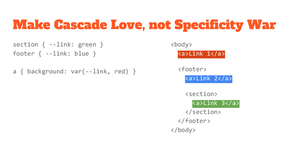
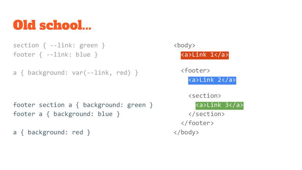
    blue } a { background: var(--link, red) } footer section a { background: green } footer a { background: blue } a { background: red } <body> <a>Link 1</a> <footer> <a>Link 2</a> <section> <a>Link 3</a> </section> </footer> </body>
  14. Old school... section { --link: green } footer { --link:

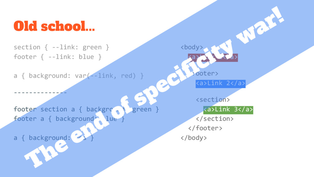
    blue } a { background: var(--link, red) } -------------- footer section a { background: green } footer a { background: blue } a { background: red } <body> <a>Link 1</a> <footer> <a>Link 2</a> <section> <a>Link 3</a> </section> </footer> </body> The end of specificity war!
  15. Fallback property @supports (--foo: green) { body { color: var(--my-color);

    } } Feature query color: red; color: var(--my-color, red);
  16. <body> <a>Link 1</a> <footer> <a>Link 2</a> <section> <a>Link 3</a> </section>

    </footer> </body> We already use CSS variables body { font-size: 18px } footer { font-size: 16px } section { font-size: 14px } a { border-width: 0.2em; padding-right: 2em; }
  17. <body> <a>Link 1</a> <footer> <a>Link 2</a> <section> <a>Link 3</a> </section>

    </footer> </body> The superhero: currentColor body { color: red } footer { color: blue } section { color: green } a { border-color: currentColor; }
  18. .theme(@bg: gray, @col: red, @var: blue) { .box { background:

    @bg } .button { color: @col } .box .button { color: @var } } .theme(); .dark { .theme(black, orange, lightgreen); } Theming with LESS
  19. .box { background: gray } .button { color: red }

    .box .button { color: blue } .dark .box { background: black } .dark .button { color: orange } .dark .box .button { color: lightgreen } Theming with CSS
  20. .box { --col: var(--alt, blue); background: var(--bg, lightgray); } .button

    { color: var(--col, red); } .dark { --bg: black; --col: orange; --alt: lightgreen; } Theming with CSS Variables