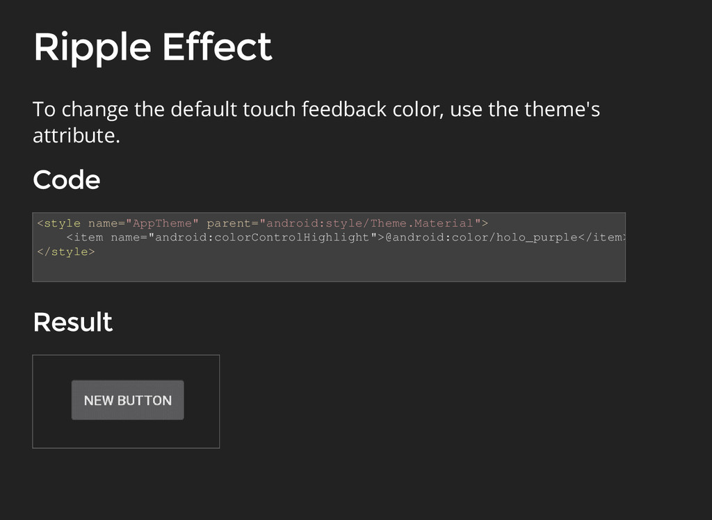
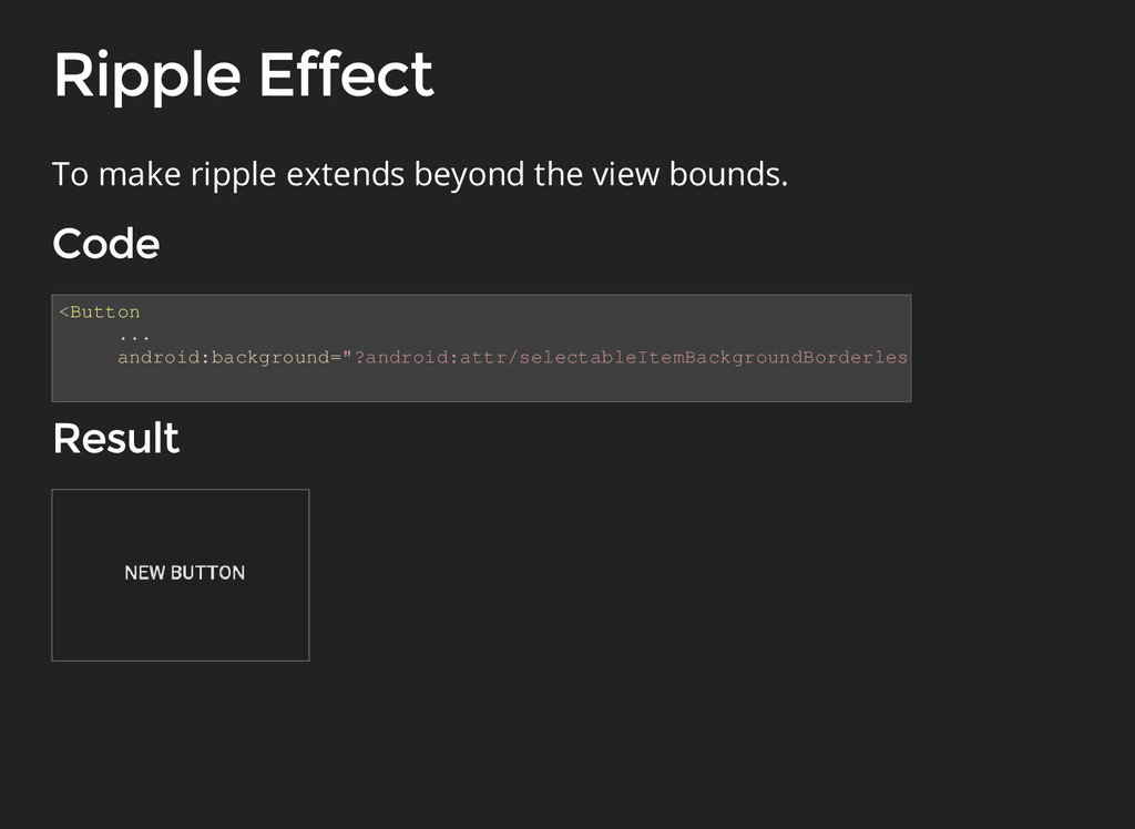
<item android:id="@android:id/mask"> <shape android:shape="rectangle" /> </item> </ripple> To change the default touch feedback color, of single view use ripple drawable. <Button android:background="@drawable/ripple"/> drawable/ripple.xml
animator = ObjectAnimator.ofFloat(view, View.X, View.Y, path); animator.setDuration(1000); animator.start(); The class has new constructors that enable you to animate coordinates along a path.
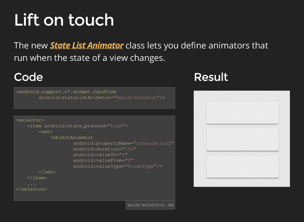
</set> </item> ... </selector> The new class lets you define animators that run when the state of a view changes. anim/selector.xml <android.support.v7.widget.CardView android:stateListAnimator="@anim/selector"/>
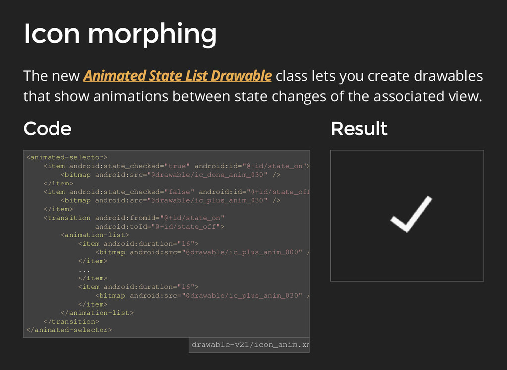
android:id="@+id/state_off"> <bitmap android:src="@drawable/ic_plus_anim_030" /> </item> <transition android:fromId="@+id/state_on" android:toId="@+id/state_off"> <animation-list> <item android:duration="16"> <bitmap android:src="@drawable/ic_plus_anim_000" /> </item> ... </item> <item android:duration="16"> <bitmap android:src="@drawable/ic_plus_anim_030" /> </item> </animation-list> </transition> </animated-selector> drawable-v21/icon_anim.xml The new class lets you create drawables that show animations between state changes of the associated view.
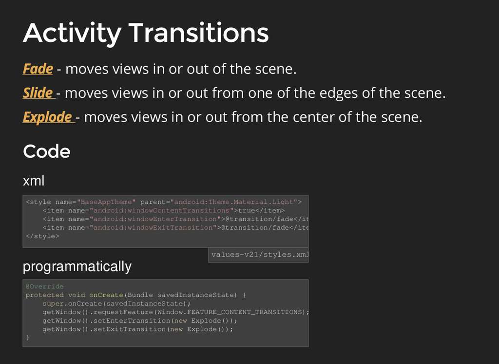
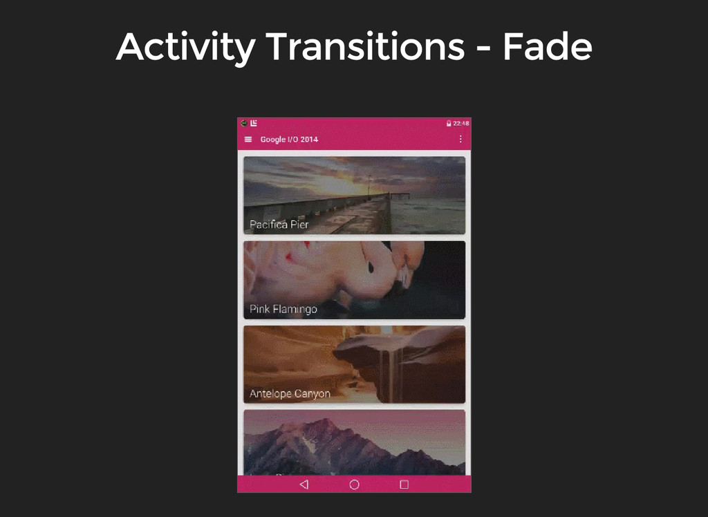
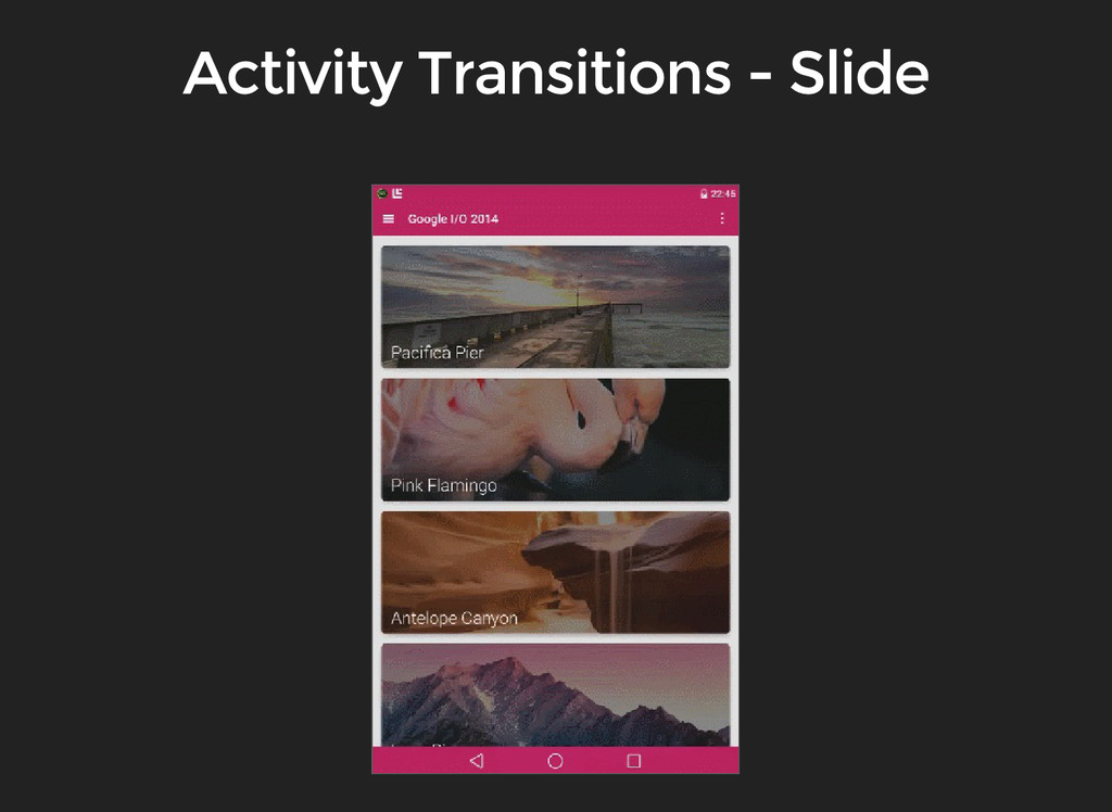
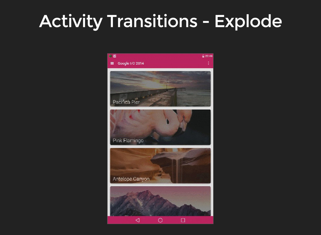
values-v21/styles.xml - moves views in or out of the scene. @Override protected void onCreate(Bundle savedInstanceState) { super.onCreate(savedInstanceState); getWindow().requestFeature(Window.FEATURE_CONTENT_TRANSITIONS); getWindow().setEnterTransition(new Explode()); getWindow().setExitTransition(new Explode()); } xml programmatically - moves views in or out from one of the edges of the scene. - moves views in or out from the center of the scene.
transition between these activities. - animates the changes in clip bounds of target views. - animates the changes in layout bounds of target views. - animates the changes in scale and rotation of target views. - animates changes in size and scale type for an image view.
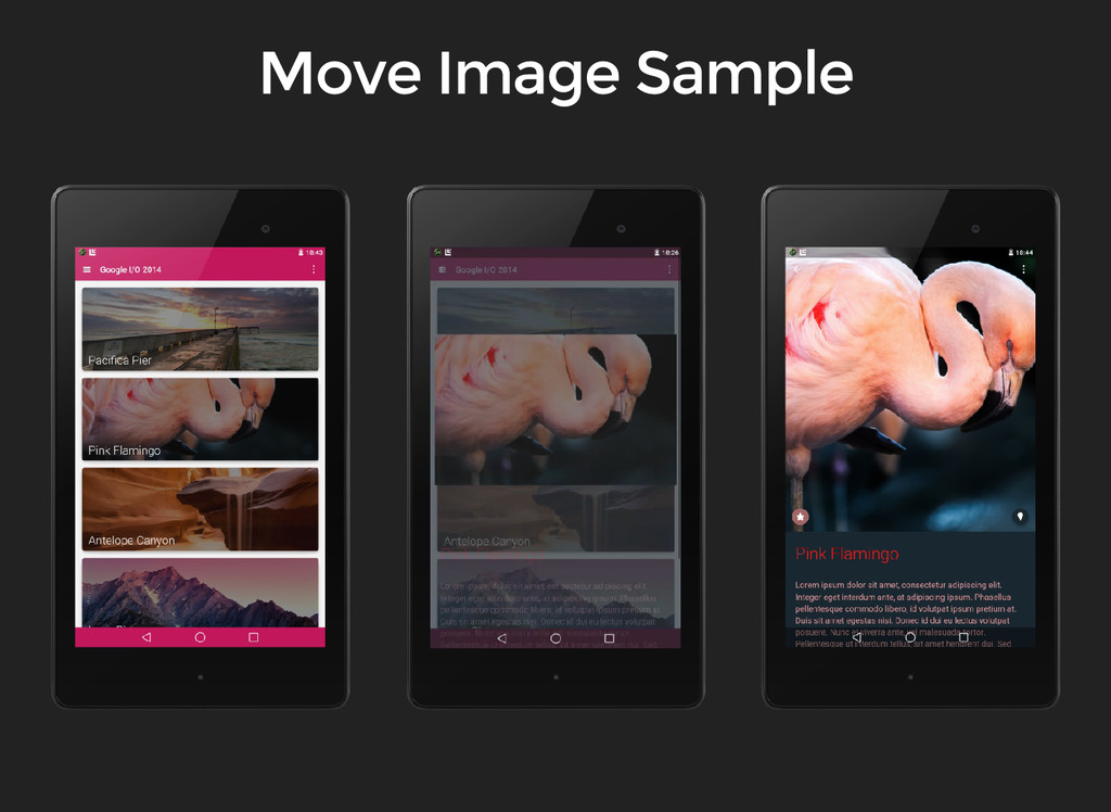
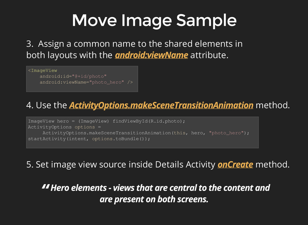
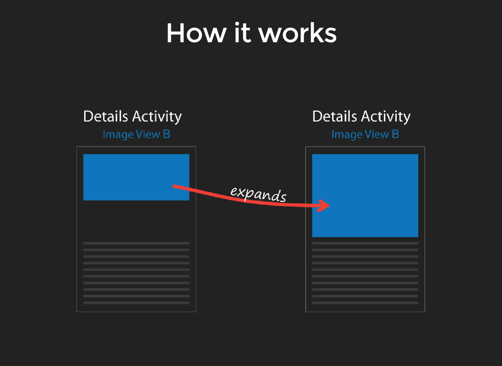
have a shared element: 1. Enable window content transitions in your style. <item name="android:windowContentTransitions">true</item> <item name="android:windowSharedElementEnterTransition">@transition/move_image</item> <item name="android:windowSharedElementExitTransition">@transition/move_image</item> 2. Specify a shared elements transition in your style. <moveImage/> transition/move_image.xml
a common name to the shared elements in both layouts with the attribute. ImageView hero = (ImageView) findViewById(R.id.photo); ActivityOptions options = ActivityOptions.makeSceneTransitionAnimation(this, hero, "photo_hero"); startActivity(intent, options.toBundle()); 5. Set image view source inside Details Activity method.
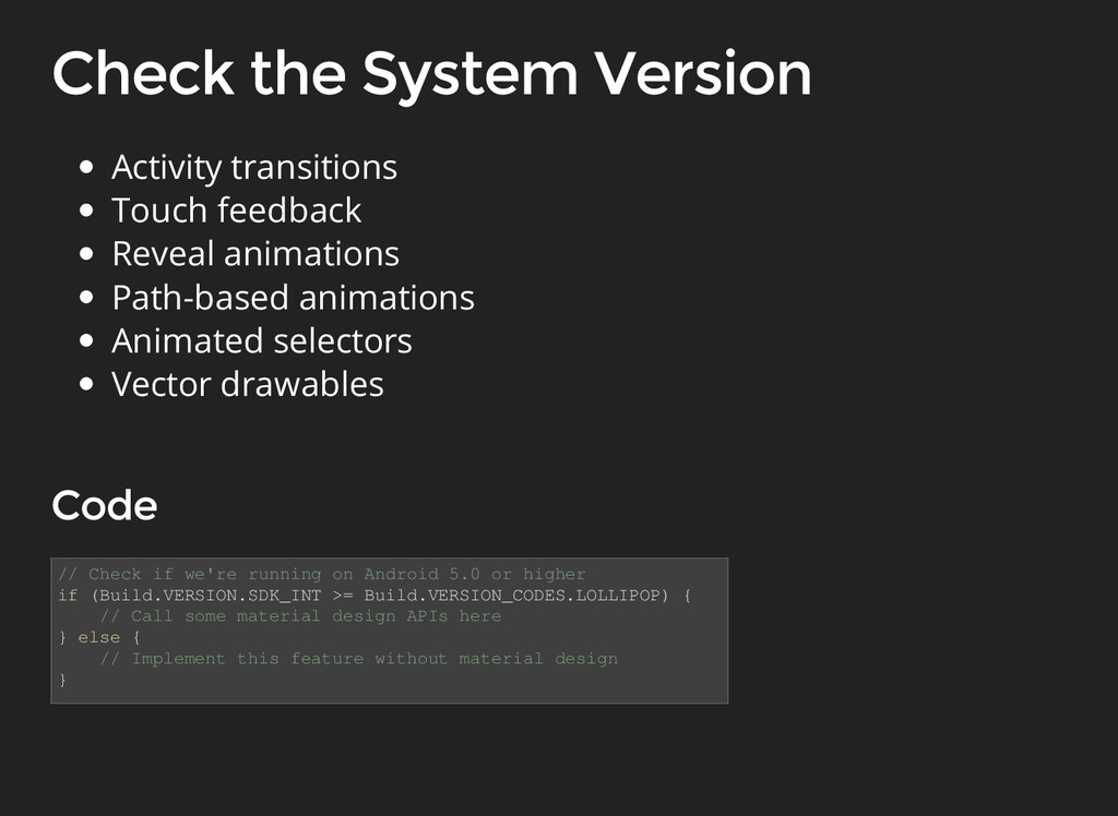
if (Build.VERSION.SDK_INT >= Build.VERSION_CODES.LOLLIPOP) { // Call some material design APIs here } else { // Implement this feature without material design } Activity transitions Touch feedback Reveal animations Path-based animations Animated selectors Vector drawables
 gdglviv
 sushichan044
 x5gtrn
 o0h
o0h
 y0hgi
y0hgi
 ganchiku
 sumedhbala
 luccafort
 broadleaf
 yukikurage
 ochtum
 pizzacat83
 manfredsteyer
 danielanewman
 katarinadahlin
 geoffreycrofte
 palkan
 rasmusluckow
 marktimemedia
 tomoyanonymous
 jct
jct
 uxyall
 eileencodes
 quramy
 sergeychernyshev