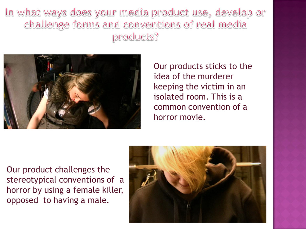
using a female killer, opposed to having a male. Our products sticks to the idea of the murderer keeping the victim in an isolated room. This is a common convention of a horror movie.
of keeping the killers identity concealed, this way the audience will be in suspense through till the end. Also the deviation from the stereotypical male killer should serve as a shock.
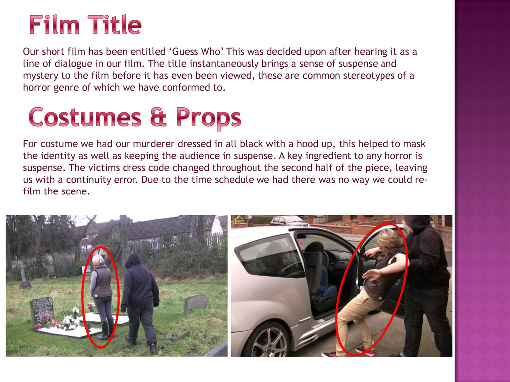
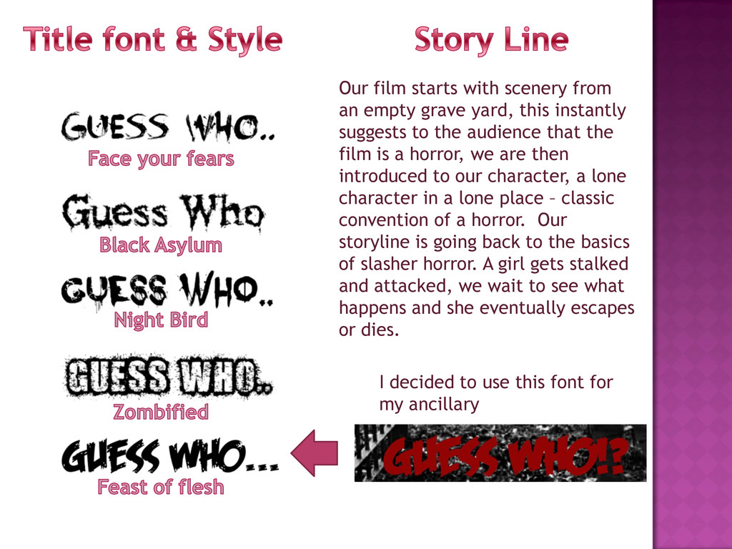
decided upon after hearing it as a line of dialogue in our film. The title instantaneously brings a sense of suspense and mystery to the film before it has even been viewed, these are common stereotypes of a horror genre of which we have conformed to. For costume we had our murderer dressed in all black with a hood up, this helped to mask the identity as well as keeping the audience in suspense. A key ingredient to any horror is suspense. The victims dress code changed throughout the second half of the piece, leaving us with a continuity error. Due to the time schedule we had there was no way we could re- film the scene.
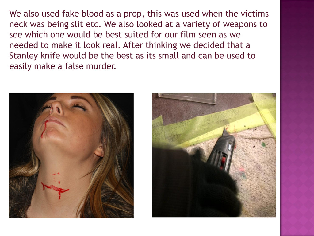
used when the victims neck was being slit etc. We also looked at a variety of weapons to see which one would be best suited for our film seen as we needed to make it look real. After thinking we decided that a Stanley knife would be the best as its small and can be used to easily make a false murder.
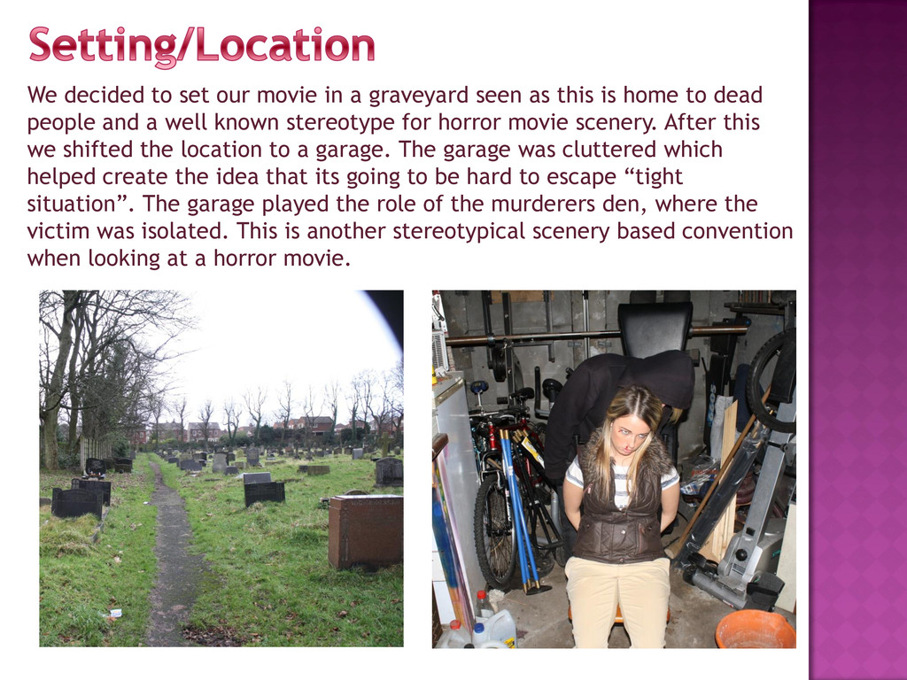
as this is home to dead people and a well known stereotype for horror movie scenery. After this we shifted the location to a garage. The garage was cluttered which helped create the idea that its going to be hard to escape “tight situation”. The garage played the role of the murderers den, where the victim was isolated. This is another stereotypical scenery based convention when looking at a horror movie.
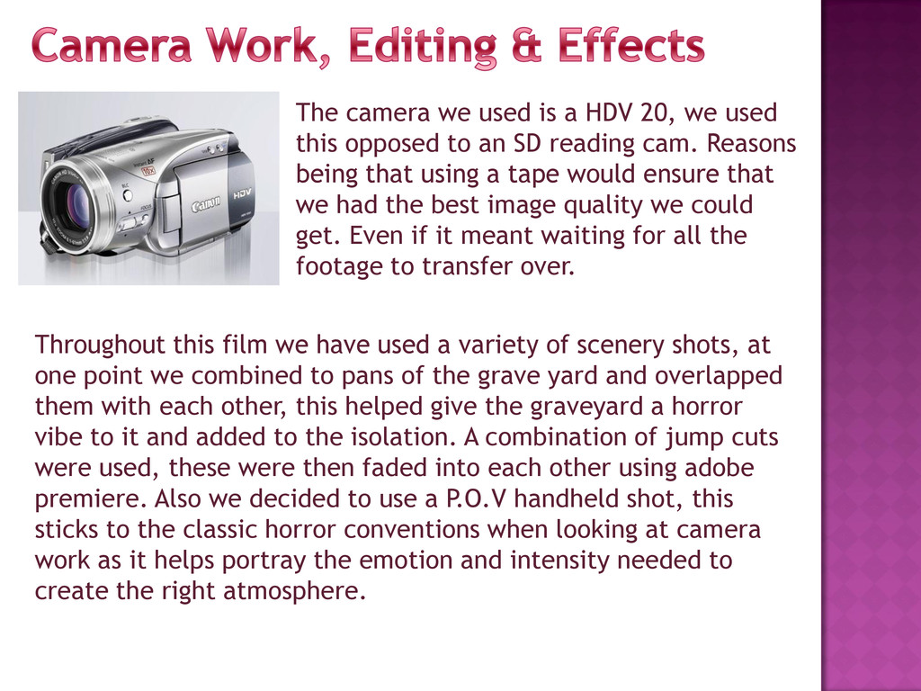
this opposed to an SD reading cam. Reasons being that using a tape would ensure that we had the best image quality we could get. Even if it meant waiting for all the footage to transfer over. Throughout this film we have used a variety of scenery shots, at one point we combined to pans of the grave yard and overlapped them with each other, this helped give the graveyard a horror vibe to it and added to the isolation. A combination of jump cuts were used, these were then faded into each other using adobe premiere. Also we decided to use a P.O.V handheld shot, this sticks to the classic horror conventions when looking at camera work as it helps portray the emotion and intensity needed to create the right atmosphere.
film starts with scenery from an empty grave yard, this instantly suggests to the audience that the film is a horror, we are then introduced to our character, a lone character in a lone place – classic convention of a horror. Our storyline is going back to the basics of slasher horror. A girl gets stalked and attacked, we wait to see what happens and she eventually escapes or dies.
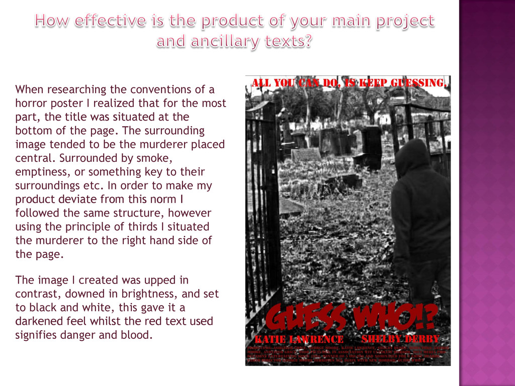
that for the most part, the title was situated at the bottom of the page. The surrounding image tended to be the murderer placed central. Surrounded by smoke, emptiness, or something key to their surroundings etc. In order to make my product deviate from this norm I followed the same structure, however using the principle of thirds I situated the murderer to the right hand side of the page. The image I created was upped in contrast, downed in brightness, and set to black and white, this gave it a darkened feel whilst the red text used signifies danger and blood.
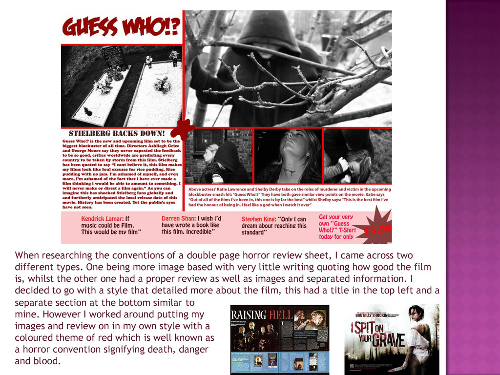
sheet, I came across two different types. One being more image based with very little writing quoting how good the film is, whilst the other one had a proper review as well as images and separated information. I decided to go with a style that detailed more about the film, this had a title in the top left and a separate section at the bottom similar to mine. However I worked around putting my images and review on in my own style with a coloured theme of red which is well known as a horror convention signifying death, danger and blood.
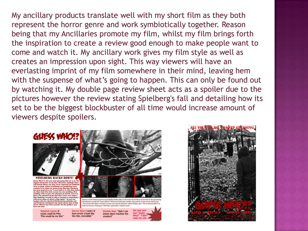
they both represent the horror genre and work symbiotically together. Reason being that my Ancillaries promote my film, whilst my film brings forth the inspiration to create a review good enough to make people want to come and watch it. My ancillary work gives my film style as well as creates an impression upon sight. This way viewers will have an everlasting imprint of my film somewhere in their mind, leaving hem with the suspense of what‟s going to happen. This can only be found out by watching it. My double page review sheet acts as a spoiler due to the pictures however the review stating Spielberg's fall and detailing how its set to be the biggest blockbuster of all time would increase amount of viewers despite spoilers.
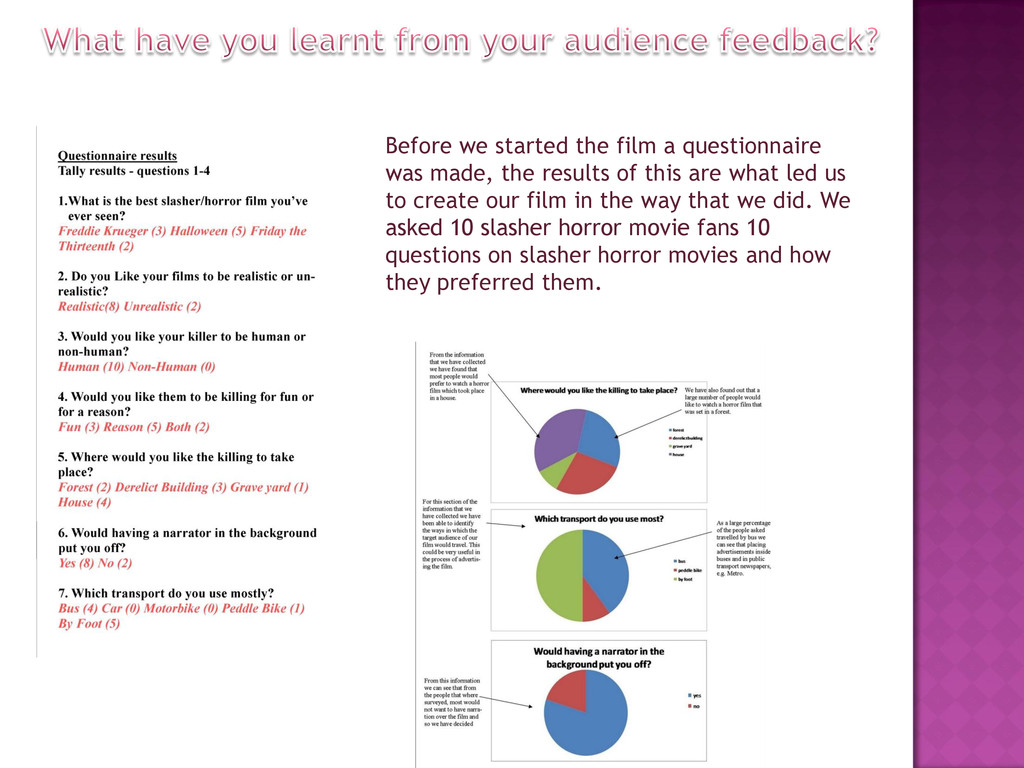
results of this are what led us to create our film in the way that we did. We asked 10 slasher horror movie fans 10 questions on slasher horror movies and how they preferred them.
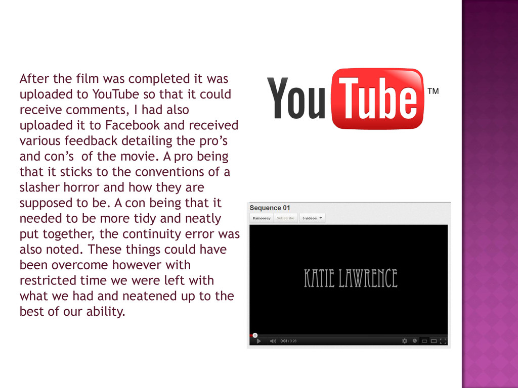
so that it could receive comments, I had also uploaded it to Facebook and received various feedback detailing the pro‟s and con‟s of the movie. A pro being that it sticks to the conventions of a slasher horror and how they are supposed to be. A con being that it needed to be more tidy and neatly put together, the continuity error was also noted. These things could have been overcome however with restricted time we were left with what we had and neatened up to the best of our ability.
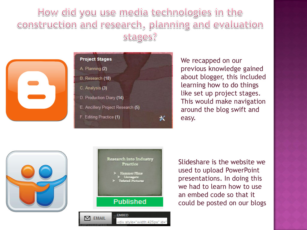
included learning how to do things like set up project stages. This would make navigation around the blog swift and easy. Slideshare is the website we used to upload PowerPoint presentations. In doing this we had to learn how to use an embed code so that it could be posted on our blogs
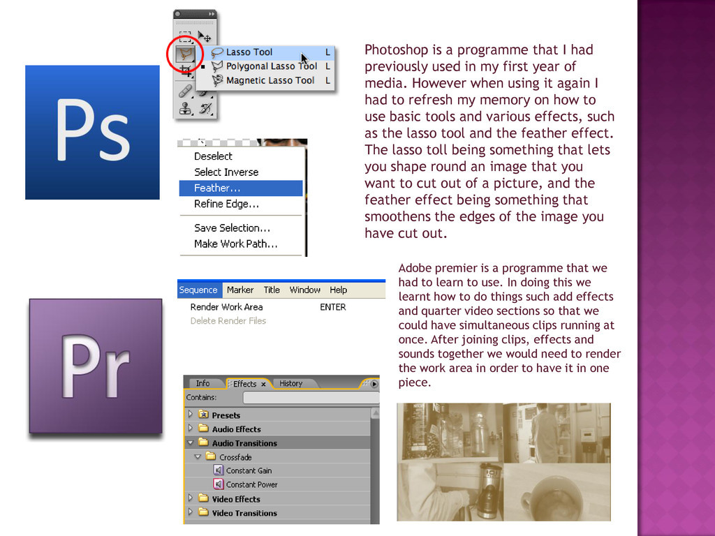
to use. In doing this we learnt how to do things such add effects and quarter video sections so that we could have simultaneous clips running at once. After joining clips, effects and sounds together we would need to render the work area in order to have it in one piece. Photoshop is a programme that I had previously used in my first year of media. However when using it again I had to refresh my memory on how to use basic tools and various effects, such as the lasso tool and the feather effect. The lasso toll being something that lets you shape round an image that you want to cut out of a picture, and the feather effect being something that smoothens the edges of the image you have cut out.
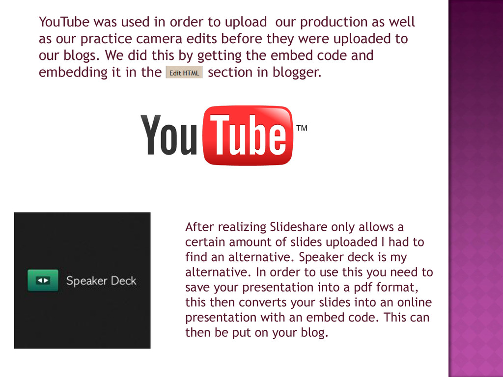
well as our practice camera edits before they were uploaded to our blogs. We did this by getting the embed code and embedding it in the section in blogger. After realizing Slideshare only allows a certain amount of slides uploaded I had to find an alternative. Speaker deck is my alternative. In order to use this you need to save your presentation into a pdf format, this then converts your slides into an online presentation with an embed code. This can then be put on your blog.


 george_moore
 ipullrank
 techseoconnect
 eileencodes
 addyosmani
 reverentgeek
 morganepeng
 sabderemane
 danielanewman
 soudai
 bethany
 tonyrice
 katarinadahlin