Upgrade to Pro
— share decks privately, control downloads, hide ads and more …
Speaker Deck
Features
Speaker Deck
PRO
Sign in
Sign up for free
Search
Search
Designing Evolution: Elements
Search
Sponsored
·
Ship Features Fearlessly
Turn features on and off without deploys. Used by thousands of Ruby developers.
→
Dan Donald
June 27, 2014
Technology
2
220
Designing Evolution: Elements
Talk for Responsive Day Out 2 in Brighton, June 2014
Dan Donald
June 27, 2014
Tweet
Share
More Decks by Dan Donald
See All by Dan Donald
Adding the foundations after the house has been built: Design systems at Auto Trader
hereinthehive
0
110
Designing Evolution
hereinthehive
0
180
Reactive Web Design
hereinthehive
1
770
Designing for Context: Reactive Web Design
hereinthehive
2
790
Other Decks in Technology
See All in Technology
OCI Database Management サービス詳細
oracle4engineer
PRO
1
7.3k
Tebiki Engineering Team Deck
tebiki
0
24k
Contract One Engineering Unit 紹介資料
sansan33
PRO
0
13k
外部キー制約の知っておいて欲しいこと - RDBMSを正しく使うために必要なこと / FOREIGN KEY Night
soudai
PRO
12
4.8k
Bedrock PolicyでAmazon Bedrock Guardrails利用を強制してみた
yuu551
0
160
Stately
mu7889yoon
1
110
SREじゃなかった僕らがenablingを通じて「SRE実践者」になるまでのリアル / SRE Kaigi 2026
aeonpeople
6
2.2k
生成AI時代にこそ求められるSRE / SRE for Gen AI era
ymotongpoo
5
2.8k
制約が導く迷わない設計 〜 信頼性と運用性を両立するマイナンバー管理システムの実践 〜
bwkw
3
880
月間数億レコードのアクセスログ基盤を無停止・低コストでAWS移行せよ!アプリケーションエンジニアのSREチャレンジ💪
miyamu
0
820
Claude_CodeでSEOを最適化する_AI_Ops_Community_Vol.2__マーケティングx_AIはここまで進化した.pdf
riku_423
2
490
GitHub Issue Templates + Coding Agentで簡単みんなでIaC/Easy IaC for Everyone with GitHub Issue Templates + Coding Agent
aeonpeople
1
190
Featured
See All Featured
GraphQLの誤解/rethinking-graphql
sonatard
74
11k
Speed Design
sergeychernyshev
33
1.5k
世界の人気アプリ100個を分析して見えたペイウォール設計の心得
akihiro_kokubo
PRO
66
36k
Making the Leap to Tech Lead
cromwellryan
135
9.7k
My Coaching Mixtape
mlcsv
0
46
Raft: Consensus for Rubyists
vanstee
141
7.3k
Embracing the Ebb and Flow
colly
88
5k
How to optimise 3,500 product descriptions for ecommerce in one day using ChatGPT
katarinadahlin
PRO
0
3.4k
Refactoring Trust on Your Teams (GOTO; Chicago 2020)
rmw
35
3.3k
Connecting the Dots Between Site Speed, User Experience & Your Business [WebExpo 2025]
tammyeverts
11
820
Being A Developer After 40
akosma
91
590k
Art, The Web, and Tiny UX
lynnandtonic
304
21k
Transcript
Designing Evolution: Elements Dan Donald @hereinthehive Monday, 30 June 14
Monday, 30 June 14
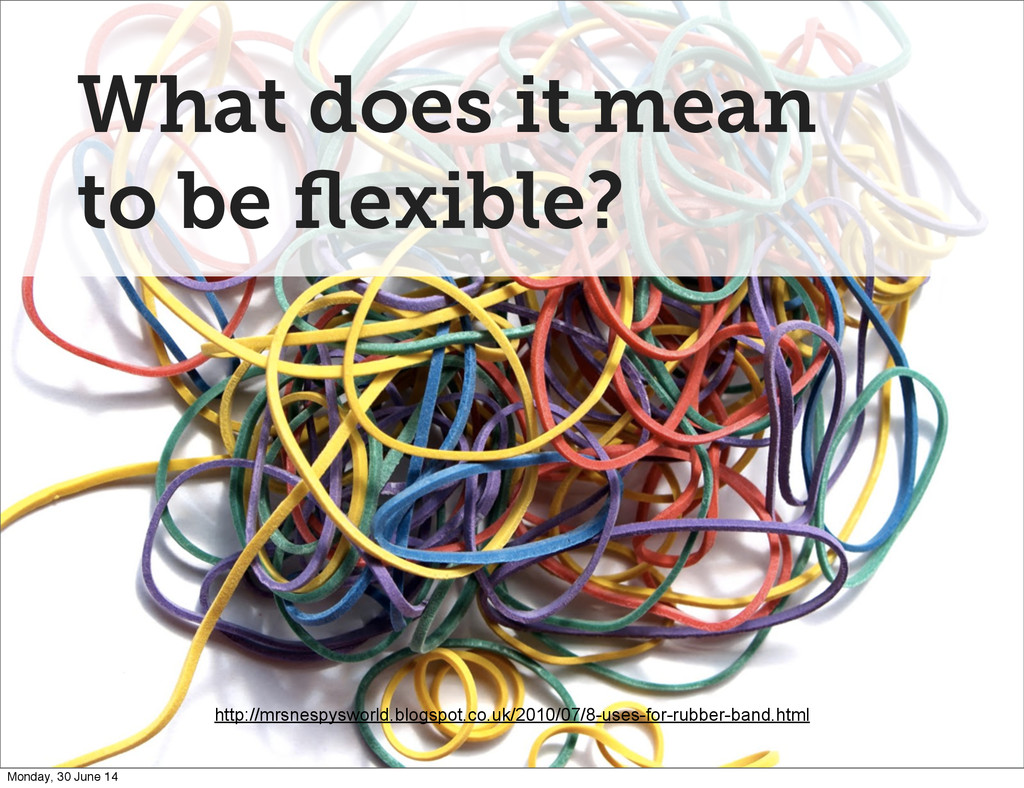
What does it mean to be flexible? http://mrsnespysworld.blogspot.co.uk/2010/07/8-uses-for-rubber-band.html Monday, 30
June 14
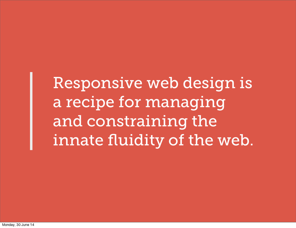
Responsive web design is a recipe for managing and constraining
the innate fluidity of the web. Monday, 30 June 14
Open to interpretation Monday, 30 June 14
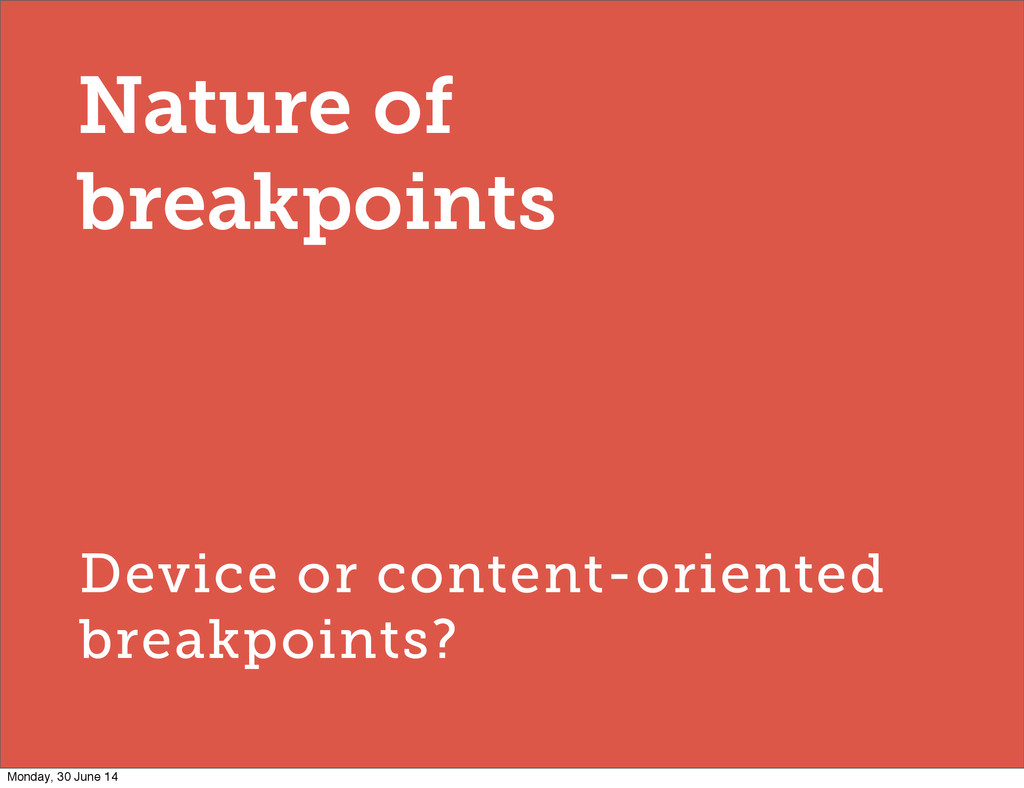
Nature of breakpoints Monday, 30 June 14
Nature of breakpoints Device or content-oriented breakpoints? Monday, 30 June
14
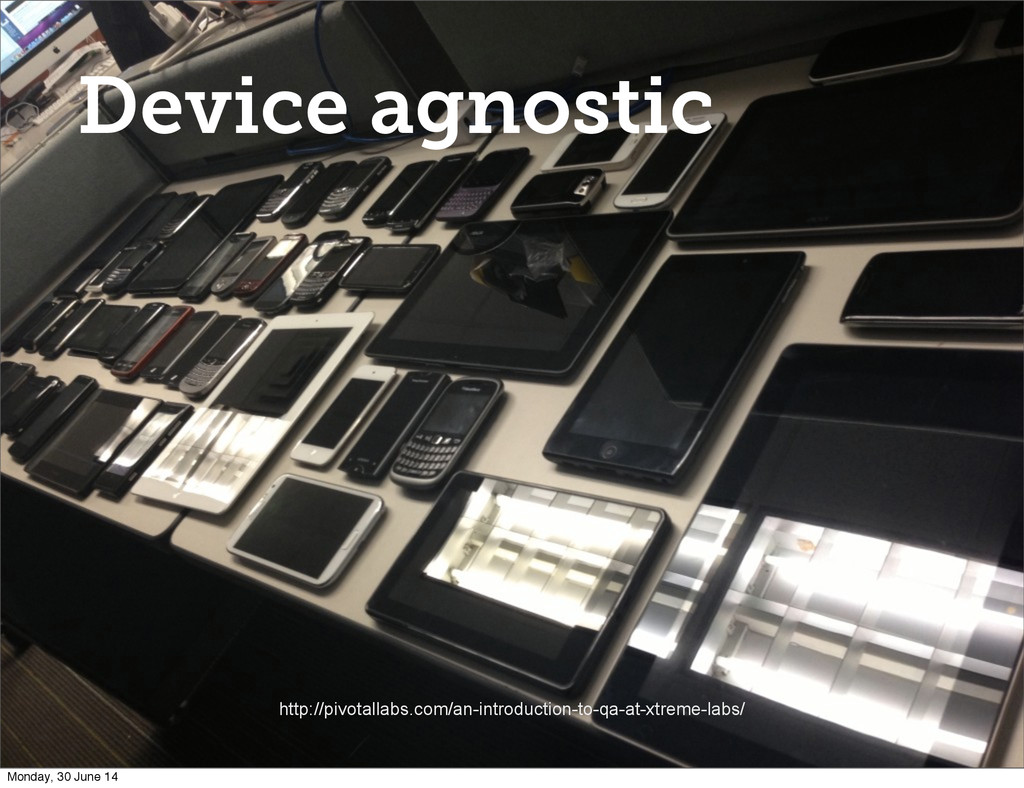
Device agnostic http://pivotallabs.com/an-introduction-to-qa-at-xtreme-labs/ Monday, 30 June 14
Universality Monday, 30 June 14
What do we know? Monday, 30 June 14
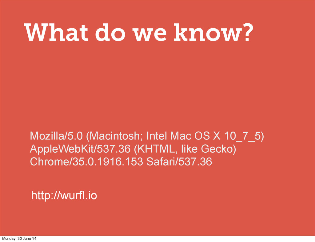
What do we know? Mozilla/5.0 (Macintosh; Intel Mac OS X
10_7_5) AppleWebKit/537.36 (KHTML, like Gecko) Chrome/35.0.1916.153 Safari/537.36 http://wurfl.io Monday, 30 June 14
When do we know it? Monday, 30 June 14
What capabilities help us make good decisions? Monday, 30 June
14
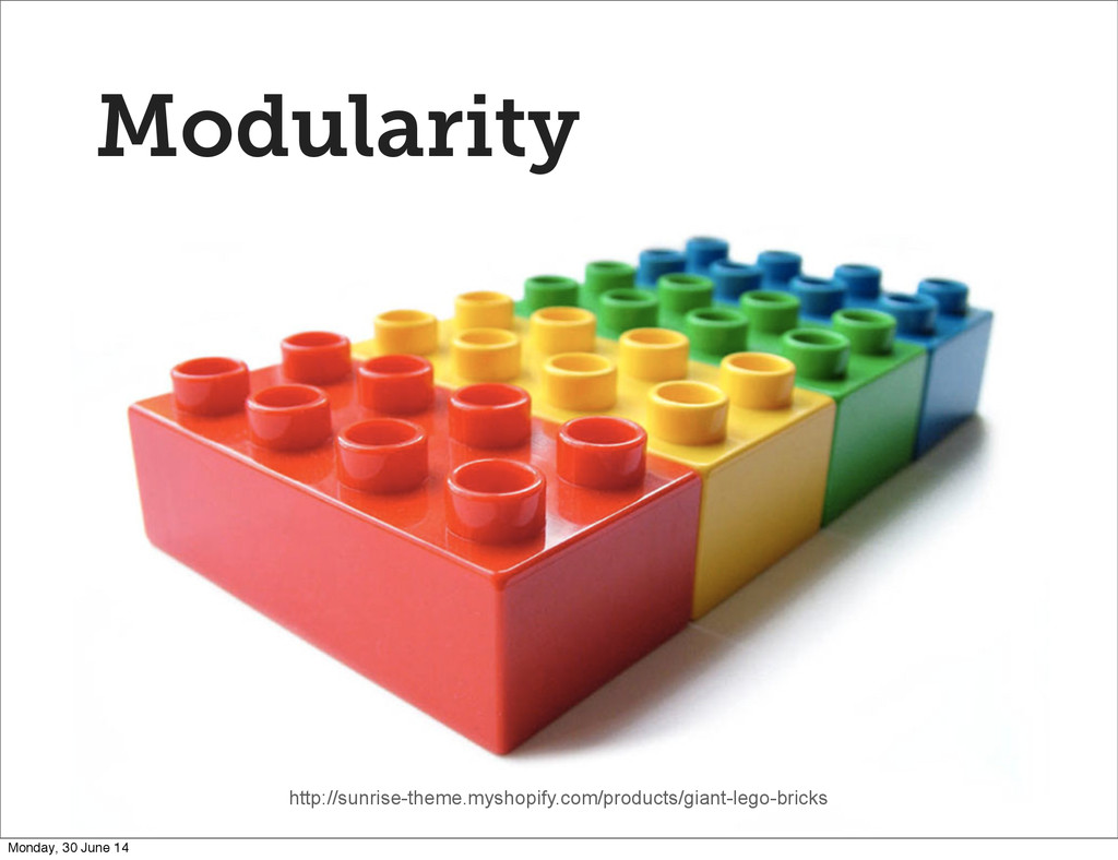
Modularity http://sunrise-theme.myshopify.com/products/giant-lego-bricks Monday, 30 June 14
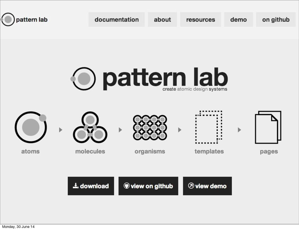
Atomic design http://patternlab.io @brad_frost Monday, 30 June 14
Monday, 30 June 14
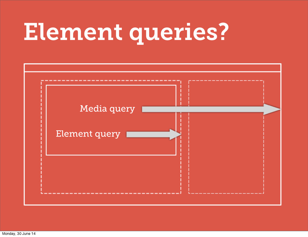
Element queries? Media query Element query Monday, 30 June 14
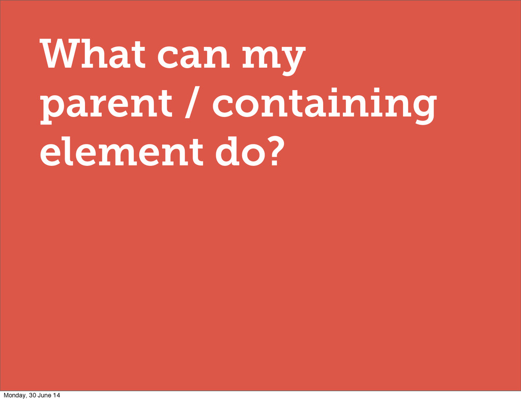
What can my parent / containing element do? Monday, 30
June 14
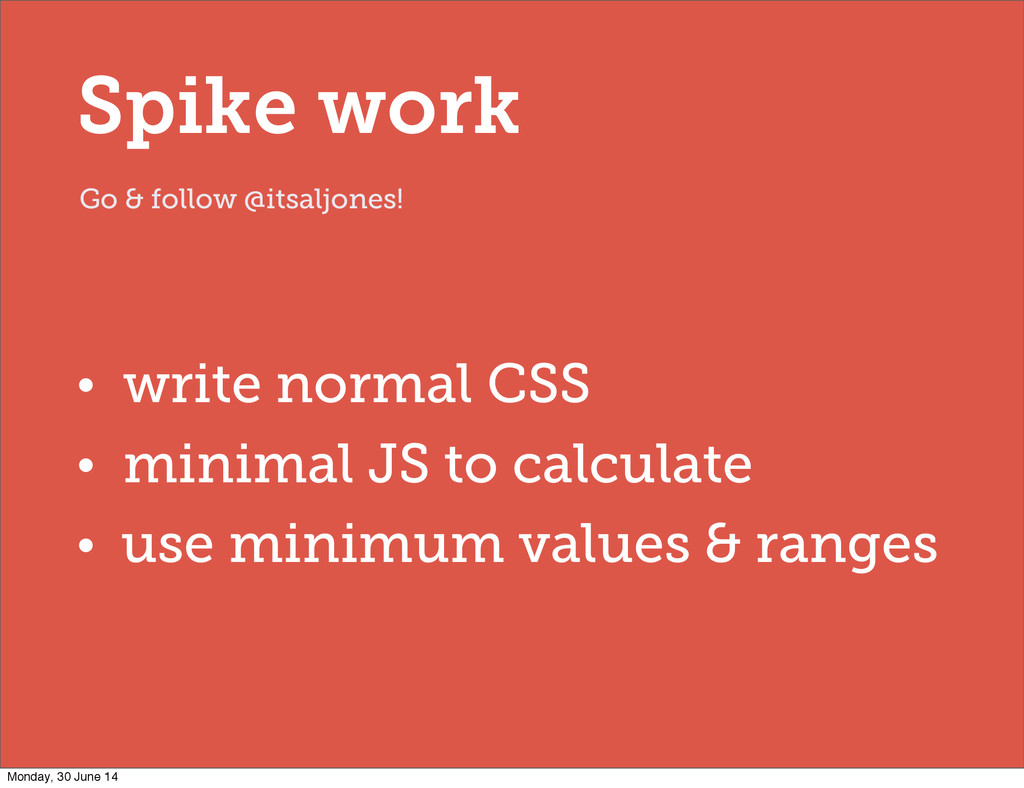
• write normal CSS • minimal JS to calculate •
use minimum values & ranges Go & follow @itsaljones! Spike work Monday, 30 June 14
CSS ‘Trigger Points’ [data-width~="20em"] [data-width~="30-40em"] Monday, 30 June 14
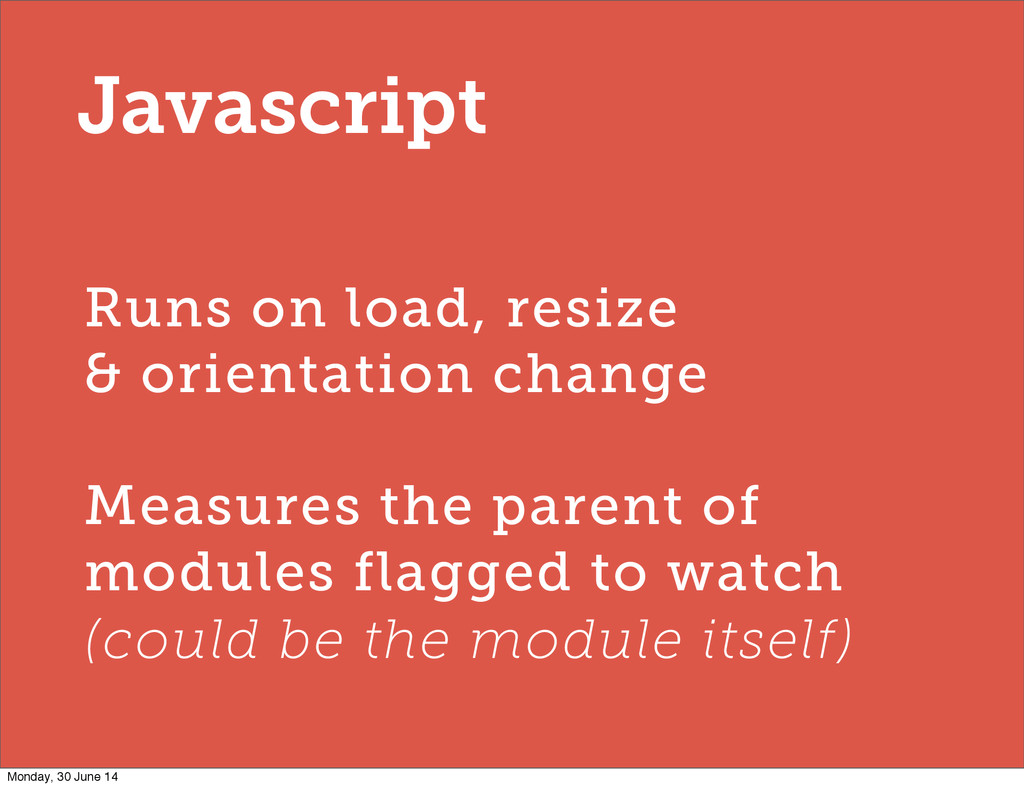
Runs on load, resize & orientation change Measures the parent
of modules flagged to watch (could be the module itself) Javascript Monday, 30 June 14
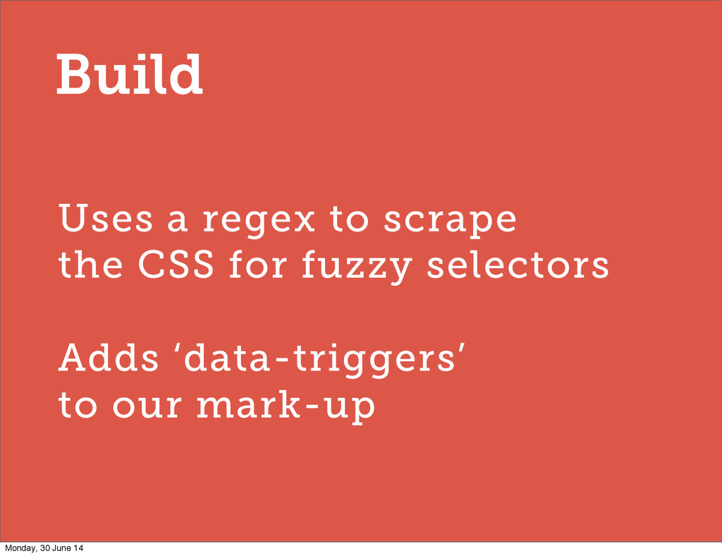
Uses a regex to scrape the CSS for fuzzy selectors
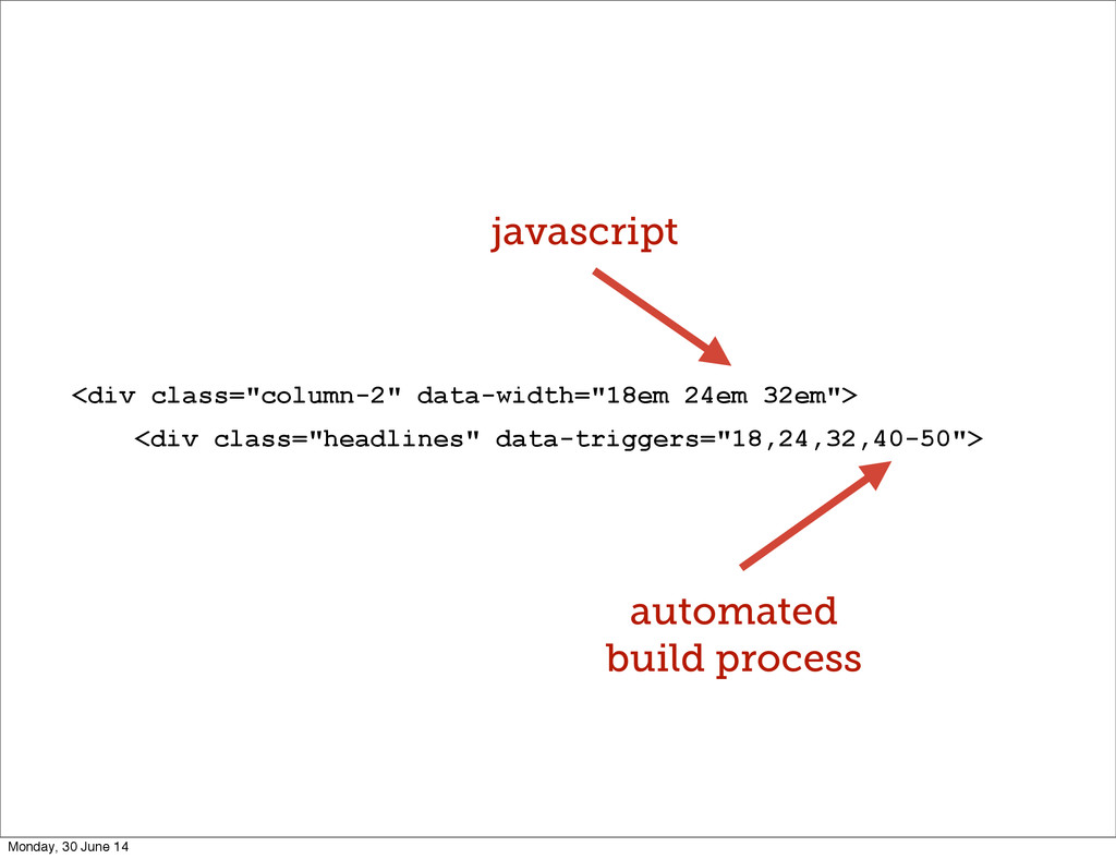
Adds ‘data-triggers’ to our mark-up Build Monday, 30 June 14
<div class="column-2" data-width="18em 24em 32em"> <div class="headlines" data-triggers="18,24,32,40-50"> automated build
process javascript Monday, 30 June 14
[data-width~="32em"] .headlines { float:right; width:32%; } Monday, 30 June 14
.headlines[data-width~="32em"] { float:right; width:32%; } .headlines.w32em { float:right; width:32%; }
Size of container or module? Monday, 30 June 14
Monday, 30 June 14
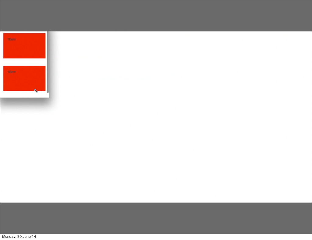
/** * Trigger Points **/ [data-width~="10em"] .mod_colours { background-color: red
} [data-width~="20em"] .mod_colours { background-color: yellow } [data-width~="30em"] .mod_colours { background-color: pink } [data-width~="40em"] .mod_colours { background-color: lightgreen } [data-width~="50em"] .mod_colours { background-color: purple } [data-width~="60em"] .mod_colours { background-color: orange } [data-width~="70em"] .mod_colours { background-color: blue } Monday, 30 June 14
Monday, 30 June 14
Monday, 30 June 14
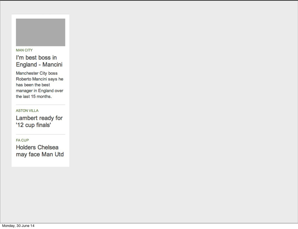
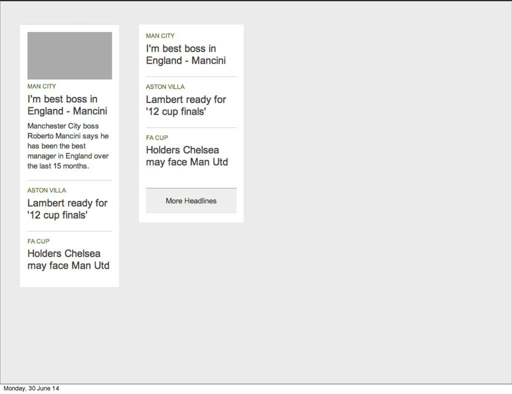
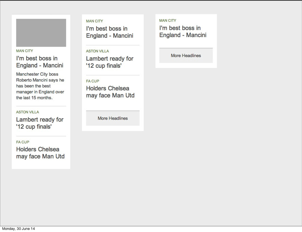
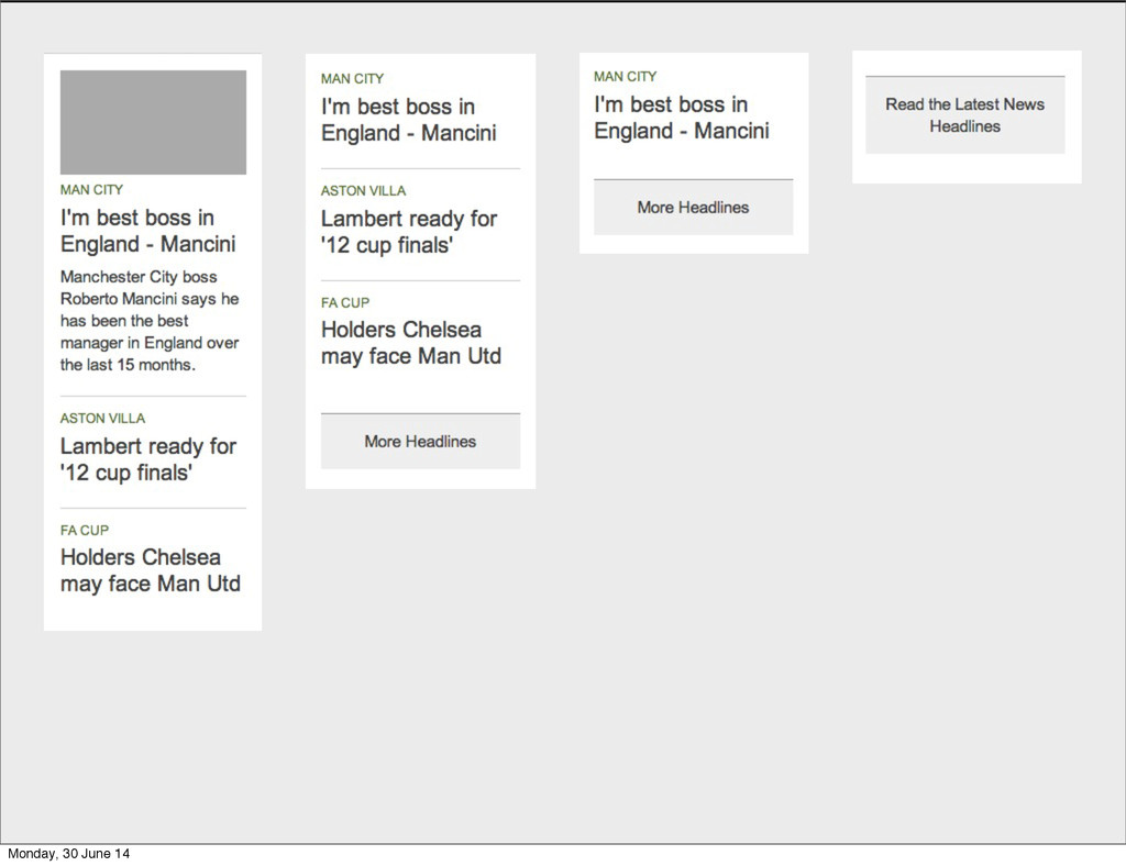
Start with the most primitive form Monday, 30 June 14
How could the layout of a module evolve? Monday, 30
June 14
Monday, 30 June 14
Monday, 30 June 14
Monday, 30 June 14
Monday, 30 June 14
Monday, 30 June 14
Monday, 30 June 14
Monday, 30 June 14
Monday, 30 June 14
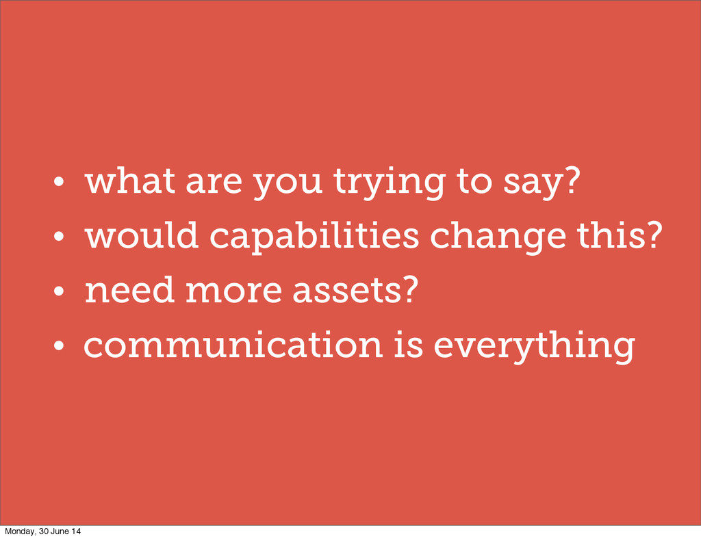
• what are you trying to say? • would capabilities
change this? • need more assets? • communication is everything Monday, 30 June 14
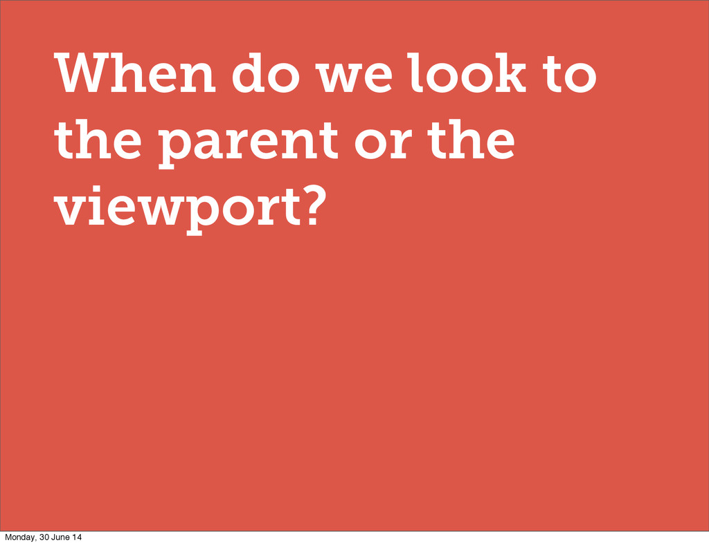
When do we look to the parent or the viewport?
Monday, 30 June 14
@media all and (min-width: 30em) { [data-width~="32em"] .headlines { float:right;
width:32%; } } Monday, 30 June 14
Progressive enhancement Monday, 30 June 14
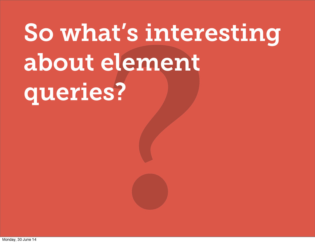
? So what’s interesting about element queries? Monday, 30 June
14
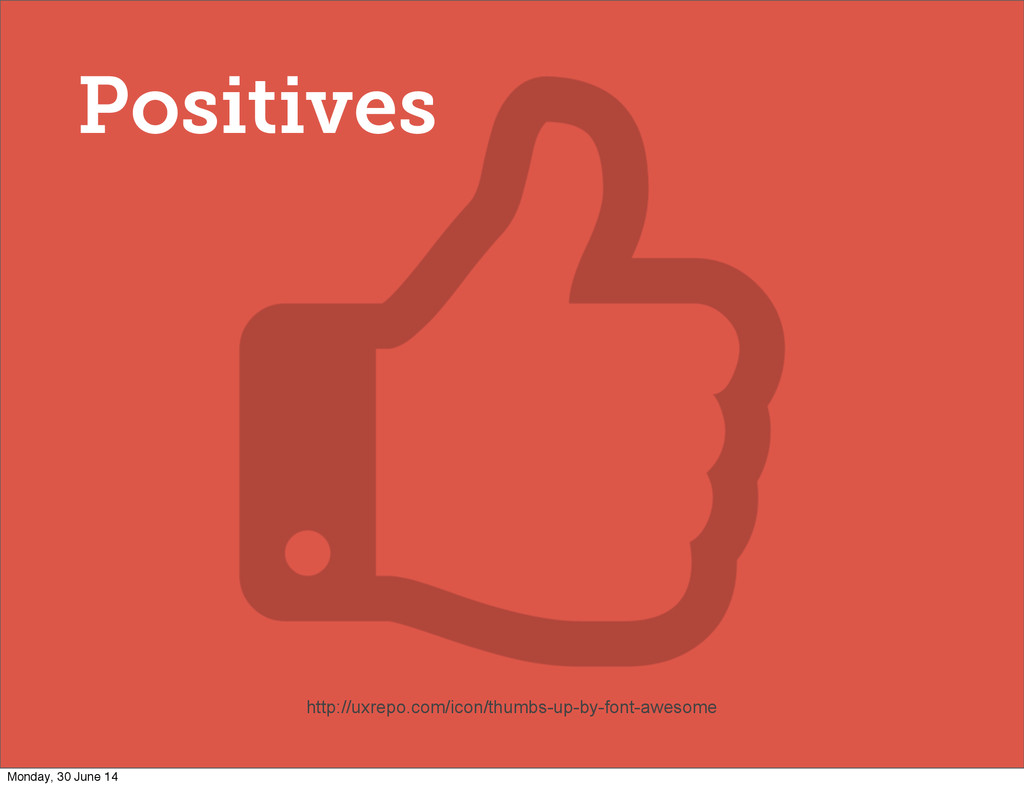
Positives http://uxrepo.com/icon/thumbs-up-by-font-awesome Monday, 30 June 14
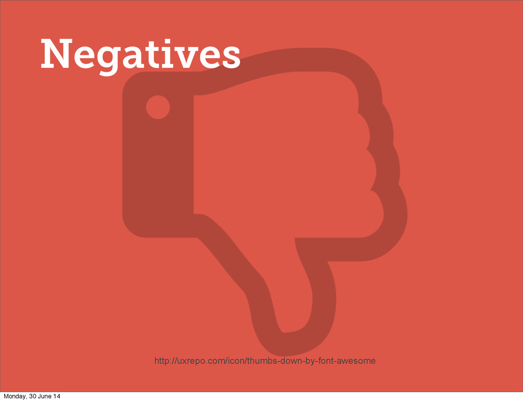
Negatives http://uxrepo.com/icon/thumbs-down-by-font-awesome Monday, 30 June 14
Should we use them now? Monday, 30 June 14
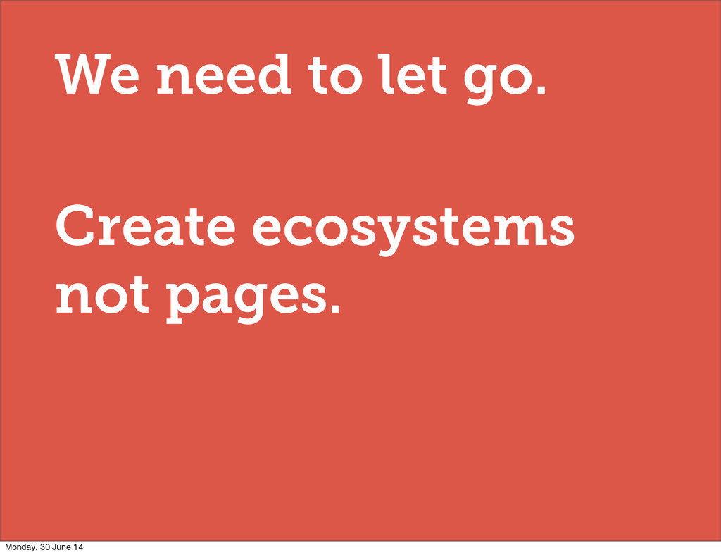
We need to let go. Create ecosystems not pages. Monday,
30 June 14
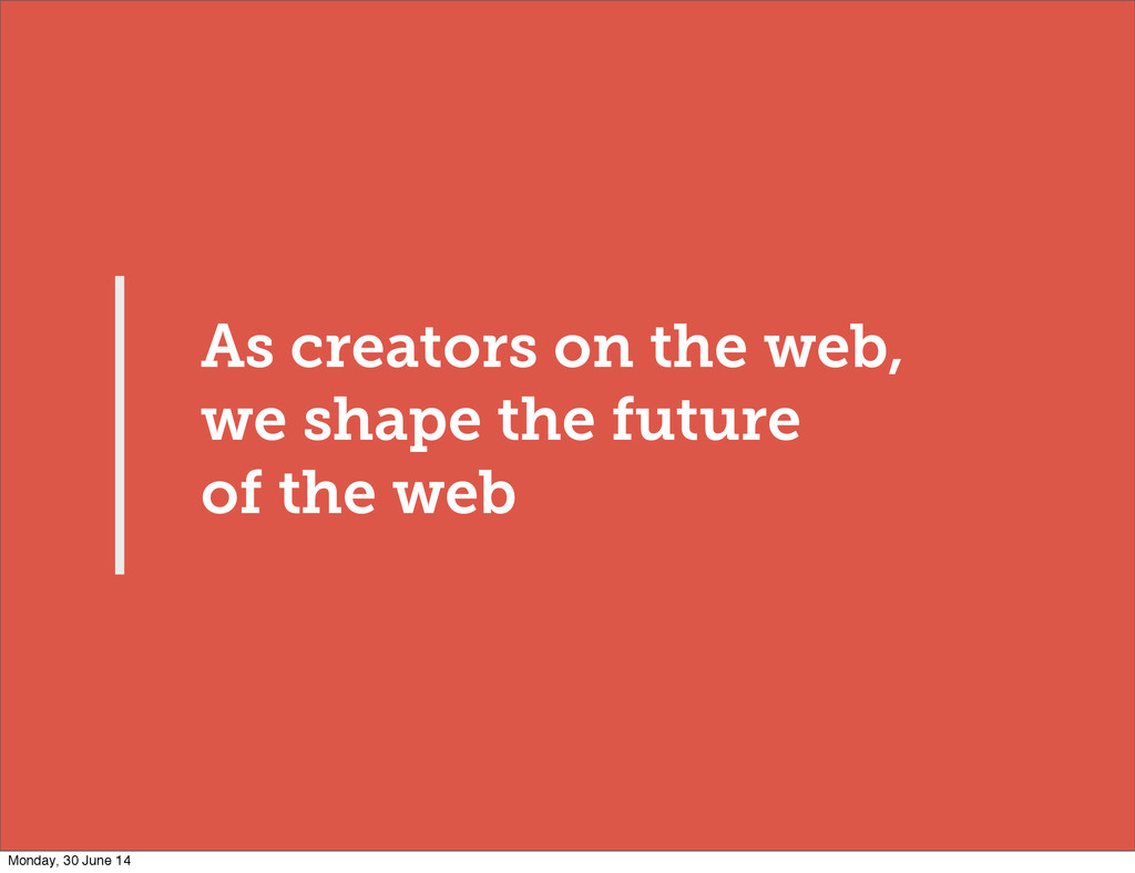
As creators on the web, we shape the future of
the web Monday, 30 June 14
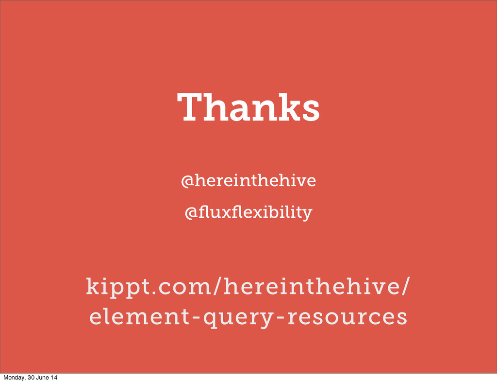
Thanks @hereinthehive @fluxflexibility kippt.com/hereinthehive/ element-query-resources Monday, 30 June 14
 hereinthehive
 oracle4engineer
 tebiki
 sansan33
 soudai
 yuu551
 mu7889yoon
 aeonpeople
 ymotongpoo
 bwkw
bwkw
 miyamu
 riku_423
 sonatard
 sergeychernyshev
 akihiro_kokubo
 cromwellryan
 mlcsv
mlcsv
 vanstee
 colly
colly
 katarinadahlin
 rmw
rmw
 tammyeverts
 akosma
 lynnandtonic
![CSS ‘Trigger Points’ [data-width~="20em"] [data-width~="30-40em"] Monday, 30 June 14](https://files.speakerdeck.com/presentations/e70e2c90e2ce01316c3a427af72f2f34/slide_19.jpg)
![[data-width~="32em"] .headlines { float:right; width:32%; } Monday, 30 June 14](https://files.speakerdeck.com/presentations/e70e2c90e2ce01316c3a427af72f2f34/slide_23.jpg)
![.headlines[data-width~="32em"] { float:right; width:32%; } .headlines.w32em { float:right; width:32%; }](https://files.speakerdeck.com/presentations/e70e2c90e2ce01316c3a427af72f2f34/slide_24.jpg)
![/** * Trigger Points **/ [data-width~="10em"] .mod_colours { background-color: red](https://files.speakerdeck.com/presentations/e70e2c90e2ce01316c3a427af72f2f34/slide_26.jpg)
![@media all and (min-width: 30em) { [data-width~="32em"] .headlines { float:right;](https://files.speakerdeck.com/presentations/e70e2c90e2ce01316c3a427af72f2f34/slide_41.jpg)