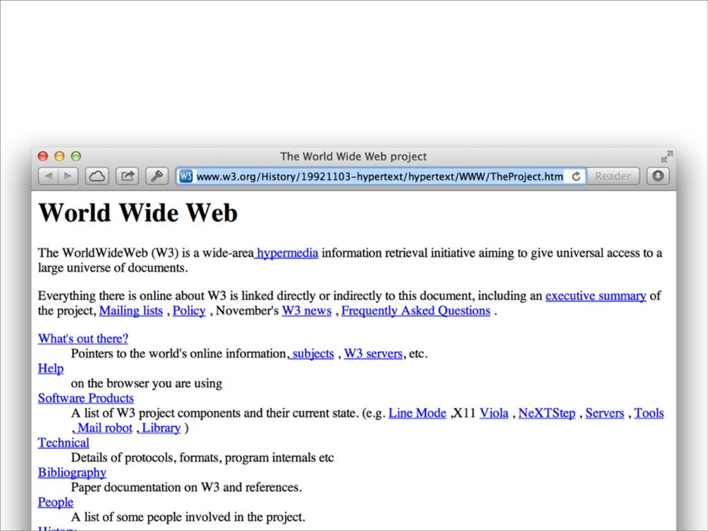
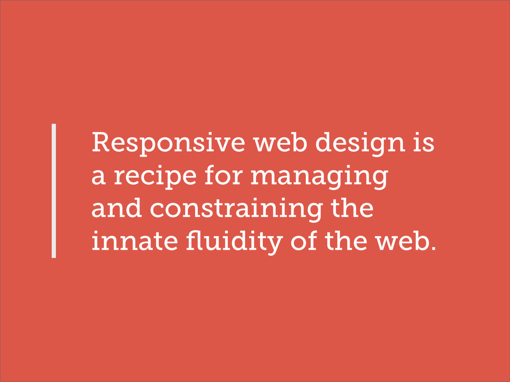
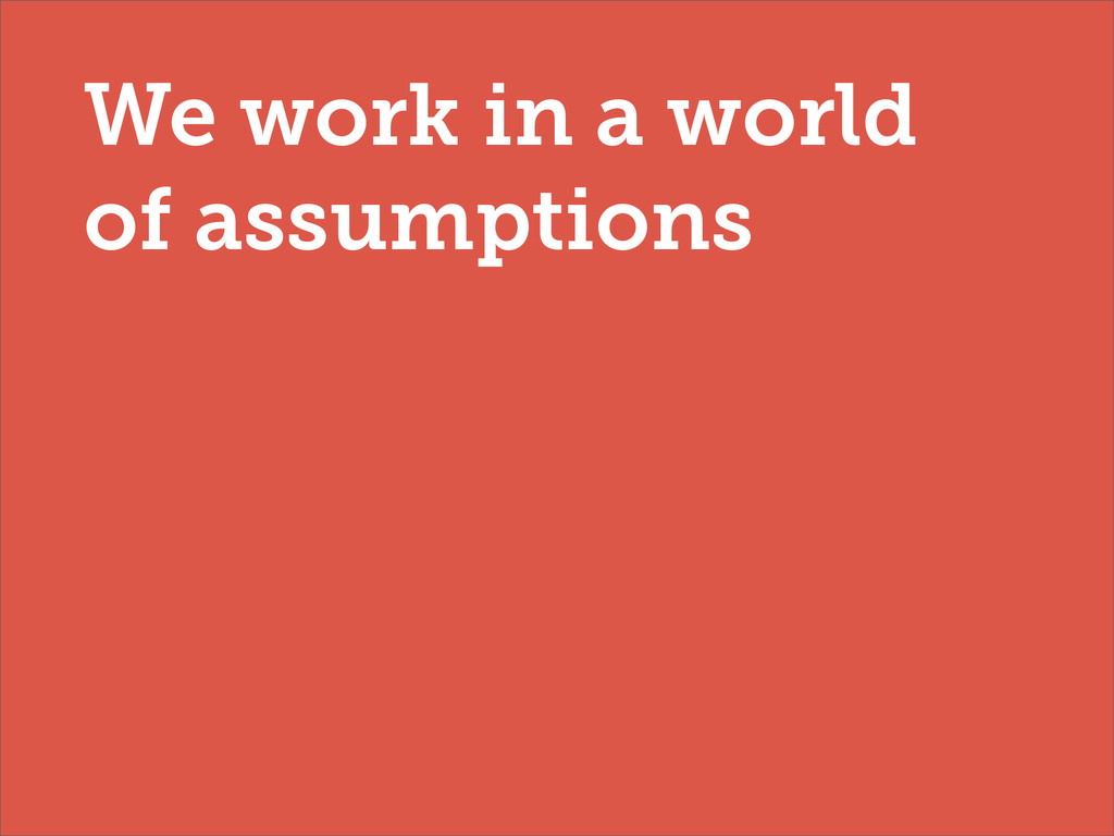
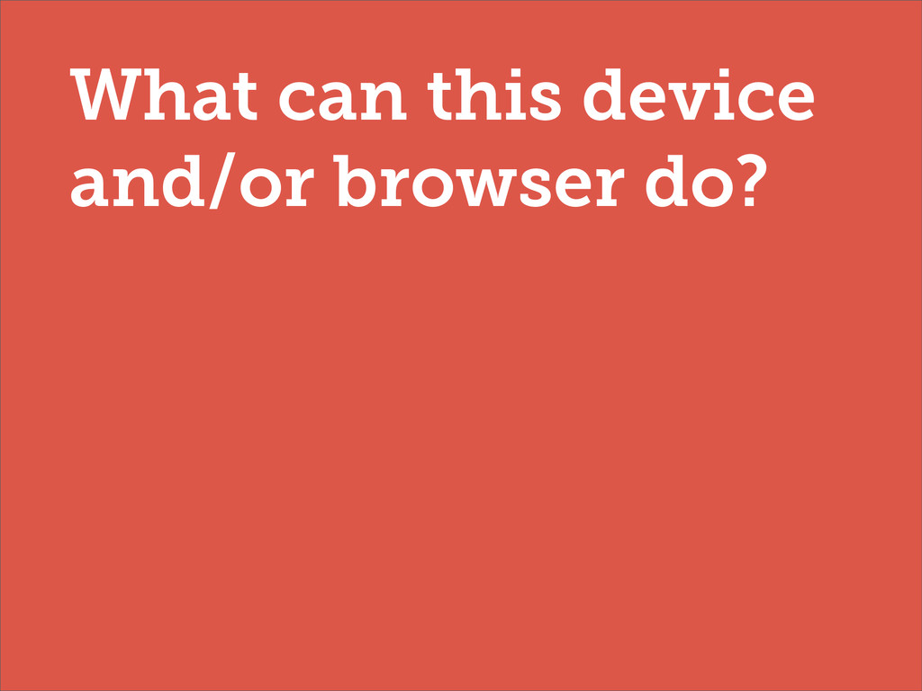
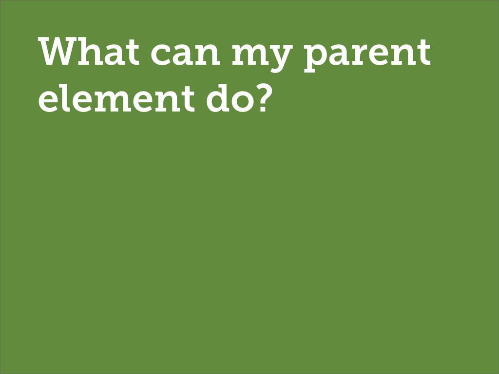
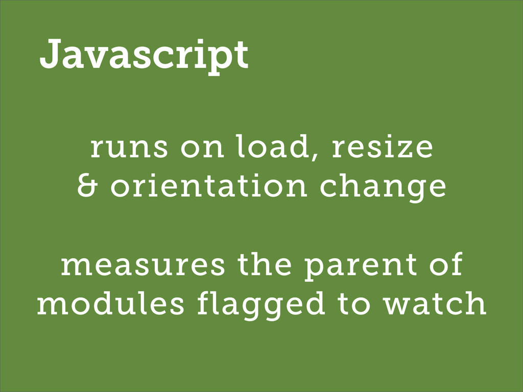
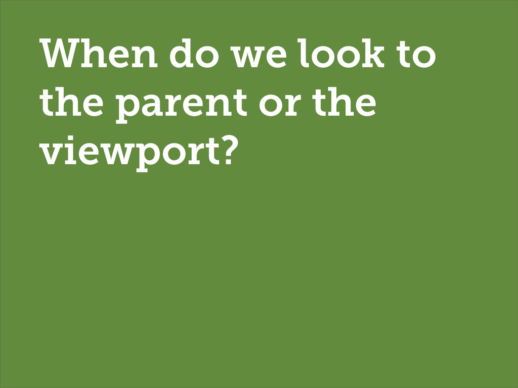
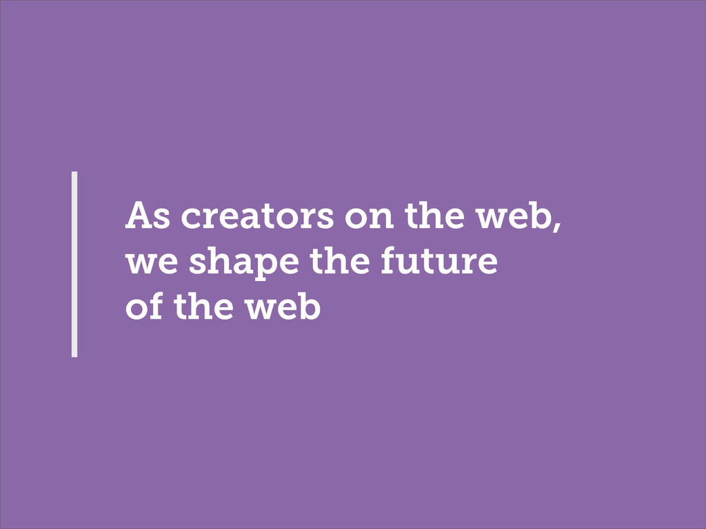
What does it really mean work with the flexibility we have through responsive web design; the interpretations of that recipe and how we can go so much further than just looking at viewport widths. In part that may be about 'element queries': what are they? Do we need them? How do they make us look differently at what we do?
 hereinthehive
 genda
genda
 masahirokawahara
 miu_crescent
 hiroramos4
 kentapapa
 exawizards
 risatube
 tosite
 daitasu
 shoe116
 tomokusaba
 gunta
gunta
 honnibal
 gr2m
gr2m
 keathley
 baasie
 tonyrice
 sergeychernyshev
 marketingsoph
 maggiecrowley
 tmiket
 akosma
 tomoyanonymous
 cassininazir
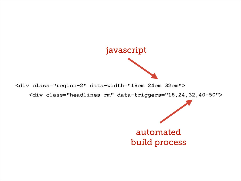
![CSS: ‘trigger points’ [data-width~="20em"] [data-width~="30-40em"]](https://files.speakerdeck.com/presentations/2dc44f50c426013115eb3a3362bbdac7/slide_33.jpg)
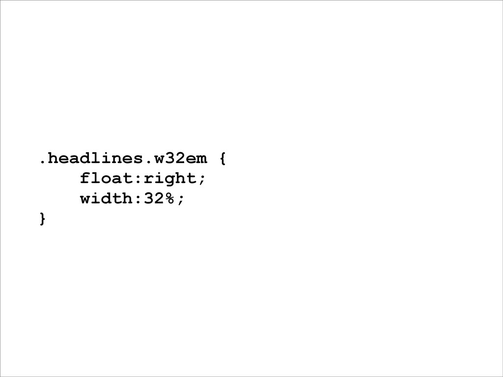
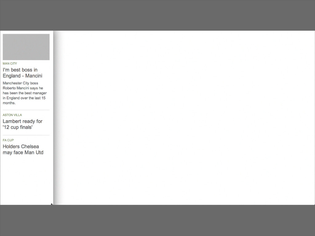
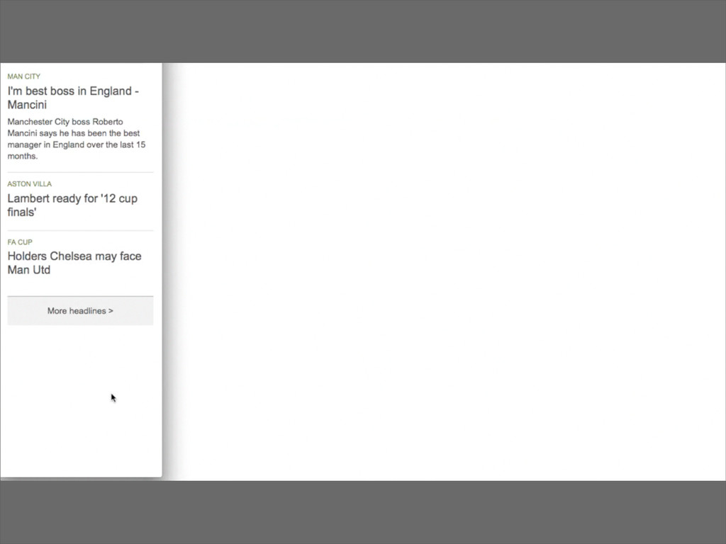
![[data-width~="32em"] .headlines { float:right; width:32%; }](https://files.speakerdeck.com/presentations/2dc44f50c426013115eb3a3362bbdac7/slide_36.jpg)
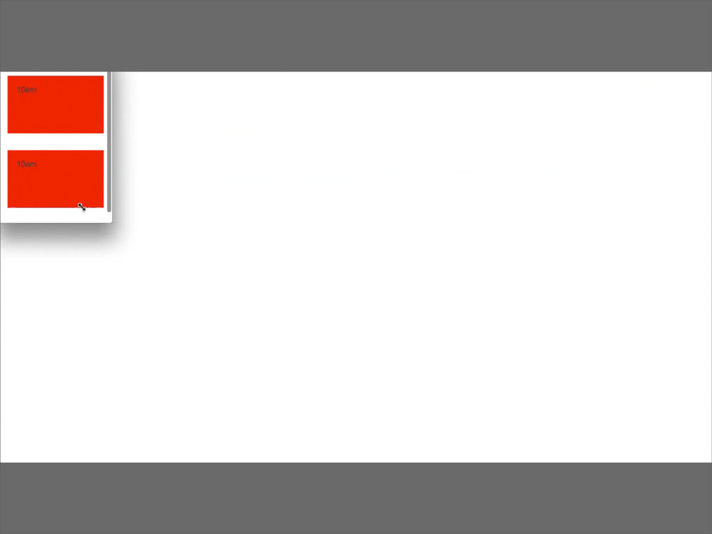
![/** * Trigger Points **/ [data-width~="10em"] .mod_colours { background-color: red](https://files.speakerdeck.com/presentations/2dc44f50c426013115eb3a3362bbdac7/slide_46.jpg)