Upgrade to Pro — share decks privately, control downloads, hide ads and more …

Building Beautiful Apps with the Design Support Library

Joe Birch
August 02, 2016

Building Beautiful Apps with the Design Support Library

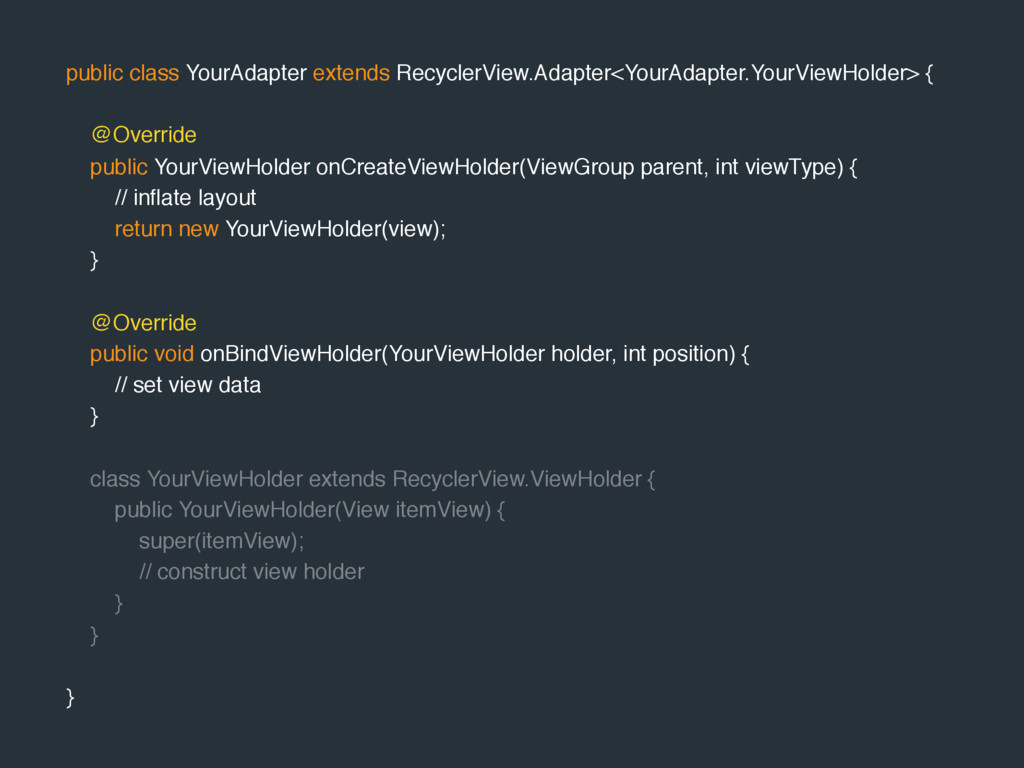
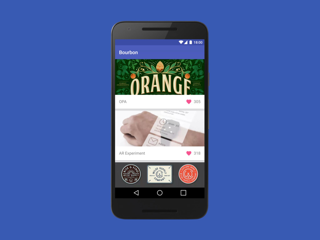
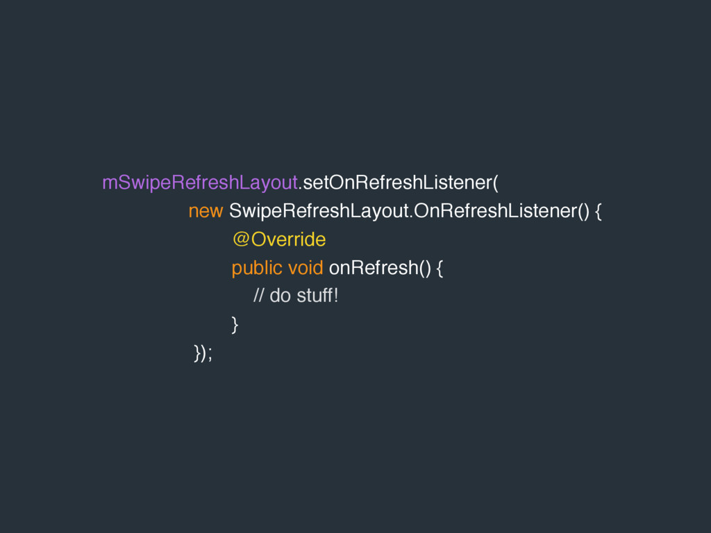
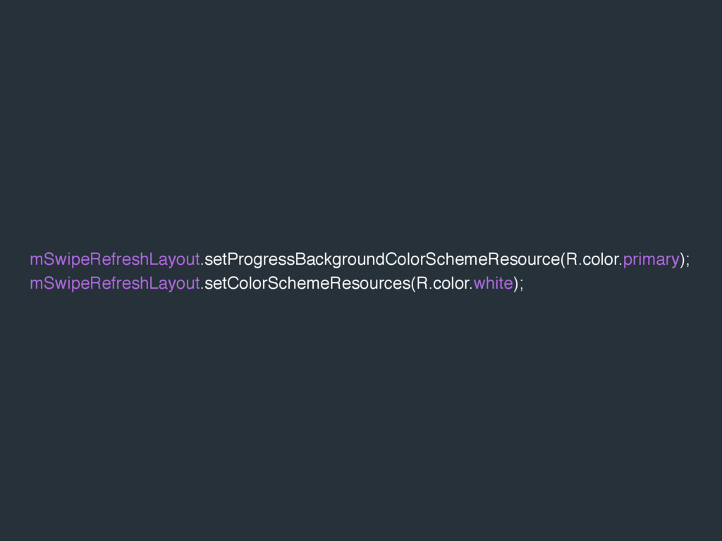
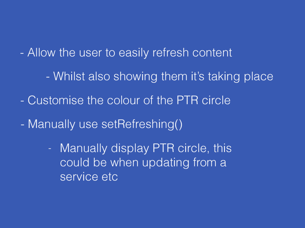
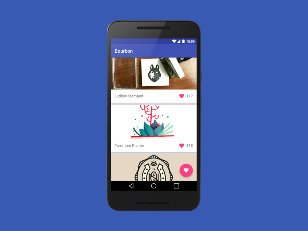
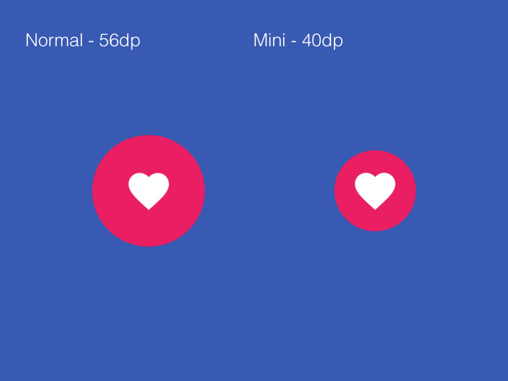
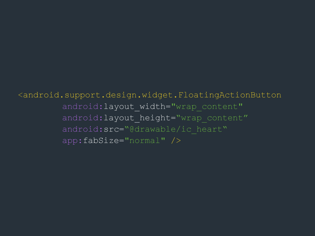
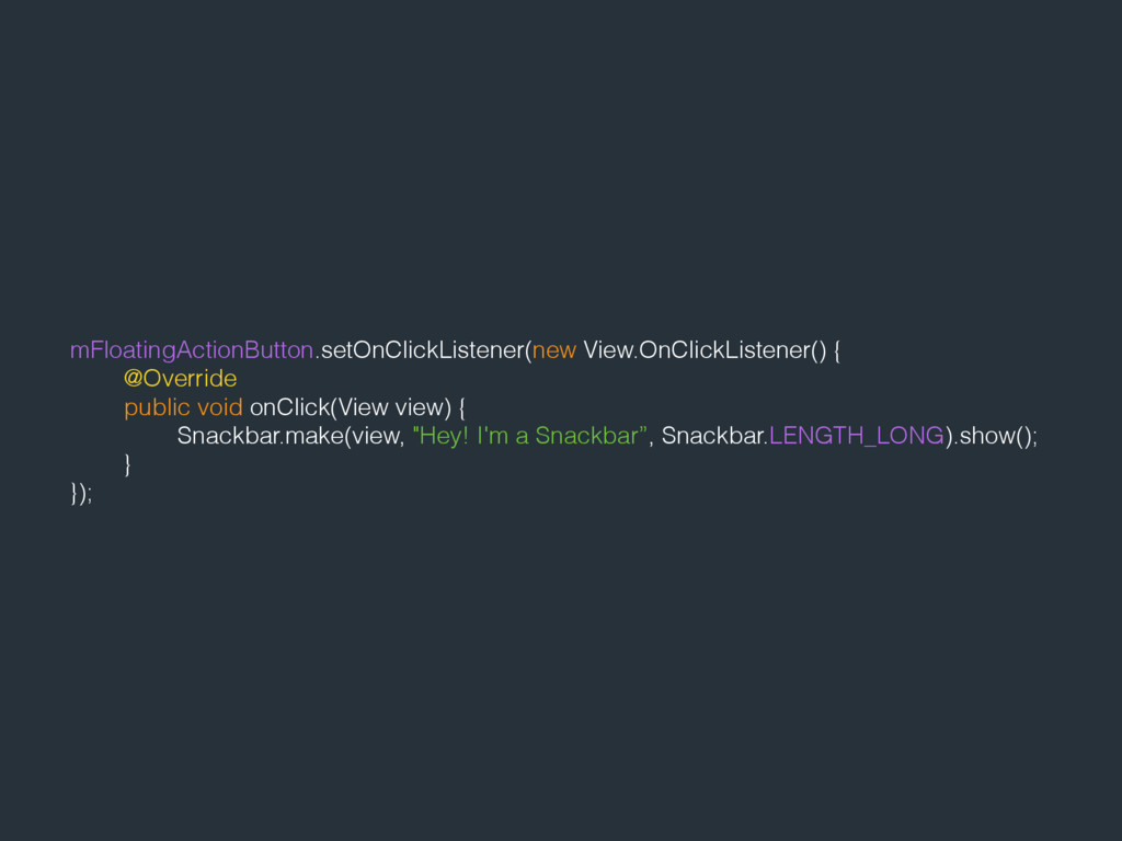
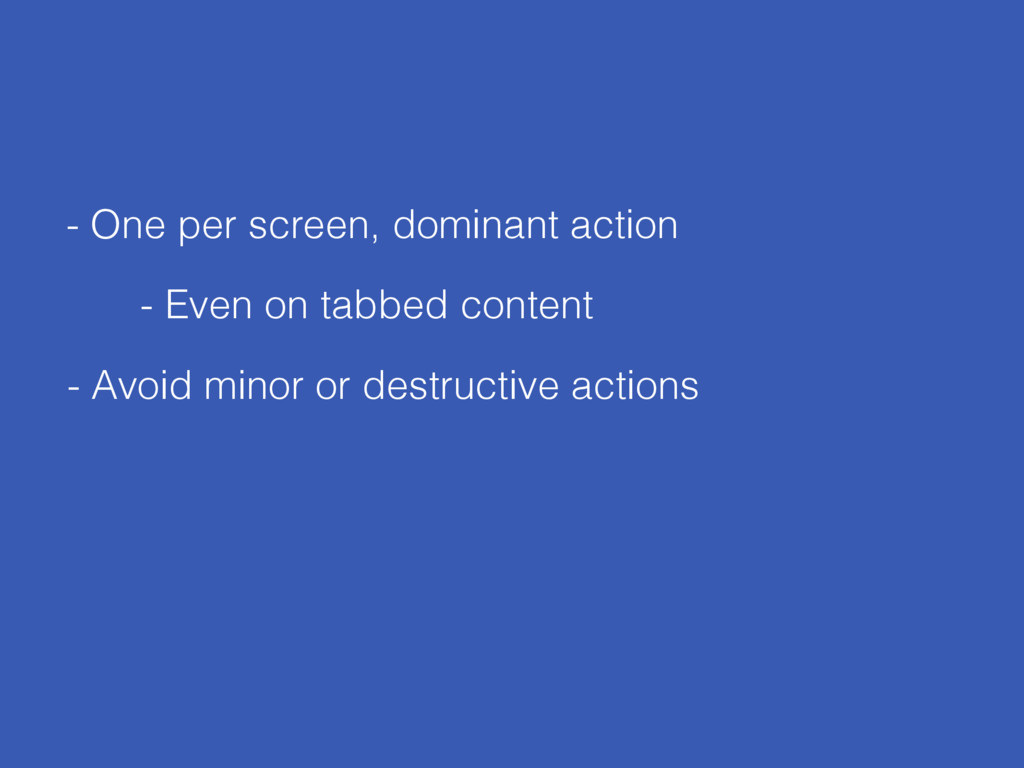
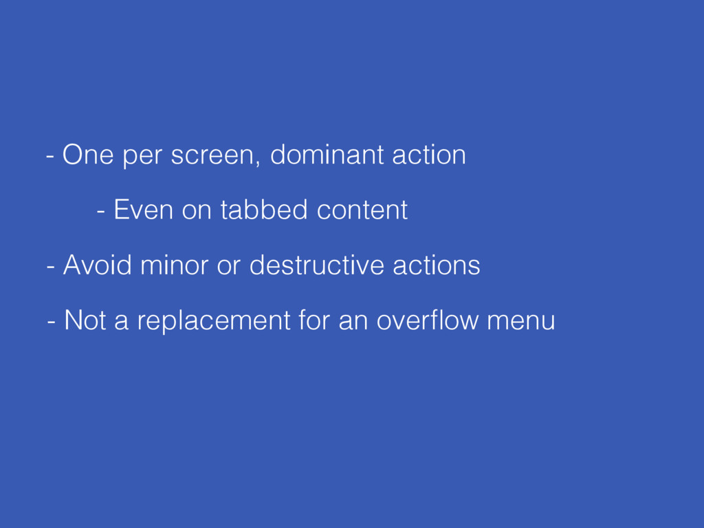
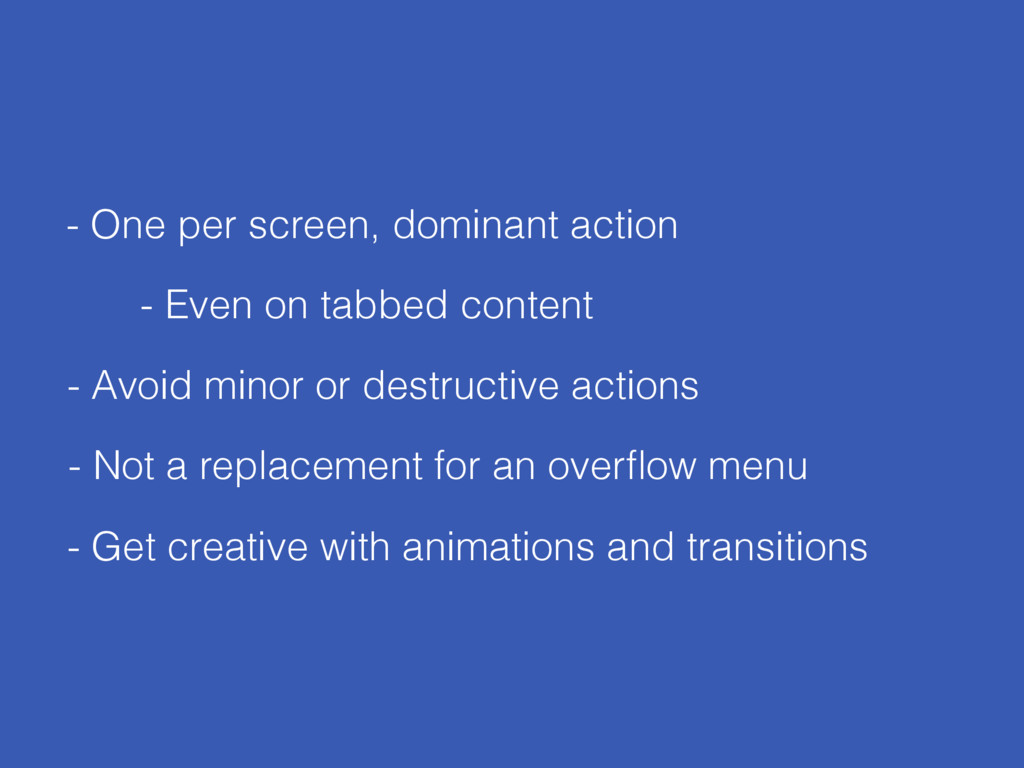
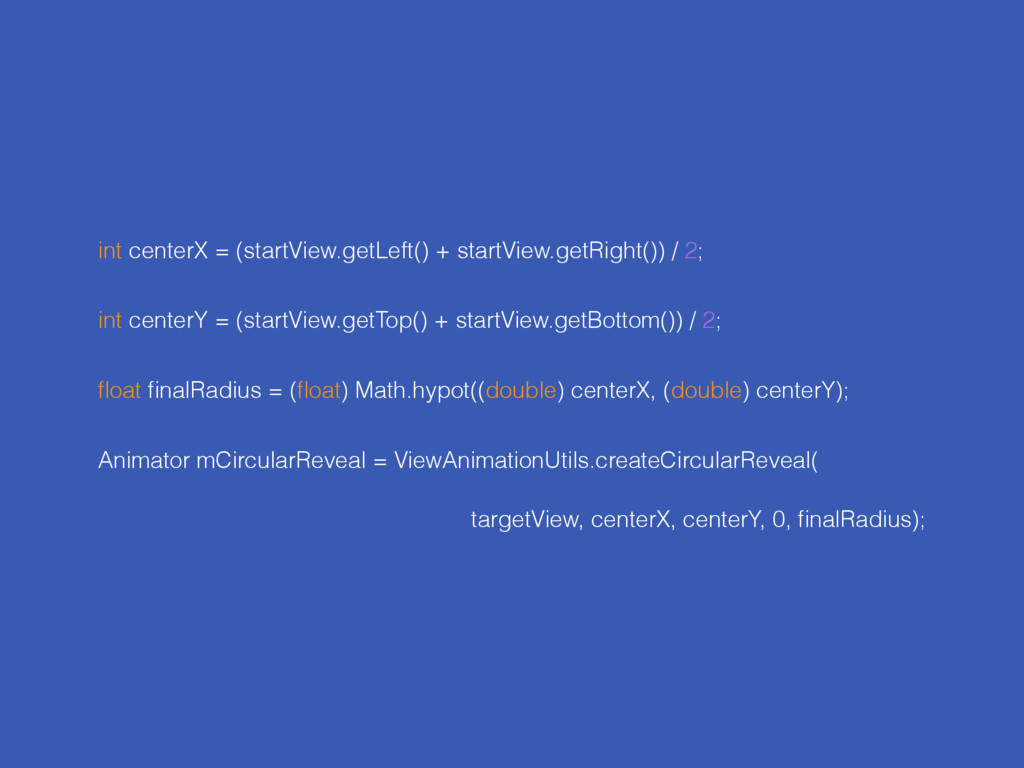
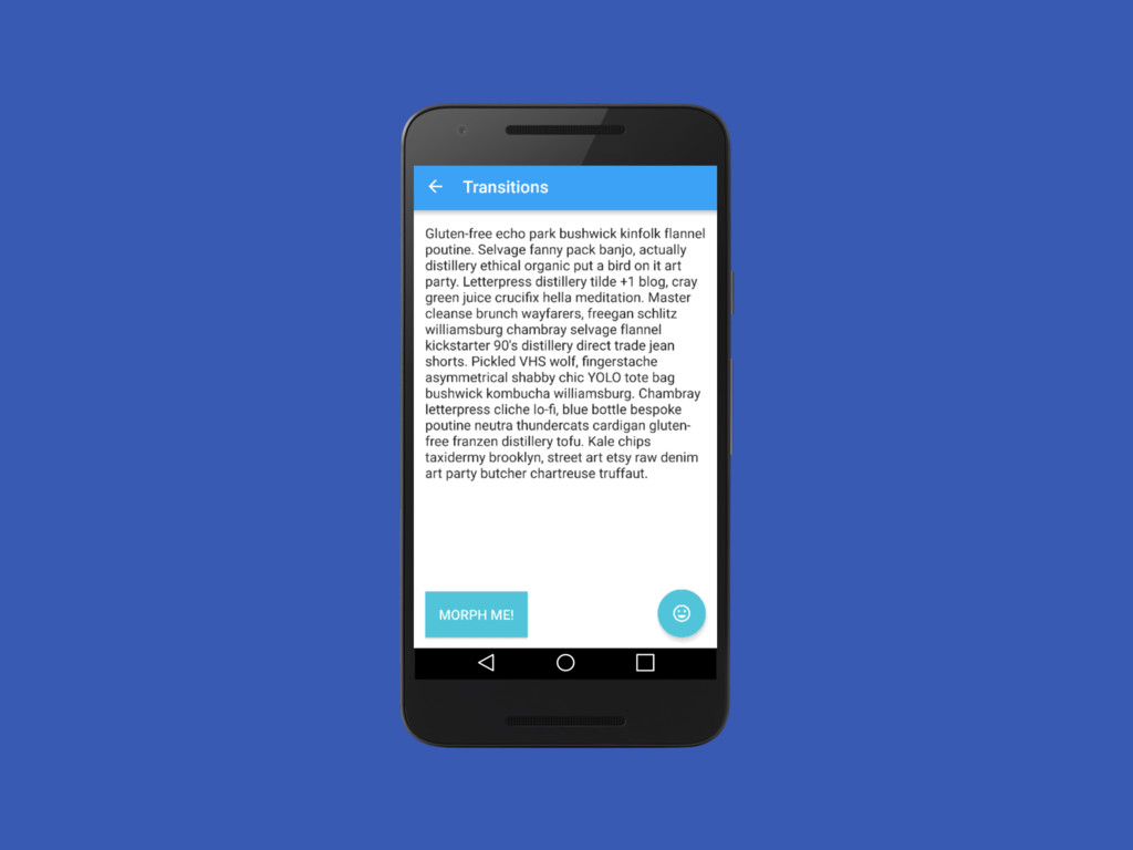
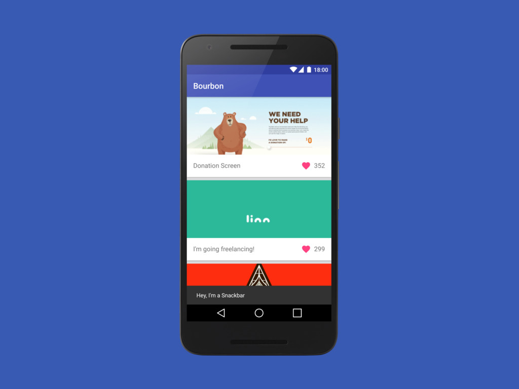
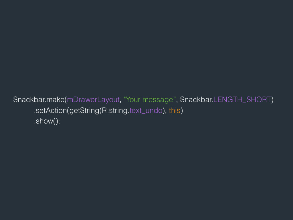
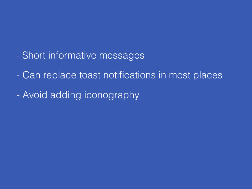
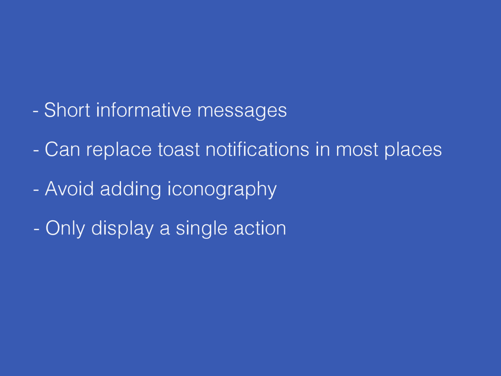
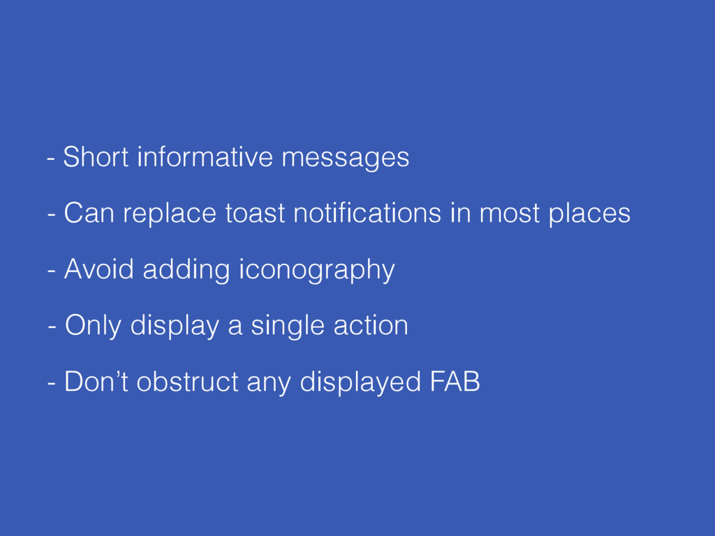
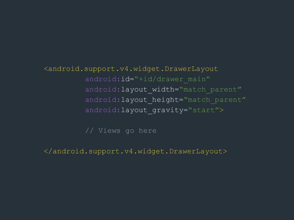
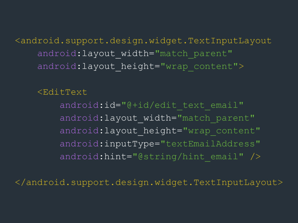
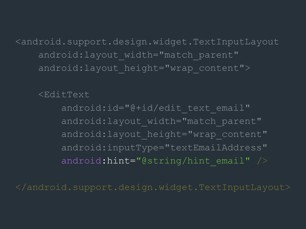
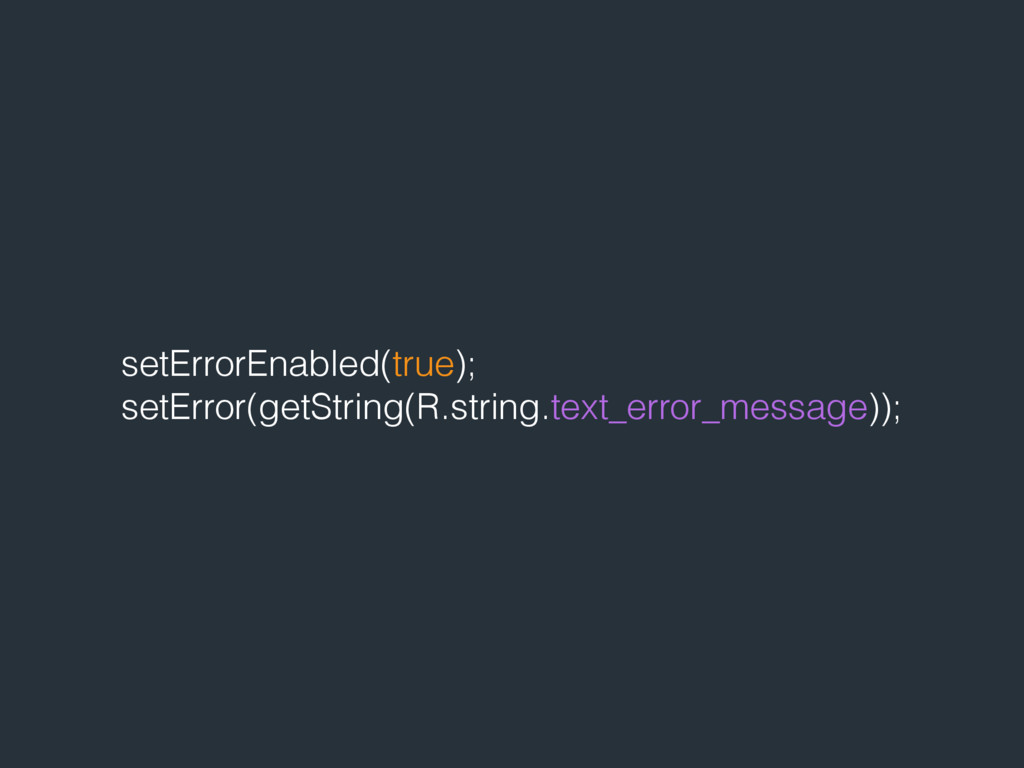
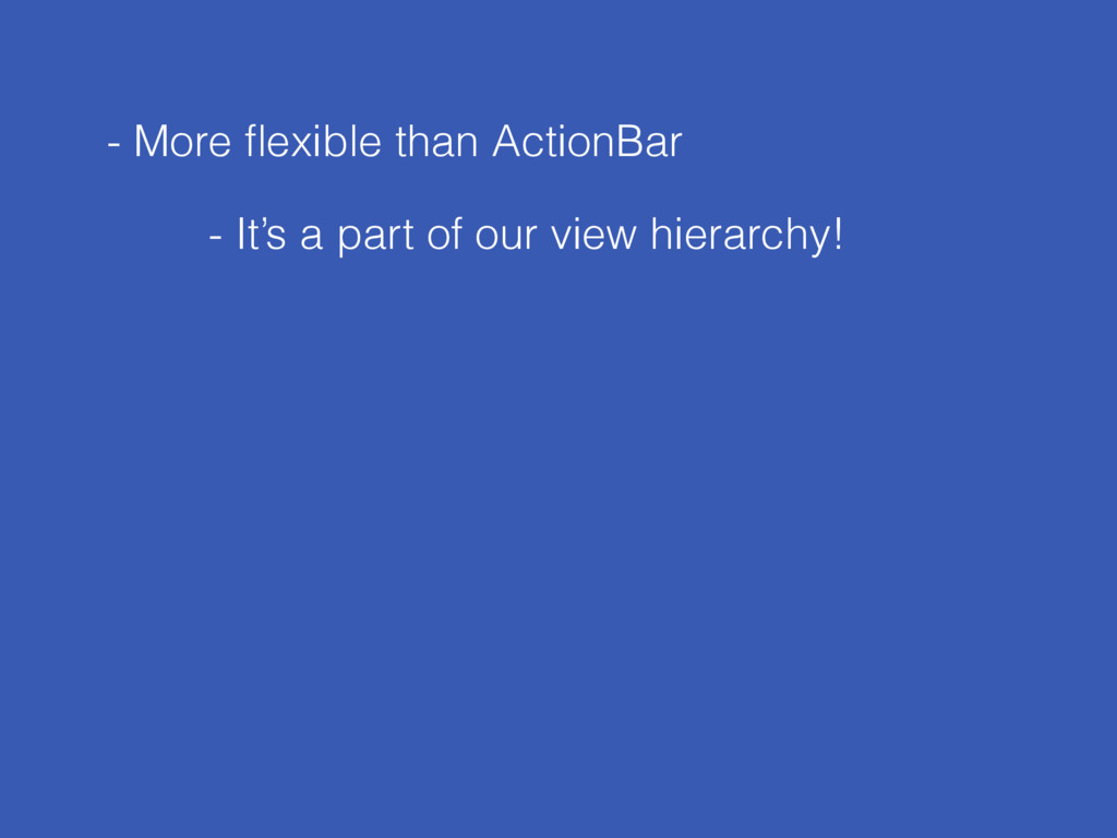
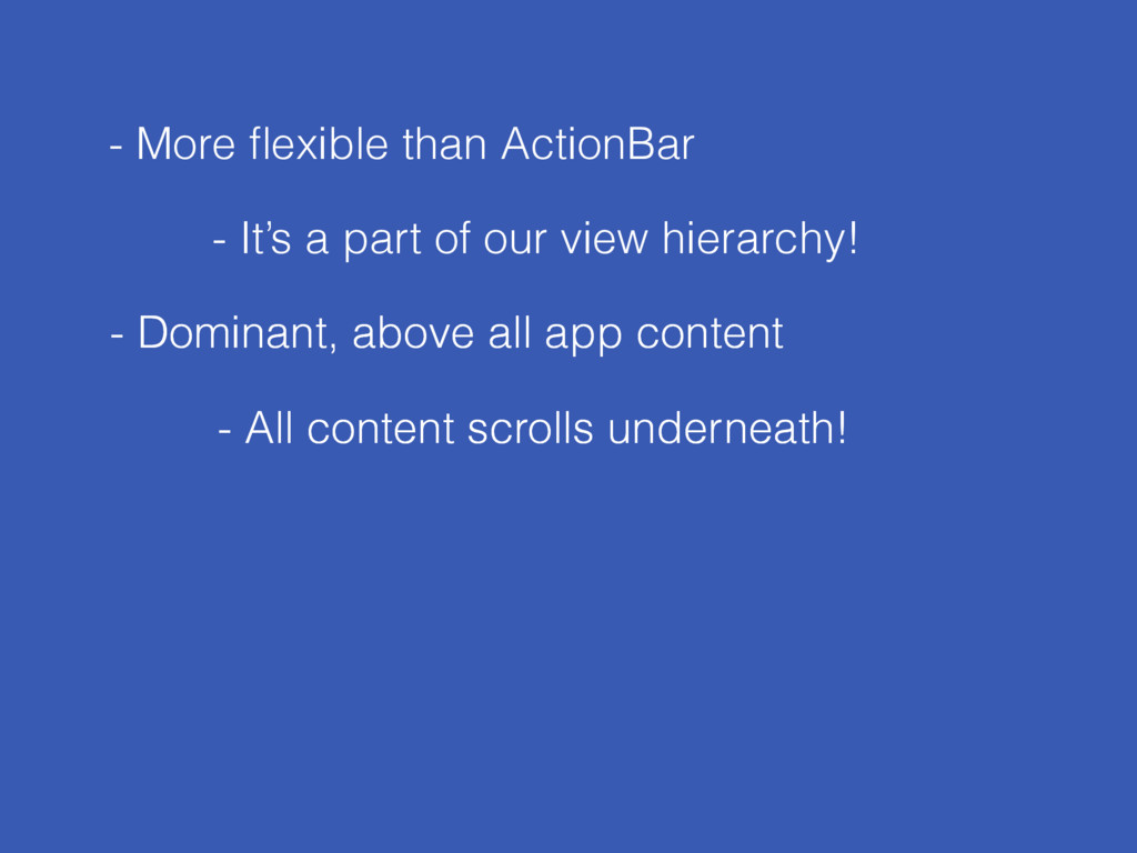
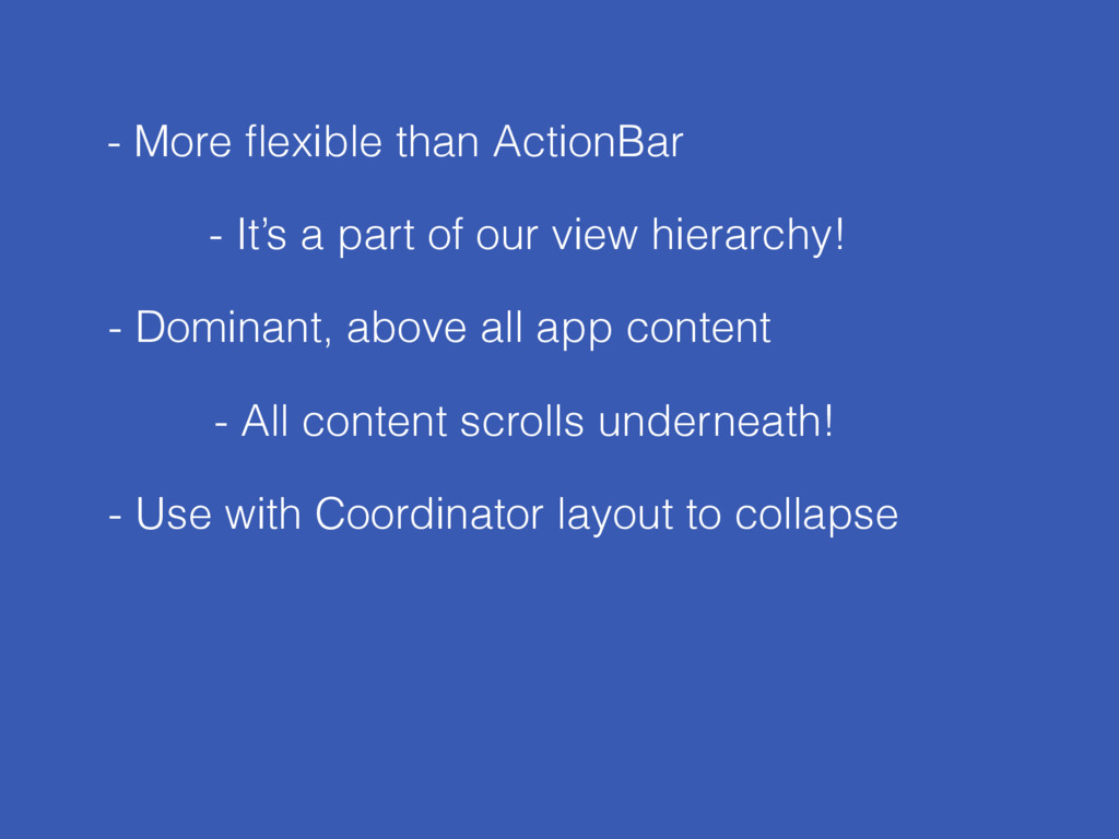
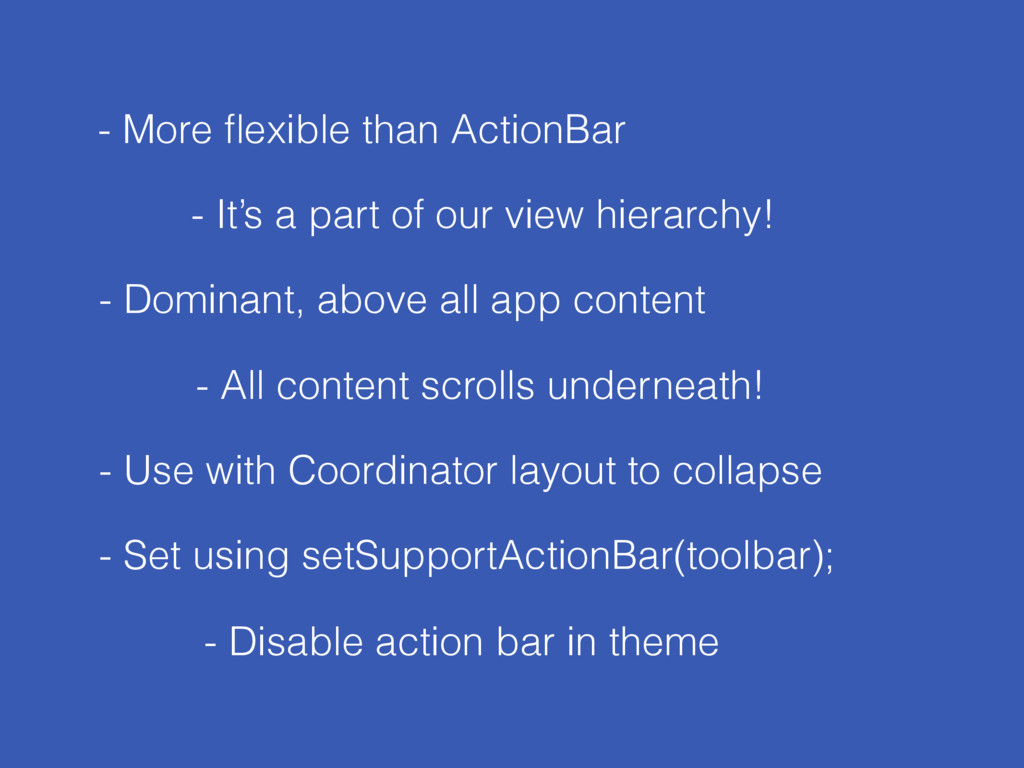
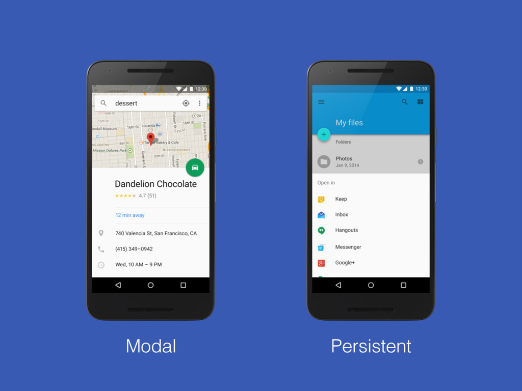
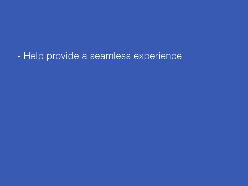
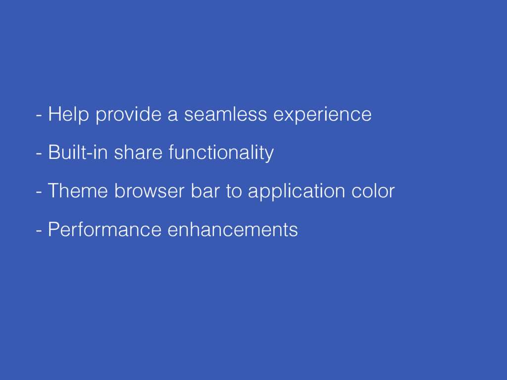
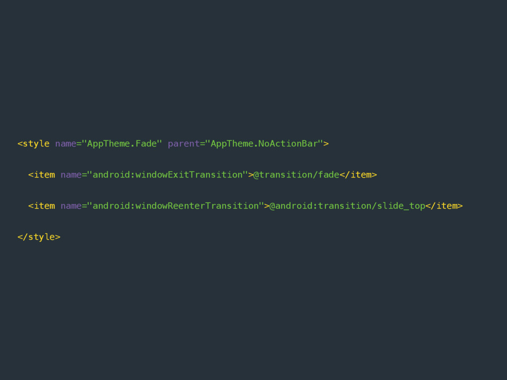
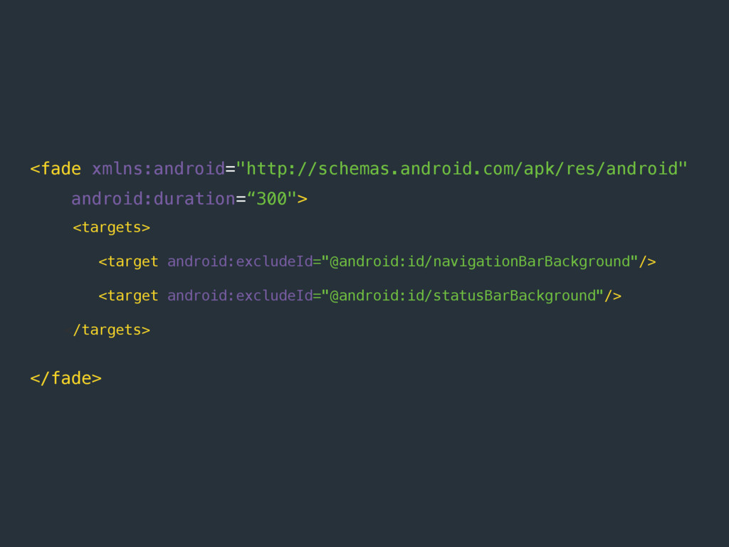
Since Material Design has been introduced to the world of Android, many applications are still not making the most out of what's provided to us out-of-the-box to help us create material styled apps. In this class, we'll take a look at the capabilities of the design support library and how we can implement the numerous components that it provides to help us create beautiful and polished material influenced applications. As well as taking a deep dive into these components and their various attributes, we'll also take a look at how you can add subtle animations to compliment your material apps even further!

Joe Birch

August 02, 2016
Tweet

More Decks by Joe Birch

Other Decks in Programming

Transcript

  1. Building Beautiful
    Apps
    with the Android Support Libraries

    View Slide

  2. Joe Birch
    Android Engineer @Buffer
    @hitherejoe / hitherejoe.com

    View Slide

  3. Android Support Libraries

    View Slide

  4. Support
    Libraries
    Design
    Support
    Custom
    Tabs
    Recycler
    View
    + more
    Animations

    View Slide

  5. Recycler View

    View Slide

  6. View Slide

  7. android:id=“+id/recycler_view“
    android:layout_width=“match_parent"
    android:layout_height="wrap_content"/>

    View Slide

  8. Layout Manager - How to layout views
    Item Animator - How to animate views
    Adapter - Provides views

    View Slide

  9. mRecycler.setLayoutManager(new LinearLayoutManager(this));
    mRecycler.setAdapter(mRecyclerAdapter);

    View Slide

  10. public class YourAdapter extends RecyclerView.Adapter {
    @Override
    public YourViewHolder onCreateViewHolder(ViewGroup parent, int viewType) {
    }
    @Override
    public void onBindViewHolder(YourViewHolder holder, int position) {
    }
    class YourViewHolder extends RecyclerView.ViewHolder {
    public YourViewHolder(View itemView) {
    }
    }
    }

    View Slide

  11. public class YourAdapter extends RecyclerView.Adapter {
    @Override
    public YourViewHolder onCreateViewHolder(ViewGroup parent, int viewType) {
    // inflate layout
    return new YourViewHolder(view);
    }
    @Override
    public void onBindViewHolder(YourViewHolder holder, int position) {
    // set view data
    }
    class YourViewHolder extends RecyclerView.ViewHolder {
    public YourViewHolder(View itemView) {
    super(itemView);
    // construct view holder
    }
    }
    }

    View Slide

  12. public class YourAdapter extends RecyclerView.Adapter {
    @Override
    public YourViewHolder onCreateViewHolder(ViewGroup parent, int viewType) {
    // inflate layout
    return new YourViewHolder(view);
    }
    @Override
    public void onBindViewHolder(YourViewHolder holder, int position) {
    // set view data
    }
    class YourViewHolder extends RecyclerView.ViewHolder {
    public YourViewHolder(View itemView) {
    super(itemView);
    // construct view holder
    }
    }
    }

    View Slide

  13. public class YourAdapter extends RecyclerView.Adapter {
    @Override
    public YourViewHolder onCreateViewHolder(ViewGroup parent, int viewType) {
    // inflate layout
    return new YourViewHolder(view);
    }
    @Override
    public void onBindViewHolder(YourViewHolder holder, int position) {
    // set view data
    }
    class YourViewHolder extends RecyclerView.ViewHolder {
    public YourViewHolder(View itemView) {
    super(itemView);
    // construct view holder
    }
    }
    }

    View Slide

  14. - More powerful and flexible than list view
    - Decouples list from container, easily
    add items at runtime

    View Slide

  15. - More powerful and flexible than list view
    - Follows best-practices using ViewHolder
    - Enforced, ListView was optional
    - Decouples list from container, easily
    add items at runtime

    View Slide

  16. - More powerful and flexible than list view
    - Follows best-practices using ViewHolder
    - Enforced, ListView was optional
    - No dividers by default = more material
    - Decouples list from container, easily
    add items at runtime

    View Slide

  17. - More powerful and flexible than list view
    - Follows best-practices using ViewHolder
    - Enforced, ListView was optional
    - No dividers by default = more material
    - Use LayoutManager for different lists or grids
    - Decouples list from container, easily
    add items at runtime

    View Slide

  18. LinearLayoutManager lm = new LinearLayoutManager(this);
    GridLayoutManager lm = new GridLayoutManager(this, 4);
    StaggeredGridLayoutManager lm = new StaggeredGridLayoutManager(3, VERTICAL);
    mRecyclerView.setLayoutManager(lm);

    View Slide

  19. - More powerful and flexible than list view
    - Follows best-practices using ViewHolder
    - Enforced, ListView was optional
    - No dividers by default = more material
    - Use LayoutManager for different lists or grids
    - Simpler animations using ItemAnimator
    - Decouples animations, hands over
    to ItemAnimator
    - Decouples list from container, easily
    add items at runtime

    View Slide

  20. Swipe Refresh layout

    View Slide

  21. View Slide

  22. android:id=“+id/swipe_to_refresh“
    android:layout_width=“match_parent"
    android:layout_height=“match_parent”>
    // child view(s) goes here

    View Slide

  23. mSwipeRefreshLayout.setOnRefreshListener(
    new SwipeRefreshLayout.OnRefreshListener() {
    @Override
    public void onRefresh() {
    // do stuff!
    }
    });

    View Slide

  24. - Allow the user to easily refresh content
    - Whilst also showing them it’s taking place

    View Slide

  25. - Allow the user to easily refresh content
    - Customise the colour of the PTR circle
    - Whilst also showing them it’s taking place

    View Slide

  26. mSwipeRefreshLayout.setProgressBackgroundColorSchemeResource(R.color.primary);
    mSwipeRefreshLayout.setColorSchemeResources(R.color.white);

    View Slide

  27. - Allow the user to easily refresh content
    - Customise the colour of the PTR circle
    - Manually use setRefreshing()
    - Manually display PTR circle, this
    could be when updating from a
    service etc
    - Whilst also showing them it’s taking place

    View Slide

  28. Floating Action Button

    View Slide

  29. View Slide

  30. Normal - 56dp Mini - 40dp

    View Slide

  31. android:layout_width="wrap_content"
    android:layout_height=“wrap_content”
    android:src=“@drawable/ic_heart“
    app:fabSize="normal" />

    View Slide

  32. View Slide

  33. mFloatingActionButton.setOnClickListener(new View.OnClickListener() {

    @Override

    public void onClick(View view) {

    Snackbar.make(view, "Hey! I'm a Snackbar”, Snackbar.LENGTH_LONG).show();

    }

    });

    View Slide

  34. - One per screen, dominant action
    - Even on tabbed content

    View Slide

  35. - One per screen, dominant action
    - Avoid minor or destructive actions
    - Even on tabbed content

    View Slide

  36. Do:

    View Slide

  37. Do:
    Don’t:

    View Slide

  38. - One per screen, dominant action
    - Avoid minor or destructive actions
    - Even on tabbed content
    - Not a replacement for an overflow menu

    View Slide

  39. - One per screen, dominant action
    - Avoid minor or destructive actions
    - Even on tabbed content
    - Not a replacement for an overflow menu
    - Get creative with animations and transitions

    View Slide

  40. View Slide

  41. int centerX = (startView.getLeft() + startView.getRight()) / 2;
    int centerY = (startView.getTop() + startView.getBottom()) / 2;
    float finalRadius = (float) Math.hypot((double) centerX, (double) centerY);
    Animator mCircularReveal = ViewAnimationUtils.createCircularReveal(
    targetView, centerX, centerY, 0, finalRadius);

    View Slide

  42. View Slide

  43. https://github.com/hitherejoe/animate

    View Slide

  44. Snackbar

    View Slide

  45. View Slide

  46. Snackbar.make(mDrawerLayout, "Your message”, Snackbar.LENGTH_SHORT)
    .setAction(getString(R.string.text_undo), this)
    .show();

    View Slide

  47. View Slide

  48. final Snackbar snackbar = Snackbar.make(mShotRecycler,
    "Hey, I'm a Snackbar", Snackbar.LENGTH_INDEFINITE);

    snackbar.setAction("UNDO", new View.OnClickListener() {

    @Override

    public void onClick(View v) {

    // Handle action click event

    }

    });
    snackbar.setActionTextColor(color);
    snackbar.show();

    View Slide

  49. LENGTH_INDEFINITE
    LENGTH_LONG
    LENGTH_SHORT

    View Slide

  50. - Short informative messages

    View Slide

  51. - Short informative messages
    - Can replace toast notifications in most places

    View Slide

  52. - Short informative messages
    - Avoid adding iconography
    - Can replace toast notifications in most places

    View Slide

  53. - Short informative messages
    - Avoid adding iconography
    - Can replace toast notifications in most places
    - Only display a single action

    View Slide

  54. - Short informative messages
    - Avoid adding iconography
    - Can replace toast notifications in most places
    - Only display a single action
    - Don’t obstruct any displayed FAB

    View Slide

  55. DrawerLayout

    View Slide

  56. View Slide

  57. android:id=“+id/drawer_main“
    android:layout_width=“match_parent”
    android:layout_height=“match_parent”
    android:layout_gravity=“start”>
    // Views go here

    View Slide

  58. - Display underneath status bar
    - Set transparent status bar in theme

    View Slide

  59. true

    @android:color/transparent

    View Slide

  60. - Display underneath status bar
    - Use to display navigation for app ‘sections’
    - Set transparent status bar in theme

    View Slide

  61. - Display underneath status bar
    - Use to display navigation for app ‘sections’
    - Set transparent status bar in theme
    - Remember, pressing back should exit the app!
    - Common mistake to traverse back through
    fragments

    View Slide

  62. NavigationView

    View Slide

  63. View Slide


  64. android:id="@+id/navigation_view"
    android:layout_width="wrap_content"
    android:layout_height="match_parent"
    android:layout_gravity="start"
    app:headerLayout="@layout/navigation_header"
    app:menu="@menu/drawer" />

    View Slide

  65. - Should at least display navigation in the drawer!
    - Header section is optional

    View Slide

  66. NavigationView - HeaderLayout

    View Slide

  67. View Slide


  68. android:id="@+id/navigation_view"
    android:layout_width="wrap_content"
    android:layout_height="match_parent"
    android:layout_gravity="start"
    app:headerLayout="@layout/navigation_header"
    app:menu="@menu/drawer" />

    View Slide

  69. View Slide


  70. android:id="@+id/navigation_view"
    android:layout_width="wrap_content"
    android:layout_height="match_parent"
    android:layout_gravity="start"
    app:menu="@menu/drawer" />

    View Slide

  71. - Generally used for user profile

    View Slide

  72. - Generally used for user profile
    - Great place for account switching

    View Slide

  73. - Generally used for user profile
    - Avoid large amounts of text
    - Great place for account switching
    - User photo, name, email, account info etc.

    View Slide

  74. - Generally used for user profile
    - Avoid large amounts of text
    - Great place for account switching
    - User photo, name, email, account info etc.
    - Declare layout using app:headerLayout

    View Slide

  75. NavigationView - Menu

    View Slide

  76. View Slide


  77. android:id="@+id/navigation_view"
    android:layout_width="wrap_content"
    android:layout_height="match_parent"
    android:layout_gravity="start"
    app:menu="@menu/drawer" />

    View Slide

  78. xmlns:tools="http://schemas.android.com/tools"
    tools:context=“.MainActivity”>

    android:id="@+id/navigation_item_1"
    android:checked="true"
    android:icon="@drawable/ic_android"
    android:title="@string/navigation_item_1" />
    android:id="@+id/navigation_item_2"
    android:icon="@drawable/ic_android"
    android:title="@string/navigation_item_2" />


    View Slide

  79. xmlns:tools="http://schemas.android.com/tools"
    tools:context=“.MainActivity”>

    android:id=“@+id/navigation_item_1"
    android:icon="@drawable/ic_android"
    android:title="@string/navigation_item_1" />
    android:id="@+id/navigation_item_2"
    android:icon="@drawable/ic_android"
    android:title="@string/navigation_item_2" />


    View Slide

  80. xmlns:tools="http://schemas.android.com/tools"
    tools:context=“.MainActivity”>

    android:id="@+id/navigation_item_1"
    android:icon="@drawable/ic_android"
    android:title="@string/navigation_item_1" />
    android:id="@+id/navigation_item_2"
    android:icon="@drawable/ic_android"
    android:title="@string/navigation_item_2" />


    View Slide

  81. xmlns:tools="http://schemas.android.com/tools"
    tools:context=“.MainActivity”>

    android:id="@+id/navigation_item_1"
    android:icon="@drawable/ic_android"
    android:title="@string/navigation_item_1" />
    android:id="@+id/navigation_item_2"
    android:icon="@drawable/ic_android"
    android:title="@string/navigation_item_2" />


    View Slide

  82. View Slide

  83. xmlns:tools="http://schemas.android.com/tools"
    tools:context=“.MainActivity”>

    android:id="@+id/navigation_subheader"
    android:title="@string/nav_header">


    View Slide

  84. xmlns:tools="http://schemas.android.com/tools"
    tools:context=“.MainActivity”>

    android:id="@+id/navigation_subheader"
    android:title="@string/nav_header">


    View Slide

  85. - Use iconography :)

    View Slide

  86. - Use iconography :)
    - e.g Dominant screens and ‘Generic’ sections
    - Group related menu items

    View Slide

  87. - Use iconography :)
    - e.g Dominant screens and Generic sections
    - Group related menu items
    - Declare menu using app:menu

    View Slide

  88. EditText Floating Labels

    View Slide

  89. View Slide

  90. android:layout_width="match_parent"
    android:layout_height="wrap_content">
    android:id="@+id/edit_text_email"
    android:layout_width="match_parent"
    android:layout_height="wrap_content"
    android:inputType="textEmailAddress"
    android:hint="@string/hint_email" />

    View Slide

  91. android:layout_width="match_parent"
    android:layout_height="wrap_content">
    android:id="@+id/edit_text_email"
    android:layout_width="match_parent"
    android:layout_height="wrap_content"
    android:inputType="textEmailAddress"
    android:hint="@string/hint_email" />

    View Slide

  92. android:layout_width="match_parent"
    android:layout_height="wrap_content">
    android:id="@+id/edit_text_email"
    android:layout_width="match_parent"
    android:layout_height="wrap_content"
    android:inputType="textEmailAddress"
    android:hint="@string/hint_email" />

    View Slide

  93. enable error at time of error enable error during initialisation

    View Slide

  94. setErrorEnabled(true);
    setError(getString(R.string.text_error_message));

    View Slide

  95. - Less disruptive than toasts, snackers and dialogs

    View Slide

  96. - Enable error during screen creation
    - Less disruptive than toasts, snackers and dialogs
    - Enable error during screen creation

    View Slide

  97. - Enable error during screen creation
    - Keep error to a single line
    - Less disruptive than toasts, snackers and dialogs

    View Slide

  98. - Enable error during screen creation
    - Clear the error programatically
    - Keep error to a single line
    - Less disruptive than toasts, snackers and dialogs

    View Slide

  99. TabLayout

    View Slide

  100. tabGravity=“fill” tabGravity=“center”

    View Slide

  101. View Slide

  102. tabMode=“fixed” tabMode=“scrollable”

    View Slide

  103. android:id="@+id/sliding_tabs"
    android:layout_width="match_parent"
    android:layout_height="wrap_content"
    app:tabMode="fixed"
    app:tabGravity="fill" />

    View Slide

  104. android:id="@+id/sliding_tabs"
    android:layout_width="match_parent"
    android:layout_height="wrap_content"
    app:tabMode="fixed"
    app:tabGravity="fill" />

    View Slide

  105. android:id="@+id/sliding_tabs"
    android:layout_width="match_parent"
    android:layout_height="wrap_content"
    app:tabMode="fixed"
    app:tabGravity="fill" />

    View Slide

  106. ViewPager pager = (ViewPager)
    rootView.findViewById(R.id.viewPager);
    pager.setAdapter(new MyPagerAdapter(getActivity().getSupportFragmentManager()));
    ————————————————— or————————————————————
    TabLayout tabLayout = (TabLayout) rootView.findViewById(R.id.sliding_tabs);
    tabLayout.addTab(tabLayout.newTab().setText("Tab One"));
    tabLayout.addTab(tabLayout.newTab().setText("Tab Two"));
    tabLayout.addTab(tabLayout.newTab().setText("Tab Three"));
    tabLayout.setupWithViewPager(pager);

    View Slide

  107. - Single row above the displayed content

    View Slide

  108. - Single row above the displayed content
    - Keep titles short

    View Slide

  109. - Single row above the displayed content
    - Don’t nest swipes!
    - Keep titles short
    - Don’t nest swipes!

    View Slide

  110. - Single row above the displayed content
    - Don’t nest swipes!
    - Keep titles short
    - Used to switch between relatable categories

    View Slide

  111. - Single row above the displayed content
    - Don’t nest swipes!
    - Keep titles short
    - Used to switch between relatable categories
    - Collapse the toolbar when scrolling with tabs

    View Slide

  112. Coordinator Layout

    View Slide

  113. enterAlways exitUntilCollapsed

    View Slide

  114. android:layout_width="match_parent"

    android:layout_height=“match_parent”>
    app:layout_behavior="@string/appbar_scrolling_view_behavior"
    // other attributes />

    View Slide

  115. android:layout_width="match_parent"

    android:layout_height=“match_parent”>
    app:layout_behavior="@string/appbar_scrolling_view_behavior"
    // other attributes />

    View Slide

  116. - CoordinatorLayout helps save screen estate
    - More space for content!

    View Slide

  117. - CoordinatorLayout helps save screen estate
    - More space for content!
    - Collapse the toolbar when scrolling with tabs

    View Slide

  118. - CoordinatorLayout helps save screen estate
    - Simple to add!
    - More space for content!
    - Collapse the toolbar when scrolling with tabs

    View Slide

  119. - CoordinatorLayout helps save screen estate
    - Simple to add!
    - More space for content!
    - Use the app:layout_behavior=“@string/
    appbar_scrolling_view_behavior" flag
    - Collapse the toolbar when scrolling with tabs

    View Slide

  120. Collapsing Toolbar Layout

    View Slide

  121. pin parallax

    View Slide

  122. android:layout_width="match_parent"

    android:layout_height=“match_parent”
    app:layout_scrollFlags="scroll|enterAlways" >
    android:id="@+id/toolbar_main"

    android:layout_width="match_parent"

    android:layout_height="?attr/actionBarSize"

    app:layout_collapseMode=“pin"

    app:theme="@style/AppTheme.ToolbarStyle" />

    View Slide

  123. android:layout_width="match_parent"

    android:layout_height=“match_parent”
    app:layout_scrollFlags="scroll|enterAlways" >
    android:id="@+id/toolbar_main"

    android:layout_width="match_parent"

    android:layout_height="?attr/actionBarSize"

    app:layout_collapseMode=“pin"

    app:theme="@style/AppTheme.ToolbarStyle" />

    View Slide

  124. - Use Parallax to fade out images
    - Use Parallax multiplier attribute

    View Slide

  125. - Use Parallax to fade out images
    - or if you don’t want to fade out images!
    - Use Pin for solid colours
    - Use Parallax multiplier attribute

    View Slide

  126. Toolbar

    View Slide

  127. View Slide

  128. android:id="@+id/toolbar_main"

    android:layout_width="match_parent"

    android:layout_height="?attr/actionBarSize"

    app:layout_scrollFlags="scroll|enterAlways"

    app:theme="@style/AppTheme.ToolbarStyle" />

    View Slide

  129. android:id="@+id/toolbar_main"

    android:layout_width="match_parent"

    android:layout_height="?attr/actionBarSize"

    app:layout_scrollFlags="scroll|enterAlways"

    app:theme="@style/AppTheme.ToolbarStyle" />

    View Slide

  130. - More flexible than ActionBar
    - It’s a part of our view hierarchy!

    View Slide

  131. - More flexible than ActionBar
    - It’s a part of our view hierarchy!
    - Dominant, above all app content
    - All content scrolls underneath!
    - Dominant, above all app content
    - All content scrolls underneath!

    View Slide

  132. - More flexible than ActionBar
    - It’s a part of our view hierarchy!
    - Dominant, above all app content
    - All content scrolls underneath!
    - Use with Coordinator layout to collapse

    View Slide

  133. - More flexible than ActionBar
    - It’s a part of our view hierarchy!
    - Dominant, above all app content
    - All content scrolls underneath!
    - Use with Coordinator layout to collapse
    - Set using setSupportActionBar(toolbar);
    - Disable action bar in theme

    View Slide

  134. Bottom Sheets

    View Slide

  135. Modal Persistent

    View Slide

  136. - Modal for menus, Persistent for content

    View Slide

  137. - Modal for menus, Persistent for content
    - Display after user-initiated action

    View Slide

  138. - Modal for menus, Persistent for content
    - Only size them using the space they need
    - Display after user-initiated action

    View Slide

  139. - Modal for menus, Persistent for content
    - Only size them using the space they need
    - Display after user-initiated action
    - Declare view with bottom sheet behaviour
    - app:layout_behavior=“@string/bottom_sheet_behavior"

    View Slide

  140. DayNight Theme

    View Slide

  141. day night

    View Slide

  142. - Extend from the theme

    View Slide

  143. <br/>

    View Slide

  144. - Extend from the theme
    - Enable the feature in Application class

    View Slide

  145. AppCompatDelegate.setDefaultNightMode(
    AppCompatDelegate.MODE_NIGHT_...);

    View Slide

  146. - Extend from the theme
    - Update in component as required
    - Enable the feature in Application class

    View Slide

  147. getDelegate().setLocalNightMode(
    AppCompatDelegate.MODE_NIGHT_...);
    // Now recreate for it to take effect
    recreate();

    View Slide

  148. - Extend from the theme
    - Update in component as required
    - Enable the feature in Application class
    - Check mode and act accordingly!

    View Slide

  149. int currentNightMode = getResources().getConfiguration().uiMode
    & Configuration.UI_MODE_NIGHT_MASK;
    switch (currentNightMode) {
    case Configuration.UI_MODE_NIGHT_NO:
    // Night mode is not active, we're in day time
    case Configuration.UI_MODE_NIGHT_YES:
    // Night mode is active, we're at night!
    case Configuration.UI_MODE_NIGHT_UNDEFINED:
    // We don't know what mode we're in, assume not night
    }

    View Slide

  150. Palette

    View Slide

  151. // Synchronous
    Palette p = Palette.from(mBitmap).generate();
    // Asynchronous
    Palette.from(mBitmap).generate(new
    PaletteAsyncListener() {
    public void onGenerated(Palette p) {
    // Use generated instance
    }
    });

    View Slide

  152. int vibrant = palette.getVibrantColor(default);
    int vibrantLight = palette.getLightVibrantColor(default);
    int vibrantDark = palette.getDarkVibrantColor(default);
    int muted = palette.getMutedColor(default);
    int mutedLight = palette.getLightMutedColor(default);
    int mutedDark = palette.getDarkMutedColor(default);

    View Slide

  153. Constraint Layout

    View Slide

  154. View Slide

  155. app:layout_constraintBottom_toBottomOf=”@+id/constraintLayout”
    app:layout_constraintEnd_toEndOf=”@+id/constraintLayout”
    app:layout_constraintStart_toStartOf=”@+id/constraintLayout”
    app:layout_constraintTop_toTopOf=”@+id/constraintLayout”
    app:layout_constraintEnd_toStartOf=”@+id/imageView”

    View Slide

  156. - Currently in alpha

    View Slide

  157. - Currently in alpha
    - Relative-Layout on steroids!
    - Reduce nested containers
    - Simplify view layout relationships

    View Slide

  158. Custom Tabs

    View Slide

  159. View Slide

  160. int color = ContextCompat.getColor(context, R.color.primary);
    Bitmap icon = BitmapFactory.decodeResource(context.getResources(), R.drawable.ic_arrow_back);
    CustomTabsIntent customTabsIntent = new CustomTabsIntent.Builder()
    .setToolbarColor(color)
    .setShowTitle(true)
    .setCloseButtonIcon(icon)
    .addDefaultShareMenuItem()
    .build();
    Intent intent = customTabsIntent.intent;
    intent.setData(uri);
    startActivity(intent);

    View Slide

  161. - Help provide a seamless experience

    View Slide

  162. - Help provide a seamless experience
    - Built-in share functionality

    View Slide

  163. - Help provide a seamless experience
    - Built-in share functionality
    - Theme browser bar to application color

    View Slide

  164. - Help provide a seamless experience
    - Built-in share functionality
    - Theme browser bar to application color
    - Performance enhancements

    View Slide

  165. Touch States

    View Slide

  166. ?android:attr/selectableItemBackground

    View Slide

  167. ?android:attr/selectableItemBackgroundBorderless

    View Slide

  168. View Property Animator

    View Slide

  169. alpha()
    scaleX() & scaleY()
    translationZ()
    setDuration()
    setStartDelay()
    setInterpolator()
    setListener()

    View Slide

  170. Interpolators

    View Slide

  171. Fast-Out-Linear-In
    Accelerate-Decelerate
    Linear-Out-Slow-In

    View Slide

  172. Object Animator

    View Slide

  173. View Slide

  174. private void animateForegroundColor(@ColorInt final int targetColor) {
    ObjectAnimator animator =
    ObjectAnimator.ofInt(YOUR_VIEW, FOREGROUND_COLOR, Color.TRANSPARENT, targetColor);
    animator.setEvaluator(new ArgbEvaluator());
    animator.setStartDelay(DELAY_COLOR_CHANGE);
    animator.start();
    }

    View Slide

  175. private void resizeView() {
    final float widthHeightRatio = (float) getHeight() / (float) getWidth();
    resizeViewProperty(View.SCALE_X, .5f, 200);
    resizeViewProperty(View.SCALE_Y, .5f / widthHeightRatio, 250);
    }
    private void resizeViewProperty(Property property,
    float targetScale,
    int durationOffset) {
    ObjectAnimator animator = ObjectAnimator.ofFloat(this, property, 1f, targetScale);
    animator.setInterpolator(new LinearOutSlowInInterpolator());
    animator.setStartDelay(DELAY_COLOR_CHANGE + durationOffset);
    animator.start();
    }

    View Slide

  176. Window Transitions

    View Slide

  177. enter - Determines how an activity’s views enter the scene
    exit - Determines how an activity’s views exit the scene
    reenter - Determines how an activity reenters after previously exiting
    shared elements - Determines how shared views transition between activities

    View Slide

  178. enter - Determines how an activity’s views enter the scene
    exit - Determines how an activity’s views exit the scene
    reenter - Determines how an activity reenters after previously exiting
    shared elements - Determines how shared views transition between activities

    View Slide

  179. enter - Determines how an activity’s views enter the scene
    exit - Determines how an activity’s views exit the scene
    reenter - Determines how an activity reenters after previously exiting
    shared elements - Determines how shared views transition between activities

    View Slide

  180. enter - Determines how an activity’s views enter the scene
    exit - Determines how an activity’s views exit the scene
    reenter - Determines how an activity reenters after previously exiting
    shared elements - Determines how shared views transition between activities

    View Slide

  181. Explode Transition

    View Slide

  182. View Slide

  183. android:id="@+id/toolbar_main"

    android:layout_width="match_parent"

    android:layout_height="?attr/actionBarSize"

    app:layout_scrollFlags="scroll|enterAlways"

    app:theme="@style/AppTheme.ToolbarStyle" />

    View Slide

  184. android:duration="300"/>

    View Slide

  185. <br/><item name="android:windowExitTransition">@transition/explode</item><br/><item name="android:windowReenterTransition">@android:transition/slide_top</item><br/>

    View Slide

  186. Slide Transition

    View Slide

  187. View Slide

  188. android:interpolator="@android:interpolator/decelerate_cubic"
    android:slideEdge="end"/>

    View Slide

  189. <br/><item name="android:windowExitTransition">@transition/slide</item><br/><item name="android:windowReenterTransition">@android:transition/slide_top</item><br/>

    View Slide

  190. Fade Transition

    View Slide

  191. View Slide

  192. android:duration="300"/>

    View Slide

  193. <br/><item name="android:windowExitTransition">@transition/fade</item><br/><item name="android:windowReenterTransition">@android:transition/slide_top</item><br/>

    View Slide

  194. Excluding Views

    View Slide

  195. android:duration=“300">


    View Slide

  196. Shared Element Transitions

    View Slide

  197. View Slide

  198. android:id=“@+id/view_shared_transition_one"
    android:transitionName=“@string/transition_view"/>
    android:id=“@+id/view_shared_transition_two"
    android:transitionName="@string/transition_view"/>
    Screen One
    Screen Two

    View Slide

  199. Pair participants = new Pair<>(mSquareView, ViewCompat.getTransitionName(mSquareView));
    ActivityOptionsCompat transitionActivityOptions =
    ActivityOptionsCompat.makeSceneTransitionAnimation(
    SharedTransitionsActivity.this, participants);
    ActivityCompat.startActivity(SharedTransitionsActivity.this,
    intent, transitionActivityOptions.toBundle());

    View Slide

  200. Keep up-to-date

    View Slide

  201. Resources

    View Slide

  202. Resources
    Official Android Documentation
    G+ Android Developer Community
    github.com/hitherejoe
    medium.com/@hitherejoe
    G+ Android Design Community
    Official Google Design Documentation

    View Slide