Upgrade to Pro — share decks privately, control downloads, hide ads and more …

Rich UI implementation examples using Jetpack Compose (Jetpack Composeを活用した強力なUI表現の実装実例)

yokomii
September 15, 2023

Rich UI implementation examples using Jetpack Compose (Jetpack Composeを活用した強力なUI表現の実装実例)

アニメーションが再生されません🙇(TODO: 配信動画のURL貼る)

yokomii

September 15, 2023
Tweet

Other Decks in Programming

Transcript

  1. Rich UI implementation examples


    using Jetpack Compose


    (Jetpack ComposeΛ׆༻ͨ͠ڧྗͳUIදݱͷ࣮૷࣮ྫ)
    DroidKaigi 2023


    Chipmunk - 2023/09/15 14:00-14:40


    @yokomii

    View Slide

  2. About Me:
    yokomii
    Android Engineer


    at Nikkei inc
    @iimokoy
    [email protected]

    2

    View Slide


  3. 3

    View Slide

  4. Purpose of the Session:
    In this session, we will introduce you to techniques for
    implementing Rich UI that is


    "more intuitive👀" and


    "evokes user emotions🔥"


    using Jetpack Compose.

    4

    View Slide

  5. How do you feel about implementing a rich UI?
    • High maintenance and management costs.


    • Unclear implementation intent.


    • Difficulty in implementation (not knowing how to do it).

    5

    View Slide

  6. > High maintenance and management costs.


    Rich UI isn't simply implemented and released, and that's the end of it.


    obligation to maintain the quality consistently.

    6

    View Slide

  7. > High maintenance and management costs.


    Rich UI code is generally complex.


    So,


    - Which can lead to mental strain for engineers.


    - Conversely, a loss of interest (often pretending not to notice).

    7

    View Slide

  8. > High maintenance and management costs.


    In Android Views, "layout codes (XML)" and for
    implementing "Rich UI codes (Java, Kotlin)" are
    managed separately.
    layout codes (XML)
    ʴ
    Rich UI codes


    (Java, Kotlin)

    8

    View Slide

  9. > High maintenance and management costs.


    In the Layout Preview, changes made to Kotlin and
    Java-based implementations for Rich UI, which are
    added after defining the layout file, are not
    reflected.


    👉 Lead to a decreased interest in the Rich UI
    code.

    9

    View Slide

  10. > High maintenance and management costs.


    In Jetpack Compose, layout and Rich UI
    implementation are written in the same Kotlin file.
    Kotlin
    Rich UI codes
    layout codes

    10

    View Slide

  11. > High maintenance and management costs.


    In Jetpack Compose Preview, you can validate the UI
    in a state with applied Rich UI implementation.


    👉 Be more conscious of Rich UI implementation.

    11

    View Slide

  12. > High maintenance and management costs.


    If you write screenshot tests, you can also save time on visual verification!
    ref: https://github.com/takahirom/roborazzi

    12

    View Slide

  13. > Unclear implementation intent.


    Jetpack Compose doesn't answer even if you ask it about
    the implementation intent.


    Let's ask the designer!

    13

    View Slide

  14. > Difficulty in implementation (not knowing how to do it).


    Implementation method is not clear.


    Development difficulty is judged to be high.


    Cost is judged to be high.

    14

    View Slide

  15. > Difficulty in implementation (not knowing how to do it).


    Implementation method is not clear.


    Development difficulty is judged to be high.


    Cost is judged to be high.


    👉 How about trying to learn the implementation method?

    15

    View Slide

  16. Let's start implementing a Rich UIʂ

    16

    View Slide

  17. Session Flow:
    1. Features for implementing Rich UI


    2. Examples of Rich UI implementations

    17

    View Slide

  18. Feature 1:


    AnnotatedString

    18

    View Slide

  19. AnnotatedString
    Enrich the following:

    19

    View Slide

  20. Instantiate AnnotatedString
    val annotatedString: AnnotatedString =


    buildAnnotatedString {}
    In Android View:
    val spannable = SpannableStringBuilder("")

    20

    View Slide

  21. Build AnnotatedString
    val annotatedString = buildAnnotatedString {


    append(text = "Congratulations, Droider ")


    append(text = "liked")


    append(text = " your post!”)


    check(this is AnnotatedString.Builder)


    }

    21

    View Slide

  22. Styling in AnnotatedString
    val annotatedString = buildAnnotatedString {


    append(text = "Congratulations, Droider ")


    withStyle(


    style = SpanStyle(


    fontWeight = FontWeight.Bold,


    color = Color(0xFFF08080)


    )


    ) {


    append(text = "liked")


    }


    append(text = " your post!")


    // ...
    Apply text styles.

    22

    View Slide

  23. constructor(


    color: Color = Color.Unspecified,


    fontSize: TextUnit = TextUnit.Unspecified,


    fontWeight: 
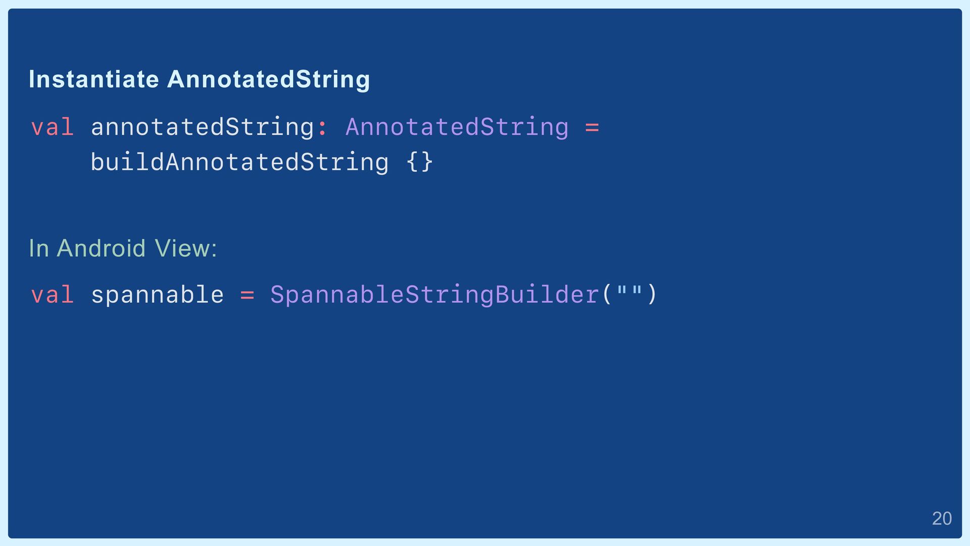
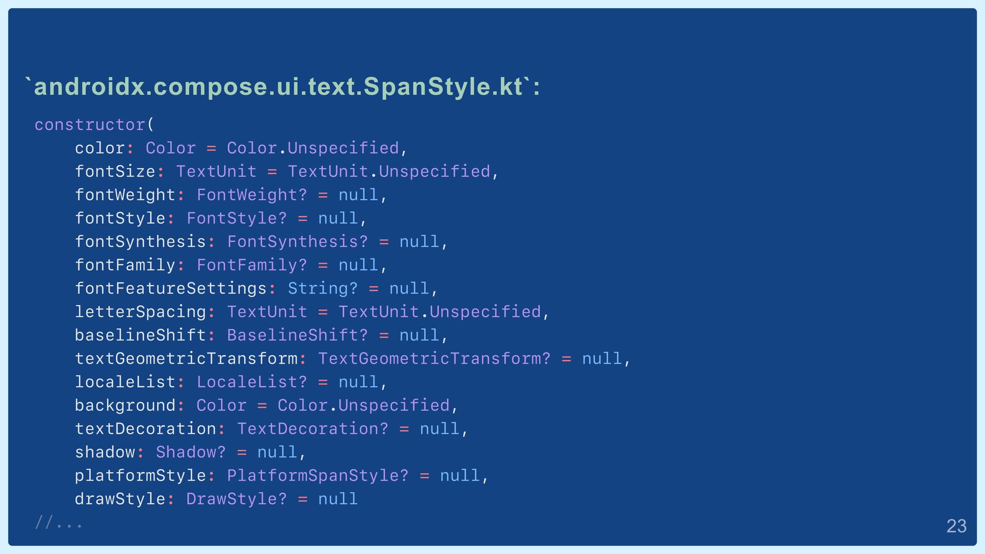
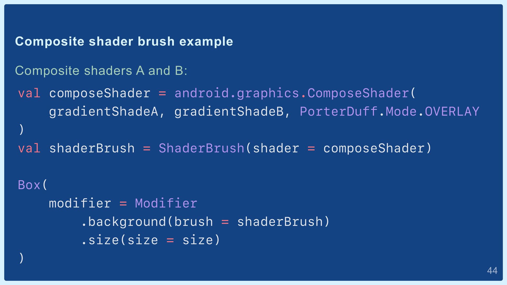
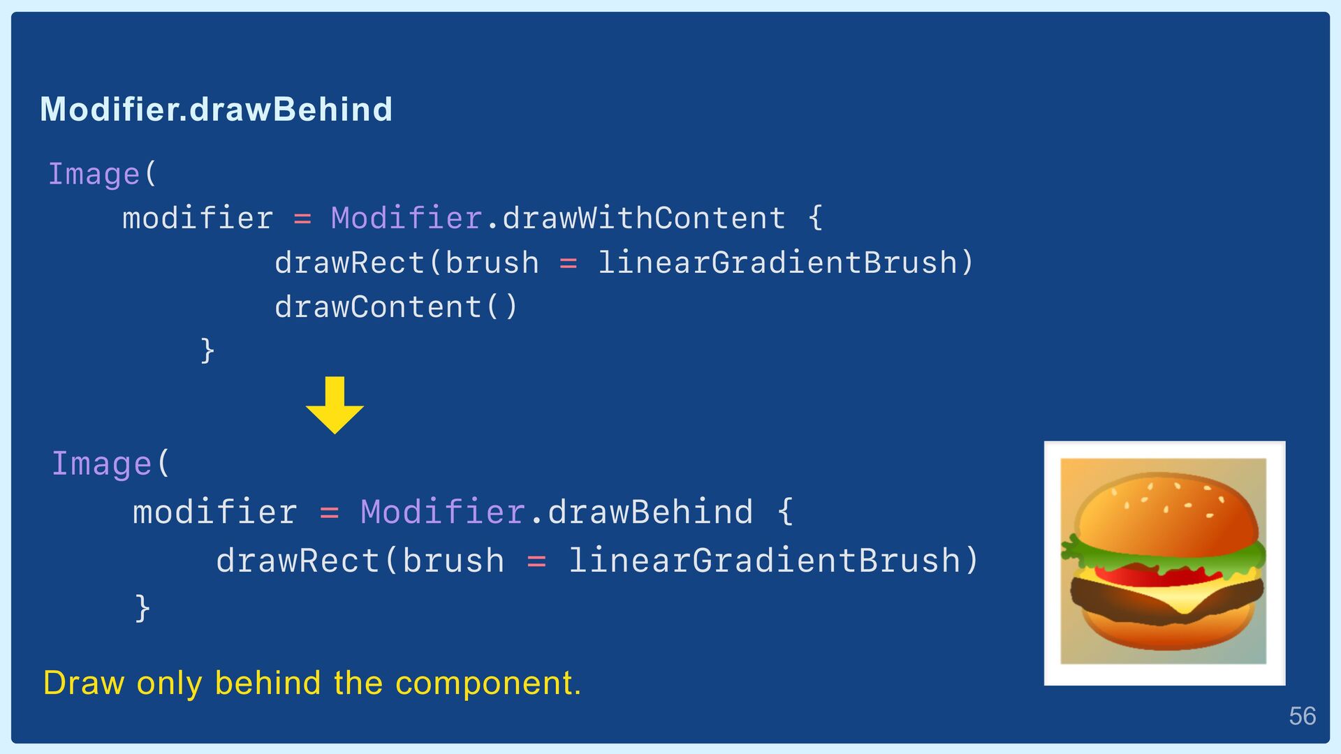
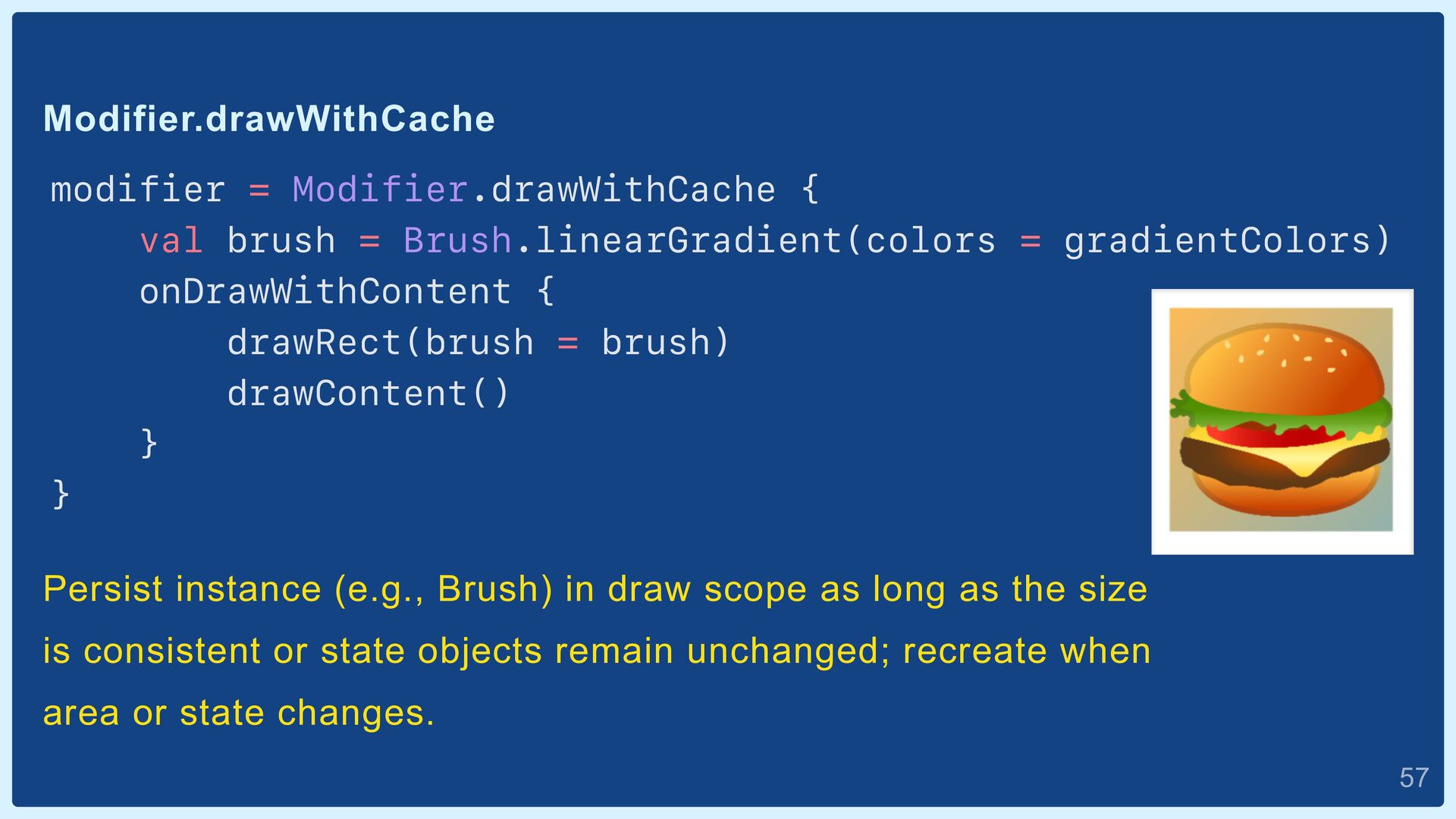
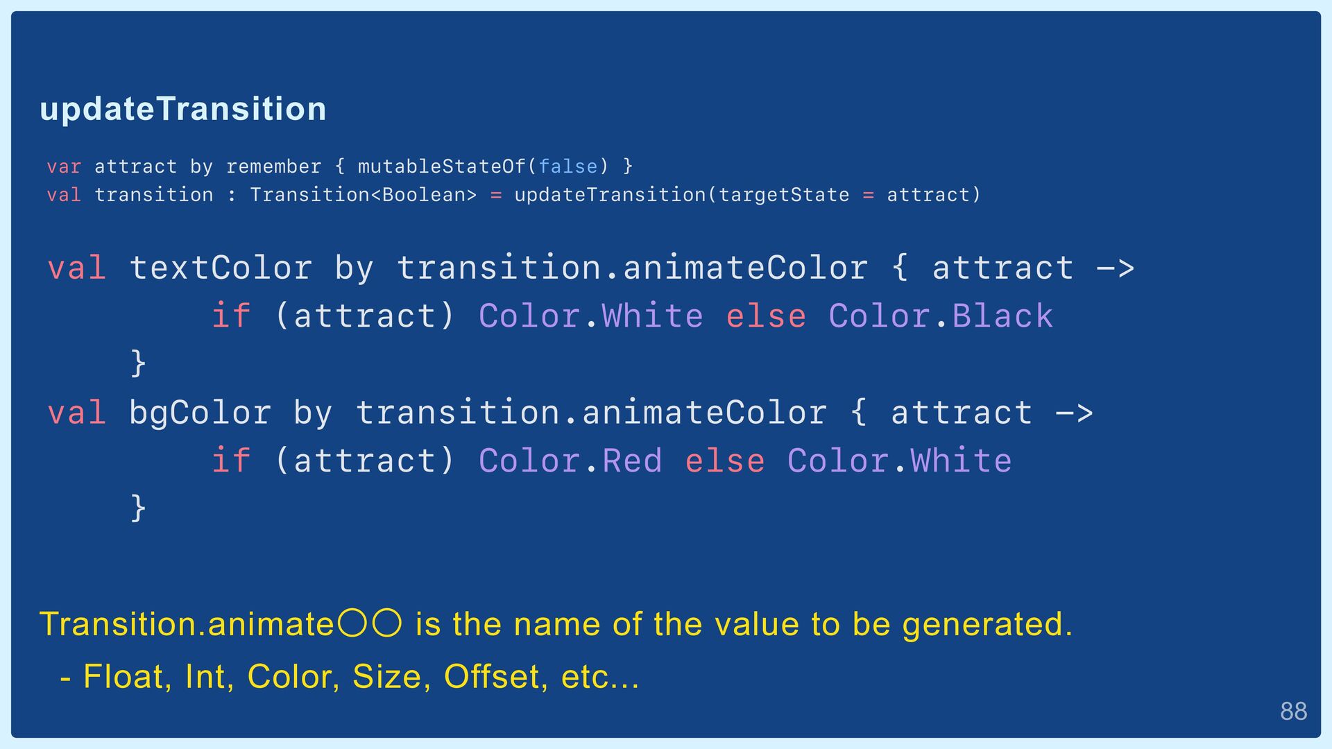
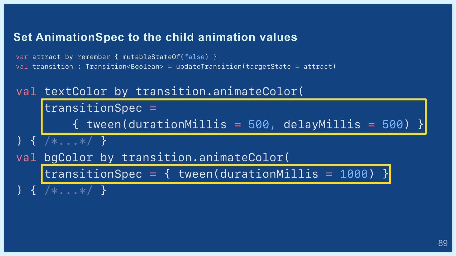
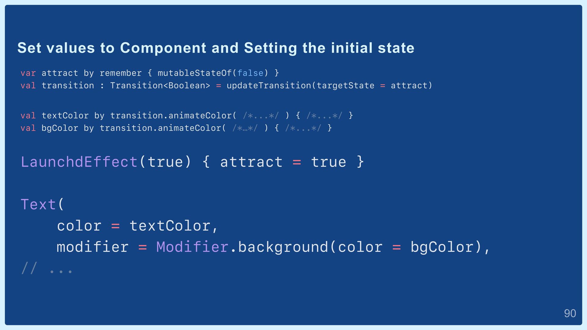
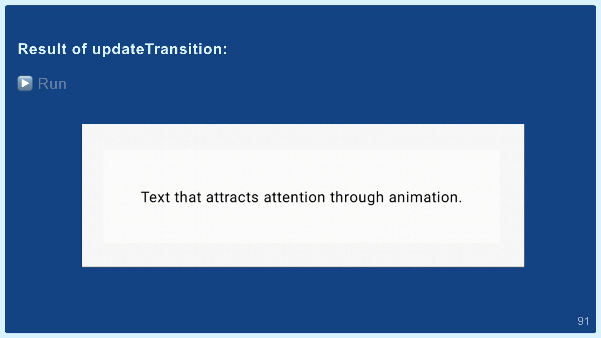
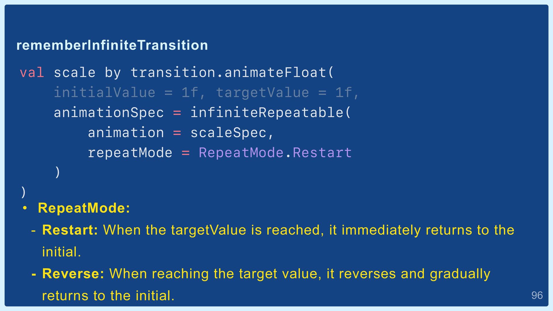
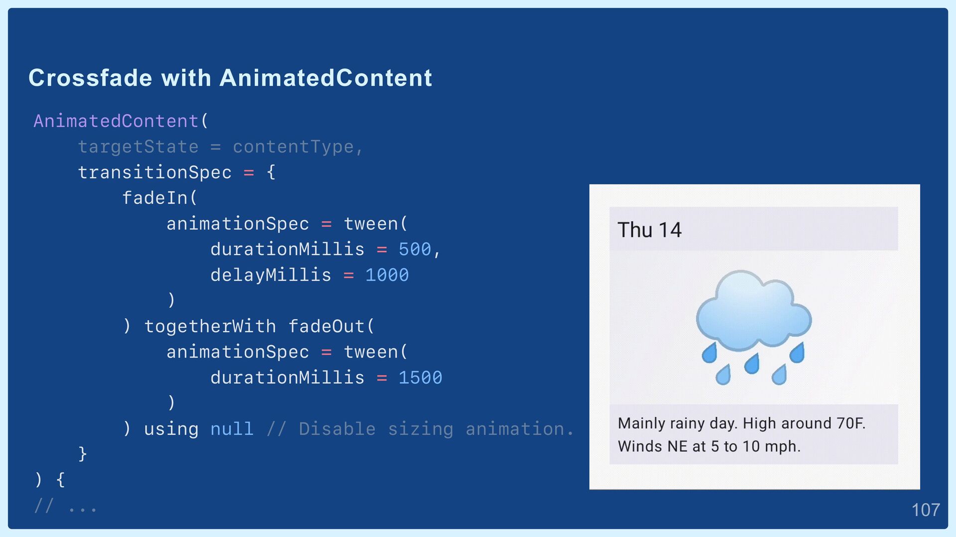
FontWeight? = null,


    fontStyle: FontStyle? = null,


    fontSynthesis: FontSynthesis? = null,


    fontFamily: FontFamily? = null,


    fontFeatureSettings: String? = null,


    letterSpacing: TextUnit = TextUnit.Unspecified,


    baselineShift: BaselineShift? = null,


    textGeometricTransform: TextGeometricTransform? = null,


    localeList: LocaleList? = null,


    background: Color = Color.Unspecified,


    textDecoration: TextDecoration? = null,


    shadow: Shadow? = null,


    platformStyle: PlatformSpanStyle? = null,


    drawStyle: DrawStyle? = null


    //...
    `androidx.compose.ui.text.SpanStyle.kt`:

    23

    View Slide

  24. AnnotatedString set to Text
    val annotatedString = buildAnnotatedString { /*...*/ }
    Text(


    text = annotatedString


    )

    24

    View Slide

  25. Result of AnnotatedString:
    ▶ Run

    25

    View Slide

  26. Insert content into AnnotatedString
    val annotatedString = buildAnnotatedString {


    append(text = "Congratulations, Droider ")


    withStyle( /*...*/ ) {


    append(text = "liked")


    }


    appendInlineContent(id = "heart_marks")


    // ... Content unique id.

    26

    View Slide

  27. Create InlineContent
    val inlineTextContent = InlineTextContent(


    placeholder = Placeholder(


    width = fontSize * 1.5,


    height = fontSize,


    placeholderVerticalAlign =


    PlaceholderVerticalAlign.TextCenter


    )


    ) {


    TODO()


    }

    27

    View Slide

  28. Create InlineContent
    val inlineTextContent = InlineTextContent( /*...*/ ) {


    Row {


    Icon(


    imageVector = Icons.Default.Favorite,


    tint = Color(0xFFF08080),


    modifier = Modifier.weight(weight = 1f)


    )


    Icon(


    imageVector = Icons.Default.Favorite,


    tint = Color(0x88F08080),


    modifier = Modifier.weight(weight = 0.5f)


    )


    }


    }

    28

    View Slide

  29. InlineContent set to Text
    val annotatedString = buildAnnotatedString {


    // ...


    appendInlineContent(id = "heart_marks")


    // ...


    }


    val inlineTextContent = InlineTextContent( /*...*/ ) { /*...*/ }


    Text(


    text = annotatedString,


    inlineContent = mapOf(


    "heart_marks" to inlineTextContent


    )


    )

    29

    View Slide

  30. Result of InlineContent:
    ▶ Run

    30

    View Slide

  31. Try next 👉

    31

    View Slide

  32. Feature 2:


    Brush

    32

    View Slide

  33. Brush subclasses:
    ɾLinearGradient


    ɾRadialGradient


    ɾSweepGradient


    ɾShaderBrush


    ɾSolidColor

    33

    View Slide

  34. LinearGradient

    34

    View Slide

  35. LinearGradient
    val colors = listOf(Color(0xFFFF9900), Color(0xFF5B8C83))


    val linearGradientBrush: Brush =


    Brush.linearGradient(colors = colors)


    Box(


    modifier = Modifier


    .background(brush = linearGradientBrush)


    )

    35

    View Slide

  36. Default start-end offsets for LinearGradient
    Offset(x = 0.0f, y = 0.0f)
    Offset(x = 1.0F/0.0F, y = 1.0F/0.0F)

    36

    View Slide

  37. Reverses the offset of LinearGradient
    val linearGradientBrush = Brush.linearGradient(


    colors = colors,


    start = Offset.Infinite, // Offset.Infinite = (x = 1F/0F, y = 1F/0F)


    end = Offset.Zero // Offset.Zero = (x = 0F, y = 0F)


    )

    37

    View Slide

  38. Other LinearGradient

    38

    View Slide

  39. RadialGradient and SweepGradient
    val radialGradientBrush =


    Brush.radialGradient(colors = colors)


    val sweepGradientBrush =


    Brush.sweepGradient(colors = colors)

    39

    View Slide

  40. ShaderBrush:
    Drawing `android.graphics.Shader`.
    android.graphics.Shader:
    • With Android platform API


    • Drawing textures, gradients, patterns, etc...

    40

    View Slide

  41. Shaders used by Gradient brushes
    • LinearGradient ὎ `android.graphics.LinearGradient.java`


    • RadialGradient ὎ `android.graphics.RadialGradient.java`


    • SweepGradient ὎ `android.graphics.SweepGradient.java`

    41

    View Slide

  42. Composite shader brush example
    Create Shader A:
    val size = 100.dp


    val sizePx = with(LocalDensity.current) { size.toPx() }


    val colorsA = listOf(Color(0xFFFF9900), Color(0xFFC0ECFF))


    val gradientShadeA = androidx.compose.ui.graphics.LinearGradientShader(


    from = Offset.Zero,


    to = Offset(sizePx, sizePx),


    colors = colorsA,


    colorStops = null,


    tileMode = TileMode.Clamp


    )

    42

    View Slide

  43. Composite shader brush example
    Create Shader B:
    val colorsB = listOf(Color(0xFF5B8C83), Color(0xFFE0DBFF))


    val gradientShadeB = LinearGradientShader(


    from = Offset(sizePx, 0f),


    to = Offset(0f, sizePx),


    colors = colorsB,


    colorStops = null,


    tileMode = TileMode.Clamp


    )

    43

    View Slide

  44. Composite shader brush example
    Composite shaders A and B:
    val composeShader = android.graphics.ComposeShader(


    gradientShadeA, gradientShadeB, PorterDuff.Mode.OVERLAY


    )


    val shaderBrush = ShaderBrush(shader = composeShader)


    Box(


    modifier = Modifier


    .background(brush = shaderBrush)


    .size(size = size)


    )

    44

    View Slide

  45. Result of ShaderBlush:
    ▶ Run

    45

    View Slide

  46. SolidColor
    val color = Color(0xFFFF9900)


    val solidColor = SolidColor(color)


    Row {


    Text(


    text = "SolidColor BG",


    modifier = Modifier


    .background(brush = solidColor)


    )


    Text(


    text = "color BG",


    modifier = Modifier


    .background(color = color)


    )


    }

    46

    View Slide

  47. Brush:
    • Drawing gradients


    - LinearGradient


    - RadialGradient


    - SweepGradient


    • Drawing `android.graphics.Shader`


    - ShaderBrush


    • Fill with a solid color (less commonly used)


    - SolidColor

    47

    View Slide

  48. Brush use cases
    Create Painter:
    val linearGradientBrush = Brush.linearGradient(colors = colors)


    val brushPainter = BrushPainter(brush = linearGradientBrush)


    Image(


    painter = brushPainter,


    contentDescription = "Gradient Image",


    // ...


    )
    "Gradient Image"


    (In TalkBack).

    48

    View Slide

  49. Brush use cases
    Apply to TextStyle:
    val linearGradientBrush =


    Brush.linearGradient(colors = colors)


    Text(


    text = "Gradient Text",


    style = TextStyle(brush = linearGradientBrush)


    )

    49

    View Slide

  50. Feature 3:


    Modifier.drawWithContent

    50

    View Slide

  51. Modifier.drawWithContent
    Image(


    painter = painterResource(id = R.drawable.hamburger),


    modifier = Modifier.drawWithContent {


    drawRect(brush = linearGradientBrush)


    drawContent() // Draw source content.


    }


    // ...
    • Draw any object in front of and behind the content.


    • Draw oneself with `drawContent()`.

    51

    View Slide

  52. Modifier.drawWithContent
    Image(


    painter = painterResource(id = R.drawable.hamburger),


    modifier = Modifier.drawWithContent {


    drawContent()


    drawRect(brush = linearGradientBrush)


    }


    // ...
    Draw in the order of declaration.

    52

    View Slide

  53. Modifier.drawWithContent
    In Android View:
    class CustomImageView : ImageView {


    override fun onDraw(canvas: Canvas) {


    canvas.drawRect(0f, 0f, 100f, 100f, paint)


    super.onDraw(canvas)


    }


    }

    53

    View Slide

  54. More complex drawing
    Image(


    painter = painterResource(id = R.drawable.hamburger),


    modifier = Modifier.drawWithContent {


    drawContent()


    withTransform({


    rotate(45f)


    scale(scaleX = 0.2f, scaleY = 2.0f)


    }) {


    drawRect(brush = linearGradientBrush)


    }


    withTransform({


    rotate(-45f)


    scale(scaleX = 0.2f, scaleY = 2.0f)


    }) {


    drawRect(brush = linearGradientBrush)


    }


    }


    // ...
    V

    54

    View Slide

  55. Clip path (Coach Mark-like).
    Box(


    modifier = Modifier.drawWithContent {


    drawContent()


    clipPath(


    path = clipPath,


    clipOp = ClipOp.Difference


    ) {


    drawRect(color = Color(0x66000000))


    }


    },


    ) {


    Image( // ...
    For more: https://blog.studysapuri.jp/entry/2023/6/26/compose-spotlight

    55

    View Slide

  56. Modifier.drawBehind
    Image(


    modifier = Modifier.drawWithContent {


    drawRect(brush = linearGradientBrush)


    drawContent()


    }
    Image(


    modifier = Modifier.drawBehind {


    drawRect(brush = linearGradientBrush)


    }
    Draw only behind the component.

    56

    View Slide

  57. Modifier.drawWithCache
    modifier = Modifier.drawWithCache {


    val brush = Brush.linearGradient(colors = gradientColors)


    onDrawWithContent {


    drawRect(brush = brush)


    drawContent()


    }


    }
    Persist instance (e.g., Brush) in draw scope as long as the size
    is consistent or state objects remain unchanged; recreate when
    area or state changes.

    57

    View Slide

  58. Feature 4:


    Animation

    58

    View Slide

  59. What is "Animation"?

    59

    View Slide

  60. Animation


    ʹ


    "Value" that changes over time.

    60

    View Slide

  61. Is this Animation?
    3x
    0ms 1000ms

    61

    View Slide

  62. Is this Animation?
    3x
    0ms 1000ms
    seisi_baby.gif

    62

    View Slide

  63. Is this Animation?
    3x
    0ms 1000ms

    63

    View Slide

  64. This is Animation
    1.25x
    1.5x
    1.75x
    2x
    2.25x
    2.5x
    2.75x
    3x
    0ms 1000ms

    64

    View Slide

  65. Value to change for scale animation
    1.25x
    1.5x
    1.75x
    2x
    2.25x
    2.5x
    2.75x
    3x
    0ms 1000ms

    65

    View Slide

  66. Value to change for alpha animation
    a^0 a^0.12 a^0.25 a^0.37 a^0.5 a^0.62 a^0.75 a^0.87 a^1
    0ms 1000ms

    66

    View Slide

  67. Animation


    ʹ


    "Value" that changes over time.

    67

    View Slide

  68. Animation value generation features

    68

    View Slide

  69. animateʓʓAsState:
    • ʓʓ is the name of the value to be generated.


    - Float, Int, Color, Size, Offset, etc...


    • Generate values based on the specified state as arguments.


    • Values are generated only when the state changes.

    69

    View Slide

  70. var isLargeScale by remember { mutableStateOf(false) }


    val scale: State by animateFloatAsState(


    targetValue = if (isLargeScale) 4f else 1f


    )
    Create animateFloatAsState

    70

    View Slide

  71. Set animation value to Image scale
    var isLargeScale by remember { mutableStateOf(false) }


    val scale by animateFloatAsState(if (isLargeScale) 4f else 1f)


    Image(


    painter = painterResource(id = R.drawable.baby),


    modifier = Modifier.size(50.dp).scale(scale),


    // ...

    71

    View Slide

  72. Start scale animation
    var isLargeScale by remember { mutableStateOf(false) }


    val scale by animateFloatAsState(if (isLargeScale) 4f else 1f)


    Image(


    painter = painterResource(id = R.drawable.baby),


    modifier = Modifier.size(50.dp).scale(scale),


    // ...


    LaunchdEffect(true) { isBigBaby = true }

    72

    View Slide

  73. Result of animateFloatAsState (Times 0.2x):
    ▶ Run

    73

    View Slide

  74. `androidx.compose.animation.core.AnimationAsState.kt`:
    @Composable


    fun animateFloatAsState(


    targetValue: Float,


    animationSpec: AnimationSpec = defaultAnimation,


    visibilityThreshold: Float = 0.01f,


    label: String = "FloatAnimation",


    finishedListener: ((Float) -> Unit)? = null


    ): State {


    // ...
    private val defaultAnimation : SpringSpec = spring()

    74

    View Slide

  75. AnimationSpec:
    • Determines the amount of change


    • Determines the duration


    • Preset physics-based calculations

    75

    View Slide

  76. SpringSpec
    specification that replicates the movement of a spring.
    fun spring(


    dampingRatio: Float = Spring.DampingRatioNoBouncy,


    stiffness: Float = Spring.StiffnessMedium,


    visibilityThreshold: T? = null


    ): SpringSpec = // ...
    • dampingRatio: Close to 1 indicates a smaller amount of vibration.


    • stiffness: Lesser values indicate greater stiffness.

    76

    View Slide

  77. • The spring's momentum becomes the
    animation value.


    • The stretched spring state is the start
    point, and it ends when it returns to its
    original shape.


    • The softer the spring, the greater the
    momentum (faster).


    • As it approaches the original shape, the
    momentum decreases (slows down).

    77

    View Slide

  78. • Vibration occurs when the spring reaches the endpoint.


    • Vibration can lead to motion beyond the endpoint or in
    the opposite direction.


    • When the damping ratio is 1, the forces trying to stop
    the spring and the forces causing it to oscillate back to
    its original shape balance each other out, resulting in
    no vibration.


    • The magnitude of vibration also varies with the stiffness
    of the spring.

    78

    View Slide

  79. SpringSpec examples:
    ▶ Run

    79

    View Slide

  80. TweenSpec
    Duration-based animation spec.
    class TweenSpec(


    val durationMillis: Int = DefaultDurationMillis,


    val delay: Int = 0,


    val easing: Easing = FastOutSlowInEasing


    ) : DurationBasedAnimationSpec { // ...
    Easing: Curve representing change in value over time

    80

    View Slide

  81. Easing Curves
    From: https://easings.net/

    81

    View Slide

  82. TweenSpec examples.
    ▶ Run

    82

    View Slide

  83. Who is doing the Animation drawing?
    • Who monitors the change in value?


    • Who is redrawing based on value changes?

    83

    View Slide

  84. Who is doing the Animation drawing?
    Compose Runtime
    Modifier.scale(1f)
    Modifier.scale(3f)
    ᶃ Detect value changes.
    ᶄRedraw.

    84

    View Slide

  85. Who is doing the Animation drawing?
    Modifier.scale(1f)
    Modifier.scale(1.01f)
    Modifier.scale(1.02f)
    Modifier.scale(1.03f)
    Animation


    Value State


    Frame A
    Frame B
    Rendering frame

    85

    View Slide

  86. Difference in Impact Phase
    Modifier.scale(3f)
    Modifier.size(size * 3f)
    • Change visual size.


    • Performance low load
    (affects Drawing Phase).
    • Change actual size.


    • High performance load
    (affects Layout Phase).
    ref: https://developer.android.com/jetpack/compose/phases

    86

    View Slide

  87. updateTransition
    Create multiple state values from a single state change.
    var attract by remember { mutableStateOf(false) }


    val transition : Transition =


    ɹɹɹɹɹupdateTransition(targetState = attract)

    87

    View Slide

  88. updateTransition
    var attract by remember { mutableStateOf(false) }


    val transition : Transition = updateTransition(targetState = attract)


    val textColor by transition.animateColor { attract ->


    if (attract) Color.White else Color.Black


    }


    val bgColor by transition.animateColor { attract ->


    if (attract) Color.Red else Color.White


    }
    Transition.animateʓʓ is the name of the value to be generated.


    - Float, Int, Color, Size, Offset, etc...

    88

    View Slide

  89. Set AnimationSpec to the child animation values
    var attract by remember { mutableStateOf(false) }


    val transition : Transition = updateTransition(targetState = attract)


    val textColor by transition.animateColor(


    transitionSpec =


    { tween(durationMillis = 500, delayMillis = 500) }


    ) { /*...*/ }


    val bgColor by transition.animateColor(


    transitionSpec = { tween(durationMillis = 1000) }


    ) { /*...*/ }


    89

    View Slide

  90. Set values to Component and Setting the initial state
    var attract by remember { mutableStateOf(false) }


    val transition : Transition = updateTransition(targetState = attract)


    val textColor by transition.animateColor( /*...*/ ) { /*...*/ }


    val bgColor by transition.animateColor( /*…*/ ) { /*...*/ }


    LaunchdEffect(true) { attract = true }


    Text(


    color = textColor,


    modifier = Modifier.background(color = bgColor),


    // ...

    90

    View Slide

  91. Result of updateTransition:
    ▶ Run
    transitionupdate.gif

    91

    View Slide

  92. updateTransition vs. multiple animateColorAsState.
    val textColor by transition.animateColor { attract ->


    if (attract) Color.White else Color.Black


    }


    val bgColor by transition.animateColor { attract ->


    if (attract) Color.Red else Color.White


    }
    VS
    val textColor by animateColorAsState(


    if (attract) Color.White else Color.Black


    )


    val bgColor by animateColorAsState(


    if (attract) Color.Red else Color.White


    )

    92

    View Slide

  93. updateTransition vs. multiple animateColorAsState
    Using updateTransition, animations
    are grouped on the


    Animation Preview, and target state
    are clearly indicated.

    93

    View Slide

  94. rememberInfiniteTransition
    Generate infinitely repeating animation state.
    val transition : InfiniteTransition =


    rememberInfiniteTransition()


    val scale by transition.animateFloat(


    initialValue = 1f, targetValue = 1f


    ʣ


    val color by transition.animateColor(


    initialValue = Color(0xFFF0AAAA),


    targetValue = Color(0xFFF06060)


    )

    94

    View Slide

  95. rememberInfiniteTransition
    val transition = rememberInfiniteTransition()


    val scale by transition.animateFloat(


    initialValue = 1f, targetValue = 1f,


    animationSpec = infiniteRepeatable(


    animation = scaleSpec,


    repeatMode = RepeatMode.Restart


    )


    )
    initial-targetValue: Values before and after the change.

    95

    View Slide

  96. rememberInfiniteTransition
    val scale by transition.animateFloat(


    initialValue = 1f, targetValue = 1f,


    animationSpec = infiniteRepeatable(


    animation = scaleSpec,


    repeatMode = RepeatMode.Restart


    )


    )
    • RepeatMode:


    - Restart: When the targetValue is reached, it immediately returns to the
    initial.


    - Reverse: When reaching the target value, it reverses and gradually
    returns to the initial.

    96

    View Slide

  97. KeyframesSpec
    val scaleSpec: KeyframesSpec = keyframes {


    durationMillis = 1000


    delayMillis = 1000


    1.2f at 250


    1.0f at 500


    1.2f at 750


    }
    1.0f
    1.2f
    Value
    Time
    initialValue


    (0)
    250 500 750 targetValue


    (1,000)

    97

    View Slide

  98. Set infinite animation values to Component
    val transition : InfiniteTransition = rememberInfiniteTransition()


    val scale by transition.animateFloat( /*...*/ )


    val color by transition.animateColor( /*...*/ )


    Icon(


    imageVector = Icons.Default.NotificationsActive,


    tint = color,


    modifier = Modifier.scale(scale)


    // ...


    )

    98

    View Slide

  99. Result of rememberInfiniteTransition:
    ▶ Run

    99

    View Slide

  100. Component animation features

    100

    View Slide

  101. AnimateVisibility
    Animate the visibility of components
    AnimatedVisibility(visible = isVisible) {


    Image( /*...*/ )


    }


    // if (isVisible) {


    // Image( /*...*/ )


    // }


    101

    View Slide

  102. Default implementations of AnimateVisibility
    @Composable


    fun RowScope.AnimatedVisibility(


    enter: EnterTransition =


    fadeIn() + expandHorizontally(),


    exit: ExitTransition =


    fadeOut() + shrinkHorizontally(),


    // ...
    @Composable


    fun ColumnScope.AnimatedVisibility(


    enter: EnterTransition =


    fadeIn() + expandVertically(),


    exit: ExitTransition =


    fadeOut() + shrinkVertically(),


    // ...

    102

    View Slide

  103. Enter-ExitTransition
    AnimatedVisibility(


    visible = isVisible,


    enter = fadeIn(animationSpec = tween()),


    exit = fadeOut() + slideOut()


    ) {


    // ...
    • enter(EnterTransition) and exit(ExitTransition) args allow configure the
    behavior of enter and exit animations.


    • Transitions can set its own AnimationSpec.


    • Transitions can combine multiple types.

    103

    View Slide

  104. AnimatedVisibility examples:

    104

    View Slide

  105. Crossfade
    When the target state changes, cross-fade animation.
    Crossfade(


    targetState = day,


    animationSpec = tween(durationMillis = 1500)


    ) { day ->


    when (day) {


    Day.TODAY -> TodayItem()


    Day.TOMORROW -> TomorrowItem()


    }


    }

    105

    View Slide

  106. AnimatedContent
    AnimatedContent(targetState = contentType) {


    when (it) {


    ContentType.WEATHER -> WeatherItem()


    ContentType.SCHEDULE -> ScheduleItem()


    }


    }
    When the target state changes, arbitrary entry/exit animations.

    106

    View Slide

  107. Crossfade with AnimatedContent
    AnimatedContent(


    targetState = contentType,


    transitionSpec = {


    fadeIn(


    animationSpec = tween(


    durationMillis = 500,


    delayMillis = 1000


    )


    ) togetherWith fadeOut(


    animationSpec = tween(


    durationMillis = 1500


    )


    ) using null // Disable sizing animation.


    }


    ) {


    // ...

    107

    View Slide

  108. Size animation with AnimatedContent.
    AnimatedContent(


    targetState = isExpanded,


    modifier =


    Modifier.background(Color(0xFFC0ECFF)),


    ) {


    when(it) {


    true -> WeatherItem()


    false -> Icon(


    imageVector = Icons.Outlined.WbSunny,


    // ...


    )


    }


    // ...

    108

    View Slide

  109. Animation features:
    • Animation value generation features:


    - animateʓʓAsState


    - updateTransition


    - rememberInfiniteTransition
    • Component animation features:


    - AnimateVisibility


    - Crossfade


    - AnimatedContent
    Delving deeper🏊: https://developer.android.com/jetpack/compose/animation

    109

    View Slide

  110. Example 1:


    Animation by user action

    110

    View Slide

  111. Animation ʹ "Value" that changes over time.
    a^0 a^0.12 a^0.25 a^0.37 a^0.5 a^0.62 a^0.75 a^0.87 a^1
    0ms 1000ms

    111

    View Slide

  112. "Value" that changes over time.


    "Value" that changes based on user actions.

    112

    View Slide

  113. List scroll animation

    113

    View Slide

  114. Set LazyListState
    val lazyListState: LazyListState = rememberLazyListState()


    LazyColumn(state = lazyListState) {}

    114

    View Slide

  115. Find LazyListItemInfo


    LazyColumn(state = lazyListState) {


    itemsIndexed(items = newsUiStates) { index, news ->


    val alpha by remember {


    derivedStateOf {


    val visibleItemInfo: LazyListItemInfo =


    lazyListState.layoutInfo.visibleItemsInfo


    .firstOrNull { it.index == index }


    ?: return@derivedStateOf 0f


    }


    }


    }


    // ...
    derivedStateOf: side effect used to reduce unnecessary
    recomposition opportunities by deriving one State into
    another State.


    ref: https://developer.android.com/jetpack/compose/side-effects#derivedstateof

    115

    View Slide

  116. Get item offset and height
    val alpha by remember {


    derivedStateOf {


    val visibleItemInfo = /*...*/


    val itemHeight = visibleItemInfo.size


    val itemY = visibleItemInfo.offset


    val viewPortHeight =


    lazyListState.layoutInfo.viewportSize.height


    }


    }

    116

    View Slide

  117. Calculate alpha value from item visible height
    val alpha by remember {


    derivedStateOf {


    // ...


    val itemVisibleHeight = when {


    itemHeight >= viewPortHeight -> { itemHeight }


    itemY > 0 -> { viewPortHeight - itemY }


    else -> { itemHeight - abs(itemY) }


    }


    itemVisibleHeight / itemHeight.toFloat()


    }


    }

    117

    View Slide

  118. Set animate value to item
    LazyColumn(state = listState) {


    itemsIndexed(items = newsUiStates) { index, news ->


    val alpha by remember { /*...*/ }


    NewsItem(


    news = news,


    modifier = Modifier.alpha(alpha = alpha)


    )


    }


    }

    118

    View Slide

  119. Result of list scroll animation:
    ▶ Run

    119

    View Slide

  120. Touch action animation

    120

    View Slide

  121. Example 2:


    Shimmer Effect

    121

    View Slide

  122. Shimmer Effect

    122

    View Slide

  123. Draw gradient💪

    123

    View Slide

  124. Create shimmer gradient brush
    val gradientColors =


    listOf(Color(0x00FFFFFF), Color(0xCCFFFFFF))


    val shimmerBrush =


    Brush.linearGradient(colors = gradientColors)

    124

    View Slide

  125. Draw shimmer gradient brush
    Text(


    text = "Your license will expire soon...",


    modifier = Modifier.drawWithContent {


    drawContent()


    drawRect(brush = shimmerBrush)


    }


    // ...

    125

    View Slide

  126. Draw shimmer gradient brush
    // ...


    modifier = Modifier.drawWithCache {


    val paint = Paint()


    onDrawWithContent {


    drawIntoCanvas { canvas ->


    canvas.withSaveLayer(bounds = size.toRect(), paint) {


    drawContent()


    drawRect(


    brush = shimmerBrush,


    blendMode = BlendMode.SrcAtop


    )


    }


    }


    }


    }

    126

    View Slide

  127. Draw shimmer gradient brush
    // ...


    modifier = Modifier.drawWithCache {


    val paint = Paint()


    onDrawWithContent {


    drawIntoCanvas { canvas ->


    canvas.withSaveLayer(bounds = size.toRect(), paint) {


    drawContent()


    drawRect(


    brush = shimmerBrush,


    blendMode = BlendMode.SrcAtop


    )


    }


    }


    }


    }
    DrawScope.drawIntoCanvas():


    directly accessing the canvas and performing drawing.

    127

    View Slide

  128. Draw shimmer gradient brush
    // ...


    modifier = Modifier.drawWithCache {


    val paint = Paint()


    onDrawWithContent {


    drawIntoCanvas { canvas ->


    canvas.withSaveLayer(bounds = size.toRect(), paint) {


    drawContent()


    drawRect(


    brush = shimmerBrush,


    blendMode = BlendMode.SrcAtop


    )


    }


    }


    }


    }
    Canvas.withSaveLayer():


    Create a layer to enable BlendMode.

    128

    View Slide

  129. Draw shimmer gradient brush
    // ...


    modifier = Modifier.drawWithCache {


    val paint = Paint()


    onDrawWithContent {


    drawIntoCanvas { canvas ->


    canvas.withSaveLayer(bounds = size.toRect(), paint) {


    drawContent()


    drawRect(


    brush = shimmerBrush,


    blendMode = BlendMode.SrcAtop


    )


    }


    }


    }


    }
    BlendMode.SrcAtop:


    Draw only on overlapping areas.


    ref: https://developer.android.com/reference/android/graphics/BlendMode

    129

    View Slide

  130. Animating gradient💪

    130

    View Slide

  131. Select animation features
    • Animation value generation features:


    - animateʓʓAsState


    - updateTransition


    - rememberInfiniteTransition👈
    • Component animation features:


    - AnimateVisibility


    - Crossfade


    - AnimatedContent

    131

    View Slide

  132. Create shimmer animation value
    val transition = rememberInfiniteTransition()


    val progress by transition.animateFloat(


    initialValue = 0f,


    targetValue = 1f,


    animationSpec = infiniteRepeatable(


    animation = tween(durationMillis = 2000),


    repeatMode = RepeatMode.Restart


    )


    )

    132

    View Slide

  133. Calculate shimmer gradient brush offset
    Text(


    modifier = Modifier.drawWithCache {


    val simmerBrush = Brush.linearGradient(


    colors = gradientColors,


    start = Offset(


    x = size.width * progress, y = size.height * progress


    ),


    end = Offset(


    x = size.width * progress * 2, y = size.height * progress * 2


    )


    )


    onDrawWithContent {


    // ...


    drawContent()


    drawRect(brush = simmerBrush, blendMode = BlendMode.SrcAtop)

    133

    View Slide

  134. Calculate shimmer gradient brush offset
    Text(


    modifier = Modifier.drawWithCache {


    val simmerBrush = Brush.linearGradient(


    colors = gradientColors,


    start = Offset(


    x = size.width * progress, y = size.height * progress


    ),


    end = Offset(


    x = size.width * progress * 2, y = size.height * progress * 2


    )


    )


    onDrawWithContent {


    // ...


    drawContent()


    drawRect(brush = simmerBrush, blendMode = BlendMode.SrcAtop)
    Text Text
    0ms 2000ms
    Text Text Text

    134

    View Slide

  135. Result of Shimmer Effect:
    ▶ Run

    135

    View Slide

  136. Example 3:


    Circular Progress Bar

    136

    View Slide

  137. Circular Progress Bar

    137

    View Slide

  138. Animation Targets
    • Text color
    • Progress text
    • Progress bar

    138

    View Slide

  139. Create updateTransition


    val transitionState = remember {


    MutableTransitionState(false).apply { targetState = true }


    }


    val transition = updateTransition(transitionState)


    // LaunchedEffect(true) { transitionState.targetState = true }
    MutableTransitionState:


    By setting a state that is different from the initial state, the animation can be
    started at the first composition.

    139

    View Slide

  140. Create animation values
    val current = 0.75f


    val colors = listOf(Color(0xFF3B91C4), Color(0xFFF84CAD))


    val progressTextColor = Color(


    ColorUtils.blendARGB(colors[0].toArgb(), colors[1].toArgb(), current)


    )


    val textColor by transition.animateColor {


    if (it) progressTextColor else colors[0]


    }


    val progress by transition.animateInt {


    if (it) (100 * current).toInt() else 0


    }


    val barAngle by transition.animateFloat { if (it) 360 * current else 0f }

    140

    View Slide

  141. Create progress Text
    val progressString = buildAnnotatedString {


    append(progress.toString())


    withStyle(style = SpanStyle(fontSize = 40.sp)) {


    append("%")


    }


    }


    Box(contentAlignment = Alignment.Center) {


    Text(


    text = progressString,


    style = TextStyle(fontSize = 80.sp, color = textColor),


    )


    // ...

    141

    View Slide

  142. Draw progress bar background
    val density = LocalDensity.current


    Box(modifier = Modifier.size(400.dp)


    .drawWithCache {


    val paint = Paint()


    val strokeWidth = with(density) { 80.dp.toPx() }


    onDrawWithContent {


    drawContent()


    drawIntoCanvas { canvas ->


    canvas.withSaveLayer(bounds = size.toRect(), paint) {


    drawCircle(


    color = Color.LightGray,


    radius = size.minDimension / 2 - strokeWidth / 2,


    style = Stroke(width = strokeWidth)


    )


    }


    // ...

    142

    View Slide

  143. Draw progress bar background
    val density = LocalDensity.current


    Box(modifier = Modifier.size(400.dp)


    .drawWithCache {


    val paint = Paint()


    val strokeWidth = with(density) { 80.dp.toPx() }


    onDrawWithContent {


    drawContent()


    drawIntoCanvas { canvas ->


    canvas.withSaveLayer(bounds = size.toRect(), paint) {


    drawCircle(


    color = Color.LightGray,


    radius = size.minDimension / 2 - strokeWidth / 2,


    style = Stroke(width = strokeWidth)


    )


    }


    // ...

    143

    View Slide

  144. Draw progress bar
    .drawWithCache {


    // ...


    val materBrush = Brush.sweepGradient(colors = colors)


    onDrawWithContent {


    drawContent()


    drawIntoCanvas { canvas ->


    canvas.withSaveLayer(bounds = size.toRect(), paint) {


    drawCircle(/* ... */)


    rotate(degrees = -90f) {


    drawArc(


    brush = materBrush,


    startAngle = 0f,


    sweepAngle = barAngle,


    useCenter = true,


    blendMode = BlendMode.SrcAtop


    )


    }


    // ...

    144

    View Slide

  145. Draw progress bar
    .drawWithCache {


    // ...


    val materBrush = Brush.sweepGradient(colors = colors)


    onDrawWithContent {


    drawContent()


    drawIntoCanvas { canvas ->


    canvas.withSaveLayer(bounds = size.toRect(), paint) {


    drawCircle(/* ... */)


    rotate(degrees = -90f) {


    drawArc(


    brush = materBrush,


    startAngle = 0f,


    sweepAngle = barAngle,


    useCenter = true,


    blendMode = BlendMode.SrcAtop


    )


    }


    // ...

    145

    View Slide

  146. Draw progress bar
    .drawWithCache {


    // ...


    val materBrush = Brush.sweepGradient(colors = colors)


    onDrawWithContent {


    drawContent()


    drawIntoCanvas { canvas ->


    canvas.withSaveLayer(bounds = size.toRect(), paint) {


    drawCircle(/* ... */)


    rotate(degrees = -90f) {


    drawArc(


    brush = materBrush,


    startAngle = 0f,


    sweepAngle = barAngle,


    useCenter = true,


    blendMode = BlendMode.SrcAtop


    )


    }


    // ...

    146

    View Slide

  147. Draw progress bar
    .drawWithCache {


    // ...


    val materBrush = Brush.sweepGradient(colors = colors)


    onDrawWithContent {


    drawContent()


    drawIntoCanvas { canvas ->


    canvas.withSaveLayer(bounds = size.toRect(), paint) {


    drawCircle(/* ... */)


    rotate(degrees = -90f) {


    drawArc(


    brush = materBrush,


    startAngle = 0f,


    sweepAngle = barAngle,


    useCenter = true,


    blendMode = BlendMode.SrcAtop


    )


    }


    // ...

    147

    View Slide

  148. ✨Circular Progress Bar✨
    ▶ Run

    148

    View Slide

  149. Future of Rich UI🚀

    149

    View Slide

  150. AGSL
    • Abbreviation for "Android Graphics Shading Language".


    • A language for writing shaders that operate on the Android graphics
    rendering system.


    • Feature added in Android 13, and it's only available on subsequent OS
    versions.

    150

    View Slide

  151. AGSL code (in .Kt file)

    151

    View Slide

  152. Use AGSL with Jetpack Compose
    val shader = RuntimeShader(WAVE_COLOR_SHADER)


    val shaderBrush = ShaderBrush(shader = shader)


    val time by produceState(0f) {


    while (true) {


    withFrameMillis { value = it / 1000f }


    }


    }


    shader.setFloatUniform("time", time)


    Image(


    painter = painterResource(id = R.drawable.alien),


    modifier = Modifier


    .onSizeChanged { size ->


    shader.setFloatUniform("resolution", size.width.toFloat(), size.height.toFloat())


    }


    .background(brush = shaderBrush)


    // ...


    )

    152

    View Slide

  153. Result of AGSL with Jetpack Compose:
    ▶ Run

    153

    View Slide

  154. Use AGSL + RenderEffect with Jetpack Compose
    Image(


    painter = painterResource(id = R.drawable.alien),


    modifier = Modifier


    .graphicsLayer {


    shader.setFloatUniform("resolution", size.width, size.height)


    renderEffect = RenderEffect.createRuntimeShaderEffect(shader, "content")


    .asComposeRenderEffect()


    }


    // ...
    @Language("AGSL")


    private val WAVE_COLOR_SHADER = """


    uniform float time;


    uniform vec2 resolution;


    uniform shader content;


    vec4 main(float2 fragCoord) {


    vec2 uv = fragCoord.xy / resolution.xy;


    float offset = cos(time * 3.0 + uv.y * 3.0) * 0.1;


    vec3 color = vec3(uv.x, uv.y + offset, 0.5 + 0.5 * sin(time));


    return mix(vec4(color, 1.0), content.eval(fragCoord), 0.7);


    }


    """.trimIndent()

    154

    View Slide

  155. Result of Use AGSL + RenderEffect with Jetpack Compose:
    ▶ Run
    agsl2.gif

    155

    View Slide

  156. Closing

    156

    View Slide

  157. Rich UI in the Android View era


    (in terms of cost).


    Affordable UI in Jetpack Compose?🤔

    157

    View Slide

  158. Let's not keep the benefits of Jetpack Compose limited to
    just engineers; sharing it with the team! Who knows, it
    might spark new UI implementation ideas?

    158

    View Slide

  159. The powerful UI implementation capabilities offered by
    Jetpack Compose are likely to bring positive effects to the
    team beyond just improving engineers' productivity👍

    159

    View Slide

  160. Have a nice Jetpack Compose life👋

    160

    View Slide