Upgrade to Pro
— share decks privately, control downloads, hide ads and more …
Speaker Deck
Features
Speaker Deck
PRO
Sign in
Sign up for free
Search
Search
RETINA时代的前端优化
Search
sokamal
November 18, 2013
Programming
190
2
Share
Embed
Copy iframe code
Copy JS code
Copy link
Start on current slide
RETINA时代的前端优化
RETINA屏幕的图片及图标处理
sokamal
November 18, 2013
More Decks by sokamal
See All by sokamal
亚马逊的快速菜单
ikamal
1
120
jQuery最佳实践
ikamal
1
110
Less_css_介绍.pdf
ikamal
1
71
Other Decks in Programming
See All in Programming
コンテキストの使い捨てをやめる — ビジネスルール駆動開発と miko —
ioki
0
190
技術記事、 専門家としてのプログラマ、 言語化
mizchi
13
5.7k
Composerを使ったサプライチェーン攻撃の様子を眺めてみる #phpstudy
o0h
PRO
2
250
Signal Forms: Details & Live Coding @enterJS 2026 in Mannheim
manfredsteyer
PRO
0
120
LLMによるContent Moderationの本番運用の裏側と品質担保への挑戦
suikabar
2
630
Java × distroless で 軽量なコンテナイメージを / Java on Distroless
contour_gara
0
540
dRuby over BLE
makicamel
2
330
Dataformのリポジトリを立ち上げるときにまずやること / dataform-day0-2026
snhryt
0
160
Spring Security 実践 ─ GraphQL APIで実務に役立つ 認証・認可 を学ぶ
wagyu
0
230
AI時代のUIはどこへ行く?その2!
yusukebe
21
7.1k
TypeScript+Orvalで実現する型安全かつ堅牢でスケーラブルなマルチチャネル通知基盤 / TSKaigi Night talks ~after conference~
d0riven
0
330
Semantic Version 単位で戦略を柔軟に変えて、パッケージアップデートを自動化する
daitasu
0
230
Featured
See All Featured
Writing Fast Ruby
sferik
630
63k
DevOps and Value Stream Thinking: Enabling flow, efficiency and business value
helenjbeal
1
240
State of Search Keynote: SEO is Dead Long Live SEO
ryanjones
0
200
WENDY [Excerpt]
tessaabrams
11
38k
Stop Working from a Prison Cell
hatefulcrawdad
274
21k
Statistics for Hackers
jakevdp
799
230k
Making the Leap to Tech Lead
cromwellryan
135
9.9k
New Earth Scene 8
popppiees
3
2.3k
How To Stay Up To Date on Web Technology
chriscoyier
790
250k
実際に使うSQLの書き方 徹底解説 / pgcon21j-tutorial
soudai
PRO
201
75k
Fantastic passwords and where to find them - at NoRuKo
philnash
52
3.7k
The Illustrated Guide to Node.js - THAT Conference 2024
reverentgeek
1
380
Transcript
RETINA时代的前端优化 ECD kamalyu
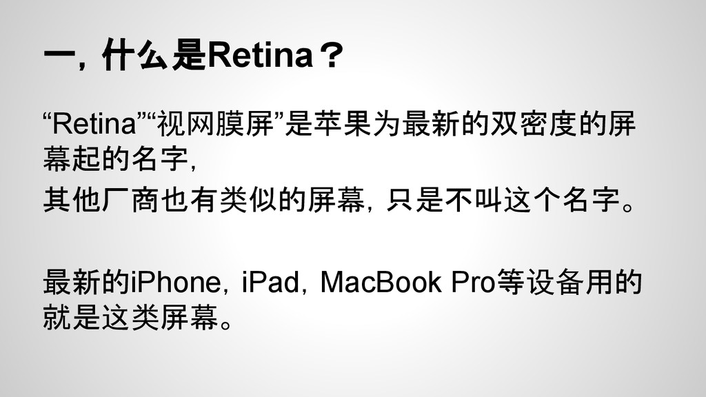
一,什么是Retina? “Retina”“视网膜屏”是苹果为最新的双密度的屏 幕起的名字, 其他厂商也有类似的屏幕,只是不叫这个名字。 最新的iPhone,iPad,MacBook Pro等设备用的 就是这类屏幕。
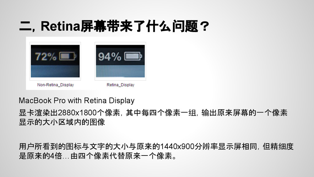
二,Retina屏幕带来了什么问题? MacBook Pro with Retina Display 显卡渲染出2880x1800个像素,其中每四个像素一组,输出原来屏幕的一个像素 显示的大小区域内的图像 用户所看到的图标与文字的大小与原来的1440x900分辨率显示屏相同,但精细度 是原来的4倍…由四个像素代替原来一个像素。
三,这个问题会影响哪些地方? 1,Favicon 2,Web Clip 3,图片 4,图标
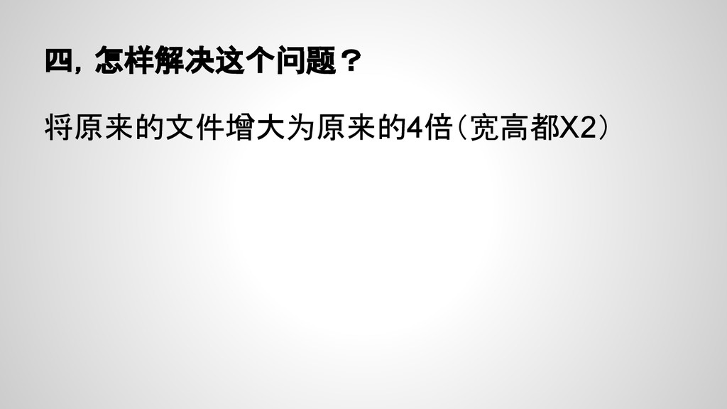
四,怎样解决这个问题? 将原来的文件增大为原来的4倍(宽高都X2)
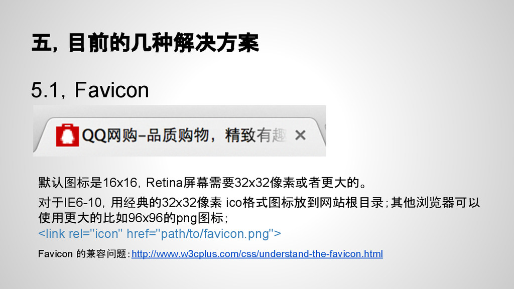
五,目前的几种解决方案 5.1,Favicon 默认图标是16x16,Retina屏幕需要32x32像素或者更大的。 对于IE6-10,用经典的32x32像素 ico格式图标放到网站根目录;其他浏览器可以 使用更大的比如96x96的png图标; <link rel="icon" href="path/to/favicon.png"> Favicon
的兼容问题:http://www.w3cplus.com/css/understand-the-favicon.html
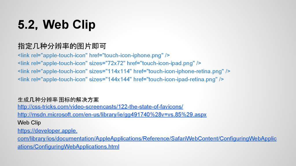
5.2,Web Clip 指定几种分辨率的图片即可 <link rel="apple-touch-icon" href="touch-icon-iphone.png" /> <link rel="apple-touch-icon" sizes="72x72"
href="touch-icon-ipad.png" /> <link rel="apple-touch-icon" sizes="114x114" href="touch-icon-iphone-retina.png" /> <link rel="apple-touch-icon" sizes="144x144" href="touch-icon-ipad-retina.png" /> 生成几种分辨率图标的解决方案 http://css-tricks.com/video-screencasts/122-the-state-of-favicons/ http://msdn.microsoft.com/en-us/library/ie/gg491740%28v=vs.85%29.aspx Web Clip https://developer.apple. com/library/ios/documentation/AppleApplications/Reference/SafariWebContent/ConfiguringWebApplic ations/ConfiguringWebApplications.html
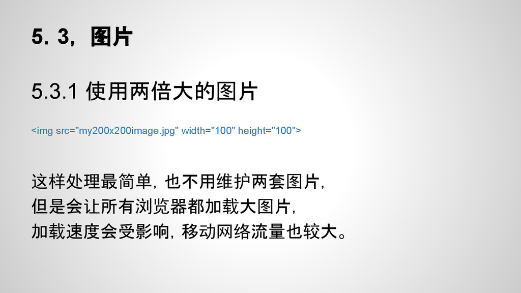
5.3, 图片 5.3.1 使用两倍大的图片 <img src="my200x200image.jpg" width="100" height="100"> 这样处理最简单,也不用维护两套图片, 但是会让所有浏览器都加载大图片,
加载速度会受影响,移动网络流量也较大。
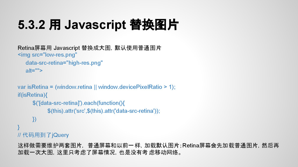
5.3.2 用 Javascript 替换图片 Retina屏幕用 Javascript 替换成大图,默认使用普通图片 <img src="low-res.png" data-src-retina="high-res.png"
alt=""> var isRetina = (window.retina || window.devicePixelRatio > 1); if(isRetina){ $('[data-src-retina]').each(function(){ $(this).attr('src',$(this).attr('data-src-retina')); }) } // 代码用到了jQuery 这样做需要维护两套图片, 普通屏幕和以前一样,加载默认图片;Retina屏幕会先加载普通图片,然后再 加载一次大图,这里只考虑了屏幕情况,也是没有考 虑移动网络。
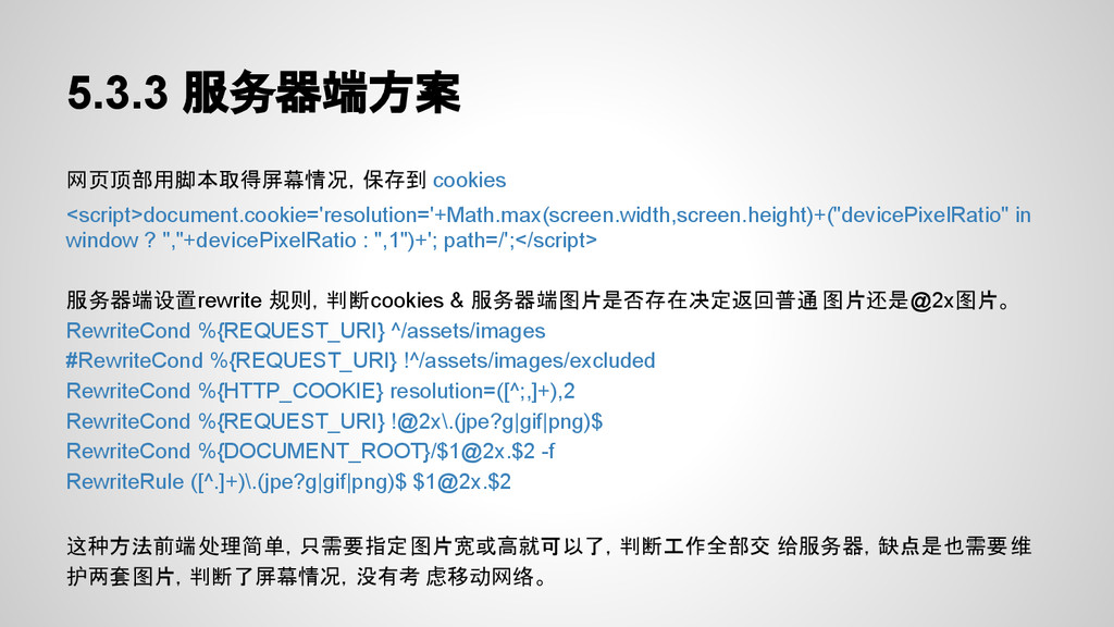
5.3.3 服务器端方案 网页顶部用脚本取得屏幕情况,保存到 cookies <script>document.cookie='resolution='+Math.max(screen.width,screen.height)+("devicePixelRatio" in window ? ","+devicePixelRatio :
",1")+'; path=/';</script> 服务器端设置rewrite 规则,判断cookies & 服务器端图片是否存在决定返回普通 图片还是@2x图片。 RewriteCond %{REQUEST_URI} ^/assets/images #RewriteCond %{REQUEST_URI} !^/assets/images/excluded RewriteCond %{HTTP_COOKIE} resolution=([^;,]+),2 RewriteCond %{REQUEST_URI} !@2x\.(jpe?g|gif|png)$ RewriteCond %{DOCUMENT_ROOT}/$1@2x.$2 -f RewriteRule ([^.]+)\.(jpe?g|gif|png)$ $1@2x.$2 这种方法前端处理简单,只需要指定图片宽或高就可以了,判断工作全部交 给服务器,缺点是也需要维 护两套图片,判断了屏幕情况,没有考 虑移动网络。
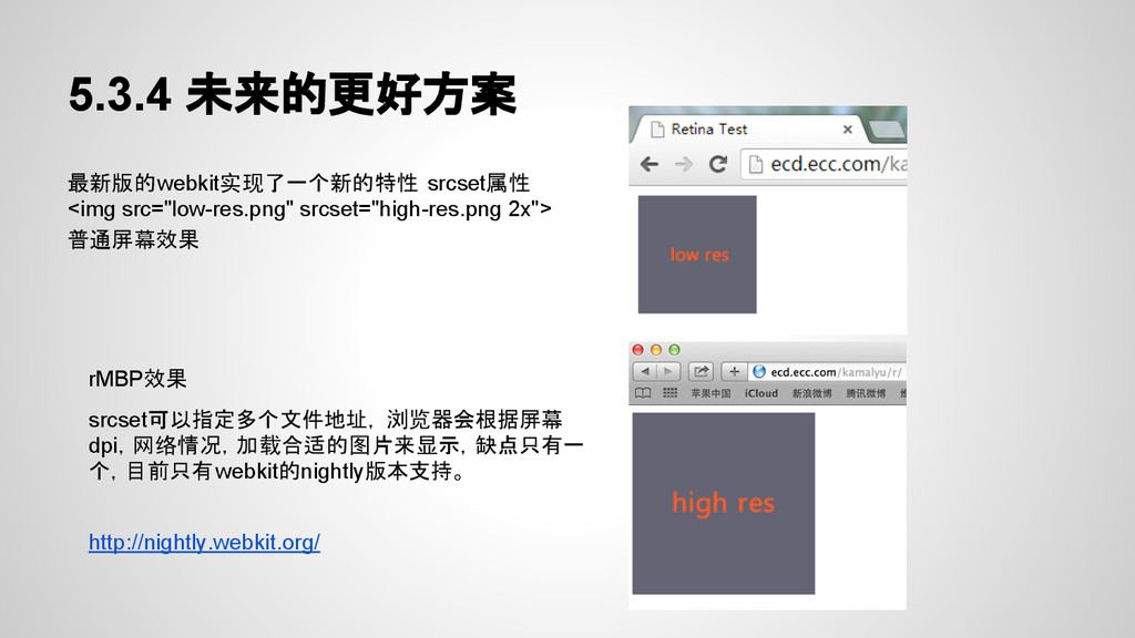
5.3.4 未来的更好方案 最新版的webkit实现了一个新的特性 srcset属性 <img src="low-res.png" srcset="high-res.png 2x"> 普通屏幕效果 rMBP效果
srcset可以指定多个文件地址, 浏览器会根据屏幕 dpi,网络情况,加载合适的图片来显示,缺点只有一 个,目前只有webkit的nightly版本支持。 http://nightly.webkit.org/
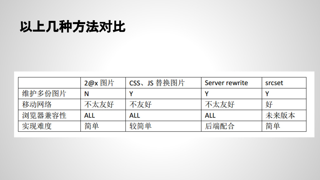
以上几种方法对比
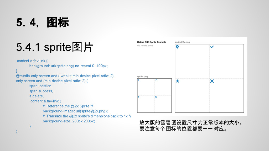
5.4, 图标 5.4.1 sprite图片 .content a.fav-link { background: url(sprite.png) no-repeat
0 -100px; } @media only screen and (-webkit-min-device-pixel-ratio: 2), only screen and (min-device-pixel-ratio: 2) { span.location, span.success, a.delete, .content a.fav-link { /* Reference the @2x Sprite */ background-image: url(
[email protected]
); /* Translate the @2x sprite's dimensions back to 1x */ background-size: 200px 200px; } } 放大版的雪碧图设置尺寸为正常版本的大小。 要注意每个图标的位置都要一一对应。
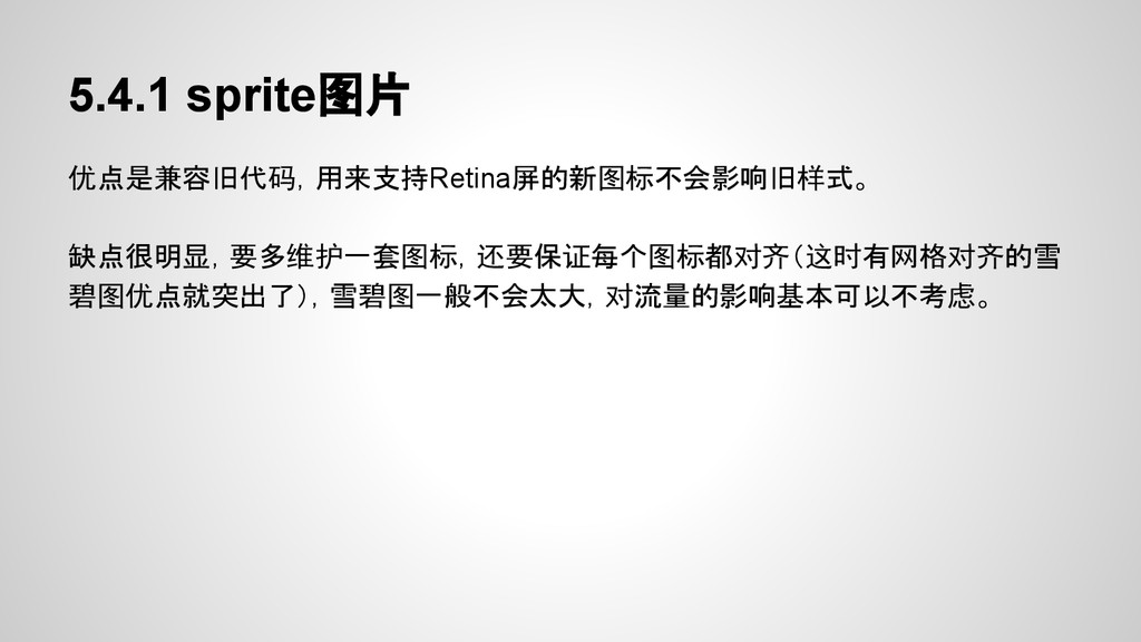
5.4.1 sprite图片 优点是兼容旧代码,用来支持Retina屏的新图标不会影响旧样式。 缺点很明显,要多维护一套图标,还要保证每个图标都对齐(这时有网格对齐的雪 碧图优点就突出了),雪碧图一般不会太大,对流量的影响基本可以不考虑。
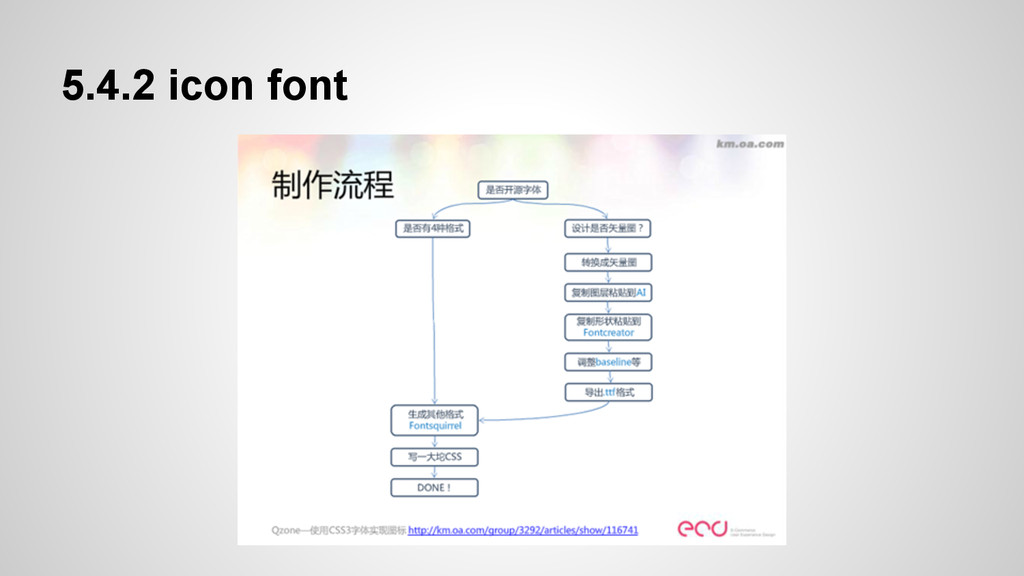
5.4.2 icon font
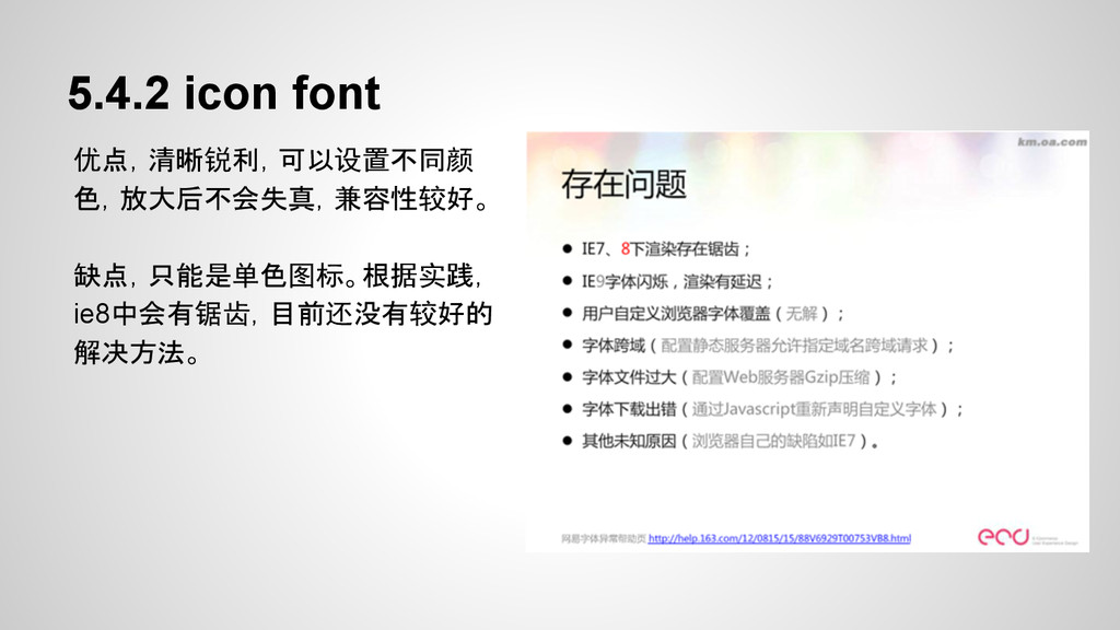
5.4.2 icon font 优点,清晰锐利,可以设置不同颜 色,放大后不会失真,兼容性较好。 缺点,只能是单色图标。根据实践, ie8中会有锯齿,目前还没有较好的 解决方法。
RETINA时代的前端优化 Thank you ECD kamalyu
 ikamal
 ioki
ioki
 mizchi
 o0h
o0h
 manfredsteyer
 suikabar
 contour_gara
 makicamel
 snhryt
 wagyu
wagyu
 yusukebe
 d0riven
 daitasu
 sferik
.png) helenjbeal
helenjbeal
 ryanjones
 tessaabrams
 hatefulcrawdad
 jakevdp
 cromwellryan
 popppiees
 chriscoyier
 soudai
 philnash
 reverentgeek