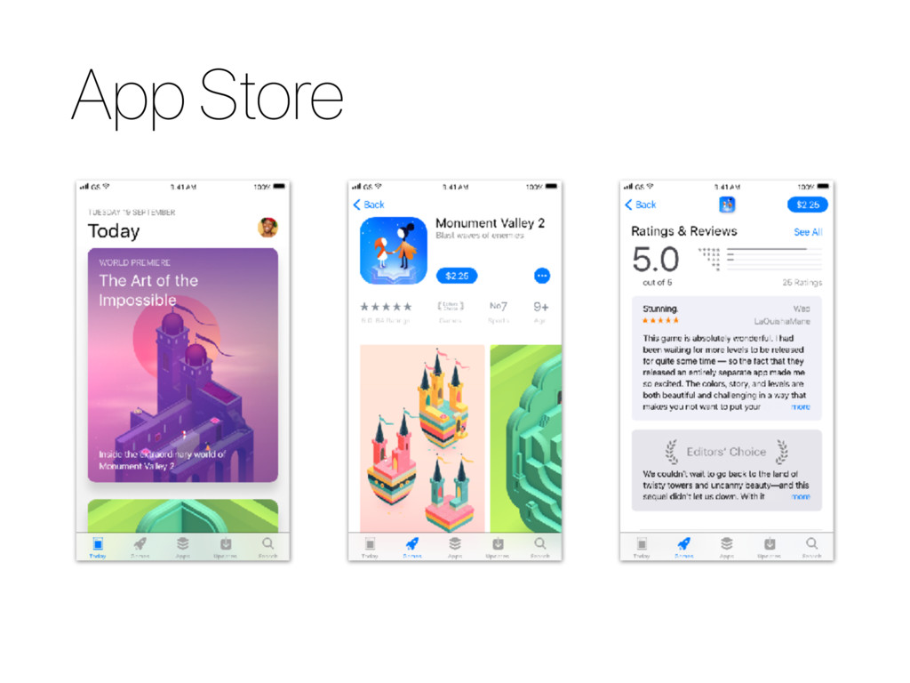
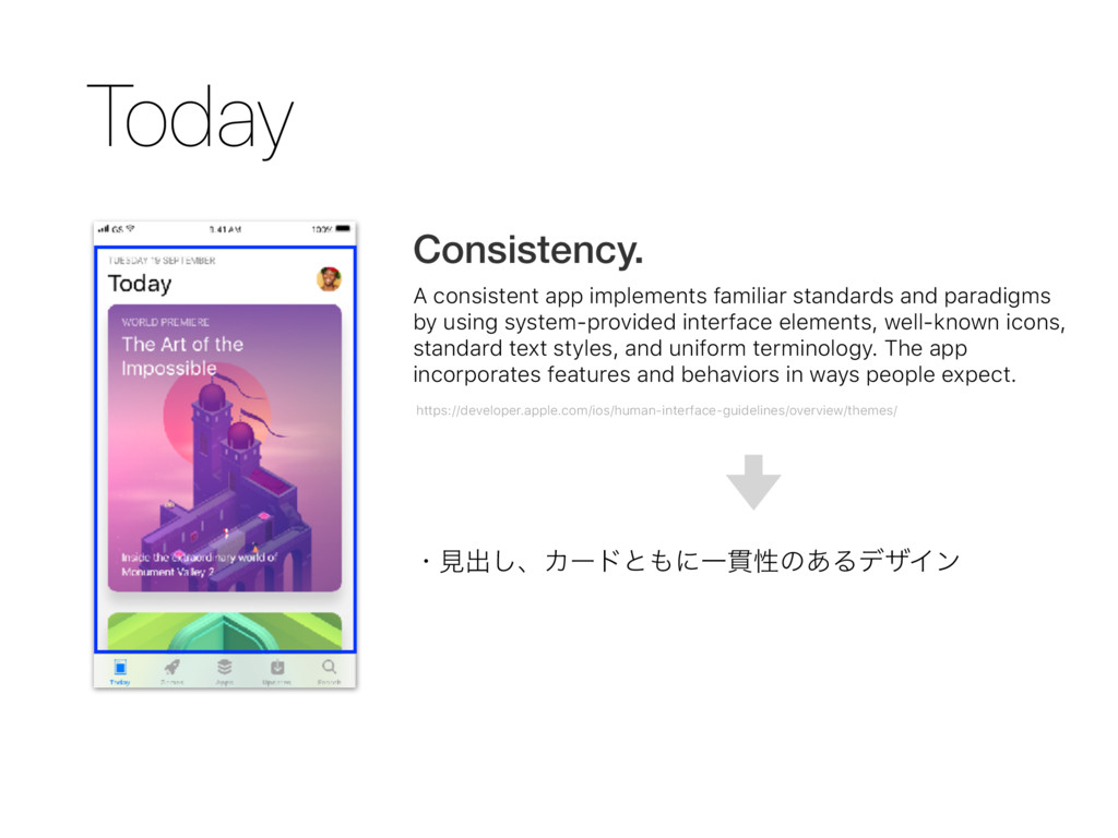
by using system-provided interface elements, well-known icons, standard text styles, and uniform terminology. The app incorporates features and behaviors in ways people expect. https://developer.apple.com/ios/human-interface-guidelines/overview/themes/ ɾݟग़͠ɺΧʔυͱʹҰ؏ੑͷ͋ΔσβΠϯ
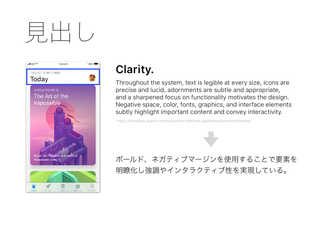
size, icons are precise and lucid, adornments are subtle and appropriate, and a sharpened focus on functionality motivates the design. Negative space, color, fonts, graphics, and interface elements subtly highlight important content and convey interactivity. https://developer.apple.com/ios/human-interface-guidelines/overview/themes/ ϘʔϧυɺωΨςΟϒϚʔδϯΛ༻͢Δ͜ͱͰཁૉΛ ໌ྎԽ͠ڧௐΠϯλϥΫςΟϒੑΛ࣮ݱ͍ͯ͠Δɻ
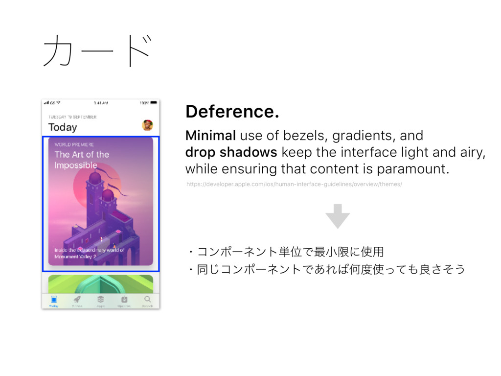
keep the interface light and airy, while ensuring that content is paramount. https://developer.apple.com/ios/human-interface-guidelines/overview/themes/ ɾίϯϙʔωϯτ୯ҐͰ࠷খݶʹ༻ ɾಉ͡ίϯϙʔωϯτͰ͋ΕԿͬͯྑͦ͞͏


 ikustan
 shihochan
 florets1
 deka_morita
 dske104
 optim
optim
 gonta
gonta
 l2hyunwoo
 rshindo
 mofurune
 nokomoro3
 kasacchiful
 yegor256
 konakalab
 codingconduct
 addyosmani
 427marketing
 watany
 frankvandijk
 axbom
axbom
 jdejongh
 signer
 danielanewman
 keavy
keavy
 thoeni