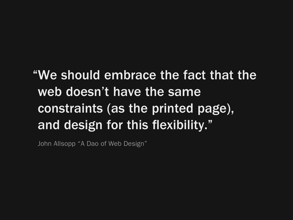
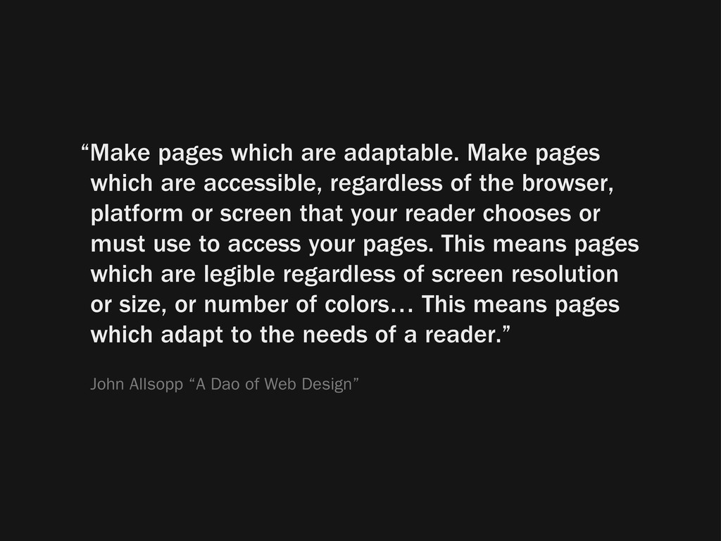
regardless of the browser, platform or screen that your reader chooses or must use to access your pages. This means pages which are legible regardless of screen resolution or size, or number of colors… This means pages which adapt to the needs of a reader.” John Allsopp “A Dao of Web Design”
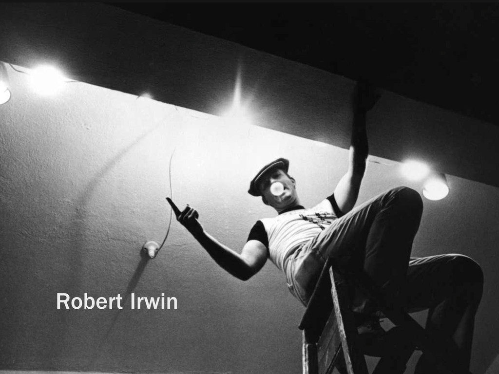
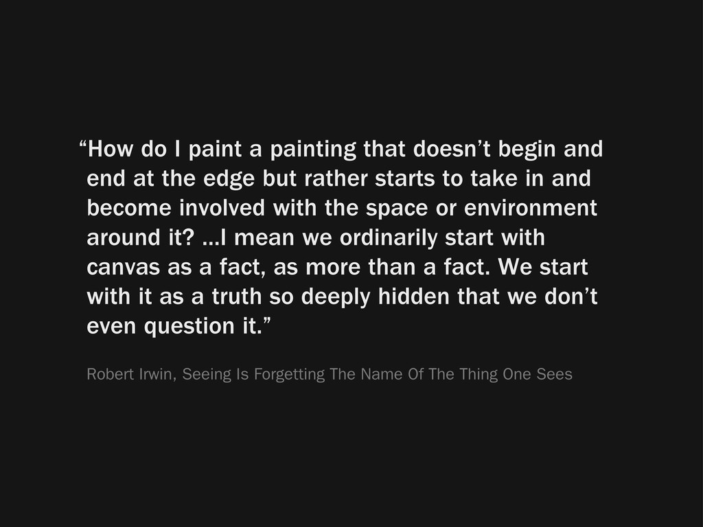
end at the edge but rather starts to take in and become involved with the space or environment around it? ...I mean we ordinarily start with canvas as a fact, as more than a fact. We start with it as a truth so deeply hidden that we don’t even question it.” Robert Irwin, Seeing Is Forgetting The Name Of The Thing One Sees
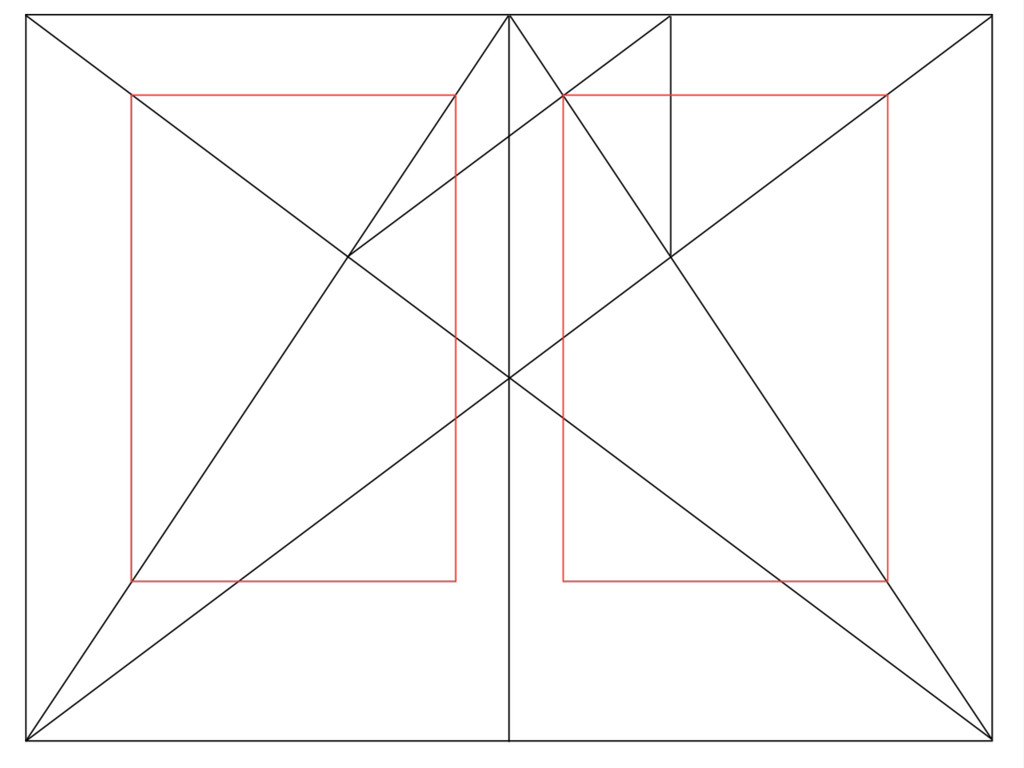
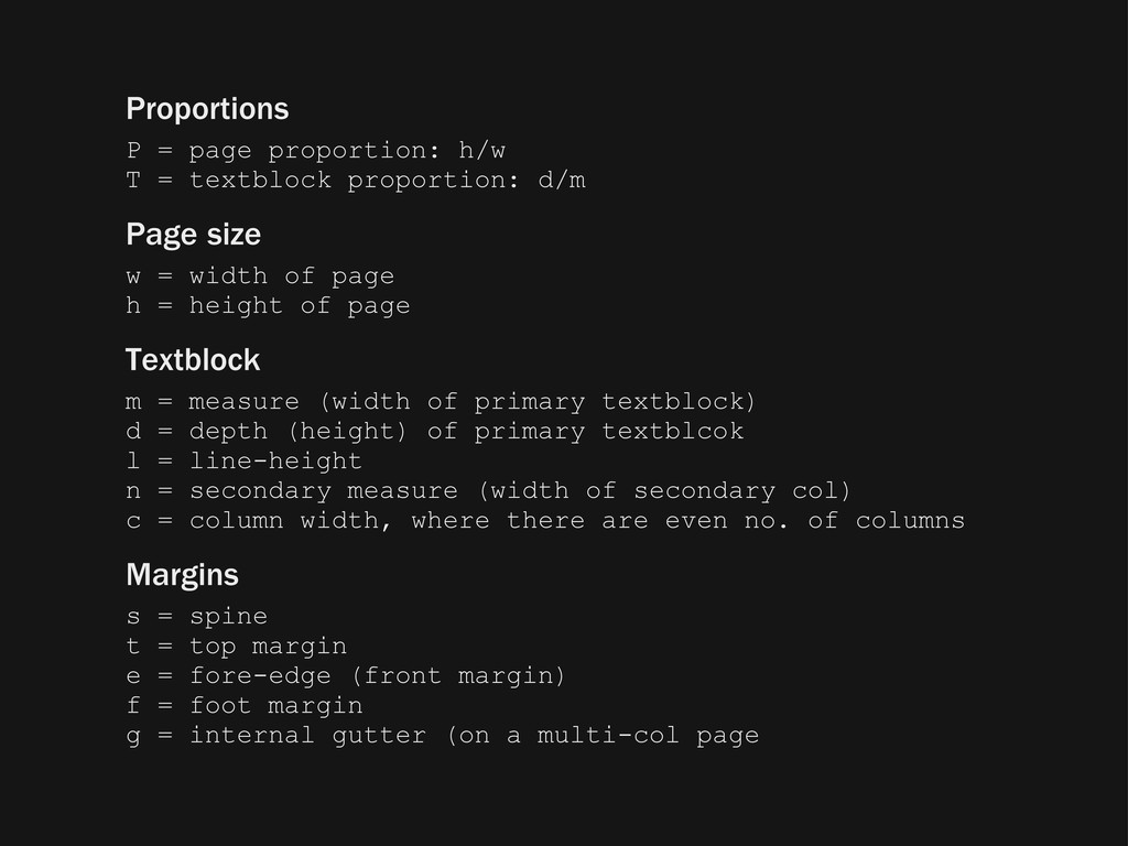
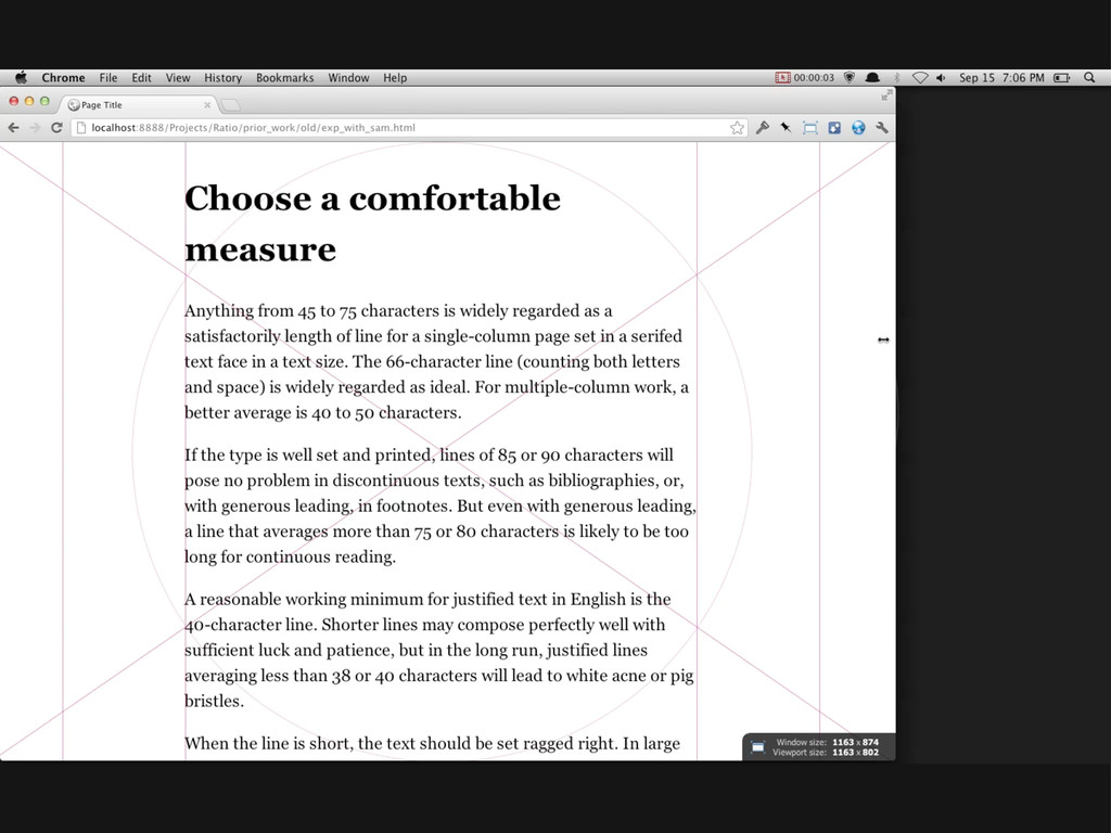
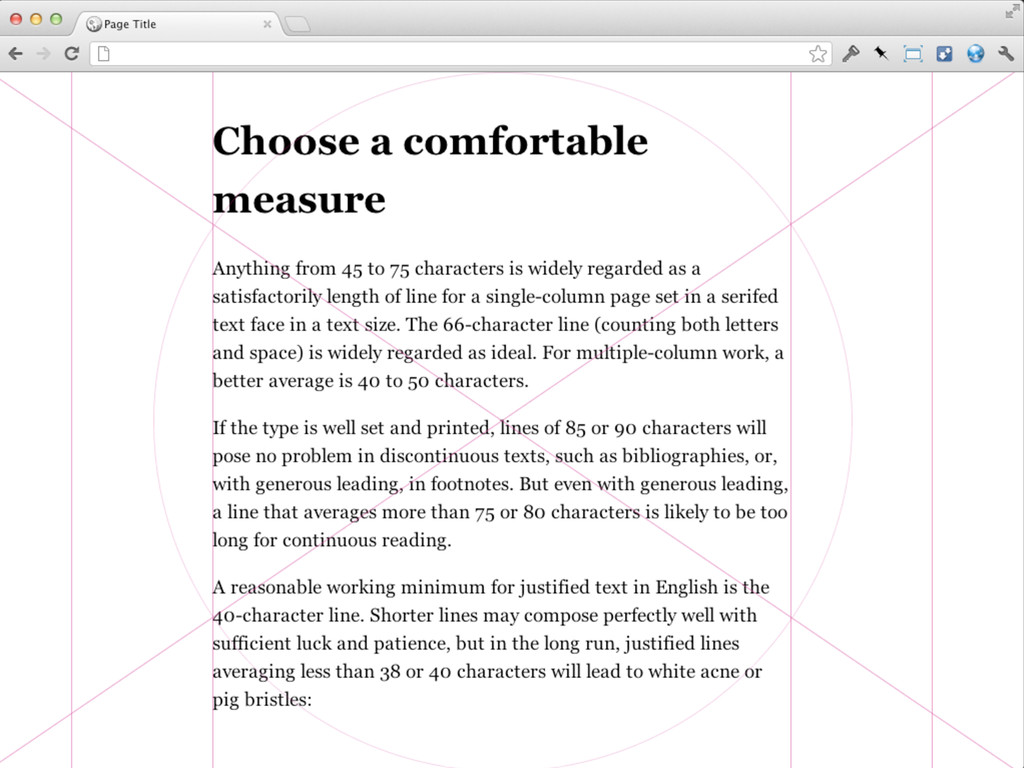
d/m Page size w = width of page h = height of page Textblock m = measure (width of primary textblock) d = depth (height) of primary textblcok l = line-height n = secondary measure (width of secondary col) c = column width, where there are even no. of columns Margins s = spine t = top margin e = fore-edge (front margin) f = foot margin g = internal gutter (on a multi-col page
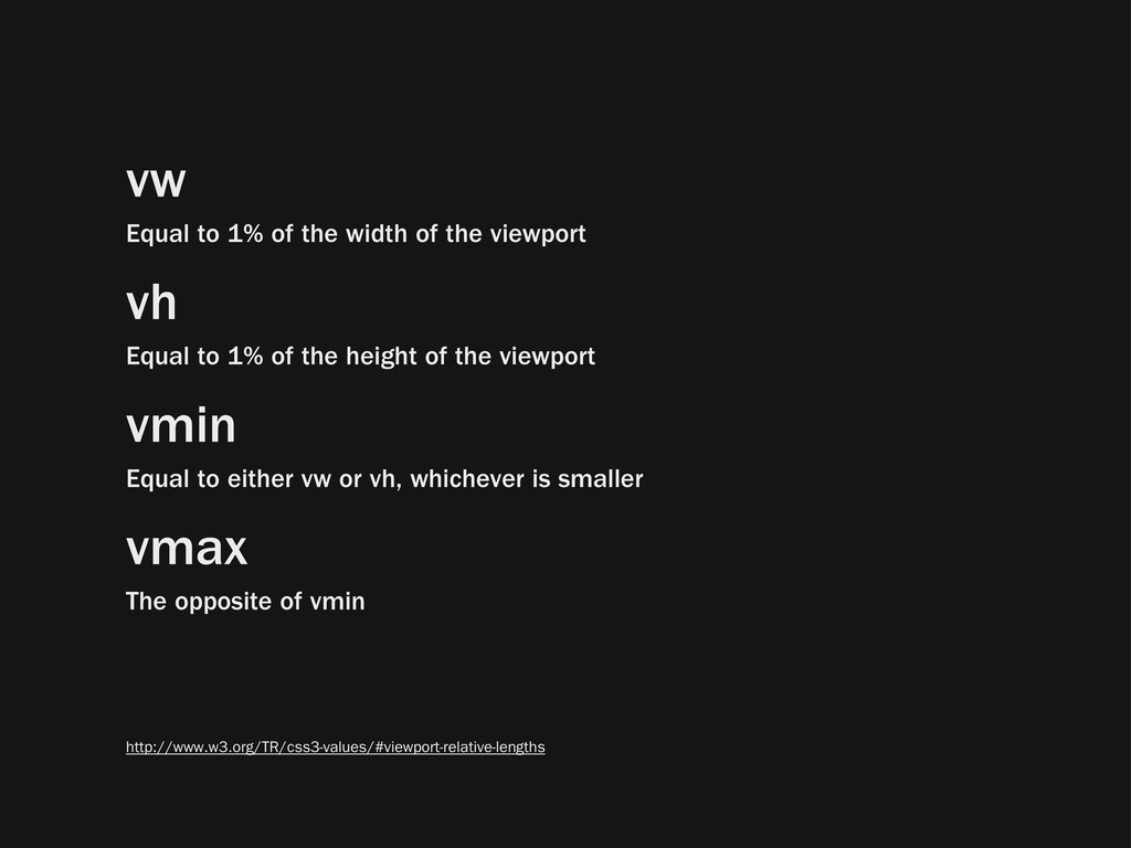
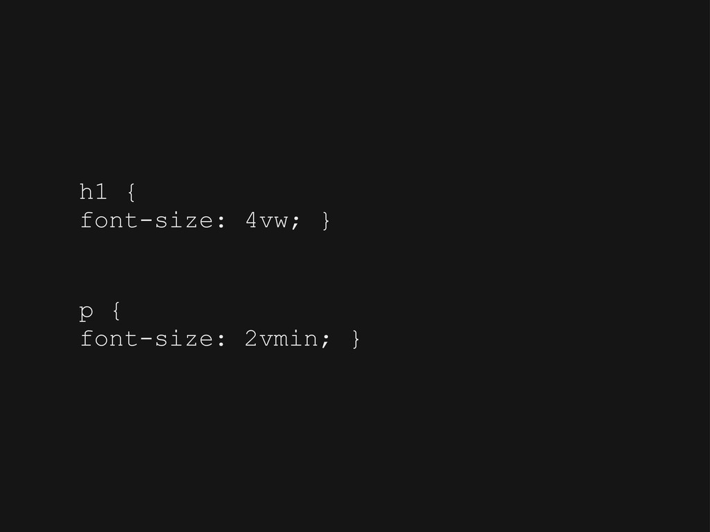
vh Equal to 1% of the height of the viewport vmin Equal to either vw or vh, whichever is smaller vmax The opposite of vmin http://www.w3.org/TR/css3-values/#viewport-relative-lengths
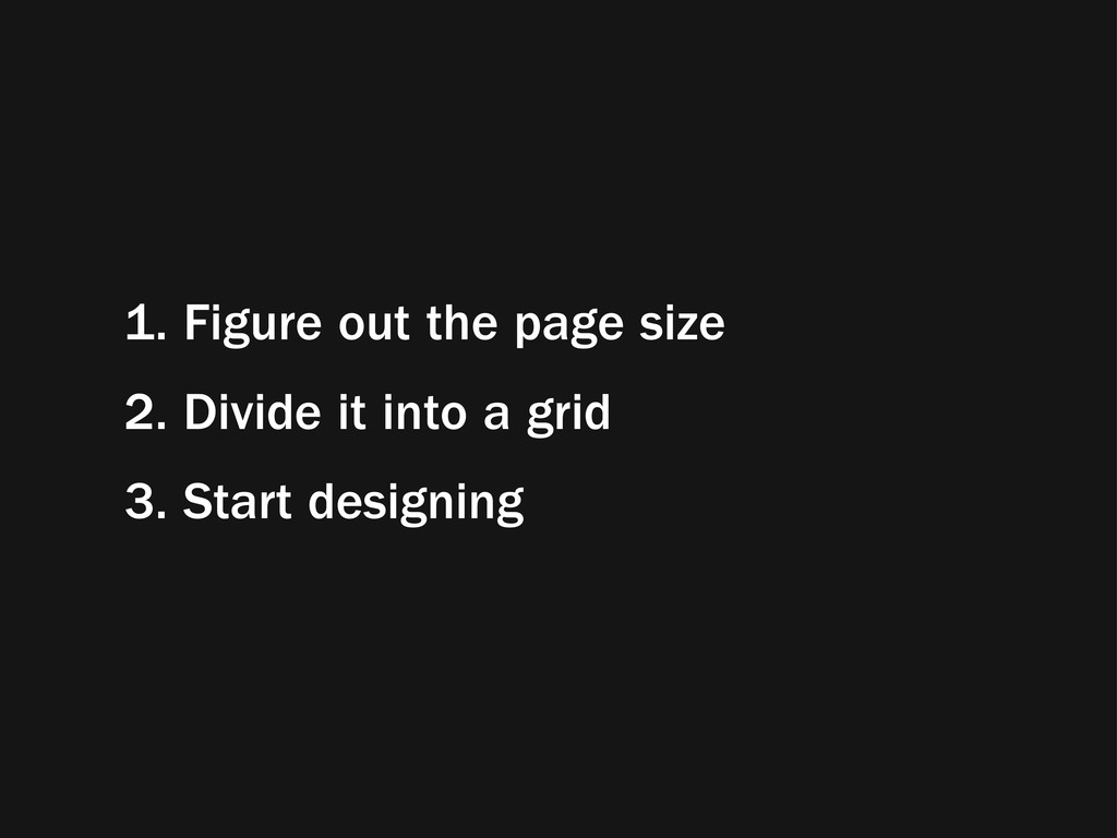
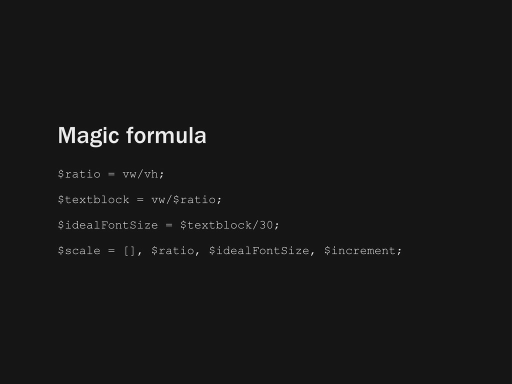
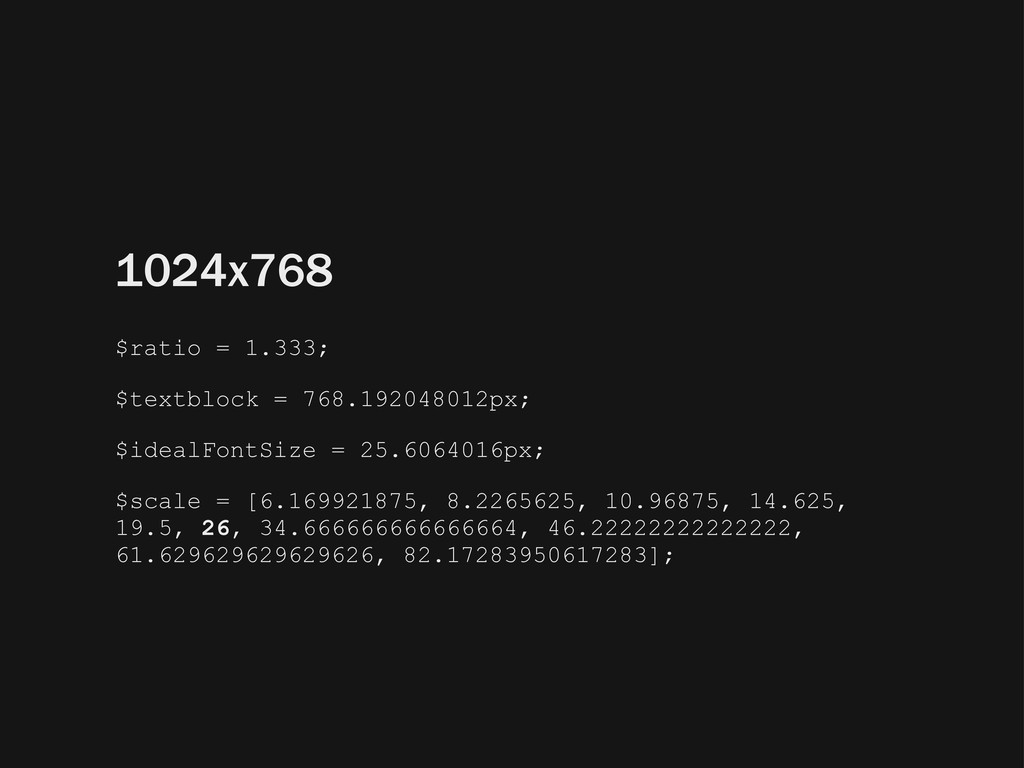
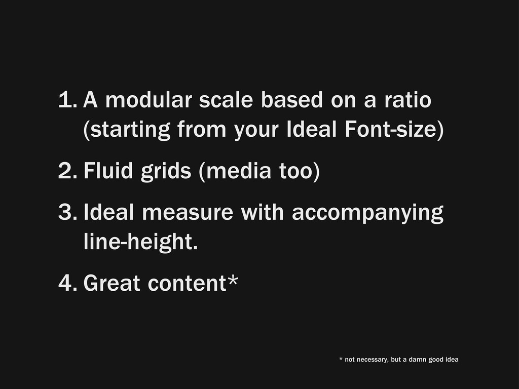
your Ideal Font-size) 2. Fluid grids (media too) 3. Ideal measure with accompanying line-height. 4. Great content* * not necessary, but a damn good idea
 jbrewer
 signull
 saki822
 hiromimaeo
 rezaline
 terencebasart
 securecat
 hiro0218
 garyuten
 kakukoki
 toshihidemurata
 visional_engineering_and_design
 calpin
 rkendrick25
 aleyda
 codingconduct
 badams
 danielanewman
 sarafernandez
 mfonobong
 addyosmani
 tanoku
 michaelherold