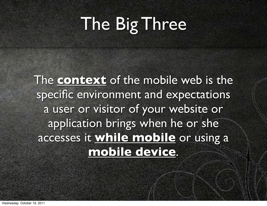
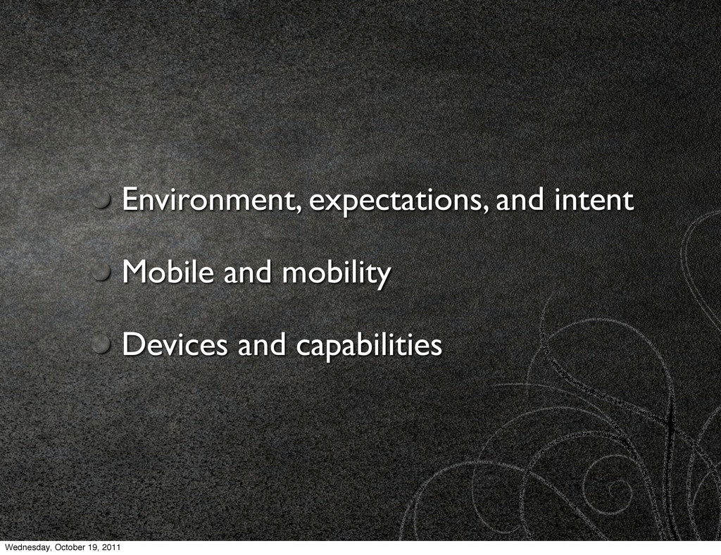
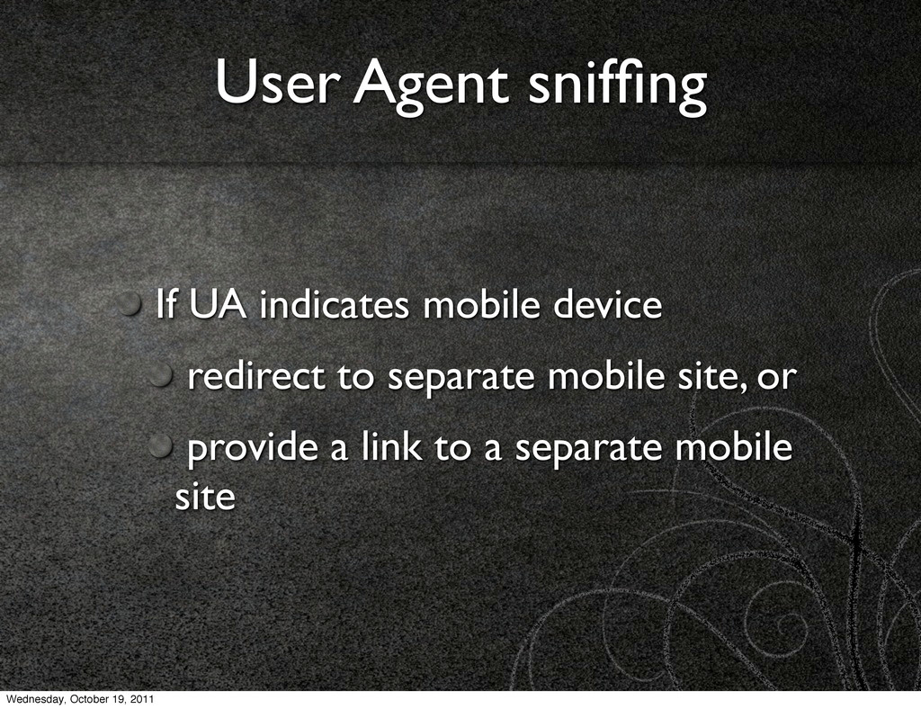
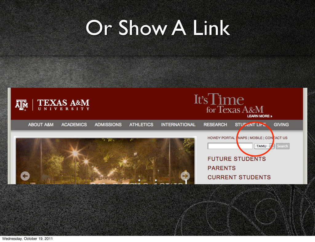
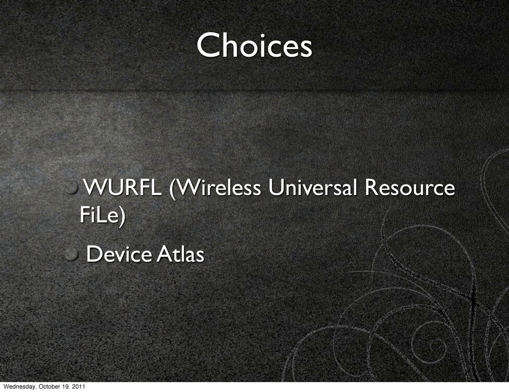
The great native apps vs mobile web debate will live on for a little while longer, but more and more we are realizing that we can get the best of both worlds with mobile web apps. However, there is an expectation of context on mobile devices, and ignoring that experience expectation is a mistake. Let's look at the contextual experience of the mobile web.
 jcarouth
 broadleaf
 hjmkth
 rollbear
 kajitack
 nagise
 minodriven
 tk3fftk
 naokihaba
 ioki
ioki
 licux
licux
 sumedhbala
 hyshu
hyshu
 dugsong
 garrettdimon
 morganepeng
 dougneiner
 eileencodes
 soysaucechin
 kastner
 andyhume
 tammielis
 baasie
 signer
 frankvandijk
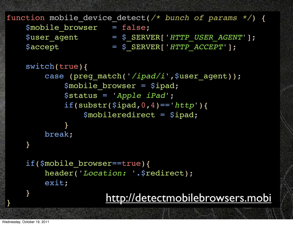
![function is_mobile() { $user_agent = strtolower($_SERVER['HTTP_USER_AGENT']); if (in_array( substr($user_agent, 0,](https://files.speakerdeck.com/presentations/4e9f625e6fb70d0051006b58/slide_19.jpg)
![Questions? Contact me [email protected] @jcarouth jcarouth on Freenode Rate at:](https://files.speakerdeck.com/presentations/4e9f625e6fb70d0051006b58/slide_59.jpg)