Upgrade to Pro — share decks privately, control downloads, hide ads and more …

The Future of YUI Skinning

Jeff Conniff
November 15, 2012

The Future of YUI Skinning

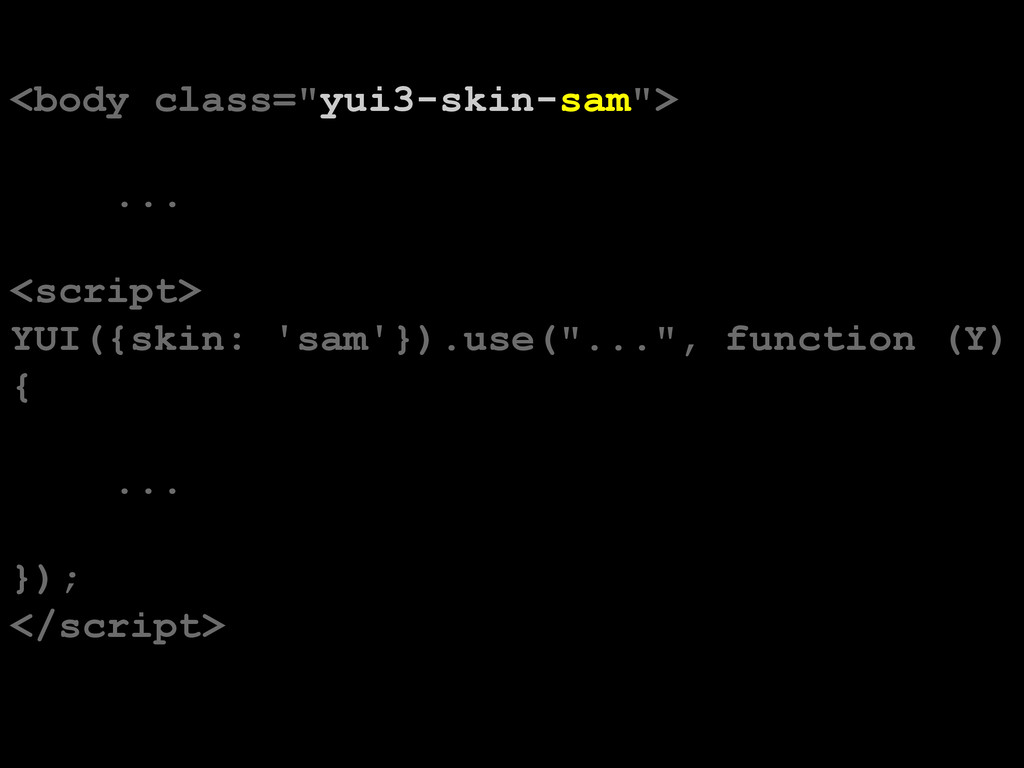
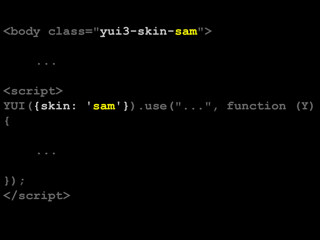
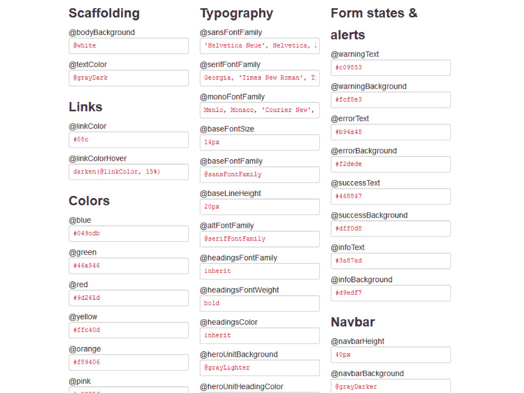
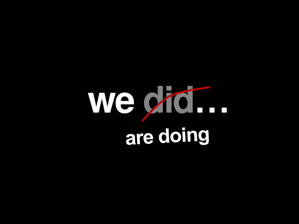
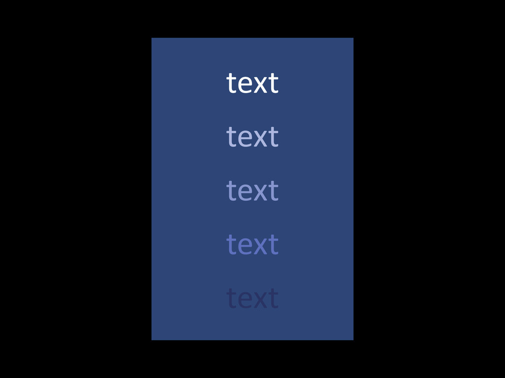
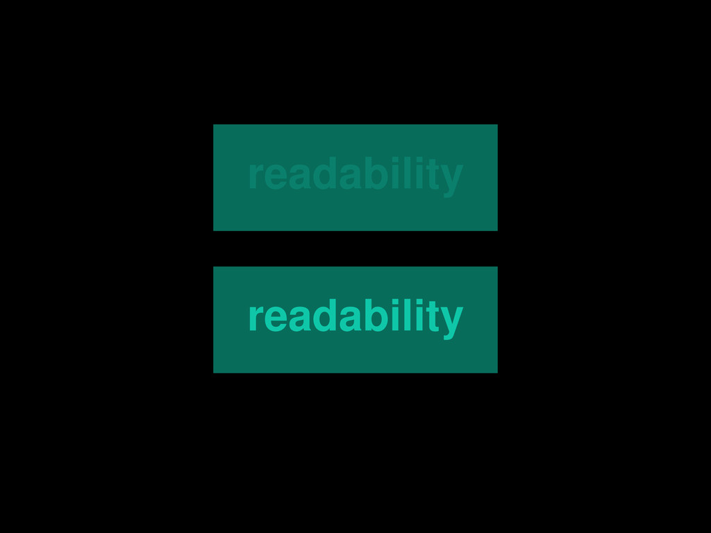
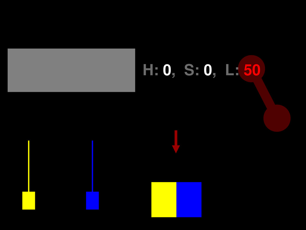
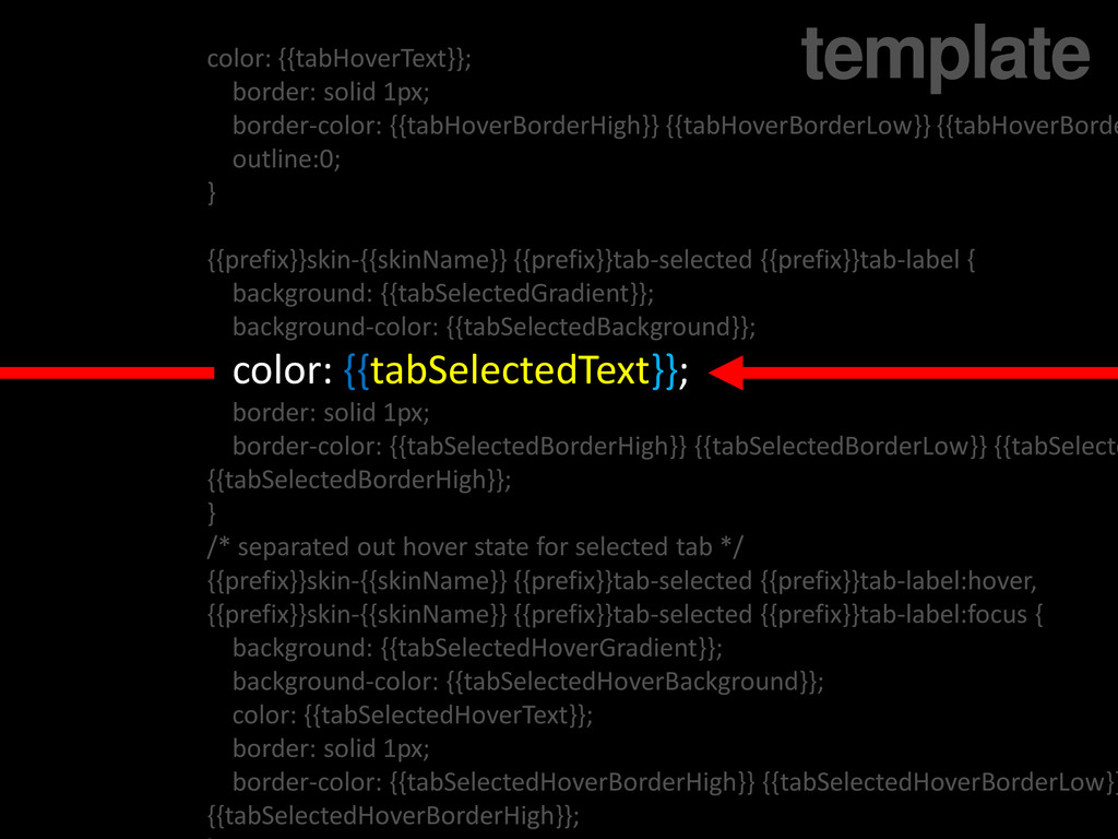
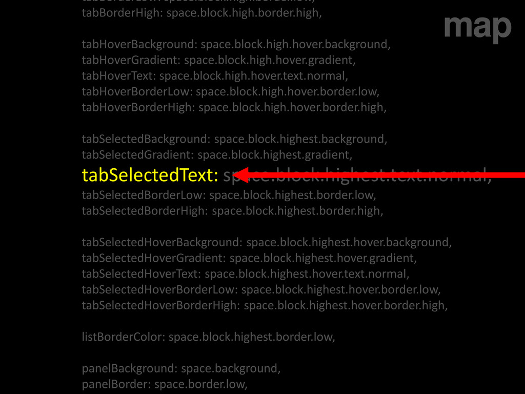
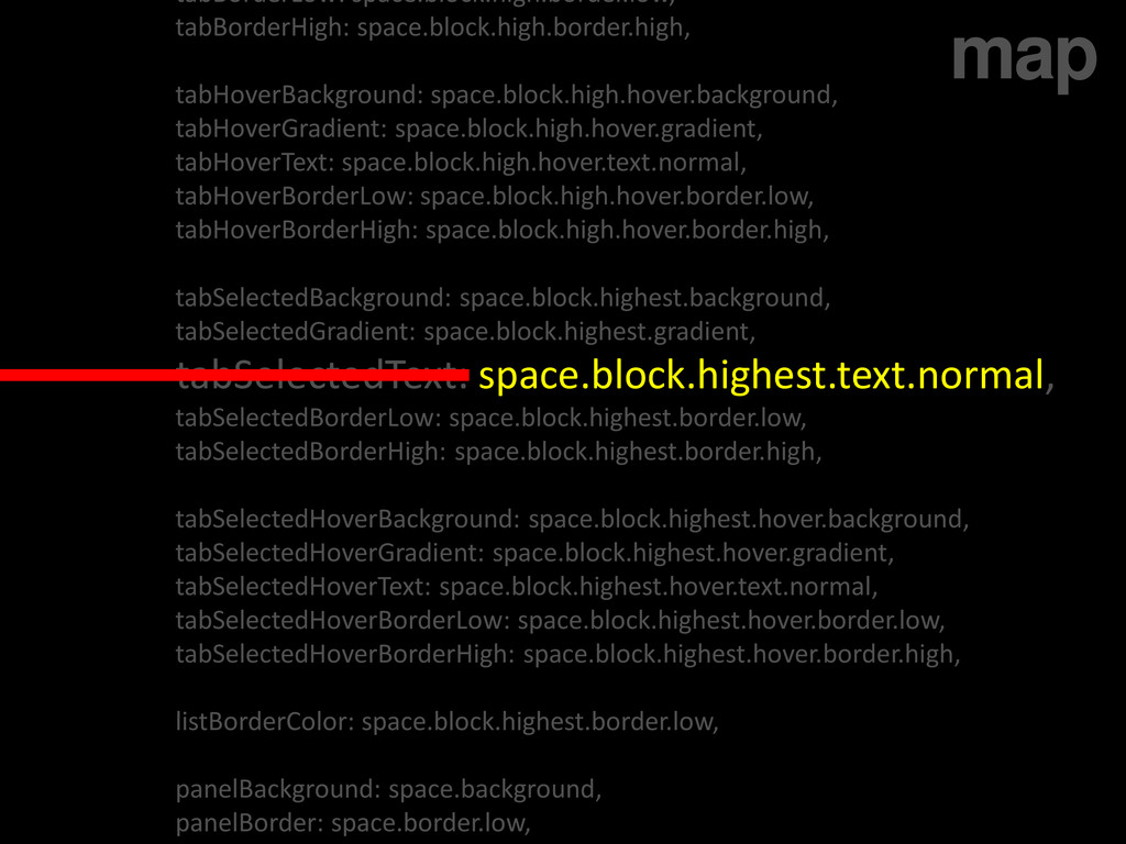
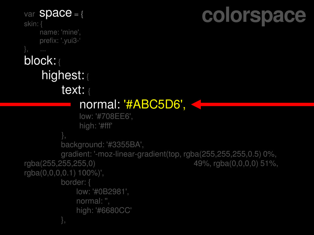
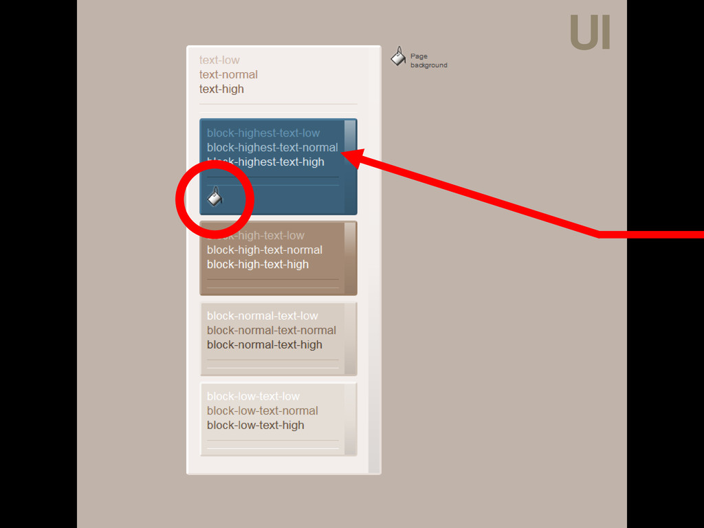
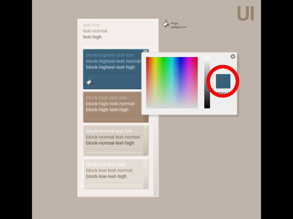
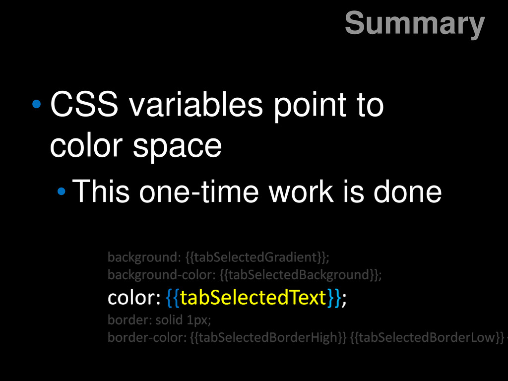
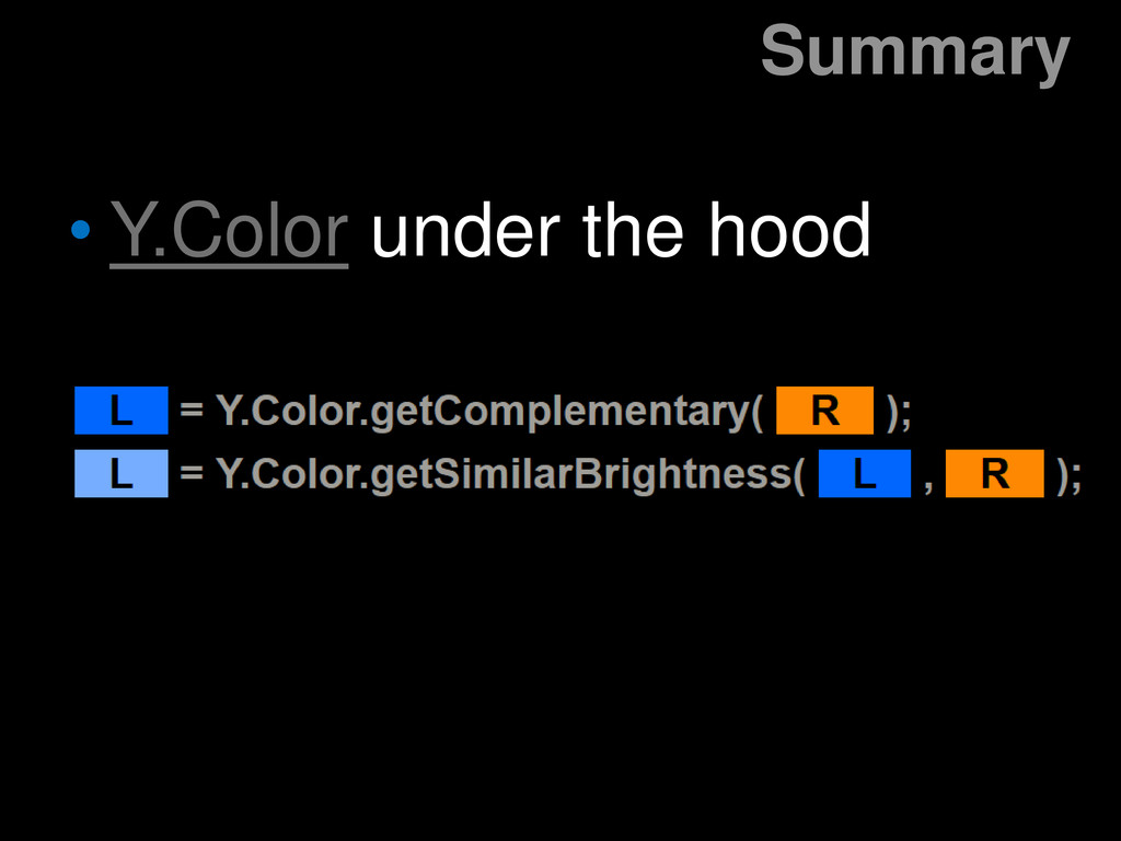
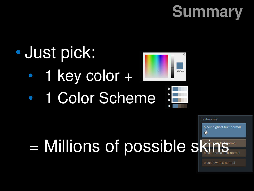
Have you ever wished it was easier to make YUI widgets skinned to look just right with the color scheme of your site or app? This will be a preview of a new system we're building to make this far easier.

Jeff Conniff

November 15, 2012
Tweet

Other Decks in Programming

Transcript

  1. ?

  2. border-style: solid; border-width: 1px; color: #EAE4DE; outline: 0 none; }

    .yui3-skin-mine .yui3-tab-selected .yui3-tab-label { background: -moz-linear-gradient(center top , rgba(255, 255, 255, 0.5) 0% border-color: #4C7C9C #335369 #335369 #4C7C9C; border-style: solid; border-width: 1px; color: #ABC5D6; } .yui3-skin-mine .yui3-tab-selected .yui3-tab-label:hover, .yui3-skin-mine .yui3 -moz-border-bottom-colors: none; -moz-border-left-colors: none; -moz-border-right-colors: none; -moz-border-top-colors: none; background: -moz-linear-gradient(center top , rgba(255, 255, 255, 0.5) 0% #35576E; border-color: #467290 #2D495D #2D495D #467290; border-image: none; border-style: solid; border-width: 1px; color: #9EBCD1; tabview.css
  3. color: {{tabHoverText}}; border: solid 1px; border-color: {{tabHoverBorderHigh}} {{tabHoverBorderLow}} {{tabHoverBorde outline:0;

    } {{prefix}}skin-{{skinName}} {{prefix}}tab-selected {{prefix}}tab-label { background: {{tabSelectedGradient}}; background-color: {{tabSelectedBackground}}; color: {{tabSelectedText}}; border: solid 1px; border-color: {{tabSelectedBorderHigh}} {{tabSelectedBorderLow}} {{tabSelecte {{tabSelectedBorderHigh}}; } /* separated out hover state for selected tab */ {{prefix}}skin-{{skinName}} {{prefix}}tab-selected {{prefix}}tab-label:hover, {{prefix}}skin-{{skinName}} {{prefix}}tab-selected {{prefix}}tab-label:focus { background: {{tabSelectedHoverGradient}}; background-color: {{tabSelectedHoverBackground}}; color: {{tabSelectedHoverText}}; border: solid 1px; border-color: {{tabSelectedHoverBorderHigh}} {{tabSelectedHoverBorderLow}} {{tabSelectedHoverBorderHigh}}; template
  4. tabBorderLow: space.block.high.border.low, tabBorderHigh: space.block.high.border.high, tabHoverBackground: space.block.high.hover.background, tabHoverGradient: space.block.high.hover.gradient, tabHoverText: space.block.high.hover.text.normal,

    tabHoverBorderLow: space.block.high.hover.border.low, tabHoverBorderHigh: space.block.high.hover.border.high, tabSelectedBackground: space.block.highest.background, tabSelectedGradient: space.block.highest.gradient, tabSelectedText: space.block.highest.text.normal, tabSelectedBorderLow: space.block.highest.border.low, tabSelectedBorderHigh: space.block.highest.border.high, tabSelectedHoverBackground: space.block.highest.hover.background, tabSelectedHoverGradient: space.block.highest.hover.gradient, tabSelectedHoverText: space.block.highest.hover.text.normal, tabSelectedHoverBorderLow: space.block.highest.hover.border.low, tabSelectedHoverBorderHigh: space.block.highest.hover.border.high, listBorderColor: space.block.highest.border.low, panelBackground: space.background, panelBorder: space.border.low, map
  5. tabBorderLow: space.block.high.border.low, tabBorderHigh: space.block.high.border.high, tabHoverBackground: space.block.high.hover.background, tabHoverGradient: space.block.high.hover.gradient, tabHoverText: space.block.high.hover.text.normal,

    tabHoverBorderLow: space.block.high.hover.border.low, tabHoverBorderHigh: space.block.high.hover.border.high, tabSelectedBackground: space.block.highest.background, tabSelectedGradient: space.block.highest.gradient, tabSelectedText: space.block.highest.text.normal, tabSelectedBorderLow: space.block.highest.border.low, tabSelectedBorderHigh: space.block.highest.border.high, tabSelectedHoverBackground: space.block.highest.hover.background, tabSelectedHoverGradient: space.block.highest.hover.gradient, tabSelectedHoverText: space.block.highest.hover.text.normal, tabSelectedHoverBorderLow: space.block.highest.hover.border.low, tabSelectedHoverBorderHigh: space.block.highest.hover.border.high, listBorderColor: space.block.highest.border.low, panelBackground: space.background, panelBorder: space.border.low, map
  6. var space = { skin: { name: 'mine', prefix: '.yui3-‘

    }, ... block: { highest: { text: { normal: '#ABC5D6', low: '#708EE6', high: '#fff' }, background: '#3355BA', gradient: '-moz-linear-gradient(top, rgba(255,255,255,0.5) 0%, rgba(255,255,255,0) ______________49%, rgba(0,0,0,0) 51%, rgba(0,0,0,0.1) 100%)', border: { low: '#0B2981', normal: '', high: '#6680CC' }, colorspace
  7. UI

  8. UI

  9. Summary • Just pick: • 1 key color + •

    1 Color Scheme = Millions of possible skins
  10. Q&A