Presentation at Strata+Hadoop World, Barcelona, Nov 19th 2014.
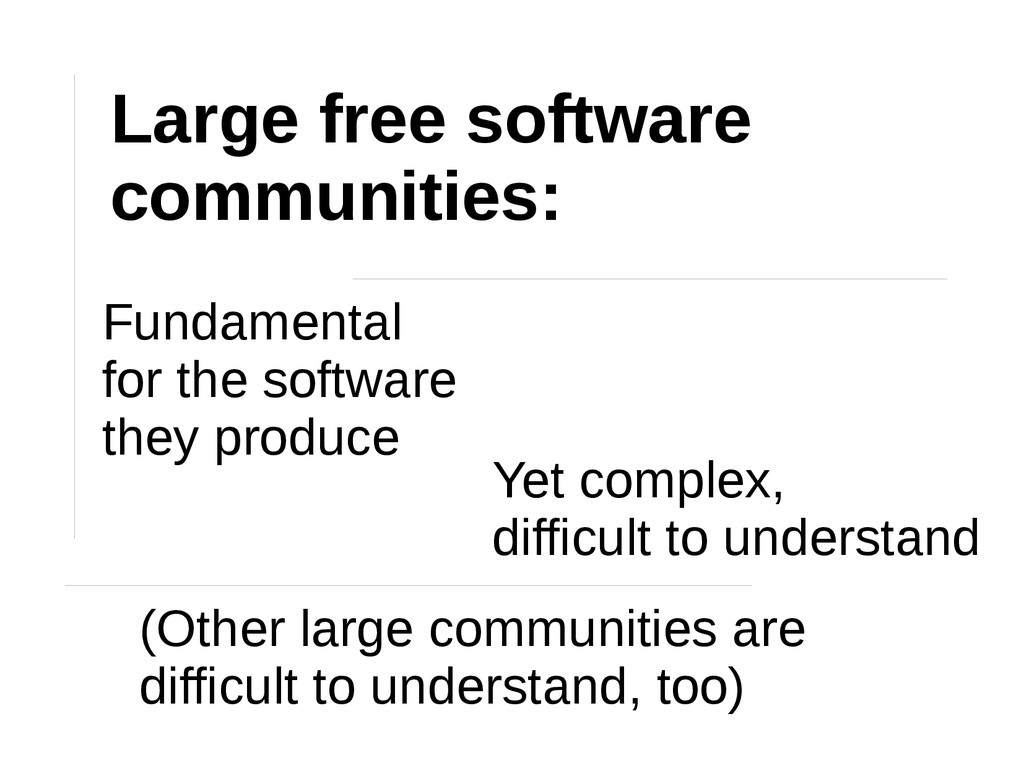
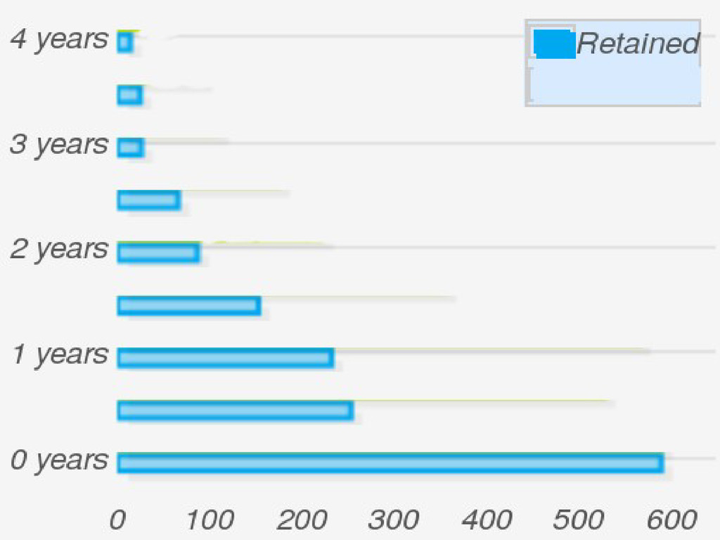
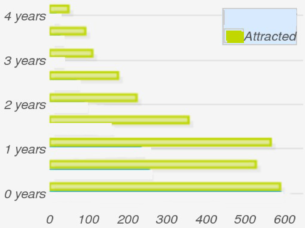
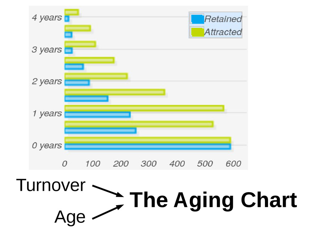
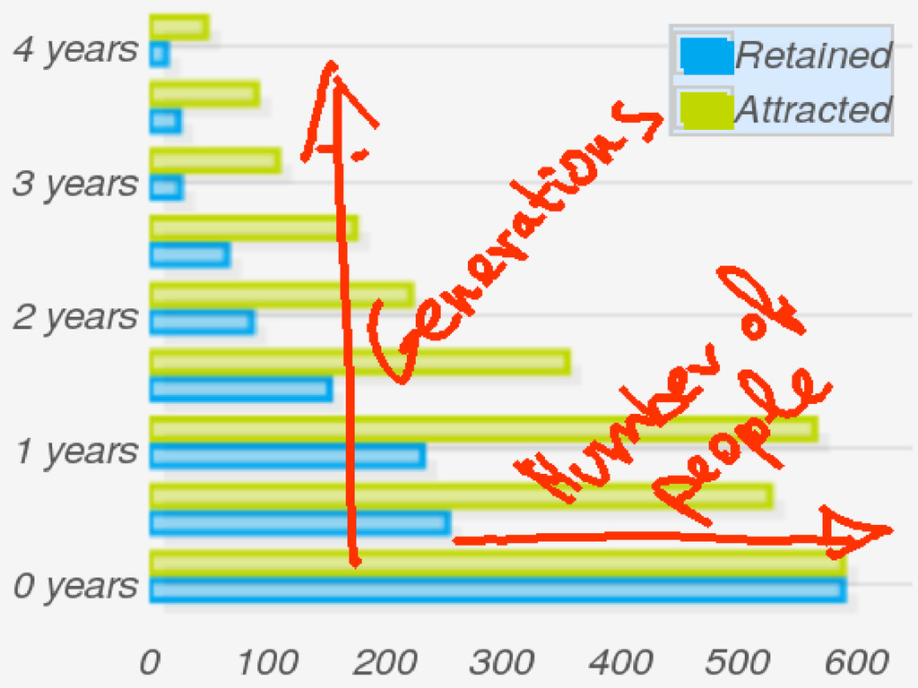
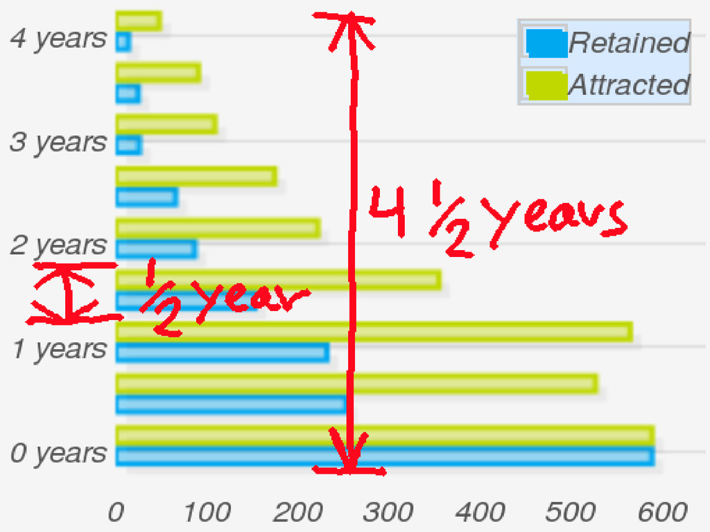
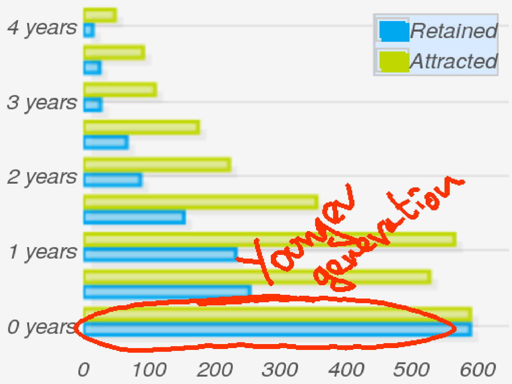
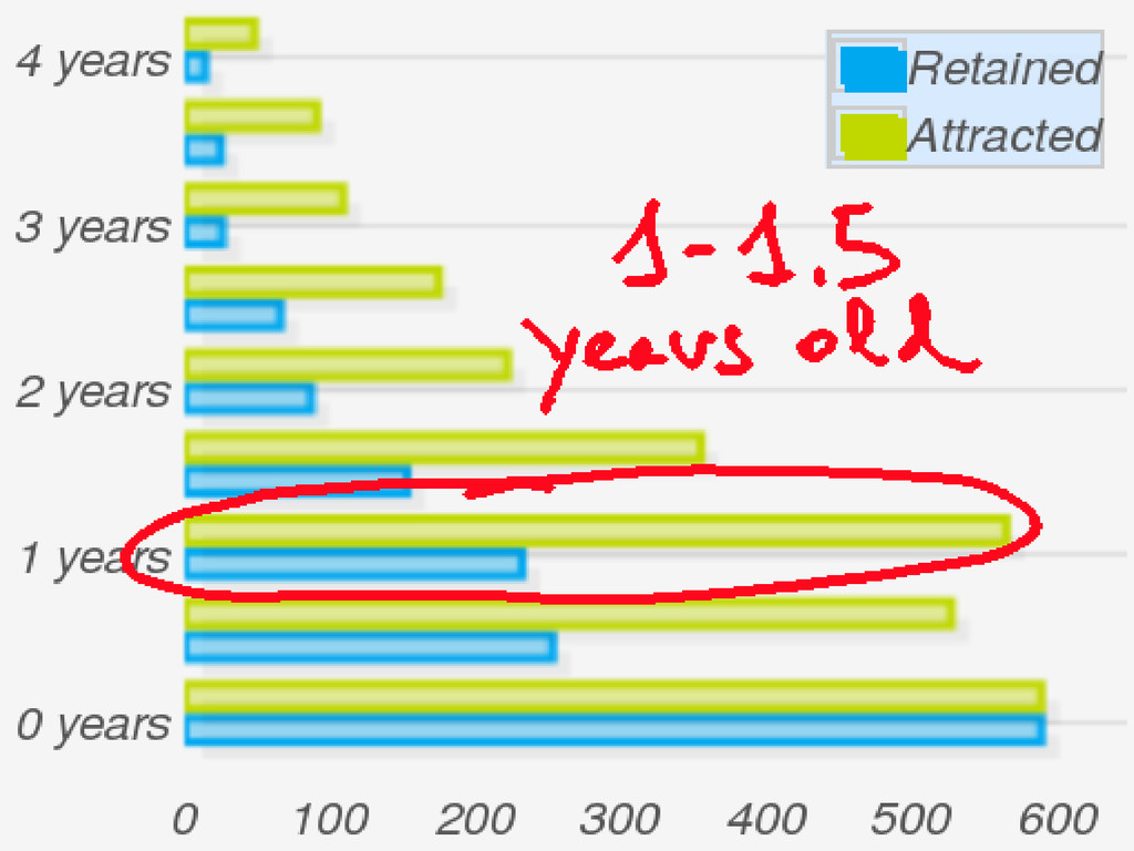
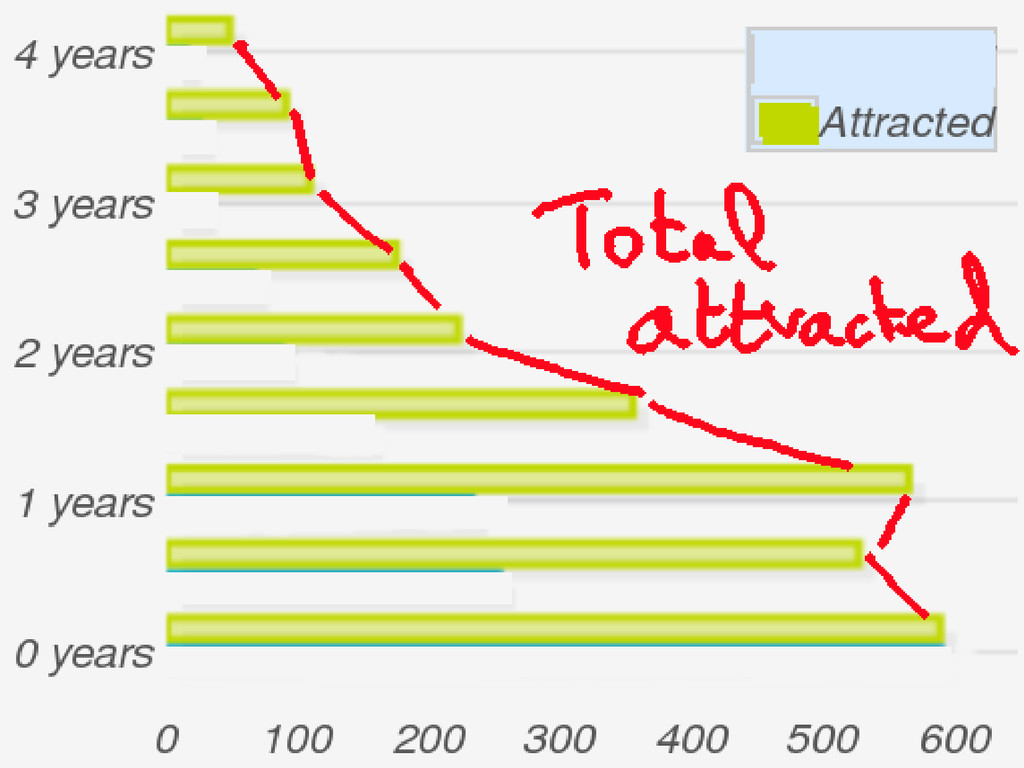
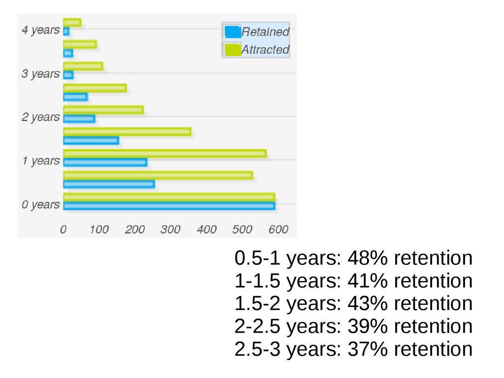
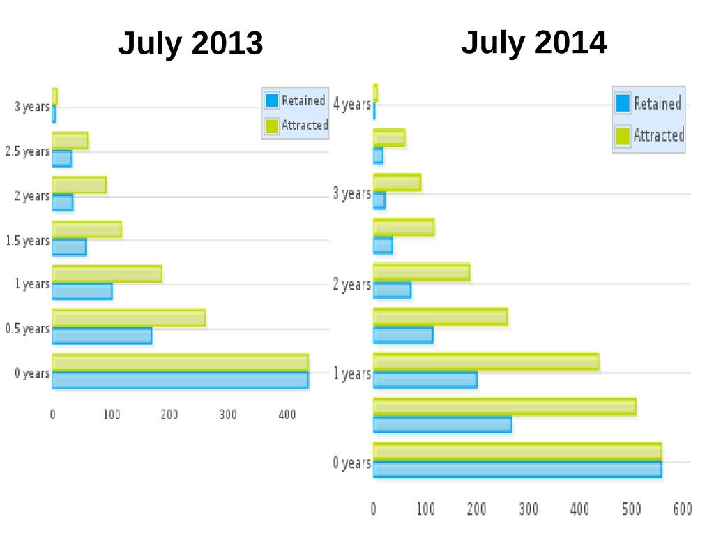
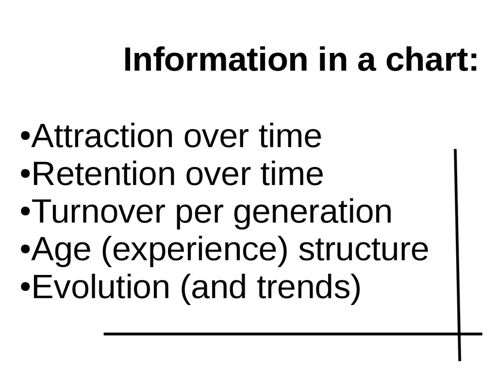
Of the many aspects to explore in communities, turnover and age structure are some of the more important. Turnover shows how people are entering and leaving the community. It tells how attractive is the community, and how it retains people once they join. Age structure, understanding age as "time in the community" shows for how long members have joined it. It tells how many people are available in different stages of experience, from old-timers to newbies. Together, both can be used to estimate engagement, to predict the future structure and size of the community, and to detect early potential problems that could prevent a healthy growth.
In large IT-mediated communities, such as social networks or free / open source software projects, the information available to compute turnover and age-in-community is massive. The problem is not exactly how to compute those parameters, but how to condense the many interesting aspects that revolve around them in simple visualizations and numbers.
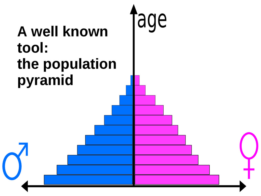
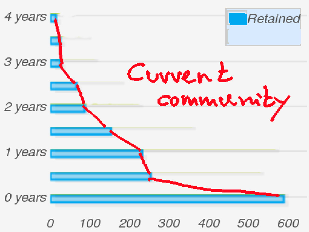
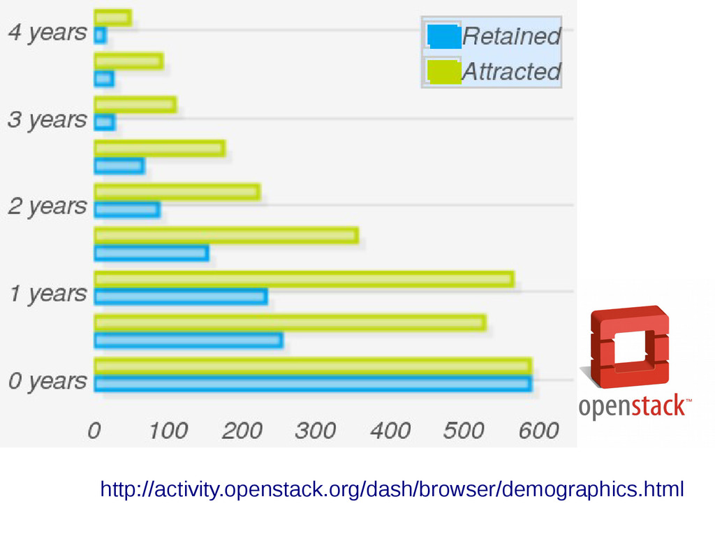
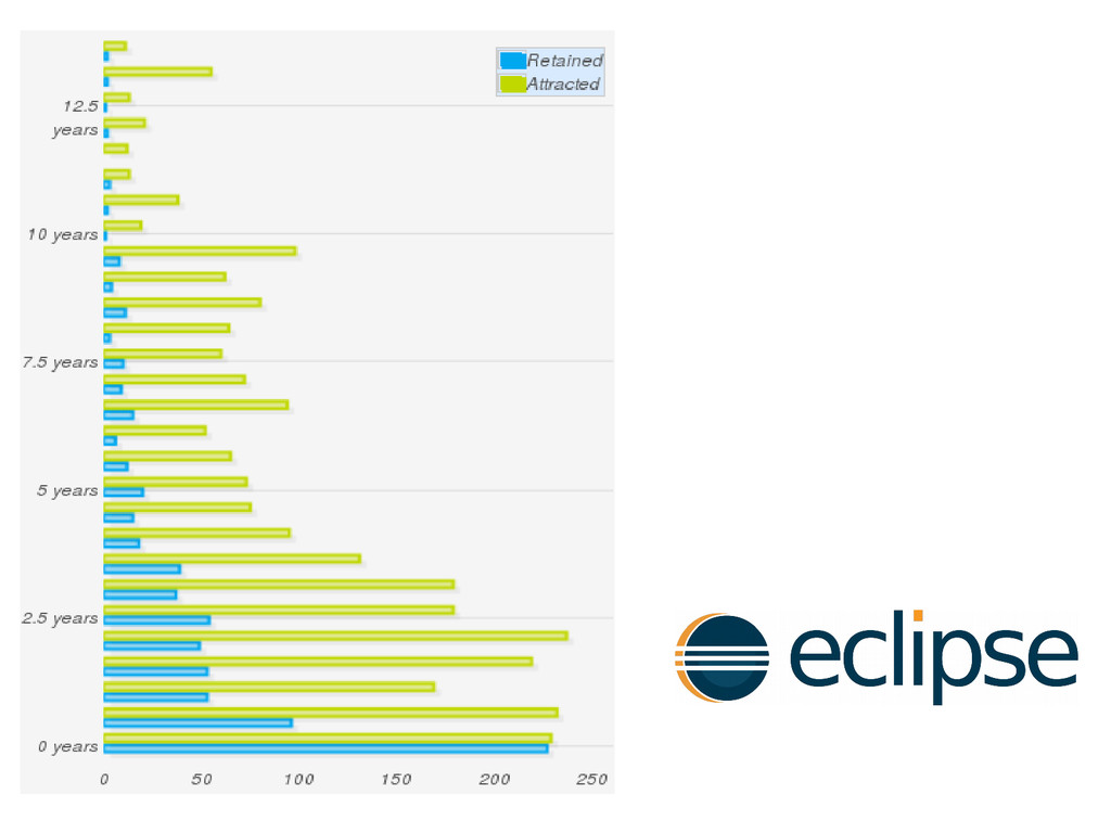
The community aging chart addresses this problem. It resembles to some extent the population pyramid used to learn about the age of populations. The chart represents the "age" of developers in the project, in a way that provides insight on its structure.
The talk shows how to interpret these community aging charts, and some real examples for free / open source development communities, such as those for the OpenStack community. More details on the aging chart can be found in "Measure your open source community’s age to keep it healthy".