A walk through of form design and heuristics that helped to to understand how HCI theory is applied to interfaces. Influenced by Luke Wroblonski's book, "Web Form Design" and j. Nielsen's "10 heuristics"
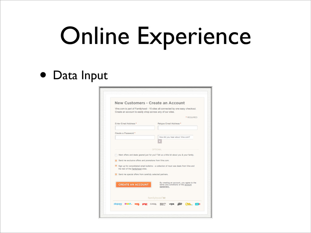
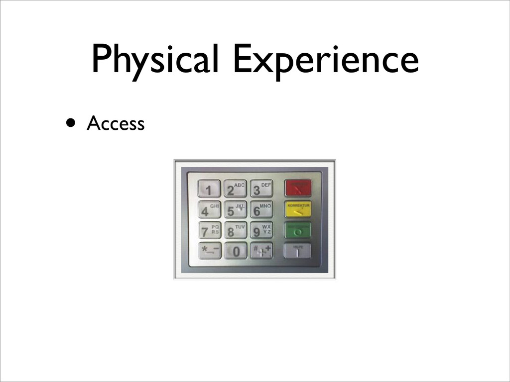
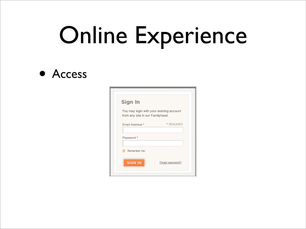
online • Business - Increase sales • Data • User - Change and edit consumer data • Business - Collect and store user data • Access • User - Customer participation • Business - Establish user communities
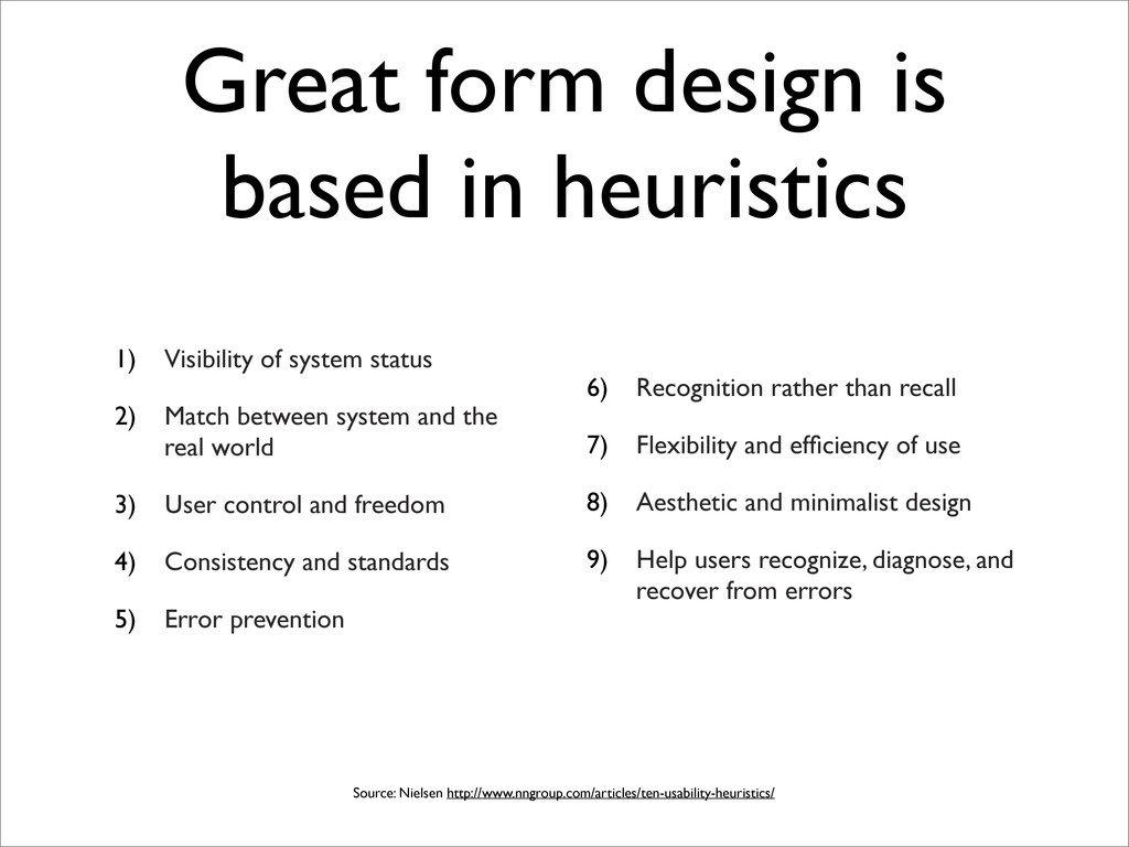
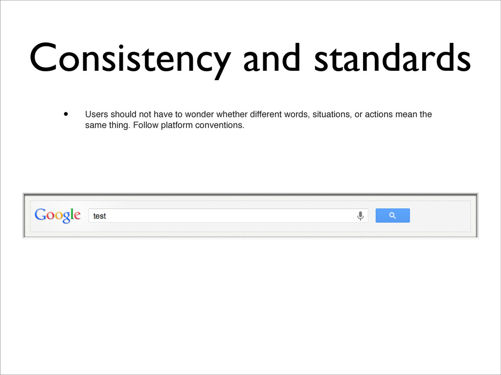
system status 2) Match between system and the real world 3) User control and freedom 4) Consistency and standards 5) Error prevention 6) Recognition rather than recall 7) Flexibility and efficiency of use 8) Aesthetic and minimalist design 9) Help users recognize, diagnose, and recover from errors Source: Nielsen http://www.nngroup.com/articles/ten-usability-heuristics/
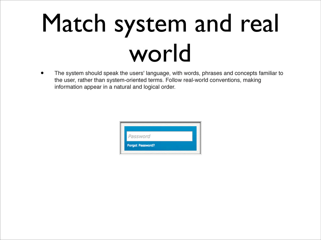
the users' language, with words, phrases and concepts familiar to the user, rather than system-oriented terms. Follow real-world conventions, making information appear in a natural and logical order.
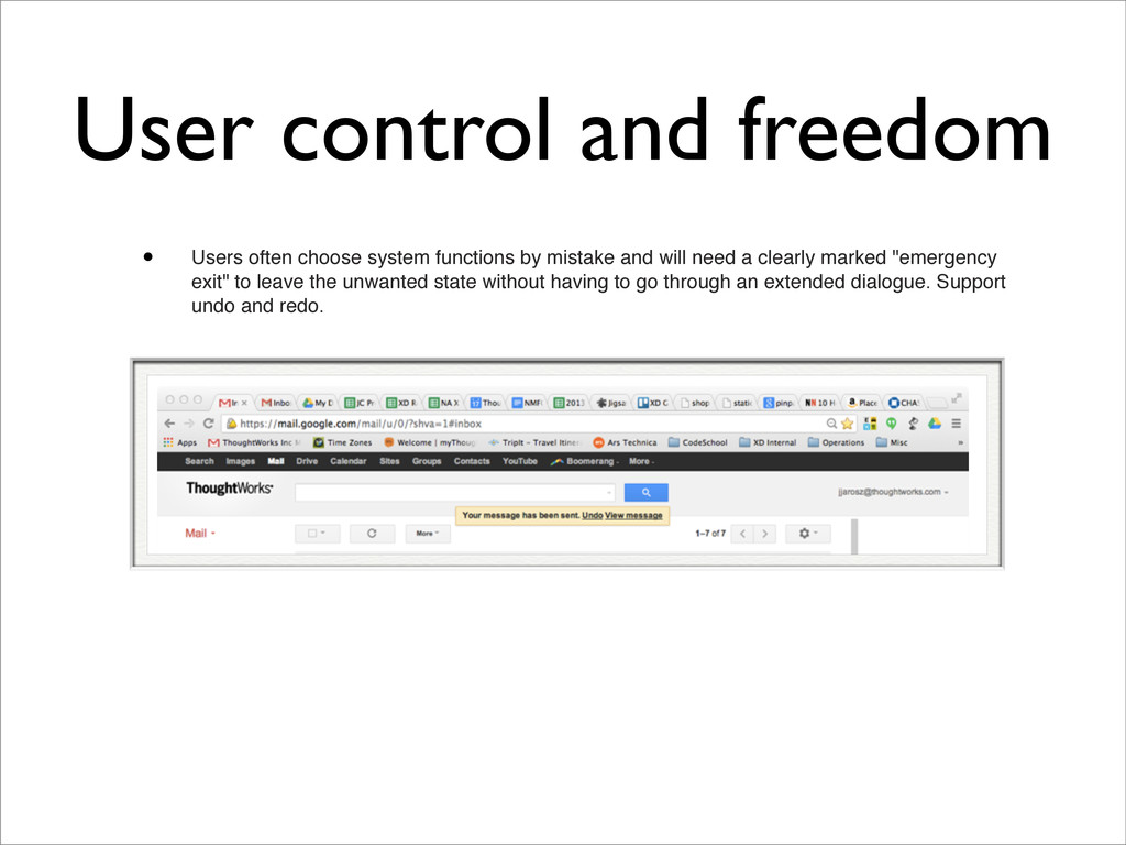
by mistake and will need a clearly marked "emergency exit" to leave the unwanted state without having to go through an extended dialogue. Support undo and redo.
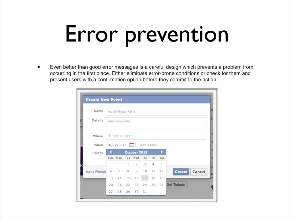
a careful design which prevents a problem from occurring in the first place. Either eliminate error-prone conditions or check for them and present users with a confirmation option before they commit to the action.
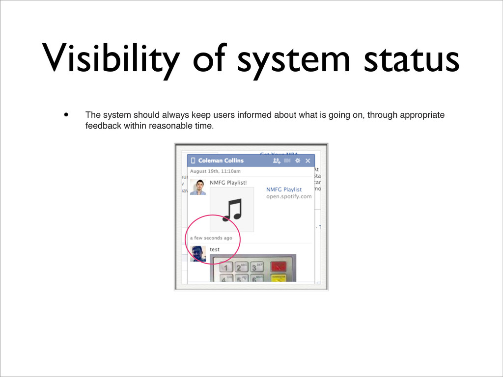
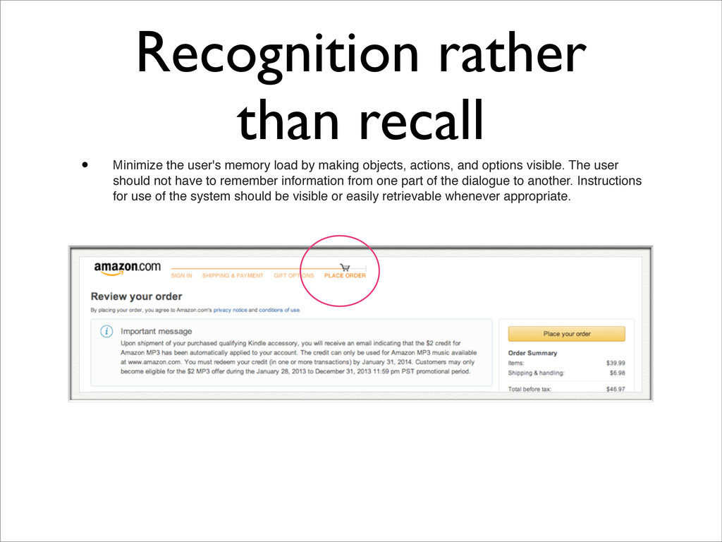
by making objects, actions, and options visible. The user should not have to remember information from one part of the dialogue to another. Instructions for use of the system should be visible or easily retrievable whenever appropriate.
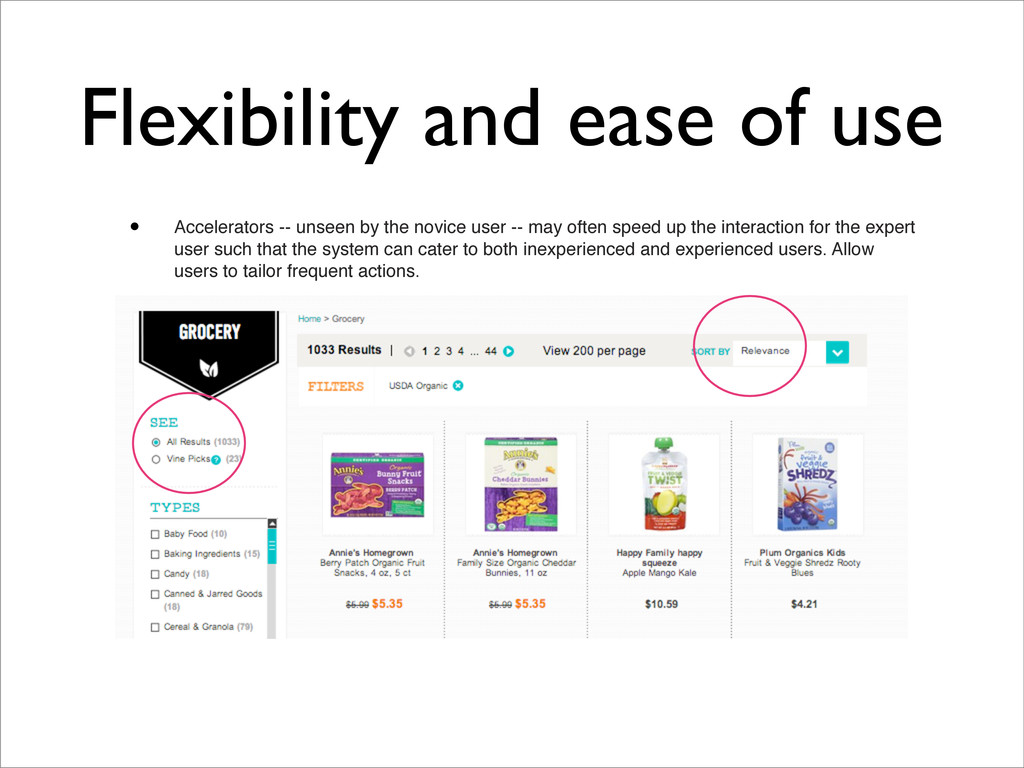
the novice user -- may often speed up the interaction for the expert user such that the system can cater to both inexperienced and experienced users. Allow users to tailor frequent actions.
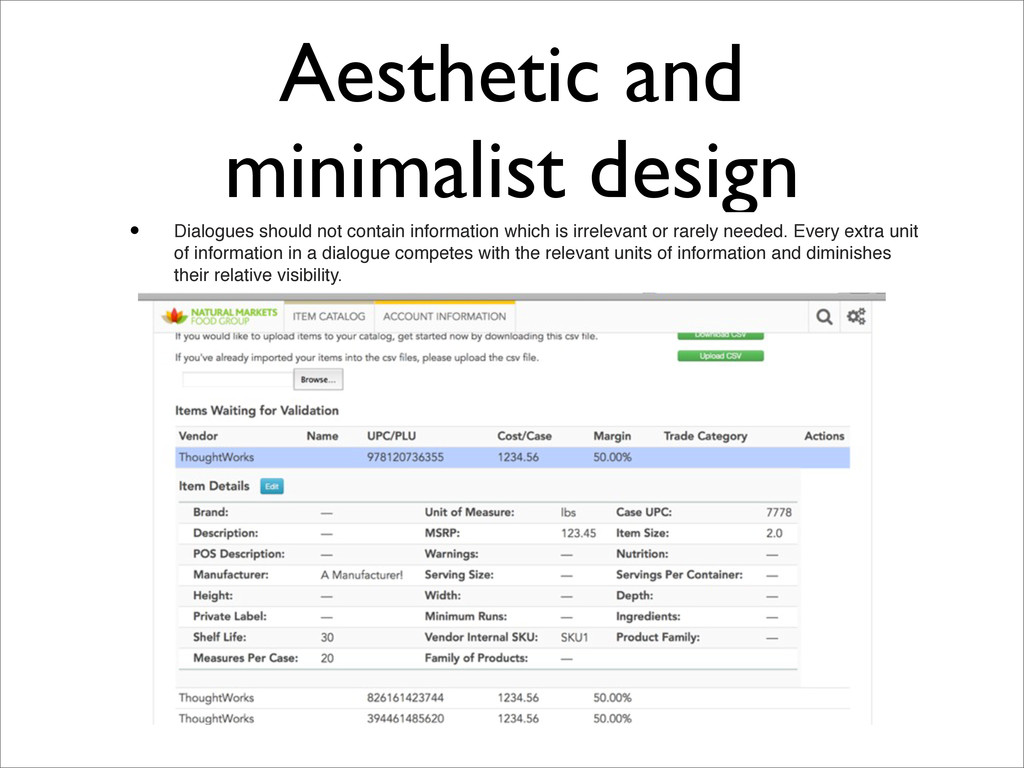
which is irrelevant or rarely needed. Every extra unit of information in a dialogue competes with the relevant units of information and diminishes their relative visibility.
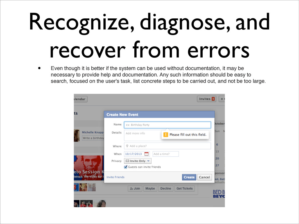
is better if the system can be used without documentation, it may be necessary to provide help and documentation. Any such information should be easy to search, focused on the user's task, list concrete steps to be carried out, and not be too large.