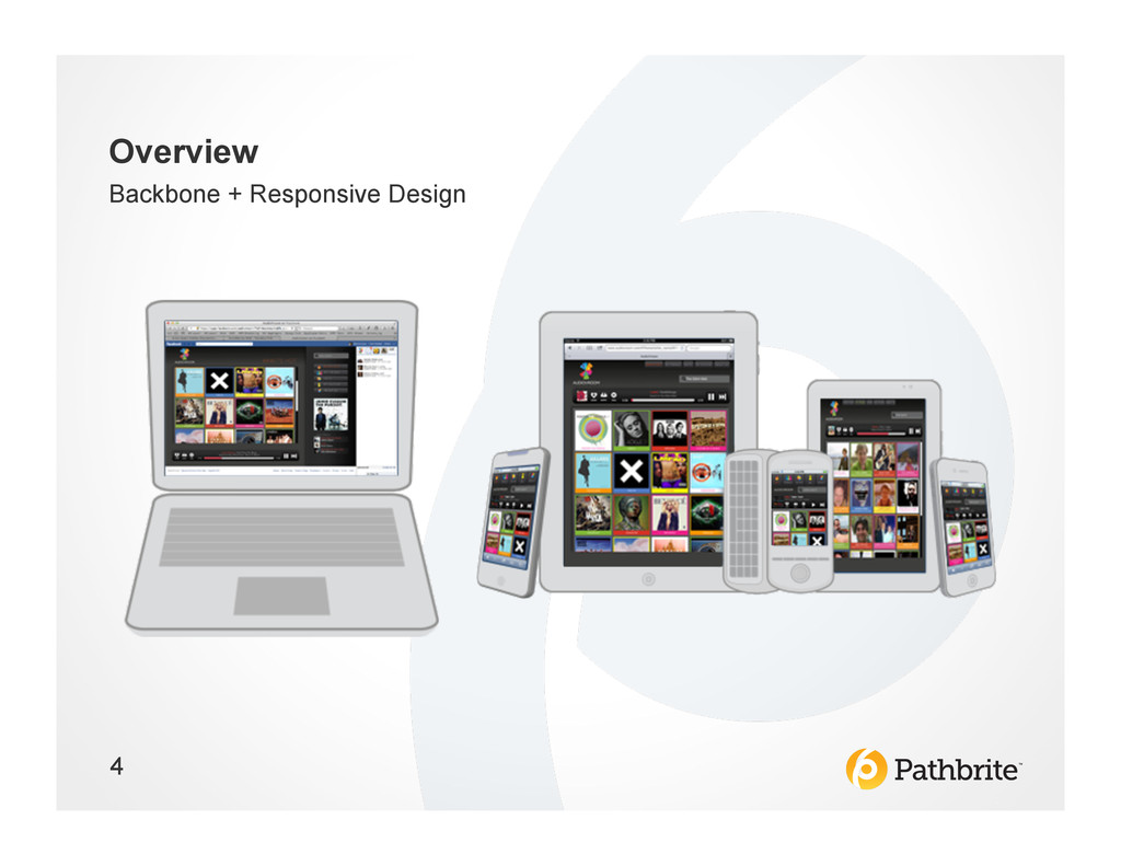
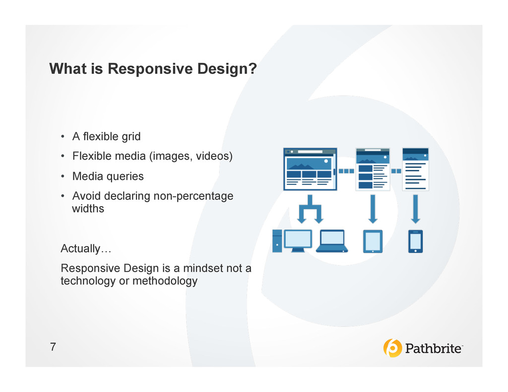
Responsive design is the forward-thinking alternative to building out separate applications or relying on device-specific templates in your web application. But be careful, as organizing the many pieces of a modern RD app can become just as unwieldy. In this session, we learn the tools, tips, and tricks to organize your Backbone application gracefully without the sweat, and dispel common misunderstandings about RD.
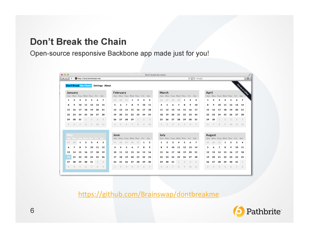
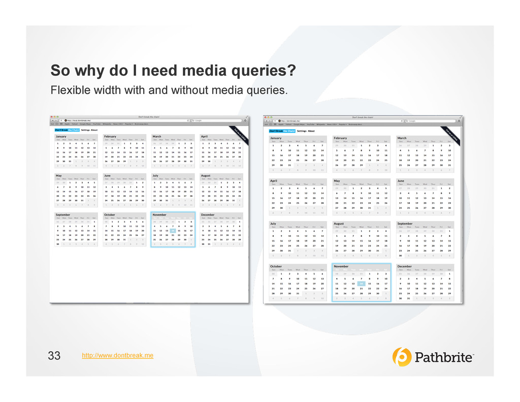
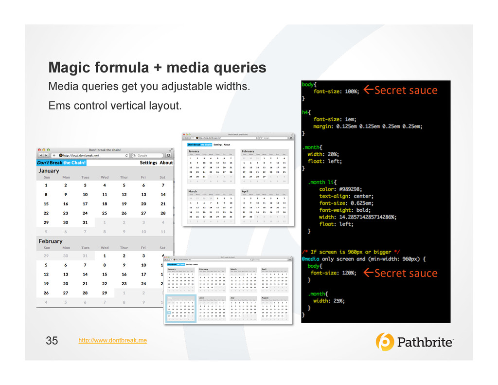
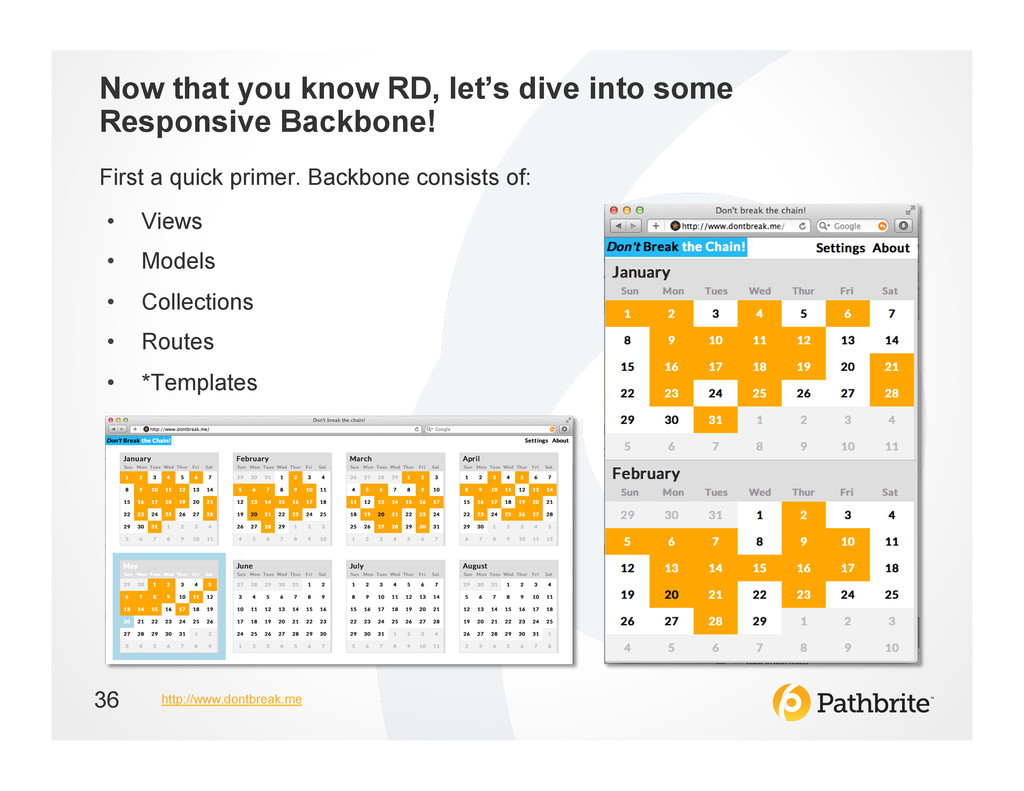
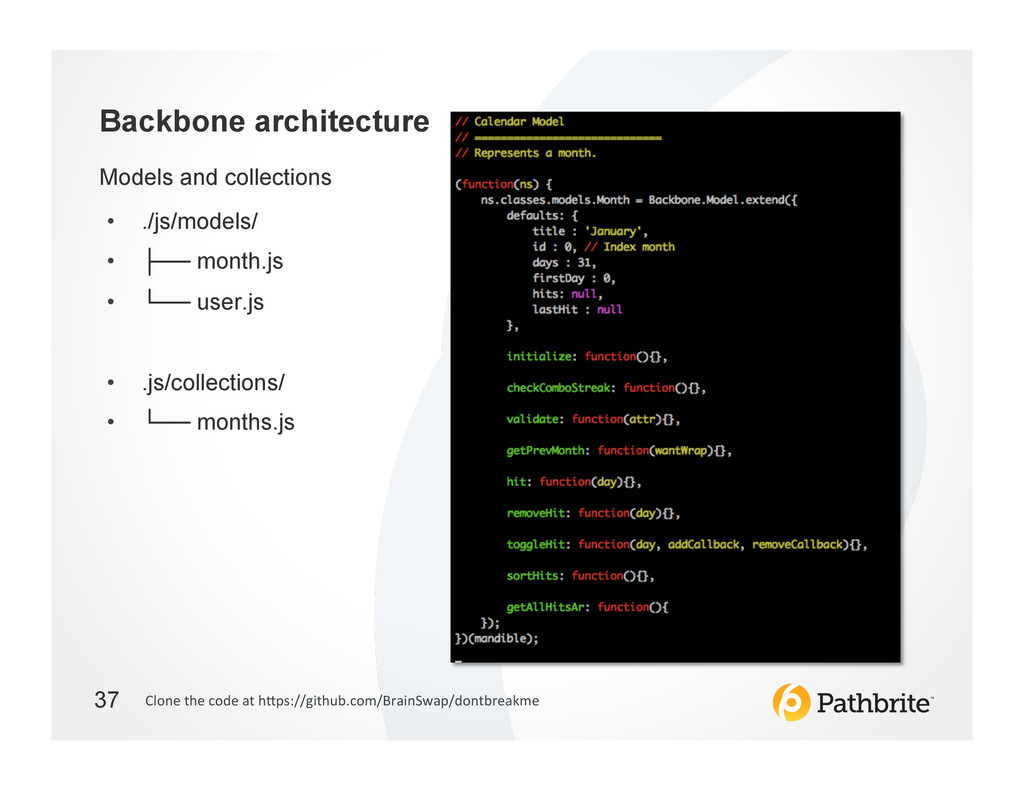
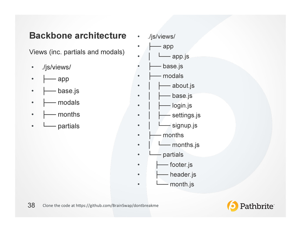
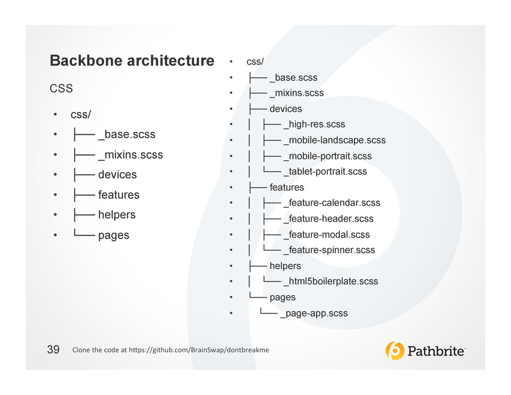
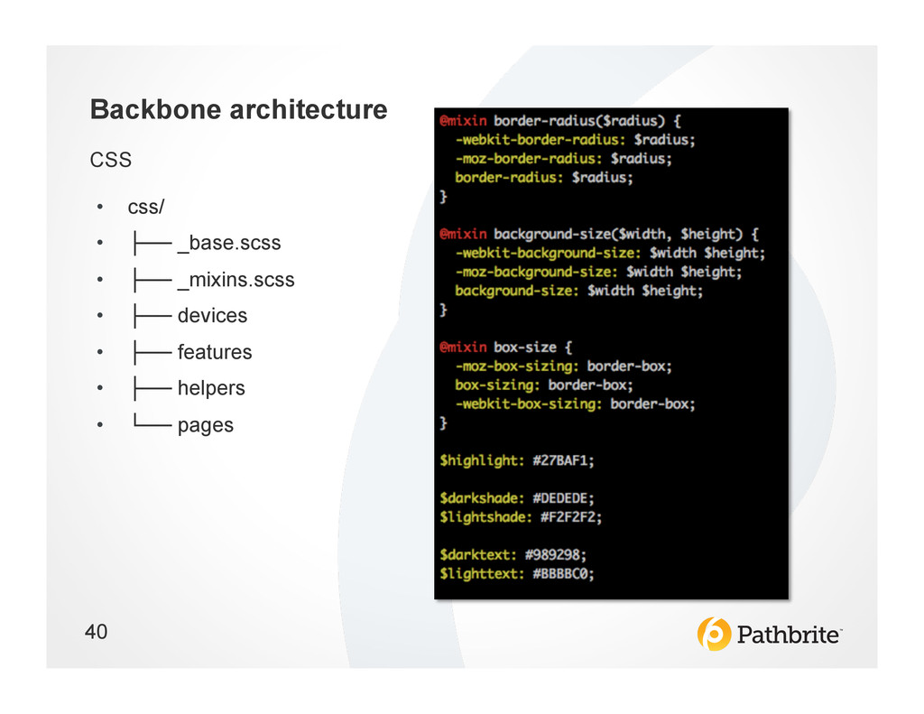
To support this presentation a fully responsive Backbone application was created and open-sourced here: http://dontbreak.me/ source: https://github.com/BrainSwap/dontbreakme
 krunkosaurus
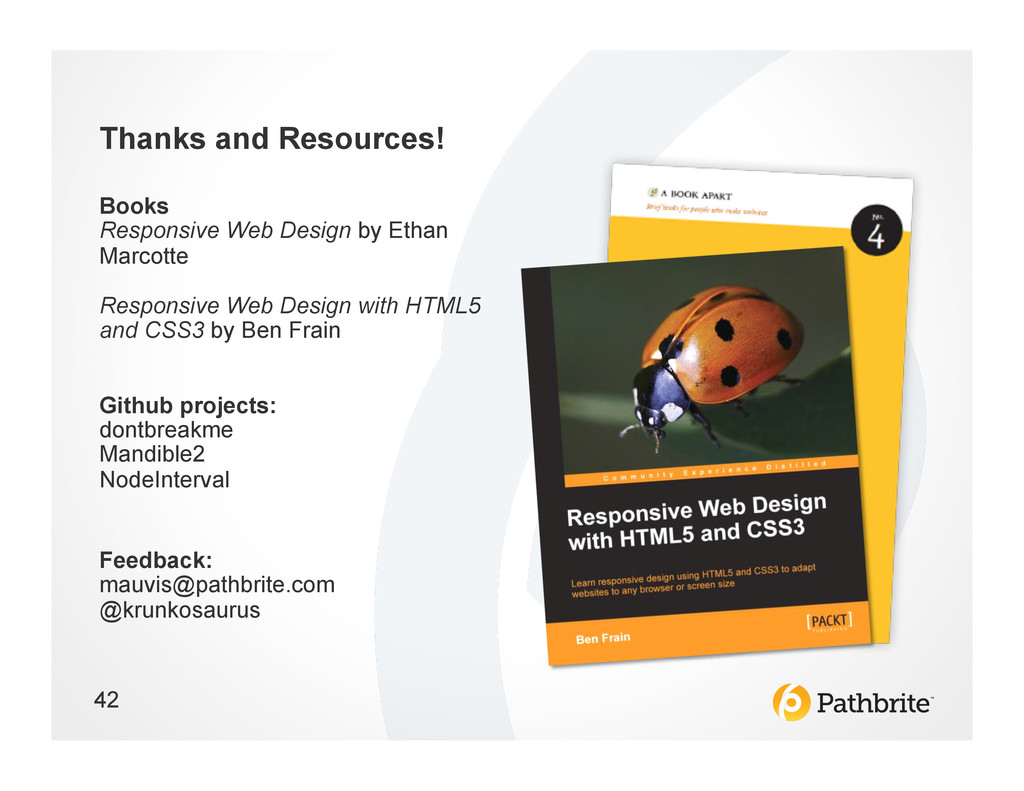
 appleboy
 naitosatoshi
 kakehashi
 chacco38
 maroon8021
 maruloop
 shin1988
 doradora09
 pict3
pict3
 lycorptech_jp
 diggymo
 y150saya
 marketingsoph
 rkaga
rkaga
 irinanazarova
 eitanlees
 csswizardry
 mfonobong
 aki_iinuma
 jlugia
 gurzu
gurzu
 kneath
 rkendrick25
 marktimemedia