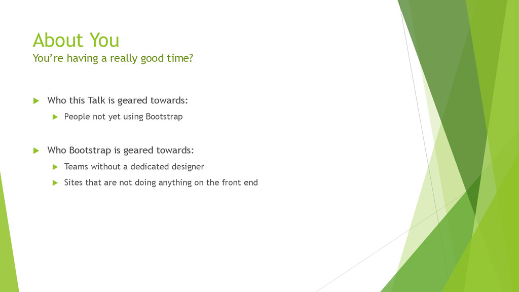
this Talk is geared towards: People not yet using Bootstrap Who Bootstrap is geared towards: Teams without a dedicated designer Sites that are not doing anything on the front end
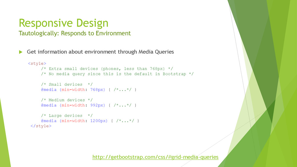
environment through Media Queries <style> /* Extra small devices (phones, less than 768px) */ /* No media query since this is the default in Bootstrap */ /* Small devices */ @media (min-width: 768px) { /*...*/ } /* Medium devices */ @media (min-width: 992px) { /*...*/ } /* Large devices */ @media (min-width: 1200px) { /*...*/ } </style> http://getbootstrap.com/css/#grid-media-queries
 kylemit
 yukukotani
 daitasu
 cottpan
 kotetuco
 manfredsteyer
 yusukebe
 tomoyakitaura
 rkaga
rkaga
 vinceamstoutz
 wemra
wemra
 nrslib
 axbom
axbom
 oripsolob
 ipullrank
 marktimemedia
 chriscoyier
 tenderlove
 sferik
 bcantrill
 3n
3n
 cassininazir
 tammielis
![Meta Tags [meta] [tags] [tagging] <meta name="viewport" content="width=device-width, initial-scale=1"> Desktop](https://files.speakerdeck.com/presentations/656b2740daa50131c6a17202678817e0/slide_4.jpg)