Lock in $30 Savings on PRO—Offer Ends Soon! ⏳

R-tistic class - Data visualisation with ggplot2

R-tistic class - Data visualisation with ggplot2

Avatar for Lars Schoebitz

Lars Schoebitz

March 16, 2017
Tweet

More Decks by Lars Schoebitz

Other Decks in Programming

Transcript

  1. ggplot2 Key components Every ggplot2 plot has three key components:

    1. data 2. A set of aesthetic mappings between variables in the data and visual properties, and 3. At lest one layer which describes how to render each observation. Layers are usually created with a geom function. taken from: Wickham, Hadley. “Getting Started with ggplot2.” In ggplot2, 11–31. Use R! Springer International Publishing, 2016. doi:10.1007/978-3-319-24277-4_2. (link)
  2. ggplot2 Example type the code below into the console and

    hit ↵ ggplot(mpg, aes(x = displ, y = hwy)) + geom_point()
  3. ggplot2 Example type the code below into the console and

    hit ↵ ggplot(mpg, aes(x = displ, y = hwy)) + geom_point()
  4. ggplot2 What does the function do? 1. Data: mpg dataset,

    which is build into ggplot2. 2. Aesthetic mapping: engine size mapped to x position, fuel economy to y position. 3. Layer: points.
  5. ggplot2 What does the function do? 1. Data: mpg dataset,

    which is build into ggplot2. 2. Aesthetic mapping: engine size mapped to x position, fuel economy to y position. 3. Layer: points. Also being referred to as a scatterplot. taken from: Wickham, Hadley. “Getting Started with ggplot2.” In ggplot2, 11–31. Use R! Springer International Publishing, 2016. doi:10.1007/978-3-319-24277-4_2. (link)
  6. ggplot 2 Exercises type the code below into the console

    and hit ↵ ggplot(gapminder, aes(country, lifeExp)) + geom_point()
  7. ggplot 2 Exercises type the code below into the console

    and hit ↵ ggplot(gapminder, aes(country, lifeExp)) + geom_point() what does the plot show?
  8. ggplot 2 Exercises: Make a scatterplot 1. Data: diamonds dataset,

    which is build into ggplot2. 2. Aesthetic mapping: carat mapped to x position, price mapped to y position. 3. Layer: points.
  9. ggplot 2 Exercises: Make a scatterplot 1. Data: diamonds dataset,

    which is build into ggplot2. 2. Aesthetic mapping: carat mapped to x position, price mapped to y position. 3. Layer: points. ggplot(diamonds, aes(x = carat, y = price)) + geom_point()
  10. ggplot 2 Aesthetic Attributes add colour, shape or size to

    aes() ggplot(mpg, aes(x = displ, y = cty, colour = class)) + geom_point()
  11. ggplot 2 Aesthetic Attributes add colour, shape or size to

    aes() ggplot(mpg, aes(x = displ, y = cty, colour = class)) + geom_point()
  12. ggplot 2 Aesthetic Attributes map shape instead of colour then

    map size instead of colour what happens? ggplot(mpg, aes(x = displ, y = cty, shape = class)) + geom_point()
  13. ggplot 2 Warnings ggplot(mpg, aes(x = displ, y = cty,

    shape = class)) + geom_point() ## Warning: The shape palette can deal with a maximum of 6 discrete value ## because more than 6 becomes difficult to discriminate; you have 7. ## Consider specifying shapes manually if you must have them. ## Warning: Removed 62 rows containing missing values (geom_point).
  14. ggplot 2 Warnings ggplot(mpg, aes(x = displ, y = cty,

    size = class)) + geom_point() ## Warning: Using size for a discrete variable is not advised.
  15. Variables Discrete, continous and categorical colour and shape work well

    with categorical variables size works well for continous variables ...
  16. ggplot 2 Exercise type the code below into the console

    and hit ↵ compare the two plots ggplot(mpg, aes(x = displ, y = hwy)) + geom_point(aes(colour = blue)) ggplot(mpg, aes(x = displ, y = hwy)) + geom_point(colour = blue)
  17. ggplot 2 Facetting another technique to display additional categorical variables

    on a plot type the code below into the console and hit ↵ ggplot(mpg, aes(x = displ, y = hwy)) + geom_point() + facet_wrap(~class) what can you see?
  18. ggplot 2 geom_smooth() Make a scatterplot using the mpg dataset

    with the aesthetic mappings engine size and fuel economy position. Then add a smoother.
  19. ggplot 2 geom_smooth() Make a scatterplot using the mpg dataset

    with the aesthetic mappings engine size and fuel economy position. Then add a smoother. ggplot(mpg, aes(x = displ, y = hwy)) + geom_point() + geom_smooth()
  20. ggplot 2 geom_smooth() Make a scatterplot using the mpg dataset

    with the aesthetic mappings engine size and fuel economy position. Then add a smoother. ggplot(mpg, aes(x = displ, y = hwy)) + geom_point() + geom_smooth()
  21. ggplot 2 geom_smooth() span ggplot(mpg, aes(x = displ, y =

    hwy)) + geom_point() + geom_smooth(span = 0.2)
  22. ggplot 2 geom_smooth() span ggplot(mpg, aes(x = displ, y =

    hwy)) + geom_point() + geom_smooth(span = 1)
  23. ggplot 2 geom_smooth() linear model ggplot(mpg, aes(x = displ, y

    = hwy)) + geom_point() + geom_smooth(method = "lm")
  24. ggplot 2 Boxplots and Jittered points few unique values (lots

    of overplotting) geom_jitter geom_boxplot geom_violin
  25. ggplot 2 Frequency Polygons ggplot(mpg, aes(hwy)) + geom_freqpoly() ## `stat_bin()`

    using `bins = 30`. Pick better value with `binwidth`.
  26. Library GridExtra install package gridExtra load package gridExtra into your

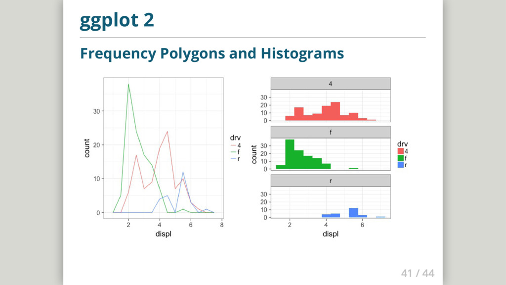
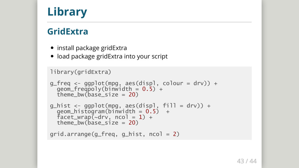
    script library(gridExtra) g_freq <- ggplot(mpg, aes(displ, colour = drv)) + geom_freqpoly(binwidth = 0.5) + theme_bw(base_size = 20) g_hist <- ggplot(mpg, aes(displ, fill = drv)) + geom_histogram(binwidth = 0.5) + facet_wrap(~drv, ncol = 1) + theme_bw(base_size = 20) grid.arrange(g_freq, g_hist, ncol = 2)
  27. Next steps Learn more and have fun! Try R Codeschool

    Hadley Wickham - R for Data Science ...and if you have questions, just write me and email: [email protected]