Share
Embed
About Dark Mode
Noritomo Inaba
WWDC19 Recap at LINE
https://line.connpass.com/event/134346/
LINE Developers
June 25, 2019
Transcript
81 slides
-
Dark Mode ▸ iOS 13ͰDark ModeΛՃ͠ɺ ૉΒ͍͠UIΛ࡞ͬͨ ▸ ·ͬͨ͘৽͍͠iOSͷσβΠϯ ▸
࣍͋ͳͨͷ൪Ͱ͢ https://developer.apple.com/videos/play/wwdc2019/214/ -
Dark Mode ▸ 3ͭͷϙΠϯτ ▸ Color ▸ Materials ▸ Views
and Controls -
Dark Mode - Color UIColor (iOS 12) ▸ System Colors
▸ Predefined Color -
Dark Mode - Color UIColor (iOS 12) ▸ System Colors
▸ .darkText ▸ .lightText ▸ .groupTableViewBackground -
Dark Mode - Color UIColor (iOS 12) ▸ Predefined Color
▸ .red ▸ .orange ▸ .yellow ▸ etc… -
Dark Mode - Color UIColor (iOS 13) ▸ Standard Colors
▸ UIElement Colors -
Dark Mode - Color UIColor (iOS 13) ▸ Standard Colors
▸ Adaptable Colors ▸ Adaptable Gray Colors ▸ Transparent Color ▸ Fixed Colors -
Dark Mode - Color UIColor (iOS 13) ▸ Standard Colors
▸ Adaptable Colors ▸ .systemRed ▸ .systemOrange ▸ .systemYellow ▸ etc… -
Dark Mode - Color UIColor (iOS 13) ▸ Standard Colors
▸ Adaptable Gray Colors ▸ .systemGray ▸ .systemGray2 ▸ .systemGray3 ▸ .systemGray4 ▸ .systemGray5 ▸ .systemGray6 -
Dark Mode - Color UIColor (iOS 13) ▸ Standard Colors
▸ Transparent Color ▸ .clear -
Dark Mode - Color UIColor (iOS 13) ▸ Standard Colors
▸ Fixed Colors ▸ .red ▸ .orange ▸ .yellow ▸ etc… -
Dark Mode - Color UIColor (iOS 13) ▸ Standard Colors
▸ UIElement Colors -
Dark Mode - Color UIColor (iOS 13) ▸ UIElement Colors
▸ Label Colors ▸ Fill Colors ▸ Text Colors ▸ Standard Content Background Colors ▸ Grouped Content Background Colors ▸ Separator Colors ▸ Link Color ▸ Nonadaptable Colors ▸ Deprecated Colors -
Dark Mode - Color UIColor (iOS 13) ▸ UIElement Colors
▸ Label Colors ▸ .label ▸ .secondaryLabel ▸ .tertiaryLabel ▸ .quaternaryLabel -
Dark Mode - Color UIColor (iOS 13) ▸ UIElement Colors
▸ Fill Colors ▸ .systemFill ▸ .secondarySystemFill ▸ .tertiarySystemFill ▸ .quaternarySystemFill -
Dark Mode - Color UIColor (iOS 13) ▸ UIElement Colors
▸ Text Colors ▸ .placeholderText -
Dark Mode - Color UIColor (iOS 13) ▸ UIElement Colors
▸ Standard Content Background Colors ▸ .systemBackground ▸ .secondarySystemBackground ▸ .tertiarySystemBackground -
Dark Mode - Color UIColor (iOS 13) ▸ UIElement Colors
▸ Grouped Content Background Colors ▸ .systemGroupedBackground ▸ .secondarySystemGroupedBackgro und ▸ .tertiarySystemGroupedBackground -
Dark Mode - Color UIColor (iOS 13) ▸ UIElement Colors
▸ Separator Colors ▸ .separator ▸ .opaqueSeparator -
Dark Mode - Color UIColor (iOS 13) ▸ UIElement Colors
▸ Link Color ▸ .link -
Dark Mode - Color UIColor (iOS 13) ▸ UIElement Colors
▸ Nonadaptable Colors ▸ .darkText ▸ .lightText -
Dark Mode - Color UIColor (iOS 13) ▸ UIElement Colors
▸ Deprecated Colors ▸ .groupTableViewBackground [Deprecated] -
Dark Mode - Color UIColor (iOS 12) ▸ System Colors
▸ Predefined Color UIColor (iOS 13) ▸ Standard Colors ▸ Adaptable Colors ▸ Adaptable Gray Colors ▸ Transparent Color ▸ Fixed Colors ▸ UIElement Colors ▸ Label Colors ▸ Fill Colors ▸ Text Colors ▸ Standard Content Background Colors ▸ Grouped Content Background Colors ▸ Separator Colors ▸ Link Color ▸ Nonadaptable Colors ▸ Deprecated Colors -
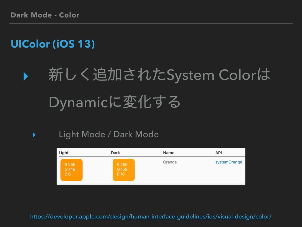
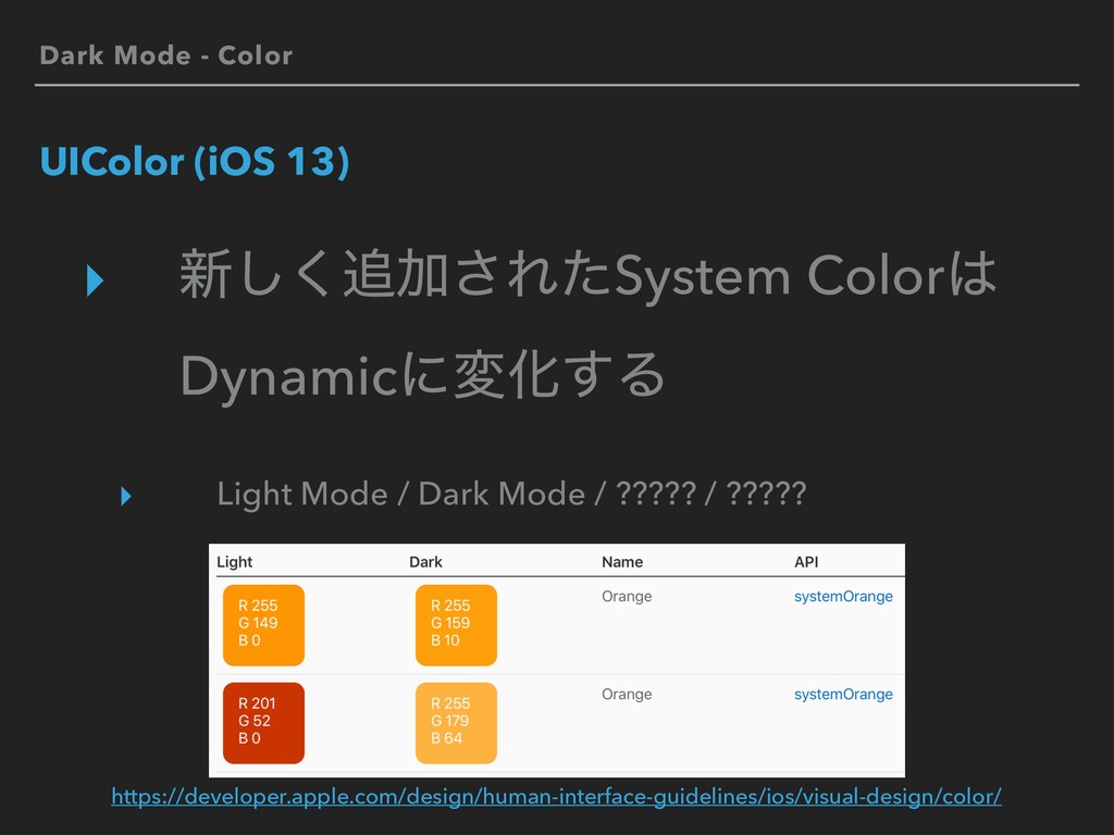
Dark Mode - Color UIColor (iOS 13) ▸ ৽͘͠Ճ͞ΕͨSystem Color
DynamicʹมԽ͢Δ ▸ Light Mode / Dark Mode https://developer.apple.com/design/human-interface-guidelines/ios/visual-design/color/ -
Dark Mode - Color UIColor (iOS 13) ▸ ৽͘͠Ճ͞ΕͨSystem Color
DynamicʹมԽ͢Δ ▸ Light Mode / Dark Mode / ????? / ????? https://developer.apple.com/design/human-interface-guidelines/ios/visual-design/color/ -
Dark Mode - Color UIColor (iOS 13) ▸ Light Mode
/ Dark Modeͷ 2छྨͰͳ͍ ▸ Accessibilityͷ ʮίϯτϥετΛ্͛Δʯ ͷऔΕΔΑ͏ʹͳͬͨ -
Dark Mode - Color UIColor (iOS 13) ▸ Light Mode
/ Contrast Normal ▸ Light Mode / Contrast High ▸ Dark Mode / Contrast Normal ▸ Dark Mode / Contrast High https://developer.apple.com/design/human-interface-guidelines/ios/visual-design/color/ -
Dark Mode - Color ͜͜·Ͱͷ·ͱΊ ▸ ৭Λࢦఆ͍ͯ͠ΔՕॴΛ Dynamic Colorʹஔ͖͑Δ ▸
1৭ʹ͖ͭ4ύλʔϯ༻ҙ͢Δ Light Mode / Dark Mode Contrast Normal / Contrast High -
Dark Mode - Color UIColor (iOS 13) ▸ System Color͚ͩΛ༻͍ͯ͠Δɹ
ΞϓϦগͳ͍ ▸ ΞϓϦͷσβΠϯʹ߹Θͤͯ Custom ColorΛ༻͢Δ͜ͱ͕ଟ͍ ▸ DynamicͳCustom ColorΛ࡞Δ -
Dark Mode - Color Custom Dynamic Color ▸ Ͳ͏ͬͯ࡞Δʁ ▸
Asset Catalog ▸ CodeͰॻ͘ ▸ e.g. marigold ͱ͍͏ Custom Dynamic ColorΛՃ͢Δ -
Dark Mode - Color Custom Dynamic Color - Asset Catalog
▸ File -> New -> File… ▸ iOS -> Resource -> Asset Catalog -> Create ▸ Add New Color Set ▸ Show Attributes Inspector ▸ Appearances -> Any, Dark ▸ Check High Contrast ▸ Set Color -
Dark Mode - Color Custom Dynamic Color - Code extension
UIColor { @available(iOS 13.0, *) public init(dynamicProvider: @escaping (UITraitCollection) -> UIColor) } -
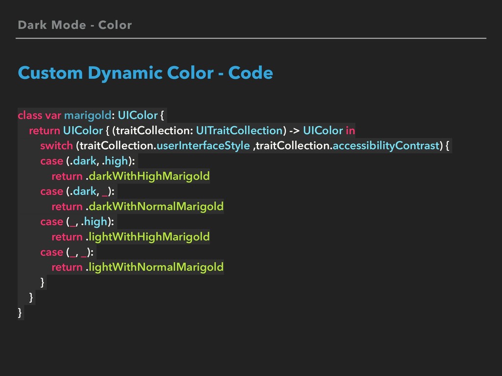
Dark Mode - Color Custom Dynamic Color - Code class
var marigold: UIColor { return UIColor { (traitCollection: UITraitCollection) -> UIColor in switch (traitCollection.userInterfaceStyle ,traitCollection.accessibilityContrast) { case (.dark, .high): return .darkWithHighMarigold case (.dark, _): return .darkWithNormalMarigold case (_, .high): return .lightWithHighMarigold case (_, _): return .lightWithNormalMarigold } } } -
Dark Mode - Image Custom Dynamic Image - Asset Catalog
▸ (File -> New -> File… ▸ iOS -> Resource -> Asset Catalog -> Create) ▸ Add New Image Set ▸ Show Attributes Inspector ▸ Appearances -> Any, Dark ▸ Check High Contrast ▸ Set Image -
Dark Mode - Image Custom Dynamic Image - Asset Catalog
https://developer.apple.com/documentation/uikit/uiimage/providing_images_for_different_appearances -
Dark Mode - Image Custom Dynamic Image - Code //
Image Set let traitCollection = view.traitCollection let image = UIImage(named: "marigold", in: nil, compatibleWith: traitCollection) // Template Image let imageView = UIImageView(image: iconImage) imageView.tintColor = .marigold // SF Symbols let photoImage = UIImage(systemName: "photo") -
Dark Mode - Material UIBlurEffect.Style (iOS 12) ▸ Constants ▸
.extraLight ▸ .light ▸ .dark ▸ .extraDark ▸ .regular ▸ .prominent -
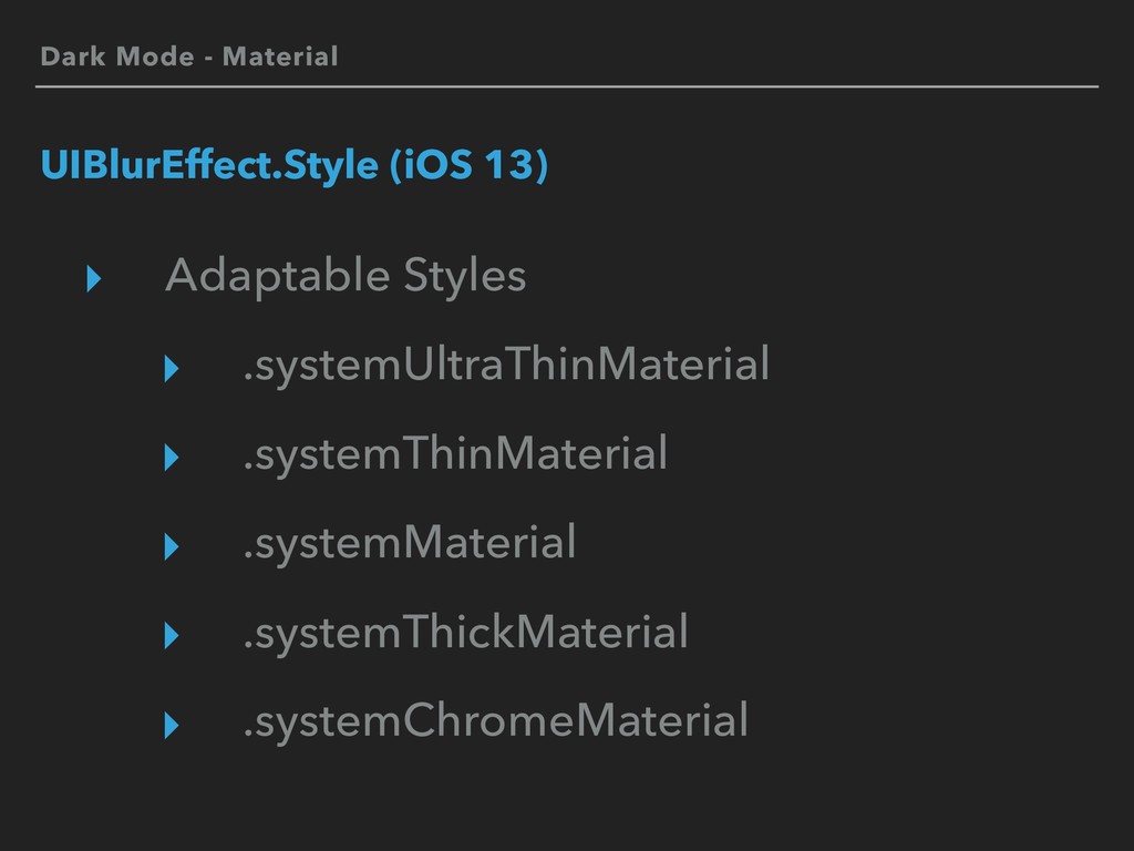
Dark Mode - Material UIBlurEffect.Style (iOS 13) ▸ Adaptable Styles
▸ Light Styles ▸ Dark Styles ▸ Additional Styles -
Dark Mode - Material UIBlurEffect.Style (iOS 13) ▸ Adaptable Styles
▸ .systemUltraThinMaterial ▸ .systemThinMaterial ▸ .systemMaterial ▸ .systemThickMaterial ▸ .systemChromeMaterial -
Dark Mode - Material UIBlurEffect.Style (iOS 13) ▸ Light Styles
▸ .systemUltraThinMaterialLight ▸ .systemThinMaterialLight ▸ .systemMaterialLight ▸ .systemThickMaterialLight ▸ .systemChromeMaterialLight -
Dark Mode - Material UIBlurEffect.Style (iOS 13) ▸ Dark Styles
▸ .systemUltraThinMaterialDark ▸ .systemThinMaterialDark ▸ .systemMaterialDark ▸ .systemThickMaterialDark ▸ .systemChromeMaterialDark -
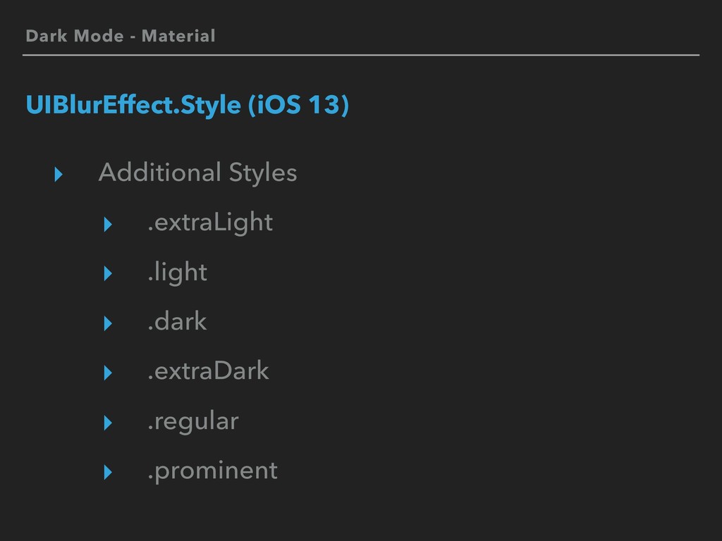
Dark Mode - Material UIBlurEffect.Style (iOS 13) ▸ Additional Styles
▸ .extraLight ▸ .light ▸ .dark ▸ .extraDark ▸ .regular ▸ .prominent -
Dark Mode - Material UIBlurEffect.Style (iOS 12) ▸ Constants UIBlurEffect.Style
(iOS 13) ▸ Adaptable Styles ▸ Light Styles ▸ Dark Styles ▸ Additional Styles -
Dark Mode - Material UIVibrancyEffectStyle (iOS 13) ▸ Label Styles
▸ Fill Styles ▸ Separator Style -
Dark Mode - Material UIVibrancyEffectStyle (iOS 13) ▸ Label Styles
▸ .label ▸ .secondaryLabel ▸ .tertiaryLabel ▸ .quaternaryLabel -
Dark Mode - Material UIVibrancyEffectStyle (iOS 13) ▸ Fill Styles
▸ .fill ▸ .secondaryFill ▸ .tertiaryFill -
Dark Mode - Material Material - Code let vibrancyEffect =
UIVibrancyEffect(blurEffect: .init(style: .systemThinMaterial), style: .fill) let visualEffectView = UIVisualEffectView(effect: vibrancyEffect) -
Dark Mode Views and Controls ▸ UIView ▸ UIViewController ▸
UITraitCollection ‣ ͳͲʹAPIՃ͋Γ ▸ ඞཁʹԠ࣮ͯ͢͡Δ -
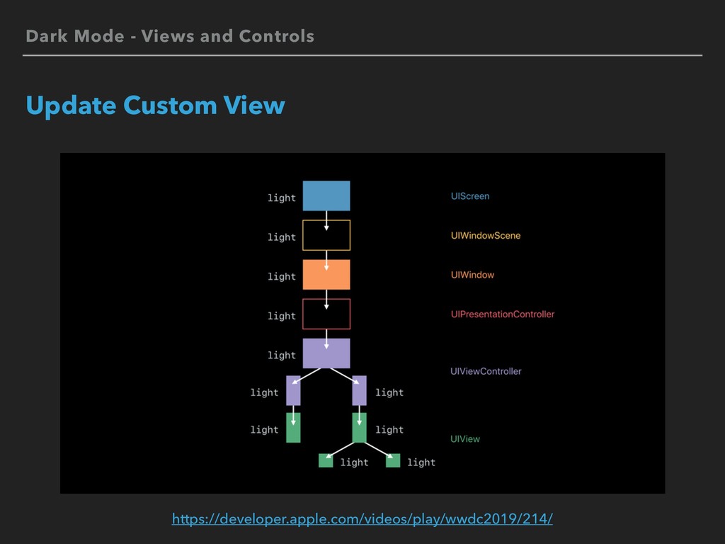
Dark Mode - Views and Controls Update Custom View UIView
UIViewController UIPresentationController traitCollectionDidChange(_:) layoutSubviews() draw(_:) updateConstraints() tintColorDidChange() traitCollectionDidChange(_:) updateViewConstraints() viewWillLayoutSubviews() viewDidLayoutSubviews() traitCollectionDidChange(_:) containerViewWillLayoutSubviews() containerViewDidLayoutSubviews() -
Dark Mode - Views and Controls Update Custom View extension
UIView { @available(iOS 13.0, *) open var overrideUserInterfaceStyle: UIUserInterfaceStyle } -
Dark Mode - Views and Controls Views and Controls ▸
ҰׅͰDark ModeΛΦϑʹ͢Δ (ΦϓτΞτ) ▸ Info.plist key ▸ <key>UIUserInterfaceStyle</key> ▸ <string>Light</string> ▸ ※ Dark ModeରԠதͷҰ࣌తͳ༻్ -
Dark Mode - Views and Controls Views and Controls ▸
UIStatusBarStyle ▸ .default ▸ .lightContent ▸ .darkContent [New] -
Dark Mode - Views and Controls Views and Controls ▸
UIActivityIndicatorView.Style ▸ .whiteLarge [Deprecated] ▸ .white [Deprecated] ▸ .gray [Deprecated] ▸ .large [New] ▸ .medium [New] -
Dark Mode - Views and Controls Views and Controls ▸
UIKeyboardAppearance ▸ UIScrollView.IndicatorStyle ▸ APIมߋͳ͠ ▸ UIBarStyle ▸ .blackOpaque [Deprecated] ▸ .blackTranslucent [Deprecated] ▸ APIՃͳ͠ -
Dark Mode Question ▸ iOS 12 ▸ iOS 11 ▸
iOS 10 ▸ ͷDark ModeରԠ͠·͔͢ʁ -
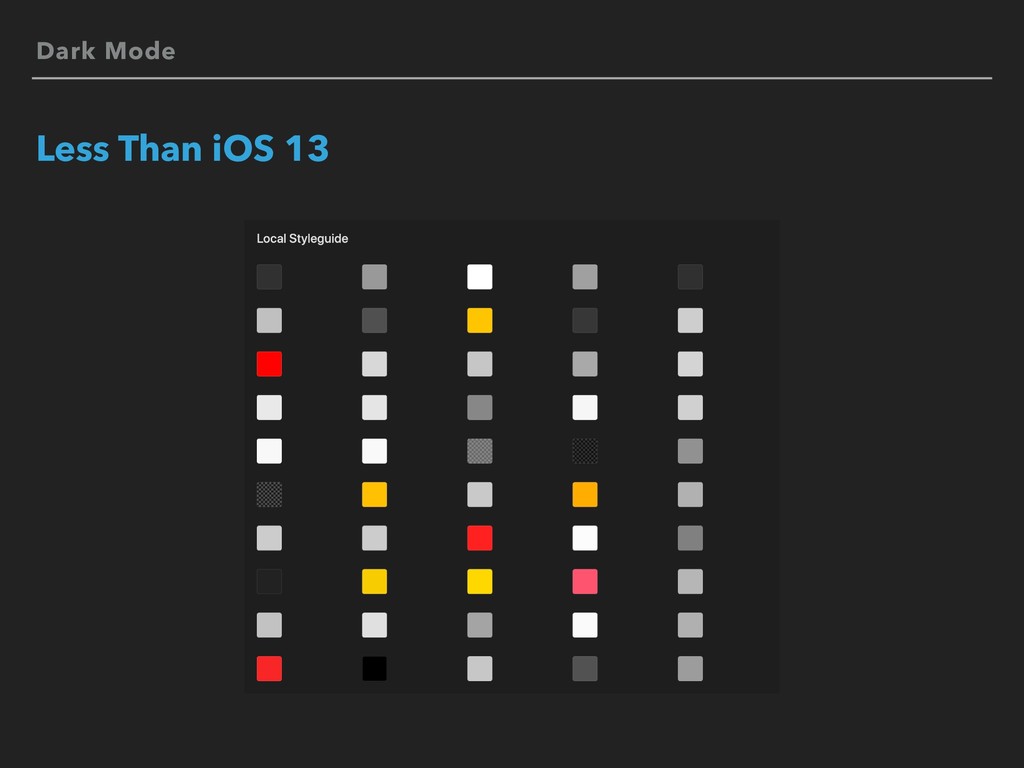
Dark Mode Less Than iOS 13 ▸ Dynamic ColorDynamic ImageAsset
CatalogͰఆٛͨ͠΄͏͕ݟ௨͕͠ྑͦ͞͏ ▸ ͨͩ͠ɺAsset CatalogͷColorSet Xcode 9 / iOS 11͔Β ▸ CodeͰॻ͔͘͠ͳ͍ -
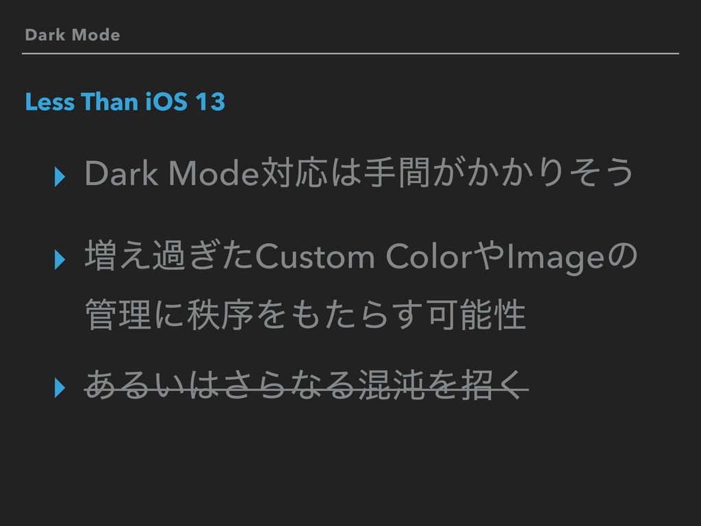
Dark Mode Less Than iOS 13 ▸ Dark ModeରԠख͕͔͔ؒΓͦ͏ ▸
૿͑ա͗ͨCustom ColorImageͷ ཧʹடংΛͨΒ͢Մೳੑ ▸ ͋Δ͍͞ΒͳΔࠞಱΛট͘ -
Dark Mode Less Than iOS 13 ▸సੜͨ͠Β Dark Modeͩͬͨ ▸
͘Β͍ͷؾ࣋ͪͰΔ͔͠ͳ͍͔ͳͱ -
Dark Mode - Color Custom Dynamic Color - Code (Less
Than iOS 13) class var marigold: UIColor { if #available(iOS 13.0, *) { return UIColor { (traitCollection: UITraitCollection) -> UIColor in switch (traitCollection.userInterfaceStyle, traitCollection.accessibilityContrast) { case (.dark, .high): return .darkWithHighMarigold case (.dark, _): return .darkWithNormalMarigold case (_, .high): return .lightWithHighMarigold case (_, _): return .lightWithNormalMarigold } } } else { if isDarkMode { return .darkWithNormalMarigold } else { return .lightWithNormalMarigold } } } -
More Information WWDC19 Sessions ▸ What's New in iOS Design
▸ https://developer.apple.com/ videos/play/wwdc2019/808/ ▸ Implementing Dark Mode on iOS ▸ https://developer.apple.com/ videos/play/wwdc2019/214/ -
More Information Human Interface Guidelines ▸ Color ▸ https://developer.apple.com/design/human-interface-guidelines/ios/visual- design/color/
▸ Dark Mode ▸ https://developer.apple.com/design/human-interface-guidelines/ios/visual- design/dark-mode/ ▸ Materials ▸ https://developer.apple.com/design/human-interface-guidelines/ios/visual- design/materials/ ▸ Color and Contrast ▸ https://developer.apple.com/design/human-interface-guidelines/accessibility/ overview/color-and-contrast/ -
More Information API Documentation ▸ Supporting Dark Mode in Your
Interface ▸ https://developer.apple.com/documentation/appkit/ supporting_dark_mode_in_your_interface ▸ Choosing a Specific Interface Style for Your iOS App ▸ https://developer.apple.com/documentation/appkit/ supporting_dark_mode_in_your_interface/ choosing_a_specific_interface_style_for_your_ios_app ▸ Providing Images for Different Appearances ▸ https://developer.apple.com/documentation/uikit/uiimage/ providing_images_for_different_appearances -
More Information API Documentation ▸ iOS Keys ▸ https://developer.apple.com/library/archive/ documentation/General/Reference/
InfoPlistKeyReference/Articles/iPhoneOSKeys.html ▸ Sample Code ▸ Adopting iOS Dark Mode ▸ https://developer.apple.com/documentation/uikit/ appearance_customization/adopting_ios_dark_mode