Upgrade to Pro — share decks privately, control downloads, hide ads and more …

Do-It-Yourself Mobile Usability at Yale

Lou Rinaldi
February 10, 2014

Do-It-Yourself Mobile Usability at Yale

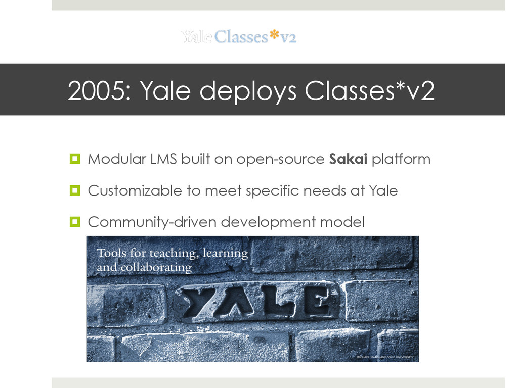
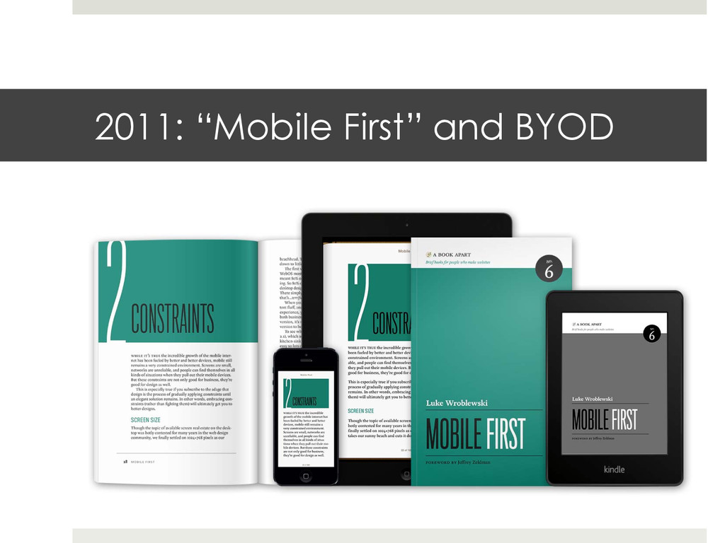
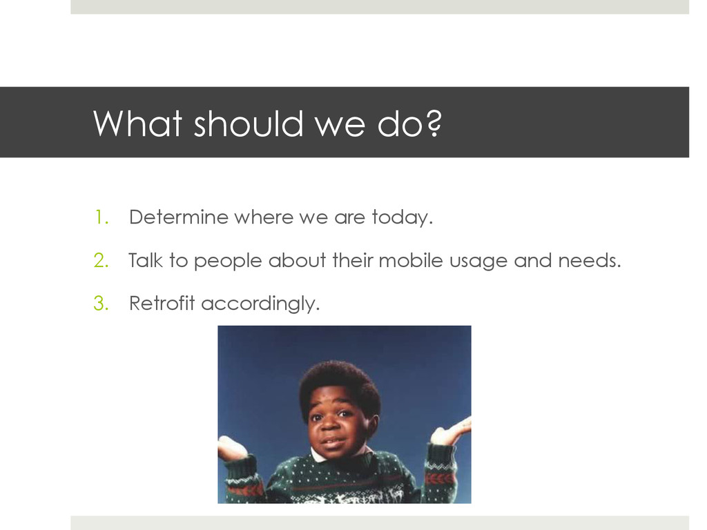
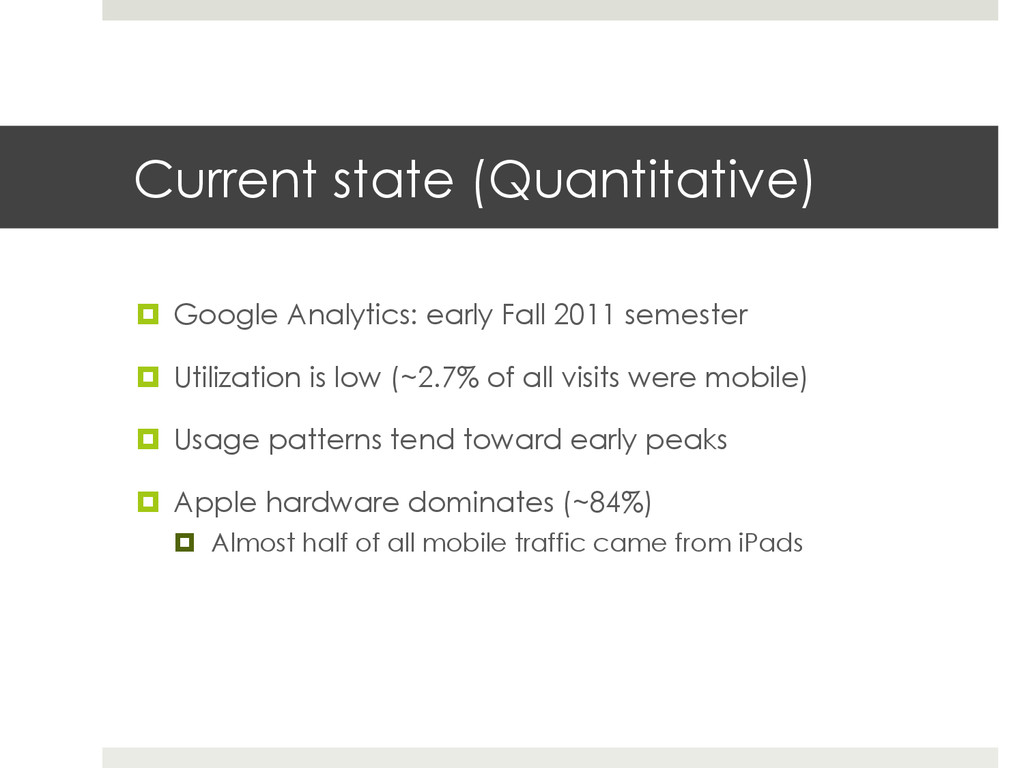
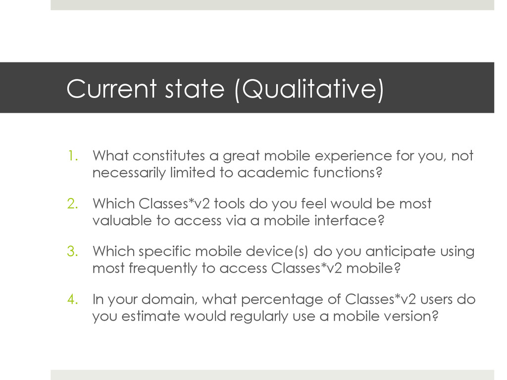
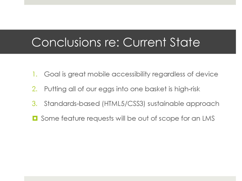
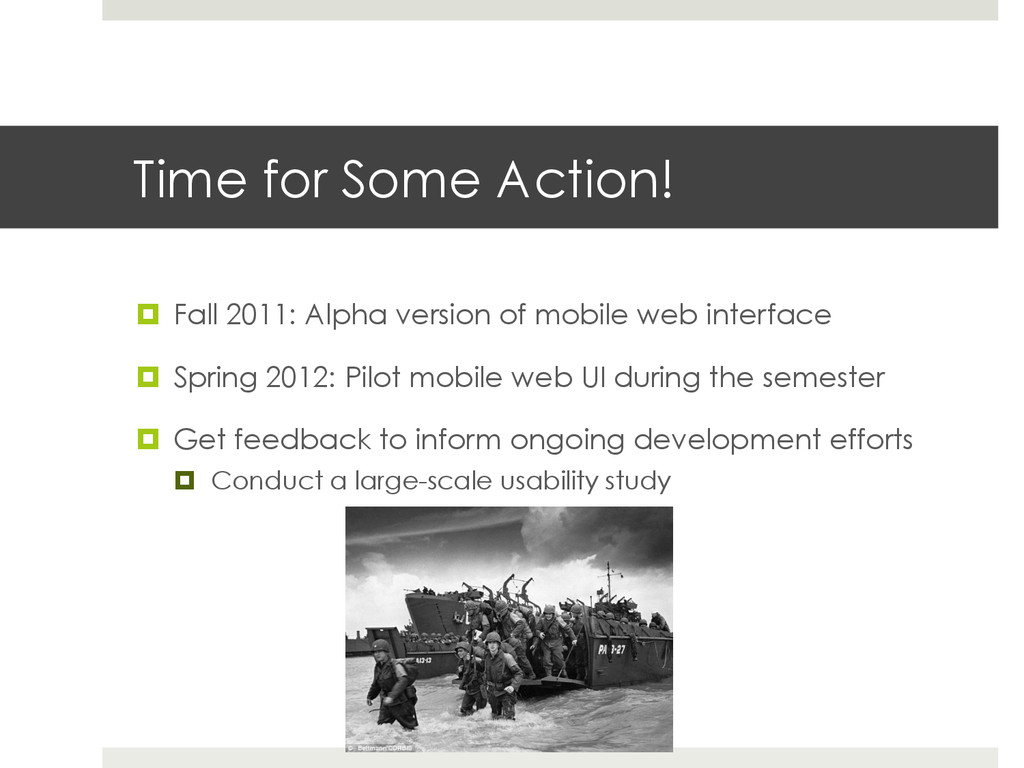
One of the biggest challenges of shifting to a "Mobile First" application design strategy in a higher education environment is that many institutional systems predate this paradigm. At Yale University, the primary learning management system has existed since 2005 and supports thousands of frequent users across the faculty, student and staff populations. The daunting task of retrofitting the LMS for mobile consumption fell to a team called the Center for Media and Instructional Innovation. With no formal usability training, but plenty of gritty do-it-yourself determination, the team set about conducting a large-scale usability study and gathered feedback to inform its mobile development efforts. Come learn about the process we successfully used and the positive outcomes we achieved.

Lou Rinaldi

February 10, 2014
Tweet

More Decks by Lou Rinaldi

Other Decks in Technology

Transcript

  1. Do-It-Yourself Mobile Usability February 10, 2014 Lou Rinaldi Yale University

    ITS Academic IT Solutions Email: [email protected] Twitter: @LouRinaldi LinkedIn: http://www.linkedin.com/in/lourinaldi/
  2. 2005: Yale deploys Classes*v2 ¤  Modular LMS built on open-source

    Sakai platform ¤  Customizable to meet specific needs at Yale ¤  Community-driven development model
  3. What should we do? 1.  Determine where we are today.

    2.  Talk to people about their mobile usage and needs. 3.  Retrofit accordingly.
  4. Current state (Quantitative) ¤  Google Analytics: early Fall 2011 semester

    ¤  Utilization is low (~2.7% of all visits were mobile) ¤  Usage patterns tend toward early peaks ¤  Apple hardware dominates (~84%) ¤  Almost half of all mobile traffic came from iPads
  5. Current state (Qualitative) 1.  What constitutes a great mobile experience

    for you, not necessarily limited to academic functions? 2.  Which Classes*v2 tools do you feel would be most valuable to access via a mobile interface? 3.  Which specific mobile device(s) do you anticipate using most frequently to access Classes*v2 mobile? 4.  In your domain, what percentage of Classes*v2 users do you estimate would regularly use a mobile version?
  6. Conclusions re: Current State 1.  Goal is great mobile accessibility

    regardless of device 2.  Putting all of our eggs into one basket is high-risk 3.  Standards-based (HTML5/CSS3) sustainable approach ¤  Some feature requests will be out of scope for an LMS
  7. Time for Some Action! ¤  Fall 2011: Alpha version of

    mobile web interface ¤  Spring 2012: Pilot mobile web UI during the semester ¤  Get feedback to inform ongoing development efforts ¤  Conduct a large-scale usability study
  8. A multi-phased approach Phase 1. Open call for volunteers ¤ 

    Upon logging into Classes*v2, a message invited interested users to apply to be part of the pilot. ¤  Sample language we used: ¤  “Help us pilot a new mobile interface for Classes*v2!” ¤  “Got a mobile device? Help us pilot a new mobile interface for Classes*v2!” ¤  “The Classes*v2 team needs your help to pilot a new mobile interface!”
  9. A multi-phased approach Phase 2. Selection of pilot participants ¤ 

    Pilot applications simply required the user’s identity as well as which Classes*v2 tools they used regularly. ¤  Since the alpha version of the mobile web interface only worked with some tools, the team wanted to ensure a good fit between these parameters and the usage habits of potential pilot participants.
  10. A multi-phased approach Phase 3. The call to action ¤ 

    We sent accepted pilot participants an introductory email: “Thanks for your interest in the Classes*v2 mobile pilot. As a first step in optimizing Classes*v2 for mobile devices, we invite your feedback on an alpha release, which includes views of several key tools. To access the mobile view, please visit … We’ll be sending you a quick survey in several weeks to learn about your experience. Your input on what works, what’s missing, and what needs to be tweaked will be incredibly helpful as we continue building the mobile view. We appreciate your participation in the alpha pilot and look forward to your feedback.”
  11. A multi-phased approach Phase 4. Gathering post-pilot feedback ¤  After

    the month-long pilot period ended, we sent participants a survey about their experience. Out of 648 participants, 220 (34%) responded to the survey. “Thank you for your participation in the pilot of the Classes*v2 mobile alpha. Please take a few minutes to complete a quick survey on your experience with the pilot. We’re grateful for the feedback, and confident that it will help us further develop and improve the interface.”
  12. Outcomes ¤  Well over 500% mobile activity increase ¤  Over

    300% increase in pages per visit during mobile sessions ¤  Over 300% increase in average time on site during mobile sessions (from roughly 20 seconds to about 90) ¤  25% increase in new mobile visitors ¤  57% decrease in the mobile bounce rate (a good thing!)
  13. Outcomes ¤  A focus group with student interns from the

    Instructional Technology Group to further refine the feedback we received ¤  Coverage in Yale Daily News ¤  Users of phone-sized devices are now automatically redirected to the mobile web interface when logging into Classes*v2
  14. Lingering Questions ¤  How might we have streamlined the process?

    ¤  Was there anything missing from our approach, bearing in mind the scale of the effort? ¤  What should we do when frequently recurring suggestions are seemingly impossible to deliver?