Upgrade to Pro — share decks privately, control downloads, hide ads and more …

Taming your CSS

Taming your CSS

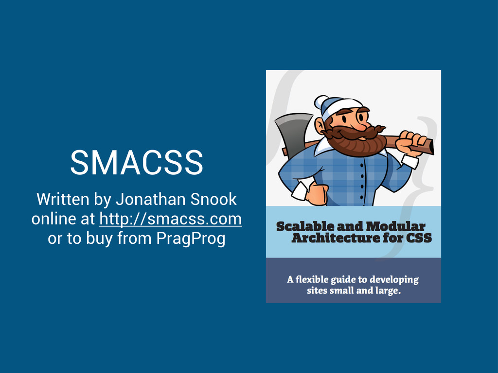
A talk on taming your CSS with SMACSS.
Presented at Codeaholics in Hong Kong
on Wednesday 12th December 2012.

http://codeaholics.hk
http://smacss.com

Matthew Rudy Jacobs

December 12, 2012
Tweet

More Decks by Matthew Rudy Jacobs

Other Decks in Technology

Transcript

  1. Wild CSS • 81 CSS files • 11 Subdirectories •

    6978 lines of CSS • *NO* structure
  2. Base styles // body body { margin: 0; font-size: 14px;

    color: $navy; } // headings h1 { text-transform: uppercase; } h1, h2, h3 { font-weight: bold; color: $orange; } // link styles a { color: $ice; } a:hover { color: $navy; }
  3. Layout styles // basic structure #header { position: fixed; top:

    0; height: 20px; } #sidebar { float: left; width: 20% } #content { float: right; width: 80% } // grid .row { clear: both; margin-left: -20px; } .span { float: left; margin-left: 20px; } // modals maybe? .modal { position: fixed; z-index: 9999; }
  4. Module styles • Distinct visual elements • Correspond to your

    style guide elements • Submodules should use a prefix • <a class=”btn btn-large” />
  5. Module styles // a Module can contain elements .hero-unit {

    padding: 60px; } .hero-unit h1 { font-size: 60px; } // a Module can have Submodules .btn { display: inline-block; padding: 4px 14px; } .btn-large { padding: 9px 14px; font-size: 16px }
  6. State styles • define state of a Layout or Module

    • prefixed with “is-” • live with their Layout or Module • correspond to javascript state changes
  7. State styles // Layout states .is-collapsed { display: none; }

    .is-expanded { display: block; } // Module states .is-disabled { background: $grey } .is-active { background-color: $green } // or prefix the Module name .btn-is-disabled { background: $grey } .btn-is-active { background-color: $green }
  8. Theme styles • Define distinct changes in the style of

    the site • User defined styles • Dark or Light
  9. Theme styles • Define distinct changes in the style of

    the site • User defined styles • Dark or Light
  10. Theme styles • Define distinct changes in the style of

    the site • User defined styles • Dark or Light
  11. Avoid Coupling // the base module .well { border: 1px

    $grey; font-size: 14px; } // this is coupled #sidebar .well { font-size: 12px } // create a sub-module instead .well-small { font-size: 12px; }
  12. Semantic & Specific // this is bad .hero-unit div {

    } // this is better .hero-unit .body { } // this is best .hero-unit-body { }
  13. Maximum depth of 2 // this is bad .hero-unit header

    h1 small .icon { } // this is better .hero-unit .header-icon { } // this is worse? .hero-unit-header-icon { }
  14. Module Structure // base Module .btn { ... } //

    Sub Modules .btn-large { ... } // Module states .btn-is-active { ... }
  15. Media Queries // define the default display .span { float:

    left; margin-left: 20px; } // define the changes @media screen and (max-width: 400px) { .span { float: none; display: block; width: 100%; } }
  16. Style Guides • a Section for each Module • an

    example of each State • an example of each Submodule • auto-generate with KSS?