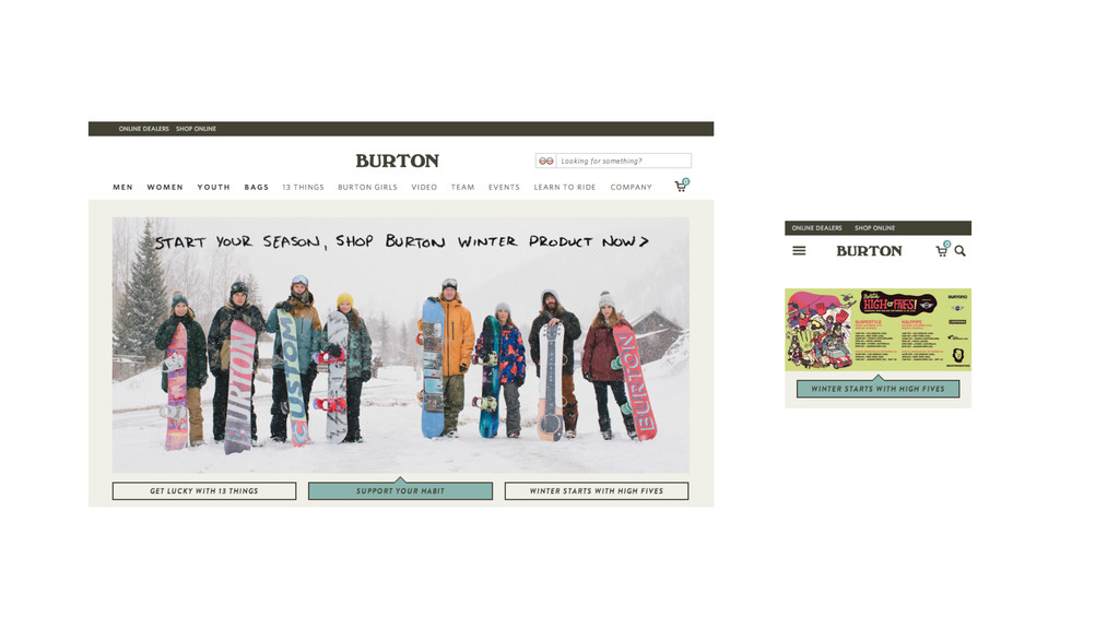
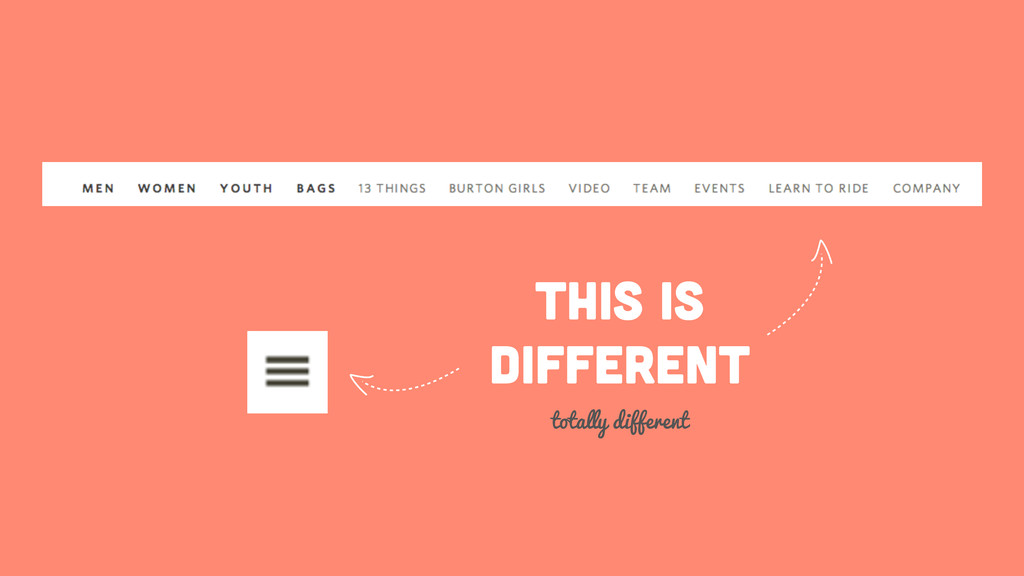
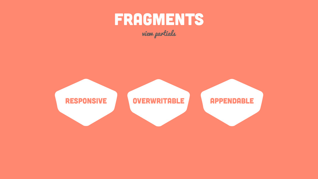
$30 off During Our Annual Pro Sale. View Details »

Fragmented Web Design

Fragmented Web Design

Think different - Build for all Devices

Matthias Lau

October 09, 2014
Tweet

More Decks by Matthias Lau

Other Decks in Programming

Transcript

  1. FRAGMENTED
    web design
    THINK DIFFERENT - BUILD FOR ALL DEVICES

    View Slide

  2. @MATTHIASLAU
    Web Verbesserer

    View Slide

  3. connected-health.eu
    the patient centered integrated health ecosystem

    View Slide

  4. „We had a lot of expectations
    regarding Responsive Webdesign,
    let´s make them real!“
    - Matthias Lau

    View Slide

  5. WHAT IS
    RESPONSIVE
    DESIGN?
    let´s have a look

    View Slide

  6. View Slide

  7. THIS IS Responsive Design
    yes it is
    FLUID / Liquid
    ADAPTIVE /
    Layout States
    Responsive
    Media
    TOUCH
    &
    Click

    View Slide

  8. „Most importantly, responsive web
    design isn’t intended to serve as a
    replacement for mobile web sites"
    - Ethan Marcotte

    View Slide

  9. FUTURE FRIENDLY
    i don´t want an iPhone6 website

    View Slide

  10. View Slide

  11. excursion: Natural
    Breakpoints
    Website-States instead of Device-States

    View Slide

  12. Sources:
    http://opensignal.com/reports/fragmentation.php

    View Slide

  13. Average Number of
    Unique Screen Resolutions
    97
    2010
    http://spyderweb.co/blog/2013/07/31/responsive-web-design-stats/2/
    232
    2013

    View Slide

  14. Brad Frost, https://flic.kr/p/aoKPDT

    View Slide

  15. Optimized for
    320px - 1280px
    Future Friendly?

    View Slide

  16. is your website usable on
    the apple watch?
    or on the google glass?

    View Slide

  17. View Slide

  18. View Slide

  19. one website for
    everyone
    we wanted

    View Slide

  20. we tried
    device-independency for
    navigation
    and failed

    View Slide

  21. View Slide

  22. View Slide

  23. this is
    different
    totally different

    View Slide

  24. !
    data-toggle="collapse" data-target=".navbar-collapse">!
    Toggle navigation!
    !
    !
    !
    !
    !
    !
    !
    Link!
    Link!
    Link!
    !

    different NAVS in one
    we use display:none a lot
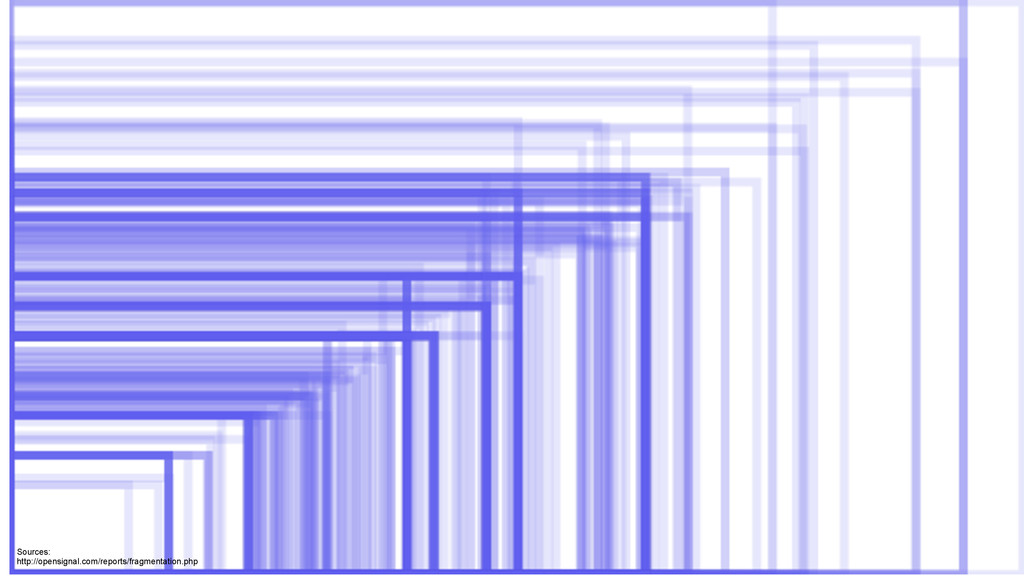
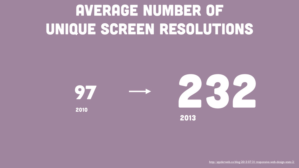
    View Slide

  25. for different devices
    some things on our
    websites need to be
    different
    embrace the difference

    View Slide

  26. device specific websites
    let´s write redundant code
    desktop
    Mobile tablet
    320px width 768px width 1280px width
    own code branches for
    every website type

    View Slide

  27. device specific websites
    let´s write redundant code
    desktop
    Mobile tablet
    320px width 768px width 1280px width
    own code branches for
    every website type
    bad Idea

    View Slide

  28. device specific websites
    let´s write redundant code
    desktop
    Mobile
    320px width >320px width

    View Slide

  29. device specific websites
    let´s write redundant code
    desktop
    Mobile
    320px width >320px width
    still BAD

    View Slide

  30. WE want on code branch
    but of course device optimized
    website
    every width

    View Slide

  31. think in fragments
    not everything has to be different
    we know this already
    from our partials

    View Slide

  32. View Slide

  33. View Slide

  34. View Slide

  35. View Slide

  36. View Slide

  37. arrange fragments
    depending on the device
    or viewport or whatever

    View Slide

  38. Desktop

    View Slide

  39. Mobile

    View Slide

  40. FRAGMENTS
    view partials
    responsive Overwritable appendable

    View Slide

  41. CODE
    let´s get dirty

    View Slide

  42. !
    <%= render :partial => @nav %>!
    !
    !
    <%= render :partial => @content %>!
    !
    !
    <%= render :partial => @footer %>
    application.html.erb

    View Slide

  43. before_action :fragmentSelection!
    !
    private!
    !
    def fragmentSelection!
    !
    # default fragments!
    @head = 'layouts/head'!
    @nav = 'layouts/nav'!
    @content = 'layouts/content'!
    @footer = 'layouts/footer'!
    !
    # mobile fragments!
    if browser.mobile?!
    @nav = 'layouts/mobile/nav'!
    end!
    !
    end
    application_controller

    View Slide

  44. the bad
    this sucks

    View Slide

  45. the good
    this is awesome about fragmented web design

    View Slide

  46. use one Responsive code
    base for all devices and
    overwrite/append
    fragments for device
    optimization
    fragmented web design

    View Slide

  47. Isn´t this RESS?
    well… partially

    View Slide

  48. THE FUTURE
    empower the browser

    View Slide

  49. the browser
    knows best
    we learned
    srcset told us

    View Slide

  50. Identify Fragments
    using HTML5 attributes

    View Slide

  51. View Slide


  52. View Slide

  53. !
    !
    !
    !

    View Slide

  54. !
    !
    !
    !

    View Slide

  55. HTTP HEADER
    name the fragments you need

    View Slide

  56. Status Code:200 OK!
    Accept:text/html,application/xhtml+xml,…!
    Accept-Encoding:gzip,deflate,sdch!
    User-Agent:Mozilla/5.0 (Macintosh;…!
    !
    Fragments:nav-mobile,content,footer

    View Slide

  57. Only request necessary
    Fragments
    just because it´s faster

    View Slide

  58. Status Code:200 OK!
    Accept:text/html,application/xhtml+xml,…!
    Accept-Encoding:gzip,deflate,sdch!
    User-Agent:Mozilla/5.0 (Macintosh;…!
    !
    Fragments:content

    View Slide

  59. Fragmented Web
    Design is nothing
    new. Just use it!
    it is not difficult

    View Slide

  60. Questions ?
    Put your questions

    View Slide

  61. Contact ME
    I’m nice
    @matthiaslau
    [email protected]
    http://laumatthias.de
    http://git.io/u6By6w

    View Slide

  62. Thanks

    View Slide