$30 off During Our Annual Pro Sale. View Details »

The Big Picture: Responsive Images in Action #devcon13

Matthias Lau
November 07, 2013

The Big Picture: Responsive Images in Action #devcon13

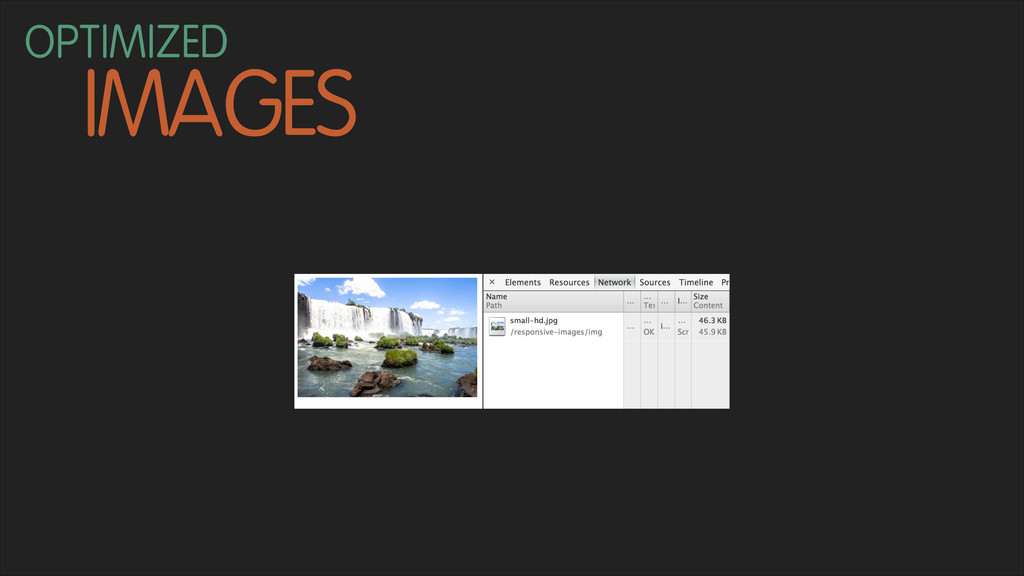
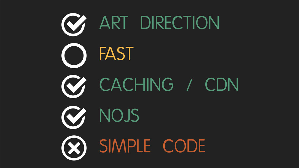
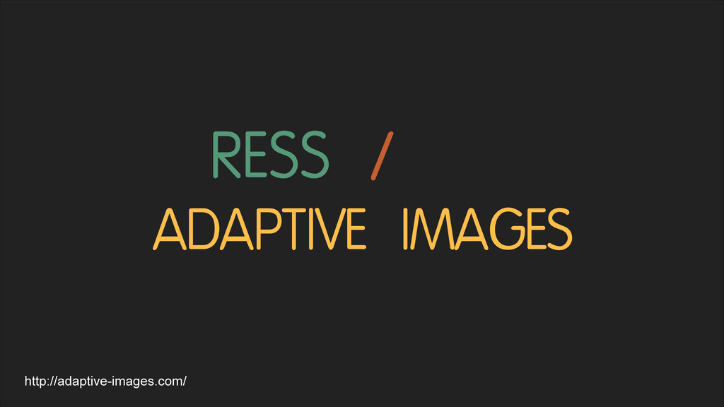
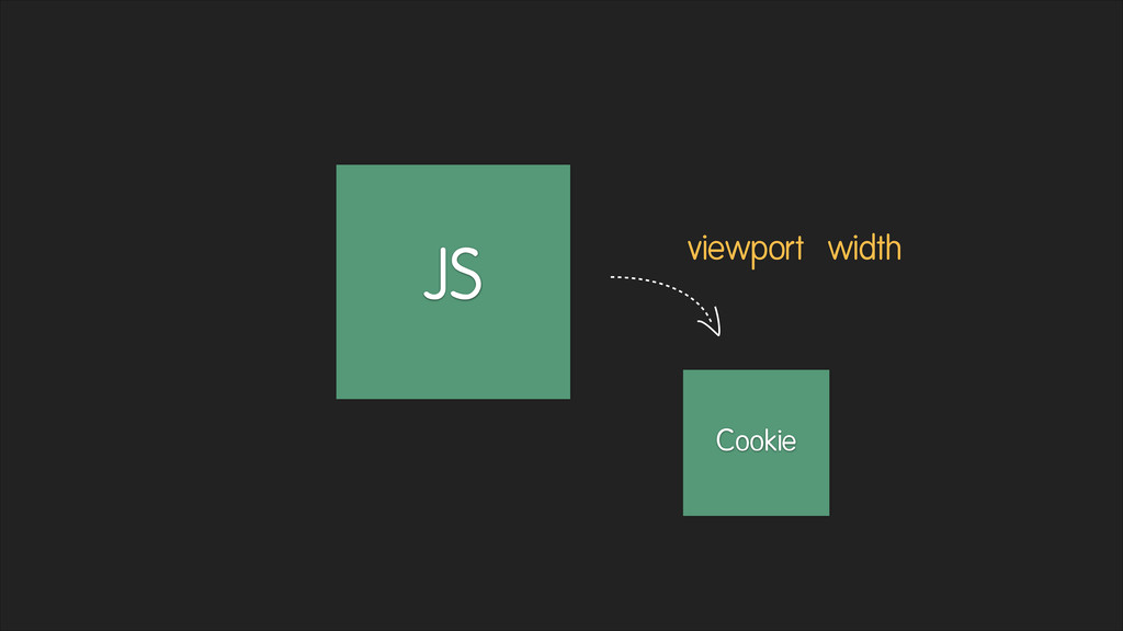
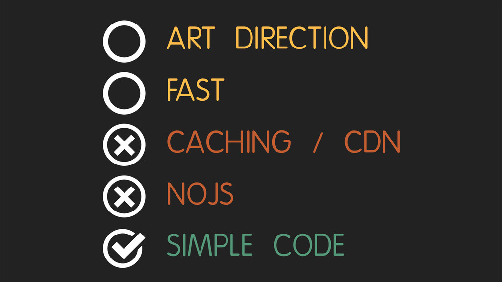
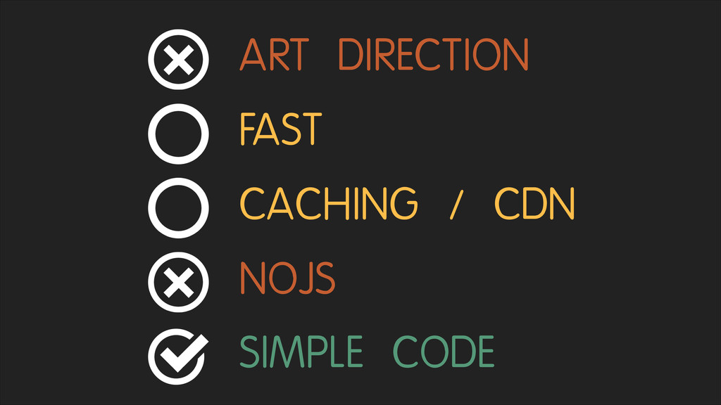
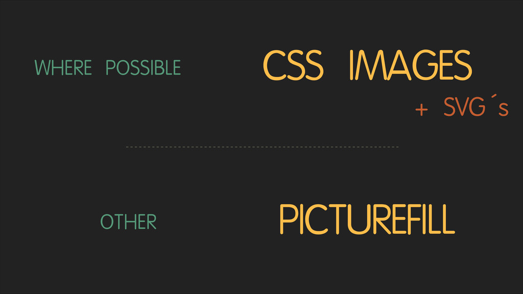
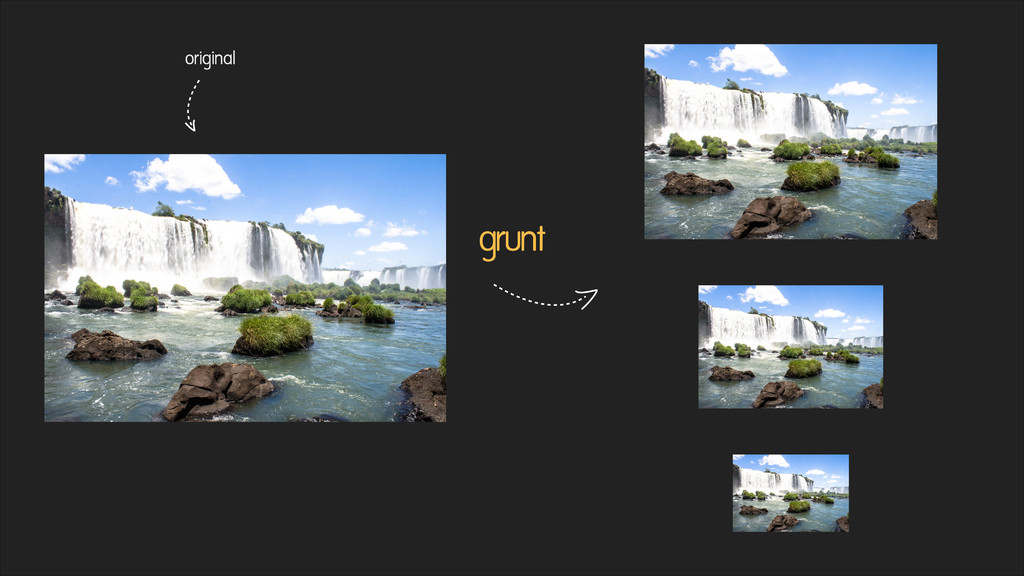
Although responsive designs are already state-of-the-art in web development the whole trend still is in its infancy. When it comes to images, a lot of responsive websites just load the same big image on every viewport. Because of this, people judge responsive design as being detrimental to performance. New markup elements like are under discussion right now but what are the alternatives, what is the best to use right now, and how do they work? I will lead you through the different techniques and polyfills and show you their pros and cons. After this talk you should be able to choose the best fitting responsive image solution for your project.

Matthias Lau

November 07, 2013
Tweet

More Decks by Matthias Lau

Other Decks in Programming

Transcript

  1. THE BIG
    PICTURE .
    responsive
    images
    in action
    PRESENTED BY MATTHIAS LAU

    View Slide

  2. {
    name: "Matthias Lau",
    link: "http://laumatthias.de",
    twitter: "@matthiaslau",
    hometown: {
    name: "Hamburg, Germany"
    },
    bio: "E-Commerce Freak and Web-Allrounder, love coding,
    awesome internet concepts, Chrome, Web Frameworks, Evernote,
    the Apple Multi-Touch Trackpad, Bouldering, Wikipedia and
    Espresso.",
    work: {
    employer: {
    name: "Jimdo"
    },
    },
    }

    View Slide

  3. View Slide

  4. View Slide

  5. A LOT!
    OPTIMIZED
    THEY

    View Slide

  6. !
    FOR SMALL VIEWPORTS
    LARGE IMAGES
    STILL...

    View Slide

  7. !
    WANT!
    WE
    WHAT

    View Slide

  8. IMAGES
    OPTIMIZED

    View Slide

  9. IMAGES
    OPTIMIZED

    View Slide

  10. IMAGES
    OPTIMIZED

    View Slide

  11. !
    DIRECTION
    ART

    View Slide

  12. View Slide

  13. View Slide

  14. !
    IMAGES
    FAST

    View Slide

  15. !
    JAVASCRIPT
    IT SHOULD
    ALSO WORK WITHOUT

    View Slide

  16. CACHING / CDN

    View Slide


  17. !
    CODE
    SIMPLE

    View Slide

  18. TECHNIQUES
    RESPONSIVE IMAGE
    http://matthiaslau.github.io/responsive-images/

    View Slide

  19. SVG´s
    USE

    View Slide

  20. BACKGROUNDS
    CSS

    View Slide

  21. BACKGROUNDS
    CSS
    #iguazu  {  
         background-­‐image:  url(small.jpg);  
    }  
    @media  screen  and  (min-­‐width:  601px)  {  
         #iguazu  {  
               background-­‐image:  url(medium.jpg);  
         }  
    }

    View Slide

  22. SIMPLE CODE
    FAST
    NOJS
    CACHING / CDN
    ART DIRECTION

    View Slide

  23. IT IS A CSS IMAGE

    View Slide


  24. ACCESSIBILITY

    View Slide

  25. CARS
    CLOWN

    View Slide


  26. View Slide

  27.  
         Iguazu  Waterfalls  
           <br/>            @media  screen  and  (max-­‐width:300px){  <br/>                  svg{  <br/>                        background-­‐image:url(http://localhost:8010/<br/>responsive_images/img/small.jpg);  <br/>                  }  <br/>            }  <br/>            @media  screen  and  (min-­‐width:301px){  <br/>                  […]  <br/>            }  <br/>        

    View Slide

  28. security  drawbacks  -­‐-­‐>  
    request  -­‐-­‐>  
    type="image/svg+xml">  


    View Slide

  29. SIMPLE CODE
    FAST
    NOJS
    CACHING / CDN
    ART DIRECTION

    View Slide

  30. ADAPTIVE IMAGES
    RESS /
    http://adaptive-images.com/

    View Slide

  31. JS
    Cookie
    viewport width

    View Slide

  32. .htaccess
    image request Scaling
    Logic
    best fitting image
    Cookie

    View Slide

  33. SIMPLE CODE
    FAST
    NOJS
    CACHING / CDN
    ART DIRECTION

    View Slide

  34. RESIZING
    SERVICES

    View Slide

  35. http://src.sencha.io/320/200/http://[...]/huge-­‐hd.jpg
    RESIZING
    SERVICES
    http://www.sencha.com/learn/how-to-use-src-sencha-io/

    View Slide

  36.  
    !
           src='http://src.sencha.io/wiw/http://[...]/huge-­‐
    hd.jpg'  
           alt='Iguazu  Waterfalls'  
           />
    RESIZING
    SERVICES

    View Slide

  37. SIMPLE CODE
    FAST
    NOJS
    CACHING / CDN
    ART DIRECTION

    View Slide

  38. ELEMENT
    PICTURE
    SRCSET
    +

    View Slide

  39.  


           Iguazu  

    View Slide

  40.                  src="small.jpg"  
                     srcset="medium.jpg  1x,  medium-­‐2x.jpg  2x">

    View Slide

  41.  
           srcset="medium.jpg  1x,  medium-­‐2x.jpg  2x">  


           Iguazu  

    View Slide

  42. <3

    View Slide

  43. SIMPLE CODE
    FAST
    NOJS
    CACHING / CDN
    ART DIRECTION

    View Slide

  44. NO BROWSER
    SUPPORT YET

    View Slide

  45. View Slide

  46. View Slide

  47. PICTUREFILL
    https://github.com/Wilto/picturefill-proposal
    https://github.com/scottjehl/picturefill

    View Slide

  48. View Slide

  49. SIMPLE CODE
    FAST
    NOJS
    CACHING / CDN
    ART DIRECTION

    View Slide

  50. MORE
    THERE IS EVEN
    HiSRC
    Foresight.js
    Riloadr rwdImages
    Retina.js
    Responsive Enhance
    Doubletake
    Content Aware Resizing
    https://docs.google.com/spreadsheet/ccc?key=0Al0lI17fOl9DdDgxTFVoRzFpV3VCdHk2NTBmdVI2OXc#gid=0
    Mobify..js

    View Slide

  51. WHAT?
    a summary
    NOW

    View Slide

  52. WHERE POSSIBLE CSS IMAGES
    OTHER PICTUREFILL
    + SVG´s

    View Slide

  53. SOMETHING
    USE
    please

    View Slide

  54. PROCESS
    THE
    with grunt

    View Slide

  55. grunt
    original

    View Slide

  56. https://github.com/andismith/grunt-responsive-images
    options:  {  
         sizes:  [  
               {  
                     name:  "s",  
                     width:  320,  
                     quality:  0.6  
               },  
               {  
                     name:  "s",  
                     suffix:  "x2",  
                     width:  640,  
                     quality:  0.6  
               },  
           […]                                              
         ]  
    },
    files:  [{  
         expand:  true,  
         cwd:  'img/',  
         src:  ['*.{jpg,gif,png}'],  
         dest:  'img/generated/'  
    }]

    View Slide

  57. „Don't click this if on a 3G
    network, it probably take
    forever, just check it out when
    you get home.“

    View Slide

  58. CONTEXT-BASED
    IMAGES
    forecast:

    View Slide

  59. QUESTIONS?
    http://twitter.com/matthiaslau
    http://laumatthias.de/
    https://www.xing.com/profile/Matthias_Lau

    View Slide