Upgrade to Pro — share decks privately, control downloads, hide ads and more …

The Magic and Pain of Responsive Design

Matthias Lau
September 08, 2012

The Magic and Pain of Responsive Design

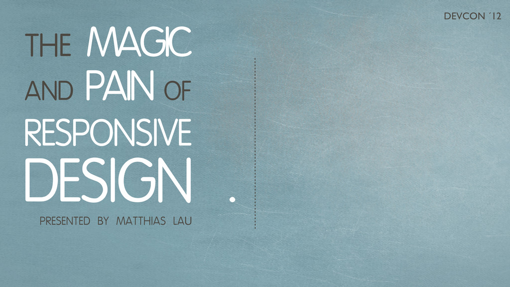
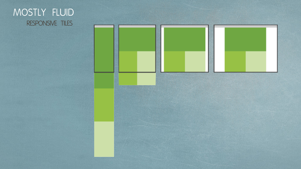
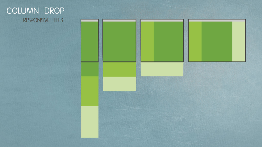
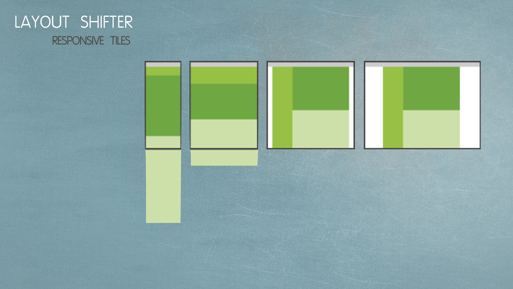
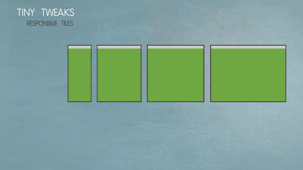
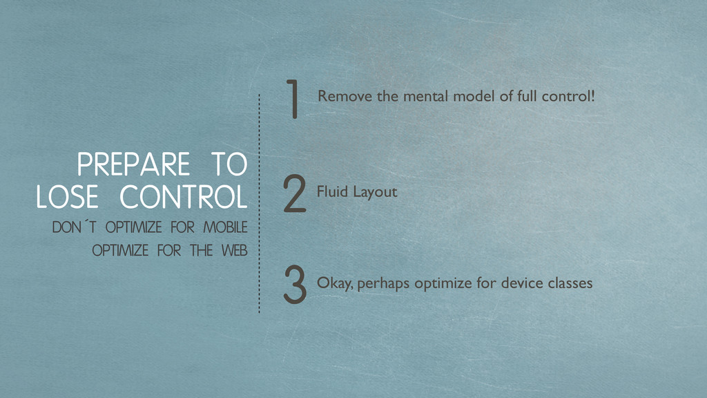
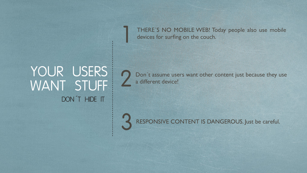
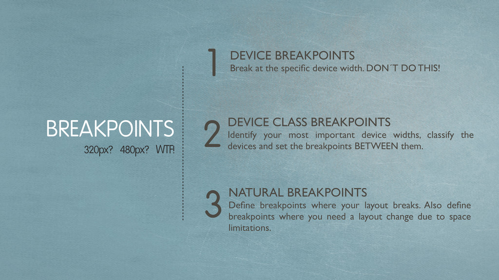
Über das wertvolle Konzept des Responsive Designs wird viel geredet und es wird zurecht gehyped. In der Praxis sieht man sich allerdings schnell Herausforderungen gegenüber, die oft einen massiven Mehraufwand bedeuten. Wann Responsive Design Sinn macht, warum es so großartig ist, welche Stolpersteine so auf dem Weg liegen und was dies für die Erstellungs-Prozesse einer Webseite bedeutet, dies wird hier betrachtet.

Matthias Lau

September 08, 2012
Tweet

More Decks by Matthias Lau

Other Decks in Programming

Transcript

  1. { name: "Matthias Lau", link: "http://laumatthias.de", twitter: "@matthiaslau", hometown: {

    name: "Hamburg, Germany" }, bio: "Web-Allrounder mit Leidenschaft für E-Commerce, Coden, Hacken, Konzipieren, Designen.", work: { employer: { name: "Jimdo" }, position: { name: "Shop-Rakete" }, }, }
  2. More than desktop: TVs, laptops, tablets, eReader and smartphones. AGE

    OF HETEROGENEOUS DEVICES 960 GRID IS SO YESTERDAY 4 1 2Fragmented screen sizes. Different usability concepts, e.g. touch. Websites should always look good and be usable. 3
  3. MAKE IT RESPONSIVE HOW DOES RESPONSIVE DESIGN WORK? /* IPAD

    */ @media screen and (max-device-width: 1024px) { } /* IPHONE */ @media screen and (max-device-width: 480px) { }
  4. „I don´t care who you are or where you´re from,

    I still love you“ LOVE YOUR USERS
  5. COMPLEXITY KEEP IT SIMPLE, STUPID 4 1 2 If you

    want to hide it, think about deleting it. Mobile First (Tablet First) The web IS responsive! We just started to use fixed width. 3Embrace CSS3.
  6. „Mobile users want to see our menu, hours, and delivery

    number. Desktop users definitely want this 1mb png of someone smiling at a salad.“ MAT MARQUIS (@wilto)
  7. “There is no Mobile Web. There is only The Web,

    which we view in different ways. There is also no Desktop Web. Or Tablet Web. Thank you.” STEPHEN HAY (@stephenhay)
  8. Remove the mental model of full control! PREPARE TO LOSE

    CONTROL DON´T OPTIMIZE FOR MOBILE OPTIMIZE FOR THE WEB 3 1 2Fluid Layout Okay, perhaps optimize for device classes
  9. THERE´S NO MOBILE WEB! Today people also use mobile devices

    for surfing on the couch. YOUR USERS WANT STUFF DON´T HIDE IT 3 1 2Don´t assume users want other content just because they use a different device! RESPONSIVE CONTENT IS DANGEROUS. Just be careful.
  10. DEVICE BREAKPOINTS Break at the specific device width. DON´T DO

    THIS! BREAKPOINTS 320px? 480px? WTF! 3 1 2DEVICE CLASS BREAKPOINTS Identify your most important device widths, classify the devices and set the breakpoints BETWEEN them. NATURAL BREAKPOINTS Define breakpoints where your layout breaks. Also define breakpoints where you need a layout change due to space limitations.
  11. FEATURE DETECTION USE JAVASCRIPT TO BE EVEN MORE RESPONSIVE if

    (Modernizr.touch){ // Touch is supported } else { // This is no touch device }
  12. There are some things RWD can´t offer. Images in the

    right size. Order of Markup. RESS FINALLY A NEW BUZZWORD 3 1 2Check HTTP headers and lookup device features in a database / API. Combine it with client side detection and share information using cookies. $WURFLWidth = $client->getDeviceCapability('max_image_width');
  13. 5 Layout and design for TABLET or MOBILE. THERE IS

    NO ONE-FITS-ALL APPROACH Use RESS to serve optimized images for each device-class. Use it for other stuff if needed (text truncate limit, markup order). BUT HERE IS A STARTER 4 1 3Define your DEVICE-CLASSES and implement media queries for them considering DEVICE CLASS BREAKPOINTS. Only use them for device specific stuff (menu, perhaps buttons). Scale down and up to find your NATURAL BREAKPOINTS where your layout breaks. Implement media queries for them and fix the layout considering RESPONSIVE TILES. Start with a FLUID LAYOUT and RESPONSIVE RESET. 2
  14. LINKS READ IT! Book: RESPONSIVE WEB DESIGN by ETHAN MARCOTTE

    http://www.abookapart.com/products/responsive-web-design FLUID GRIDS by ETHAN MARCOTTE http://www.alistapart.com/articles/fluidgrids/ RESPONSIVE WEB DESIGN by ETHAN MARCOTTE http://www.alistapart.com/articles/responsive-web-design/ RESPONSIVE LAYOUTS http://www.thismanslife.co.uk/projects/lab/responsivewireframes/ 320 AND UP - tiny screen first HTML5 Boilerplate http://stuffandnonsense.co.uk/projects/320andup/ RESPONSIVE DESIGN TESTING TOOL http://mattkersley.com/responsive/ 5 REASONS WHY RESPONSIVE DESIGN IS NOT WORTH IT http://managewp.com/5-reasons-why-responsive-design-is-not- worth-it
  15. LINKS READ IT! RESPONSIVE DESIGN SKETCHBOOK http://appsketchbook.com/products/responsive-design- sketchbook RESPONSIVE IMAGES

    http://filamentgroup.com/lab/ responsive_images_experimenting_with_context_aware_image_sizing/ MULTI-DEVICE LAYOUT PATTERNS http://www.lukew.com/ff/entry.asp?1514 AN EVENT APART: THE RESPONSIVE DESIGNER´S WORKFLOW http://www.lukew.com/ff/entry.asp?1353