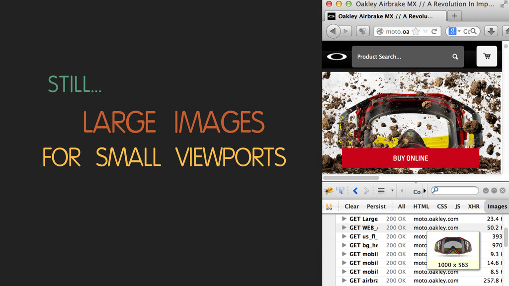
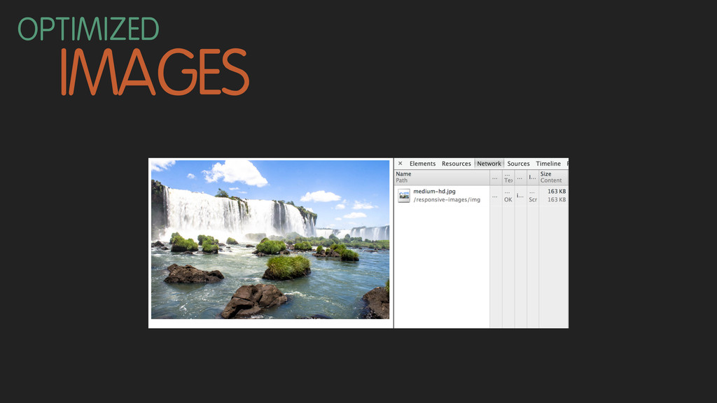
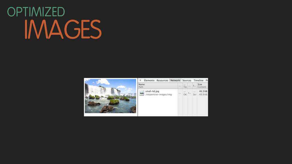
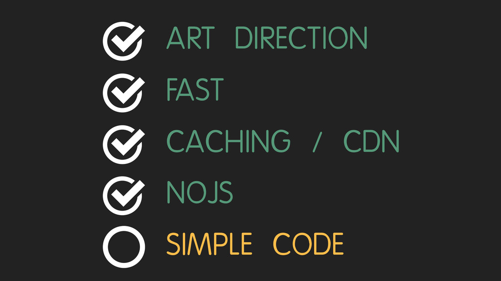
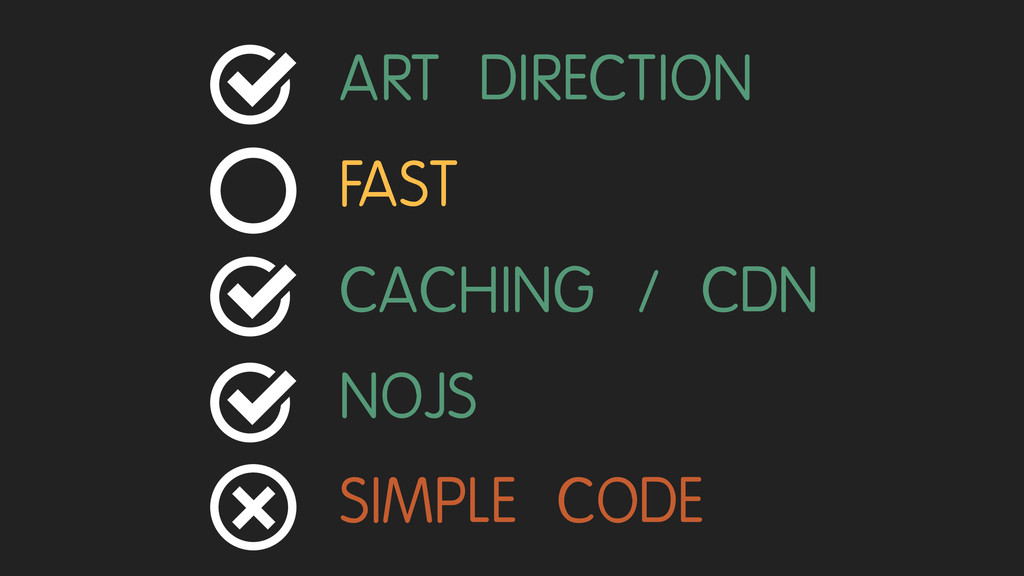
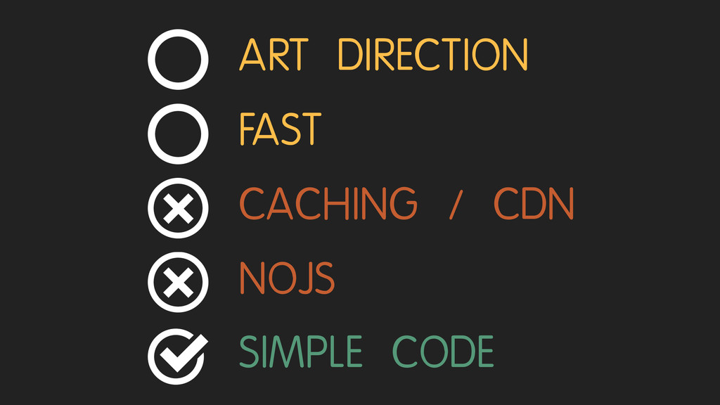
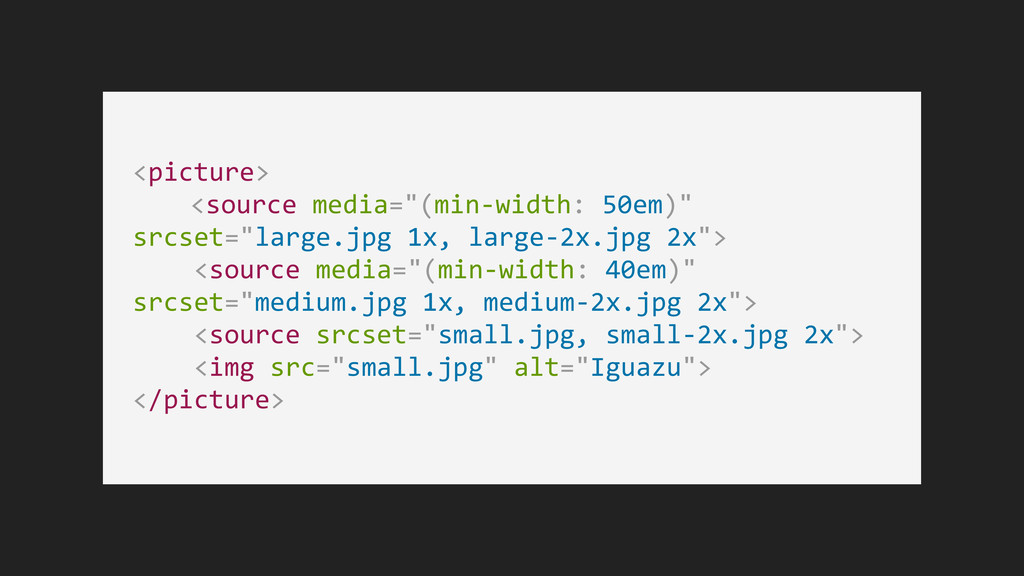
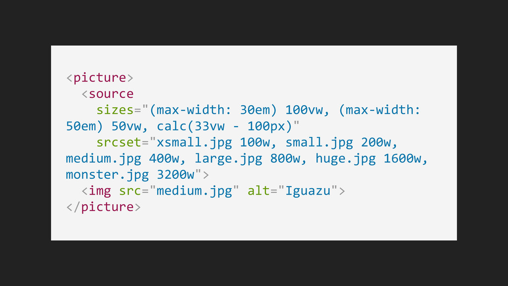
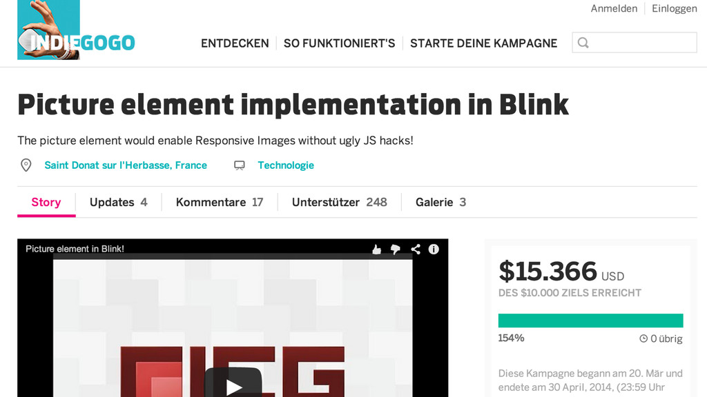
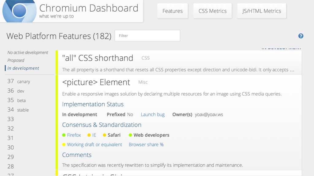
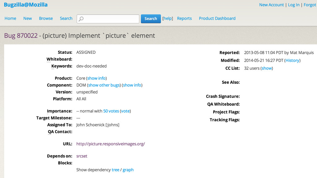
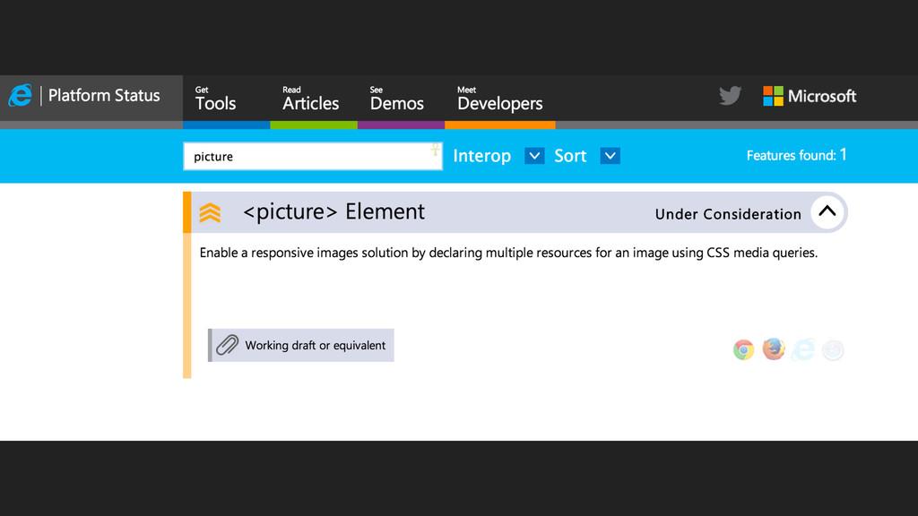
Although responsive designs are already state-of-the-art in web development the whole trend still is in its infancy. When it comes to images, a lot of responsive websites just load the same big image on every viewport. Because of this, people judge responsive design as being detrimental to performance. New markup elements like are in development right now but what are the alternatives, what is the best to use right now, and how do they work? I will lead you through the different techniques and polyfills and show you their pros and cons. After this talk you should be able to choose the best fitting responsive image solution for your project.
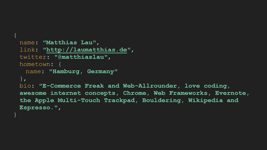
 matthiaslau
 inoueasei
 pkshadeck
 hananouchi
 wanko_it
 ivargrimstad
 shibuchaaaan
 ryugen04
 kajitack
 kazumax55
 hanhan1978
 pizzacat83
 yusukebe
 chrisshort
 cassininazir
 ipullrank
 jmmastey
 ryanjones
 pwiseman
 danielanewman
 sergeychernyshev
 brad_frost
 dougneiner
 joshbly
 kneath
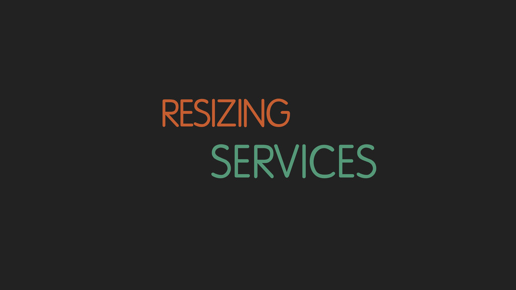
![http://src.sencha.io/320/200/http://[...]/huge-‐hd.jpg RESIZING SERVICES http://www.sencha.com/learn/how-to-use-src-sencha-io/](https://files.speakerdeck.com/presentations/485f2e60c5620131946206305ec17342/slide_37.jpg)
![<script src='http://src.sencha.io/screen.js'></script> ! <img src='http://src.sencha.io/wiw/http://[...]/huge-‐](https://files.speakerdeck.com/presentations/485f2e60c5620131946206305ec17342/slide_38.jpg)