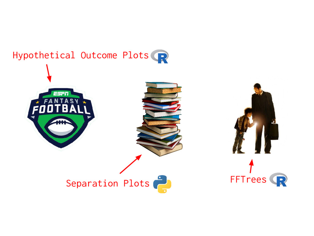
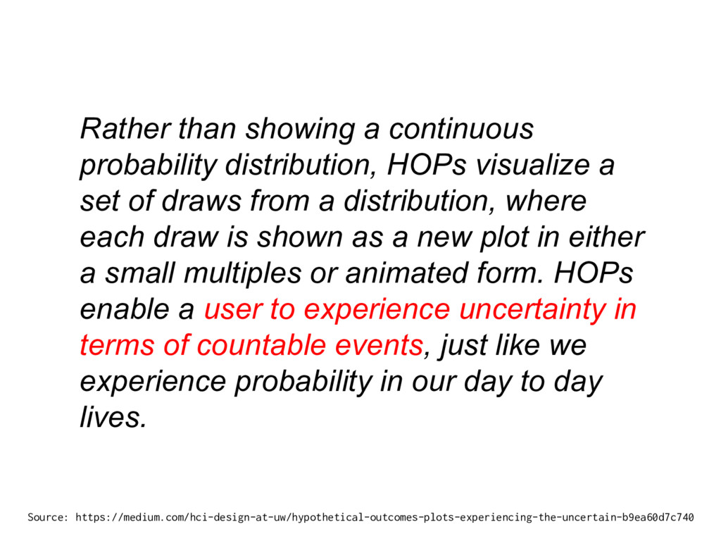
set of draws from a distribution, where each draw is shown as a new plot in either a small multiples or animated form. HOPs enable a user to experience uncertainty in terms of countable events, just like we experience probability in our day to day lives. Source: https://medium.com/hci-design-at-uw/hypothetical-outcomes-plots-experiencing-the-uncertain-b9ea60d7c740
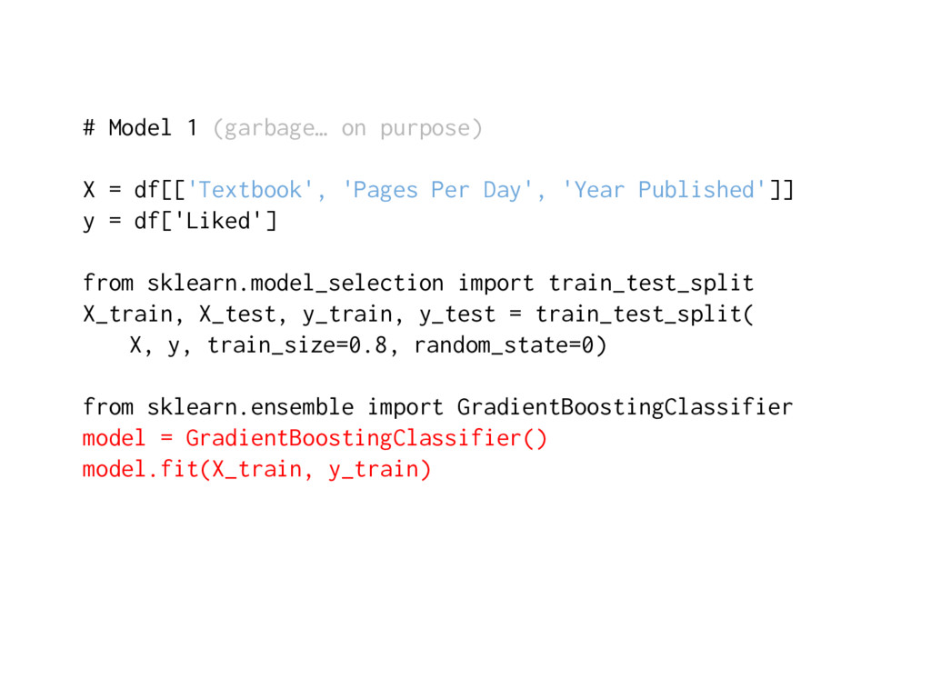
Per Day', 'Year Published']] y = df['Liked'] from sklearn.model_selection import train_test_split X_train, X_test, y_train, y_test = train_test_split( X, y, train_size=0.8, random_state=0) from sklearn.ensemble import GradientBoostingClassifier model = GradientBoostingClassifier() model.fit(X_train, y_train)
models with binary outcomes. This technique allows the analyst to evaluate model fit based upon the models’ ability to consistently match high-probability predictions to actual occurrences of the event of interest, and low-probability predictions to nonoccurrences of the event of interest. Unlike existing methods for assessing predictive power for logit and probit models such as Percent Correctly Predicted statistics, Brier scores, and the ROC plot, our “separation plot” has the advantage of producing a visual display that is informative and easy to explain to a general audience, while also remaining insensitive to the often arbitrary probability thresholds that are used to distinguish between predicted events and nonevents. Source: https://scholars.duke.edu/display/pub998145
from sklearn.model_selection import train_test_split X_train, X_test, y_train, y_test = train_test_split( X, y, train_size=0.8, random_state=0) from sklearn import tree model = tree.DecisionTreeClassifier() model.fit(X_train, y_train)
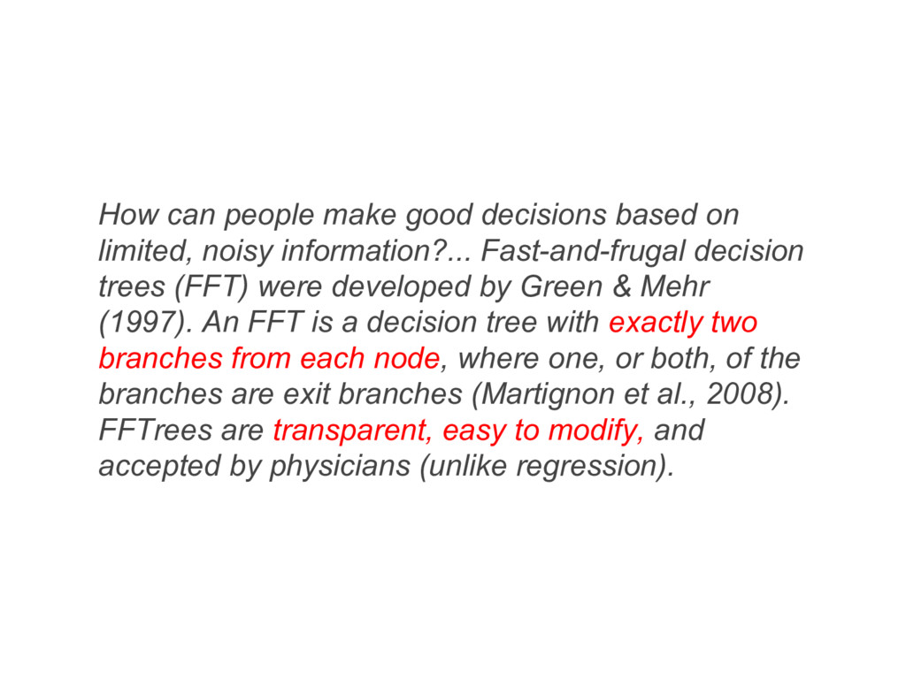
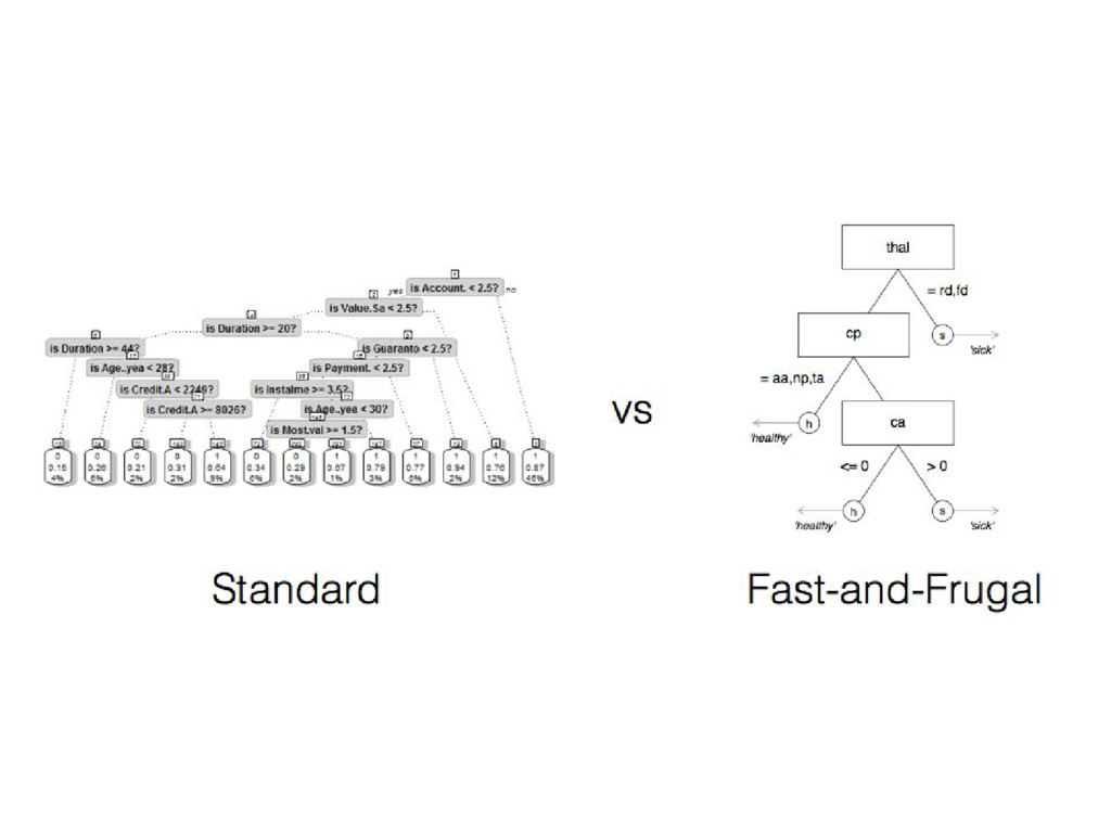
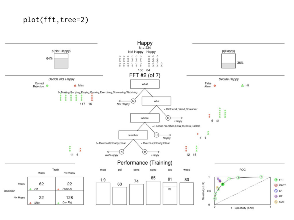
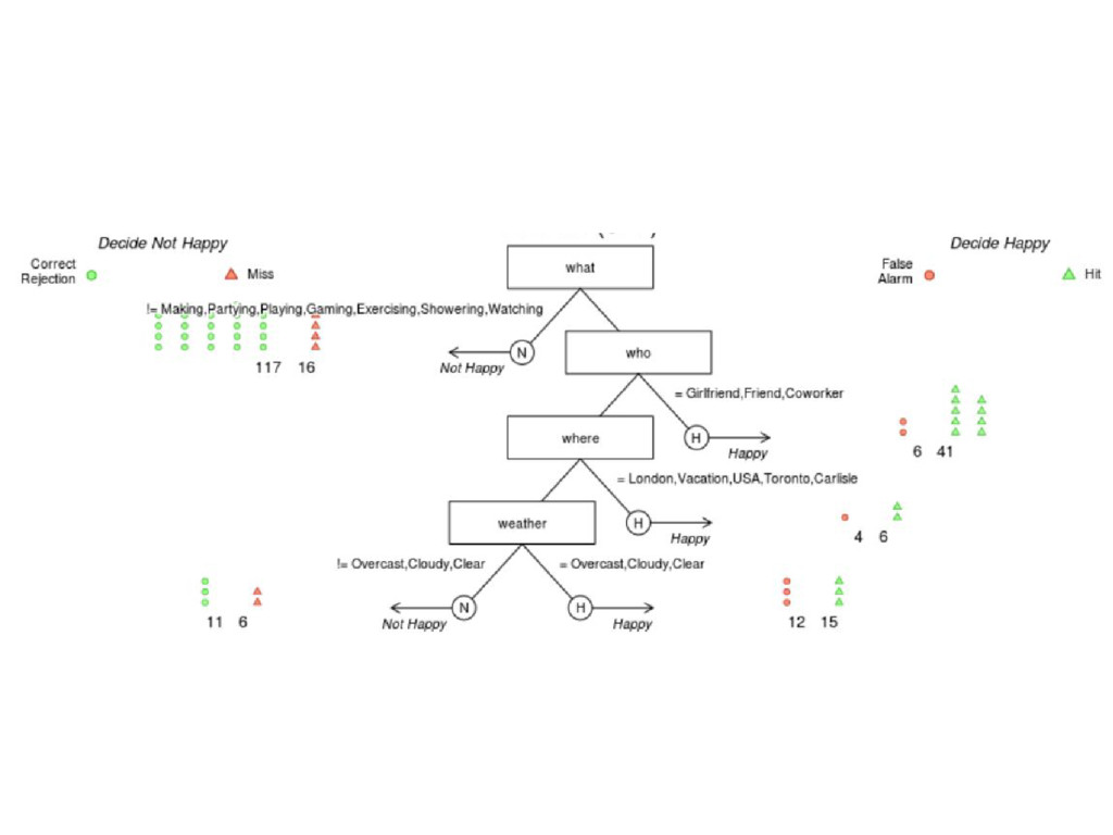
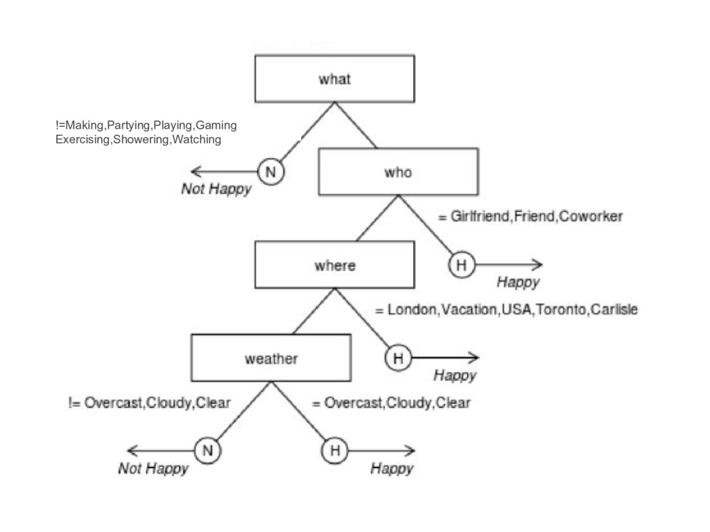
information?... Fast-and-frugal decision trees (FFT) were developed by Green & Mehr (1997). An FFT is a decision tree with exactly two branches from each node, where one, or both, of the branches are exit branches (Martignon et al., 2008). FFTrees are transparent, easy to modify, and accepted by physicians (unlike regression).
[2] "If who != {Girlfriend,Friend,Coworker}, predict Not Happy" [3] "If where != {London,Vacation,USA,Toronto,Carlisle}, predict Not Happy, otherwise, predict Happy" $v2 [1] "If what = {Making,Partying,Playing,Gaming,Exercising,Showering,Watching}, predict Happy. If who != {Girlfriend,Friend,Coworker}, predict Not Happy. If where != {London,Vacation,USA,Toronto,Carlisle}, predict Not Happy, otherwise, predict Happy"
![y_true = y_test y_pred = model.predict_proba(X_test)[:, 1] separation_plot(y_true, y_pred)](https://files.speakerdeck.com/presentations/ace587162be84b3696a6237483673004/slide_72.jpg)
![X = df[['Average Rating', 'Pages Per Day']] y = df['Liked']](https://files.speakerdeck.com/presentations/ace587162be84b3696a6237483673004/slide_74.jpg)
![y_true = y_test y_pred = model.predict_proba(X_test)[:, 1] separation_plot(y_true, y_pred)](https://files.speakerdeck.com/presentations/ace587162be84b3696a6237483673004/slide_76.jpg)
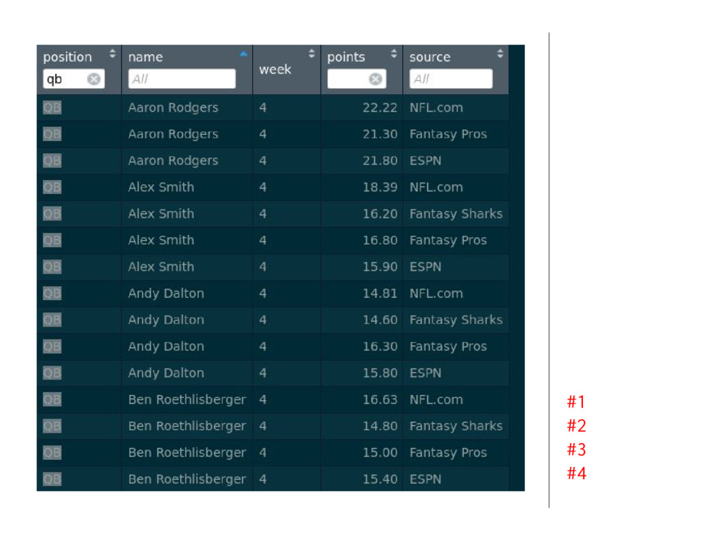
![#1 #2 y_true = y_test y_pred = model.predict_proba(X_test)[:, 1] separation_plot(y_true,](https://files.speakerdeck.com/presentations/ace587162be84b3696a6237483673004/slide_77.jpg)
![> inwords(fft) $v1 [1] "If what = {Making,Partying,Playing,Gaming,Exercising,Showering,Watching}, predict Happy"](https://files.speakerdeck.com/presentations/ace587162be84b3696a6237483673004/slide_101.jpg)