Upgrade to Pro — share decks privately, control downloads, hide ads and more …

Desktop-first to Mobile-first with Bootstrap

Desktop-first to Mobile-first with Bootstrap

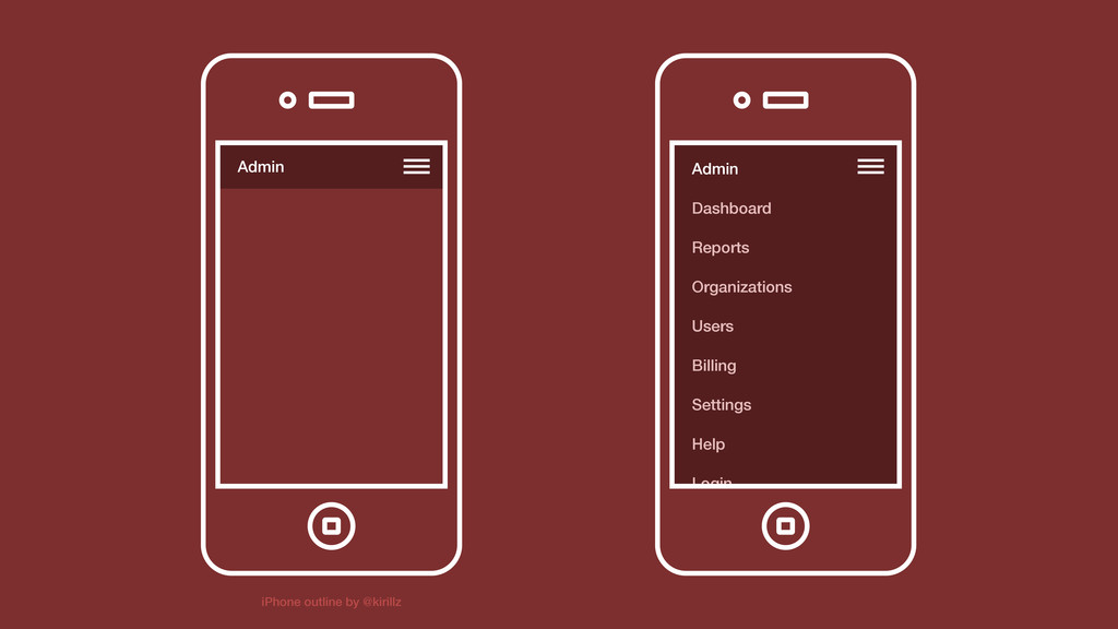
Historically Bootstrap has been desktop-first—since the initial release and every subsequent update. With the upcoming release of v3, we've switched to a mobile-first approach. We're still finalizing much of the CSS, but the last few months of development have been intense and an awesome learning experience. This talk highlights some of the things I've learned along the way—some design, some code, and some still unanswered questions.

This talk was given at the Responsive Web Design meetup in SF, sponsored by Rocket Lawyer. <3 to them for organizing everything!

Mark Otto

April 26, 2013
Tweet

More Decks by Mark Otto

Other Decks in Technology

Transcript

  1. B

    View Slide

  2. Hi, I’m @mdo.
    <3

    View Slide

  3. Desktop-first
    Mobile-first
    to

    View Slide

  4. With Bootstrap
    Or any other project, really.

    View Slide

  5. B

    View Slide

  6. B Created in 2011
    v1: Desktop
    v2: Responsive
    v3: Mobile-first

    View Slide

  7. 1ST

    View Slide

  8. It’s a shiny, hand-held
    world out there.

    View Slide

  9. What’s a nerd to do?
    We mobile-first that shit.

    View Slide

  10. Mobile first?

    View Slide

  11. Media query up
    Designed from smallest viewport up
    Constrains design to only the essentials

    View Slide

  12. Let’s do this.
    Use this one weird trick to fix all your code.

    View Slide

  13. Global annoyances
    1

    View Slide


  14. 1

    View Slide


  15. 1

    View Slide

  16. // Disable iOS/WinMobile font size changes
    @media screen and (max-device-width: 480px) {
    html {
    -webkit-text-size-adjust: 100%;
    -ms-text-size-adjust: 100%;
    }
    }
    1
    2
    3
    4
    5
    6
    7

    View Slide

  17. Pixels or rems?
    2

    View Slide

  18. // Using rems means double the code
    // if you want any IE8 support.
    .element {
    font-size: 32px;
    font-size: 3.2rem;
    }
    1
    2
    3
    4
    5
    6

    View Slide

  19. // And what about margin, padding, etc?
    // Do we double all those, too?
    .element {
    font-size: 32px;
    font-size: 3.2rem;
    margin: 10px 0;
    margin: .5rem 0;
    padding: 10px 15px;
    padding: 1rem 1.5rem;
    }
    1
    2
    3
    4
    5
    6
    7
    8
    9
    10

    View Slide

  20. Responsive IE8?
    3

    View Slide


  21. 1
    2
    3
    4
    5
    6
    7
    8

    View Slide

  22. Start small.
    4

    View Slide

  23. Start refactors with a single component
    Keep your browser window narrow
    KISS (more on that later)

    View Slide

  24. Uncomment, comment.
    5

    View Slide

  25. Don’t always start over
    Make it a painful refactor
    Will help existing and future employees

    View Slide

  26. Border-box er’ything.
    6

    View Slide

  27. // Consistent box-model
    * {
    -webkit-box-sizing: border-box;
    -moz-box-sizing: border-box;
    box-sizing: border-box;
    }
    1
    2
    3
    4
    5
    6

    View Slide

  28. Avoid overrides.
    7

    View Slide

  29. Be efficient, for your sake, and for file size
    Document your overrides
    Don’t undo yourself

    View Slide

  30. .example {
    margin: 40px;
    }
    // Bad overrides
    .example-modifier {
    margin: 40px 0;
    }
    // Better overrides
    .example-modifier {
    margin-left: 0;
    margin-right: 0;
    }
    1
    2
    3
    4
    5
    6
    7
    8
    9
    10
    11
    12
    13
    14

    View Slide

  31. // Bootstrap 2
    .navbar-fixed-top {
    position: fixed;
    top: 0;
    left: 0;
    right: 0;
    }
    @media screen and (max-width: 480px) {
    .navbar-fixed-top {
    position: static;
    }
    }
    1
    2
    3
    4
    5
    6
    7
    8
    9
    10
    11
    12
    13
    14

    View Slide

  32. 1
    2
    3
    4
    5
    6
    7
    8
    9
    10
    // Bootstrap 3
    @media screen and (min-width: 768px) {
    .navbar-fixed-top {
    position: fixed;
    top: 0;
    left: 0;
    right: 0;
    }
    }

    View Slide

  33. Design like it’s 2005.
    8

    View Slide

  34. Forget all the embellishments early on
    Strip everything, and add it back later
    Treat it like a boss prototype

    View Slide

  35. Media query strategy.
    9

    View Slide

  36. Single file, or embedded?
    Ideal world would be both honestly
    We’re still figuring this out

    View Slide

  37. position: rough;
    10

    View Slide

  38. Android’s scroll is laggier than iOS
    iOS has problems updating fixed elements
    Responsive navs in limited viewports

    View Slide

  39. Admin Admin
    Dashboard
    Reports
    Organizations
    Users
    Billing
    Settings
    Help
    Login
    iPhone outline by @kirillz

    View Slide

  40. Submenus are crap.
    11

    View Slide

  41. Tap targets are super small
    Horizontal space is also rather limited
    But there are workarounds if you need ‘em

    View Slide

  42. Dropdown link
    Dropdown link
    Dropdown link
    Dropdown link ▶
    Dropdown link
    Dropdown link
    Dropdown link
    Dropdown link ▶
    Dropdown link ▶
    Submenu link
    Submenu link
    Submenu link
    Submenu link
    Submenu link
    Dropdown link
    Dropdown link
    Dropdown link
    Dropdown link ▶
    Back
    Submenu link
    Submenu link
    Submenu link
    Submenu link

    Dropdown link
    Dropdown link
    Dropdown link
    Dropdown link ▼
    Dropdown link
    Dropdown link
    Dropdown link
    Dropdown link ▼
    Submenu link
    Submenu link
    Submenu link
    Submenu lin
    Dropdown link ▼
    Submenu link
    Submenu link
    Submenu link
    Submenu link

    View Slide

  43. It depends.
    12

    View Slide

  44. No guideline fits every situation
    This stuff takes time and work
    Follow your heart

    View Slide

  45. Thanks, nerds!
    <3

    View Slide

  46. Questions?

    View Slide