Upgrade to Pro — share decks privately, control downloads, hide ads and more …

Beautiful Web Typography (2017)

Mel Choyce
August 12, 2017

Beautiful Web Typography (2017)

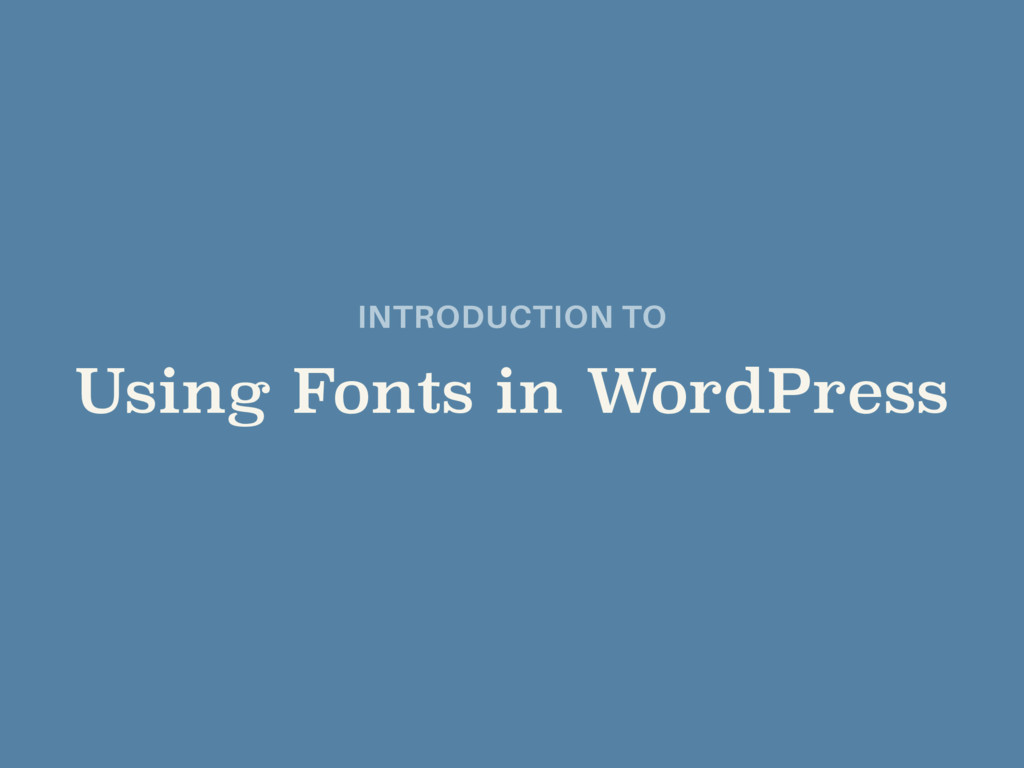
Presented at WordCamps Portland Maine and Montreal in 2017.

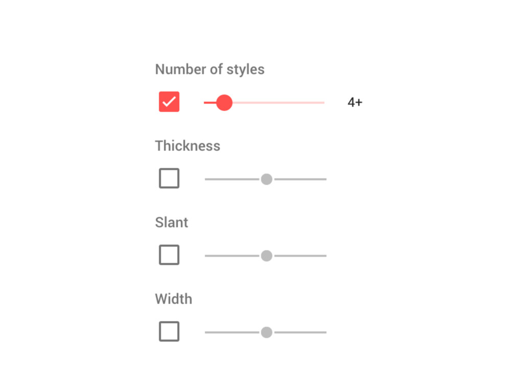
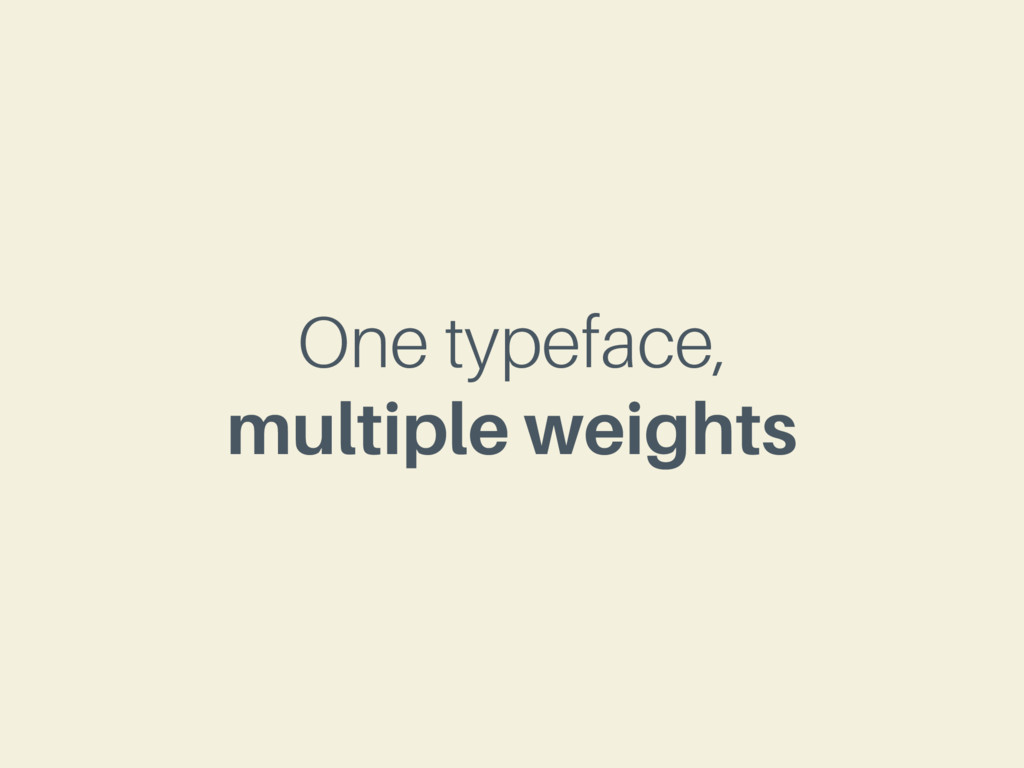
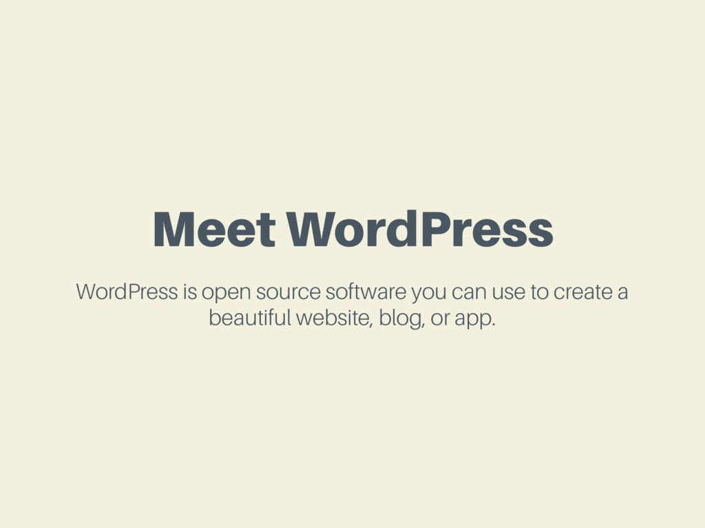
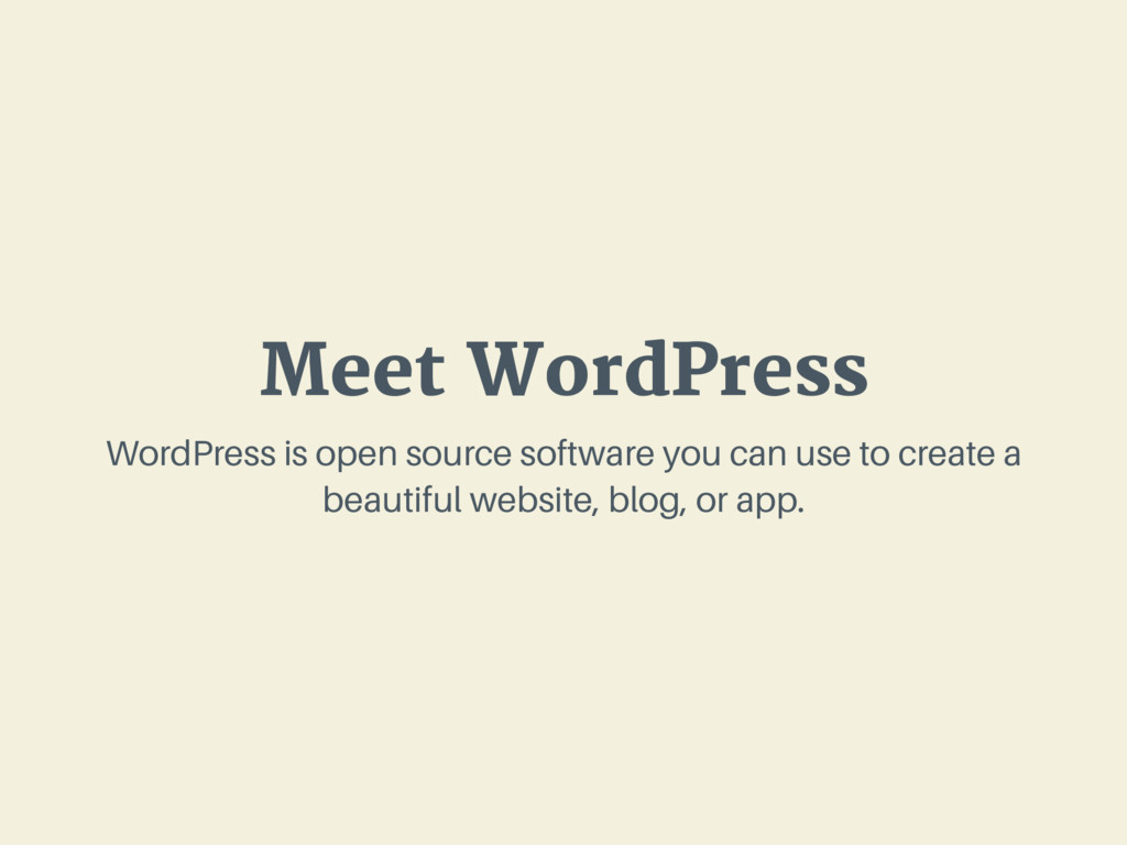
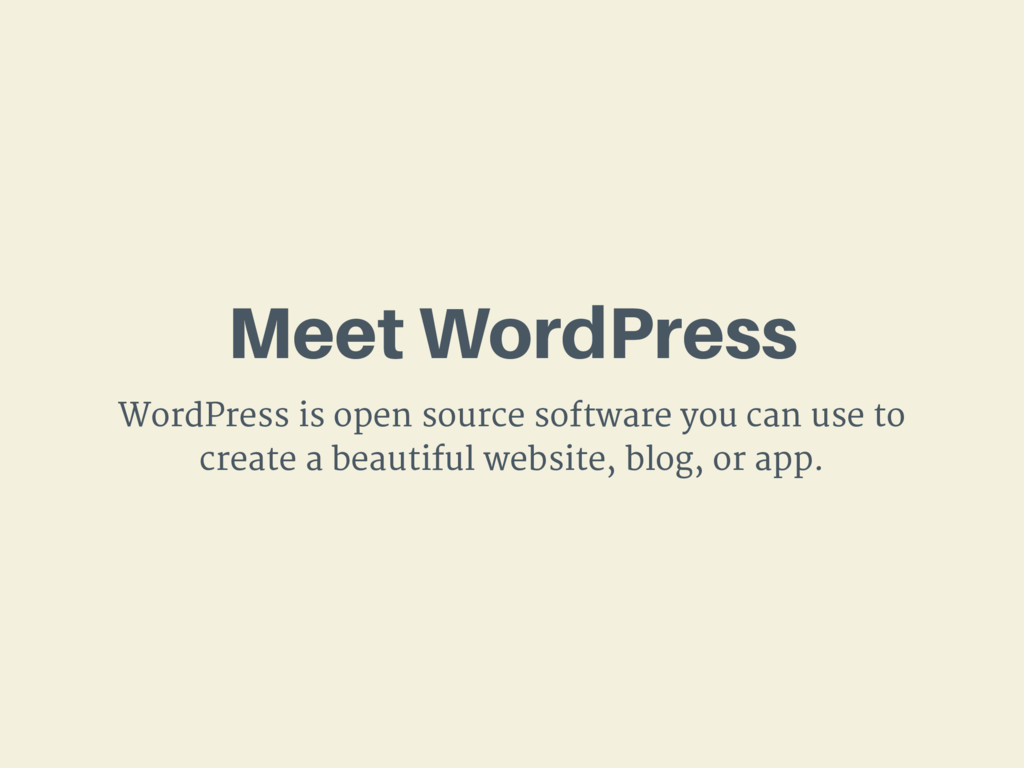
With the rapid popularization of web fonts over the past few years, type on the web has never been more exciting! We’ll learn a bit about basic typographic principles, review techniques and services for integrating web fonts into your WordPress sites, and finally conclude with a bit of speculation on where type on the web is heading.

Mel Choyce

August 12, 2017
Tweet

More Decks by Mel Choyce

Other Decks in Design

Transcript

  1. Beautiful

    Web Typography

    View Slide

  2. Mel Choyce
    PRODUCT DESIGNER AT AUTOMATTIC
    @melchoyce
    melchoyce.design

    View Slide

  3. INTRODUCTION TO

    Beautiful Web Type

    View Slide

  4. Web Design is 95%
    Typography
    — Oliver Reichenstein

    View Slide

  5. National Geographic http://www.nationalgeographic.com/mag...
    TYPE ON THE WEB

    View Slide

  6. Ghostly Ferns http://ghostlyferns.com/
    TYPE ON THE WEB

    View Slide

  7. FCINQ http://www.fcinq.com/
    TYPE ON THE WEB

    View Slide

  8. Wired http://www.wired.com/
    TYPE ON THE WEB

    View Slide

  9. Seedlip https://www.seedlipdrinks.com/
    TYPE ON THE WEB

    View Slide

  10. NASA Gene Lab http://genelab.nasa.gov/
    TYPE ON THE WEB

    View Slide

  11. can make their type
    ANYONE
    LOOK GOOD

    View Slide

  12. INTRODUCTION TO

    Typographic Principles

    View Slide

  13. Picking
    Pairing
    &

    View Slide

  14. Picking
    Pairing
    &

    View Slide

  15. think about
    Tone

    View Slide

  16. Neutral Stylized
    >

    View Slide

  17. Pick body fonts with
    multiple weights

    View Slide

  18. View Slide

  19. View Slide

  20. Picking
    Pairing
    &

    View Slide

  21. One typeface,
    multiple weights

    View Slide

  22. Meet WordPress
    WordPress is open source software you can use to create a
    beautiful website, blog, or app.

    View Slide

  23. Meet WordPress
    WordPress is open source software you can use to create a
    beautiful website, blog, or app.

    View Slide

  24. Sans + Serif = ❤

    View Slide

  25. Meet WordPress
    WordPress is open source software you can use to create a
    beautiful website, blog, or app.

    View Slide

  26. Meet WordPress
    WordPress is open source software you can use to
    create a beautiful website, blog, or app.

    View Slide

  27. Pick a Family
    when in doubt

    View Slide

  28. Meet WordPress
    WordPress is open source software you can use to
    create a beautiful website, blog, or app.

    View Slide

  29. Meet WordPress
    WordPress is open source software you can use to create a
    beautiful website, blog, or app.

    View Slide

  30. Meet WordPress
    WordPress is open source software you can use to
    create a beautiful website, blog, or app.

    View Slide

  31. Use decorative headers
    Sparingly

    View Slide

  32. Borrow Pairings
    still worried?

    View Slide

  33. Beautiful Web Type http://hellohappy.org/beautiful-web-type/
    TYPEFACE PAIRINGS

    View Slide

  34. Google Web Fonts Typographic Project http://femmebot.github.io/google-type/
    TYPEFACE PAIRINGS

    View Slide

  35. Typewolf http://www.typewolf.com/
    TYPEFACE PAIRINGS

    View Slide

  36. Font Pair http://fontpair.co/
    TYPEFACE PAIRINGS

    View Slide

  37. Size

    View Slide

  38. don’t make me
    SQUINT

    View Slide

  39. 14-22
    px body fonts

    View Slide

  40. Line-height

    View Slide

  41. 1x
    is so, so sad.

    View Slide

  42. View Slide

  43. 1.4-1.6x
    for body fonts

    View Slide

  44. View Slide

  45. 1.2-1.4x
    for header fonts

    View Slide

  46. View Slide

  47. body {
    font-size: 1em;
    line-height: 1.5;
    }
    h1, h2, h3 {
    line-height: 1.3;
    }

    View Slide

  48. Line-length

    View Slide

  49. 45-75
    characters per line*
    * including spaces and punctuation

    View Slide

  50. View Slide

  51. More
    sometimes
    is okay

    View Slide

  52. Less
    sometimes
    is okay*
    * especially on smaller screens

    View Slide

  53. Balancing Act

    View Slide

  54. Style

    View Slide

  55. only center
    short text

    View Slide

  56. Lorem ipsum dolor sit
    amet, consectetur
    adipiscing elit. Quisque
    quis feugiat ex. Aenean
    nec ipsum non lacus
    malesuada consectetur id
    eu dui.
    Praesent commodo nisi
    sed est semper fringilla
    euismod ac diam.
    Maecenas dui dui, lobortis
    ut blandit vel, tempus sed
    ante. Fusce sit amet
    auctor odio.
    Quisque dolor libero,
    vulputate vitae justo nec,
    molestie lacinia neque.
    Maecenas a vehicula
    sapien. Praesent odio
    nulla, laoreet a dapibus ut,
    blandit nec ipsum.

    View Slide

  57. only all-caps
    short text

    View Slide

  58. avoid
    justified text

    View Slide

  59. only underline
    links

    View Slide

  60. limit your # of
    font styles

    View Slide

  61. don’t use
    100% black

    View Slide

  62. View Slide

  63. INTRODUCTION TO

    Using Fonts in WordPress

    View Slide

  64. pick a
    Source

    View Slide

  65. figure out your
    constraints

    View Slide

  66. Self-Hosted?
    Cloud-Hosted?

    View Slide

  67. figure out your
    budget

    View Slide

  68. No budget?
    Small budget?
    Large budget?

    View Slide

  69. Free Hosted Service

    View Slide

  70. The Good
    Free!

    View Slide

  71. The Bad
    • Not as many high-quality options
    • Limited styles/weights
    • Limited character sets
    • Limited multi language support
    • Often overused

    View Slide

  72. Paid Hosted Service

    View Slide

  73. The Good
    • Support
    • Higher quality fonts
    • More likely to find extended character sets
    • More likely to find multi language support
    • More likely to be both good and unique

    View Slide

  74. The Bad
    • They cost money
    • Might have to pay based on traffic
    • More licensing restrictions

    View Slide

  75. Self-Hosted Service

    View Slide

  76. The Good
    • Totally customizable setup
    • Can remove characters to reduce font size
    • You “own” your fonts

    View Slide

  77. The Bad
    • Requires additional setup
    • Requires additional tech knowledge
    • Optimization up to you
    • Often more expensive for paid fonts

    View Slide

  78. use a
    Plugin

    View Slide

  79. great if you’re not
    rolling your own

    View Slide

  80. great if you don’t have
    file access

    View Slide

  81. add it
    Manually

    View Slide

  82. @font-face {
    font-family: 'Typeface';
    src: url('Typeface.eot?') format('eot'),
    url('Typeface.woff') format('woff'),
    url('Typeface.ttf') format('truetype');
    }
    BULLETPROOF @FONT-FACE
    http://www.paulirish.com/2009/bulletproof-font-face-implementation-syntax/

    View Slide

  83. WEBFONT GENERATOR
    Font Squirrel http://www.fontsquirrel.com/tools/webfont-generator

    View Slide

  84. @font-face {
    font-family: 'Typeface';
    src: url('Typeface.woff2') format('woff2'),
    url('Typeface.woff') format('woff');
    }
    MODERN @FONT-FACE STACK
    https://css-tricks.com/snippets/css/using-font-face/

    View Slide

  85. Google Fonts

    View Slide

  86. Paid & Hosted
    • Depends on your service
    • Usually given something to add to your

    View Slide

  87. THINKING ABOUT

    The Future of Type

    View Slide

  88. higher quality
    Free Fonts

    View Slide

  89. going back to
    System Fonts

    View Slide

  90. Responsive Type

    View Slide

  91. RESPONSIVE TYPOGRAPHY MEDIA QUERIES
    body {
    font-size: 100%;
    }
    h1 {
    font—size: 2.5em;
    }
    @media screen and (max-width: 50em) {
    h1 {
    font—size: 2em;
    }
    }
    @media screen and (max-width: 40em) {
    h1 {
    font—size: 1.5em;
    }
    }

    View Slide

  92. RESPONSIVE TYPOGRAPHY JAVASCRIPT
    FlowType.js http://simplefocus.com/flowtype/

    View Slide

  93. https://css-tricks.com/viewport-sized-typography/
    CSS Tricks: Viewport Sized Typography
    RESPONSIVE TYPOGRAPHY CSS

    View Slide

  94. h1 {
    font-size: 6vw;
    }
    h2 {
    line-height: 3vh;
    }
    p {
    line-height: 2vmin;
    }

    View Slide

  95. Variable Fonts

    View Slide

  96. https://blog.typekit.com/2016/09/14/variable-fonts-a-new-kind-of-font-for-flexible-design/
    A responsive lettering example by Erik van Blokland
    VARIABLE FONTS

    View Slide

  97. Imagine condensing or extending glyph widths
    ever so slightly, to accommodate narrow and
    wide viewports. Imagine raising your favorite
    font’s x-height just a touch at small sizes.
    Imagine sharpening or rounding your brand
    typeface in ways its type designer intended, for
    the purposes of art direction. Imagine
    shortening descenders imperceptibly so that
    headings can be set nice and tight without
    letters crashing into one another. Imagine this
    all happening live on the web, as a natural part
    of responsive design.
    — Tim Brown, Variable fonts, a new kind of font for flexible design.

    View Slide

  98. can’t use them
    just yet

    View Slide

  99. Color Fonts

    View Slide

  100. VARIABLE FONTS
    https://color.typekit.com/

    View Slide

  101. Thanks!
    @melchoyce
    melchoyce.design
    https://choycedesign.com/type/

    View Slide