Upgrade to Pro — share decks privately, control downloads, hide ads and more …

Beautiful Web Typography

Mel Choyce
April 25, 2015

Beautiful Web Typography

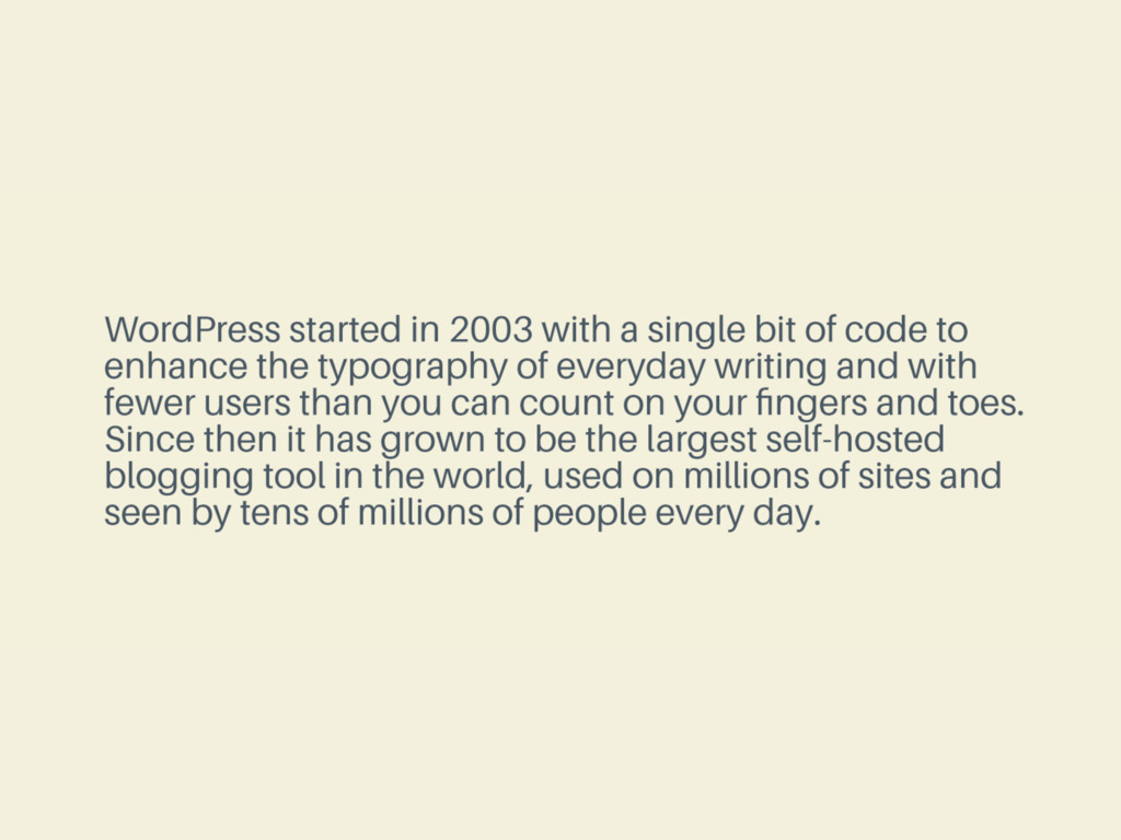
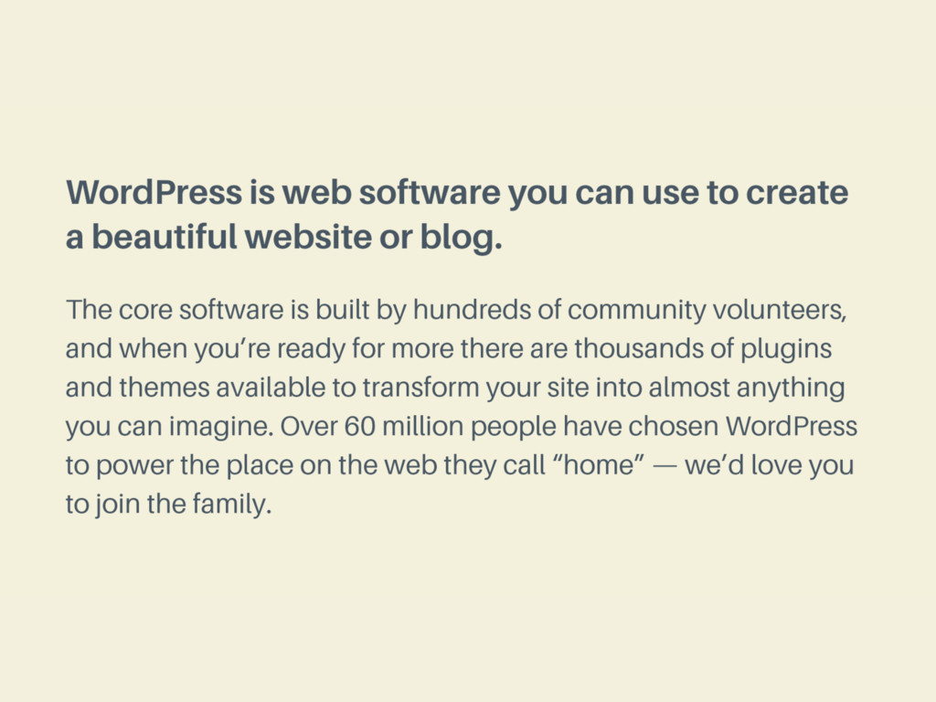
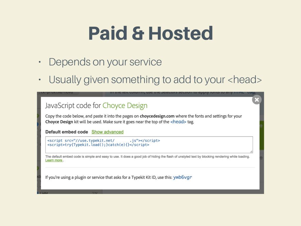
Presented at WordCamp Minneapolis 2015. With the rapid popularization of web fonts over the past few years, type on the web has never been more exciting! We’ll learn a bit about basic typographic principles, review techniques and services for integrating web fonts into your WordPress sites, and finally conclude with a bit of speculation on where type on the web is heading.

Mel Choyce

April 25, 2015
Tweet

More Decks by Mel Choyce

Other Decks in Design

Transcript

  1. Beautiful

    Web Typography

    View Slide

  2. Mel Choyce
    DESIGN ENGINEER AT AUTOMATTIC
    @melchoyce
    melchoyce.design

    View Slide

  3. INTRODUCTION TO

    Beautiful Web Type

    View Slide

  4. Web Design is 95%
    Typography
    — Oliver Reichenstein

    View Slide

  5. National Geographic http://www.nationalgeographic.com/mag...
    TYPE ON THE WEB

    View Slide

  6. Ghostly Ferns http://ghostlyferns.com/
    TYPE ON THE WEB

    View Slide

  7. FCINQ http://www.fcinq.com/
    TYPE ON THE WEB

    View Slide

  8. Wired http://www.wired.com/
    TYPE ON THE WEB

    View Slide

  9. Seedlip https://www.seedlipdrinks.com/
    TYPE ON THE WEB

    View Slide

  10. NASA Gene Lab http://genelab.nasa.gov/
    TYPE ON THE WEB

    View Slide

  11. can make their type
    ANYONE
    LOOK GOOD

    View Slide

  12. INTRODUCTION TO

    Typographic Principles

    View Slide

  13. Picking
    Pairing
    &

    View Slide

  14. Picking
    Pairing
    &

    View Slide

  15. think about
    Tone

    View Slide

  16. Neutral Stylized
    >

    View Slide

  17. Pick body fonts with
    multiple weights

    View Slide

  18. View Slide

  19. View Slide

  20. Picking
    Pairing
    &

    View Slide

  21. One typeface,
    multiple weights

    View Slide

  22. Sans + Serif = <3

    View Slide

  23. Pick a Family
    when in doubt

    View Slide

  24. Use decorative headers
    Sparingly

    View Slide

  25. Borrow Pairings
    still worried?

    View Slide

  26. Beautiful Web Type http://hellohappy.org/beautiful-web-type/
    TYPEFACE PAIRINGS

    View Slide

  27. Google Web Fonts Typographic Project http://femmebot.github.io/google-type/
    TYPEFACE PAIRINGS

    View Slide

  28. Typewolf http://www.typewolf.com/
    TYPEFACE PAIRINGS

    View Slide

  29. Font Pair http://fontpair.co/
    TYPEFACE PAIRINGS

    View Slide

  30. Size

    View Slide

  31. don’t make me
    SQUINT

    View Slide

  32. 14-22
    px body fonts

    View Slide

  33. Line-height

    View Slide

  34. 1x
    is so, so sad.

    View Slide

  35. View Slide

  36. 1.4-1.6x
    for body fonts

    View Slide

  37. View Slide

  38. 1.2-1.4x
    for header fonts

    View Slide

  39. View Slide

  40. body {
    font-size: 16px;
    line-height: 1.5;
    }
    h1, h2, h3 {
    line-height: 1.3;
    }

    View Slide

  41. Line-length

    View Slide

  42. 45-75
    characters per line*
    * including spaces and punctuation

    View Slide

  43. View Slide

  44. More
    sometimes
    is okay

    View Slide

  45. Less
    sometimes
    is okay*
    * especially on smaller screens

    View Slide

  46. Balancing Act

    View Slide

  47. Style

    View Slide

  48. only center
    short text

    View Slide

  49. only all-caps
    short text

    View Slide

  50. avoid
    justified text

    View Slide

  51. only underline
    links

    View Slide

  52. limit your # of
    font styles

    View Slide

  53. don’t use
    100% black

    View Slide

  54. View Slide

  55. INTRODUCTION TO

    Using Fonts in WordPress

    View Slide

  56. pick a
    Source

    View Slide

  57. figure out your
    constraints

    View Slide

  58. Self-Hosted?
    Cloud-Hosted?

    View Slide

  59. figure out your
    budget

    View Slide

  60. No budget?
    Small budget?
    Large budget?

    View Slide

  61. Free Hosted Service

    View Slide

  62. The Good
    Free!

    View Slide

  63. The Bad
    • Not as many high-quality options
    • Limited styles/weights
    • Limited character sets
    • Limited multi language support
    • Often overused

    View Slide

  64. Paid Hosted Service

    View Slide

  65. The Good
    • Support
    • Higher quality fonts
    • More likely to find extended character sets
    • More likely to find multi language support
    • More likely to be both good and unique

    View Slide

  66. The Bad
    • They cost money
    • Might have to pay based on traffic
    • More licensing restrictions

    View Slide

  67. Self-Hosted Service

    View Slide

  68. The Good
    • Totally customizable setup
    • Can remove characters to reduce font size
    • You “own” your fonts

    View Slide

  69. The Bad
    • Requires additional setup
    • Requires additional tech knowledge
    • Optimization up to you
    • Often more expensive for paid fonts

    View Slide

  70. use a
    Plugin

    View Slide

  71. great if you’re not
    rolling your own

    View Slide

  72. great if you don’t have
    file access

    View Slide

  73. add it
    Manually

    View Slide

  74. @font-face {
    font-family: 'Typeface';
    src: url(‘Typeface.eot?') format(‘eot'),
    url('Typeface.woff') format('woff'),
    url(‘Typeface.ttf') format('truetype');
    }
    Bulletproof @font-face
    http://www.paulirish.com/2009/bulletproof-font-face-implementation-syntax/

    View Slide

  75. WEBFONT GENERATOR
    Font Squirrel http://www.fontsquirrel.com/tools/webfont-generator

    View Slide

  76. Google Fonts

    View Slide

  77. Paid & Hosted
    • Depends on your service
    • Usually given something to add to your

    View Slide

  78. THINKING ABOUT

    The Future of Type

    View Slide

  79. higher quality
    Free Fonts

    View Slide

  80. Responsive Type

    View Slide

  81. RESPONSIVE TYPOGRAPHY MEDIA QUERIES
    body {
    font-size: 100%;
    }
    h1 {
    font—size: 2.5em;
    }
    @media screen and (max-width: 50em) {
    h1 {
    font—size: 2em;
    }
    }
    @media screen and (max-width: 40em) {
    h1 {
    font—size: 1.5em;
    }
    }

    View Slide

  82. RESPONSIVE TYPOGRAPHY JAVASCRIPT
    FitText.js http://fittextjs.com/

    View Slide

  83. RESPONSIVE TYPOGRAPHY JAVASCRIPT
    FlowType.js http://simplefocus.com/flowtype/

    View Slide

  84. https://css-tricks.com/viewport-sized-typography/
    CSS Tricks: Viewport Sized Typography
    RESPONSIVE TYPOGRAPHY CSS

    View Slide

  85. h1 {
    font-size: 6vw;
    }
    h2 {
    line-height: 3vh;
    }
    p {
    line-height: 2vmin;
    }

    View Slide

  86. http://alistapart.com/blog/post/variable-fonts-for-responsive-design
    Variable Fonts for Responsive Design
    RESPONSIVE TYPEFACES

    View Slide

  87. Dynamic Text

    View Slide

  88. TYPE & SVG
    Animated Text Fills http://tympanus.net/Tutorials/AnimatedTextFills/index.html

    View Slide

  89. Thanks!
    @melchoyce
    melchoyce.design
    https://choycedesign.com/type/

    View Slide