Upgrade to Pro — share decks privately, control downloads, hide ads and more …

Inline Styles

Inline Styles

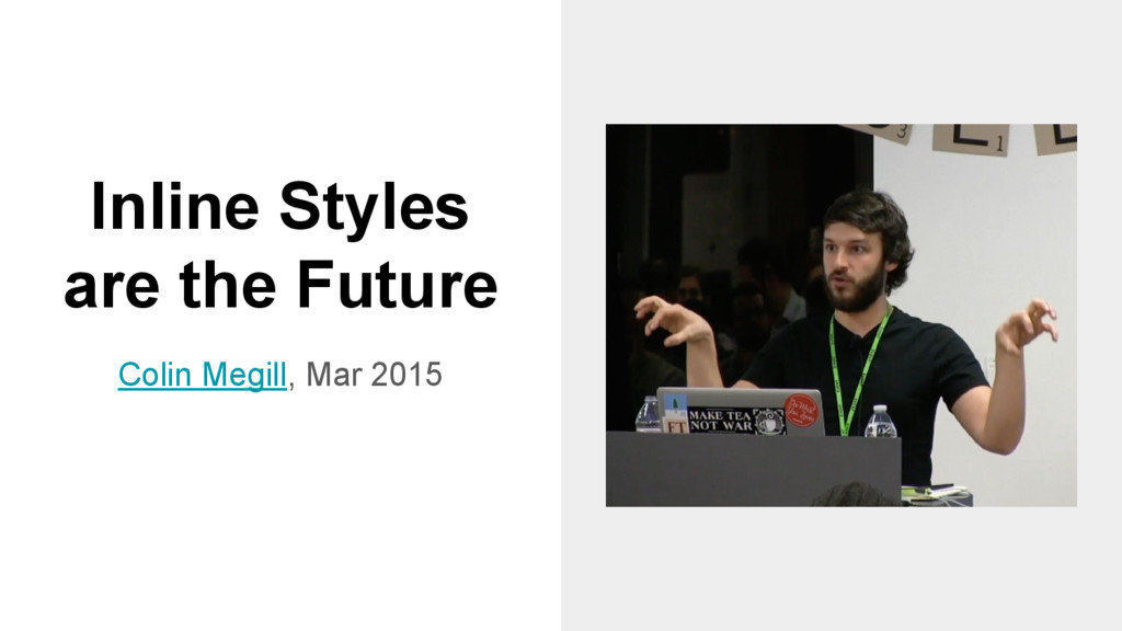
Talking about inline styles is always hard and there are still a lot of unanswered questions, like: 'are you kidding me?'.
I'll try to give you the key to enter the magical world of #CSSinJS (or to stay away from it forever).

Michele Bertoli

October 30, 2015
Tweet

More Decks by Michele Bertoli

Other Decks in Programming

Transcript

  1. Inline Styles
    @MicheleBertoli

    View Slide

  2. Front End Developer at YPlan
    Member of WEBdeBS
    Follow me @MicheleBertoli
    Michele Bertoli

    View Slide

  3. Badmouthing CSS has the unfortunate side effect of driving
    entire communities away from React. Part of me wonders if
    this is on purpose.
    - Mark Dalgleish

    View Slide

  4. Survey
    JSX
    from 2.71 to 4.36 (+61%)
    Inline Styles
    from 2.55 to 3.08 (+21%)

    View Slide

  5. Mindset
    - Give it five minutes
    - Unlearn everything
    - Components

    View Slide

  6. History

    View Slide

  7. React: CSS in
    JS
    Christopher Chedeau, Nov 2014

    View Slide

  8. React: CSS in JS
    - Global Namespace
    - Dependencies
    - Dead Code Elimination
    - Minification
    - Sharing Constants
    - Non-deterministic Resolution
    - Isolation

    View Slide

  9. Inline Styles
    are the Future
    Colin Megill, Mar 2015

    View Slide

  10. Inline Styles are the Future
    - Modularization
    - Computation & 
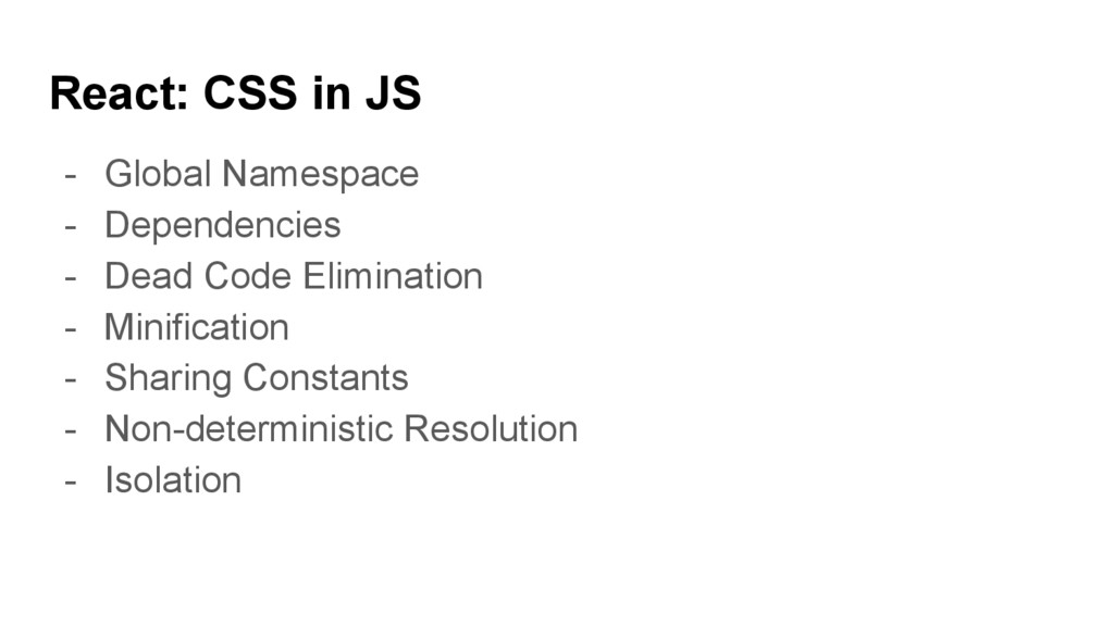
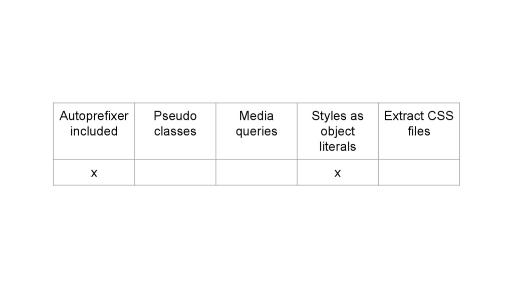
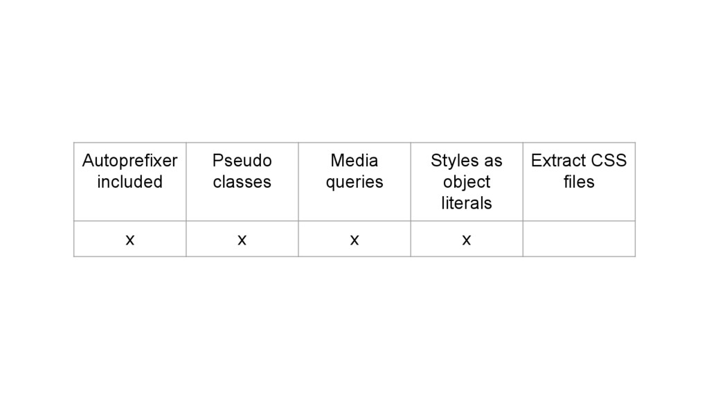
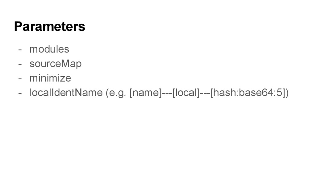
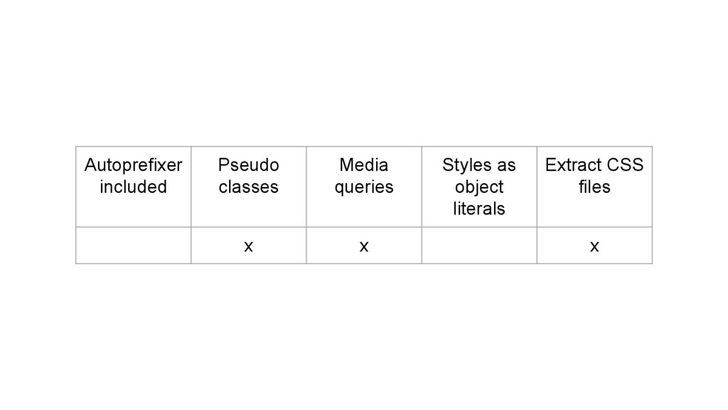
State
    - Explicit Modifiers
    - Support for pseudo elements and browser states
    - Support for media queries
    - Progressive Enhancement
    - Dead code elimination & Minification
    - Large teams / maintainability

    View Slide

  11. The End of
    Global CSS
    Mark Dalgleish, May 2015

    View Slide

  12. The End of Global CSS
    - import styles from './MyComponent.css';
    - Local scope

    View Slide

  13. JavaScript
    Style Sheets
    (JSSS)
    Netscape Communications
    Corporation, Aug 1996

    View Slide

  14. JavaScript Style Sheets (JSSS)
    h1 { font-size: 20pt; }
    document.tags.H1.fontSize = "20pt";
    with (tags.H3) {
    color = "green";
    }

    View Slide

  15. Inline Styles

    View Slide

  16. React
    const divStyle = {
    color: 'white',
    backgroundImage: 'url(' + 
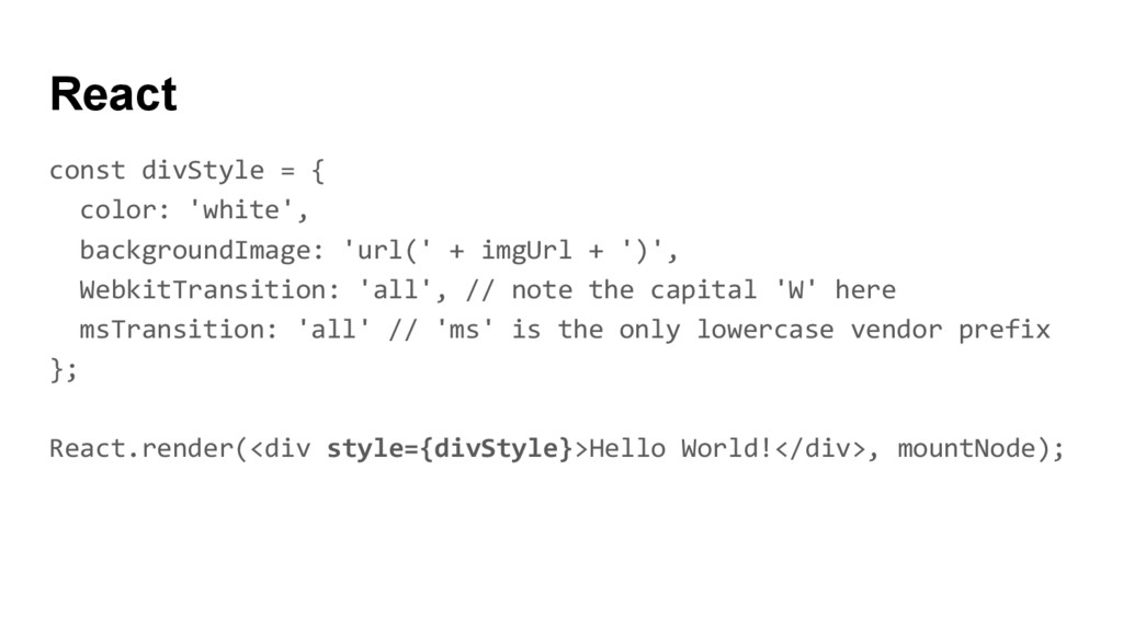
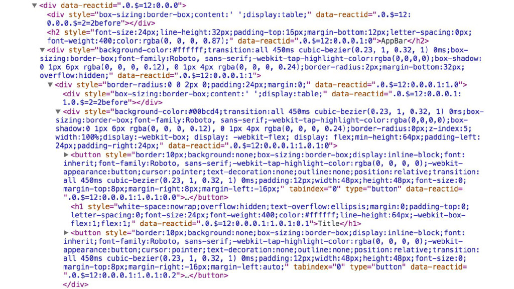
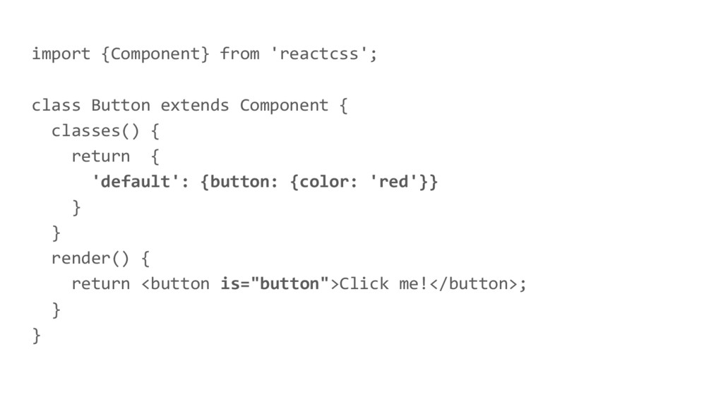
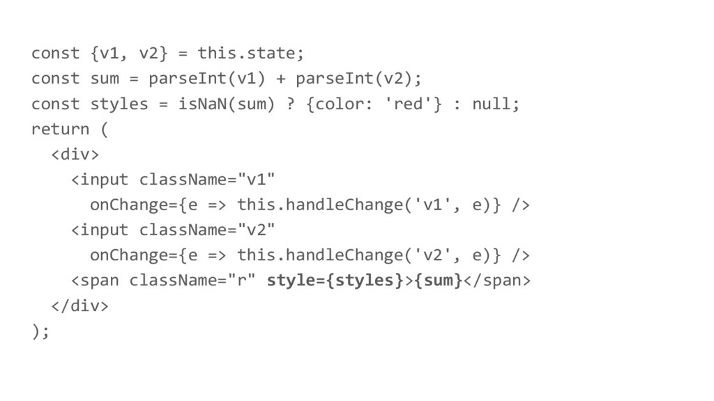
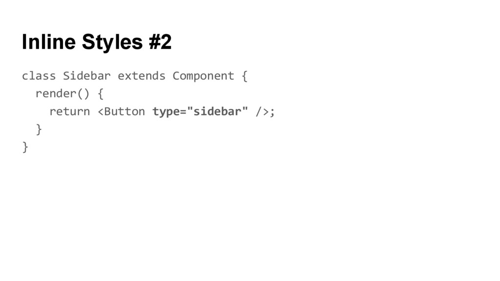
imgUrl + ')',
    WebkitTransition: 'all', // note the capital 'W' here
    msTransition: 'all' // 'ms' is the only lowercase vendor prefix
    };
    React.render(Hello World!, mountNode);

    View Slide

  17. Can your Style Sheets do this? :)

    View Slide

  18. Recompute
    handleChange(e) {
    this.setState({number: e.target.value});
    }
    render() {
    const styles = {fontSize: this.state.number};
    return (
    value={this.state.number} onChange={this.handleChange} />
    );
    }

    View Slide

  19. Problems
    - Pseudo classes/elements
    - Media queries
    - Style fallbacks
    - Animations
    - !important
    - Separation of concerns
    - Debugging
    - Performance?

    View Slide

  20. View Slide

  21. Inline Styles #forreal
    - Uniqlo (US - mobile)

    View Slide

  22. CSS in JS

    View Slide

  23. View Slide

  24. React Inline
    Transform inline styles
    defined in JavaScript
    modules into static CSS
    code and class names so
    they become available to,
    e.g. the `className` prop
    of React elements.
    martinandert/react-inline

    View Slide

  25. import StyleSheet from 'react-inline';
    const styles = StyleSheet.create({
    button: {color: 'red',
    ':hover': {color: 'green'}
    }
    });
    class Button extends Component {
    render() {
    return Click me!;
    }
    }

    View Slide

  26. $ react-inline-extract
    --vendor-prefixes
    --compress-class-names
    --minify
    --bundle ../public/bundle.css
    --babelize
    ./src
    ./tmp
    CLI

    View Slide

  27. const styles = {
    button: "_0"
    };
    class Button extends Component {
    render() {
    return Click me!;
    }
    }
    Component

    View Slide

  28. ._0{color:red}._0:hover{color:green}
    CSS

    View Slide

  29. Autoprefixer
    included
    Pseudo
    classes
    Media
    queries
    Styles as
    object
    literals
    Extract CSS
    files
    x x x x x

    View Slide

  30. ReactCSS Bringing Classes to Inline
    Styles.
    casesandberg/reactcss

    View Slide

  31. React CSS
    - "Pop" classes on and off
    - Keep styles in one place
    - Simple to attach to elements

    View Slide

  32. import {Component} from 'reactcss';
    class Button extends Component {
    classes() {
    return {
    'default': {button: {color: 'red'}}
    }
    }
    render() {
    return Click me!;
    }
    }

    View Slide


  33. Click me!
    Default

    View Slide

  34. import {Component} from 'reactcss';
    class Button extends Component {
    classes() {
    return {
    'default': {button: {color: 'red'}},
    'disabled': {button: {opacity: 0.5}}
    }
    }
    render() {
    return Click me!;
    }
    }

    View Slide


  35. Click me!
    Disabled

    View Slide

  36. Activating classes
    classes() {
    // This is activated by default
    'default': { … },
    // this.props.disabled === true
    'disabled': { … },
    // this.props.foo === 'bar'
    'foo-bar': { … }
    }

    View Slide

  37. Autoprefixer
    included
    Pseudo
    classes
    Media
    queries
    Styles as
    object
    literals
    Extract CSS
    files
    x x

    View Slide

  38. View Slide

  39. Radium
    Radium is a set of tools to
    manage inline styles on
    React elements. It gives
    you powerful styling
    capabilities without CSS.
    FormidableLabs/radium

    View Slide

  40. Features
    - Conceptually simple extension of normal inline styles
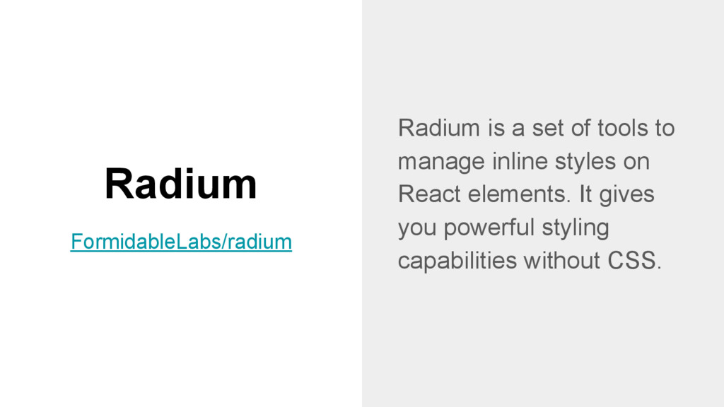
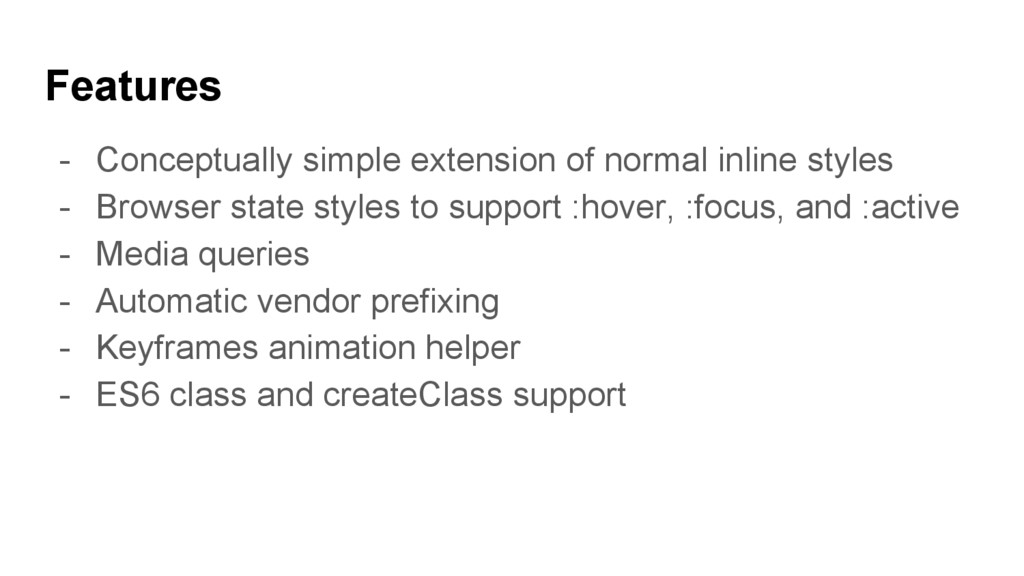
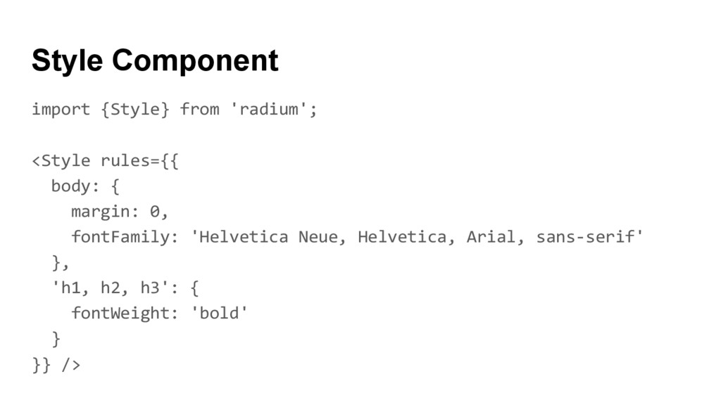
    - Browser state styles to support :hover, :focus, and :active
    - Media queries
    - Automatic vendor prefixing
    - Keyframes animation helper
    - ES6 class and createClass support

    View Slide

  41. const styles = {
    button: {
    color: 'red',
    ':hover': {
    color: 'green'
    }
    }
    };
    Styles

    View Slide

  42. import Radium from 'radium';
    @Radium
    class Button extends Component {
    render() {
    return Click me!;
    }
    }
    Component

    View Slide

  43. Click me!
    Click me!
    Output

    View Slide

  44. How does Radium work?
    Add handlers to props if interactive 
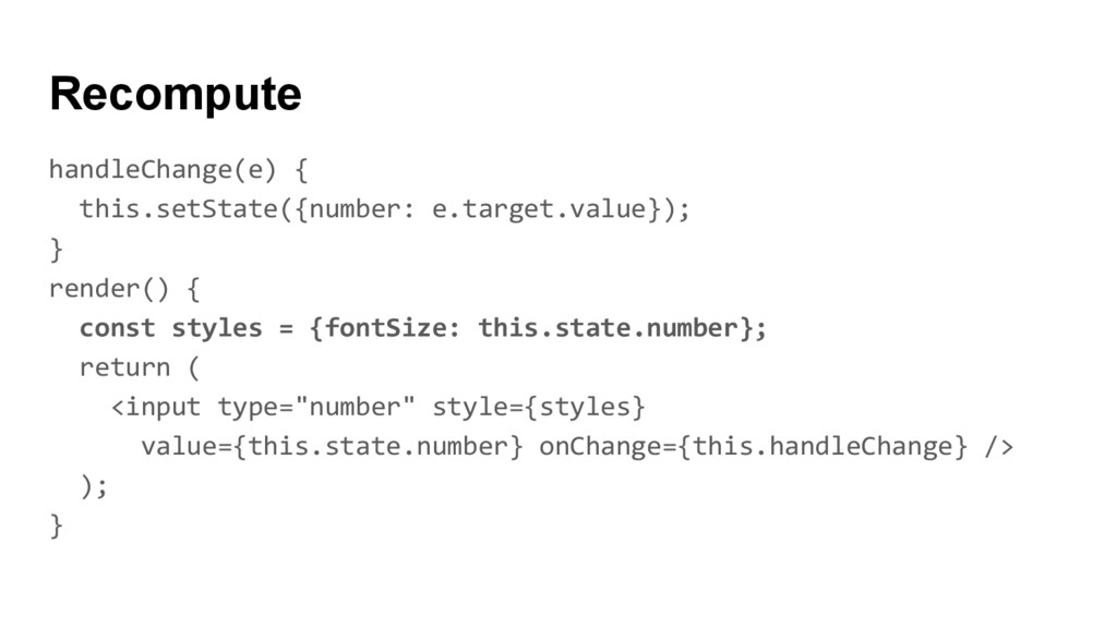
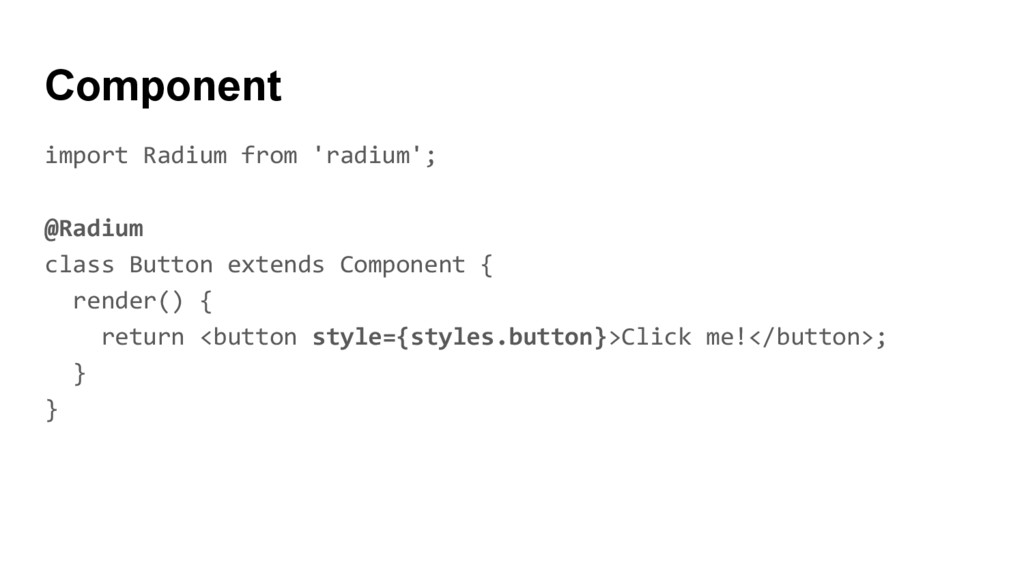
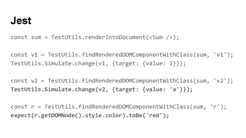
styles are specified, e.g.
    onMouseEnter for :hover, wrapping existing handlers if
    necessary.
    If any of the handlers are triggered, e.g. by hovering, Radium
    calls setState to update a Radium-specific field on the
    components state object.

    View Slide

  45. Animations
    const pulseKeyframes = Radium.keyframes({
    '0%': {width: '10%'},
    '50%': {width: '50%'},
    '100%': {width: '10%'},
    });
    const styles = {
    animation: `${pulseKeyframes} 3s ease 0s infinite`,
    };

    View Slide

  46. import {Style} from 'radium';
    body: {<br/>margin: 0,<br/>fontFamily: 'Helvetica Neue, Helvetica, Arial, sans-serif'<br/>},<br/>'h1, h2, h3': {<br/>fontWeight: 'bold'<br/>}<br/>}} /><br/>Style Component<br/>

    View Slide

  47. Flash of Incorrectly Styled Content (FISC)
    {
    color: 'red',
    '@media (max-width: 500px)': {
    color: 'green'
    }
    }
    Click me!

    View Slide

  48. Autoprefixer
    included
    Pseudo
    classes
    Media
    queries
    Styles as
    object
    literals
    Extract CSS
    files
    x x x x

    View Slide

  49. View Slide

  50. A CSS Module is a CSS
    file in which all class
    names and animation
    names are scoped locally
    by default.
    CSS Modules
    css-modules/css-modules

    View Slide

  51. CSS
    .common {
    color: red;
    }

    View Slide

  52. React
    import React from 'react';
    import styles from './button.css';
    const Button = React.createClass({
    render() {
    return Click me!;
    }
    });

    View Slide

  53. Output
    Click me!;

    View Slide

  54. CSS Loader
    module.exports = {
    module: {
    loaders: [
    { test: /\.css$/, loader: "style-loader!css-loader" },
    ]
    }
    };

    View Slide

  55. Parameters
    - modules
    - sourceMap
    - minimize
    - localIdentName (e.g. [name]---[local]---[hash:base64:5])

    View Slide

  56. BEM
    .button {
    color: red;
    }
    .button--disabled {
    opacity: 0.5;
    }
    Click me!

    View Slide

  57. SASS
    .button {
    color: red;
    }
    .button--disabled {
    @extends .button;
    opacity: 0.5;
    }
    Click me!

    View Slide

  58. Composition
    .common {
    color: red;
    }
    .disabled {
    composes: common;
    opacity: 0.5;
    }

    View Slide

  59. React
    import React from 'react';
    import styles from './button.css';
    const Button = React.createClass({
    render() {
    return Click me!;
    }
    });

    View Slide

  60. Output
    >Click me!;

    View Slide

  61. Dependencies
    .common {
    color: red;
    }
    .disabled {
    composes: common;
    composes: small from './typography.css';
    opacity: 0.5;
    }

    View Slide

  62. Output
    Click me!;

    View Slide

  63. Exceptions
    :global switches to global scope for the current selector.

    View Slide

  64. CSS Modules disadvantages
    - You have to use camelCase CSS 
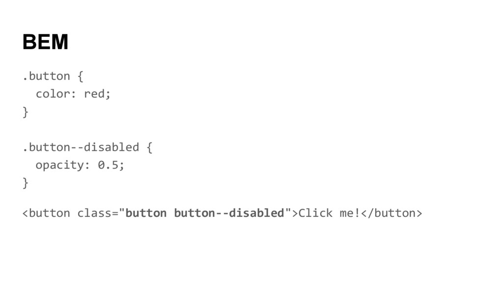
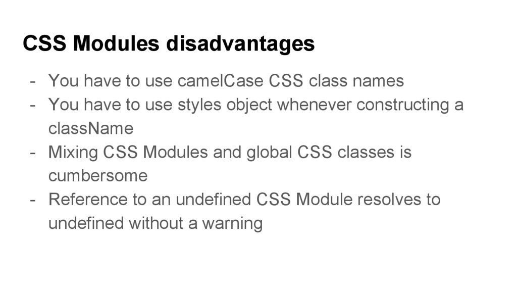
class names
    - You have to use styles object whenever constructing a
    className
    - Mixing CSS Modules and global CSS classes is
    cumbersome
    - Reference to an undefined CSS Module resolves to
    undefined without a warning

    View Slide

  65. React CSS
    Modules React CSS Modules
    implement automatic
    mapping of CSS modules.
    gajus/react-css-modules

    View Slide

  66. import CSSModules from 'react-css-modules';
    import styles from './button.css';
    @CSSModules(styles)
    class Button extends Component {
    render() {
    return Click me!;
    }
    };

    View Slide

  67. Autoprefixer
    included
    Pseudo
    classes
    Media
    queries
    Styles as
    object
    literals
    Extract CSS
    files
    x x x

    View Slide

  68. Application State

    View Slide

  69. Example
    [ ] + [ ] =
    [ 1 ] + [ 2 ] = 3
    [ 1 ] + [ a ] = NaN

    View Slide

  70. const {v1, v2} = this.state;
    const sum = parseInt(v1) + parseInt(v2);
    const styles = isNaN(sum) ? {color: 'red'} : null;
    return (

    onChange={e => this.handleChange('v1', e)} />
    onChange={e => this.handleChange('v2', e)} />
    {sum}

    );

    View Slide

  71. const sum = TestUtils.renderIntoDocument();
    const v1 = TestUtils.findRenderedDOMComponentWithClass(sum, 'v1');
    TestUtils.Simulate.change(v1, {target: {value: 1}});
    const v2 = TestUtils.findRenderedDOMComponentWithClass(sum, 'v2');
    TestUtils.Simulate.change(v2, {target: {value: 2}});
    const r = TestUtils.findRenderedDOMComponentWithClass(sum, 'r');
    expect(r.getDOMNode().textContent).toBe('3');
    Jest

    View Slide

  72. const sum = TestUtils.renderIntoDocument();
    const v1 = TestUtils.findRenderedDOMComponentWithClass(sum, 'v1');
    TestUtils.Simulate.change(v1, {target: {value: 1}});
    const v2 = TestUtils.findRenderedDOMComponentWithClass(sum, 'v2');
    TestUtils.Simulate.change(v2, {target: {value: 'a'}});
    const r = TestUtils.findRenderedDOMComponentWithClass(sum, 'r');
    expect(r.getDOMNode().style.color).toBe('red');
    Jest

    View Slide

  73. FAQ

    View Slide

  74. #1 How are
    designers supposed
    to write CSS in
    JavaScript?

    View Slide

  75. $bg: ();
    @for $i from 0 to $n {
    $a: $i*360deg/$n + $ac;
    $au: if($rev, 360 - $a/1deg, $a/1deg);
    $c: hsl($au + $ac2, 100%, 50%);
    $bg: $bg, radial-gradient(circle at
    $rc*(1 + cos($a)) $rc*(1 + sin($a)),
    rgba($c, $of), rgba($c, 0) 1.25*$rc);
    }
    background: $bg;
    SASS

    View Slide

  76. View Slide

  77. Inline Styles for designers
    - Keys are the camelCased version of the style names
    - Values are strings
    - Commas instead of semicolons
    - Vendor prefixes (other than ms) begin with a capital letter

    View Slide

  78. #2 What if I want to
    change library or
    framework after 14
    months?

    View Slide

  79. Once you’re in, you’re in.
    - Copy and paste
    - No migration tools (write one!)

    View Slide

  80. #3 My button has to
    look different
    according to his
    parent, how can I do
    it?

    View Slide

  81. .button {
    color: red;
    }
    .sidebar .button {
    font-weight: bold;
    }
    CSS

    View Slide

  82. const button = {
    color: red
    };
    class Button extends Component {
    render() {
    const style = Object.assign({}, button, this.props.style);
    return Click me!;
    }
    }
    Inline Styles #1

    View Slide

  83. class Sidebar extends Component {
    render() {
    return ;
    }
    }
    Inline Styles #1

    View Slide

  84. const styles = {
    button: {color: 'red'},
    sidebar: {font-weight: 'bold'}
    };
    class Button extends Component {
    render() {
    const {type} = this.props;
    const style = Object.assign({}, styles.button, styles[type]);
    return Click me!;
    }
    }
    Inline Styles #2

    View Slide

  85. class Sidebar extends Component {
    render() {
    return ;
    }
    }
    Inline Styles #2

    View Slide

  86. .common {
    color: red;
    }
    .sidebar {
    composes: common;
    font-weight: bold;
    }
    CSS Modules

    View Slide

  87. import styles from './button.css';
    class Button extends Component {
    render() {
    const type = this.props.type || 'common';
    return Click me!;
    }
    }
    CSS Modules

    View Slide

  88. class Sidebar extends Component {
    render() {
    return ;
    }
    }
    CSS Modules

    View Slide

  89. The end

    View Slide

  90. - use the right tool, no matter if it breaks the rules
    - inline styles vs local scope
    - appearance vs state
    - have fun :)
    Recap

    View Slide

  91. Any questions?

    View Slide