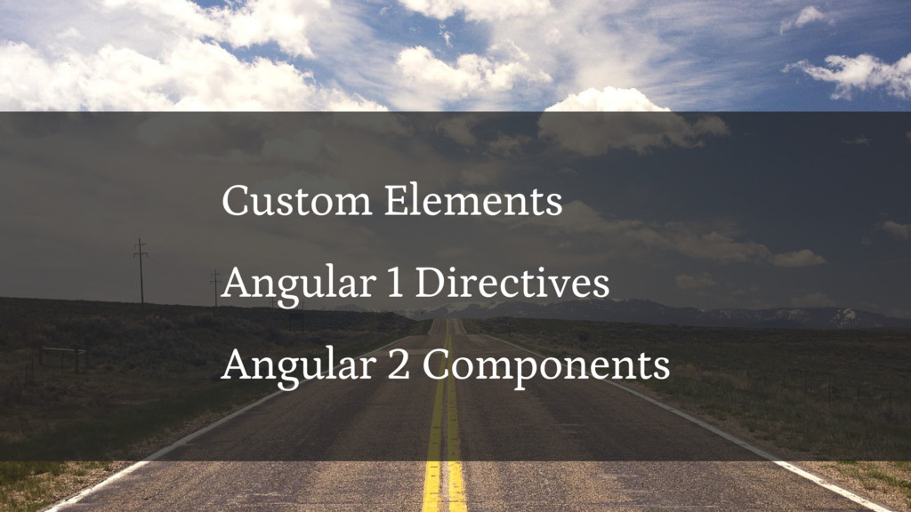
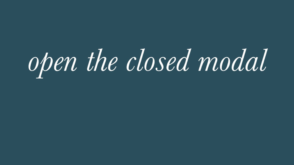
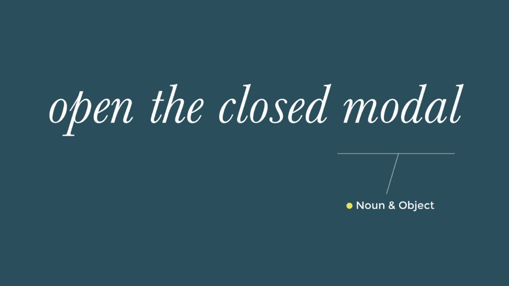
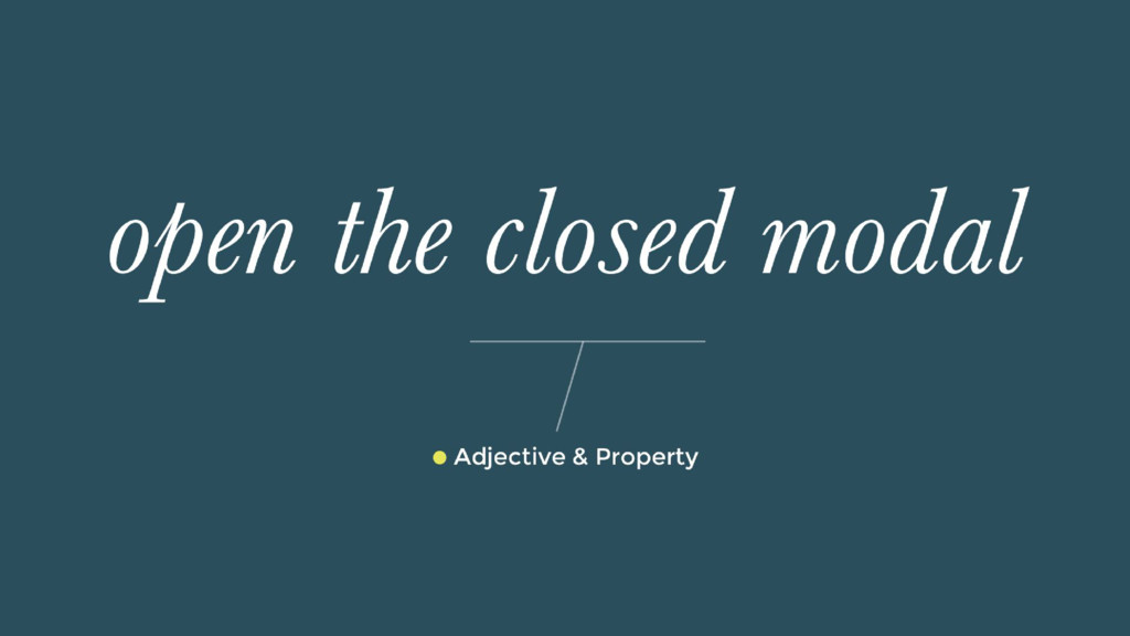
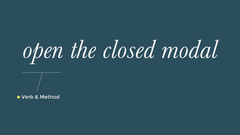
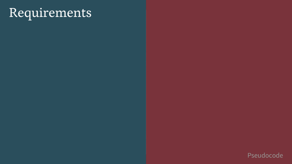
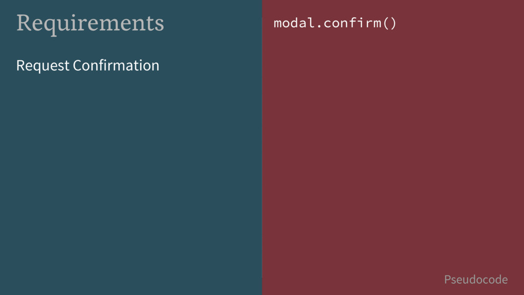
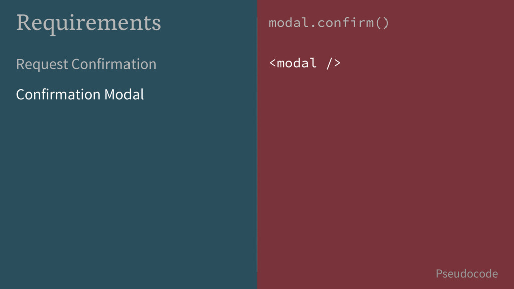
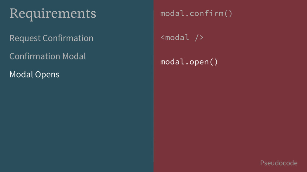
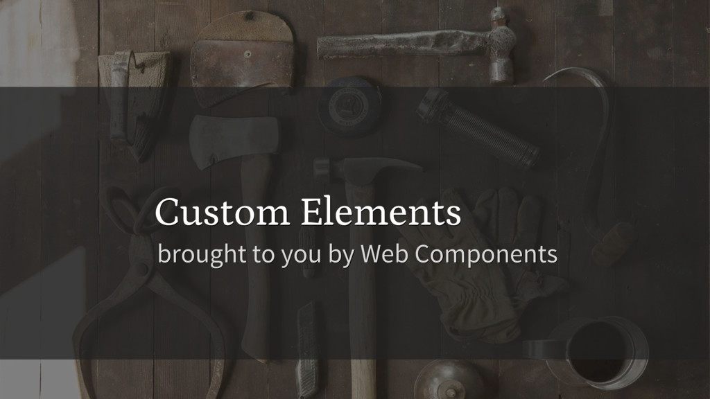
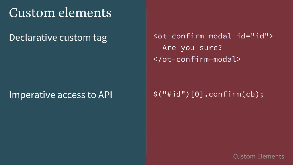
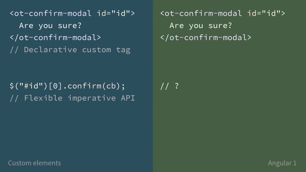
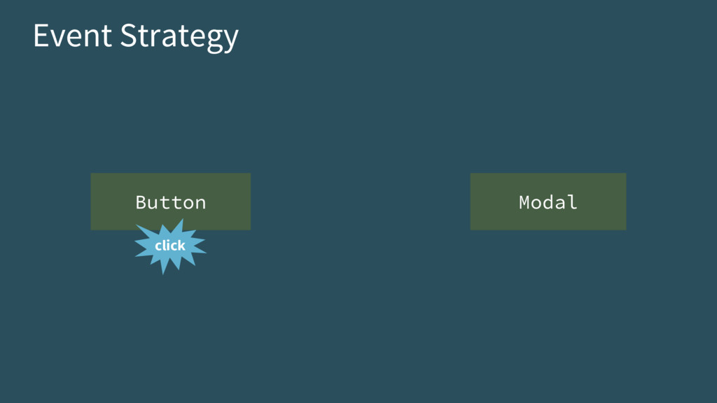
So you’ve embraced architecting your Angular application with reusable components – cheers to you! But you have UI components that need to communicate with each other or expose public methods, and you’re wondering about your options. In this talk, we’ll cover how new web component standards, like Custom Elements, handle this. Next, we’ll walk through how to accomplish it today in Angular 1.x – and bring it all together into what a solution will look like in upcoming Angular 2. Afterwards, you'll know how to design and implement the public HTML and JavaScript interfaces of GUI components.
Talk presented at Angular Connect in October 2015.
 morewry
 line_developers_tw
 ry
ry
 kawaguti
 rymiyamoto
 masaruogura
 oracle4engineer
 seafay
 cmusudakeisuke
 iotengineer22
 amarelo_n24
 kairim0
 palkan
 holman
 kimpetersen
 lindahogenes
 konakalab
 szymonslowik
.png) helenjbeal
helenjbeal
 mojombo
 codingconduct
 moore
moore
 danielanewman
 sferik
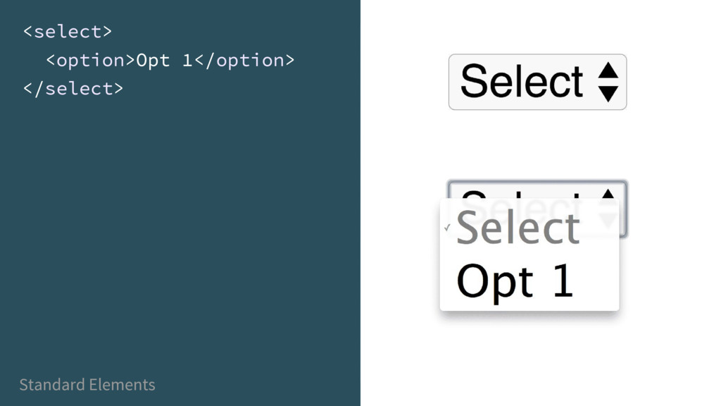
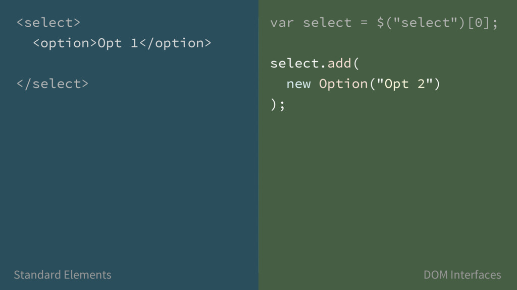
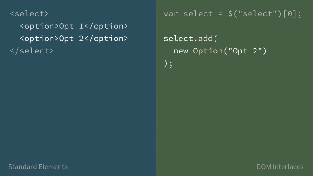
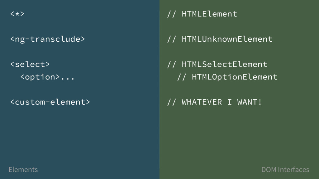
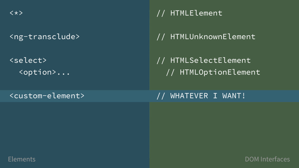
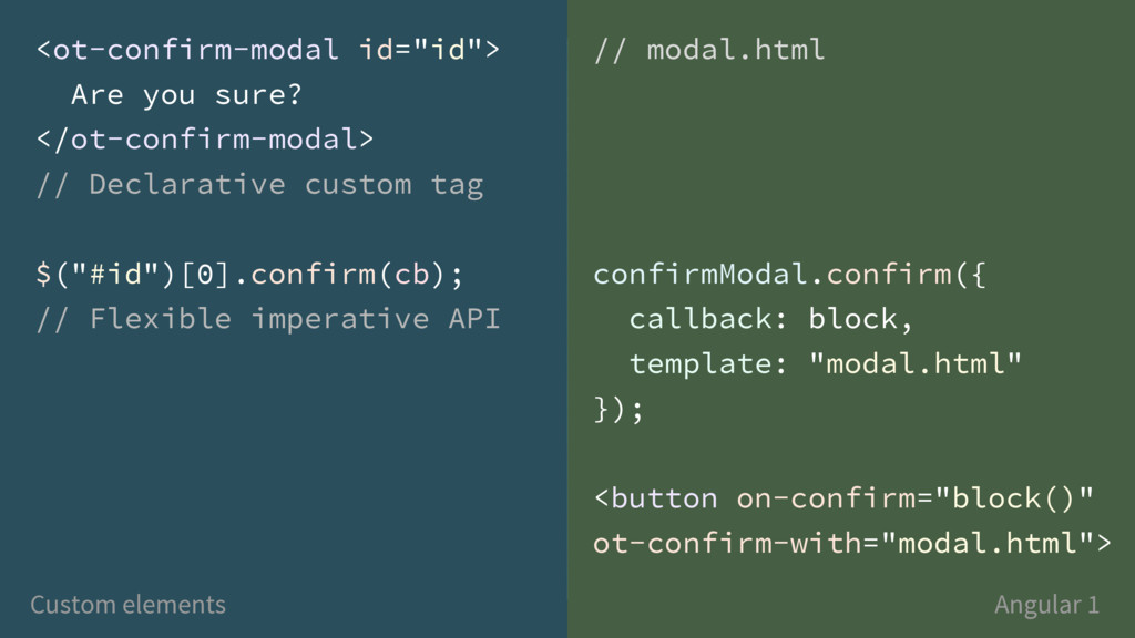
![Standard Elements - DOM Interfaces var select = $("select")[0]; <select>](https://files.speakerdeck.com/presentations/4362da80911f4f49b0f743f462695a01/slide_7.jpg)
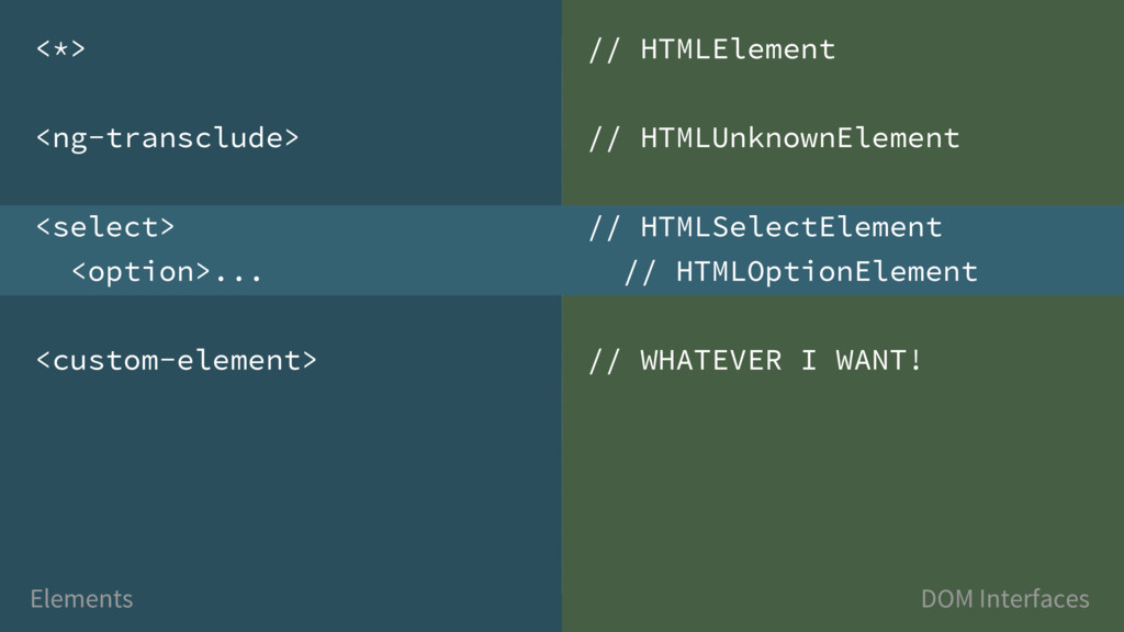
![var select = $("select")[0]; select.options select.options.length // 1 Standard Elements](https://files.speakerdeck.com/presentations/4362da80911f4f49b0f743f462695a01/slide_8.jpg)
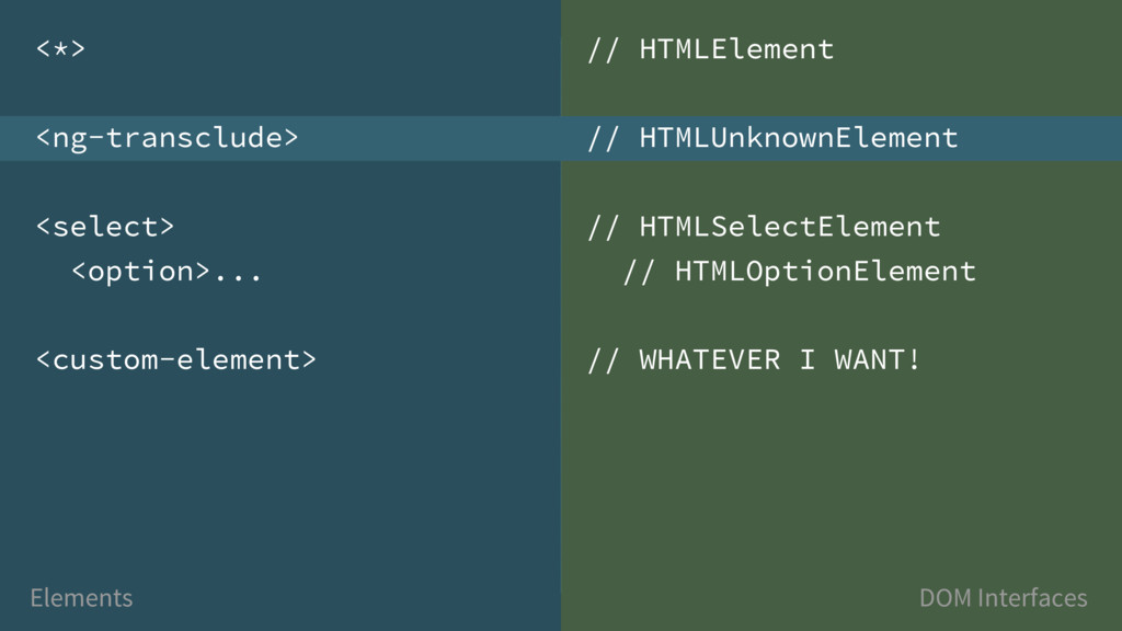
![var select = $("select")[0]; select.options select.options.length // 1 Standard Elements](https://files.speakerdeck.com/presentations/4362da80911f4f49b0f743f462695a01/slide_9.jpg)
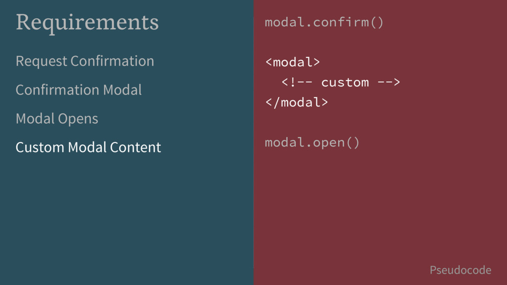
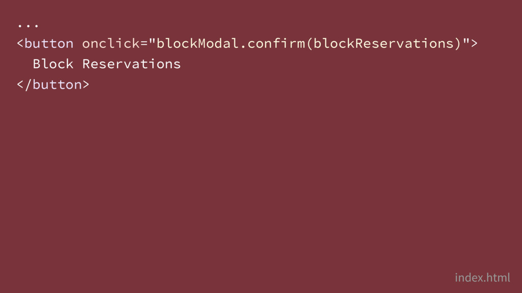
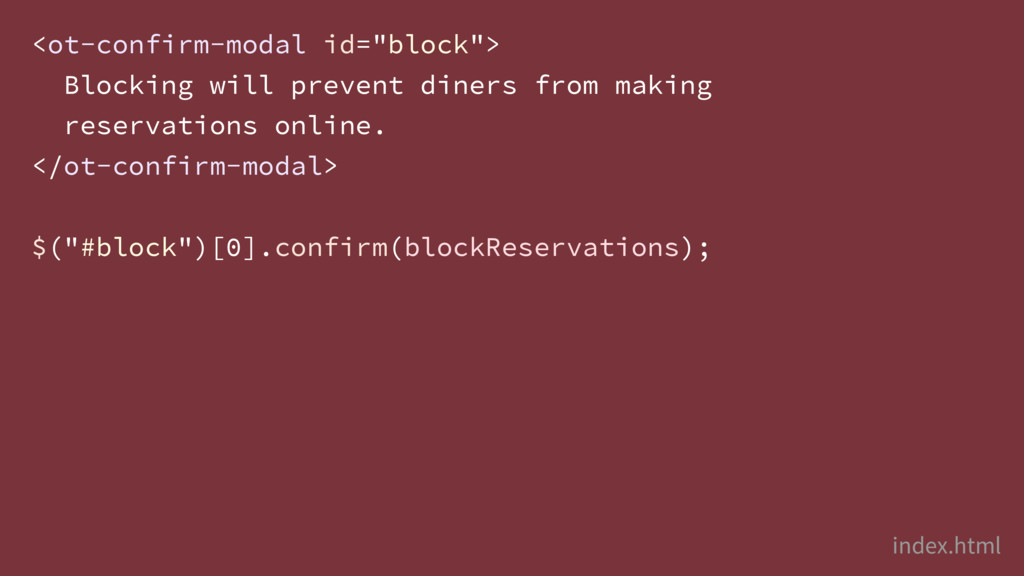
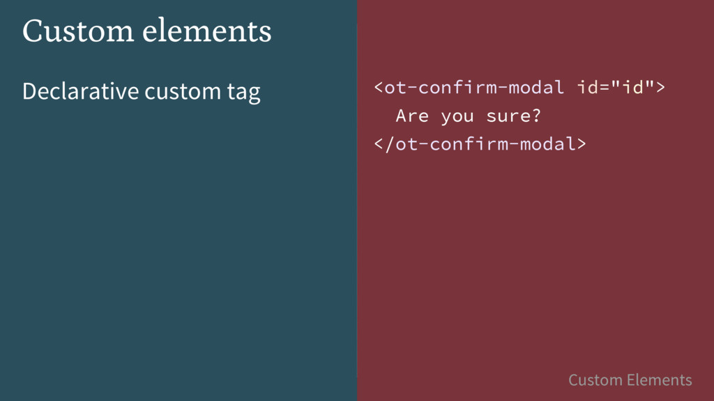
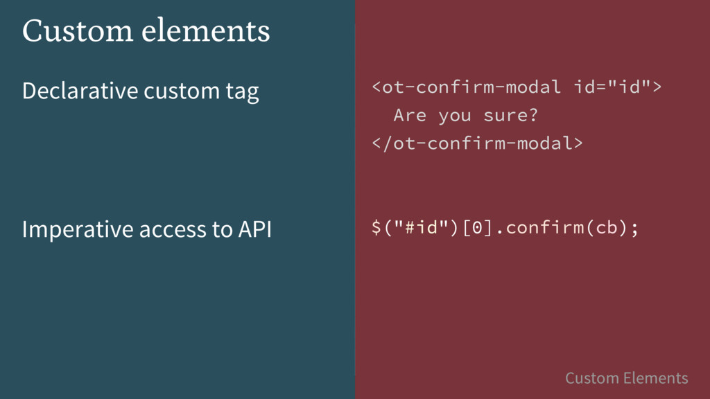
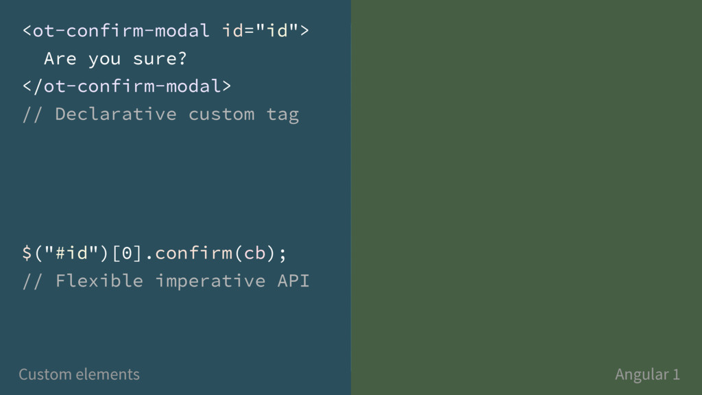
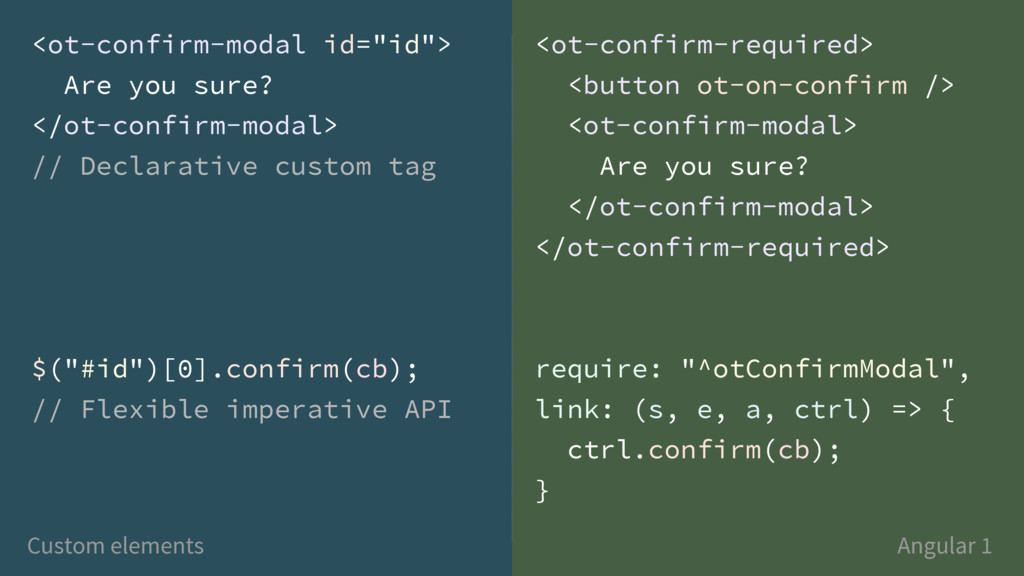
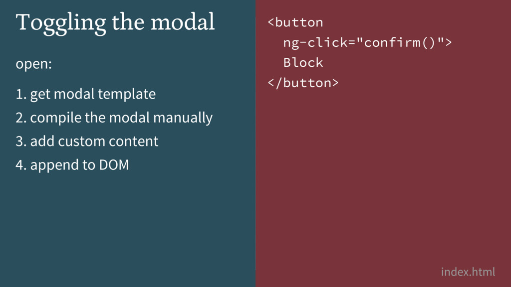
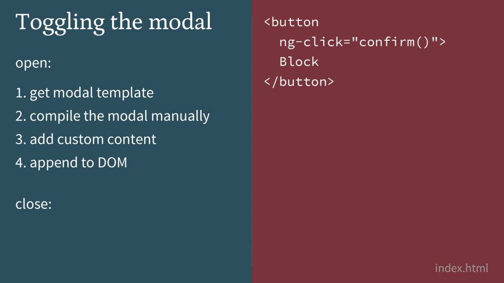
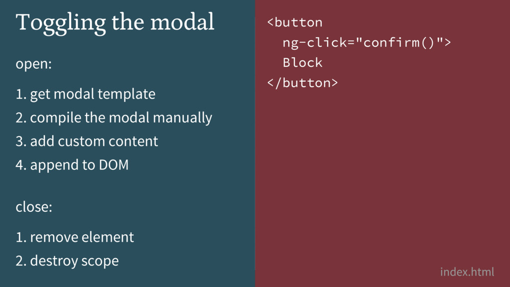
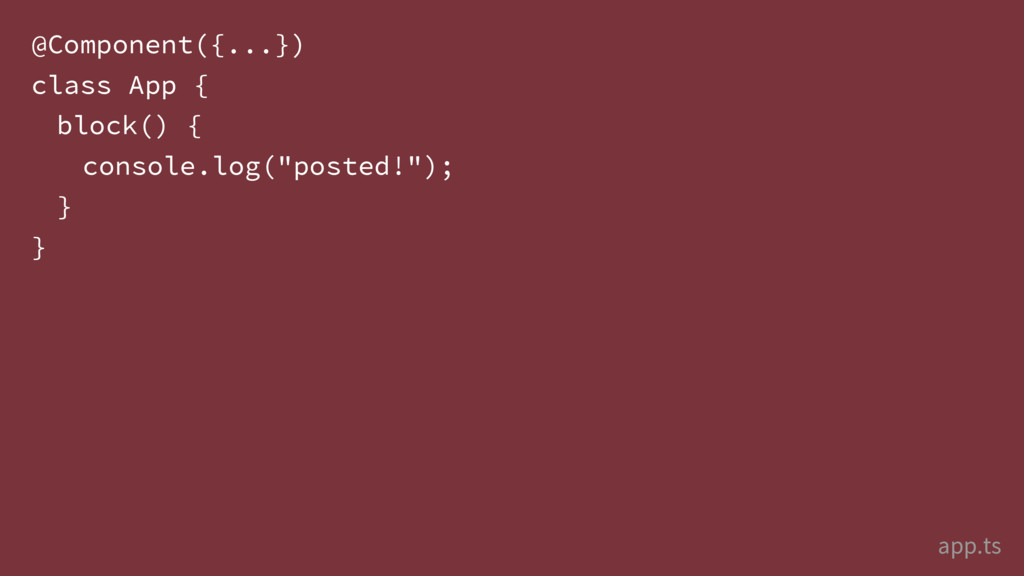
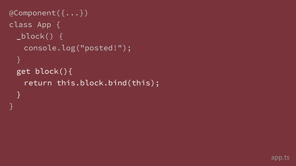
![... var blockModal = $("#block")[0]; // blockModal.confirm() Query DOM -](https://files.speakerdeck.com/presentations/4362da80911f4f49b0f743f462695a01/slide_73.jpg)
![... var blockModal = $("#block")[0]; // blockModal.confirm() Query DOM -](https://files.speakerdeck.com/presentations/4362da80911f4f49b0f743f462695a01/slide_74.jpg)
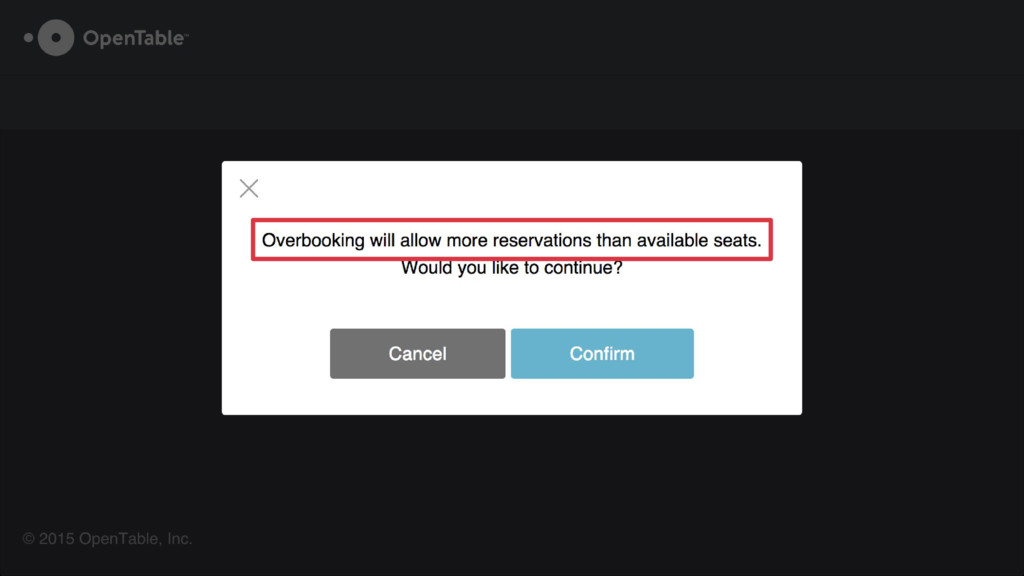
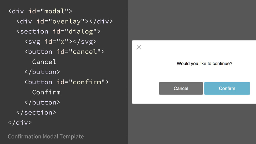
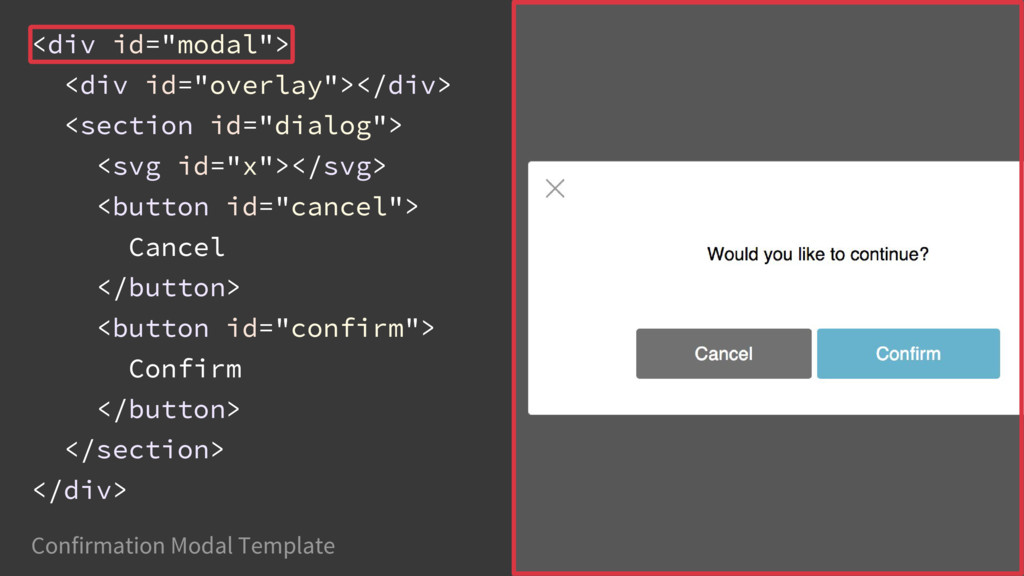
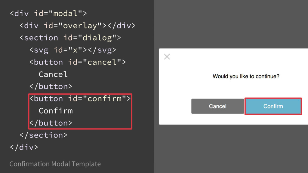
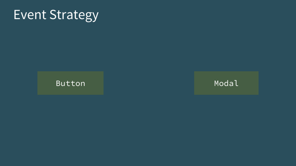
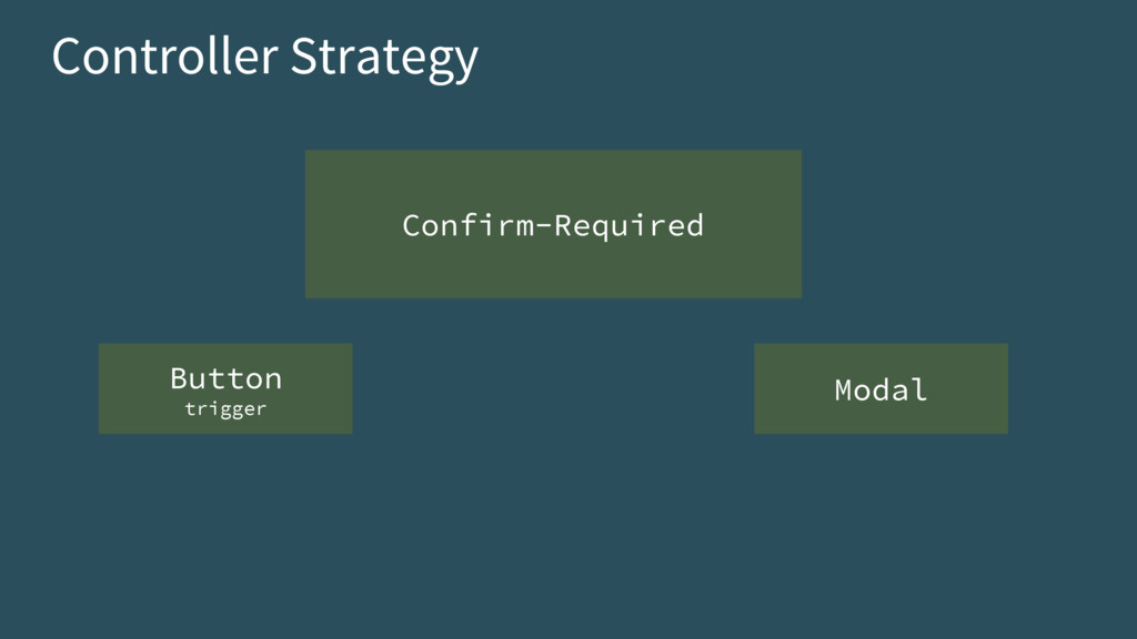
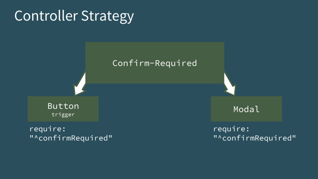
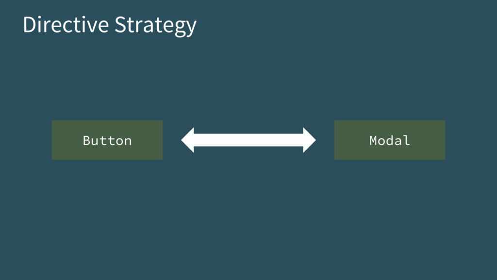
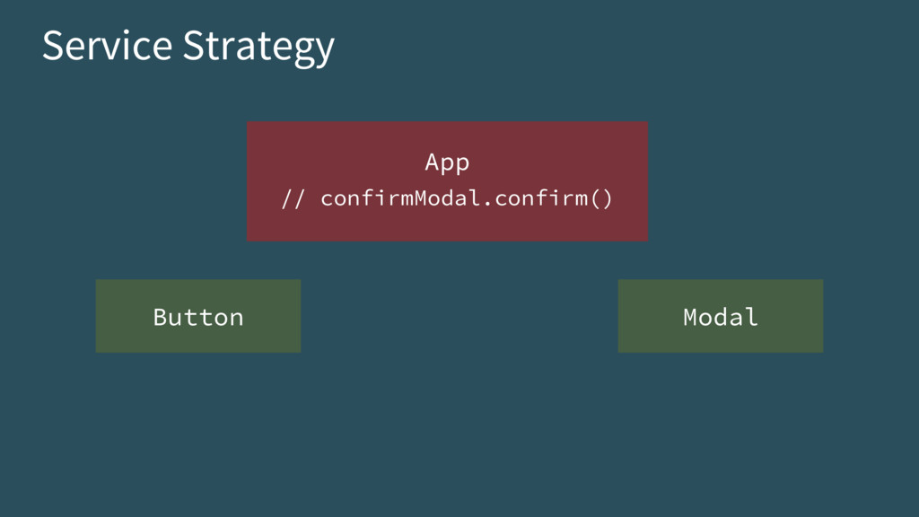
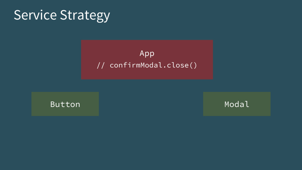
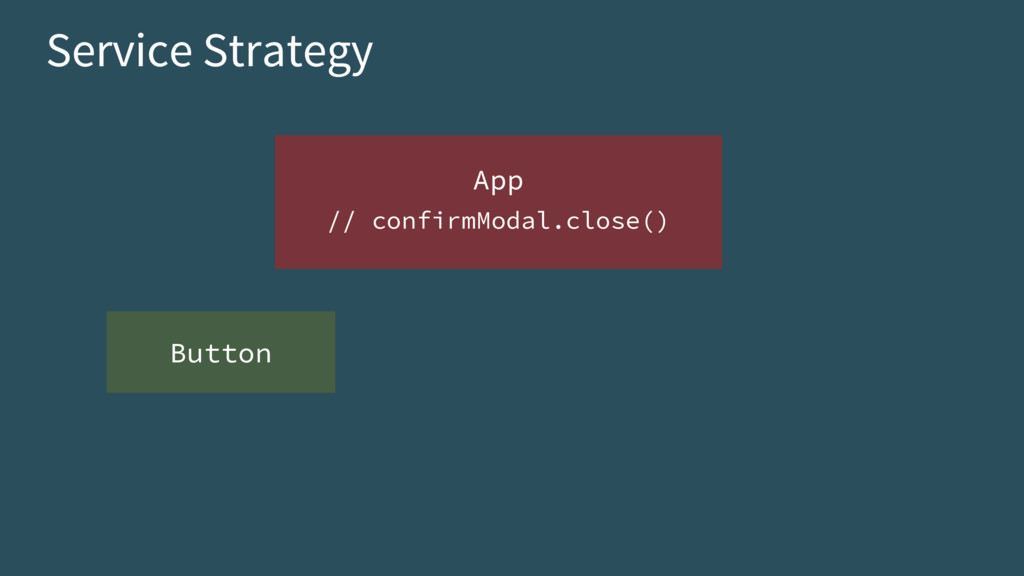
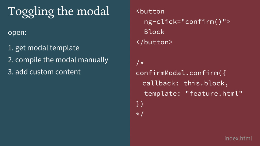
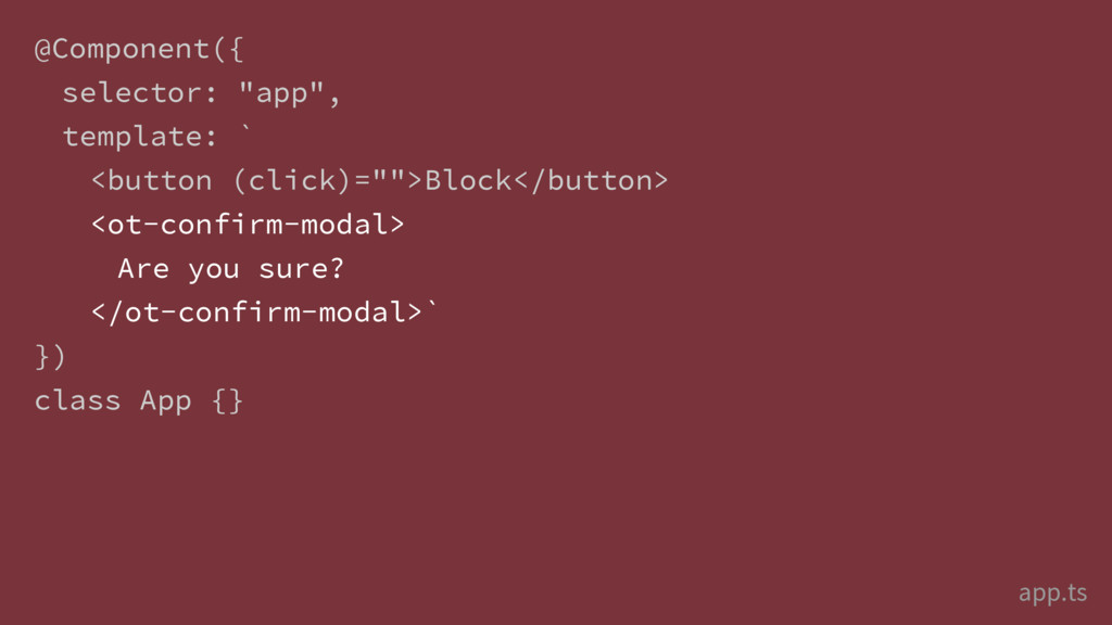
![Service Strategy App ["confirmModal"] Modal Button](https://files.speakerdeck.com/presentations/4362da80911f4f49b0f743f462695a01/slide_123.jpg)
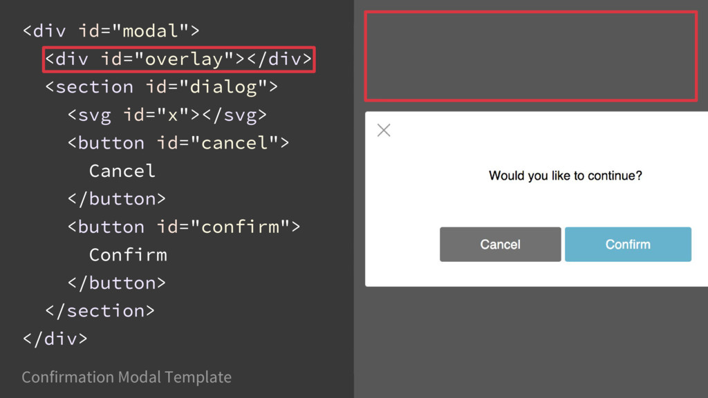
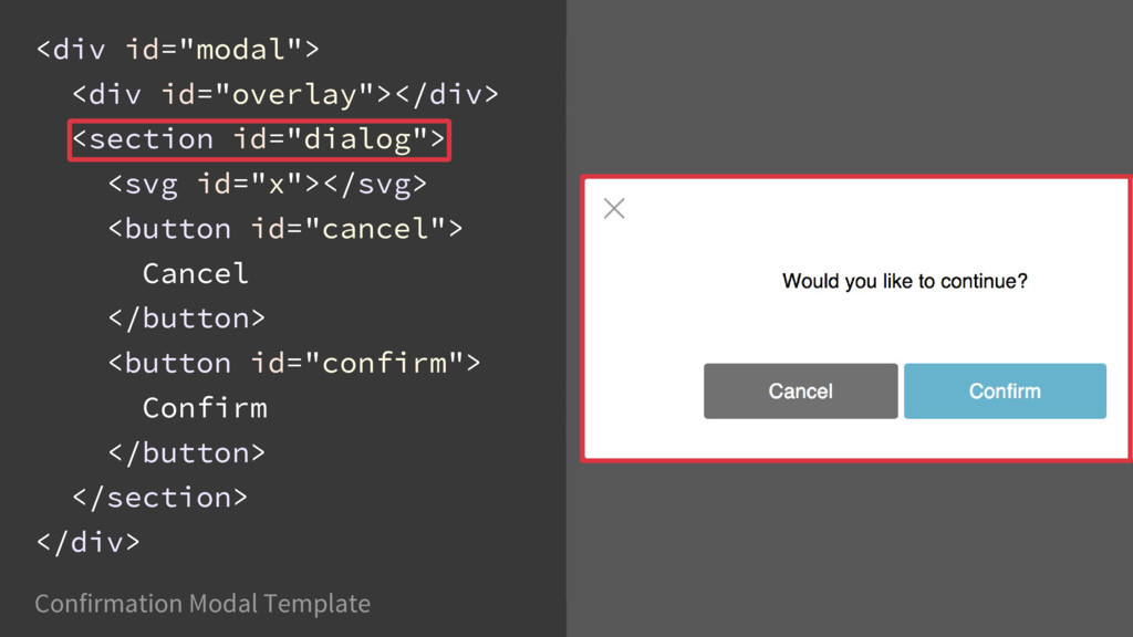
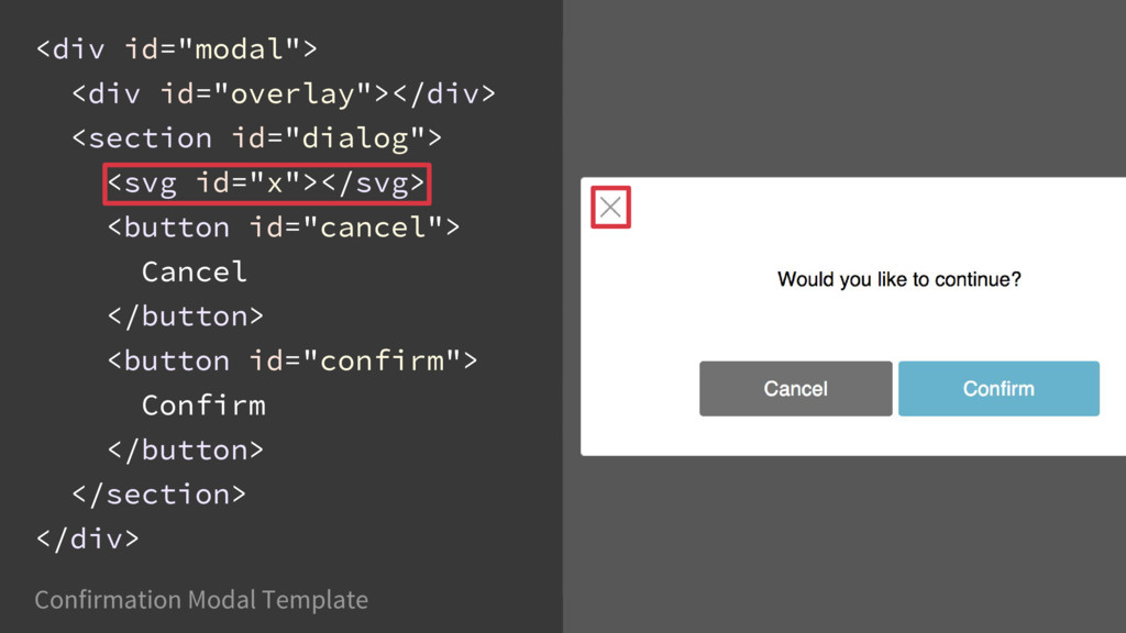
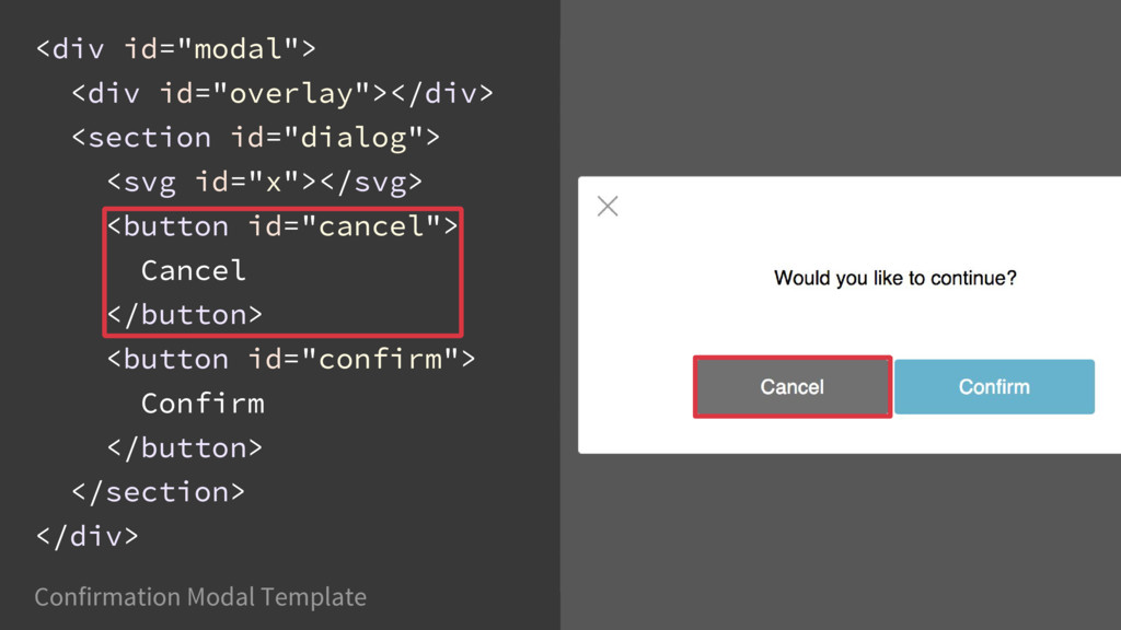
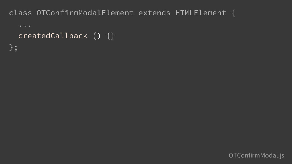
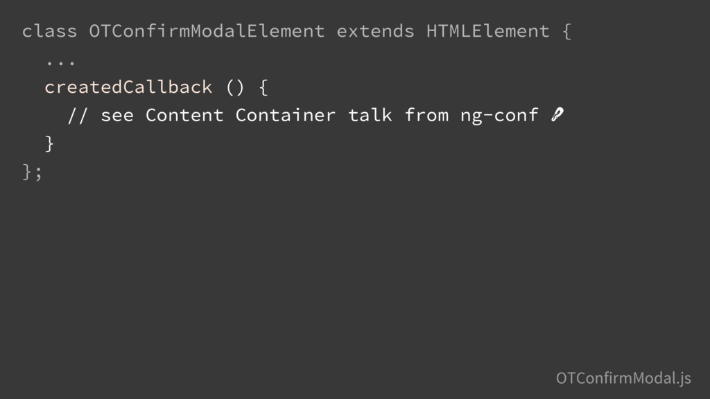
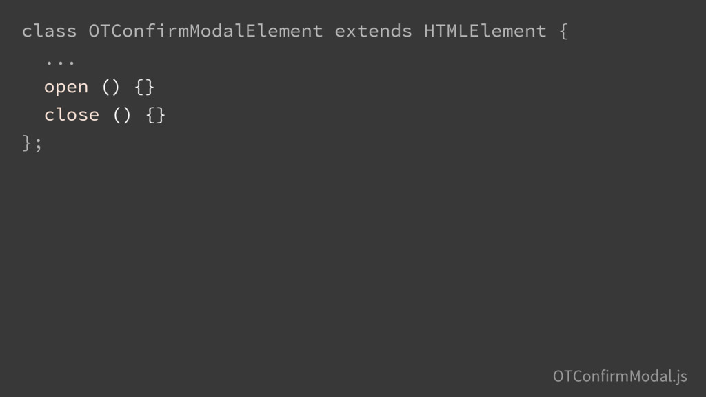
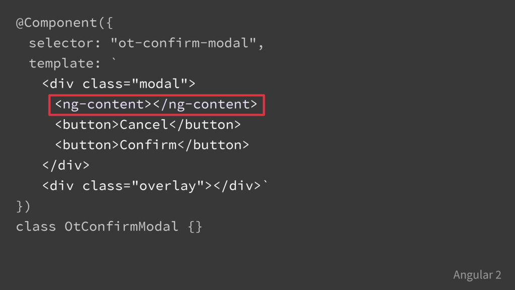
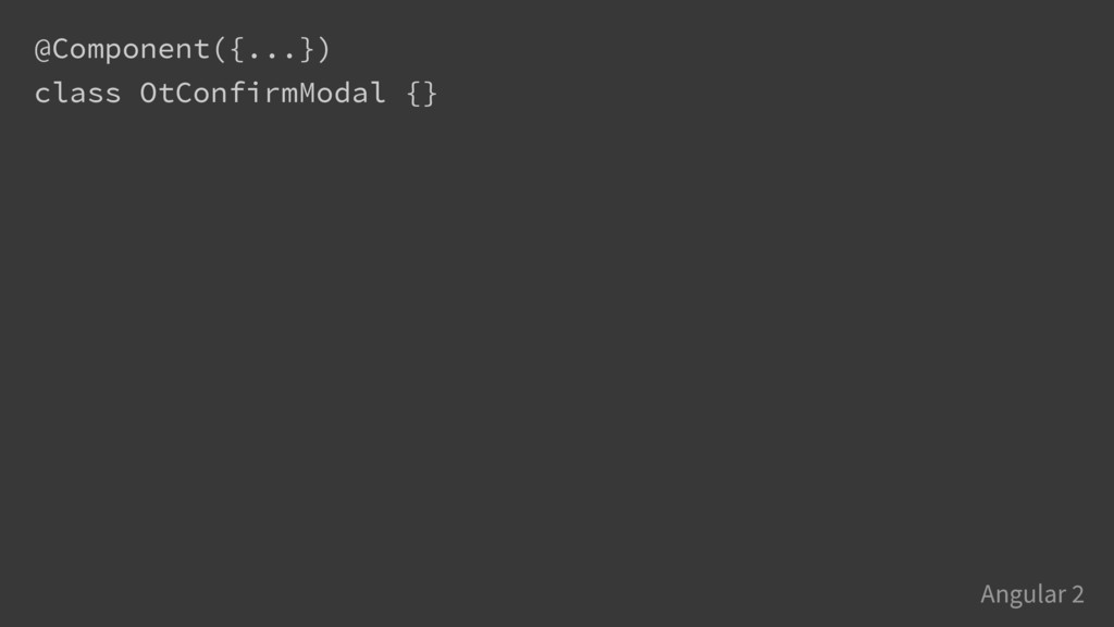
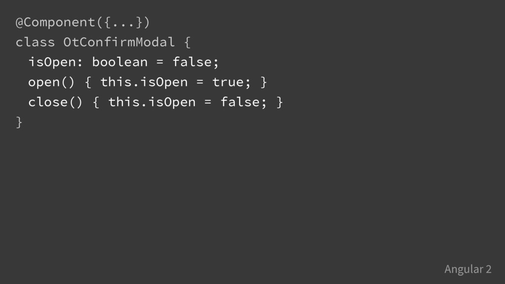
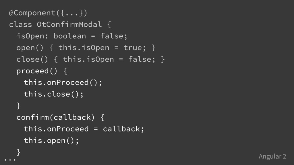
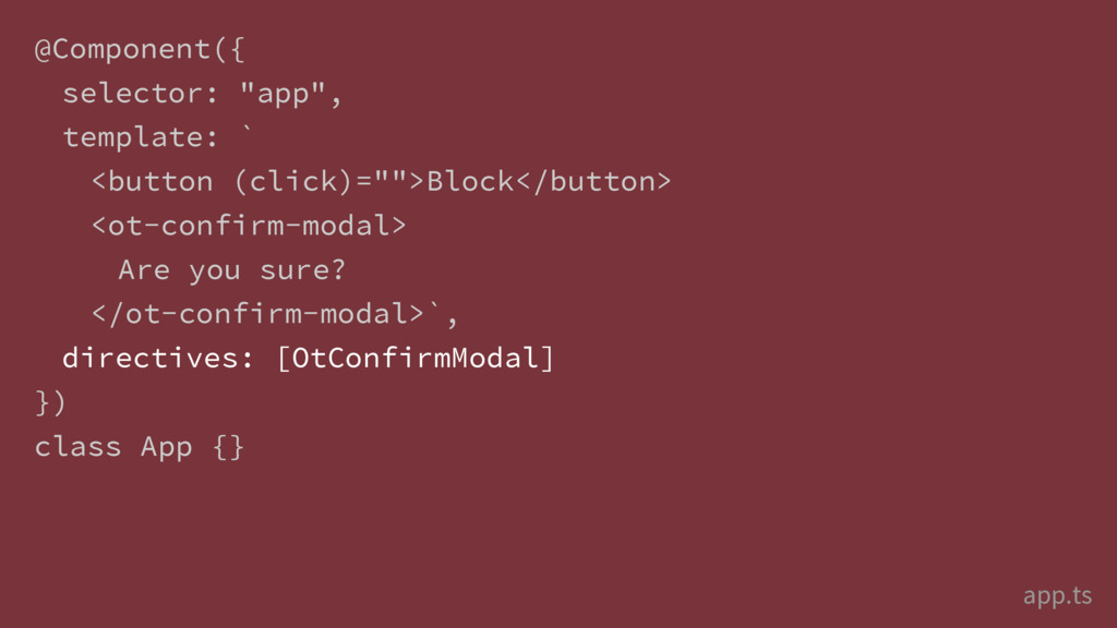
![@Component({ selector: "ot-confirm-modal", template: ` <div class="modal" [hidden]="!isOpen"> <ng-content></ng-content> <button>Cancel</button>](https://files.speakerdeck.com/presentations/4362da80911f4f49b0f743f462695a01/slide_147.jpg)
![@Component({ selector: "ot-confirm-modal", template: ` <div class="modal" [hidden]="!isOpen"> <ng-content></ng-content> <button](https://files.speakerdeck.com/presentations/4362da80911f4f49b0f743f462695a01/slide_148.jpg)
![@Component({ selector: "ot-confirm-modal", template: ` <div class="modal" [hidden]="!isOpen"> <ng-content></ng-content> <button](https://files.speakerdeck.com/presentations/4362da80911f4f49b0f743f462695a01/slide_149.jpg)
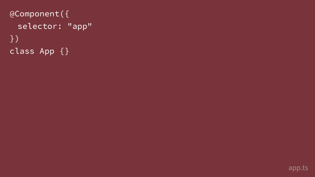
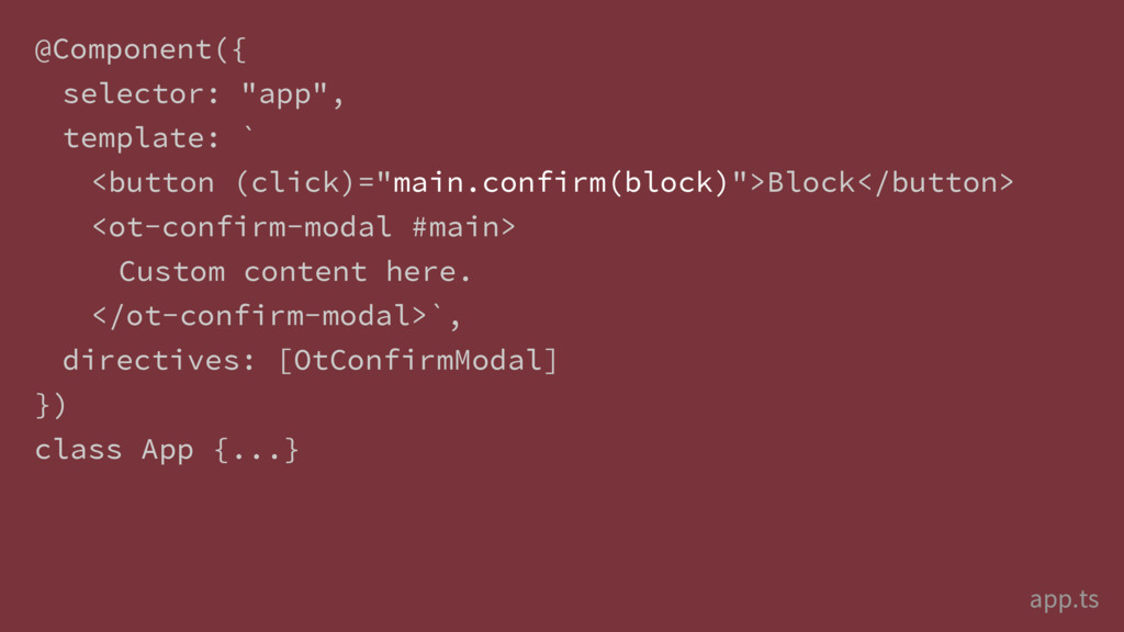
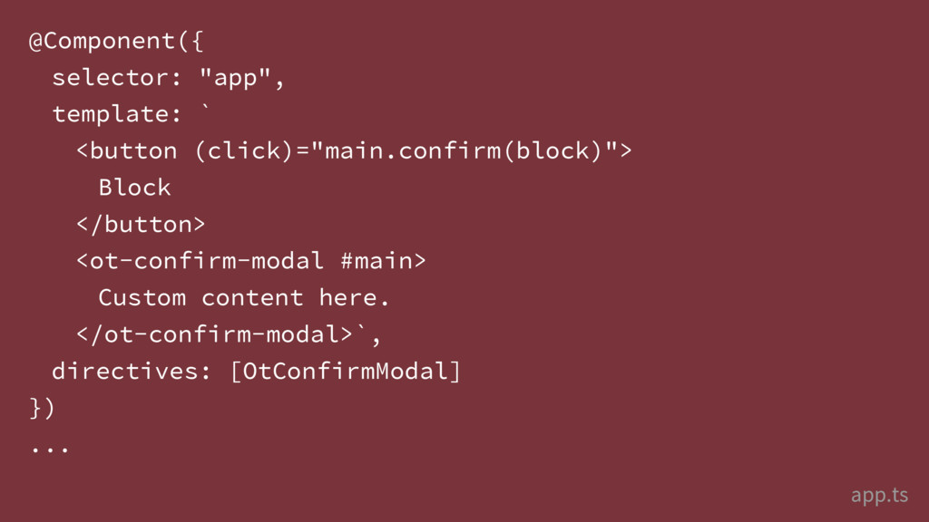
![@Component({ selector: "app", template: ` <button [confirm-with]="main" (confirm)="block()"> Block </button>](https://files.speakerdeck.com/presentations/4362da80911f4f49b0f743f462695a01/slide_167.jpg)
![@Directive({ selector: "[ot-confirm-with]" }) class OtConfirmWith {} Angular 2 scope:](https://files.speakerdeck.com/presentations/4362da80911f4f49b0f743f462695a01/slide_169.jpg)
![@Directive({ selector: "[ot-confirm-with]" }) class OtConfirmWith { @Input("ot-confirm-with") modal: OtConfirmModal;](https://files.speakerdeck.com/presentations/4362da80911f4f49b0f743f462695a01/slide_170.jpg)
![@Directive({ selector: "[ot-confirm-with]" }) class OtConfirmWith { @Input("ot-confirm-with") modal: OtConfirmModal;](https://files.speakerdeck.com/presentations/4362da80911f4f49b0f743f462695a01/slide_171.jpg)
![@Directive({ selector: "[ot-confirm-with]" }) class OtConfirmWith { @Input("ot-confirm-with") modal: OtConfirmModal;](https://files.speakerdeck.com/presentations/4362da80911f4f49b0f743f462695a01/slide_172.jpg)
![@Directive({ selector: "[ot-confirm-with]" }) class OtConfirmWith { @Input("ot-confirm-with") modal: OtConfirmModal;](https://files.speakerdeck.com/presentations/4362da80911f4f49b0f743f462695a01/slide_173.jpg)
![@Directive({ selector: "[ot-confirm-with]" }) class OtConfirmWith { @Input("ot-confirm-with") modal: OtConfirmModal;](https://files.speakerdeck.com/presentations/4362da80911f4f49b0f743f462695a01/slide_174.jpg)
![@Directive({ selector: "[ot-confirm-with]" }) class OtConfirmWith { @Input("ot-confirm-with") modal: OtConfirmModal;](https://files.speakerdeck.com/presentations/4362da80911f4f49b0f743f462695a01/slide_175.jpg)
![@Directive({ selector: "[ot-confirm-with]" }) class OtConfirmWith { @Input("ot-confirm-with") modal: OtConfirmModal;](https://files.speakerdeck.com/presentations/4362da80911f4f49b0f743f462695a01/slide_176.jpg)