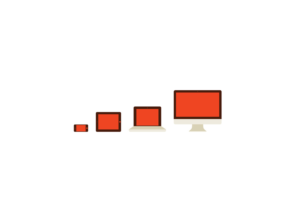
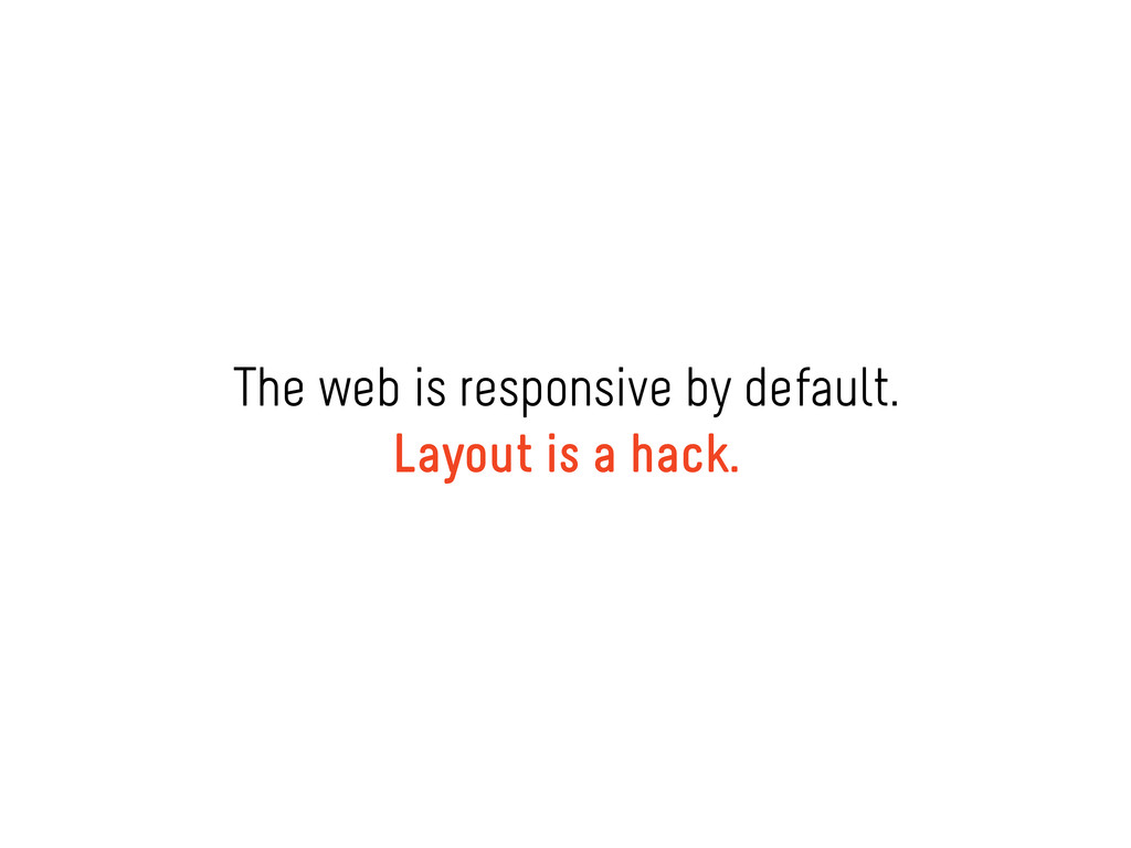
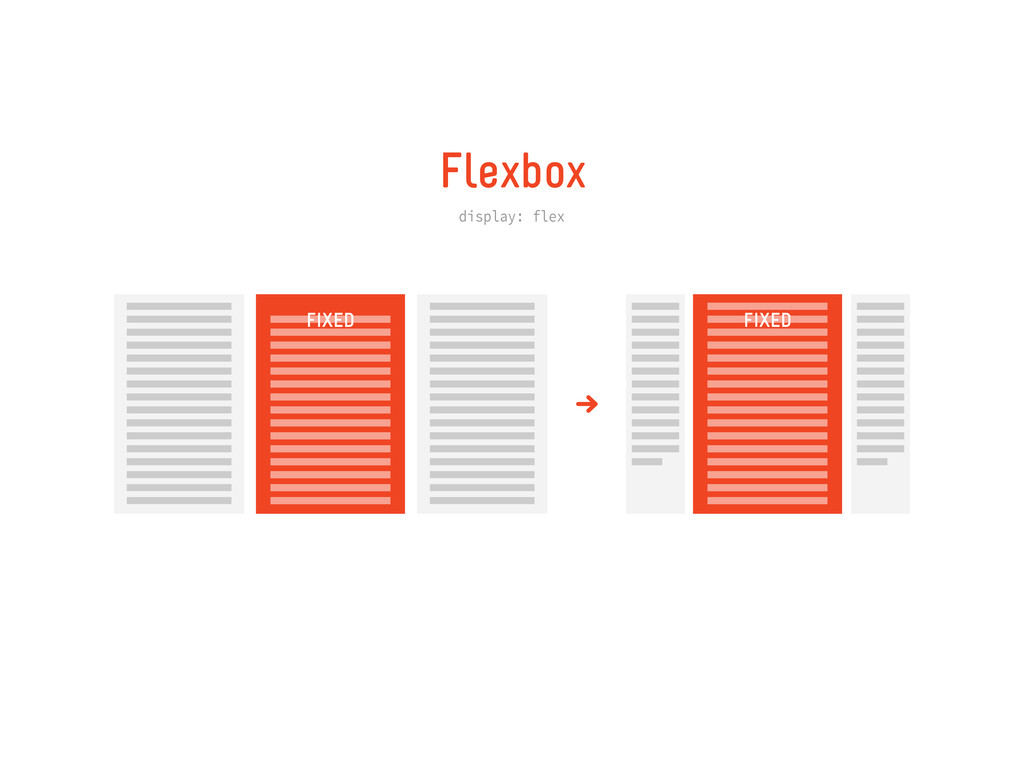
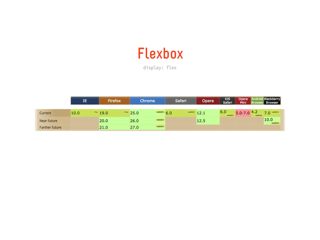
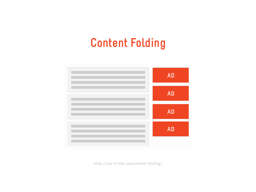
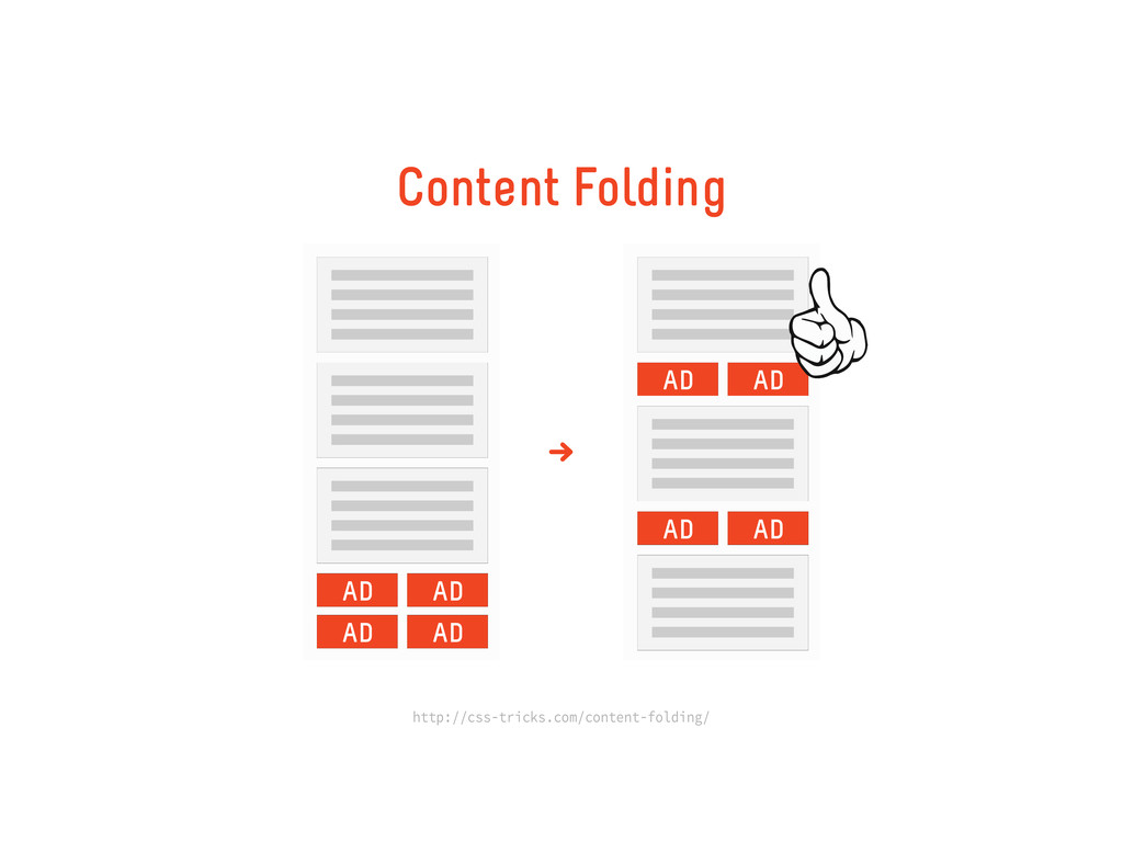
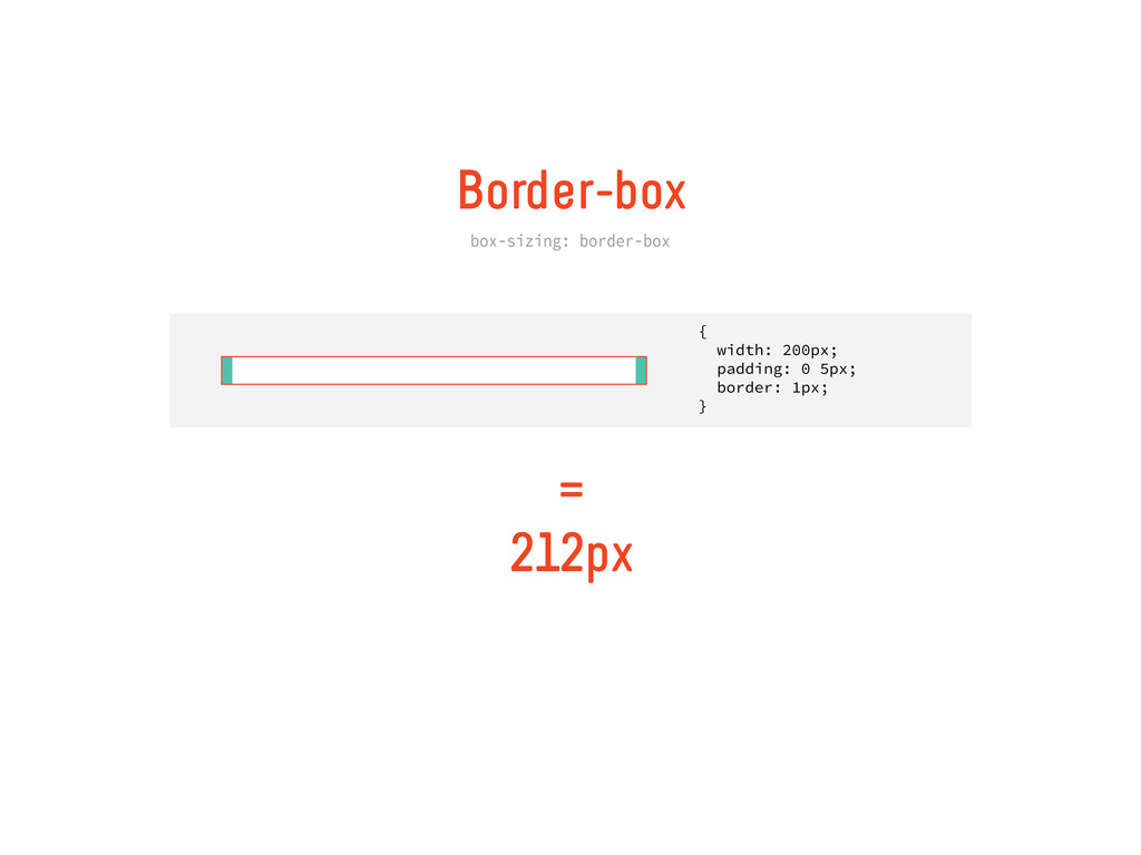
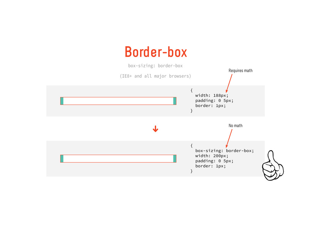
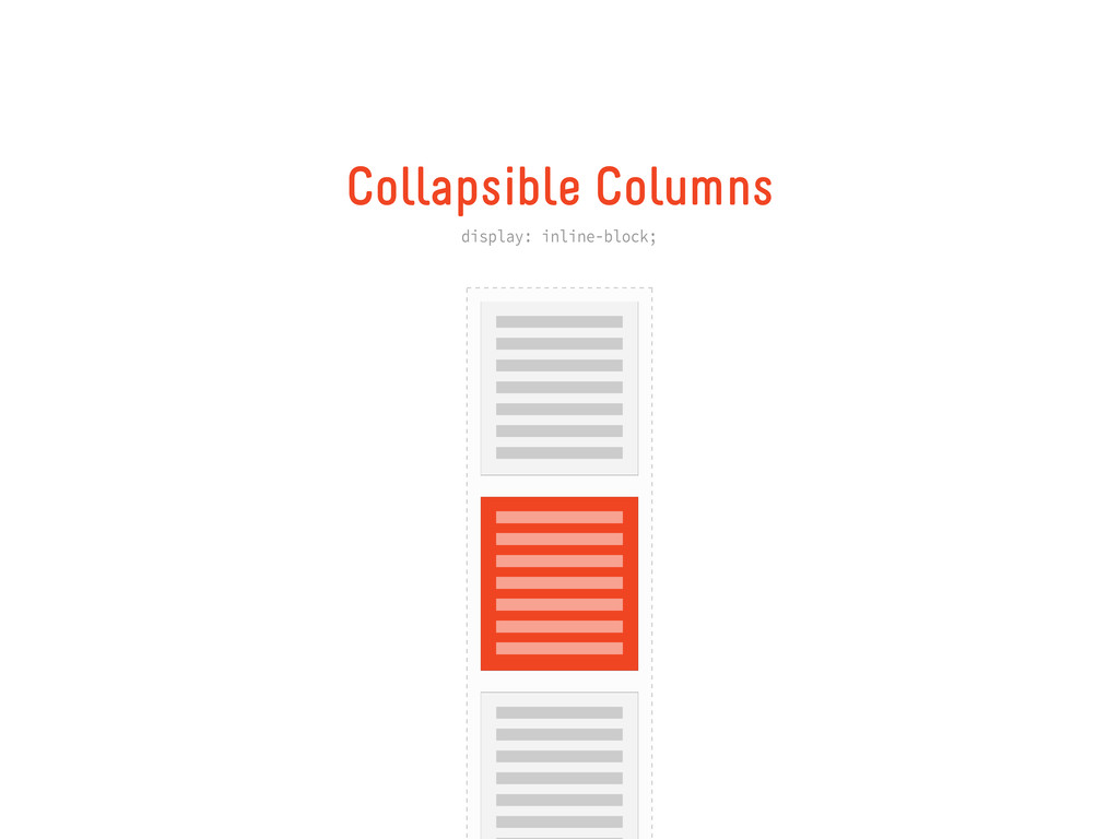
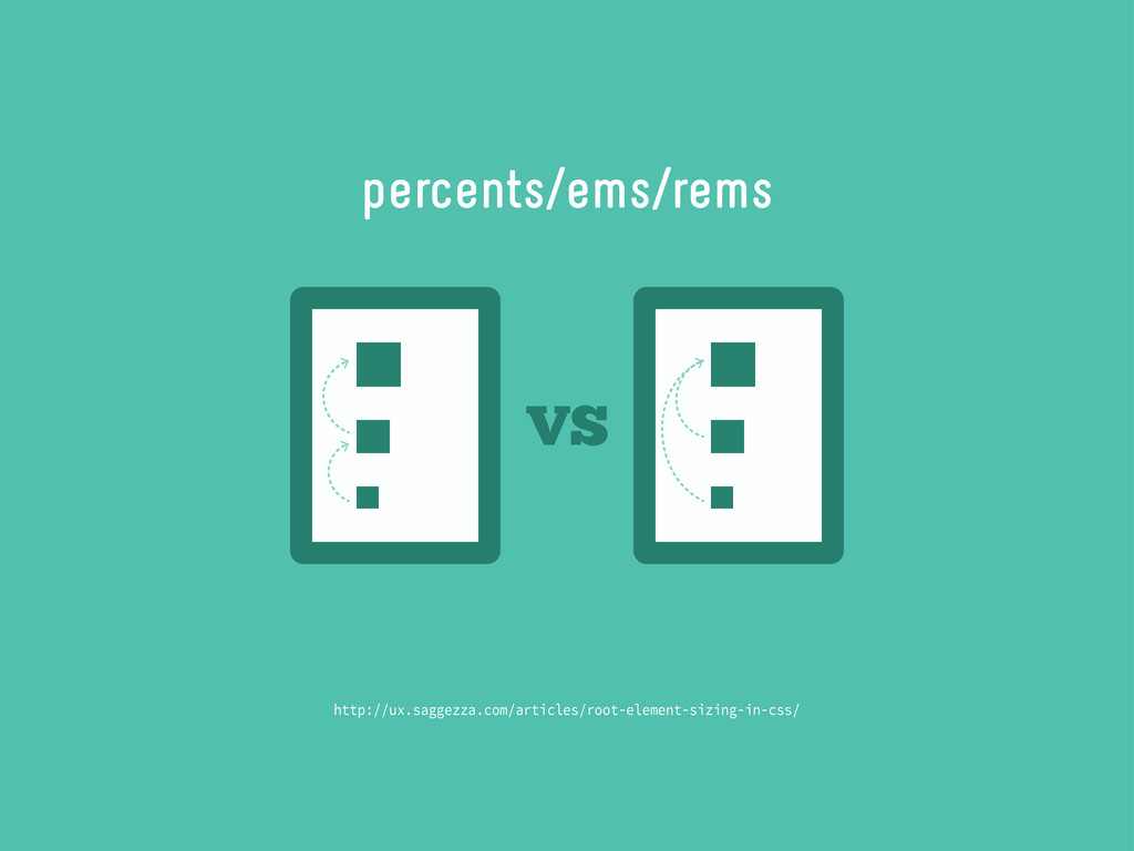
Tips & tricks for achieving device-agnosticism. Unfortunately it's really tricky to make layout work for you. Css has a lot of promise in W3C proposals, but we're not quite there yet.
In the meantime, here are some good guidelines to help you with design decisions.
 mshwery
 sevendex
 mhand01
 csswizardry
 centou
 a2k
a2k
 root_recruit
 shotamatsuo
 mottox2
 dmattsun
 chiemitaki
 rezaline
 davetheseo
 lara
lara
 mojombo
 schlessera
 aleyda
 lauravandoore
 nwiizo
 eitanlees
 techseoconnect
 inesmontani
 livdayseo