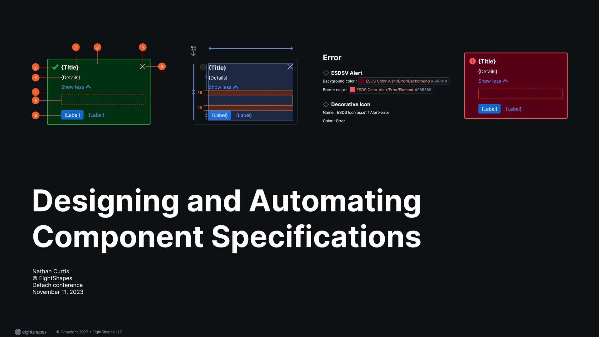
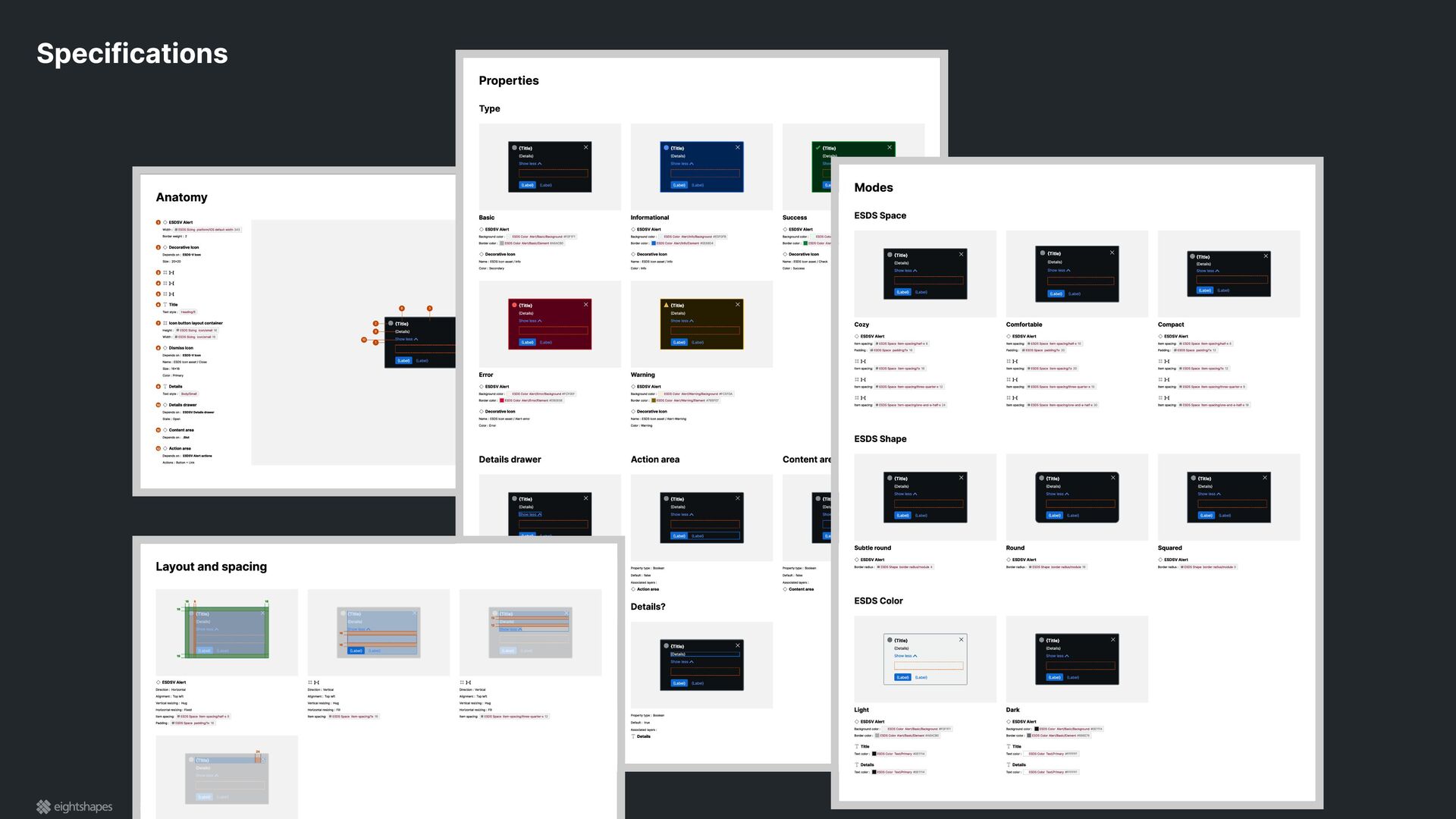
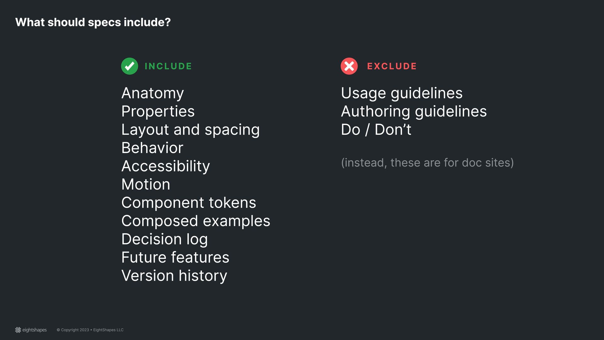
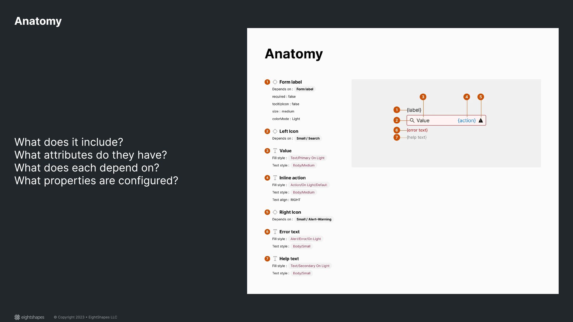
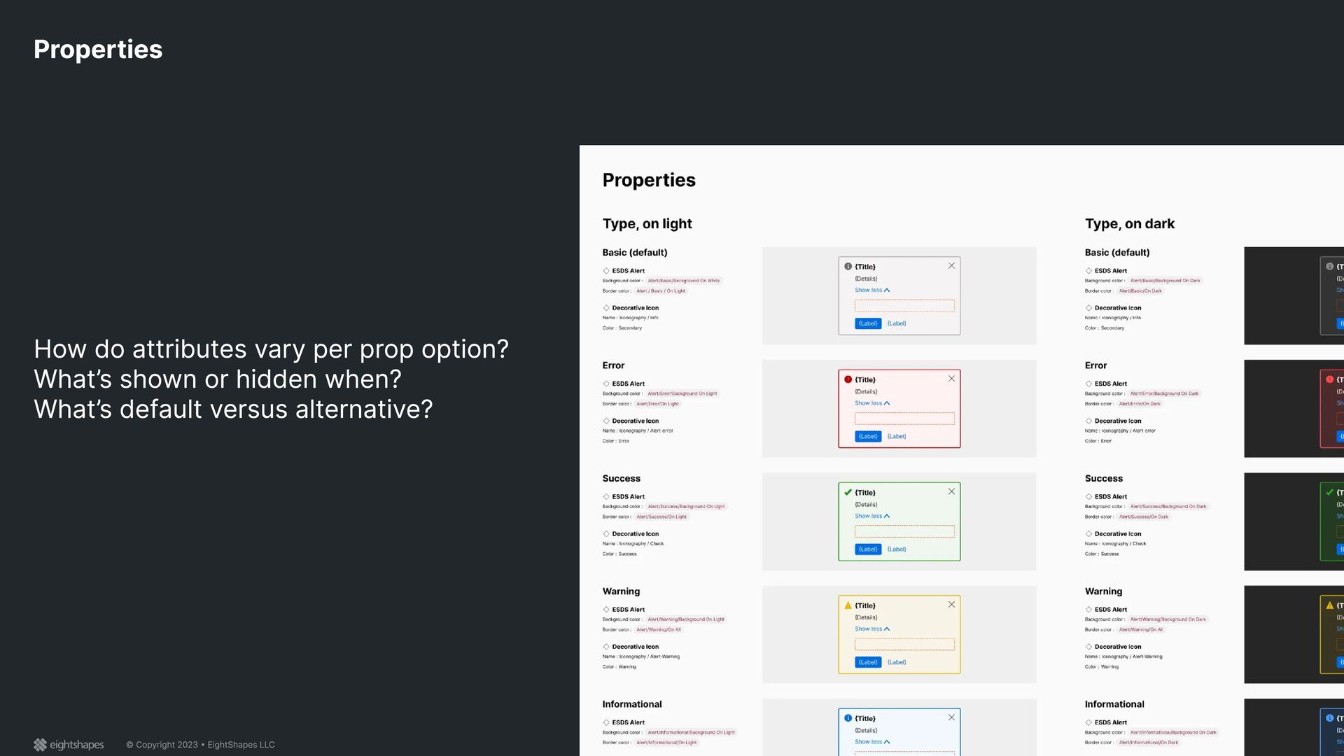
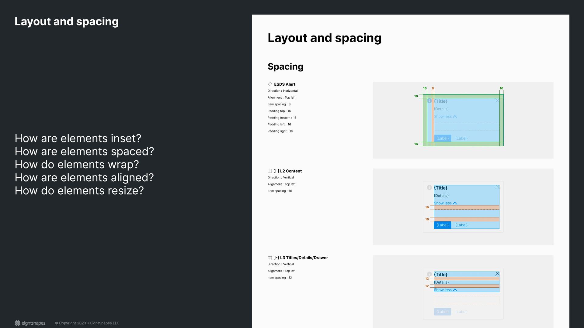
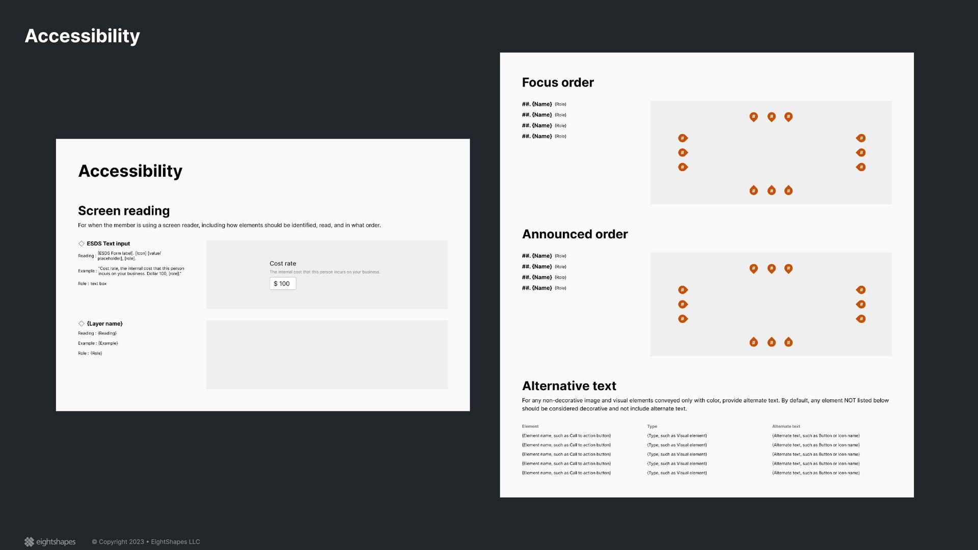
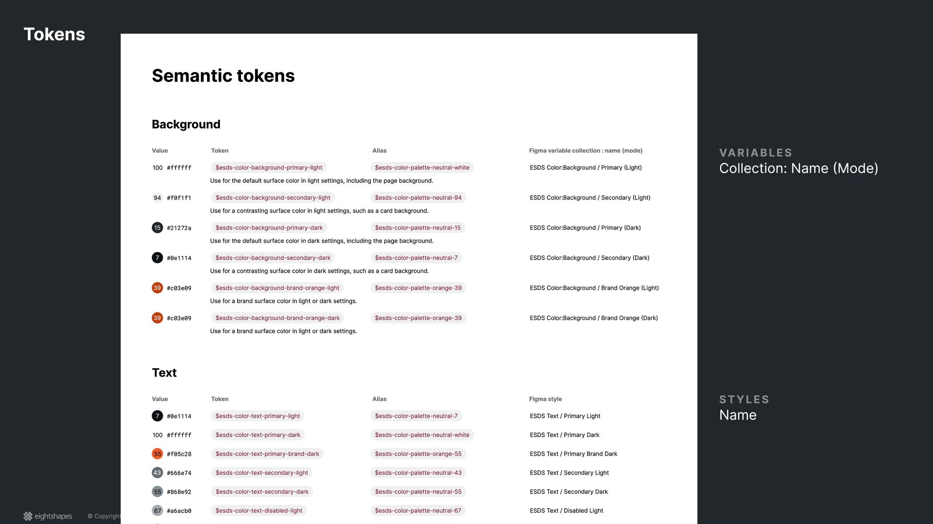
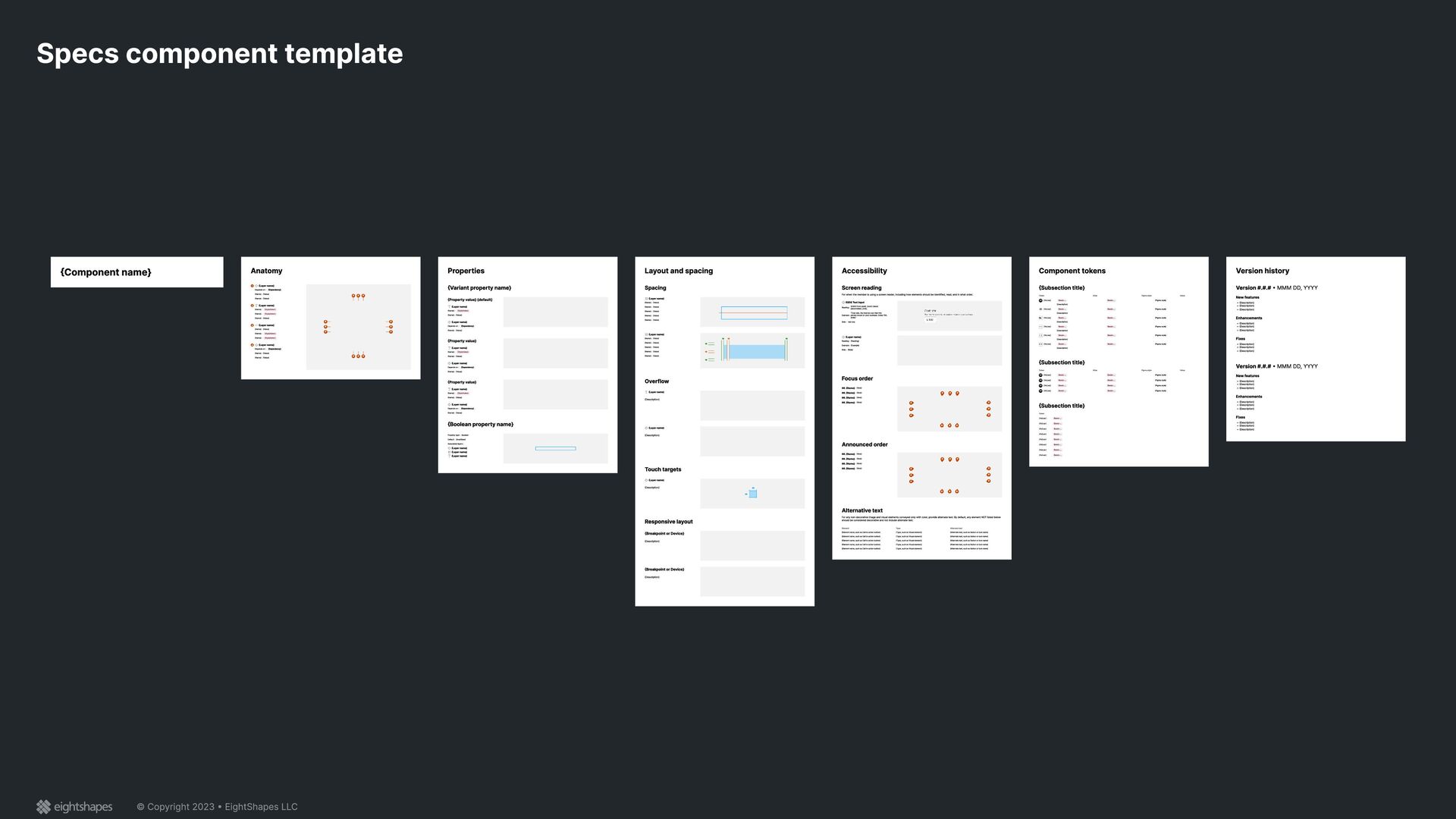
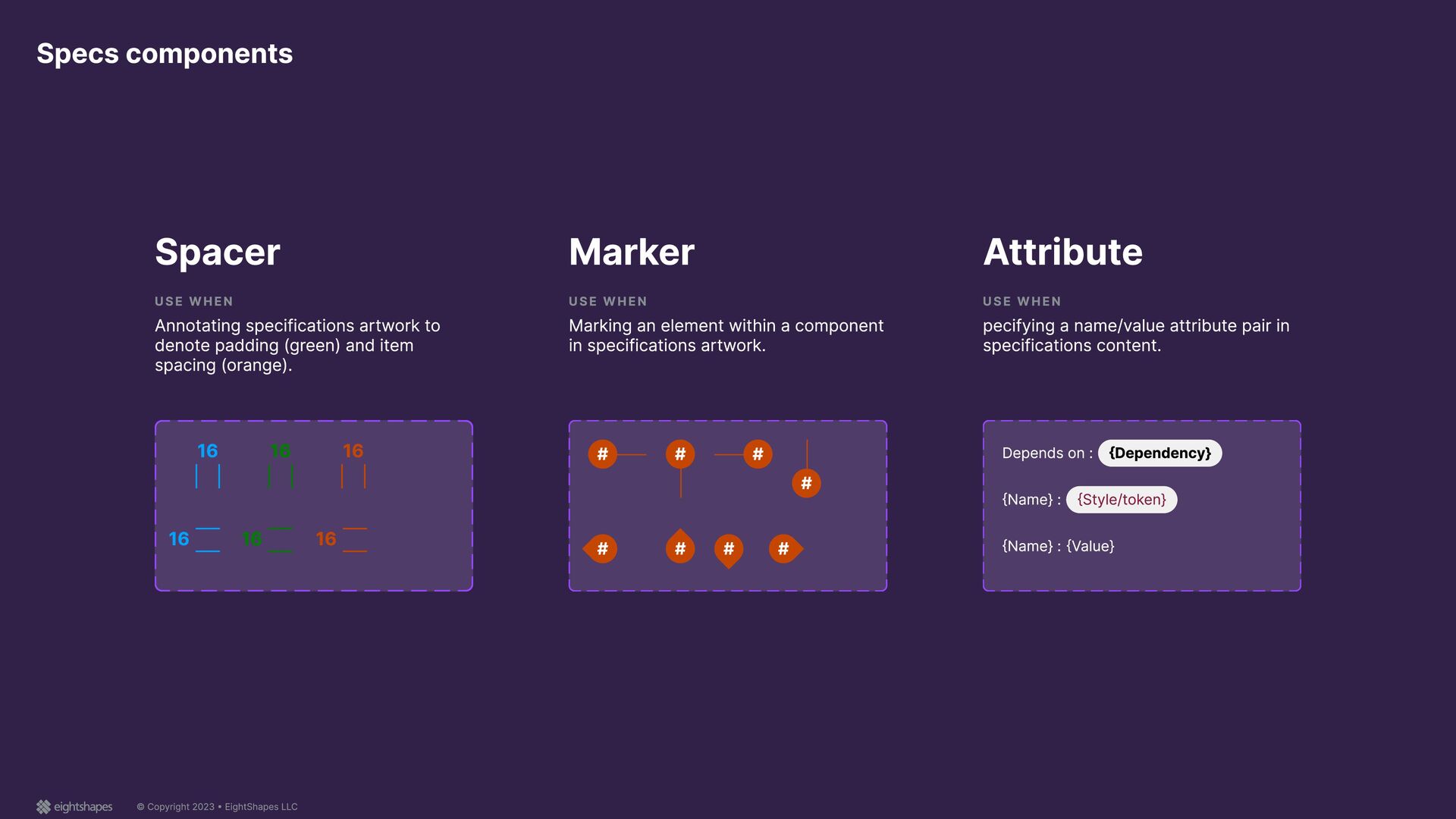
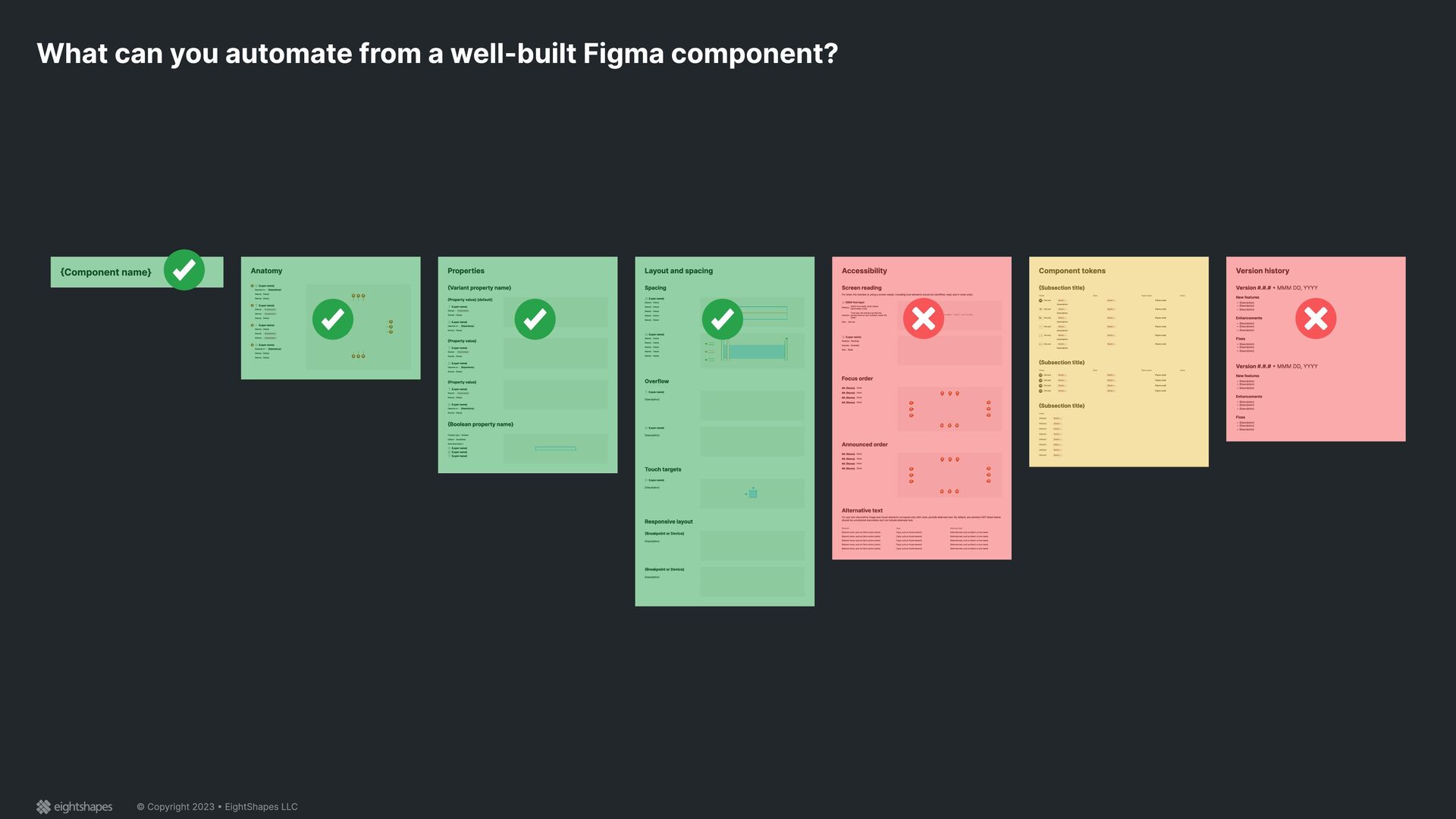
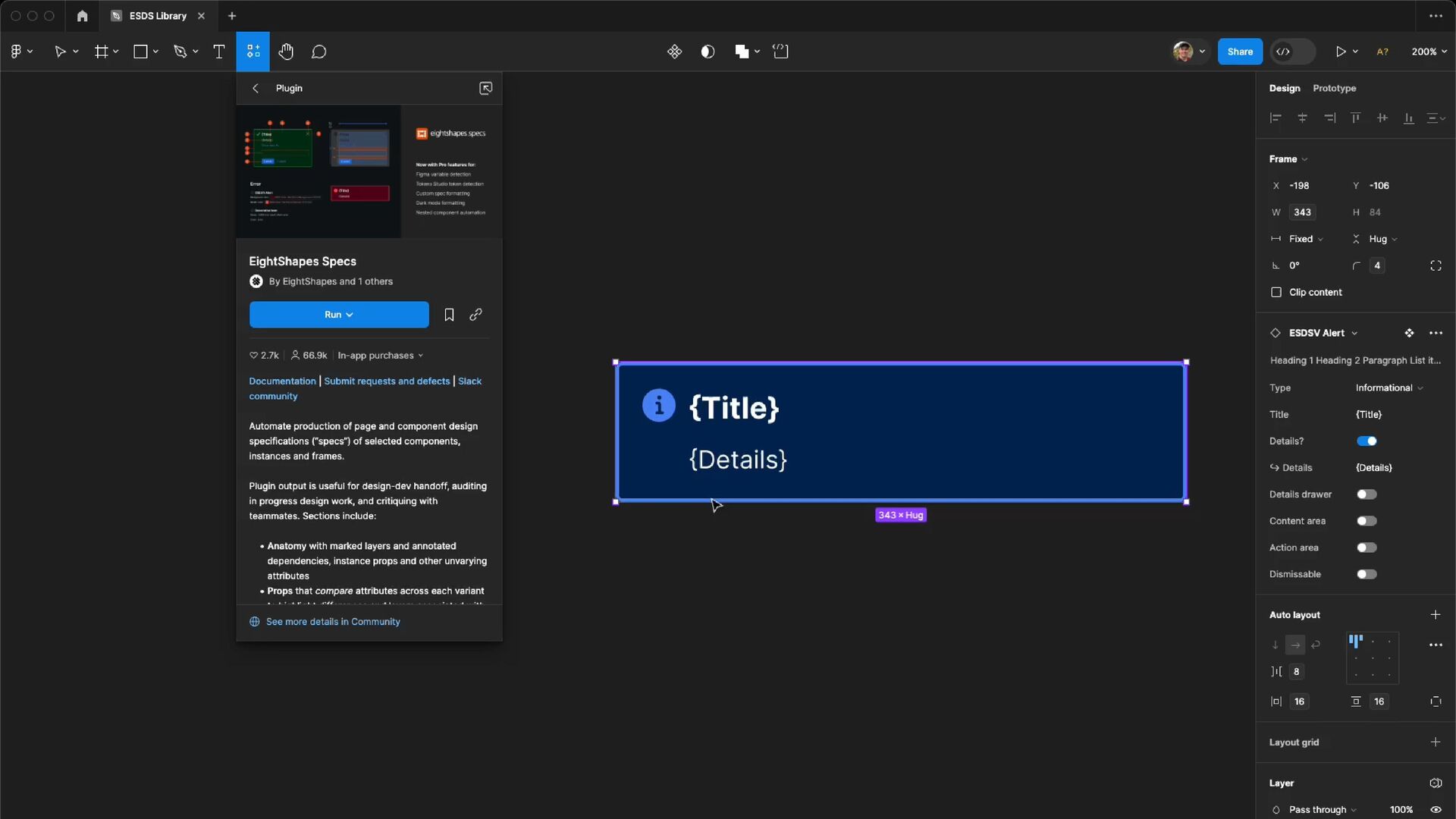
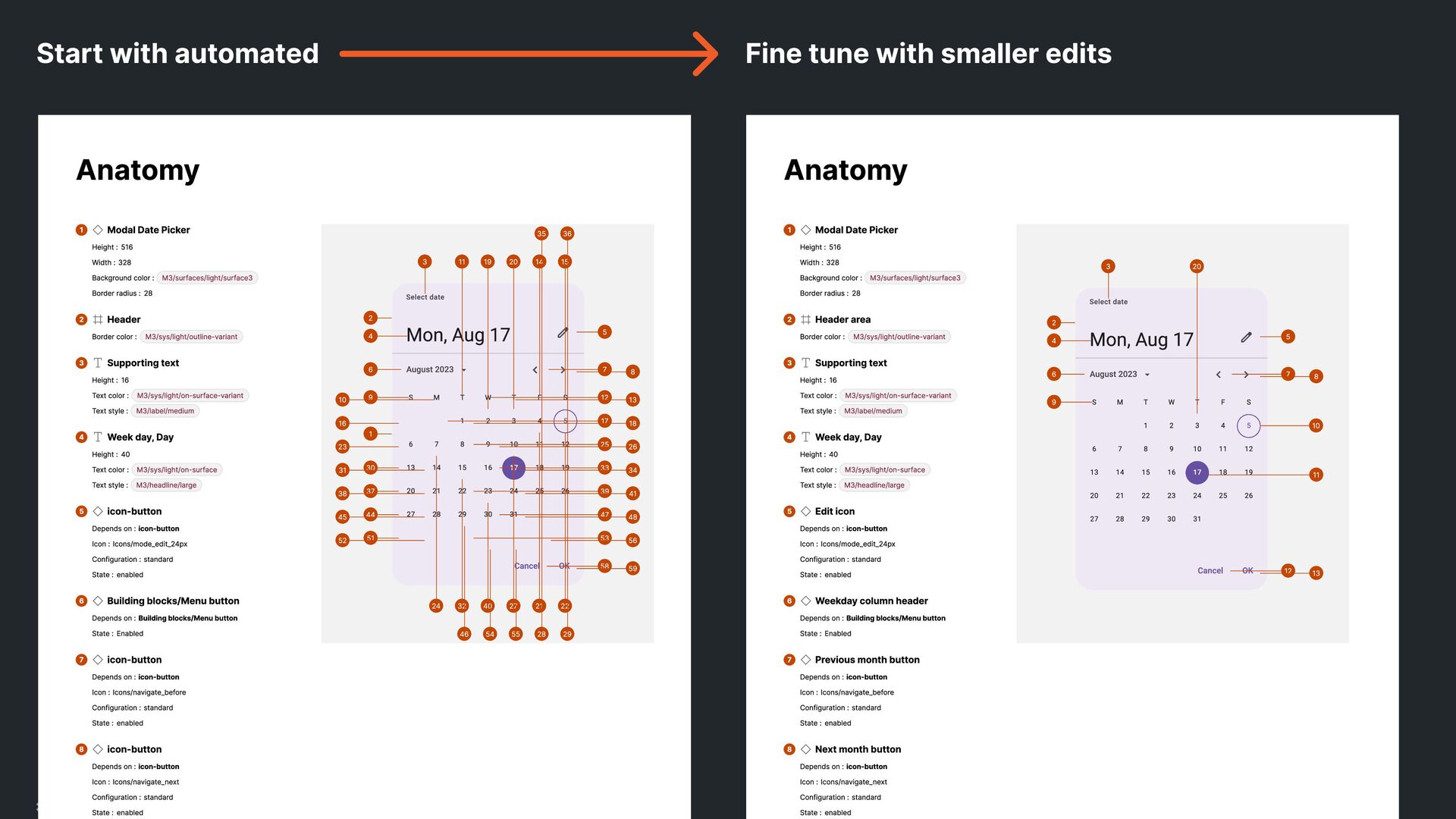
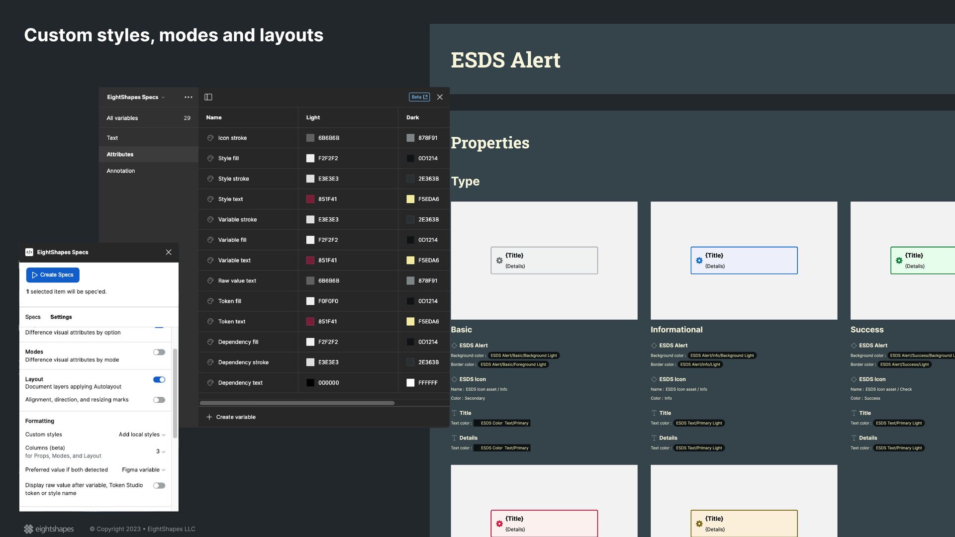
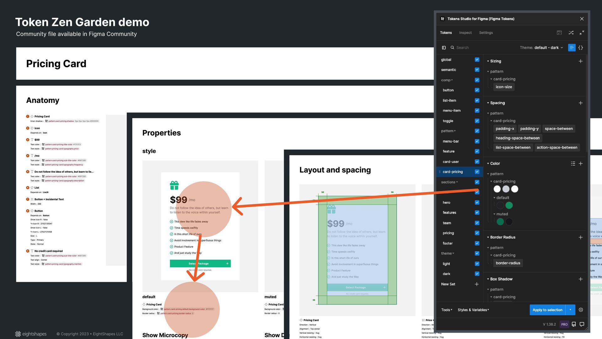
from a well-built Figma component? {Component name} Anatomy 1 {Layer name} Depends on : {Dependency} {Name} : {Value} {Name} : {Value} 2 {Layer name} {Name} : {Style/token} {Name} : {Style/token} {Name} : {Value} 3 {Layer name} {Name} : {Value} {Name} : {Style/token} {Name} : {Style/token} 4 {Layer name} Depends on : {Dependency} {Name} : {Value} {Name} : {Value} # # # # # # # # # # # # Properties {Variant property name} {Property value} (default) {Layer name} {Name} : {Style/token} {Name} : {Value} {Layer name} Depends on : {Dependency} {Name} : {Value} {Property value} {Layer name} {Name} : {Style/token} {Name} : {Value} {Layer name} Depends on : {Dependency} {Name} : {Value} {Property value} {Layer name} {Name} : {Style/token} {Name} : {Value} {Layer name} Depends on : {Dependency} {Name} : {Value} {Boolean property name} Property type : Boolean Default : {true/false} Associated layers : {Layer name} {Layer name} {Layer name} Layout and spacing Spacing {Layer name} {Name} : {Value} {Name} : {Value} {Name} : {Value} {Name} : {Value} {Name} : {Value} {Layer name} {Name} : {Value} {Name} : {Value} {Name} : {Value} {Name} : {Value} {Name} : {Value} 16 16 16 16 16 16 Overflow {Layer name} {Description} {Layer name} {Description} Touch targets {Layer name} {Description} 48 48 Responsive layout {Breakpoint or Device} {Description} {Breakpoint or Device} {Description} Accessibility Screen reading For when the member is using a screen reader, including how elements should be identified, read, and in what order. ESDS Text input Reading : [ESDS Form label]. [Icon] [value/ placeholder], [role]. Example : “Cost rate, the internal cost that this person incurs on your business. Dollar 100, [role].” Role : text box {Layer name} Reading : {Reading} Example : {Example} Role : {Role} Focus order ##. {Name} {Role} ##. {Name} {Role} ##. {Name} {Role} ##. {Name} {Role} # # # # # # # # # # # # Announced order ##. {Name} {Role} ##. {Name} {Role} ##. {Name} {Role} ##. {Name} {Role} # # # # # # # # # # # # Alternative text For any non-decorative image and visual elements conveyed only with color, provide alternate text. By default, any element NOT listed below should be considered decorative and not include alternate text. Element Type Alternate text {Element name, such as Call to action button} {Type, such as Visual element} {Alternate text, such as Button or Icon name} {Element name, such as Call to action button} {Type, such as Visual element} {Alternate text, such as Button or Icon name} {Element name, such as Call to action button} {Type, such as Visual element} {Alternate text, such as Button or Icon name} {Element name, such as Call to action button} {Type, such as Visual element} {Alternate text, such as Button or Icon name} {Element name, such as Call to action button} {Type, such as Visual element} {Alternate text, such as Button or Icon name} Component tokens {Subsection title} Token Alias Figma style Value 00 {Value} $esds-... $esds-... {Figma style} {Description} 00 {Value} $esds-... $esds-... {Figma style} {Description} Aa {Value} $esds-... $esds-... {Figma style} {Description} {Value} $esds-... $esds-... {Figma style} {Description} {Value} $esds-... $esds-... {Figma style} {Description} {Value} $esds-... $esds-... {Figma style} {Description} {Subsection title} Token Alias Figma style Value 00 {Value} $esds-... $esds-... {Figma style} 00 {Value} $esds-... $esds-... {Figma style} 00 {Value} $esds-... $esds-... {Figma style} 00 {Value} $esds-... $esds-... {Figma style} {Subsection title} Token {Value} $esds-... {Value} $esds-... {Value} $esds-... {Value} $esds-... {Value} $esds-... {Value} $esds-... {Value} $esds-... {Value} $esds-... Version history Version #.#.# • MMM DD, YYYY New features @ {Description( @ {Description( @ {Description} Enhancements @ {Description( @ {Description( @ {Description} Fixes @ {Description( @ {Description( @ {Description} Version #.#.# • MMM DD, YYYY New features @ {Description( @ {Description( @ {Description} Enhancements @ {Description( @ {Description( @ {Description} Fixes @ {Description( @ {Description( @ {Description}
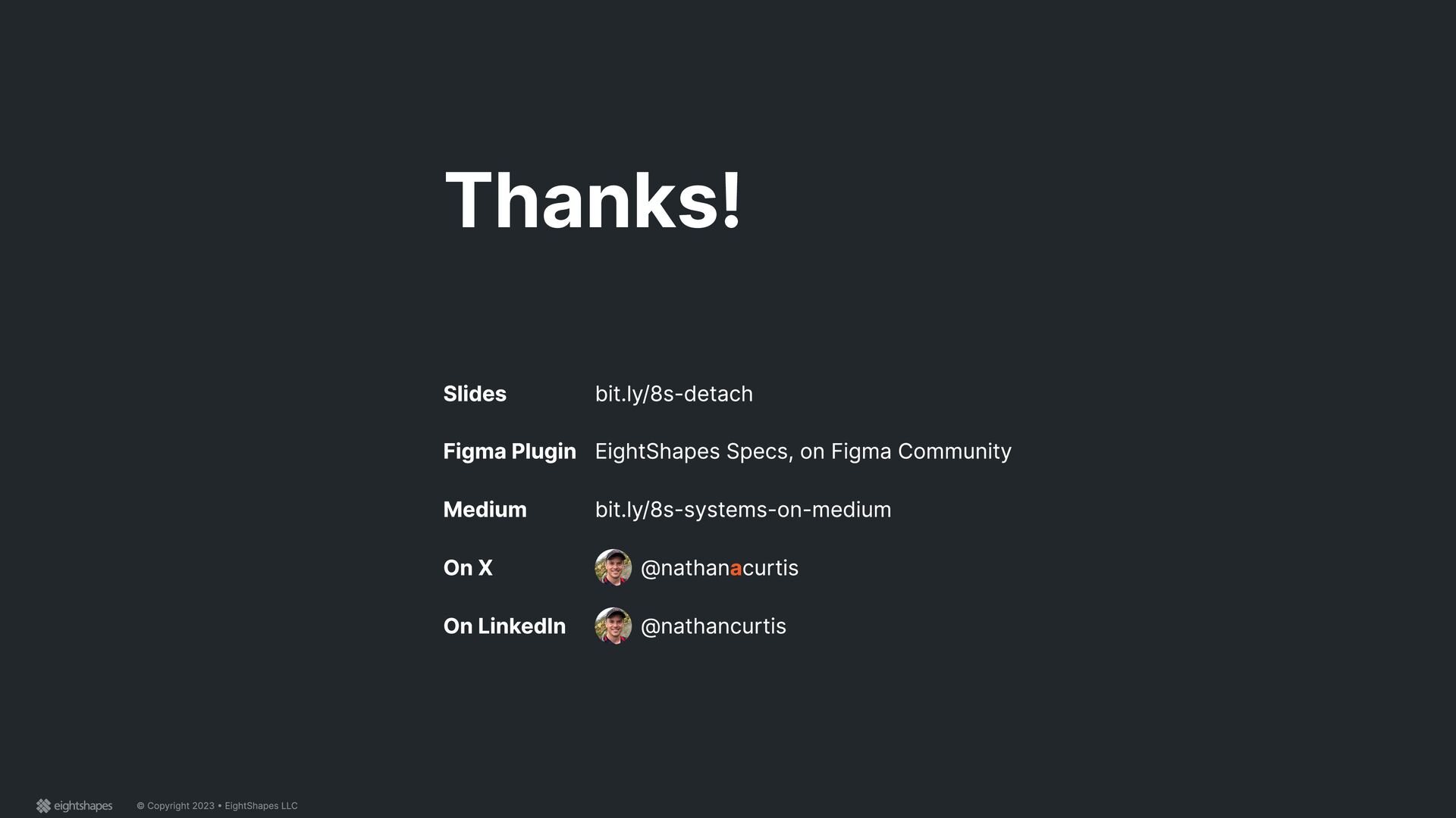
 nathanacurtis
 saki822
 koyaman
 usagimaru
 lynteo
 xtone
xtone
 moco1013
 saka2jp
 0b1tk
0b1tk
 mottox2
 atsushihomma
 sekiguchiy
 shoko_seven11
 ryanjones
 mkilby
 marktimemedia
 techseoconnect
 rkaga
rkaga
 jakevdp
 mojombo
 palkan
 sarafernandez
 mfonobong
 scottboms