Upgrade to Pro — share decks privately, control downloads, hide ads and more …

Sass

 Sass

A quick introduction to the Sass CSS pre-processor, originally presented at Refresh Rochester in June 2013

Nathan Henderson

June 25, 2013
Tweet

More Decks by Nathan Henderson

Other Decks in Design

Transcript

  1. body { font-family: sans-serif; font-size: 30em; font-weight: bold; } #contents

    { width: 800px; } #contents #sidebar { float: right; width: 200px; } #contents #main { width: 600px; background: #eeeeee; } #contents #main h2 { color: blue; } #footer { height: 200px; } CSS body { font-family: sans-serif; font-size: 30em; font-weight: bold; } #contents { width: 800px; } #contents #sidebar { float: right; width: 200px; } #contents #main { width: 600px; background: #eeeeee; } #contents #main h2 { color: blue; } #footer { height: 200px; } Nested CSS
  2. body { font-family: sans-serif; font-size: 30em; font-weight: bold; } #contents

    { width: 800px; #sidebar { float: right; width: 200px; } #main { width: 600px; background: #eeeeee; h2 { color: blue; } } } #footer { height: 200px; } SCSS body { font-family: sans-serif; font-size: 30em; font-weight: bold; } #contents { width: 800px; } #contents #sidebar { float: right; width: 200px; } #contents #main { width: 600px; background: #eeeeee; } #contents #main h2 { color: blue; } #footer { height: 200px; } Nested CSS
  3. body { font-family: sans-serif; font-size: 30em; font-weight: bold; } #contents

    { width: 800px; #sidebar { float: right; width: 200px; } #main { width: 600px; background: #eeeeee; h2 { color: blue; } } } #footer { height: 200px; } SCSS body { font-family: sans-serif; font-size: 30em; font-weight: bold; } #contents { width: 800px; } #contents #sidebar { float: right; width: 200px; } #contents #main { width: 600px; background: #eeeeee; } #contents #main h2 { color: blue; } #footer { height: 200px; } Nested CSS
  4. body { font-family: sans-serif; font-size: 30em; font-weight: bold; } #contents

    { width: 800px; #sidebar { float: right; width: 200px; } #main { width: 600px; background: #eeeeee; h2 { color: blue; } } } #footer { height: 200px; } SCSS • SCSS = “Sassy CSS” • Default Sass syntax • Superset of CSS3 (CSS is SCSS!) • Nested selectors
  5. body { font-family: sans-serif; font-size: 30em; font-weight: bold; } #contents

    { width: 800px; #sidebar { float: right; width: 200px; } #main { width: 600px; background: #eeeeee; h2 { color: blue; } } } #footer { height: 200px; } SCSS • SCSS = “Sassy CSS” • Default Sass syntax • Superset of CSS3 (CSS is SCSS!) • Nested selectors • Nested properties too
  6. • SCSS = “Sassy CSS” • Default Sass syntax •

    Superset of CSS3 (CSS is SCSS!) • Nested selectors • Nested properties too body { font: { family: sans-serif; size: 30em; weight: bold; } } #contents { width: 800px; #sidebar { float: right; width: 200px; } #main { width: 600px; background: #eeeeee; h2 { color: blue; } } } #footer { height: 200px; } SCSS
  7. • SCSS = “Sassy CSS” • Default Sass syntax •

    Superset of CSS3 (CSS is SCSS!) • Nested selectors • Nested properties too • Indentation isn’t required, but… body { font: { family: sans-serif; size: 30em; weight: bold; } } #contents { width: 800px; #sidebar { float: right; width: 200px; } #main { width: 600px; background: #eeeeee; h2 { color: blue; } } } #footer { height: 200px; } SCSS
  8. body { font-family: sans-serif; font-size: 30em; font-weight: bold; } #contents

    { width: 800px; #sidebar { float: right; width: 200px; } #main { width: 600px; background: #eeeeee; h2 { color: blue; } } } #footer { height: 200px; } SCSS body font-family: sans-serif font-size: 30em font-weight: bold #contents width: 800px #sidebar float: right width: 200px #main width: 600px background: #eeeeee h2 color: blue #footer height: 200px Sass
  9. body { font-family: sans-serif; font-size: 30em; font-weight: bold; } #contents

    { width: 800px; #sidebar { float: right; width: 200px; } #main { width: 600px; background: #eeeeee; h2 { color: blue; } } } #footer { height: 200px; } SCSS body font-family: sans-serif font-size: 30em font-weight: bold #contents width: 800px #sidebar float: right width: 200px #main width: 600px background: #eeeeee h2 color: blue #footer height: 200px Sass
  10. • “Sass” or “indented” syntax • White space aware (2

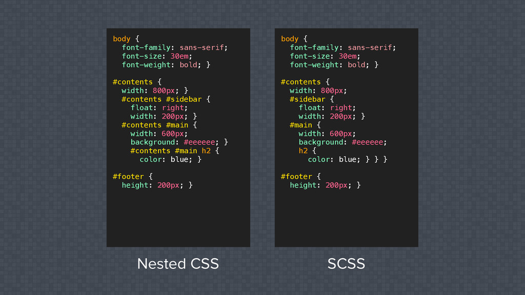
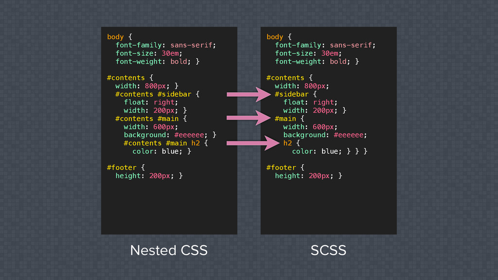
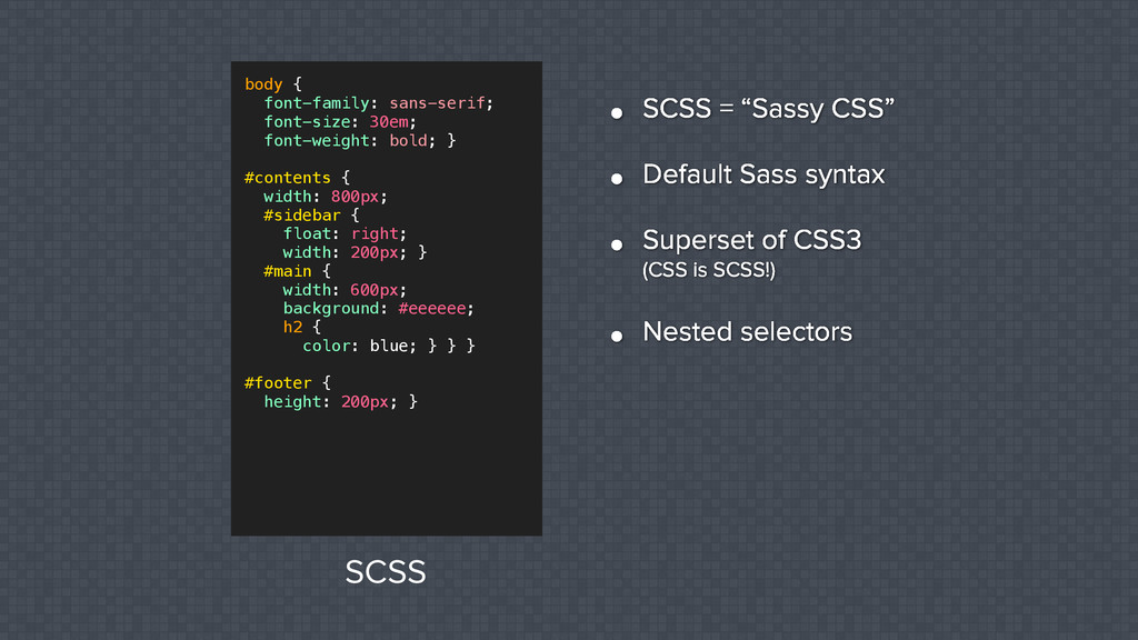
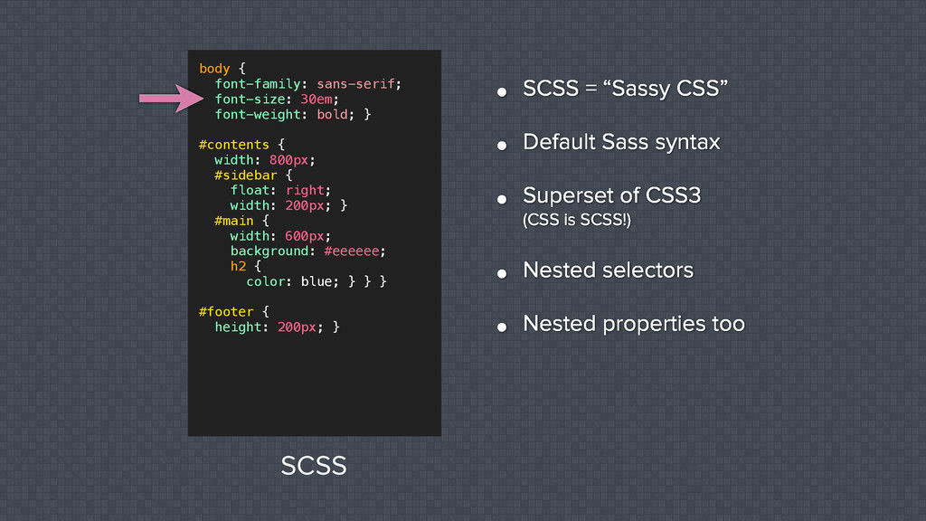
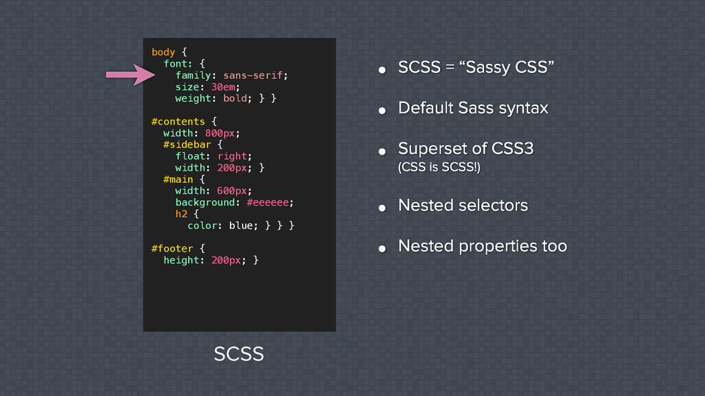
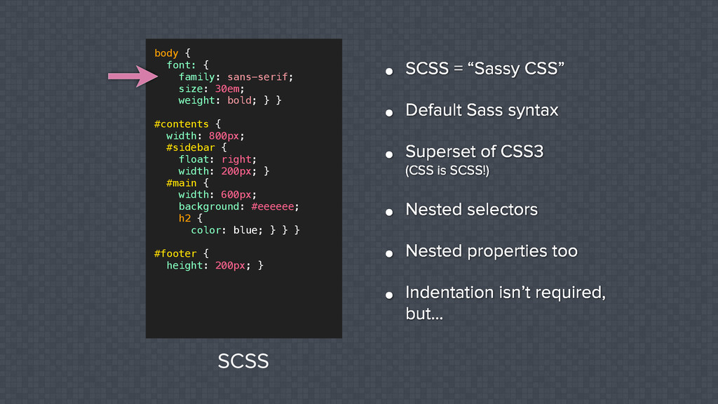
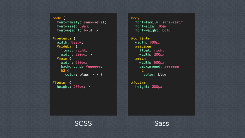
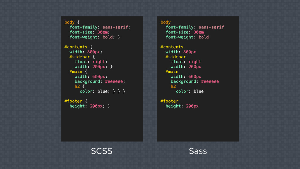
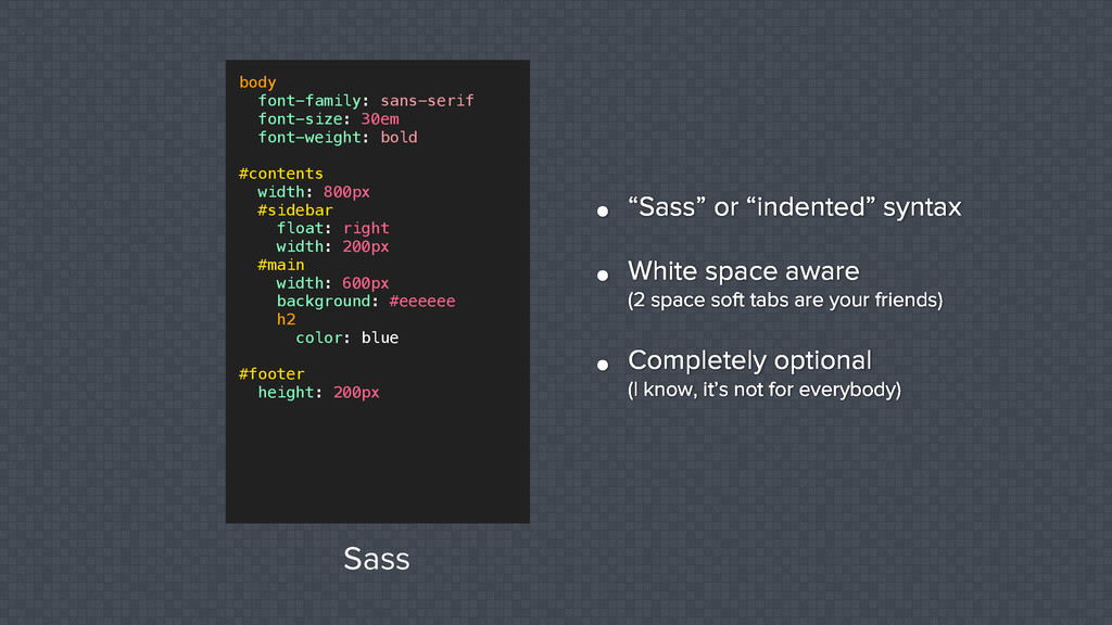
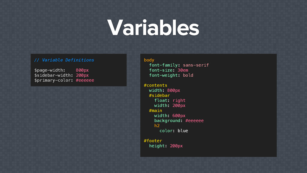
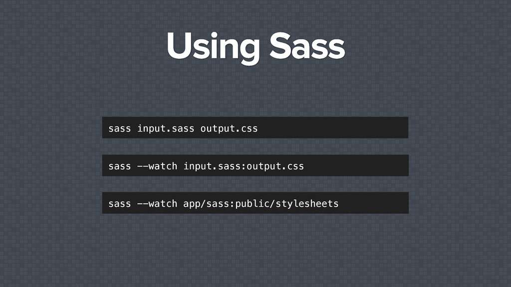
    space soft tabs are your friends) • Completely optional (I know, it’s not for everybody) body font-family: sans-serif font-size: 30em font-weight: bold #contents width: 800px #sidebar float: right width: 200px #main width: 600px background: #eeeeee h2 color: blue #footer height: 200px Sass
  11. Variables body font-family: sans-serif font-size: 30em font-weight: bold #contents width:

    800px #sidebar float: right width: 200px #main width: 600px background: #eeeeee h2 color: blue #footer height: 200px // Variable Definitions $page-width: 800px $sidebar-width: 200px $primary-color: #eeeeee
  12. Variables body font-family: sans-serif font-size: 30em font-weight: bold #contents width:

    800px #sidebar float: right width: 200px #main width: 600px background: #eeeeee h2 color: blue #footer height: 200px // Variable Definitions $page-width: 800px $sidebar-width: 200px $primary-color: #eeeeee body font-family: sans-serif font-size: 30em font-weight: bold #contents width: $page-width #sidebar float: right width: $sidebar-width #main width: ??? background: $primary-color h2 color: blue #footer height: 200px
  13. Variables body font-family: sans-serif font-size: 30em font-weight: bold #contents width:

    800px #sidebar float: right width: 200px #main width: 600px background: #eeeeee h2 color: blue #footer height: 200px // Variable Definitions $page-width: 800px $sidebar-width: 200px $primary-color: #eeeeee body font-family: sans-serif font-size: 30em font-weight: bold #contents width: $page-width #sidebar float: right width: $sidebar-width #main width: ??? background: $primary-color h2 color: blue #footer height: 200px
  14. Variables body font-family: sans-serif font-size: 30em font-weight: bold #contents width:

    800px #sidebar float: right width: 200px #main width: 600px background: #eeeeee h2 color: blue #footer height: 200px // Variable Definitions $page-width: 800px $sidebar-width: 200px $primary-color: #eeeeee body font-family: sans-serif font-size: 30em font-weight: bold #contents width: $page-width #sidebar float: right width: $sidebar-width #main width: ??? background: $primary-color h2 color: blue #footer height: 200px body font-family: sans-serif font-size: 30em font-weight: bold #contents width: $page-width #sidebar float: right width: $sidebar-width #main width: $page-width - $sidebar-width background: $primary-color h2 color: blue #footer height: 200px
  15. Variables body font-family: sans-serif font-size: 30em font-weight: bold #contents width:

    800px #sidebar float: right width: 200px #main width: 600px background: #eeeeee h2 color: blue #footer height: 200px // Variable Definitions $page-width: 800px $sidebar-width: 200px $primary-color: #eeeeee body font-family: sans-serif font-size: 30em font-weight: bold #contents width: $page-width #sidebar float: right width: $sidebar-width #main width: ??? background: $primary-color h2 color: blue #footer height: 200px body font-family: sans-serif font-size: 30em font-weight: bold #contents width: $page-width #sidebar float: right width: $sidebar-width #main width: $page-width - $sidebar-width background: $primary-color h2 color: blue #footer height: 200px MATH
  16. Real World Example // Dimensions $page_width: 960px $nav_tabs: 6 //

    number of navigation tabs $tab_width: round($page_width / $nav_tabs) - 1
  17. Real World Example // Dimensions $page_width: 960px $nav_tabs: 7 //

    number of navigation tabs $tab_width: round($page_width / $nav_tabs) - 1
  18. Real World Example // Dimensions $page_width: 960px $nav_tabs: 7 //

    number of navigation tabs $tab_width: round($page_width / $nav_tabs) - 1
  19. Using Variables ✦ Colors ✦ Font Stacks ✦ Margins &

    Padding ✦ Border widths ✦ Border radii
  20. More Mixins @mixin ez-border($width, $color) border-width: $width border-style: solid border-color:

    $color #aboutbox @include ez-border(2px, #eee) @mixin ez-border($width: 2px, $color: #eee) border-width: $width border-style: solid border-color: $color #aboutbox @include ez-border
  21. More Mixins @mixin ez-border($width, $color) border-width: $width border-style: solid border-color:

    $color #aboutbox @include ez-border(2px, #eee) @mixin ez-border($width: 2px, $color: #eee) border-width: $width border-style: solid border-color: $color #aboutbox @include ez-border #aboutbox @include ez-border(1px, #444)
  22. Fun with Mixins ✦ Mixin definitions can include other mixins

    ✦ Try the ‘&’ parent selector ✦ Global variables in mixins
  23. @extend <div class="alert criticalAlert"> Oh snap! The roof is on

    fire! </div> .alert border: 1px #f00 background-color: #eee .criticalAlert border-width: 3px color: #8a0808
  24. @extend <div class="alert criticalAlert"> Oh snap! The roof is on

    fire! </div> .alert border: 1px #f00 background-color: #eee .criticalAlert border-width: 3px color: #8a0808 .alert border: 1px #f00 background-color: #eee .criticalAlert @extend .alert border-width: 3px color: #8a0808
  25. @extend <div class="alert criticalAlert"> Oh snap! The roof is on

    fire! </div> .alert border: 1px #f00 background-color: #eee .criticalAlert border-width: 3px color: #8a0808 <div class="criticalAlert"> Oh snap! The roof is on fire! </div> .alert border: 1px #f00 background-color: #eee .criticalAlert @extend .alert border-width: 3px color: #8a0808
  26. Multiple @extends .alert border: 1px #f00 background-color: #eee .criticalAlert border-width:

    3px color: #8a0808 .greatGooglyMoogly @extend .alert @extend .criticalAlert border-style: dashed <div class="greatGooglyMoogly"> Oh snap! The roof is on fire! </div>
  27. Multiple @extends .alert border: 1px #f00 background-color: #eee .criticalAlert border-width:

    3px color: #8a0808 .greatGooglyMoogly @extend .alert @extend .criticalAlert border-style: dashed <div class="greatGooglyMoogly"> Oh snap! The roof is on fire! </div> .alert border: 1px #f00 background-color: #eee .criticalAlert border-width: 3px color: #8a0808 .greatGooglyMoogly @extend .alert, .criticalAlert border-style: dashed
  28. @extend vs. Mixins @extend modifies selectors, mixins add properties &

    values .alert border: 1px #f00 background-color: #eee .criticalAlert @extend .alert border-width: 3px color: #8a0808 Sass Input (@extend) .alert, .criticalAlert border: 1px #f00 background-color: #eee .criticalAlert border-width: 3px color: #8a0808 CSS Output
  29. @extend vs. Mixins @extend modifies selectors, mixins add properties &

    values @mixin alert border: 1px #f00 background-color: #eee .criticalAlert @mixin alert border-width: 3px color: #8a0808 Sass Input (@mixin) .criticalAlert border: 1px #f00 background-color: #eee border-width: 3px color: #8a0808 CSS Output
  30. Placeholder selector %-prefixed selectors don’t get rendered to CSS %alert

    border: 1px #f00 background-color: #eee .criticalAlert @extend %alert border-width: 3px color: #8a0808 Sass Input .criticalAlert border: 1px #f00 background-color: #eee .criticalAlert border-width: 3px color: #8a0808 CSS Output
  31. Parent Selector a font-weight: bold text-decoration: none a:hover text-decoration: underline

    a font-weight: bold text-decoration: none &:hover text-decoration: underline
  32. @import & Partials @import "rounded-corners", "text-shadow" filenames that start with

    an underscore won’t be compiled into the output directory _rounded-corners.sass _text-shadow.sass
  33. Command Line ✦ Requires Ruby ✦ Best to use a

    new(ish) version of Ruby (1.9.3 or higher) ✦ Probably a good idea to use a Ruby version manager (RVM, rbenv, etc.)
  34. GUI Apps ✦ CodeKit Mac http://incident57.com/codekit/ ✦ Scout Mac &

    Windows http://mhs.github.io/scout-app/ ✦ Compass.app Mac, Windows, and Linux http://compass.handlino.com ✦ Others
  35. Q&A